Displaying posts from November, 2013
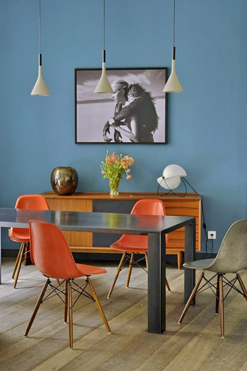
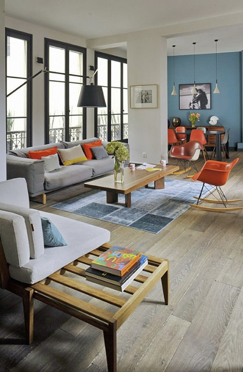
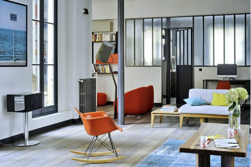
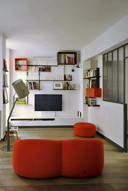
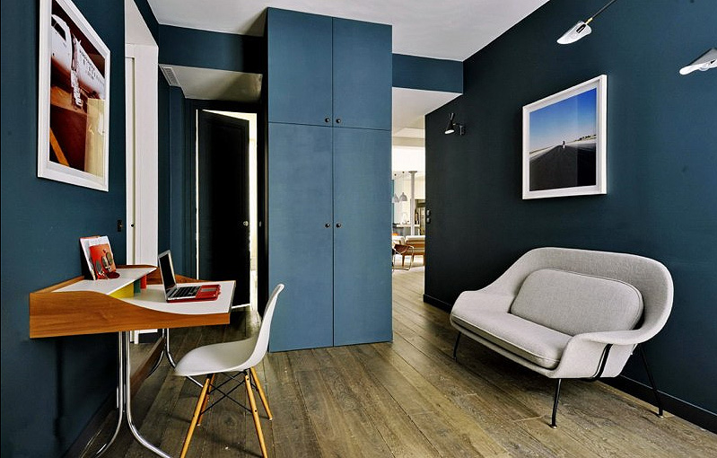
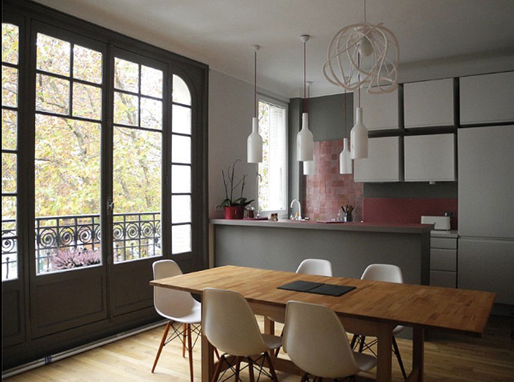
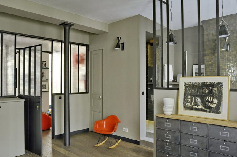
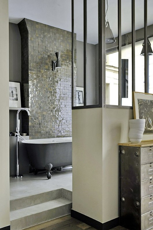
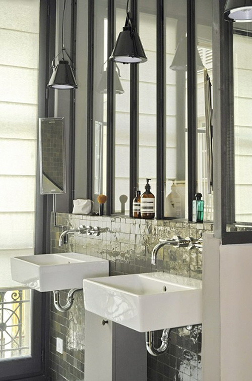
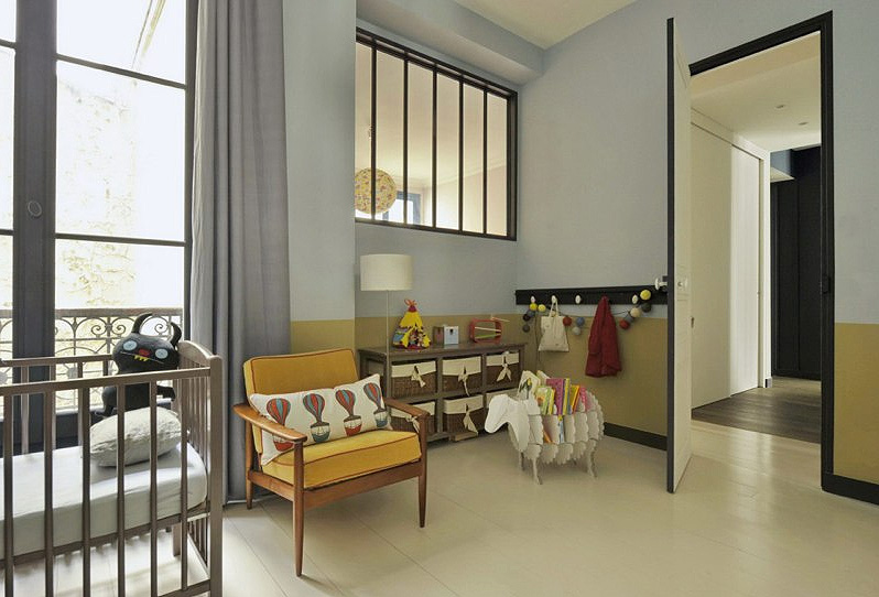
I’m loving these spaces by Karine Simonot and Stéphanie Maigret of MOC (Maison, Objets et Chantiers). Some bold colour accents, some always fabulous Eames chairs and some amazing architecture for an eye-catching backdrop.
Hello!
Posted on Thu, 28 Nov 2013 by midcenturyjo
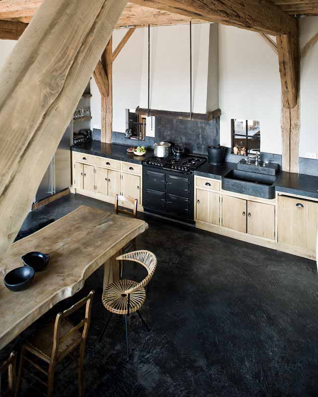
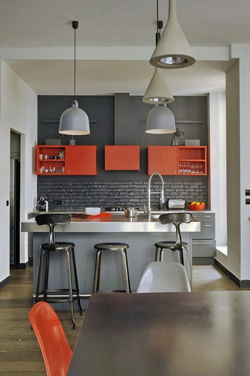
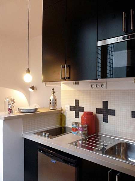
I just had to show one more shot by the amazing photographer Jeroen van der Spek. Love the kitchen. Love the shot!
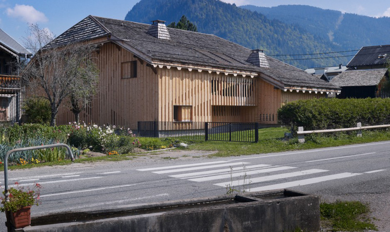
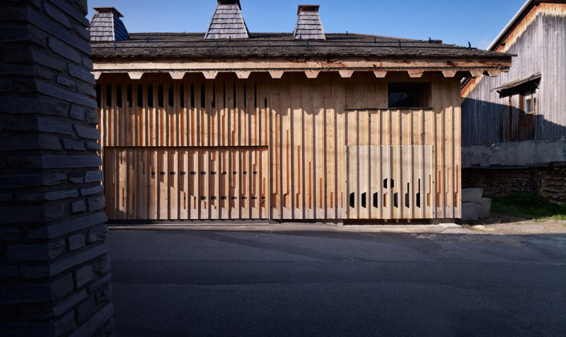
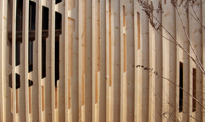
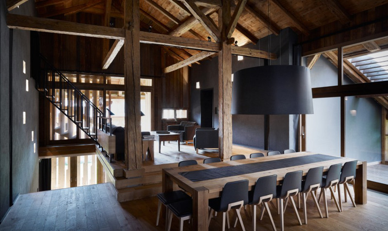
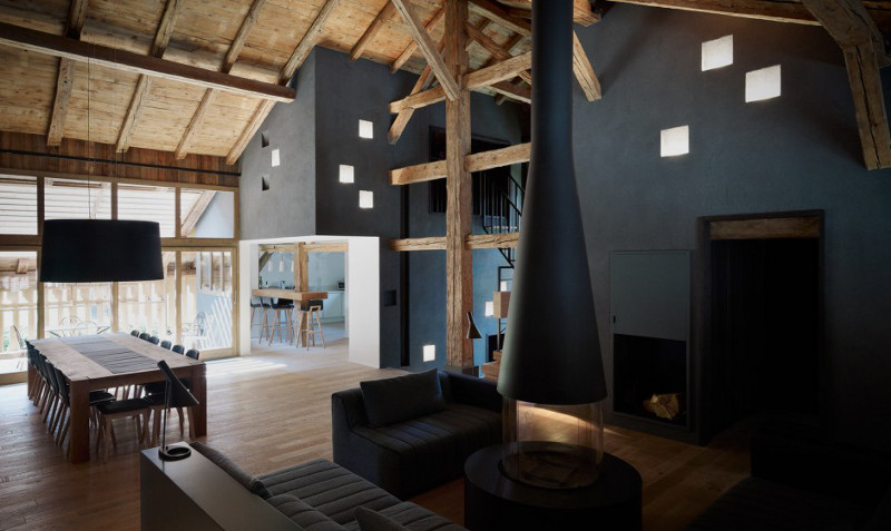
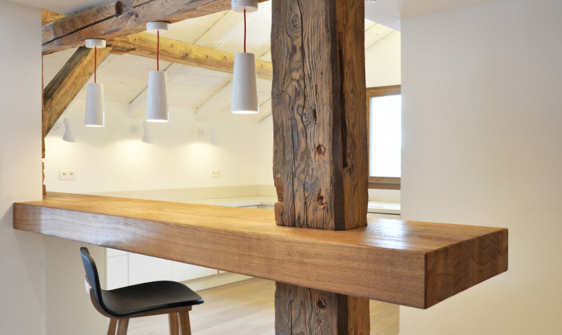
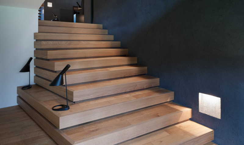
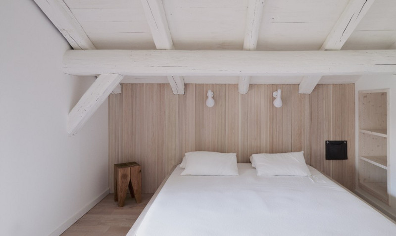
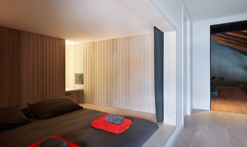
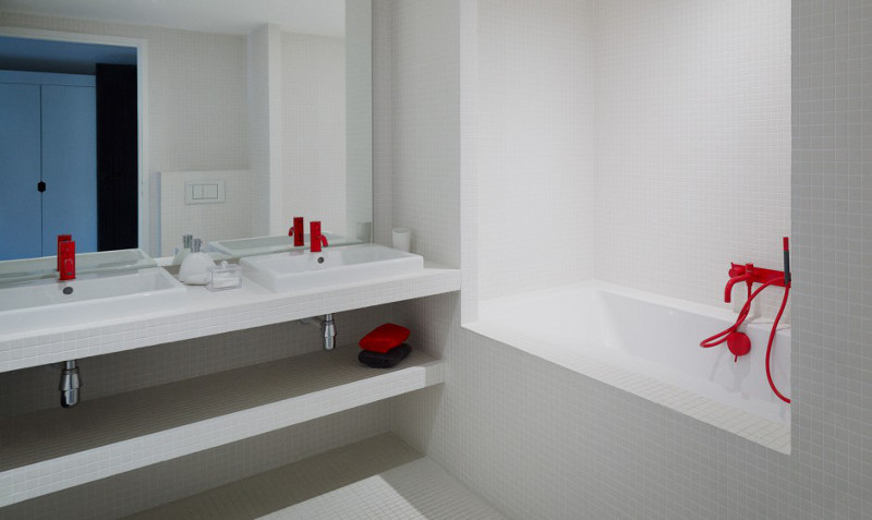
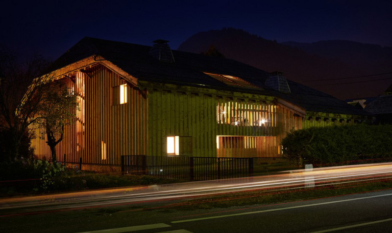
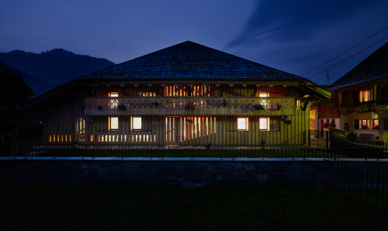
Villa Solaire
Posted on Thu, 28 Nov 2013 by midcenturyjo
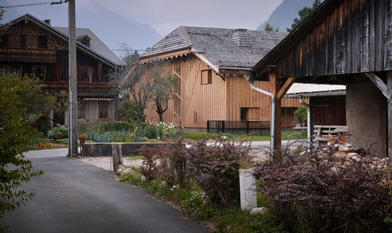
Sitting solidly in the village of Morzine in the Rhône-Alpes region of France is an old wooden farmhouse from 1840. The renovation by Jérémie Koempgen Architecture and FUGA respects the history of the building while creating a modern luxury holiday villa. By piercing the wooden envelope light is allowed deep within. Like yesterday’s Yorkshire barn conversion the home is minimalist, its dark colour scheme referencing traditional dark interiors centred round the hearth. Soaring ceilings and hefty beams are balanced by the clean modern lines of the furniture and fittings.
Nook:/nʊk/noun
1. A small corner, alcove, or recess, especially one in a large room.
2. A hidden or secluded spot.
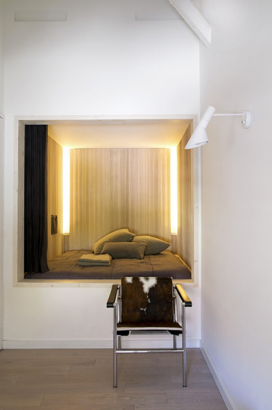
I want one. Badly. Via Jean-Marc Palisse.
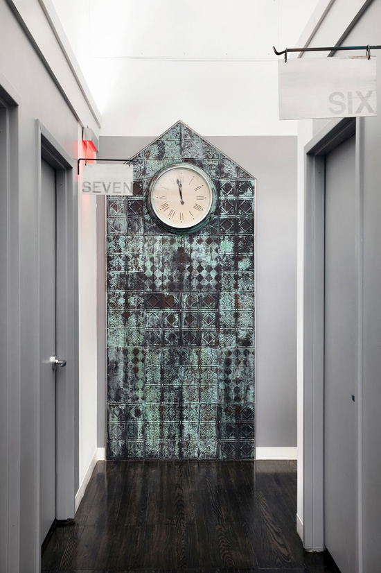
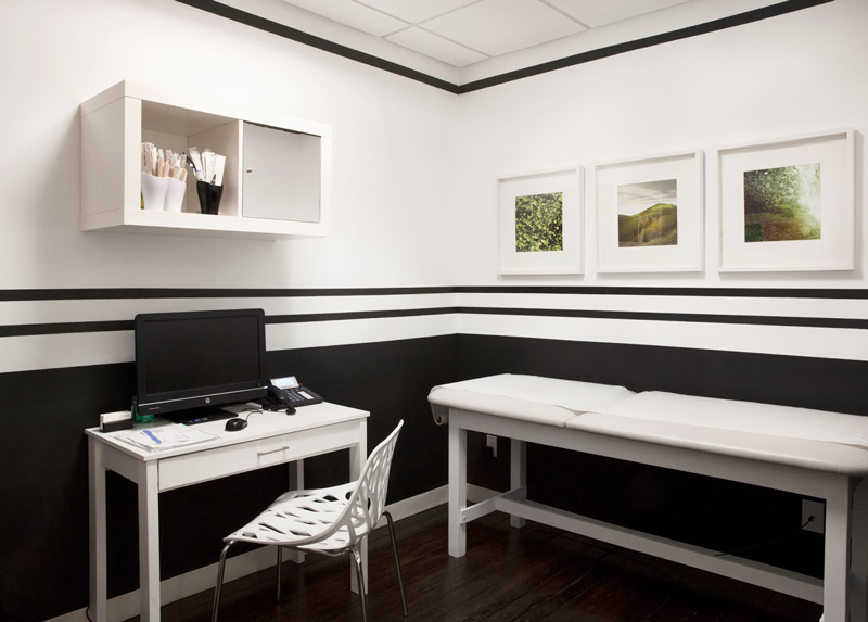
You won’t believe what this is
Posted on Wed, 27 Nov 2013 by KiM
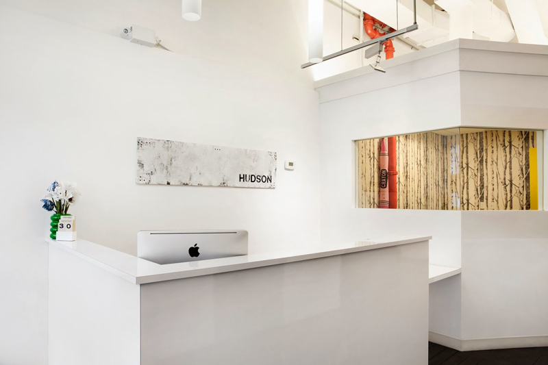
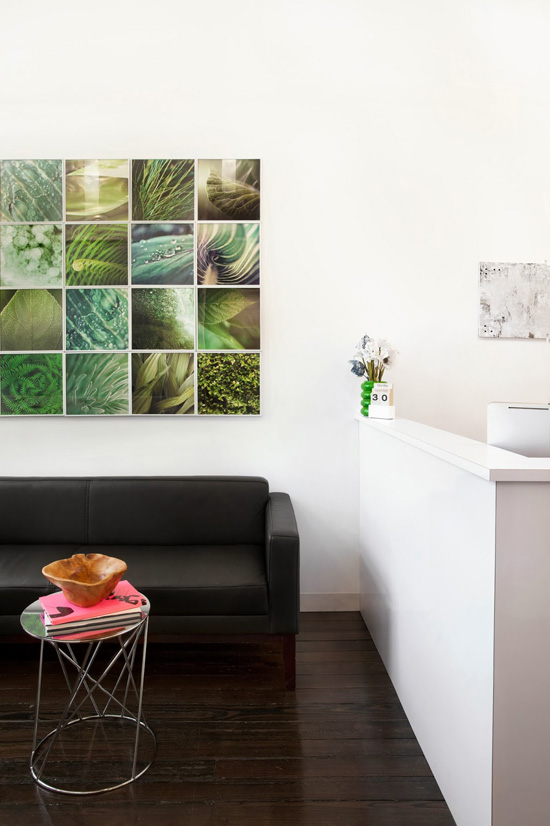
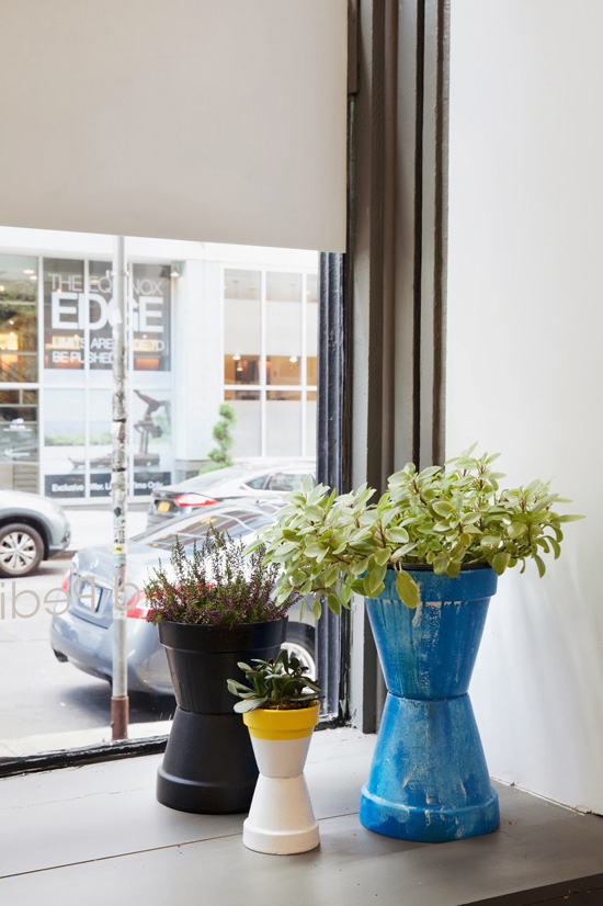
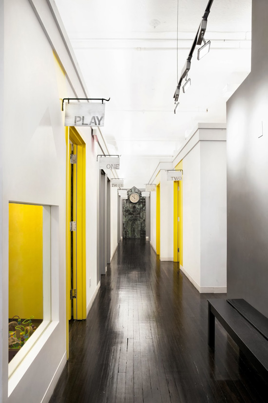
Diana Mui wrote us recently, and explained that she is an Interior Designer, Artist, Drill lover and Painter of walls. 🙂 She wanted to share a project she has completed that I have to admit is truly remarkable. It is the coolest doctor’s office I have ever seen, and makes me wonder why doctor’s offices are always so damn tacky and cold.
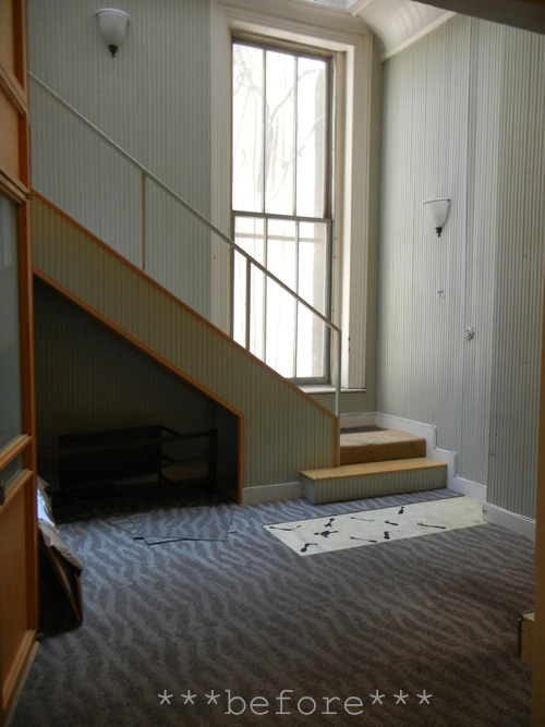
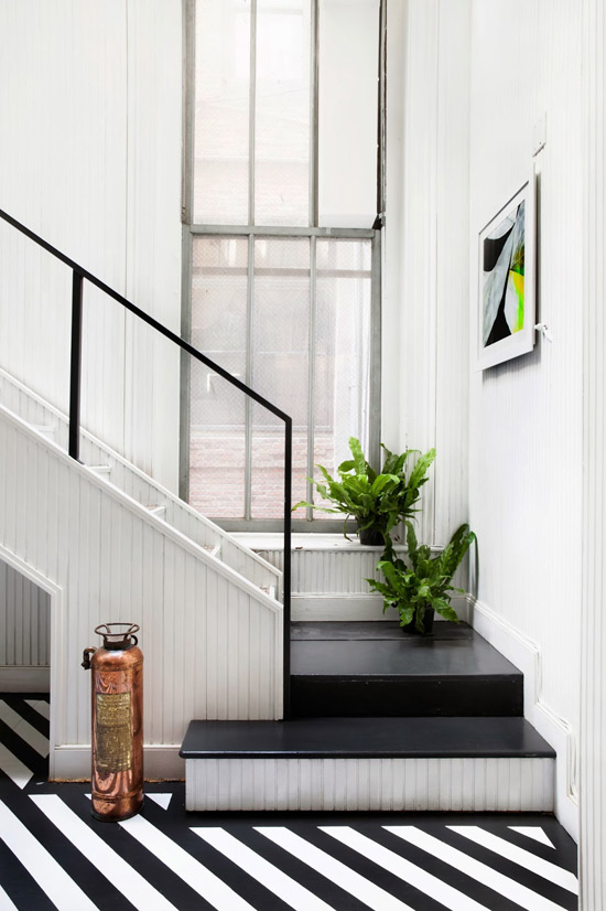
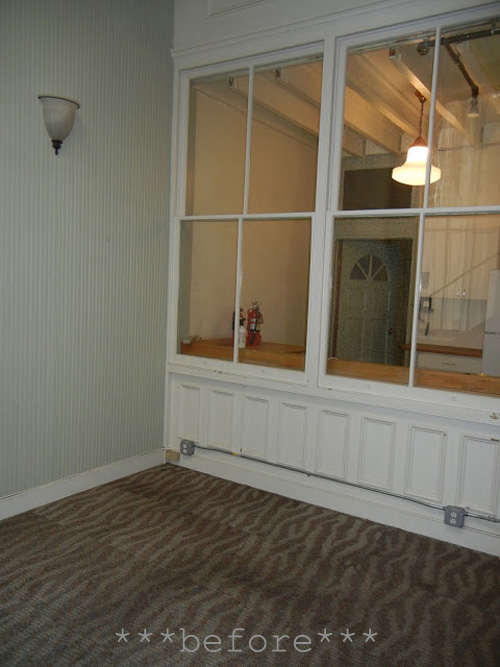
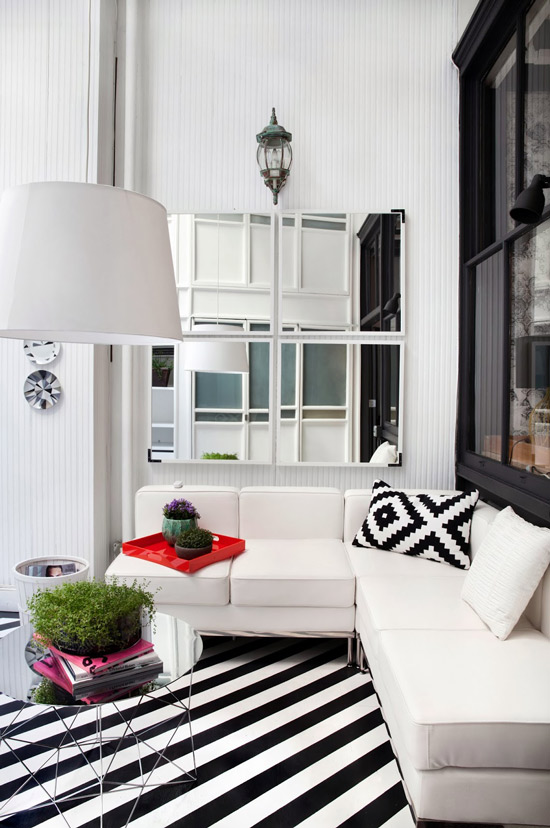
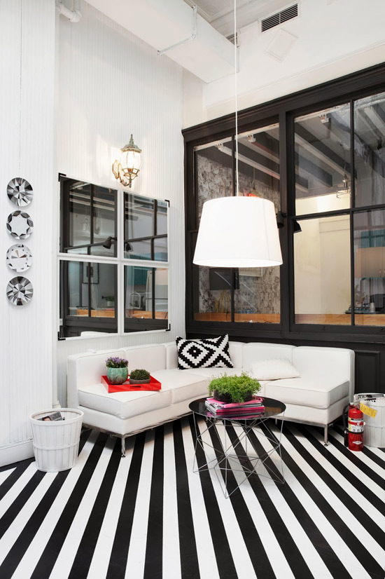
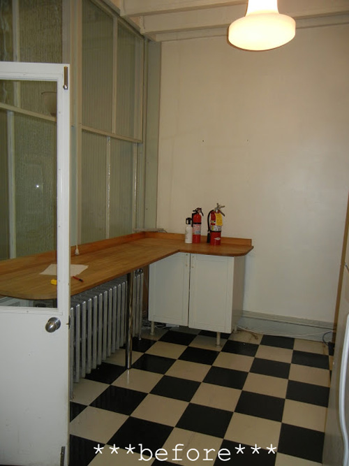
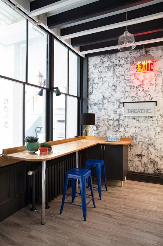
When we started the back area of this project, we believed it was a tear down and we were prepared to renovate the entire space. We took some time and started to believe in fixing all the little flaws without the original plan for a dramatic renovation. After all, I believe our first responsibility to our planet is also the easiest. Recycle, reuse and whenever possible creatively create anew. Besides this space is located in Tribeca. Tribeca is an amazing contrast of old and new. We truly wanted to make a big impact without knocking anything down and do our best to makeover the old, the broken and the flawed. Instead, we aimed to freshen it up with a touch of bold, and unexpected style. This is a doctors office for allergies and it’s the re-freshening area for patients. The ceilings are 14′ high. Tongue and groove wainscoting covers most walls as stairs lead to a small office. The striped floors are on a diagonal to create movement within the space. This also breaks up the vertical lines created by the wainscoting. The furniture kept simple, clean, fresh and white allowing the floor to take center stage. The simplicity of a brass antique fire extinguisher takes the place of a sculpture. Outdoor lighting are now used as patina indoor lighting. Within the second room – bleached gray panels line the floors. A classic lit exit sign is set over panels of brand new textured wallpaper. Newly installed and then distressed with random touches of black and white paint. Wood beams run across ceiling and again, random coats of black and/or white paint defines each of them. Original glass panes and doors divide the two back areas. Painted a deep rich gray to allow the light to truly sparkle through the glass. (after photos by Marietta Leung)