Displaying posts from June, 2018
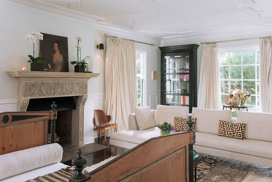
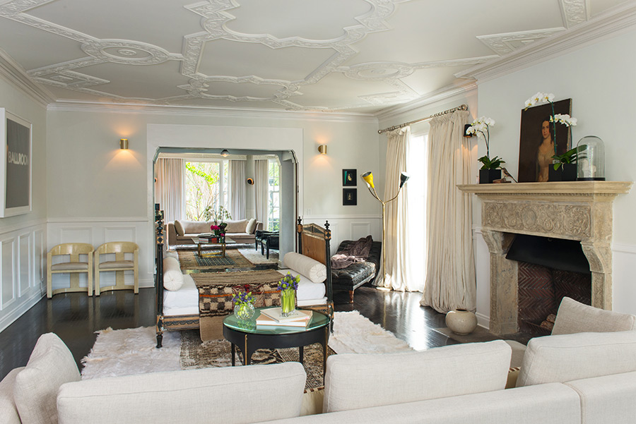
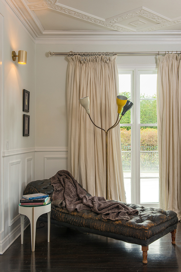
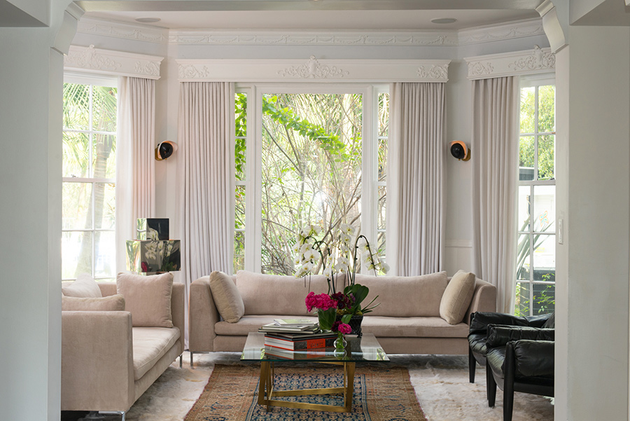
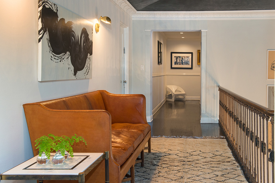
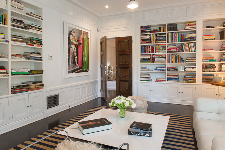
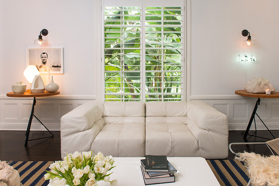
Milk and honey
Posted on Mon, 25 Jun 2018 by midcenturyjo
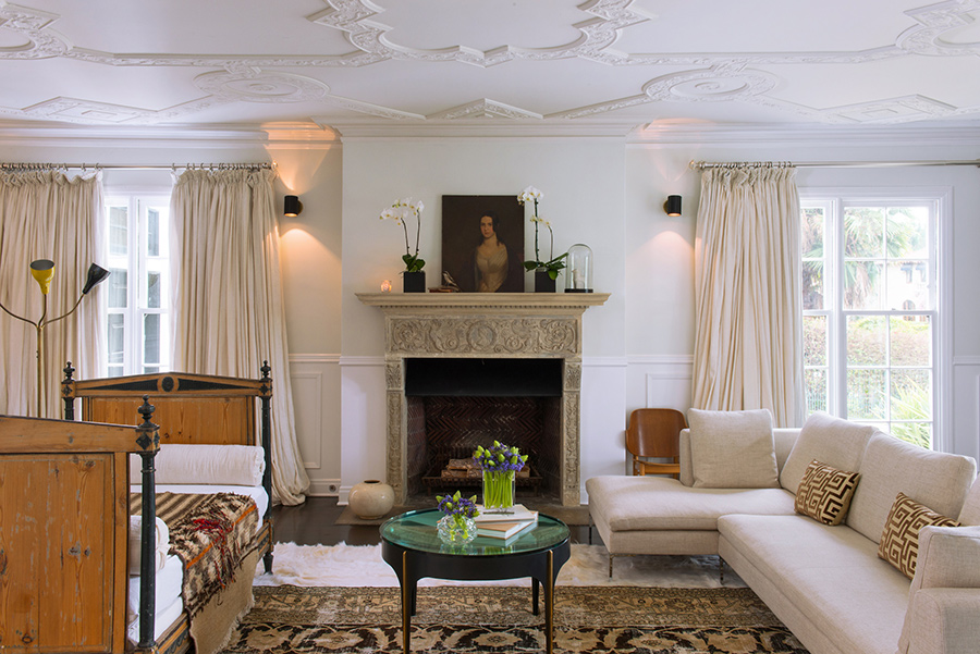
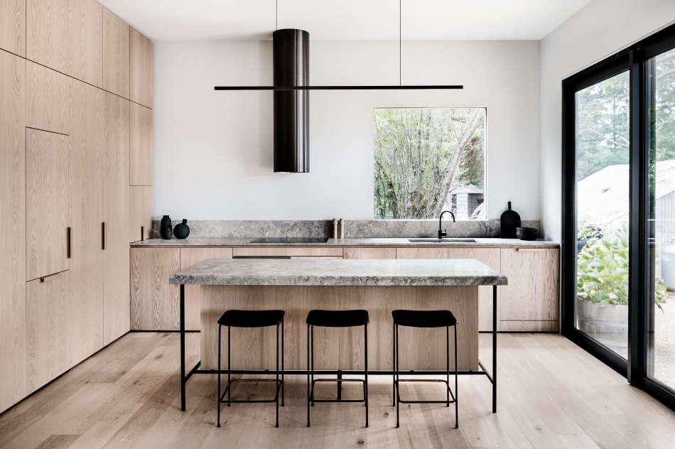
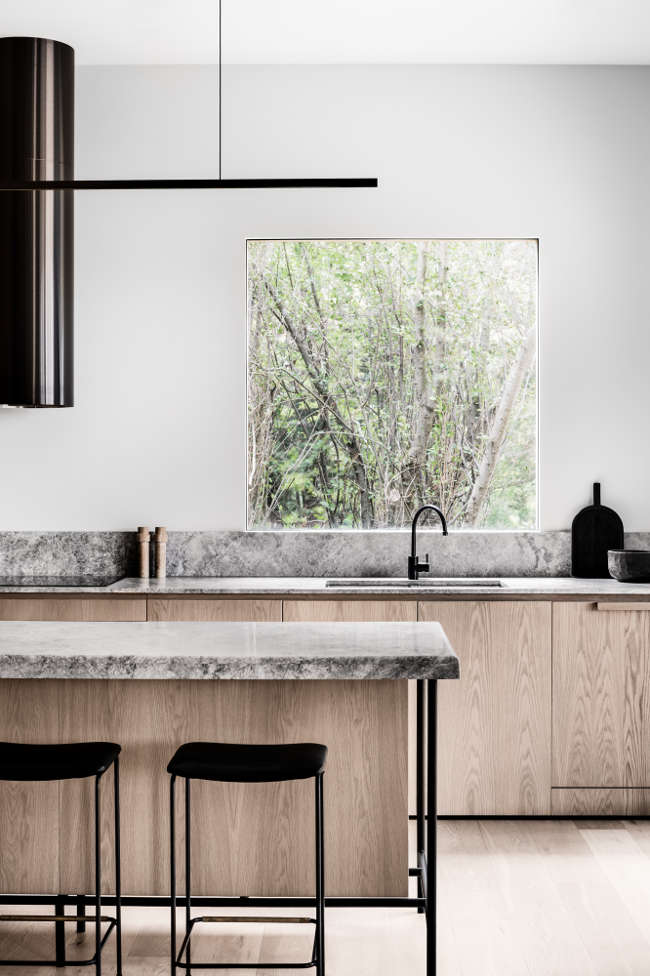
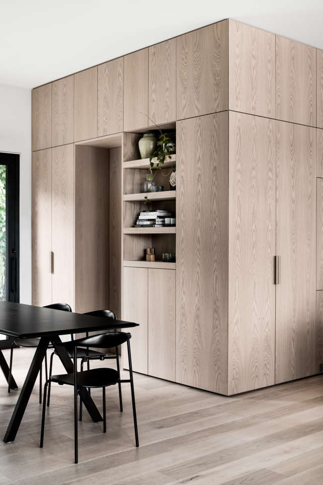
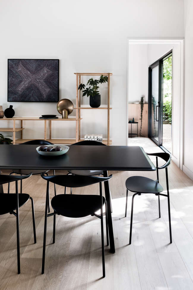
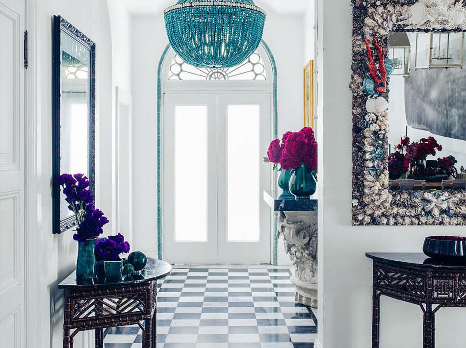
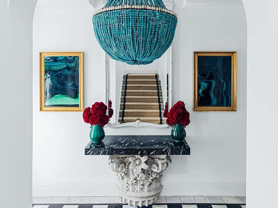
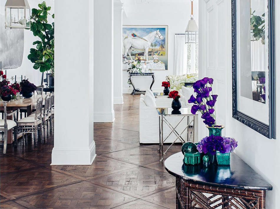
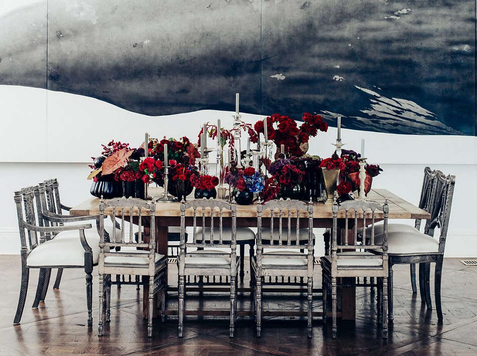
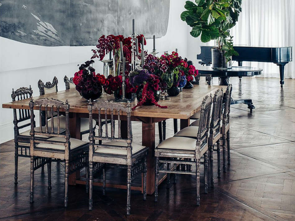
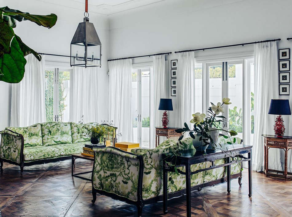
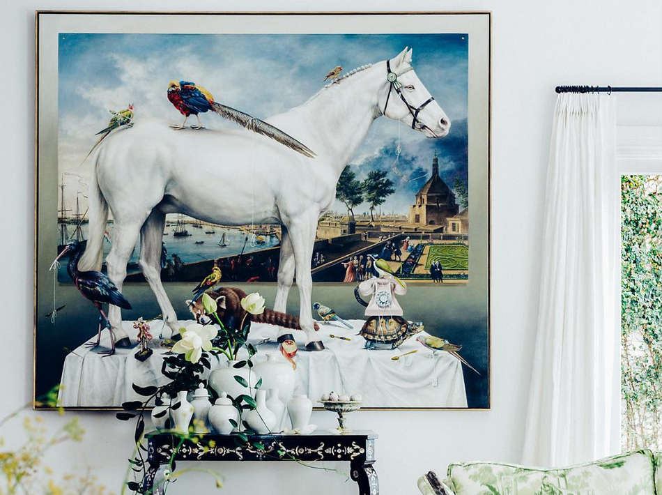
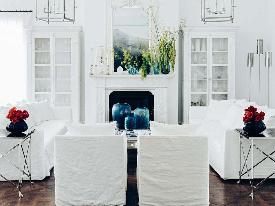
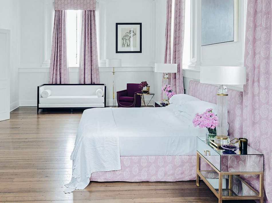
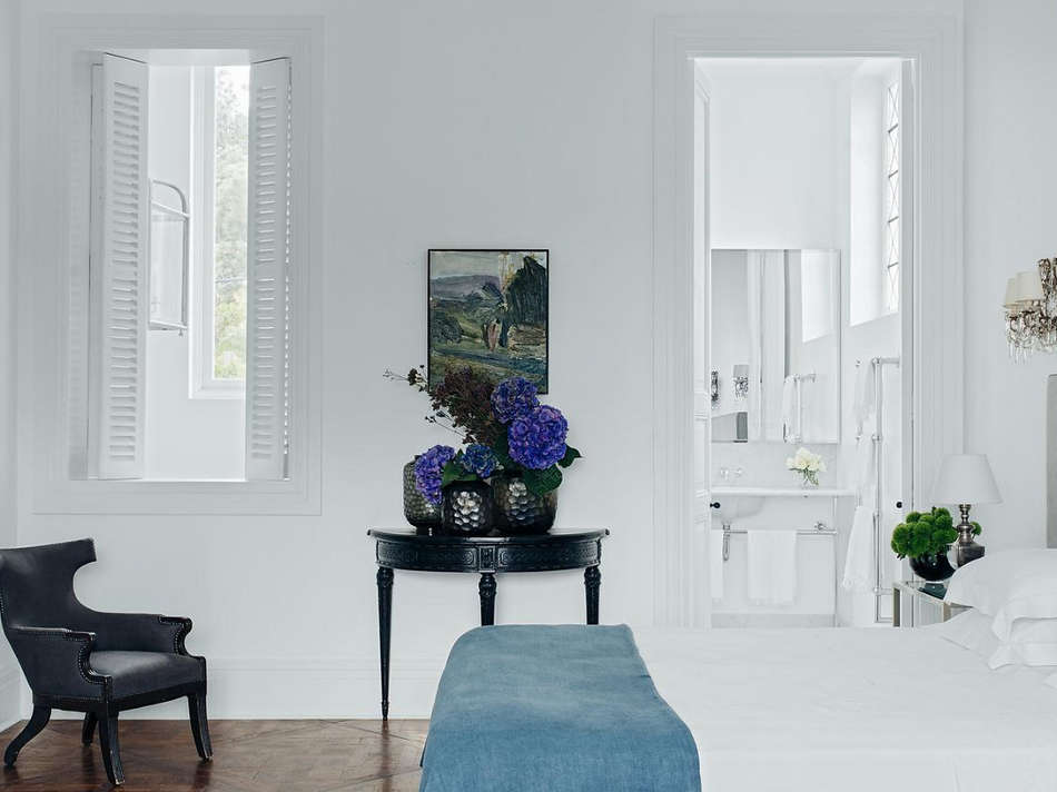
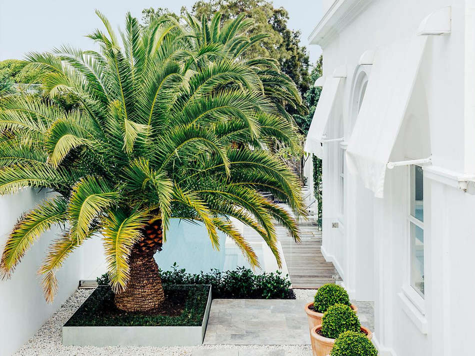
A neutral nirvana, a land of milk and honey, heavenly rooms. A little too much hyperbole? I may be gushing but I love the neutral palette, the eclectic choice of furnishings, the sophistication and beauty of these rooms by Hancock Design.
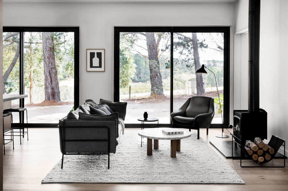
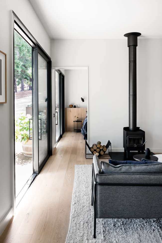
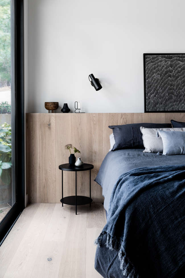
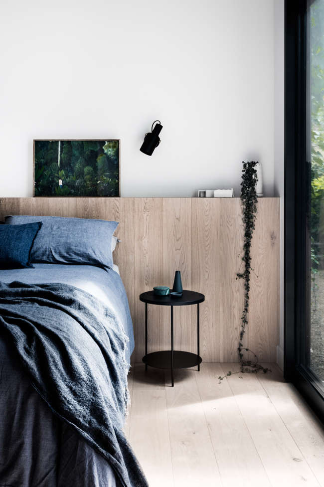
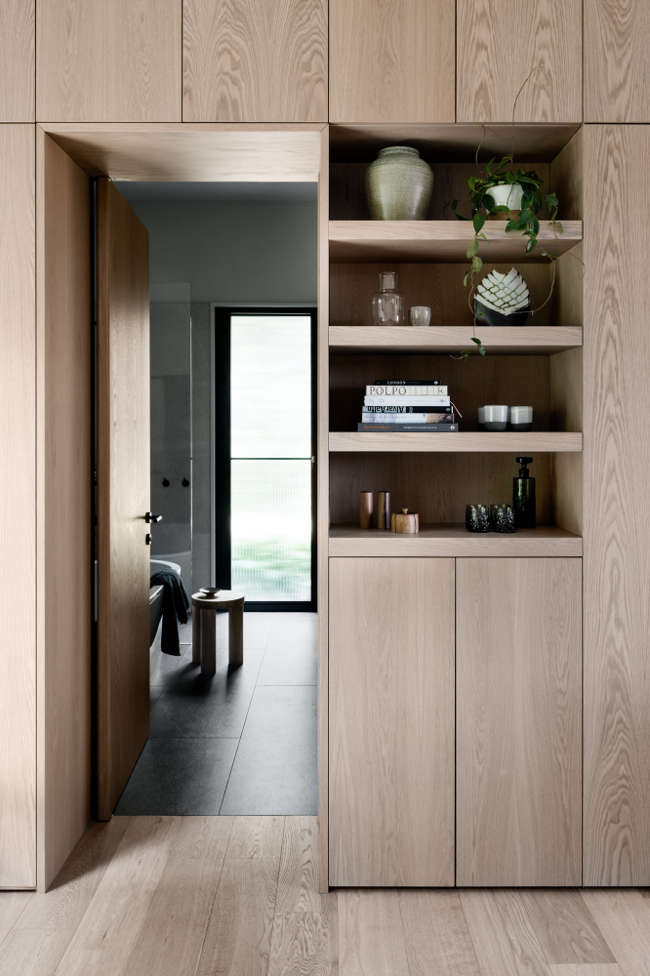
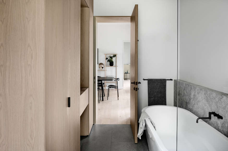
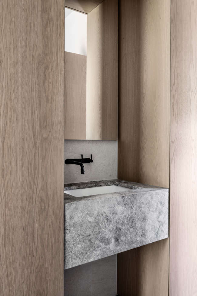
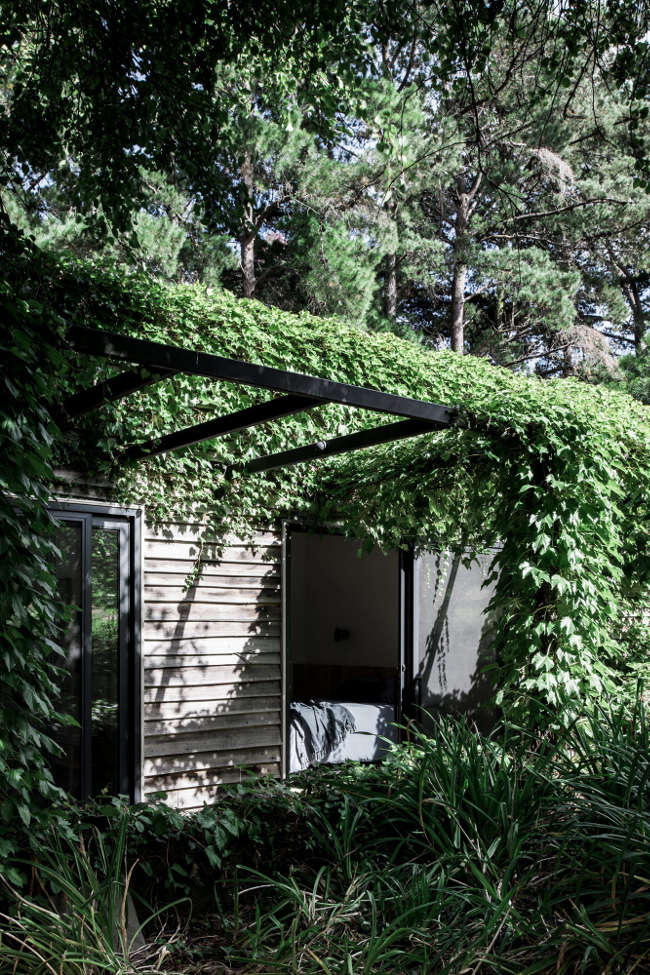
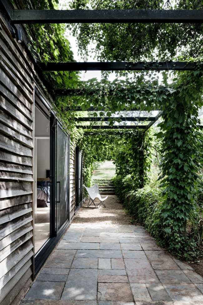
Merrick’s Guest House
Posted on Mon, 25 Jun 2018 by midcenturyjo
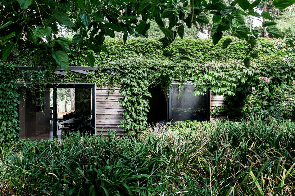
This rustic, timber clad out-house (originally designed by Eckersley Garden Architecture) has undergone a clever transformation into sophisticated guest accommodation on a rural property in Victoria’s Mornington peninsula. A beautiful site, a beautiful vine clad building and now a modern, light filled getaway redesigned by Melbourne-based Studio Esteta.
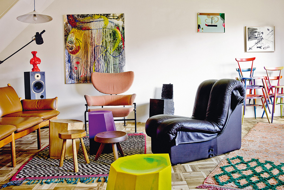
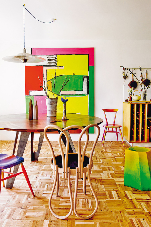
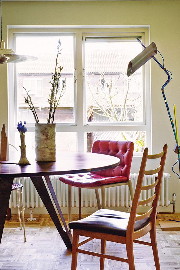
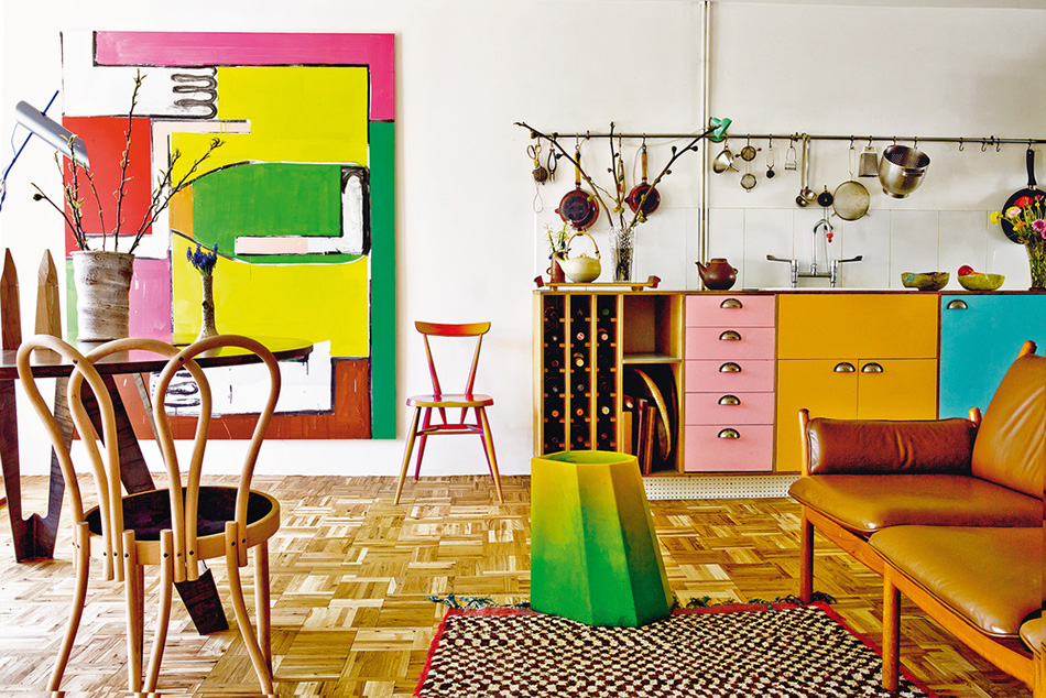
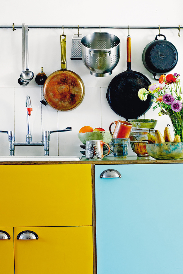
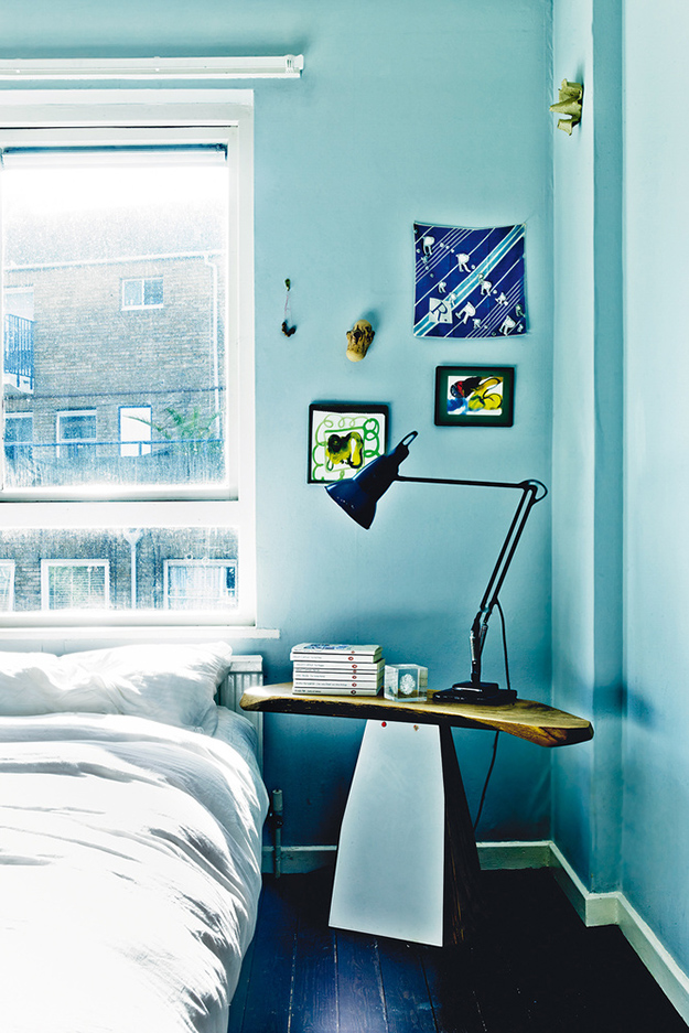
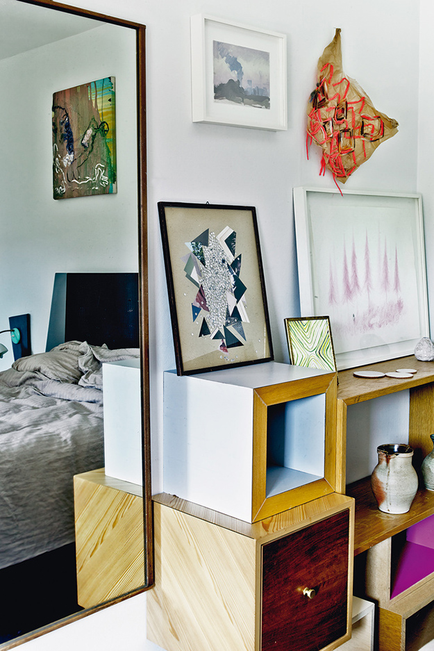
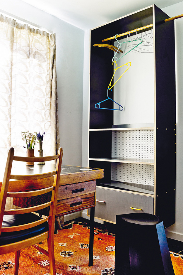
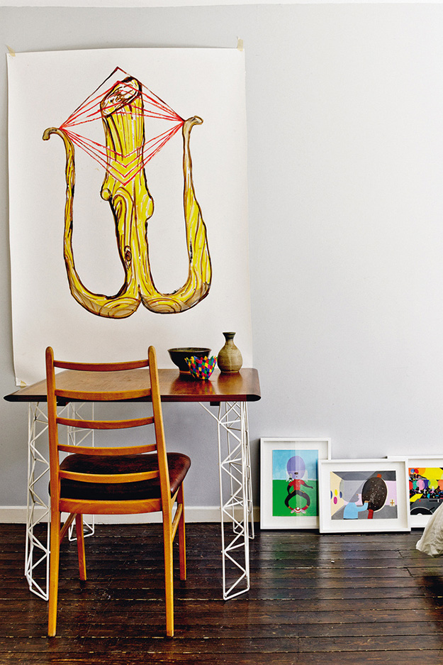
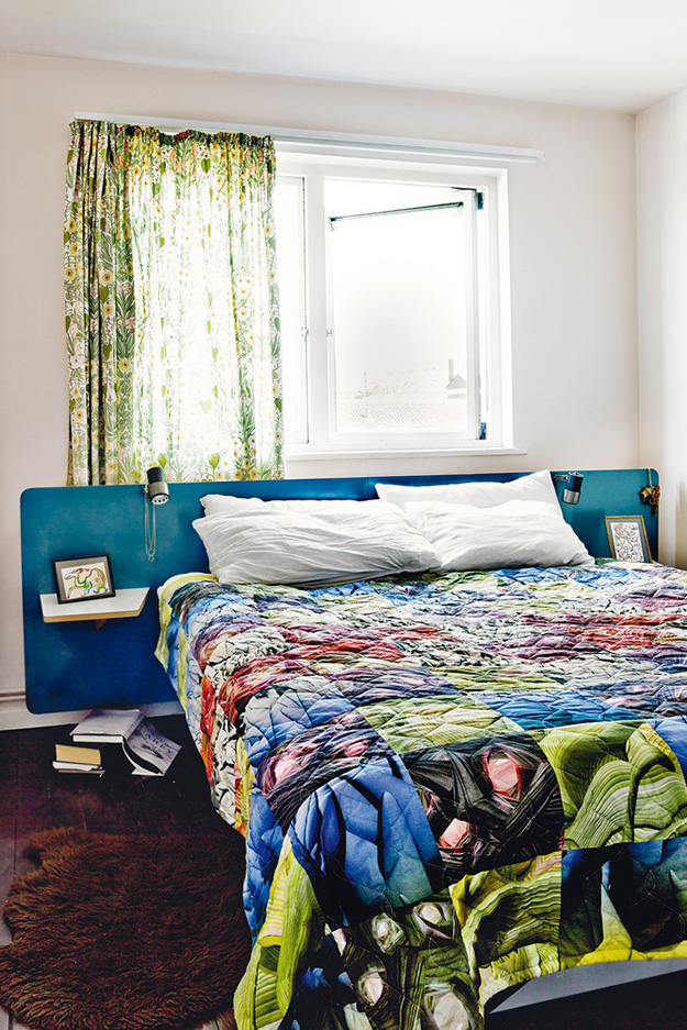
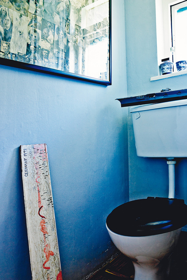
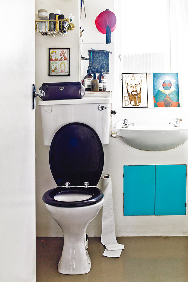
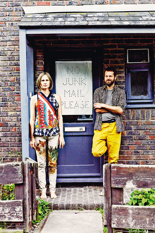
A colourful and unique home in London
Posted on Sun, 24 Jun 2018 by KiM
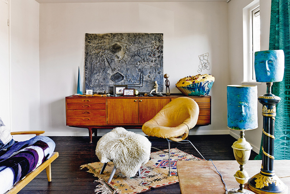
Me and trends do not get along. AT ALL. Unique interiors are where it’s at and this home in London is about as unique as it gets. I mean, LOOK AT THE KITCHEN CABINETS! Italian designer Martino Gamper and New Zealand artist Francis Upritchard live here, and have taken uniqueness to the next level with bold colours, lots of art and funky furniture. A total distraction from the ordinary, detail-lacking architecture. Via Architectural Digest Spain, photos by Pablo Zamora.
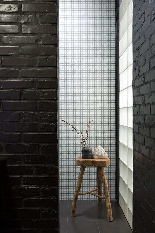
Stalking on a Saturday
Posted on Sat, 23 Jun 2018 by midcenturyjo
I’m stalking a confection of a house in Sydney’s Watson Bay. A converted 1920’s Masonic Hall that has undergone a “Frenchification”. So many beautiful glimpses at what has been because unfortunately it has been sold for quite some time. A girl can still dream can’t she? Don’t miss the video for so much more. Link here while it lasts and if you are intertested in what it looked like when it sold in 2015 check out here.

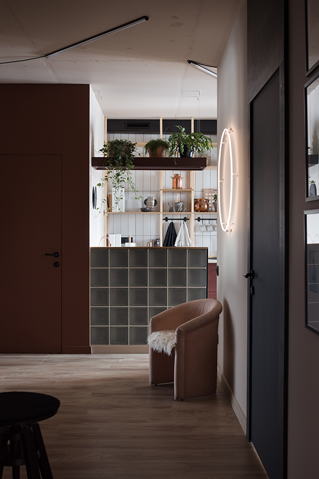
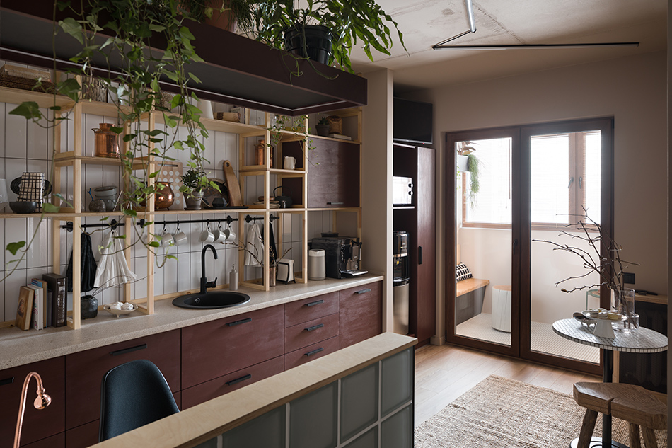
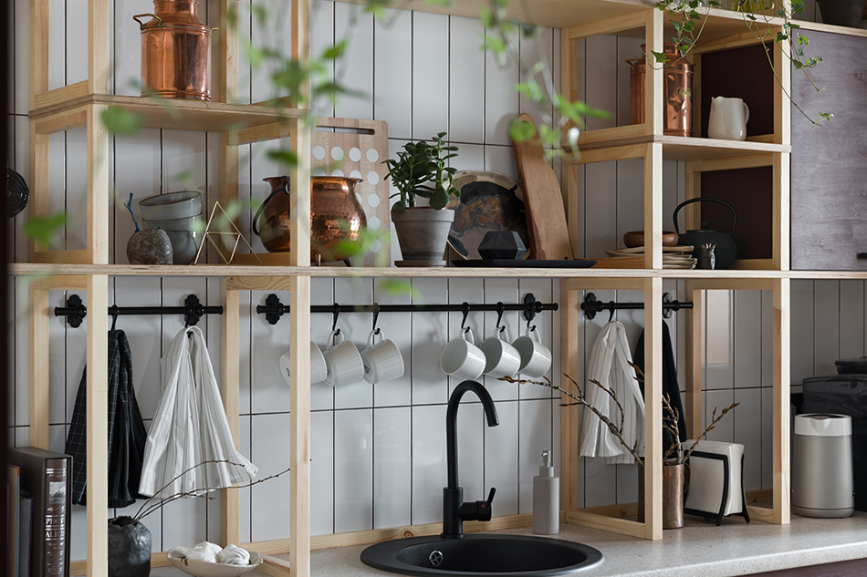
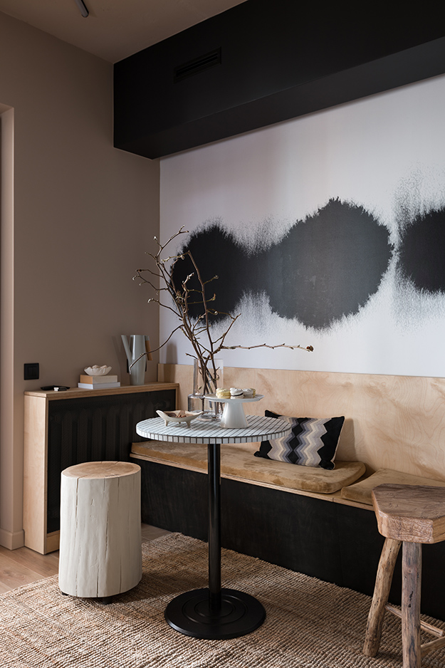
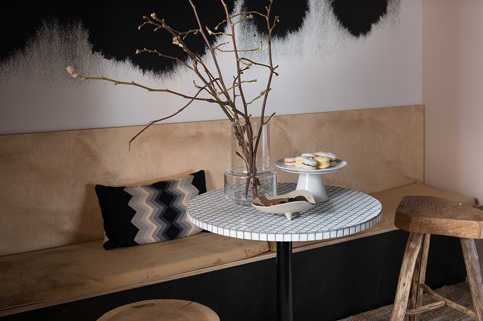
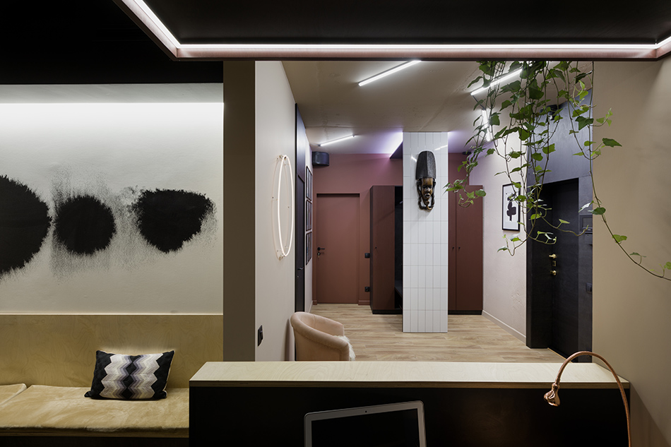
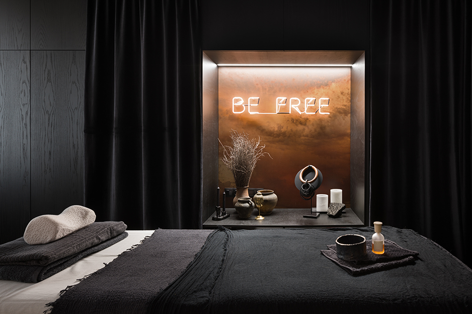
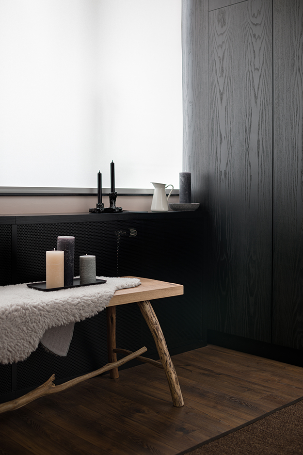
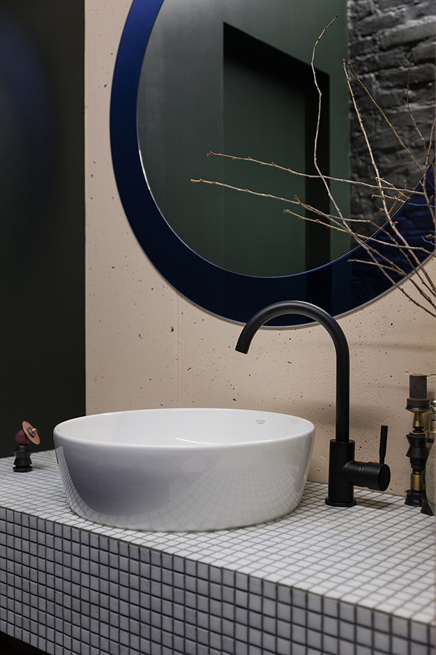
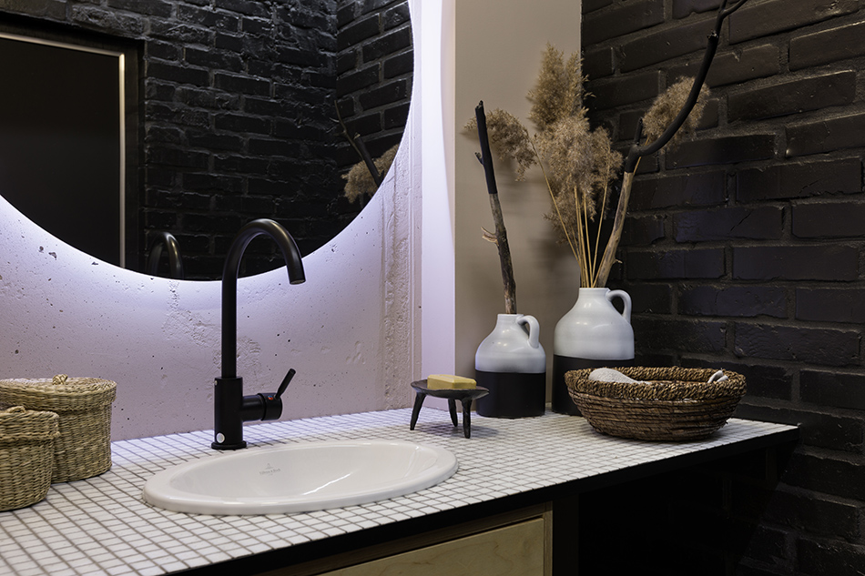
A studio with style
Posted on Fri, 22 Jun 2018 by KiM
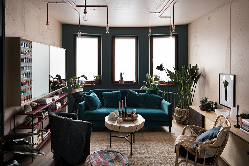
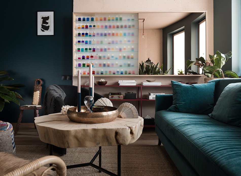
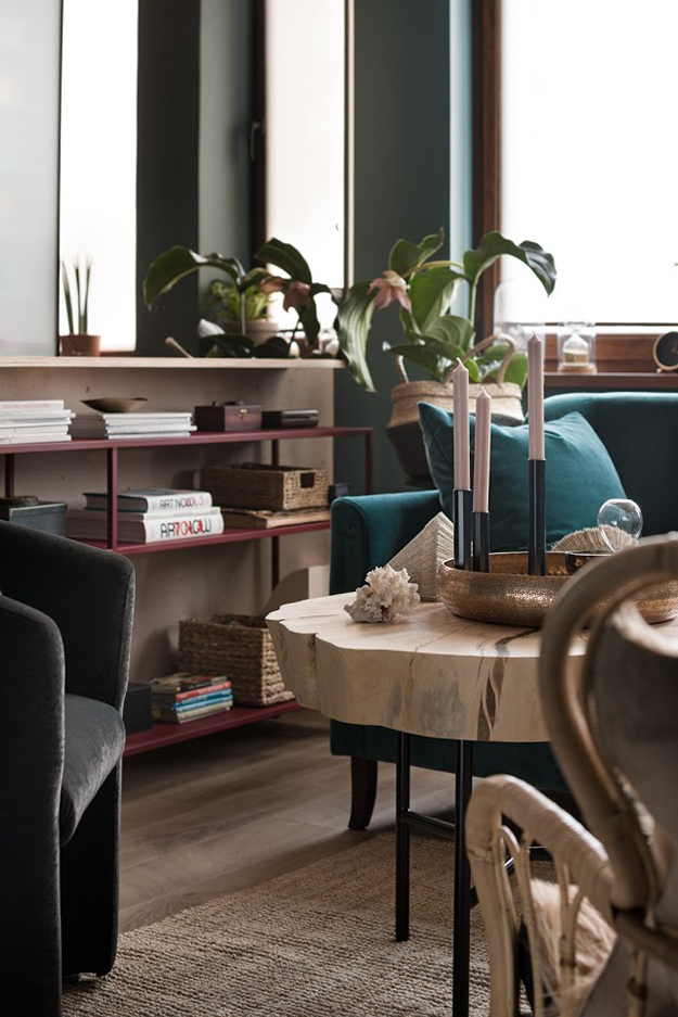
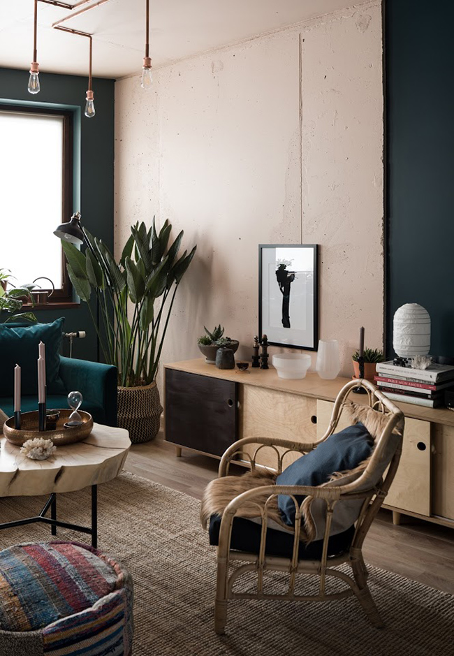
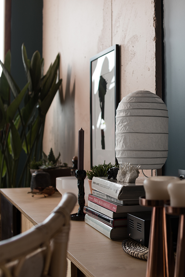
Before I get into this post, just a quick note of apology for the outages that keep happening with the blog. Our blog host is upgrading their servers and apparently there’s nothing we can do. So frustrating! Hopefully this will be over very soon. 🙁 Back to this post which is a wonderful distraction from all of that. A big thanks to Olga Fradina for sharing this project of her with us. Here are the details: The customer had a long-nurtured dream of a new studio for her counselling. It all started from the recent redesign of the Yoga room under my direction that pushed the customer to fulfilling her dream as soon as possible. The only request was the functionality – the presence of kitchen, reception and tea room, massage room adjacent to a shower room and the room for Aura-Soma consultations with a special rack. And the budget was the only limit. The colour scheme of the massage room is the Desert Rose (Paint and Paper Library) shade. The kitchen-living room area was originally designed in a cold colour set, but during the project implementation we decided to change it for the warm one, more comfortable for perception and allowing for relaxation: the walls in the vestibule and the kitchen are of Regency Fawn (Little Greene) shade, furniture in the kitchen– Georgetown (Paint and Paper Library) shade. The key element in the Aura-Soma room is the rack with the illumination, designed by Olga Fradina Interior Design, that contains the bottles of oil for this special type of colour and aroma therapy created by the Englishwoman Vickie Wall 20 years ago. The walls are of Dutch and Scottish sky shade – Hague Blue and Inchyra Blue (Farrow & Ball). One of the key decorative elements in the massage room is the niche decorated on the back wall with the printing of clouds printed on canvas from Olga’s photo and the fluorescent inscription “Be Free”. I love everything about this – the warm colours used, the unique kitchen design, the simple wood banquette, the copper/neon niche…