Displaying posts labeled "Kim’s House"
My guest bedroom transformed into a media room
Posted on Wed, 13 Dec 2017 by KiM
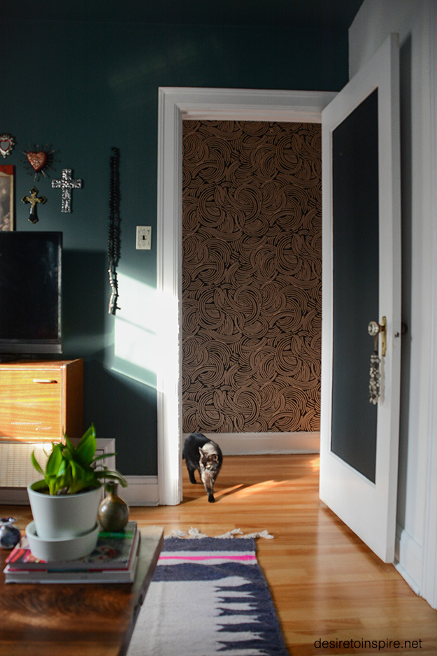
The other day I realized I needed a project. Nothing too time-consuming because I have some work coming up on the house I want to tackle but something to tide me over until then. An idea came to mind, and luckily my husband was totally on board. Our guest bedroom never gets used, except for a place for cats to nap. It seemed like a complete waste of a room. We have 2 TVs in the house – one in the living room and one in our bedroom. Watching a movie in the bedroom meant one of us falling asleep within 5 minutes, and watching in the living room meant we’d each take a couch. Neither one an ideal situation. So we turned the rather small guest bedroom (10’x8.5′) into a media room. Every piece I used in the space was either already there, taken from other rooms or was pulled out of our 3rd floor storage room. And we LOVE IT!!! Here is what the bedroom looked before the transformation:

And here is what it looks like now. (Resource list at the end).
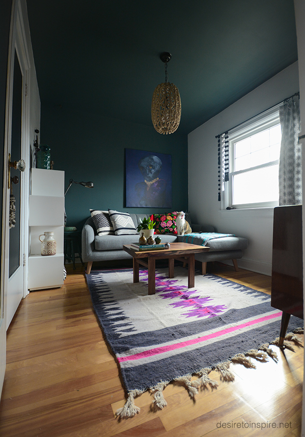
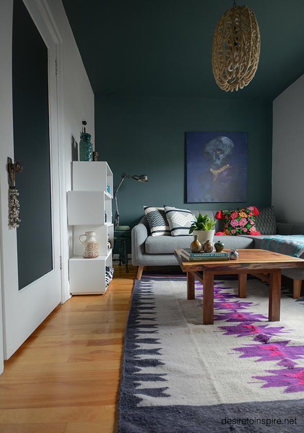
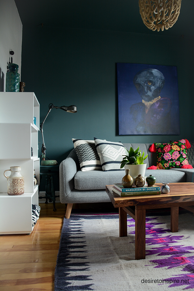
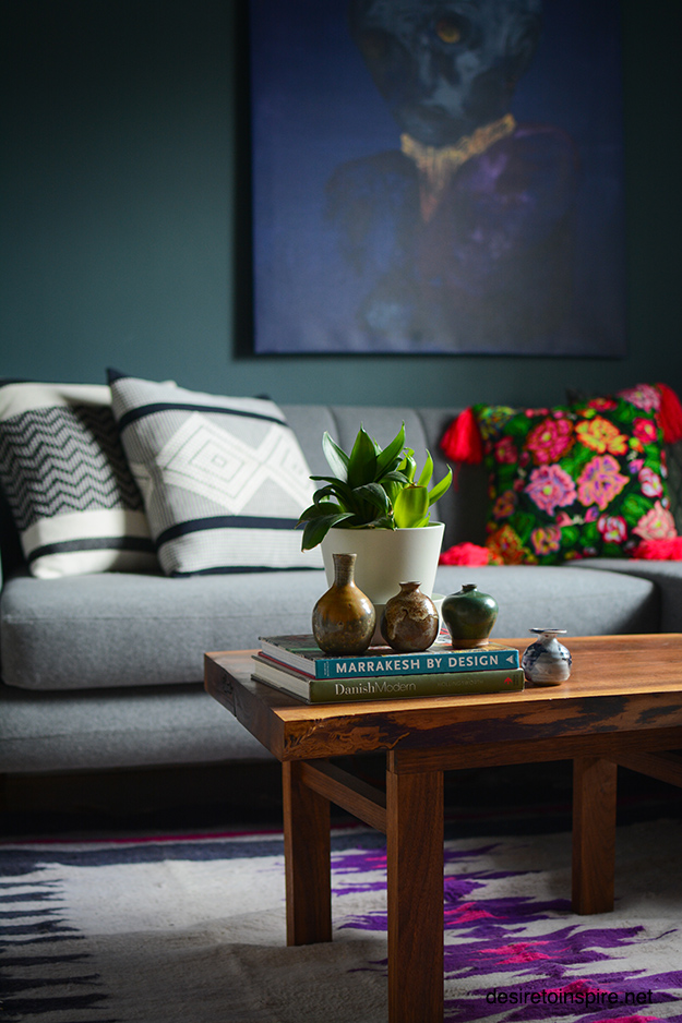

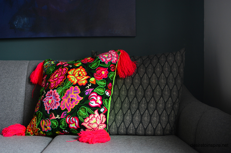
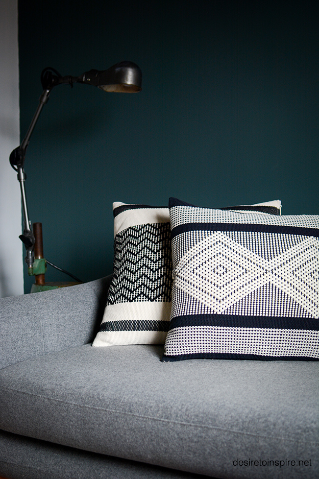
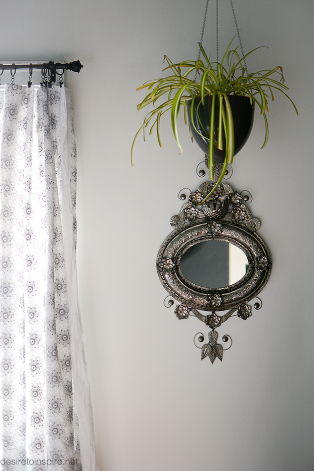
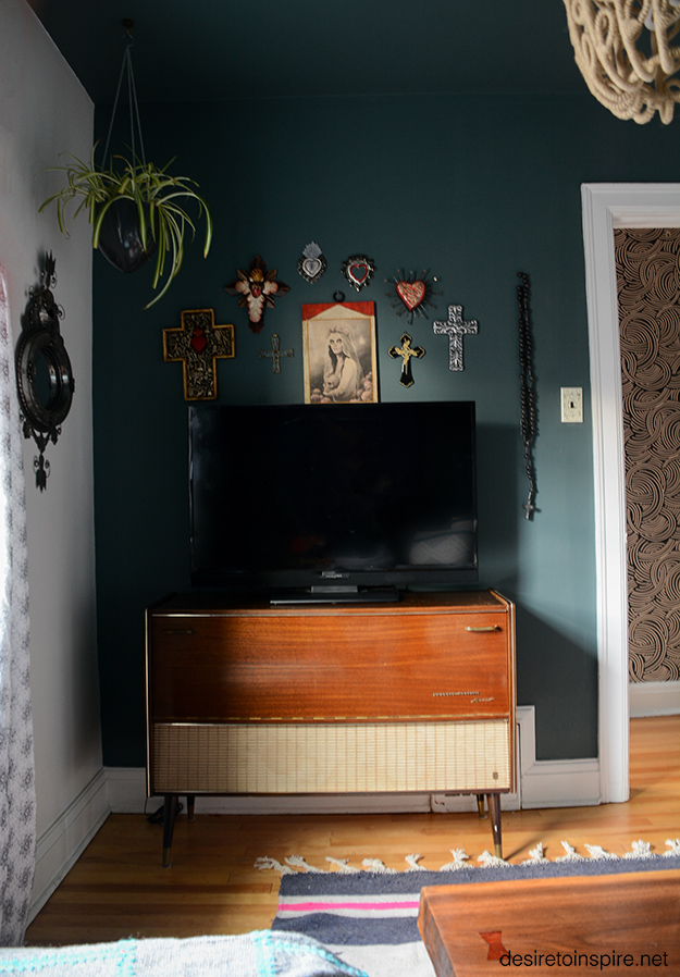
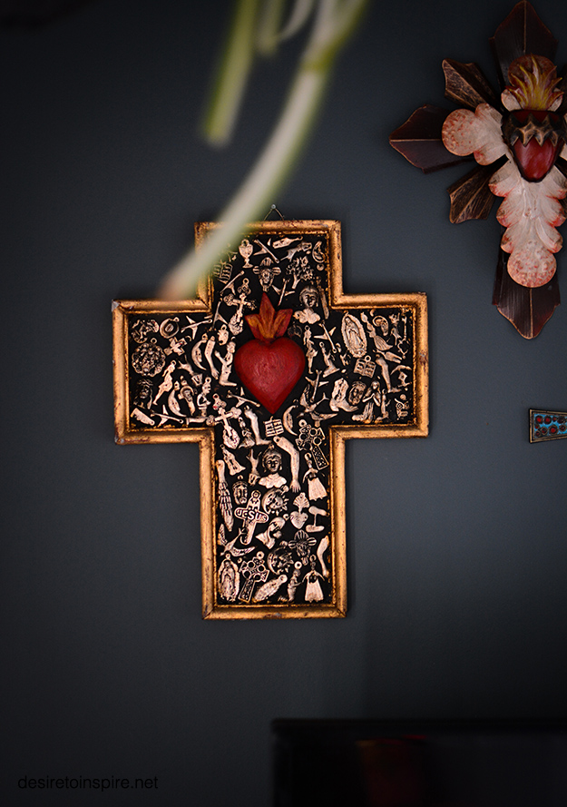
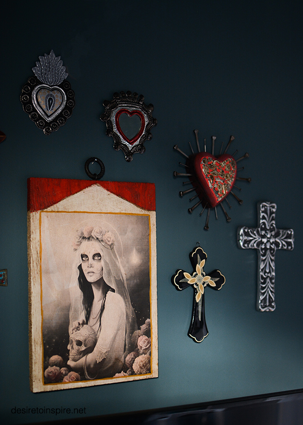


 From trips to Mexico: wool rug on floor, everything on walls but large canvas, all pillows
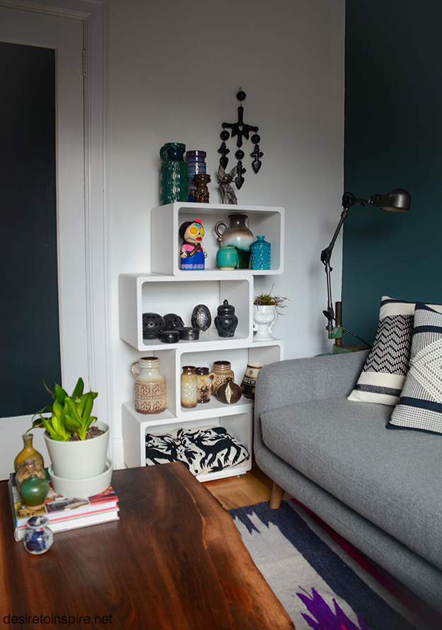
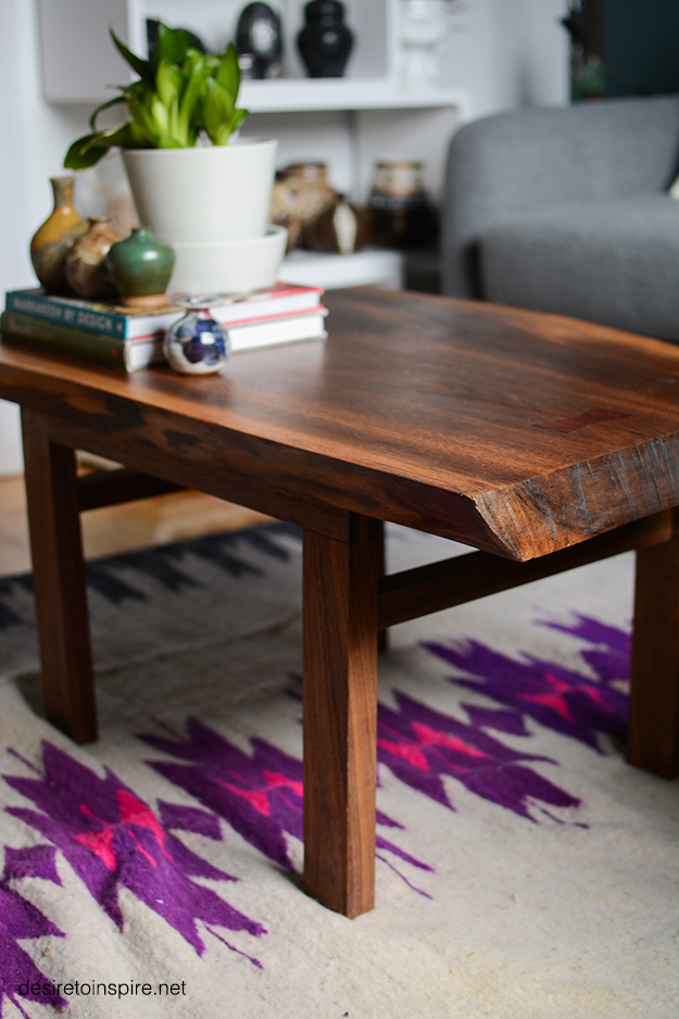
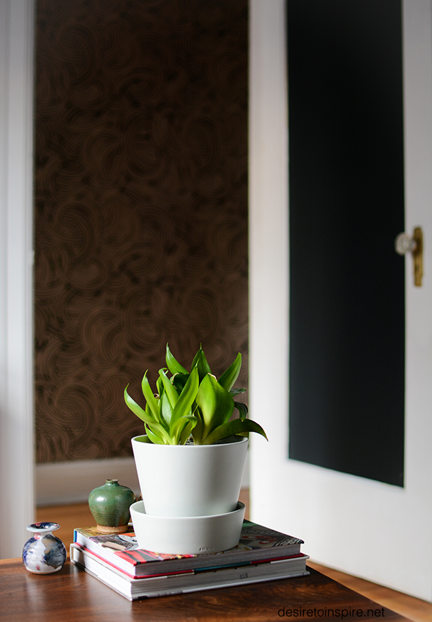
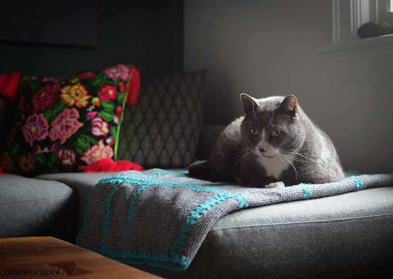
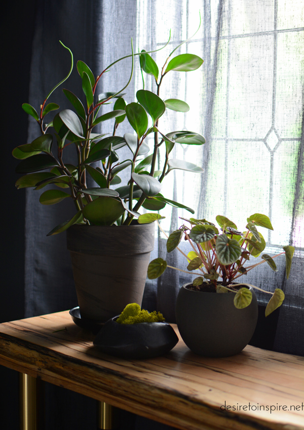
Vintage: pots on coffee table, vases on white shelving, blanket on sofa, fabric used as curtains, stereo cabinet used as TV stand
Sectional sofa: Furniture Maison
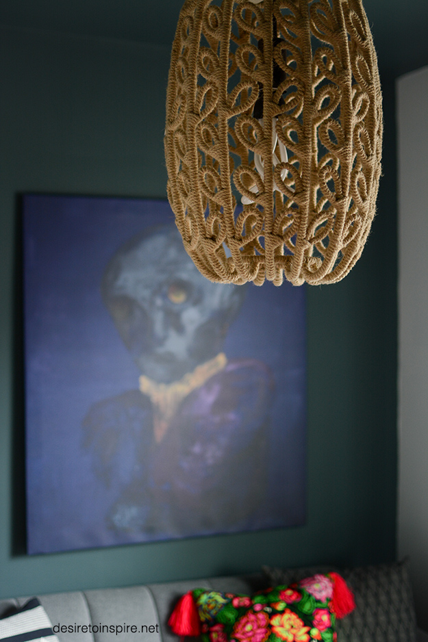
Art over sofa: Madame Clamour by Villa Betula
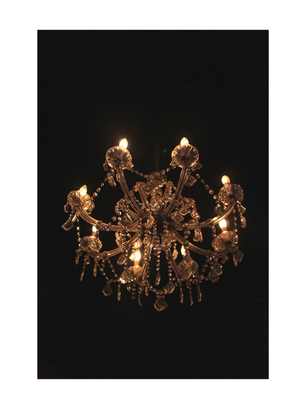
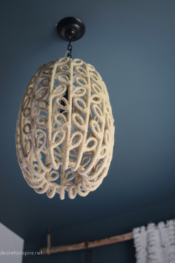
Pendant light: Wunderkammer
Coffee table: built by my husband
Plant pot: Ikea
Table lamp: semi-built/semi-restored by a friend
Walls: Farrow & Ball Inchyra Blue (hallway wallpaper = Tourbillon)
Featuring 3 of the herd: Phoebe, Mimin and Felix 🙂
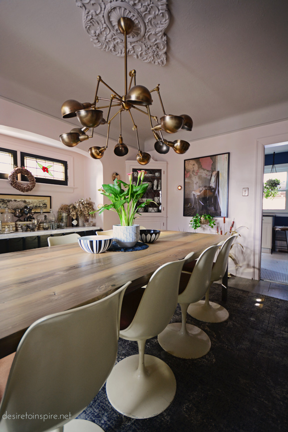
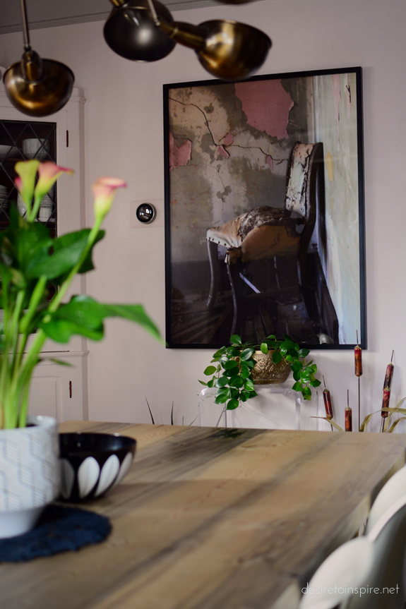
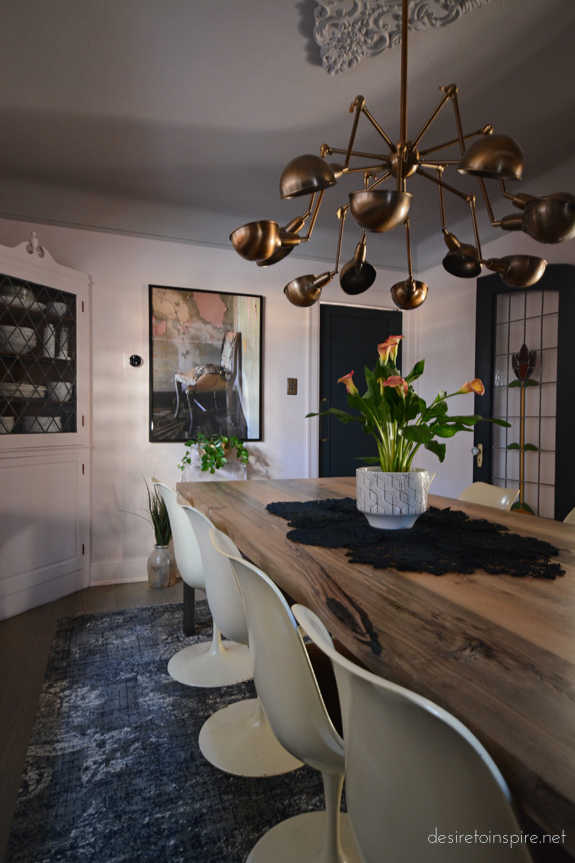
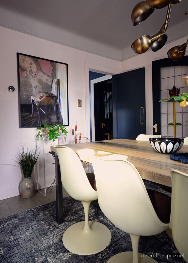
New art in my dining room from Minted
Posted on Wed, 15 Mar 2017 by KiM
I have been on the hunt for some art for my dining room wall for a while now and wasn’t really sure what I wanted until the folks at Minted got in touch and offered me a framed limited edition fine art print. I was so excited to go through allllllllll the prints on their site. They have so many talented artists on board. I thought it would be an intimidating experience but I was immediately drawn into so many gorgeous prints and quickly realized their website is incredibly user-friendly. It’s so awesome I have to show you.
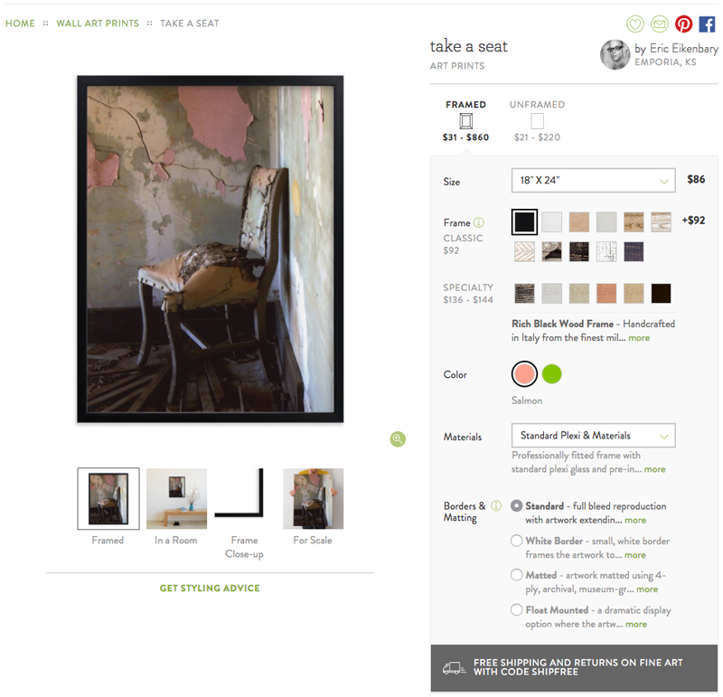
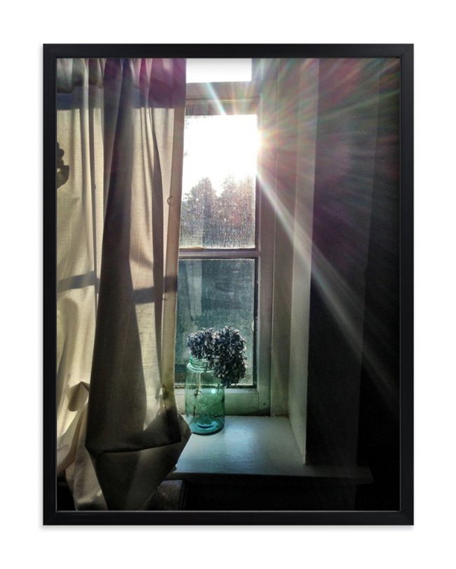
This is the print I went with – take a seat by Eric Eikenbary. When you select the size and frame you want on the right side, the left side shows you the photo framed, in a room, the frame close-up and how the print looks to scale. Freaking genius!!!! I seriously love this, and it’s great for people who are dimension-challenged and order items online only to receive it and go “huh, I thought it was alot bigger than that”. Now you can see before you buy! Anyway, they have lots of options for the frame material and borders/matting and all that good stuff. I went with a simple matt black metal frame and no matt/border. I am thrilled with my selection. It is so much better than the vintage metal sculpture I had there instead. I was hoping for something more graphic and I love photographic art so kudos to Eric Eikenbary for knocking this photo out of the park. I also need to share this photo I took on my phone just as I was digging into the package.
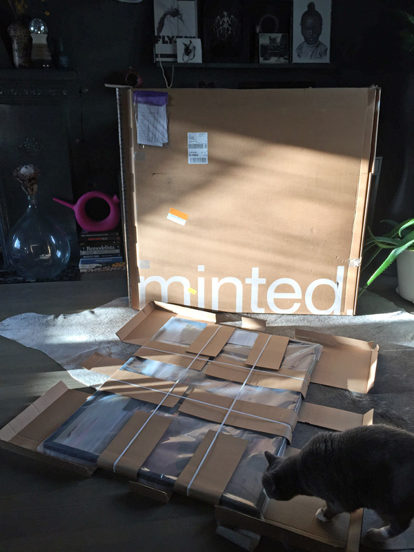
My framed print was soooo well packaged, especially given I ordered it in 30×40′ so I was a bit anxious to see how it was going to make the trip up from the States (California I think). It was completely unscathed, which is not surprising given their packaging methods. And the herd of cats lounged on the boxes for 2 days until I got tired of stepping over them. 🙂 Anyway, let me show you more of my new art!
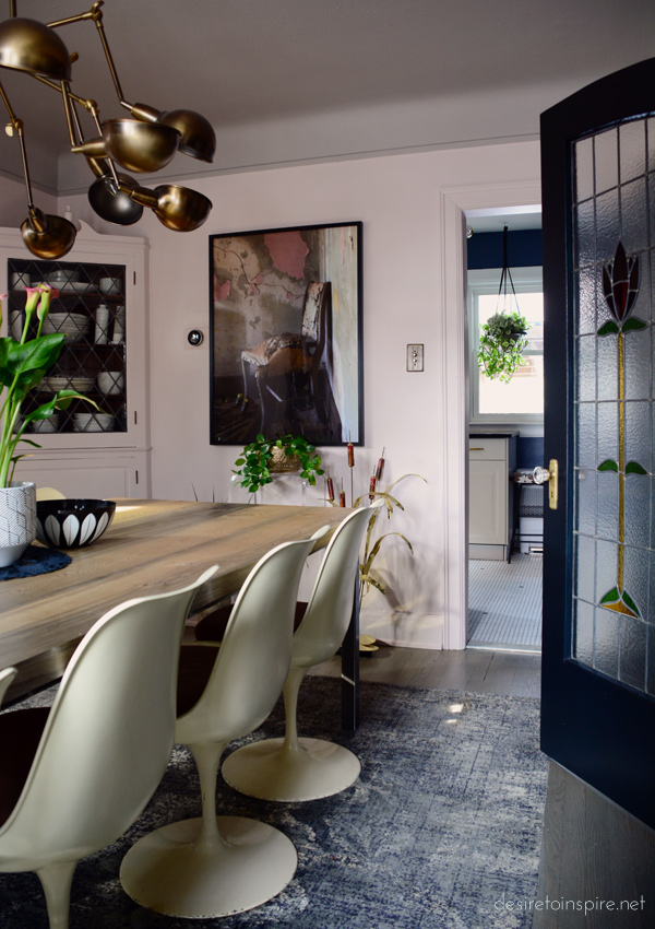
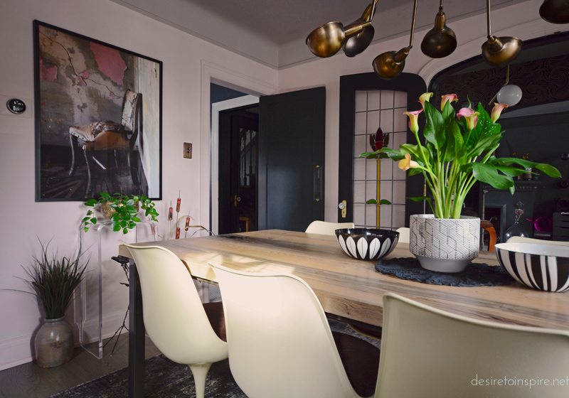
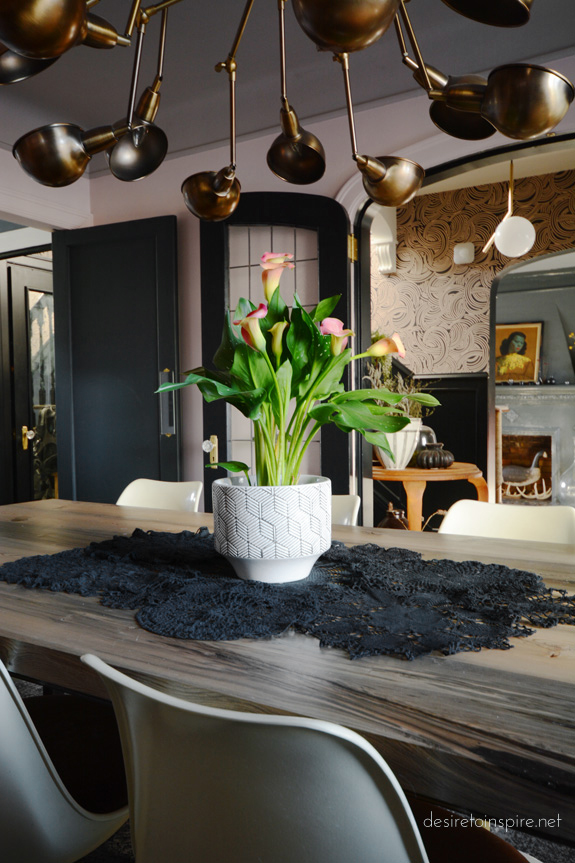
I was so stoked about this new piece in my home I bought myself this gorgeous lily (?) plant for my dining table.
I thought you might like to see what prints caught my eye and made this a really hard decision.

Blogger friend Jamie Derringer’s Untitled 1b

Kate Ahn’s mother embrace
Misty Hughes’ burgeon
Clare’s Bywater
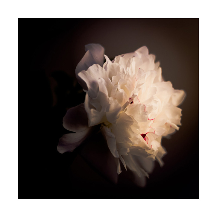
Qing Ji’s A White Peony
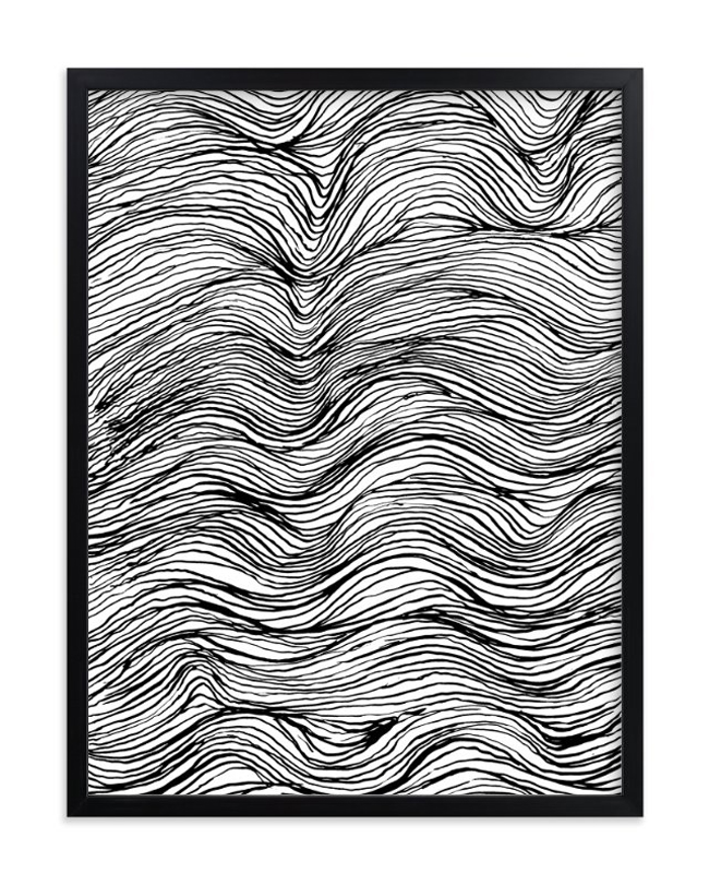
Elliot Stokes’ ebb and flow ink lines
My guest bedroom makeover
Posted on Tue, 8 Nov 2016 by KiM
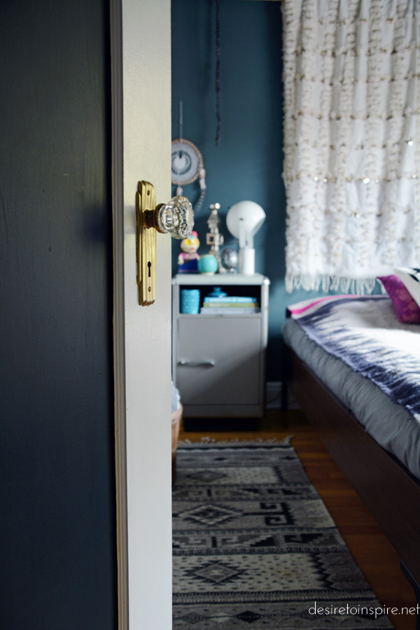
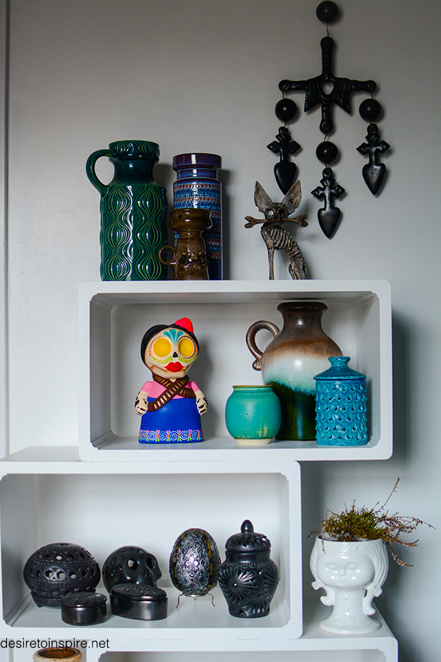
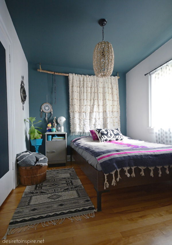
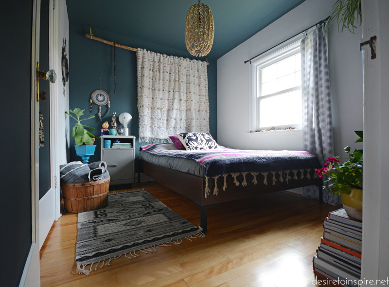
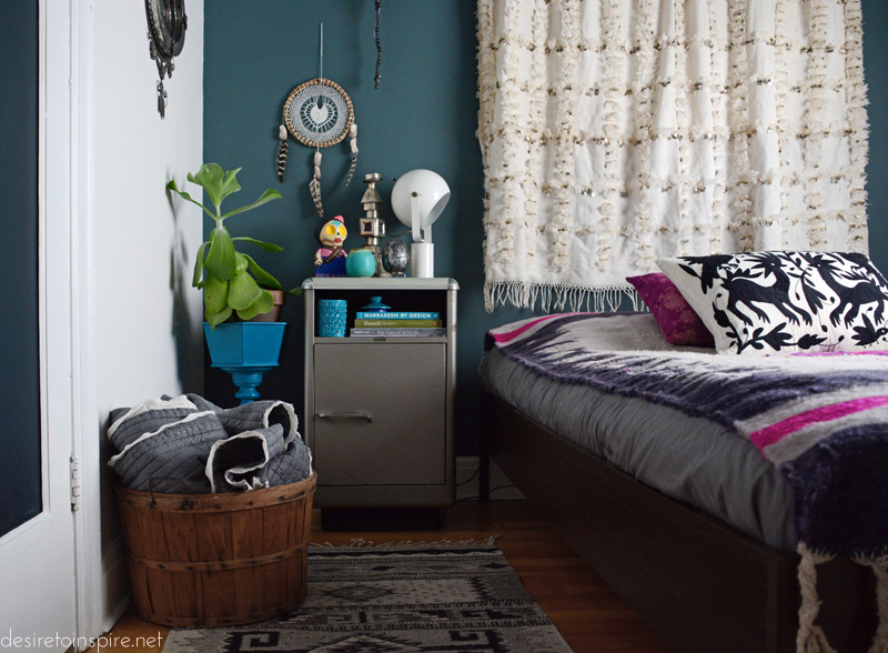
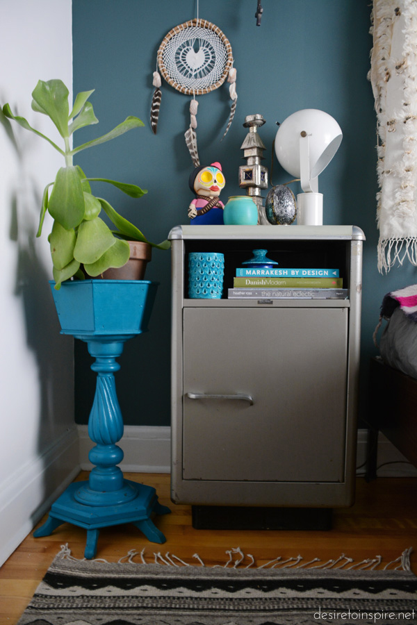
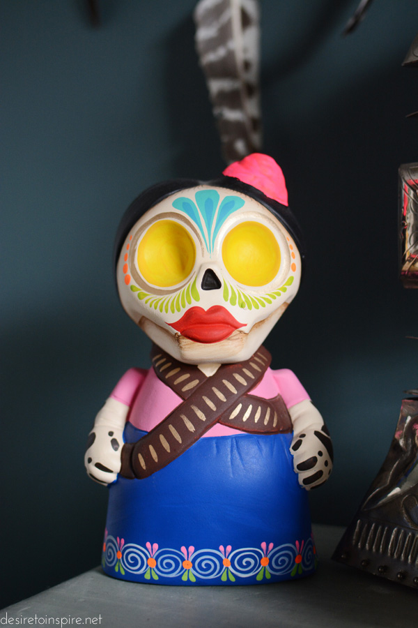
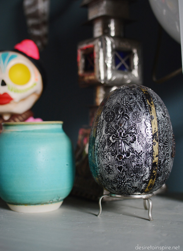
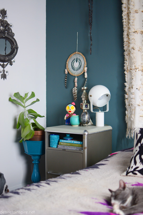
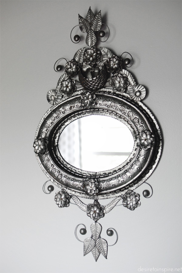
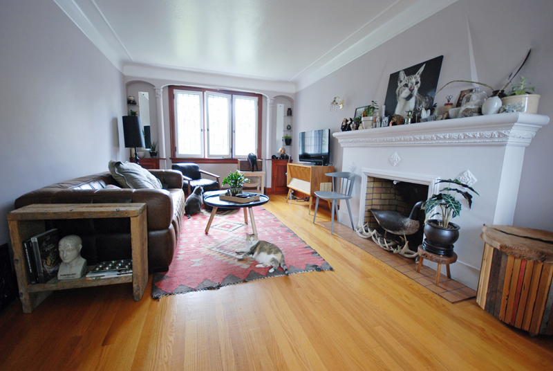
It has been a while since I got around to decorating my guest bedroom and I finally found some time to snap some photos so I can share it with you. This room is annoyingly small (10’x8.5′) so it fits nothing really but our old queen size bed and a couple of small furniture items. I am tempted to do what the next door neighbours did and rip out the wall between it and the master bedroom and make an ensuite….maybe one day when I win the lottery. In the meantime if anyone wants to stay over, we have a proper bedroom setup which we did not have in our tiny previous 2 bedroom (1 bedroom plus dressing room/closet) house. As for the decor, after working on most of the other rooms in the house I came to realize that I had a bunch of things I had carted back with me from one of my many winter vacations in Puerto Vallarta, Mexico that did not have homes. Thus resulting in this Mexican theme space! At the end of the post I will list sources, but just about all of it are Mexico mementos. This room was a great excuse to try one of the new Farrow & ball colours – Inchyra Blue which I used on the ceiling and opposing walls to create a canopy effect. I LOVE this incredible blue/teal/grey shade and how cocooning painting those 3 walls are without going dark all over (I have enough dark rooms in this house already). I highly recommend this colour for anyone looking for something unique that is dark but not too dark. And as I have come to expect from F&B colours, it has chameleon tendencies and changes drastically depending on the amount of light.
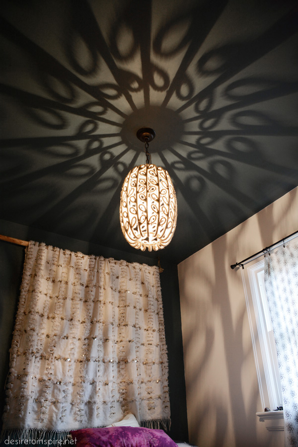
I had to share a photo of the incredible patterns this light makes when it’s on. So pretty!!
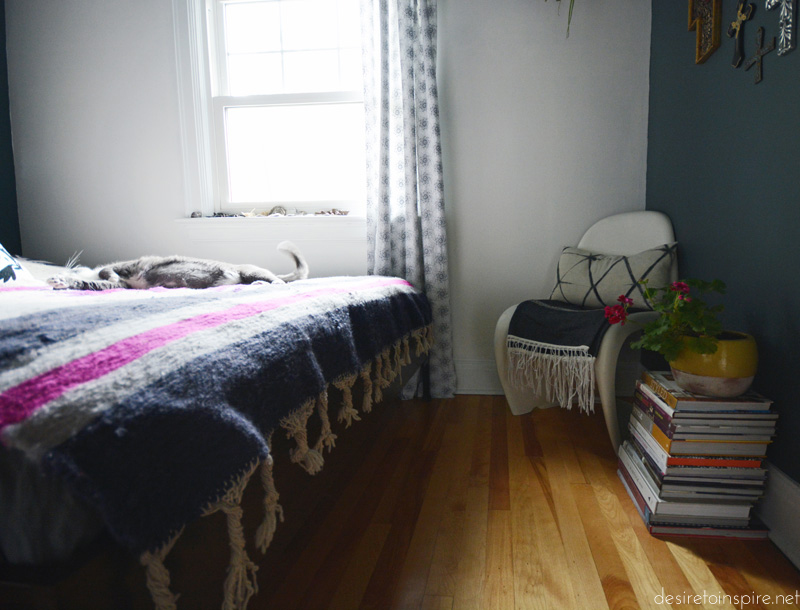
(Felix LOVES the rug/bed cover)
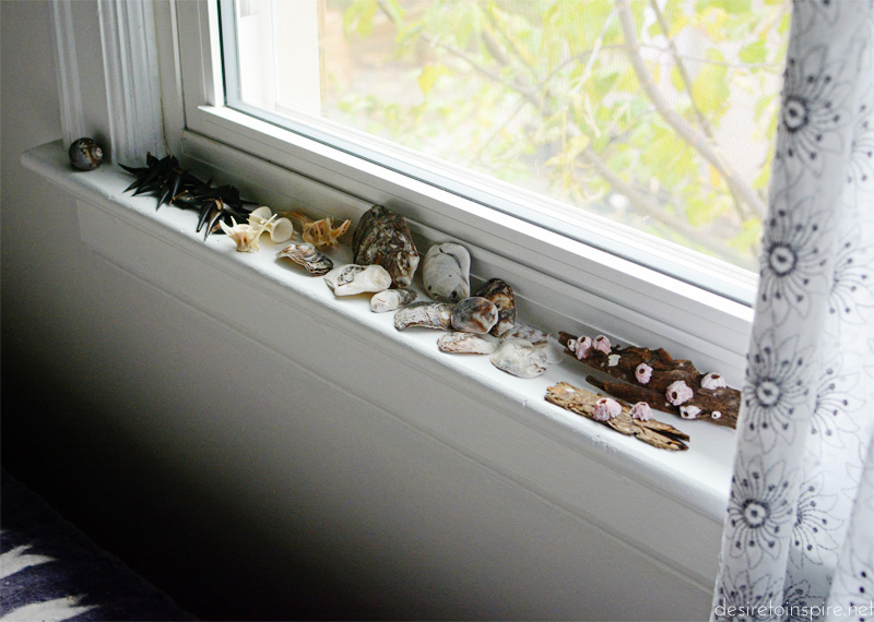
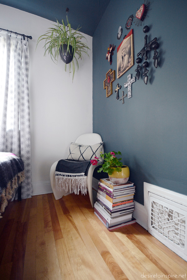
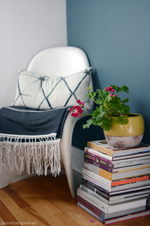
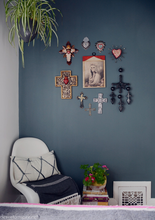
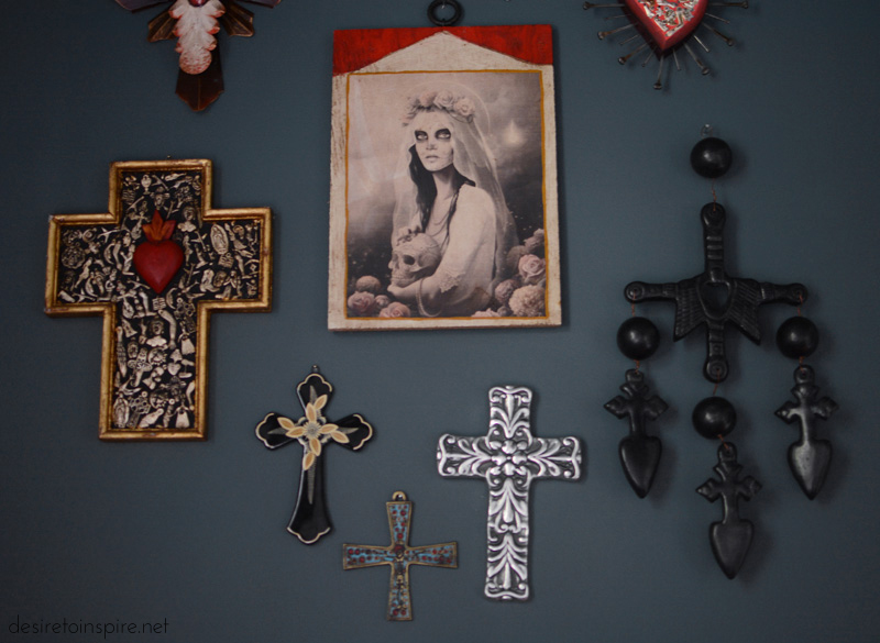
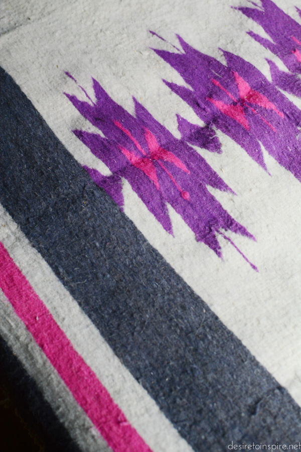
From Mexico: wool rug on floor and on bed, everything on walls, otomi pillow, blanket on Panton chair, trinkets on nightstand except blue pots, shells on window ledge
Vintage: metal nightstand, Panton chair, fabric used as curtains, plant stand
Moroccan wedding blanket: a wedding gift from Jo
Pendant light: Wunderkammer
White lamp on nightstand: HighJinx
Pillow on chair: VdeV
My living room makeover – part 2
Posted on Tue, 11 Oct 2016 by KiM
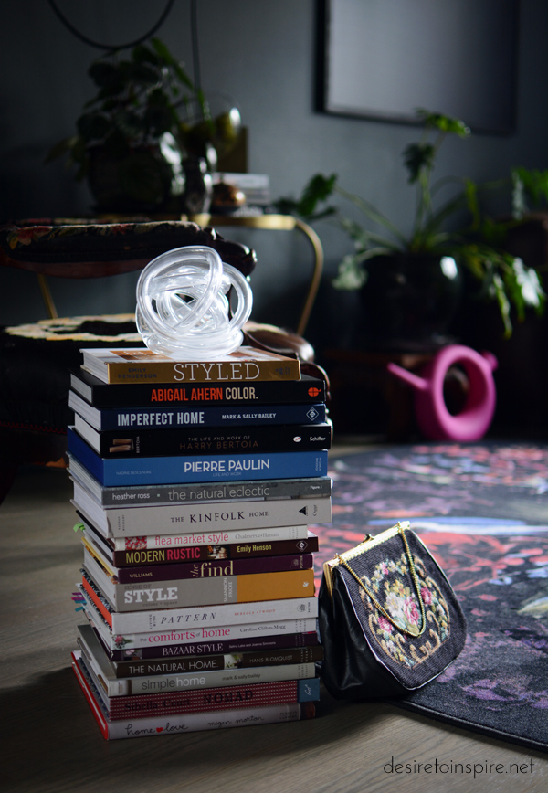
The left side of my living room looked like this right after we moved in. This is a very long and narrow space (23’x11′) so while it’s easy to break it up into different zones on each end, it gets a little tough fitting in a really large sofa and TV cabinet and not having everything running along the walls and ending up with a boring layout. And while you may recall I had received a new sofa not that long ago, my choice of wool fabric was really not smart in a house with a bunch of cats so I moved it upstairs to the storage room and may use it when we convert the space into a library. Since then I did however score the rug of my dreams and that caused an entire re-arrangement of the space and I bought a few new pieces to go with it.
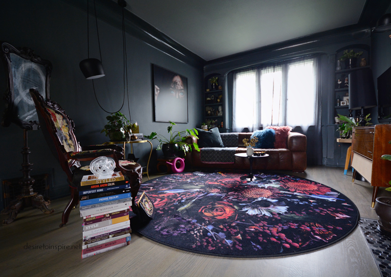
This rug is Fool’s Paradise by Marcel Wanders for Moooi Carpets from The Modern Shop. It is soooooo gorgeous, and pretty much ideal in this house of many pets because it is essentially commercial grade and very low pile so it will stand up to wear and tear and fur and constant vacuuming. The flower photo printed on it is SO sharp and the colours are incredible. I opted for round instead of rectangular (and the smaller of the 2 sizes) because I didn’t want to emphasize the long and narrow shape to the room. Even though my sofa is rather big and bulky, by placing it on an angle in the corner it makes it look SO much smaller and really opens up the space.
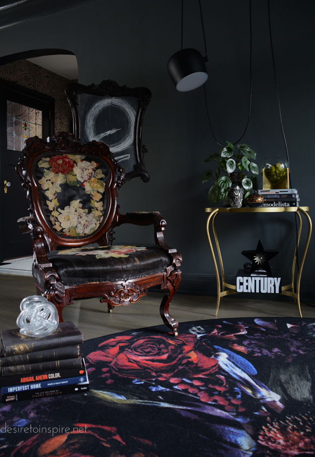
I had to find a new chair to work with the rug, and came across this Victorian grandfather chair at Yardley’s Antiques. I love the competing florals together. The glass sculpture on the pile of books and glass vase on a stand are from West Elm. The gold with marble top table is from Homesense. The star light under the table is from Gaslight Electric Sign Co.. The antique fireplace screen turned artwork is from Highjinx. The light is the Flos Aim pendant designed by the Bouroullec brothers.
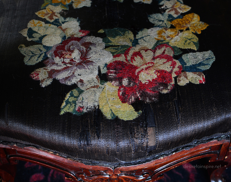
This is a REALLY old chair, and I need to find some trim to cover those staples.
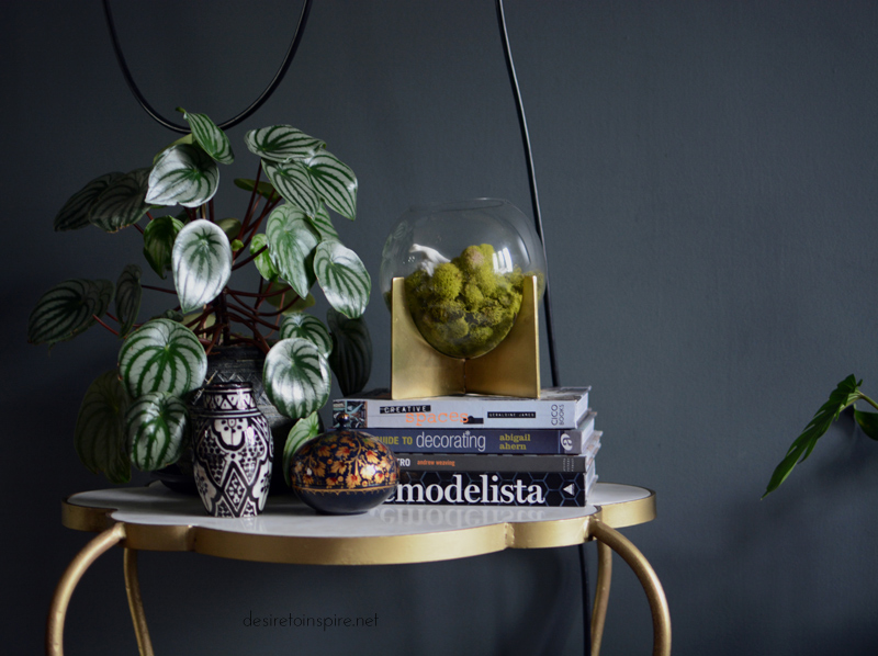
The vase and lidded bowl are vintage. That’s a watermelon peperomia plant. The leaves are adorable.
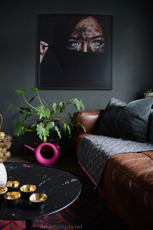
The art is this photo by Amanda Sebayang from Bali. I purchased a digital copy and had it printed on photoboard 40’x40′ by Posterjack, with a simple frame made by my husband. The fleece blanket is by David Fussenegger and plastic watering can by Qui est Paul? from Alteriors. Pillow from Homesense.

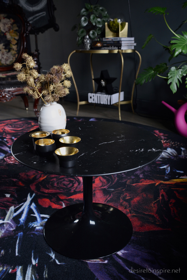
This rug also called for a new coffee table, and I wanted something small so I splurged and purchased an Eero Saarinen for Knoll black marble top side table from Alteriors. Kin tealight holders by Claesson Koivisto Rune for Skultuna from The Modern Shop. Bud vase from General Fine Craft.
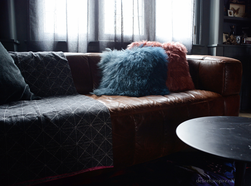
More pillows from Homesense.
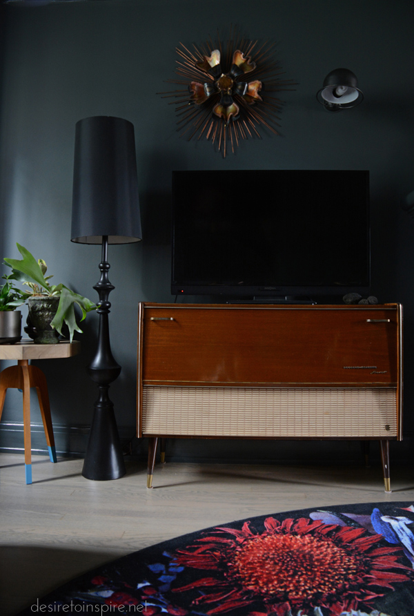
Vintage media cabinet. Lamp from Homesense. Table base by Pretty Pegs. Vintage wire sculpture from a shop in Montreal and Jieldé light from eBay.
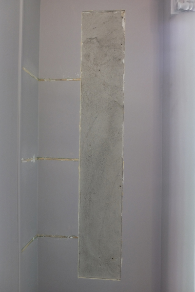
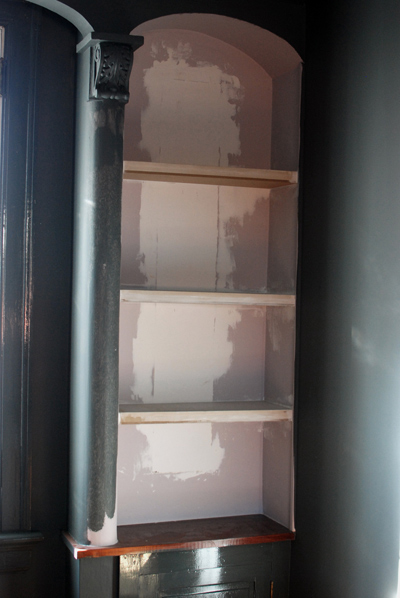
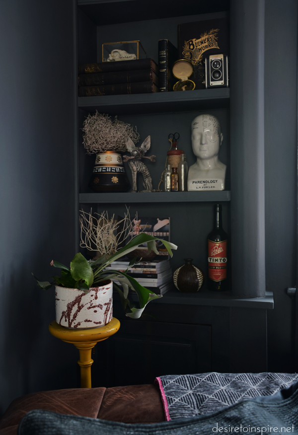
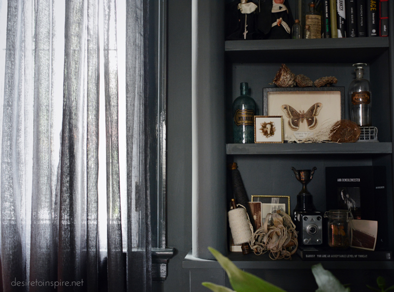
These alcoves were awful. They had a piece of mirror down the center, and curved glass shelves on one side. That had to go. Husband patched the holes and built floating shelves. They are now filled with random trinkets – my cabinets of curiosities.
My living room makeover – part 1
Posted on Tue, 11 Oct 2016 by KiM
Last week I shared my dining room makeover here and here, and today I wanted to share my now dark and dramatic living room. I have featured little bits and pieces of it over the past year or so but I never had all the finishing touches done (like trim, and painting out the fireplace tile) until recently. It was finally time to snap some photos and do a little feature on the blog. This is now my favourite room in the house and I am really stoked at the result, even if it will never REALLY be finished because as I mentioned last week, I’m always on the hunt for that “perfect” item. Ok, so here is a before shot:
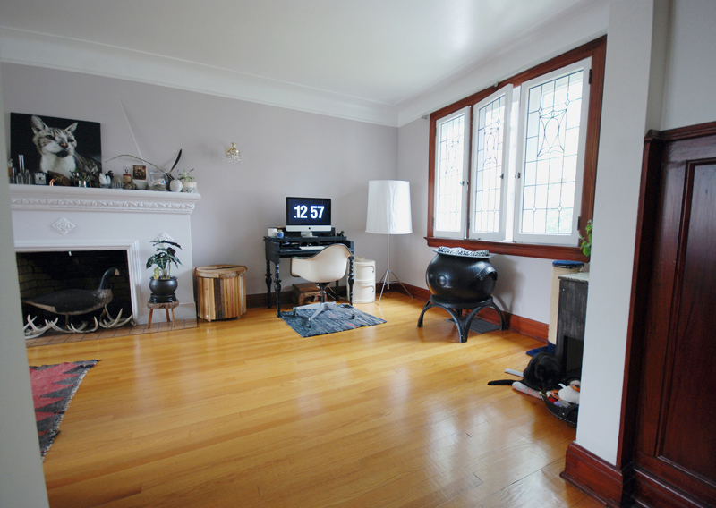
This photo was taken right after we moved in. Gross taupe walls, even grosser yellow/orange oak floors, mahogany varnished trim and terracotta coloured dirty fireplace tiles.
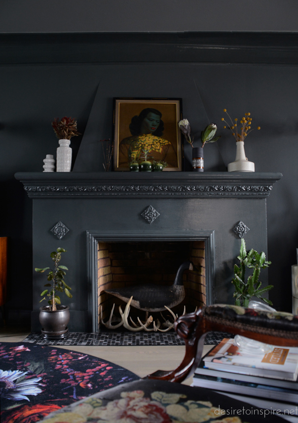
Everything has been replaced, re-painted or re-stained. The floors, like in the dining room, were stripped and re-stained with Minwax’s Classic Grey. The walls are Farrow & Ball’s Downpipe with Plummett on the ceiling. These 2 colours are incredible and in my top 5 colours of all time. Especially Downpipe – it can look green, yellow, blue, black depending on the amount of light coming in the room.
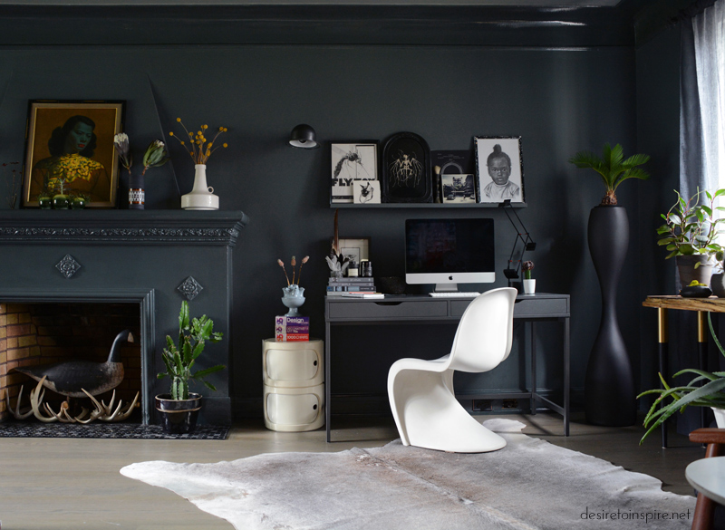
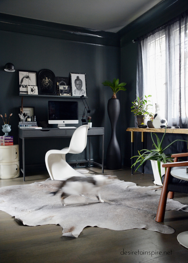
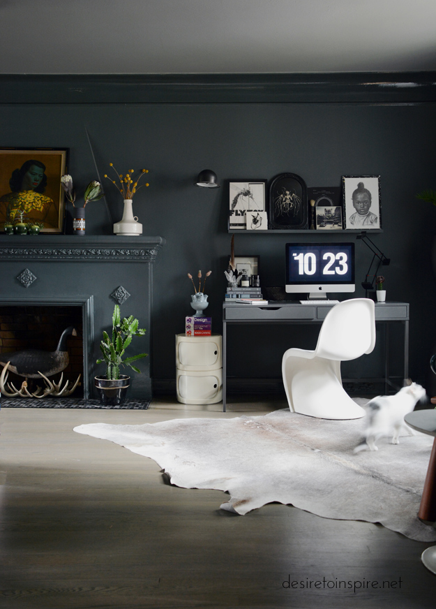
Sources: The unit next to my desk is vintage Marc Held for Prisunic, manufactured by Flair. Vintage Panton S chair by Vitra. Ikea Alex desk. Artemide Tizio lamp from GR Shop. Vintage Jieldé wall mount light via eBay. Tall plastic plant stand from Plust Collection by Euro3plast from Alteriors. Console table legs by Pretty Pegs. Table top by Daff Design. Featuring former ferals Bernie and Frankie.
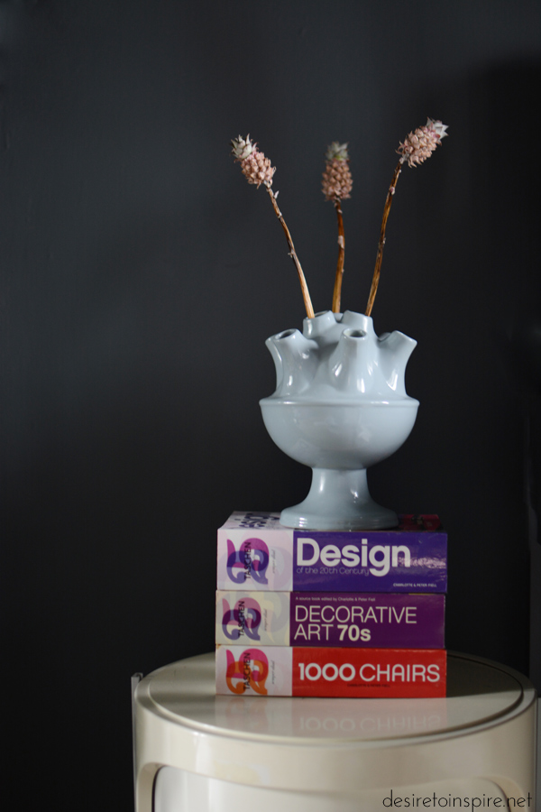
This vase is from a local shop now closed, and used to be a really bad minty green. I spray painted it glossy grey. Funky little dried pineapple flowers from blumenstudio.
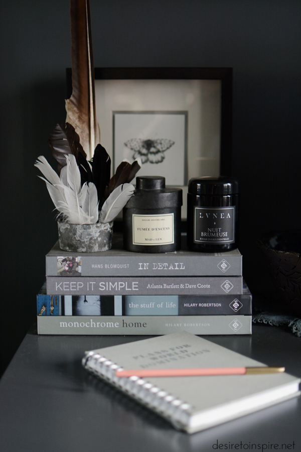
Vintage flower frog holding feathers (including an eagle feather from P.E.I.). Original butterfly drawing by Nicomi Nix Turner. MAD et LEN candle from Cendre and Lvnea candle.
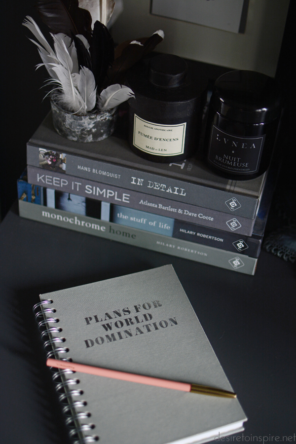
Notebook I think from Chapters, Hay Denmark pencil from The Modern Shop.
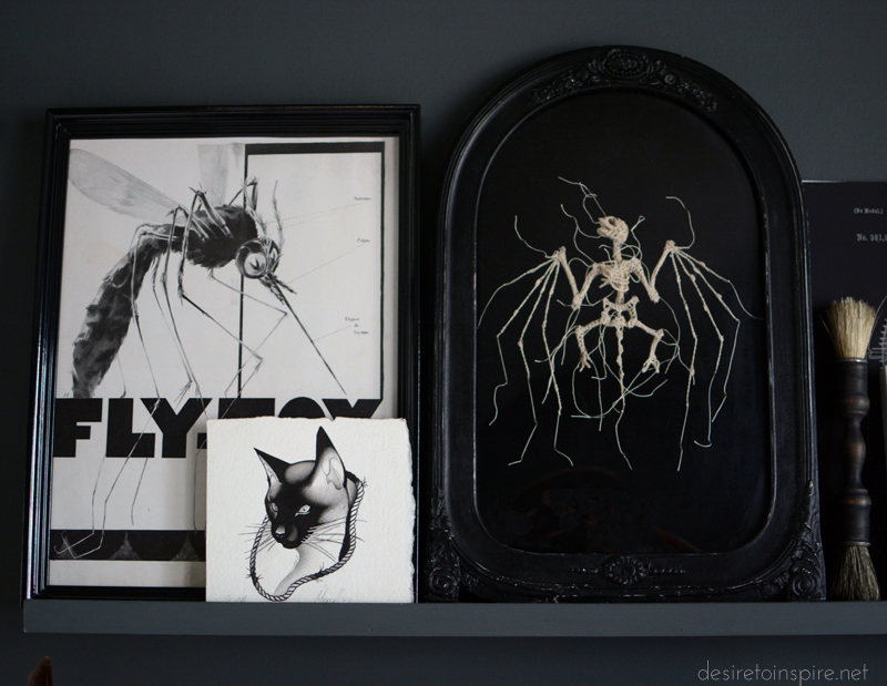
Bug ad from a magazine from Decadisme, my cat tattoo drawing by Pari Corbitt, embroidered bat by Caitlin T. McCormack.
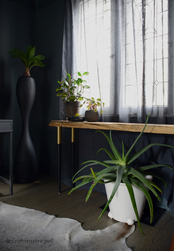
Cheap pots from Rona/Home Depot/Lowe’s, small handmade pot by Wolf + Sadie (le lou ula)
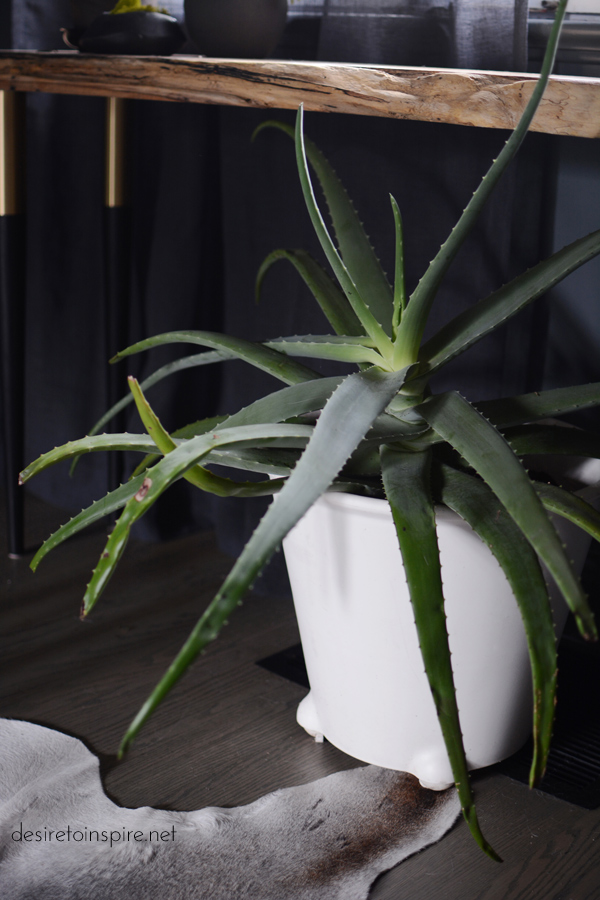
I have 4 of these white plastic pots from Ikea from many years ago and a crazy big aloe.
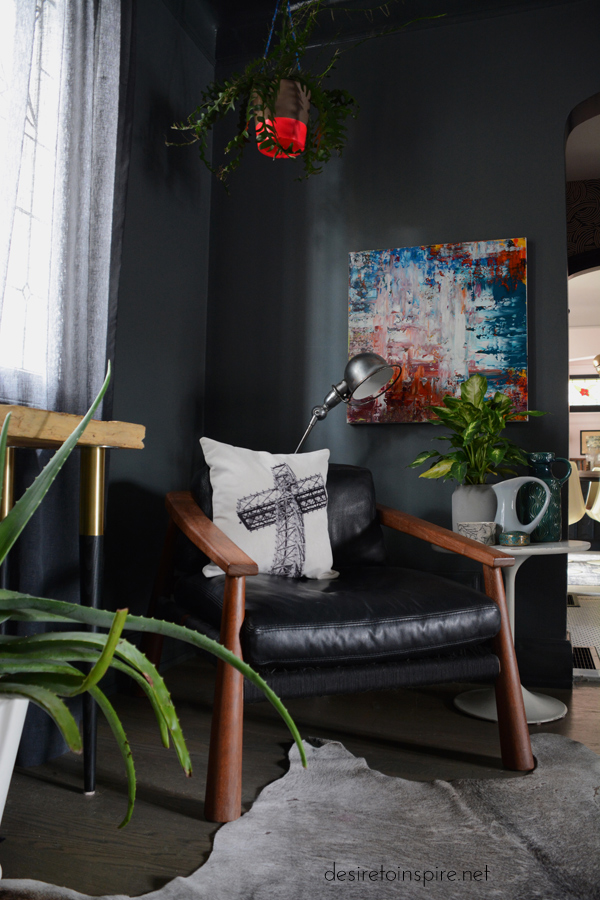
Lounge chair from Green Light District. Pillow by Fotofibre. Original painting from a blog reader named Angela from Singapore. Vintage Jieldé purchased from a blog reader. Hanging pot with a fishbone cactus from a shop in Montreal whose name I can’t recall.
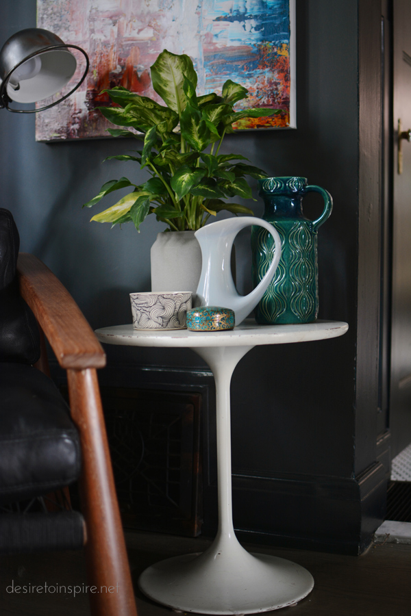
Reproduction tulip table from WISEMAN + CROMWELL. Ferm Living pot from The Modern Shop. Thrifted teal West German vase and Japanese (?) box. Vintage grey vase from a care package sent from Jo. Swirly pot handmade by Jeremy Ford.
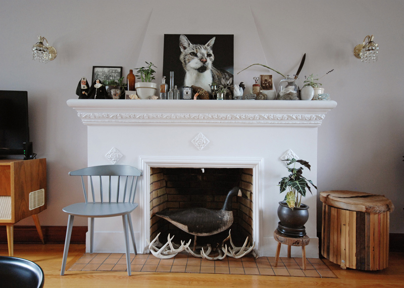
Here is a photo of my fireplace taken right after we moved in. Boring. Ugly. Those tiles were so terrible.
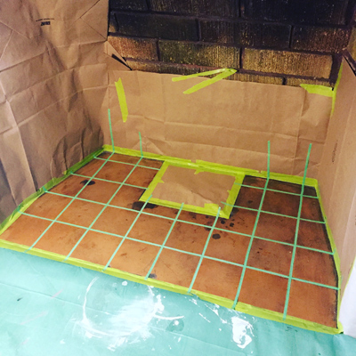
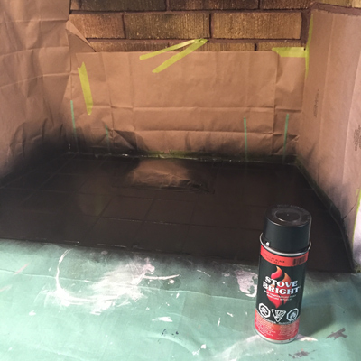
When the I had tile work done in the foyer and kitchen I also had the tile guy replace the fireplace tile along the front and I painted the tile inside the fireplace with special heat-resistant spray paint. I even had painters tape on hand that was the size of the grout lines to make the tiles stand out a bit more.
I like this MUCH better 🙂
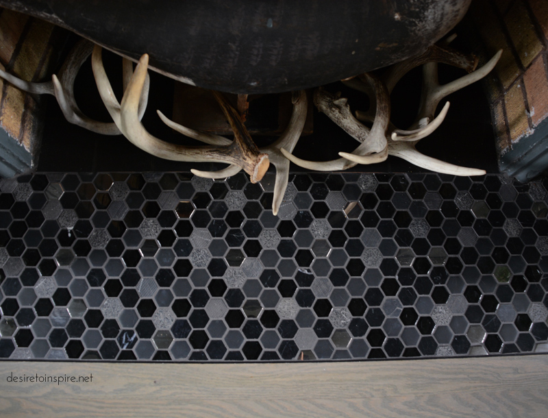
This tile was pretty costly considering I only needed less than 1 box but I really wanted to do a statement tile and these are really fun (and tile selection in this city sucks and it was pretty much the only thing I even remotely liked for this space). They’re a mix of mirrored and cement and other materials that I found at Euro Tile & Stone.
Stay tuned for the other half of the room.

