Displaying posts labeled "Kim’s House"
Indecisiveness
Posted on Wed, 19 Aug 2015 by KiM
Do you recall about a month ago when I blogged that I found THE TILE?
I had settled on this one for the vestibule and kitchen, with the wainscoting painted out glossy black and walls in Farrow & Ball Lotus wallpaper in the foyer/stairs/upstairs hallway, and then a 6″ white hexagon tile in the foyer (easier than redoing the hardwood in there – that way we can use the stairs while the floors in the dining/living rooms get redone).
And then Monday we went tile shopping for what might have been the FIFTH time. SHOOT ME. This time it was to find tile to do the area inset in the hardwood in front of the fireplace (and something cheap for inside the fireplace). I did find one of the most beautiful little hexagon tiles I have ever seen.
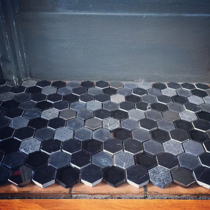
It cost a small fortune considering the small amount I needed, but I adore it. The mix of greys with different textures is incredible. I think it’s going to look fantastic. (I found it at Euro Tile & Stone)
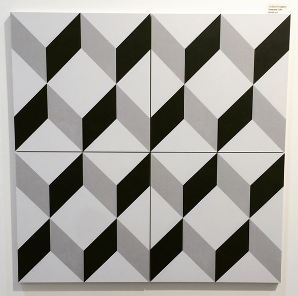
Anyhoo, more to the point is that I came across the most perfect tumbling block patterned tile – my all-time favourite pattern EVER, in the perfect size and colours, and at an ok price.
Now I am dying a slow death at the thought of passing this up. So maybe I throw caution to the wind and just go with this one. I spent a couple minutes last night doing a really bad photoshopping job to show you my idea.
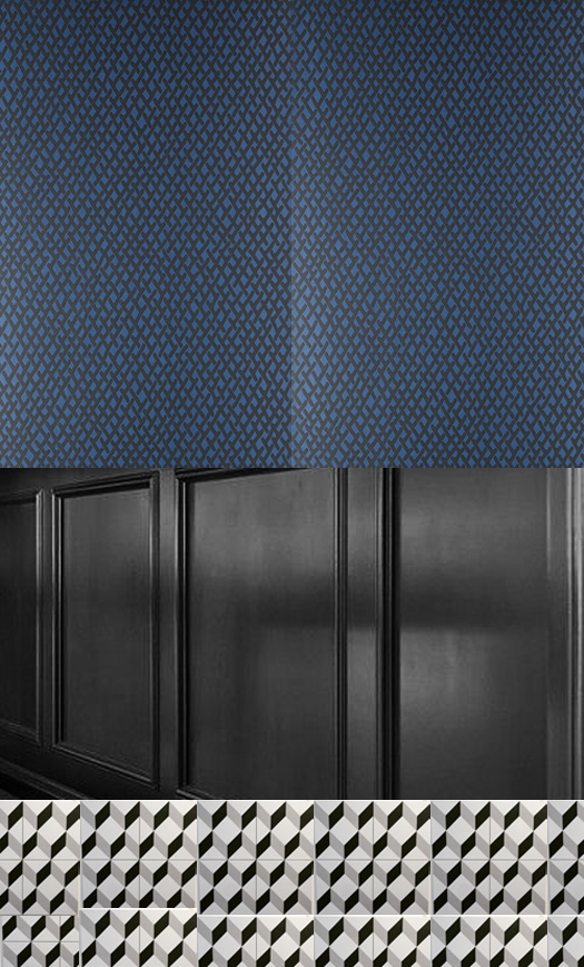
What do you think? I cannot pass up free wallpaper (thank you Farrow & Ball!) and this one, Amime, seems to maybe work. (Coincidentally I have a roll of it – I am going to line my glass-front kitchen cabinet with it). This idea is growing on me. VERY QUICKLY.
****To clarify, I would use this tumbling block tile in the vestibule, foyer and through into the kitchen.
Thoughts on new flooring
Posted on Mon, 13 Jul 2015 by KiM
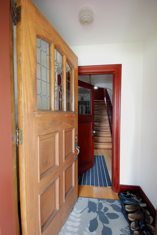
Instead of a pets on furniture post this morning, you’re getting my thoughts on my flooring situation because I am short on submissions once again (if you’d like to submit photos please send them to kim[at]desiretoinspire[dot]net). I had Friday off so the husband and I went tile shopping AGAIN. Ottawa seems to be very limited in anything renovation related, so I have been having a hard time finding anything even remotely interesting, and every store seems to carry the same products. I am desperate to get the flooring situation in my house dealt with soon because I feel like that should be the next step before anything else I tackle. To recap, we are looking to rip up all the hardwood in the vestibule, foyer, living and dining room, and the tile in the kitchen. I want to tile the vestibule, foyer and kitchen and do a rustic looking hardwood in the living and dining rooms. Here are some photos I took when we first moved in of the foyer and vestibule:
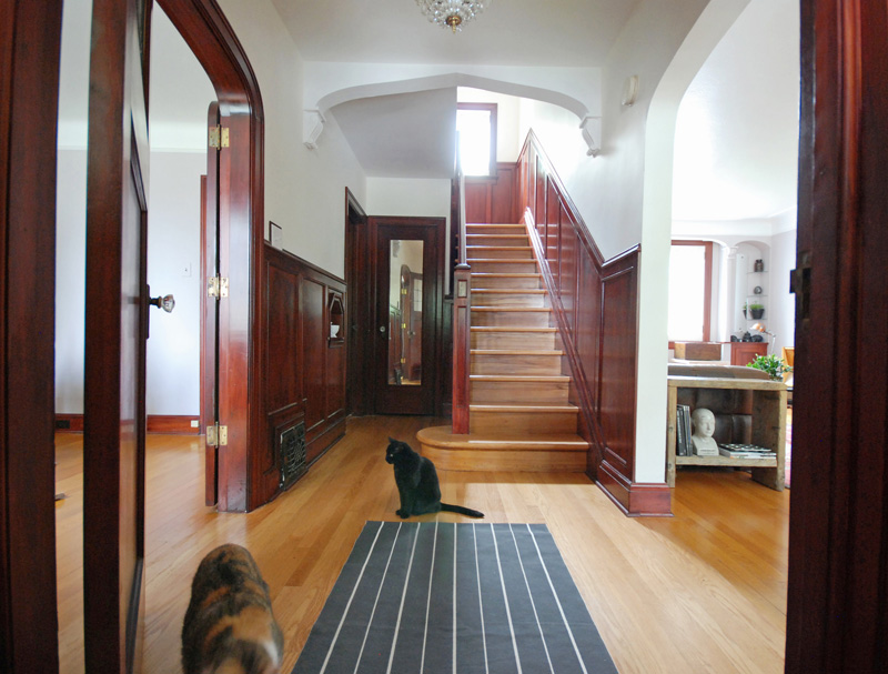
Here is the kitchen which leads to the door to the backyard. In the photo above the dining room is to the left with the kitchen behind it, and living room to the right.
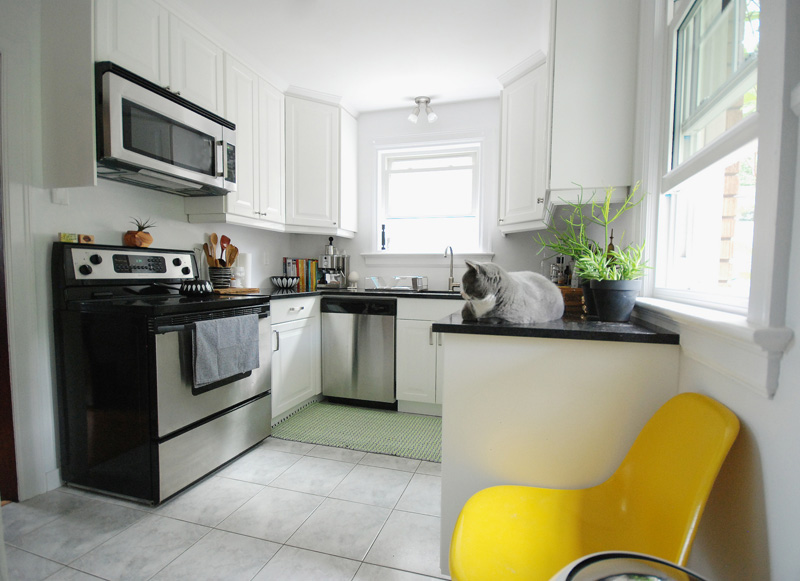
My tiny kitchen. TINY.
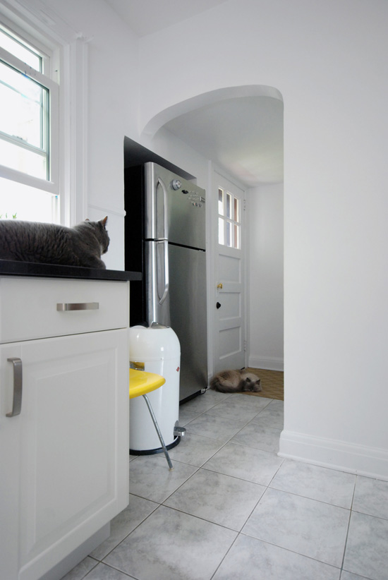
We would tile down to the back door, and this is the little hallway where our fridge resides in a bump-out on the back porch. Strange, I know.
The kitchen walls have since been painted in Farrow & Ball’s Stiffkey Blue, the hardware and lighting have been replaced with brass and we’ve been waiting almost 2 months for our freaking brass faucet to arrive.
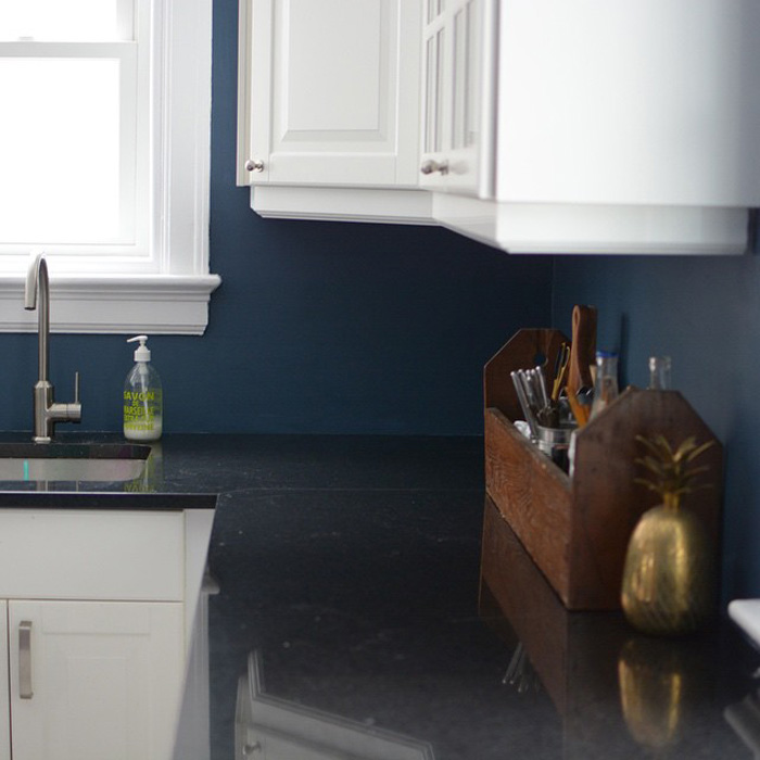
Farrow & Ball kindly sent me a roll of Anime wallpaper to line my glass cabinet…but since they sent me an entire roll, I was thinking of also wallpapering the wall with the archway leading to the back door.

In the living and dining room we want to make our own ‘rustic/reclaimed’ wood. This flooring we spotted at Orange Gallery was made with Home Depot wood!

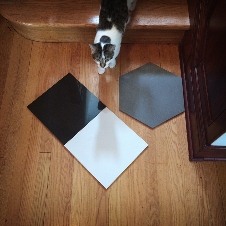
At first I thought black marble would be a good choice for a tile as it would suit the style of my traditional craftsman home.
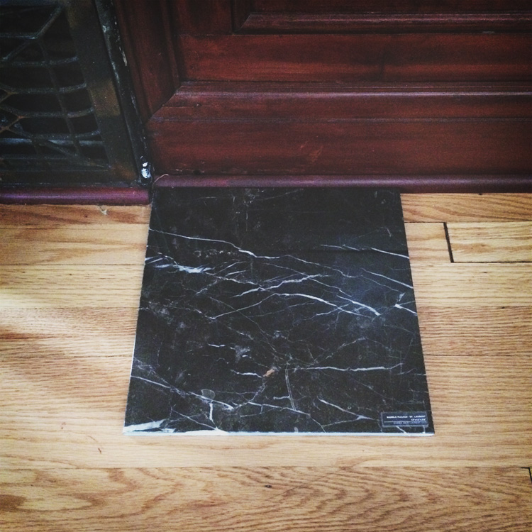
But that’s a bit boring. And what if it ends up being too vein-y?
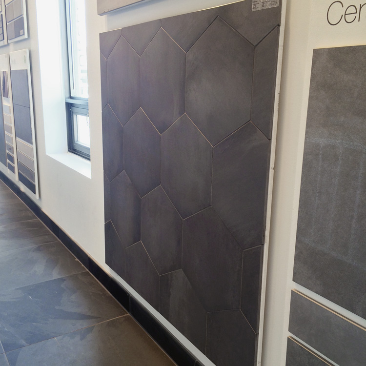
Friday we came across these grey dark concrete colour hexagon tiles at Céragrès that I fell in love with. We brought one home to try and it seems really dark, and I’m not keen on introducing another colour to the kitchen.
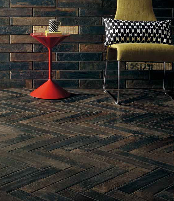
Céragrès is getting samples of this gorgeous chevron tile today but the length is 24″ and I think that would be too long for the narrow spaces we are working with.
![]()
A kind employee at Centura Tile told us about a new line they are carrying next month – including this cool herringbone tile (by Fioranese).
But again, maybe too dark. And I don’t think this would work in the kitchen.
At Centura I spotted this in a corner and immediately started hyperventilating. (But at about $16/sq ft it’s pricey)

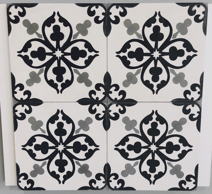
After discussing this topic with some family members around my parent’s pool Saturday during a heat wave, a suggestion was made to have a different tile in the foyer from the vestibule and kitchen. I had not thought of that. I mentioned my concern for not being able to use a fun wallpaper in the foyer and up the stairs (I have been dreaming about Farrow & Ball’s black and white Lotus pattern) if the tile was too graphic. So my younger sister came up with what I think is likely the perfect solution. The patterned black and white in the above photo in the really tiny vestibule and in the kitchen, and solid black and white tiles in a checkerboard pattern but laid diagonally in the foyer. This way we get the drama of the gorgeous pattern which I think is a perfect tile in my rather plain kitchen, and then a solid in the foyer so I can use a bold wallpaper that won’t compete with the floors.
I would love to hear your thoughts/comments before I make my tile purchases hopefully next weekend. 🙂
Rearranging, hanging and redecorating
Posted on Wed, 1 Jul 2015 by KiM
Happy Canada Day fellow Canadians!! It is a miserable day here in the country’s capital as it usually seems to be on this, the biggest holiday of the year (WTF). Instead of attempting to enjoy the festivities around the city in the rain I am sitting here at my computer having spent the morning tweaking photos I took last weekend of some decorating and rearranging I did when I managed to find some spare time. So I thought I would share them with you all today before I knock more items off my blog to-do list and then head to my parents for a random turkey dinner.
I have lived in this house for a year now and had yet to hang anything on the walls, so despite not having painted many rooms, I decided to hang some art in my dining room and office area in my living room before I lose my mind. For my workspace I opted for a picture shelf, that way I can rotate art as frequently as I wish without damaging my plaster walls that are painted in my favourite colour of all time – Farrow & Ball’s downpipe. It seems Ikea no longer carries their picture shelves unfinished so I had my husband build me one so I could paint it the wall colour. I really love my little monochromatic office corner now. 🙂

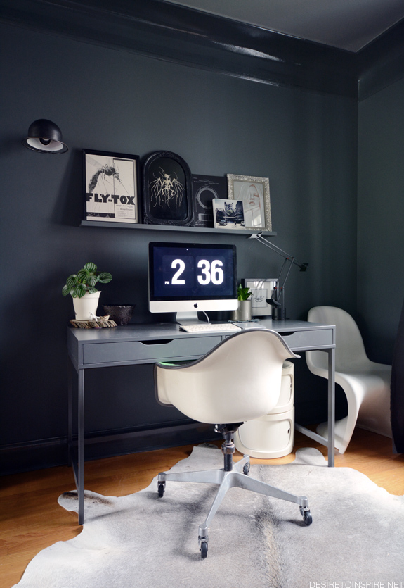
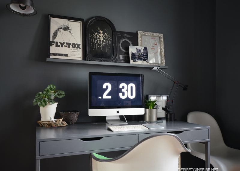
I would love to replace that Panton chair with a tall plant (perhaps a fiddle leaf fig that I can promptly kill).

vintage magazine ad from Décadisme and Jieldé from eBay
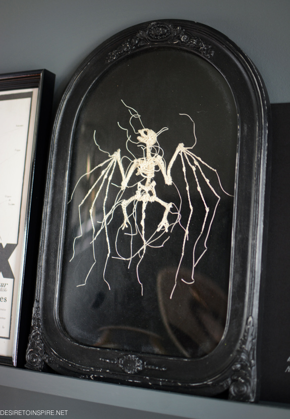
my treasured crocheted bat by Caitlin T. McCormack
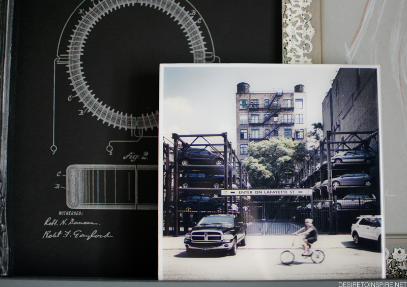
tesla patent letterpress print by Gaslight Electric Sign Co., resin photo by Ronny Ritschel from Lola Dot Studio
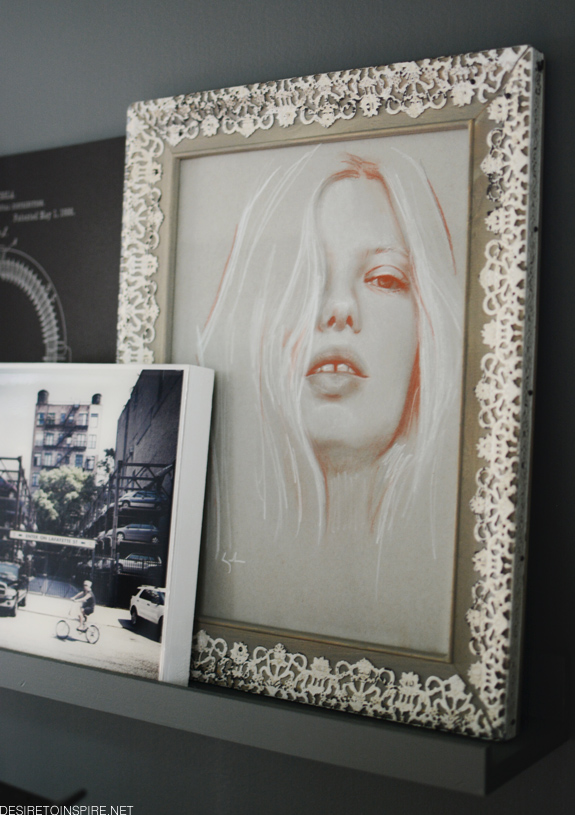
portrait by Kate Zambrano
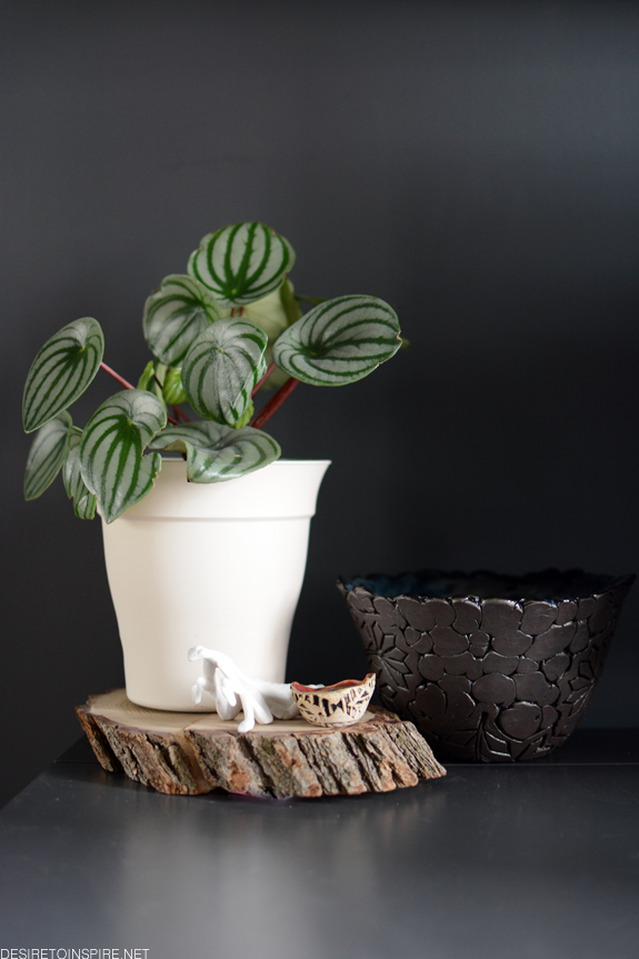
cheap pot I need to replace with something cooler, ceramic bug from Wunderkammer, bowls by Julie of Hollow clayworks
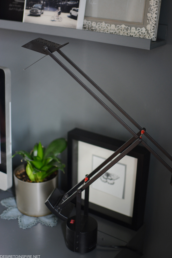
my beloved beaten up and chewed on (thanks Felix) Tizio lamp
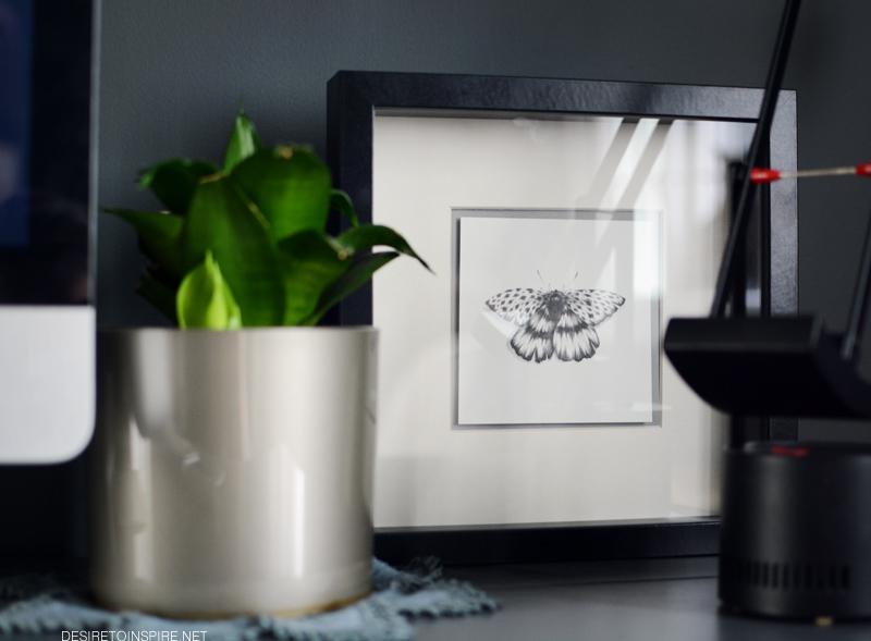
moth pencil drawing by Nicomi Nix Turner (that I would LOVE to get tattooed on me)
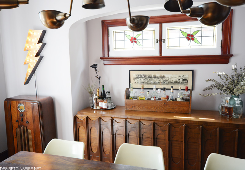
Now, before I get into my dining room, please note I have yet to do anything to the walls in here so they are still a horrifying taupe. I really have no idea what to do in here – ideally I would like to use a Farrow & Ball paint as they’ve been graciously providing me with their products. I don’t think I want to do wallpaper because the hallway/foyer just outside this room will be wallpapered and likely the ceiling in the kitchen so that would be too much pattern. I hung a couple of things in here, added a new piece of furniture and rearranged the top of the credenza to turn it into a bar. I am still waiting on the husband to build me an 8 person reclaimed wood dining table…
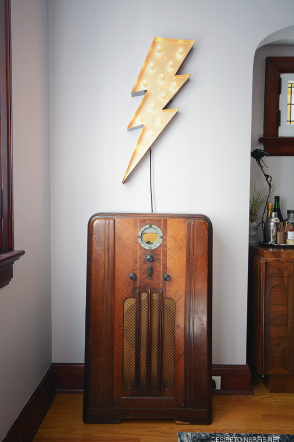
Finally, I have a Daff Design (= husband) working floor model vintage radio turned Bluetooth speaker in the dining room! This thing is a BEAST. It sounds so incredible. It is for sale if anyone local is interested 🙁 We purchased it from the sweet ladies of High Jinx. Above it is a really cool lighting bolt sign by Gaslight Electric Sign Co.

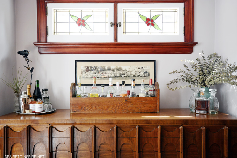
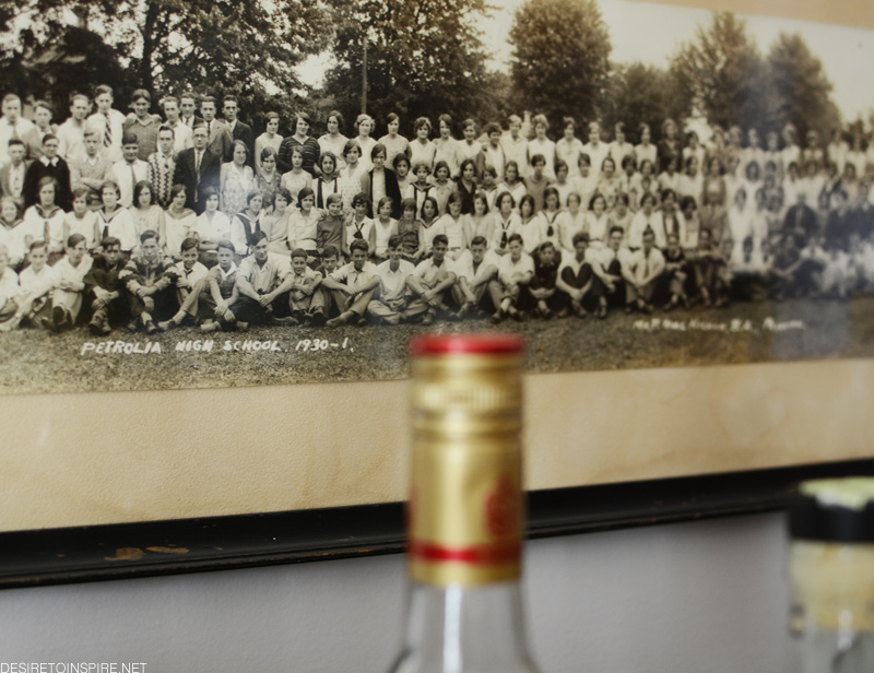
vintage wooden toolbox (I removed the rod) from High Jinx, class photo from a flea market

vintage metal rose from a flea market, and OMG Split Tree Cocktail Co. syrups/cordials are SO YUMMY

lotsa booze
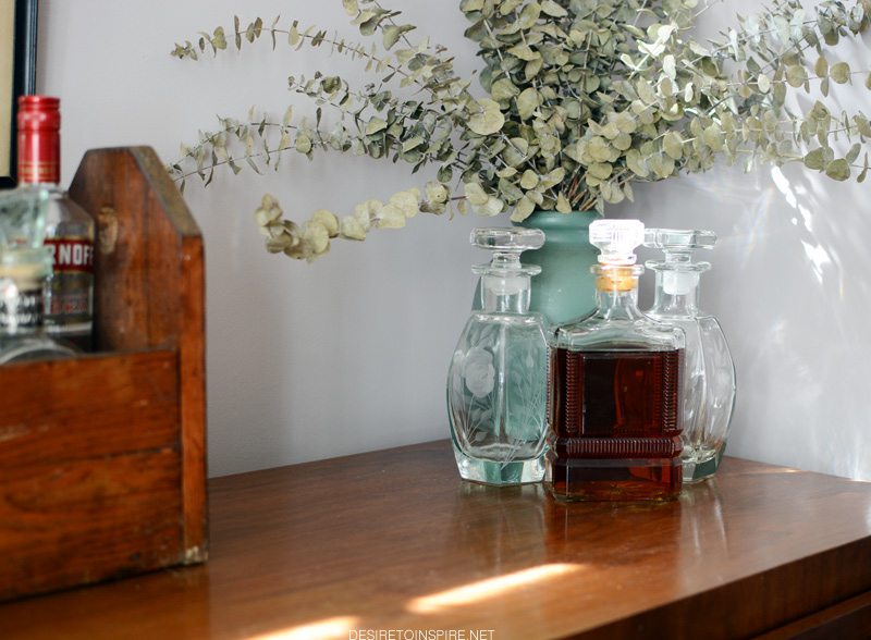
beautiful etched glass decanters (empty) I found at the Ottawa Antique & Vintage Market
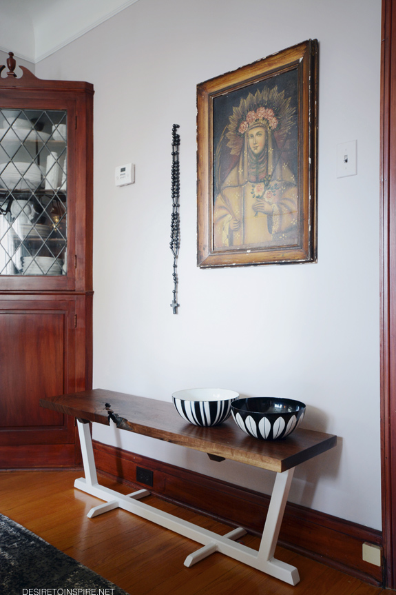
At the ManMade show a couple of weeks ago Matt Wallace had this stunning walnut topped bench for sale. And NO ONE bought it. So I did because LOOK AT IT!
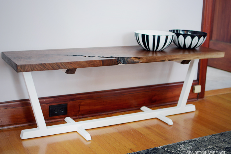
I did not have anywhere else to display my absolute favourite vintage Catherine Holm bowls (from Samantha Howard Vintage and the Ottawa Antique Market on Bank St) so why not on the bench?
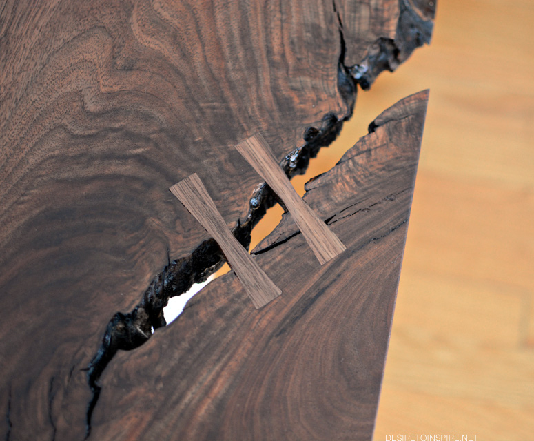
OH YEAH. This piece of walnut is exquisite.
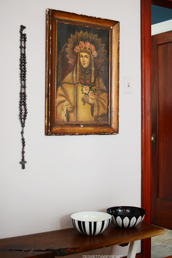
I’m not 100% loving the rosary I picked up in Puerto Vallarta mixed with this new antique painting I bought from Joel of Antiquus Goods but it will do for now until I figure out some other arrangement.

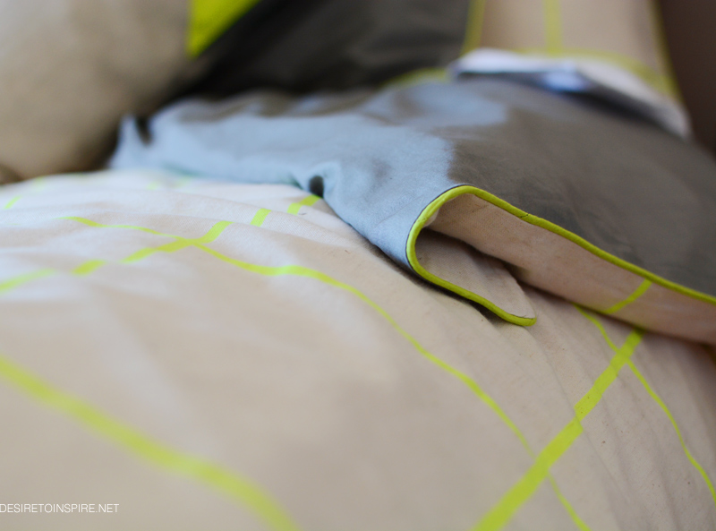
My new bedding from Aura
Posted on Tue, 5 May 2015 by KiM
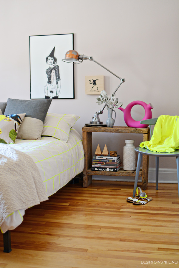
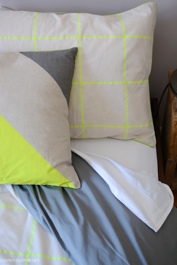
I was SO stoked when the folks of Australian company Aura (one of our long-time advertisers and designers of a really amazing line of bed linen, homewares and rugs) emailed recently with the fantastic news that some of their bedding is now available in Canada at Hudson’s Bay! WOHOO!!! To my delight the kind ladies of Aura offered to send my a duvet cover set and 2 pillows. YES!!! I have always purchased duvet covers at Ikea…and not that there is anything wrong with that but now I see what I have been missing. It was a reeeeally hard choice to make but in the end I went with the Lattice Lime duvet cover set, and the jumbo stripe and dipped decorative pillows. The duvet cover is soooo comfy, in a cotton/linen blend on the front (gawd I love linen bedding!!!) with a cotton back that is satiny soft (and neon piping for that extra oomph). The pillows are 100% linen with feather inserts so they are just divine. I am over the moon with this new bedding, and despite having done nothing with my bedroom since buying this house, I was excited to get some sort of design happening with the new bedding as inspiration. Pay no attention to the bland wall colour as that will change eventually, but to my surprise the bedding just blends right in. Thanks to Aura my bedroom looks pretty amazing if I may say! P.S. Aura isn’t sold at all Hudson’s Bay locations but that doesn’t matter because you can order online!


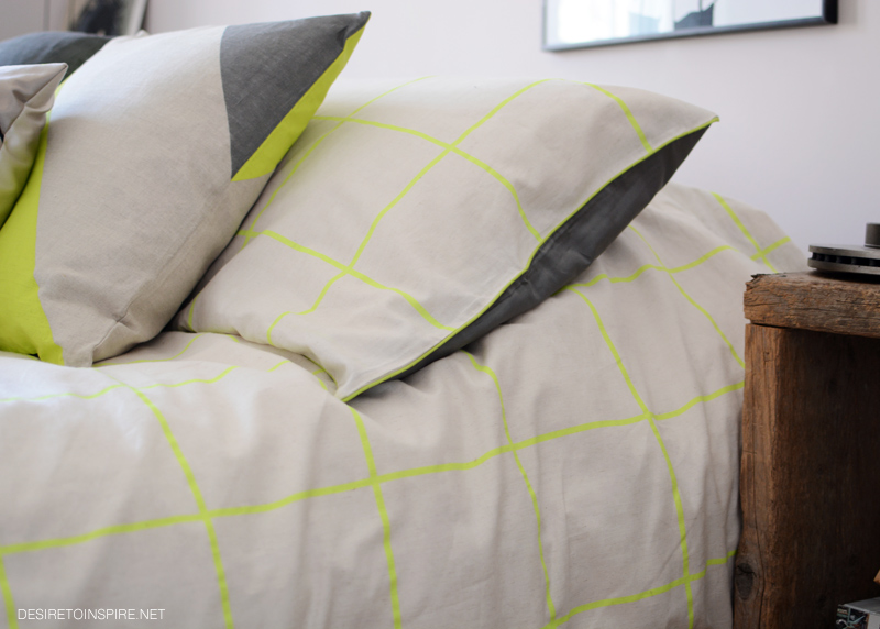
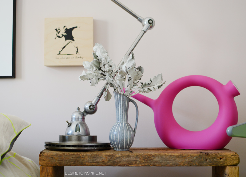


Other sources: satin bird pillow = Cynthia Rowley from Homesense, art over bed = Tender is the Night a giclée by Lina Ekstrand, art over nightstand = ‘Ceci n’est pas un Banksy’ by Marc Adornato, nightstand and wooden diamonds made by my husband Daff Design, Qui est Paul? watering can from Alteriors, vintage West German vases and Jieldé lamp, dried leaves from Blumenstudio, chair = J104 chair by Hay Denmark from The Modern Shop
A few new things around the house
Posted on Wed, 15 Apr 2015 by KiM
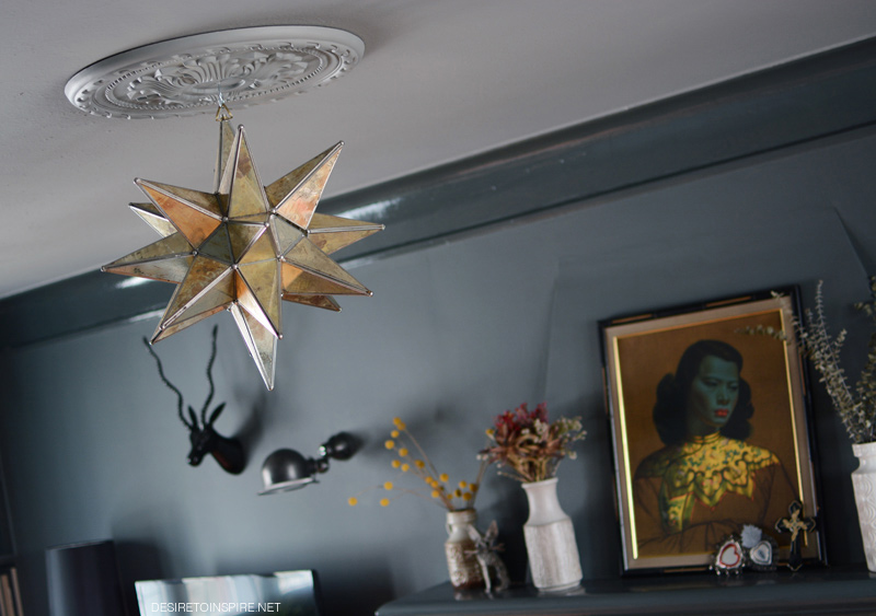
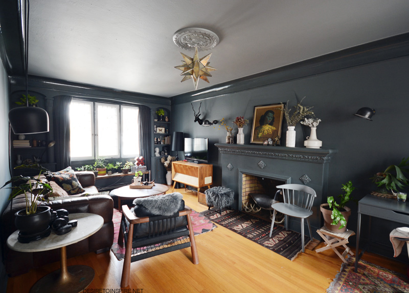
My life has been super crazy for the past couple of months and while I am trying to find time to get my kitchen redo completed (may take a while if I end up redoing the floor) a few new things have happened in other spaces. Nothing major but getting anything done around here is a miracle and I need to celebrate it. For starters, I bought a light fixture 2 months ago and it was finally hung up in my living room (that is a dig at the husband who has no excuses). I say hung instead of installed but it literally is just hung on the ceiling. Judging by the mark in the centre of the ceiling when we bought this house, it seems that in another life, there may have been a light fixture. The ceilings and walls in here are plaster, not drywall so I refuse to go tearing holes anywhere for no good reason. I don’t really need a working light in the ceiling as I already have 8 lights in the room but the large expanse of ceiling looked a little bare despite me having put up a ceiling medallion when I painted the room. It was a good start but it was missing something. It was missing THIS GORGEOUS LIGHT.
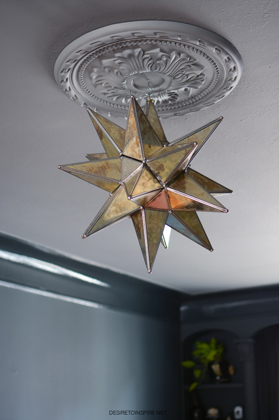
I found it at my favourite vintage lighting shop – Architectural Antiques. I am so freaking happy with this light fixture. It brings some sparkle into the room, and who doesn’t like sparkle?!
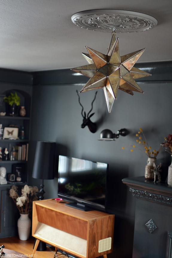
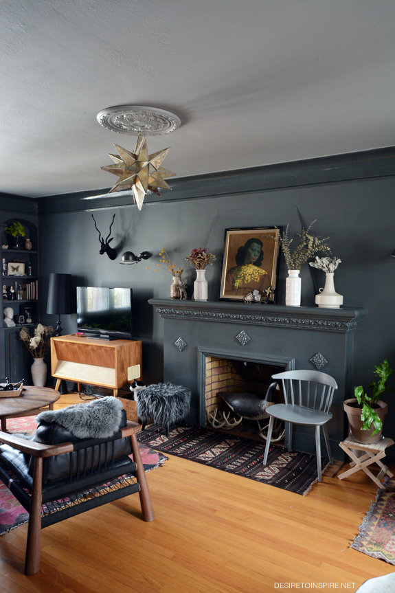
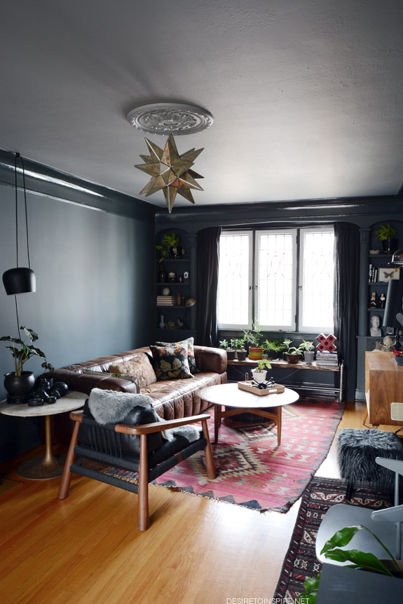
It is killing me that I don’t have art hanging above the sofa yet. UGH!
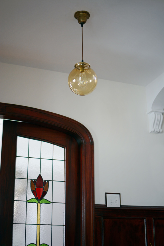
At the same lighting store I also found this simple amber glass shade fixture for the foyer.
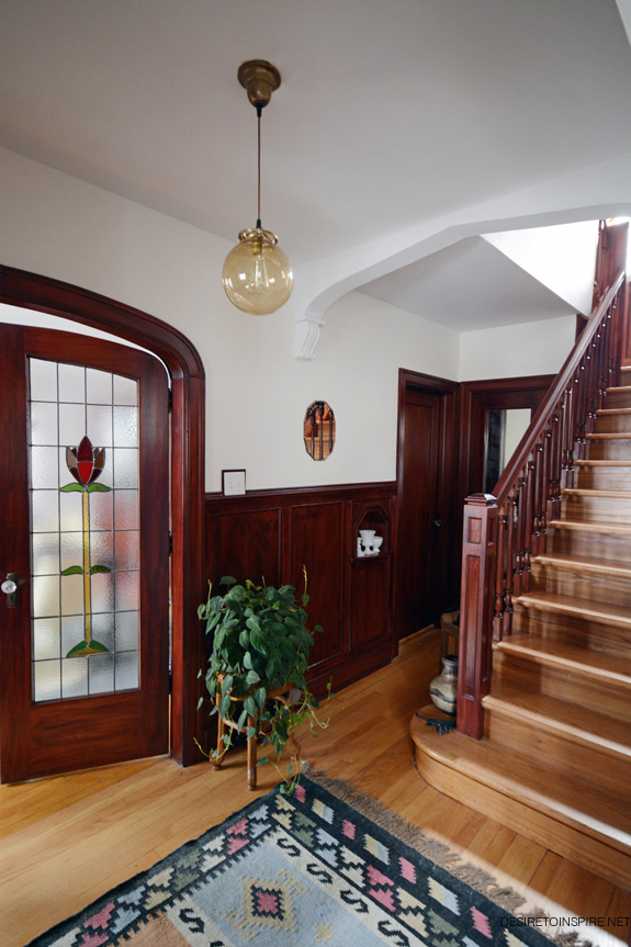
(I tone down the yellow and orange in my photos before posting them, that is how much I detest these floors)
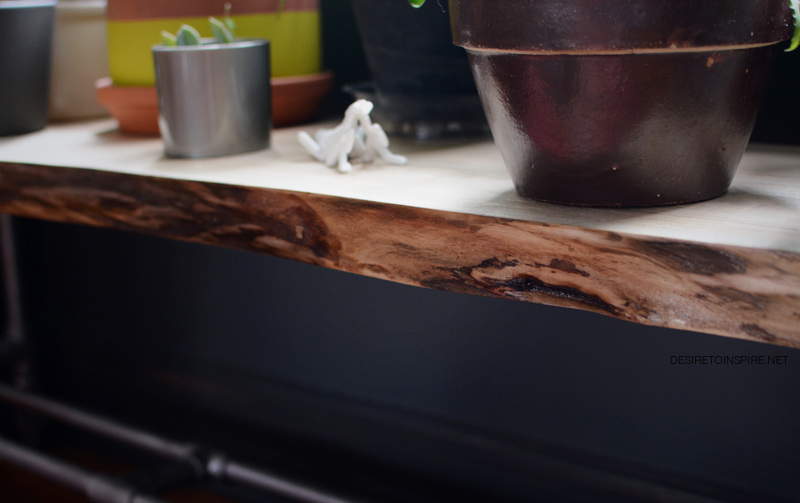
My husband has gotten into woodworking so when I realized he had accumulated a decent stash of really nice wood, I asked him to replace the boring teak (?) wood top to my bench I use as a plant stand in the living room. He used a gorgeous piece of butternut.