Displaying posts from March, 2009
The good, the bad and the what were they thinking
Posted on Sun, 22 Mar 2009 by midcenturyjo
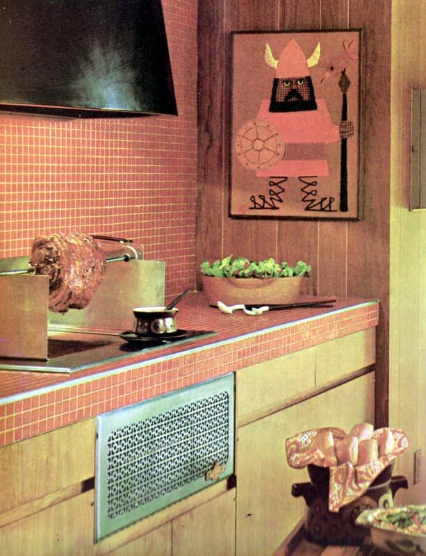
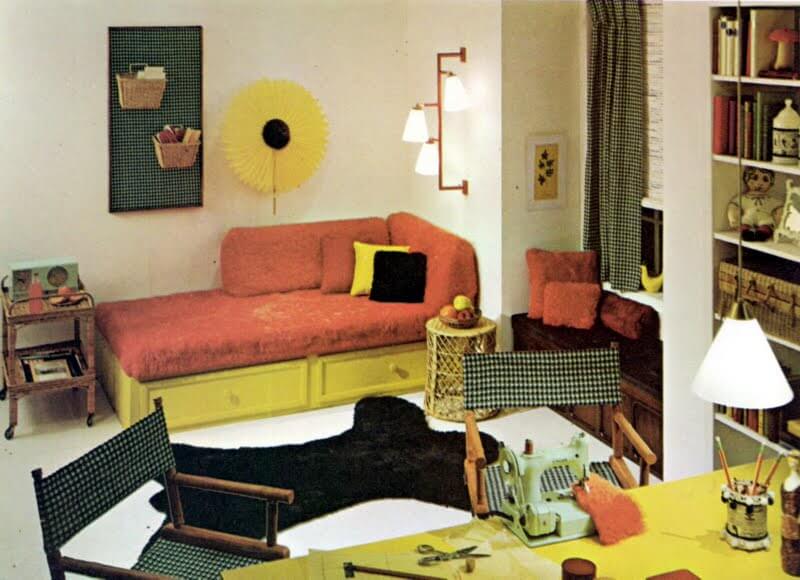
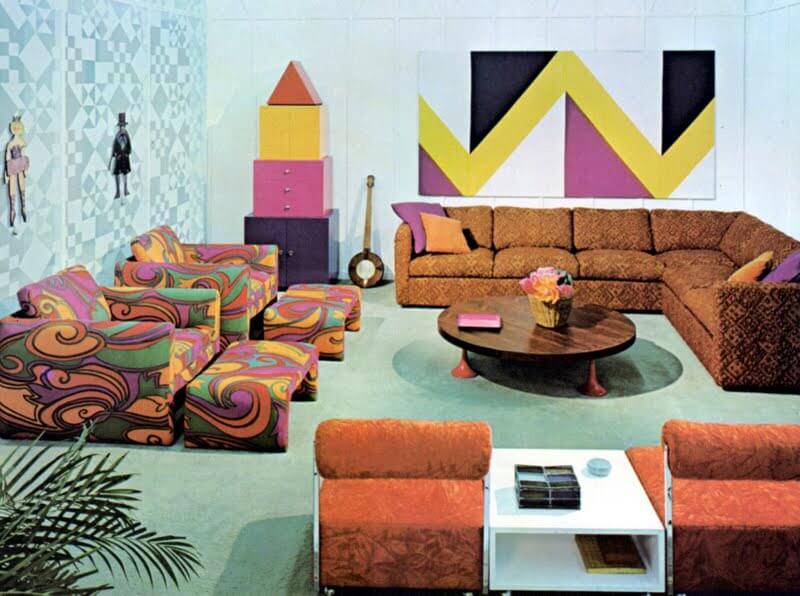
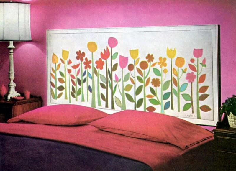
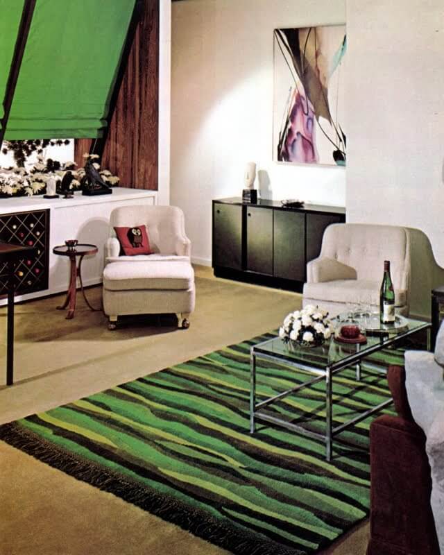
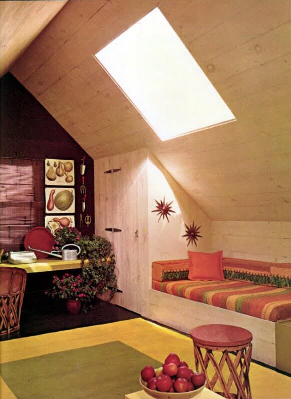
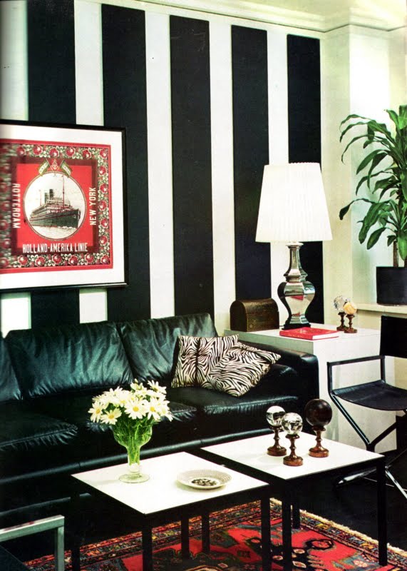
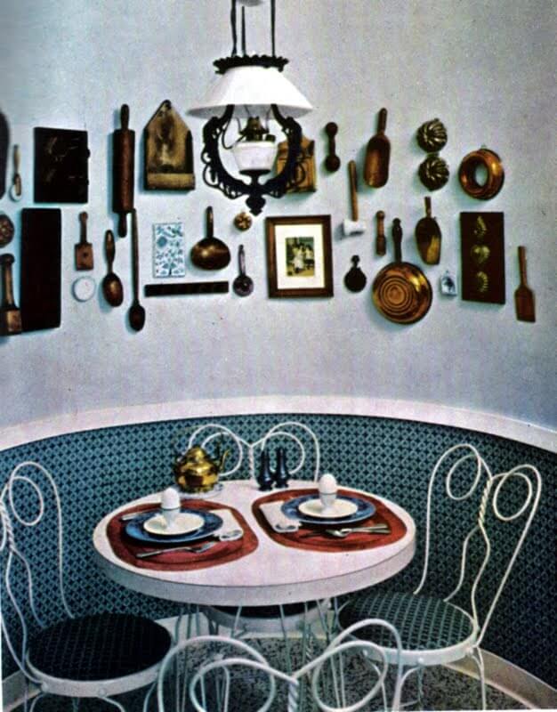
Studying hard Kim? Thought I’d cheer you up with a retro post. Haven’t dragged out a retro design book for some time now. The title says it all. Enjoy! (Scanned from The Practical Encyclopedia of Good Decorating and Home Improvement, Meredith Corporation, New York, 1971.)
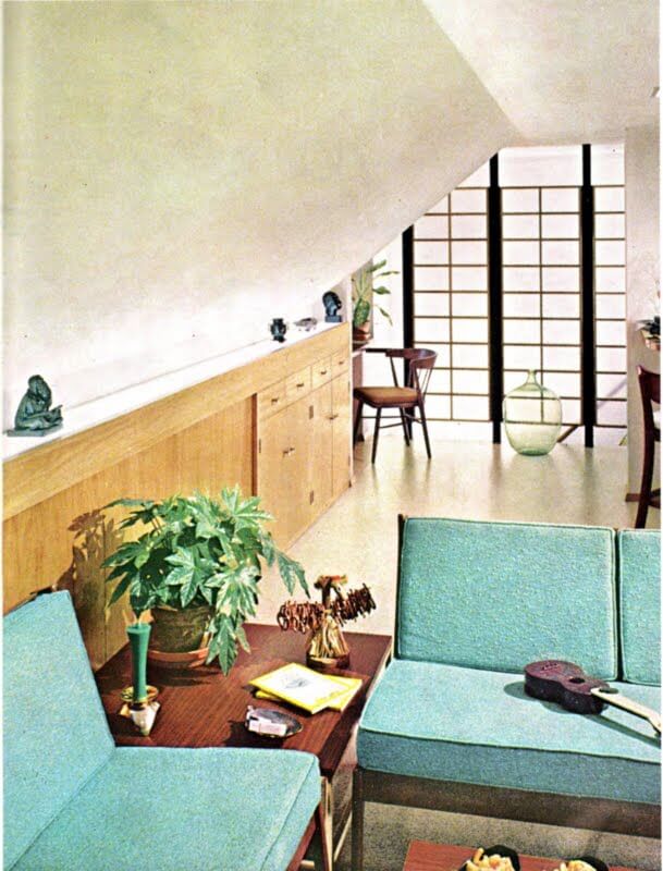
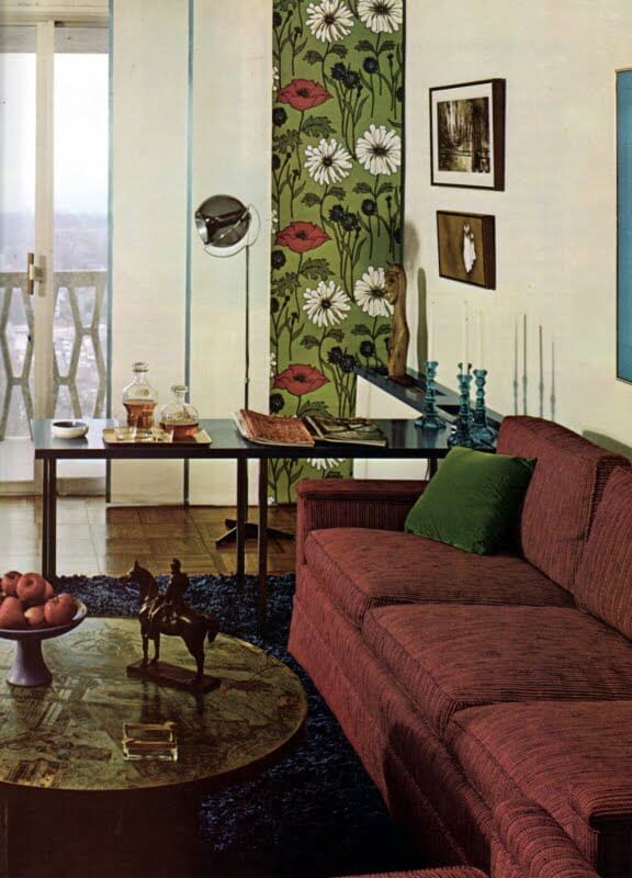
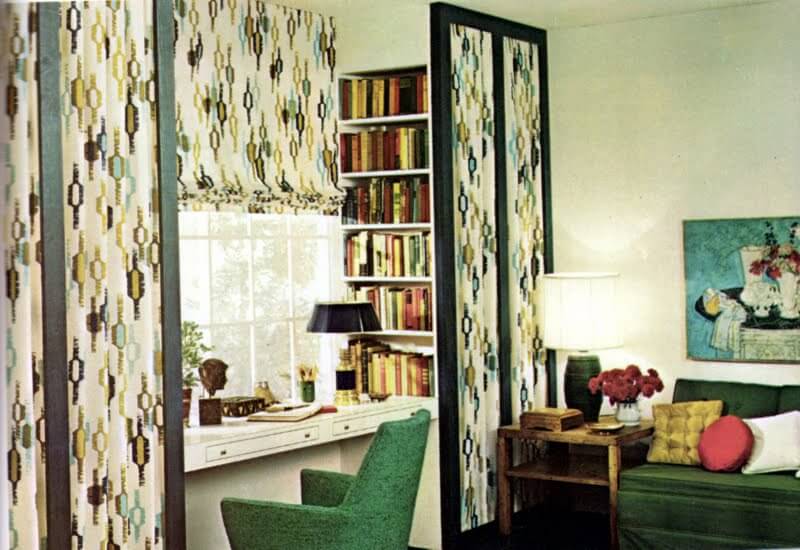
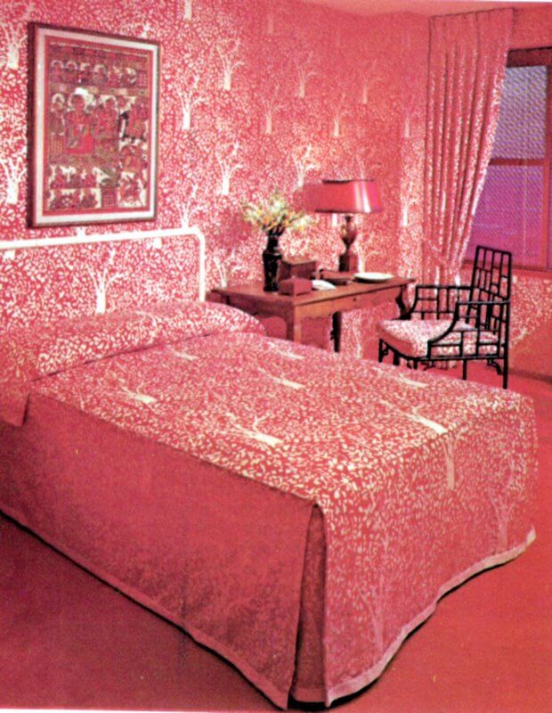
My dream kitchen
Posted on Tue, 17 Mar 2009 by KiM
This blog chronicles my entire kitchen renovation from start to finish. Greentea Design has provided me with their solid wood kitchen cabinets, and I’m taking care of the rest.
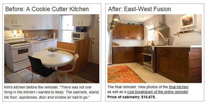
If you’d like to be brought up to date, check out my kitchen remodel blog for an archive of previous posts. I posted recently some before and after photos, and for this final post I’d like to share some photos I took for Greentea, the interview they have added to their website about my renovation, and a video tour of the kitchen.
My kitchen is complete, and I am ecstatic at the result. I can finally say that I have my dream kitchen. It is beyond my expectations, and every time I walk through my front door and see it, I can’t help but smile. I am never going to want to sell this house. I can’t imagine leaving this kitchen behind. I’d like to take this opportunity to again thank the folks at Greentea Design. They made this dream come true for me, and I am so grateful (and shocked) that they agreed to this partnership. It was alot of fun and hard work (on both our parts) and they were so patient and helpful throughout the whole process. I hope I can get in a trip to Toronto sometime soon so I can finally meet them and see their showroom. So thank you Greentea Design – you guys ROCK and I’m so proud to have a Greentea kitchen.
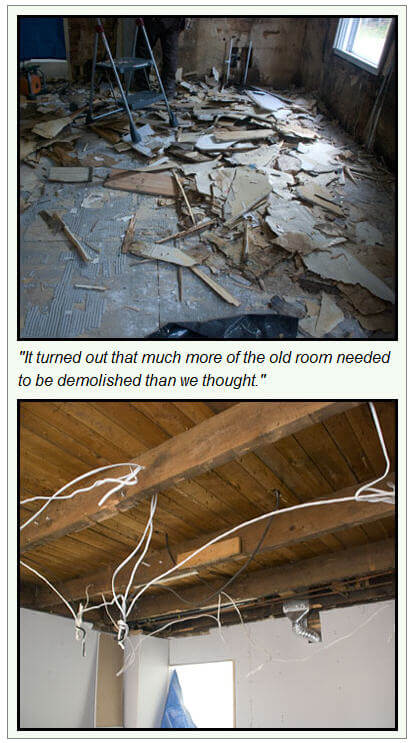
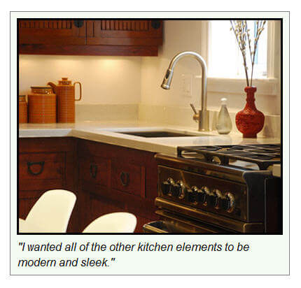
To start this post off, I wanted to invite you to check out the interview Greentea did with me that is now published on their website. They’ve divided it into 3 parts – Planning, Demolition and Installation, and the Finished Kitchen. What an honour to have my renovation featured on their main page. Here are some photos they’ve included in the interview.
I took some photos not too long ago for Greentea that really showcase the cabinetry so I thought I’d share some of them. (For the purpose of getting decent shots of the cabinets, the dining table and chairs were pushed into the living room).
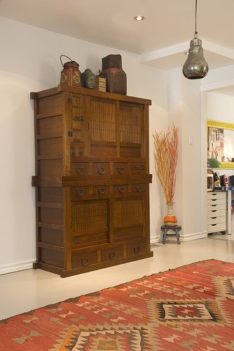
For more final photos, and to see my video tour (complete with cat shenanigans), click HERE.
WINKS
Posted on Sat, 14 Mar 2009 by midcenturyjo

WINKS – weekend links. Here we list what has come in during the week, things we’ve found and things we think you’ll want to see. If you’d like to see your blog or website featured email us and if we think it fits with our readers we’ll link you. So what’s in this week?
-
- I’m still totally hooked on anything Florence Broadhurst and would kill for one of these beautiful rugs from Australian handwoven rug specialists Cadrys. Bob & Mark Cadry will soon be bound for the USA to reveal their gorgeous Florence Broadhurst Collection, launching in both Los Angeles and New York. Four decades ago Florence and Cadry patriarch Jacques would chat about their love of textiles and rugs and now the family company “re-unites” them again. See more here.
-
- Wow! Love glass mosaics, love these fun examples from Trend. It’s their new Wallpaper Collection. And the colours!! Daffodil yellows, peony pinks, cornflower blues and meadow greens.
-
- Camilla Aspeli emailed, “My chair Drops showed at Stockholm furniture fair, made out of leftover textiles, inner tube and steel legs. Dusk poufs made of leftover textiles. Treat bowls. Recycled lampshade frames with colorful threads makes perfect bowls! Wild Camilla!
-
- Frou-Frou & Claude – luxury screen makers based in London. Not only beautiful upholstered screens but lovely staging on the website too.
-
- Brad and Ashley emailed to introduce their new Etsy store Vintage Renaissance for a quirky take on vintage finds. I know Kim LOVES their Vintage suitcase pet bed. Good luck guys!
- Today my little sister is getting married. Well commitment ceremony is what we have here. It’s a wonderful family day. But what do you buy two middle aged (OMG I’m older than her!) women who have too much of everything and have warned you that they want no presents? You give the present to someone who really needs it. I bought a couple of goats here and I’m sure you can find something similar in your home country. Congrats girls! We love you!
A chair revamped, and a dilemma
Posted on Fri, 13 Mar 2009 by KiM
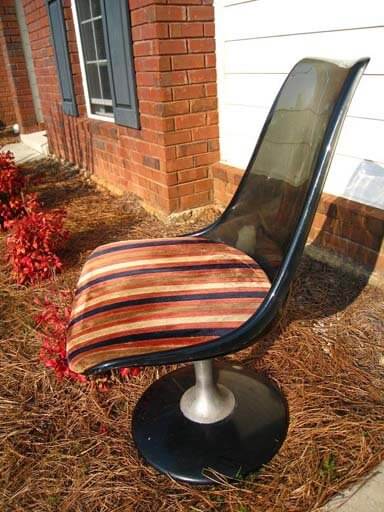
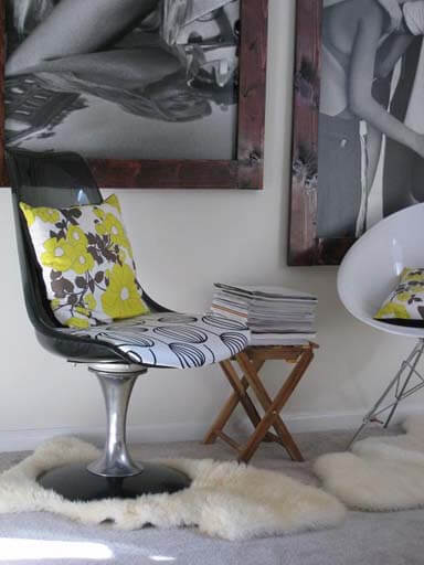
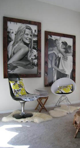
We received an email from Doreen that I HAD to share: I love everything mid-century modern and therefore, I thought I would share a recent find with you. I went to a local antique/thrift store last weekend. I had been hoping to find a mid-century modern chair one day here in Columbus, GA. Never thought, I would! My luck was about to change this time! I went in and could not believe that they had a Chromcraft chair for sale that was in good condition. Now comes the best – the price tag! It was priced for $38 and I ended up getting it for $30!!! Can you believe it! As soon as I bought it, I went home and cleaned up the whole chair and polished the chrome base. Even though I kind of liked the retro cushion cover it came with – it was dirty and it did not really fit in with my decor. Therefore, I re-upholstered it with a black and white fabric that I had gotten from IKEA. I took before and after pictures that I am going to attach to this mail. I paired the chair with another recent find. The white chair I bought new and I love the look of both chairs together. The two black and white pictures you see on the wall behind the chairs are old Abercrombie & Fitch boards and I just made the frames myself.
She did such an amazing job on the chair, and her vignette is fantastic! Love the huge framed ads and the frames are perfect. Kudos to you Doreen!!
We also received an email from Jen who is looking for some advice on her living room: I am hoping you and your readers can inspire me. I am having a mental block regarding what colors to interject in the attached room (paint/trim, window coverings, accessories). I have searched through endless blogs, magazines, etc, and I am having a real hard time. We are keeping the furniture (minus the speakers/lamp/entertainment center). We are adding in the loop media center/file hutch from crate and barrel. Our style is organic modern and we want this room to feel warm and cozy.
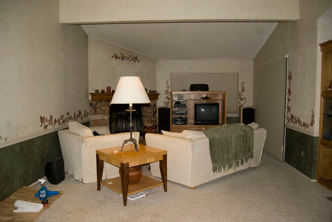
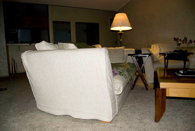
For more information check this post she published on her blog. She has removed the wallpaper (YAY!) and is thinking about bright white trim, dark warm gray below the chair rail, and light warm gray above the chair rail. I was thinking more brown tones as opposed to grey (and I always lean towards grey) because of the fireplace colour, but if the carpet is grey, then I would go with a grey with alot of brown in it (and I’m seeing orange accents, mixed with maybe some acid green). I would keep the colour below the chair rail only slightly darker than above, because it just emphasizes the narrowness of the space. It sounds like Jen is putting her new entertainment stand where the existing one is, which I’m not loving. I would put it to the left of the fireplace, and maybe have the couch to the left of it facing the far window, and chair in front of the patio doors, angled towards the couch. Narrow rooms are very tough to organize as I know very well having lived in a couple narrow houses. So if anyone has any suggestions please leave a comment for Jen!
All there in black and white
Posted on Fri, 13 Mar 2009 by midcenturyjo
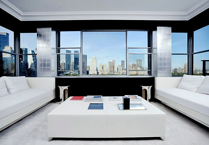
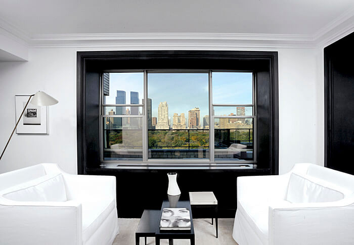
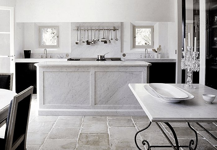
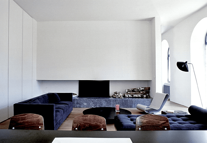
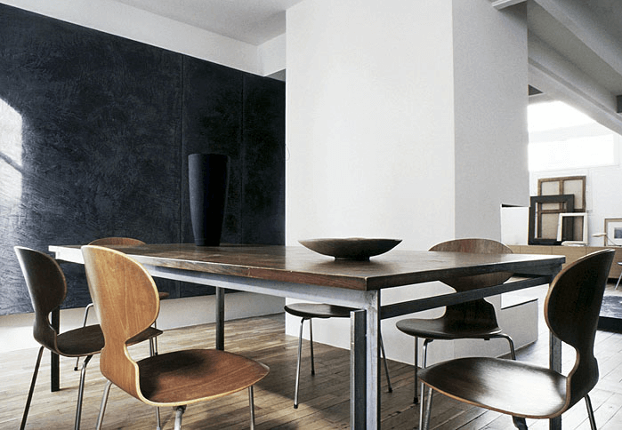
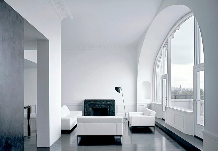
A limited palette but maximum appeal. Stark modern interiors by Paris architectural firm Joseph Dirand. Oh the luxury of pure minimalism. Imagine having a sleek and often hidden home for the “things” of everyday life. Clean lines may be cold to some but heaven to others. And just a hint of aged timber to warm the heart!
