Shareen Joel encore
Posted on Thu, 10 Nov 2011 by midcenturyjo
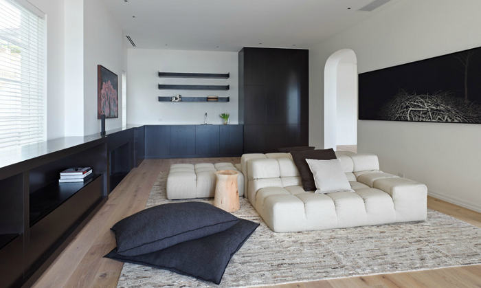
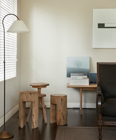
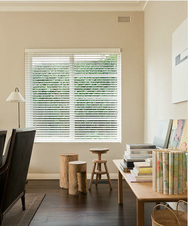
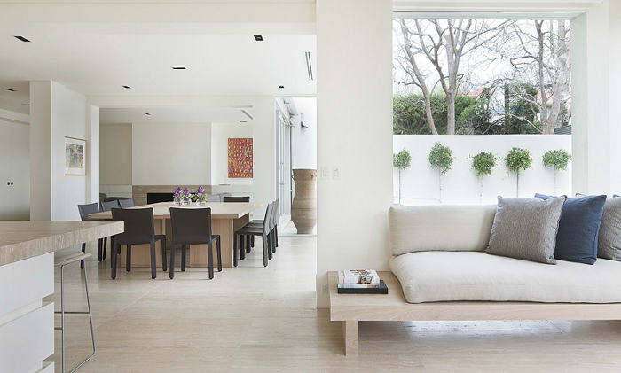
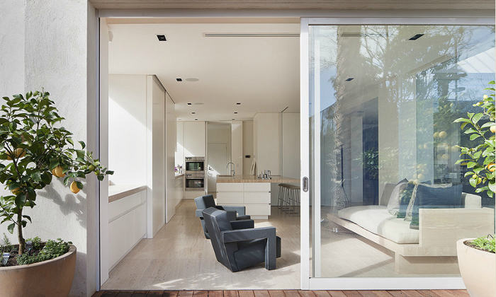
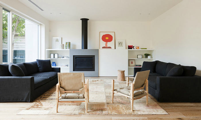
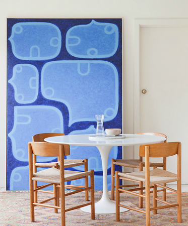
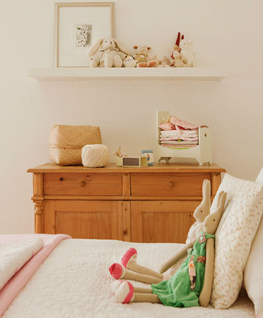
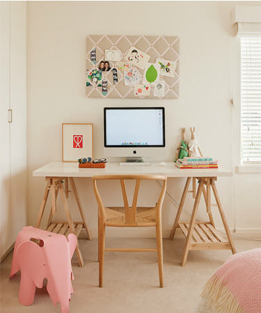
It’s still about simplicity, balance, elegance and proportion. The spaces are still clean and crisp. Form still follows function, the modern minimalist feel continues. So what is different from the last time I featured Shareen Joel‘s work? An expanded portfolio and lots more lovely pictures on her website that’s what. Wonderful work.





J E N E E N + N I C O L E says:
I love it!! Simple & Chic!!
polish chick says:
good potential, but i'd say something's missing. it's like a pasta dish with not enough garlic or salt: a little bland.
Sammy says:
I like the designs and spacious feel that you've created here
selina says:
nice lines, clean pictures but doesn't get my juices going if I was honest
Gwyn says:
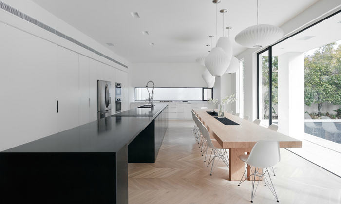
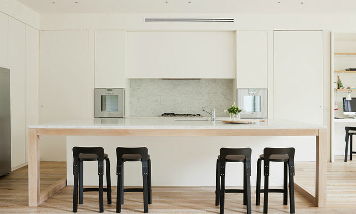
I love these too but I've always been a bit of a minimalist. The kitchens are just perfect.
Alice says:
Such beautiful interiors by SJD. Thoughtful and considered design throughout every space and detail.
christa says:
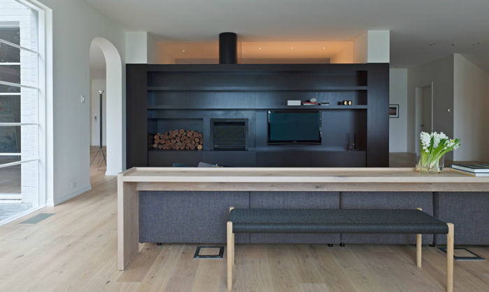
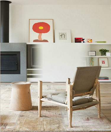
Hey, what's up with the PhotoShop error on #12 down? It looks like in 11 and 12, the tv was removed (well, not entirely on 12).
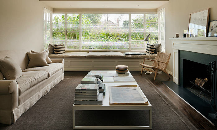
I like the rooms with more contrast, the ones that are sort of beige on beige are not doing it for me – they need more pop, or more stark. Too middle.
f says:
LOVE the flowing horizontal lines!!!
Bfordesign says:
I really love Tufty Time sofa of Patricia Urquiola and the group of lamps from the dinning.
Caroline says:
Photoshop error = sliding door to hide the ugly tv..
I like most of these spaces, just imagine the rooms with people, light and life. 🙂