Cube House
Posted on Tue, 4 Jun 2013 by KiM
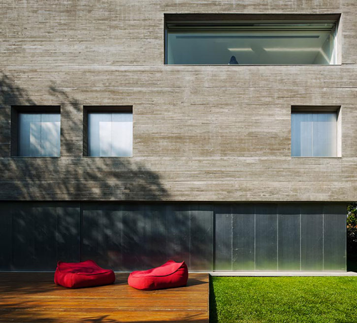
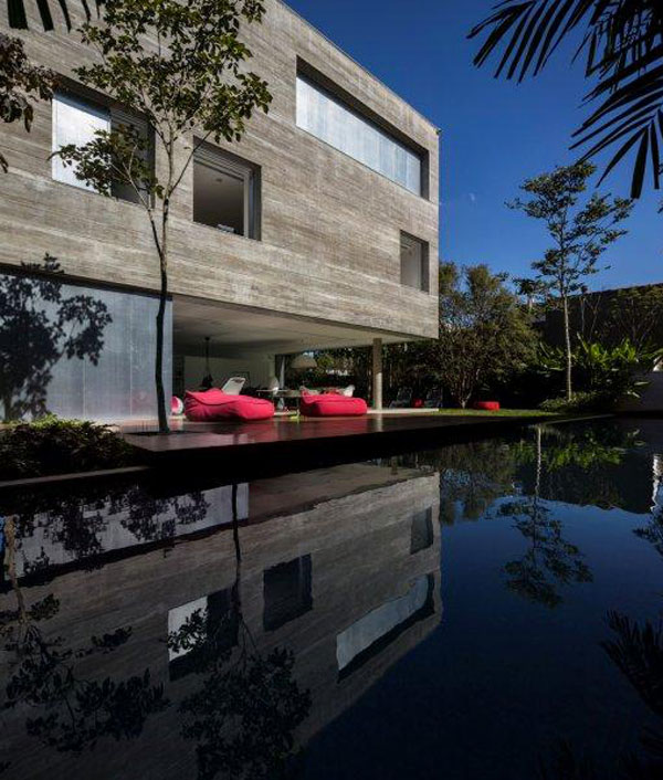
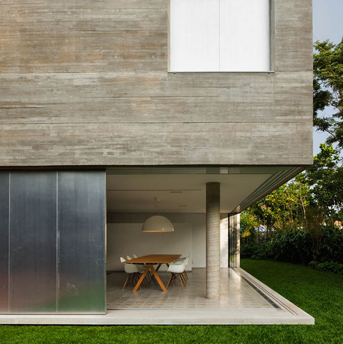
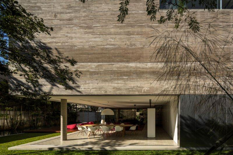
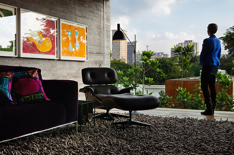
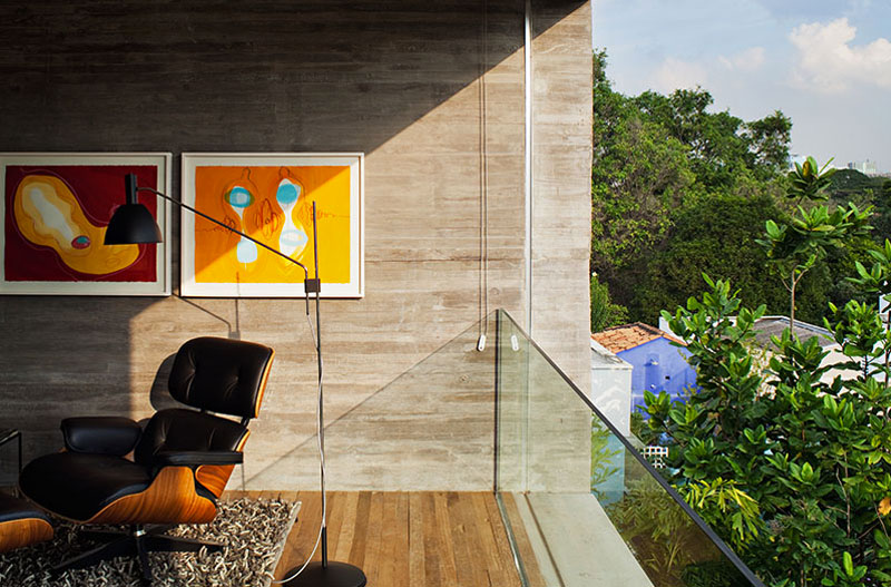
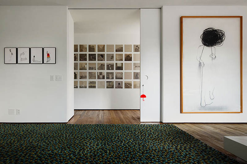
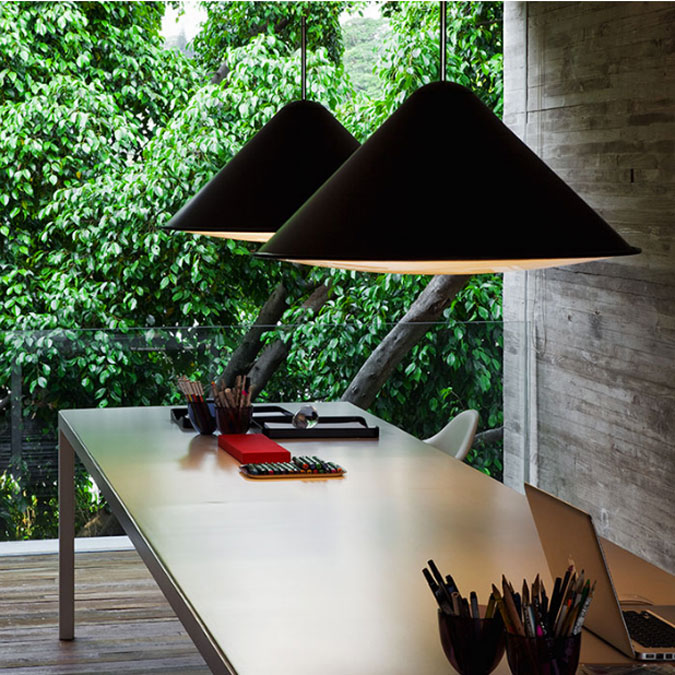
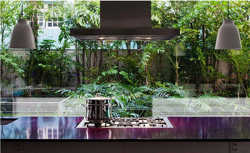
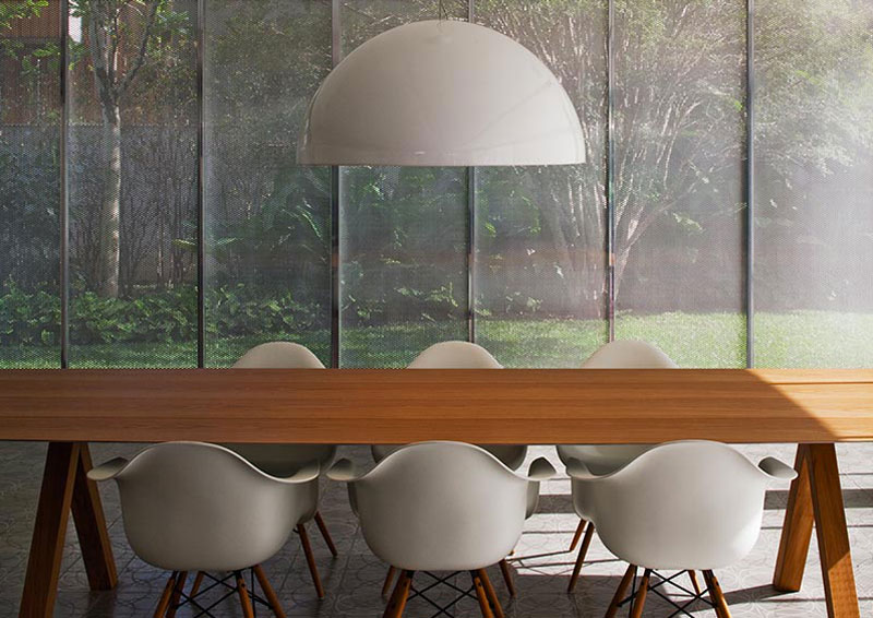
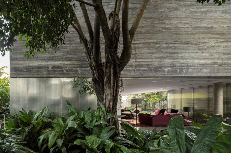
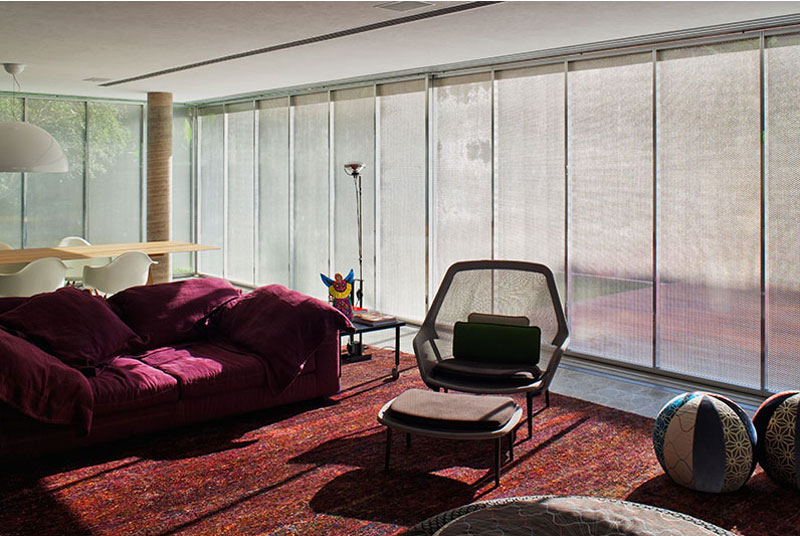
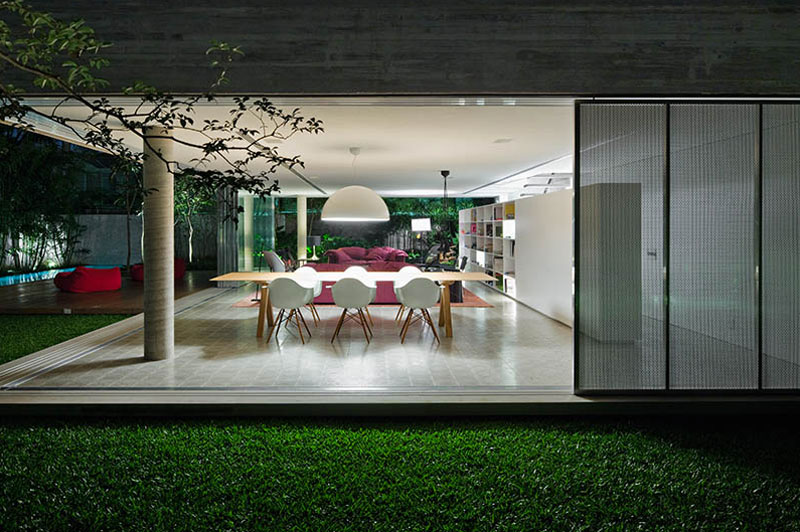
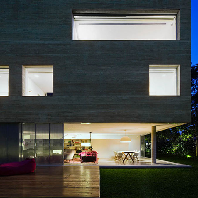
Sometimes less is more. In this case it’s not less house, but less detail. This is the Cube House by Marcio Kogan of StudioMK27. Amidst the lush grennery at the edge of the city sits this cube, and it needs no more. Indoor/outdoor living to take advantage of the views, the pool, the property. Less is definitively more. (P.S. More projects by StudioMK27 here and here)
Leave a Reply to Ruth Cancel reply


Goldsteins says:
What stunning modernity! I especially love the contemporary pieces that are smaller but impactful—like the pendant lights and the white chairs, which provide a great contrast against the wood table. What material is that brown column in the room with the purple couch?
Ruth says:
It really reminds me of what architecture schools look like…the one's I have visited in the U.S.. I asked my husband why the schools are so minimal with no built in "beauty", just a big block of concrete. He said because the students shouldn't feel influenced by the design of their surroundings while they develop their talents. I think Studio MK27 felt nostalgic for those good ol' student days!