There’s no place like Laplace
Posted on Sat, 20 Jul 2013 by midcenturyjo
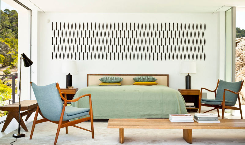
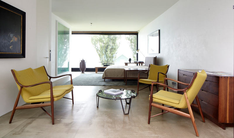
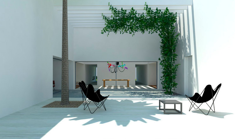
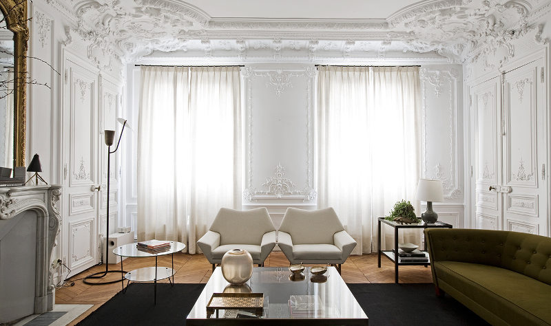
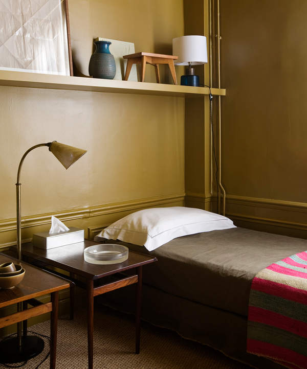
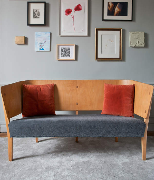
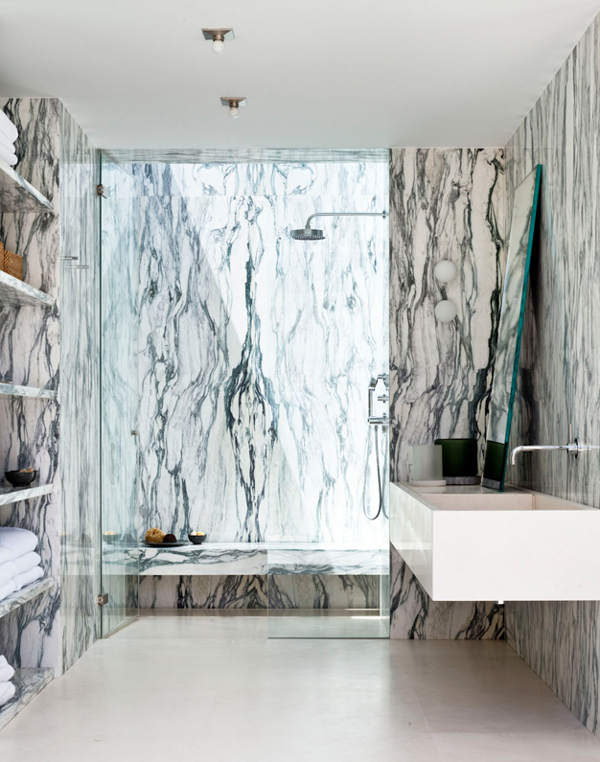
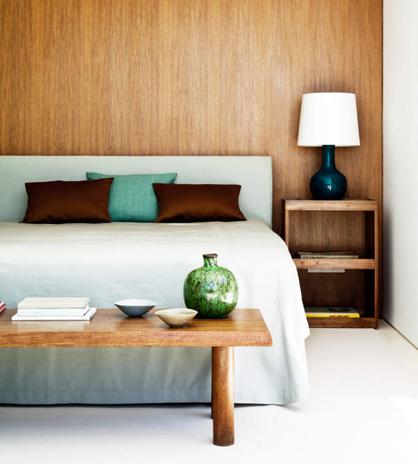
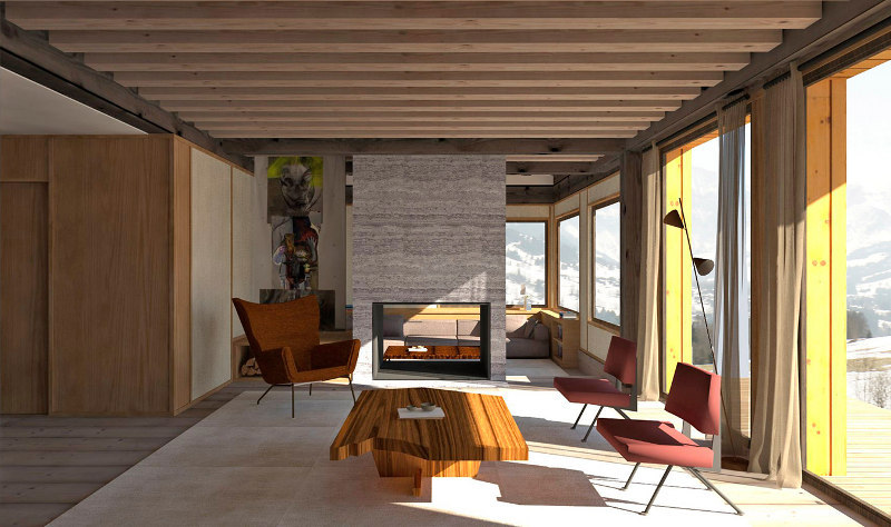
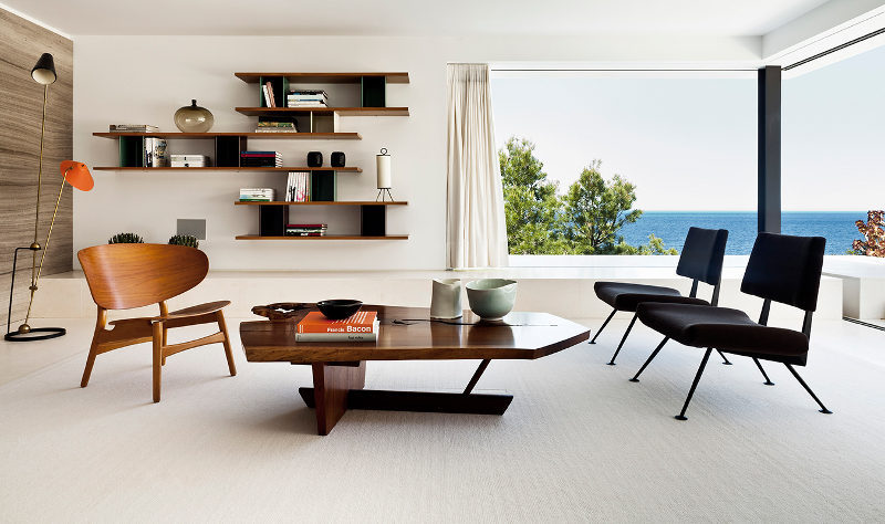
Sorry for the pun. I couldn’t resist. Just like I can’t resist these interiors designed by Luis Laplace and his team. Modern, international, artful and art filled, successful and beautiful. Paris based Laplace& Co.


Deb says:
I agree, Pauline. It actually made me catch my breath…
Bucky says:
Well, a first, I think. I saved every photo. Masterwork. Thanks again , girls 🙂
oh holland says:
Ooooh la la, Laplace! Coveting every chair and sofa.
The piece de resistance is the second photo: that tall architectural wedding cake dotted with clean MCM furniture is nonpareil.
Patty says:
In love with the second photo, and the bath photo. Absolutely love!
Thanks, Patty
AlexP. says:
amazing post! thanks! loved each photo.
Cassie says:
Wow, LOVE
amyharriet says:
Love the simple elegant design!
oregonbird says:
There's a certain James Dean-ishness going on, isn't there? The sense of the pre-blockbuster era come to life, before excess became the norm. Italy and a touch of Spanish-down-the-hall in an easy SoCal mix, but nothing permanent, nothing planned. Hotel life has been left behind, but the simplicity of non-ownership, as a motif, still hasn't been thrown aside. Very 60's Hollywood. That mustard bedroom is just… filmatic. The colors and clean lines of the first picture hum 'The Man From U.N.C.L.E.' 🙂 The huge spaces that sprawl, that lift up into the light and the air, are left to their own devices, rather than filled in pointlessly. No overstuffed anything! Spare and unpretentious, dynamic lines and relationships, almost old fashioned; classic sensitive masculinity.
This is work that gives space some respect. Bonus points for taking that sensibility into more ornate territory without losing control. I see everyone else likes those more european images best — the rise to the challenge is masterful, sure, but there's just something so unbearably sexy about the simple approach.
Penny says:
Goodness gracious – I think I just felt my heart skip a beat!!!
That second image – the detail, the space, the beauty of it all…..breathtaking images…
D.C. says:
What area or address is the second image place from?