Little white box
Posted on Tue, 4 Mar 2014 by midcenturyjo
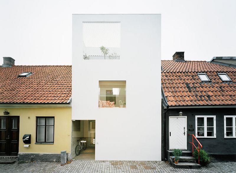
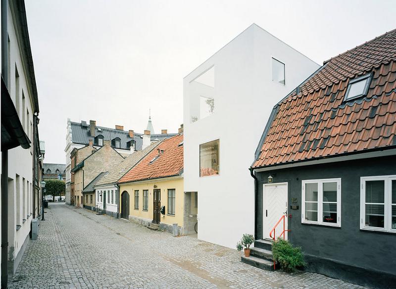
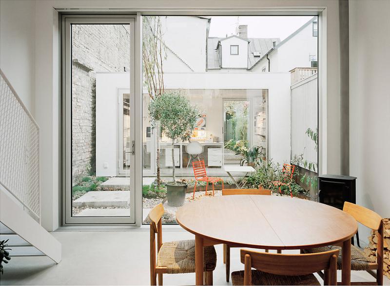
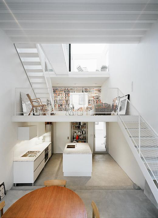
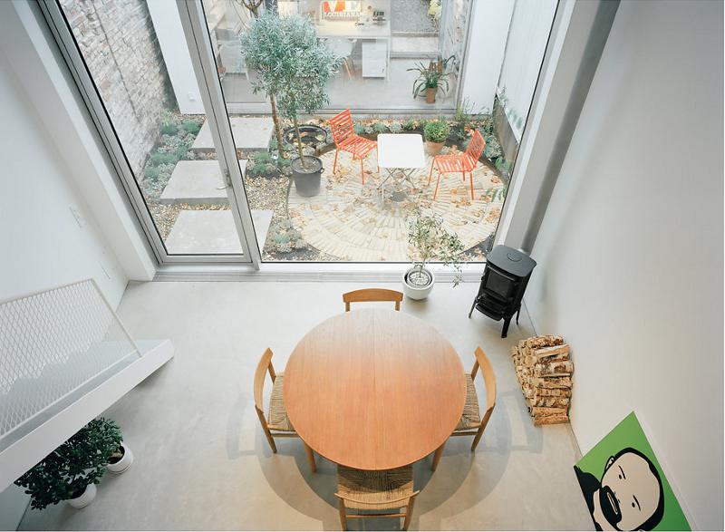
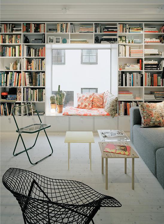
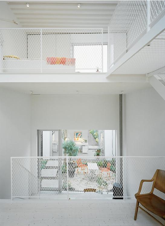
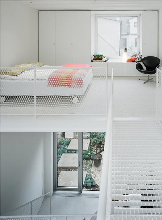
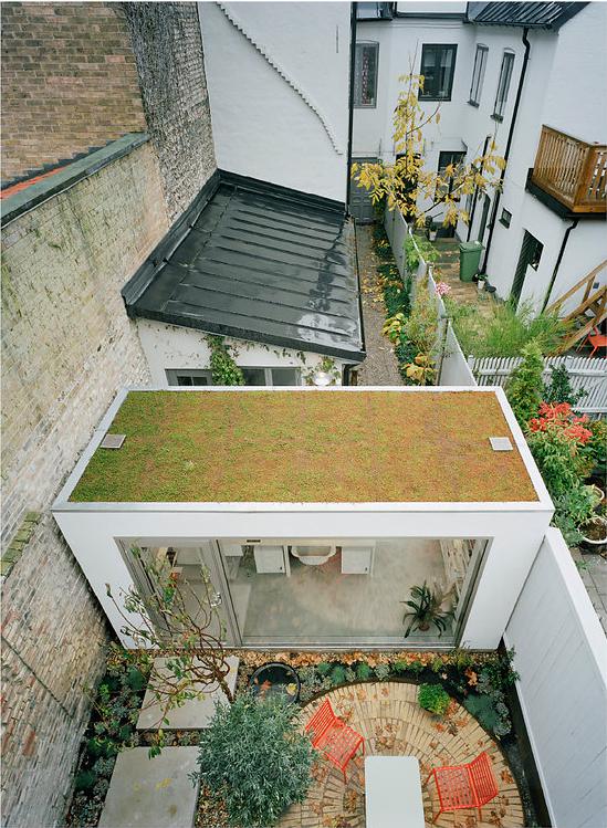
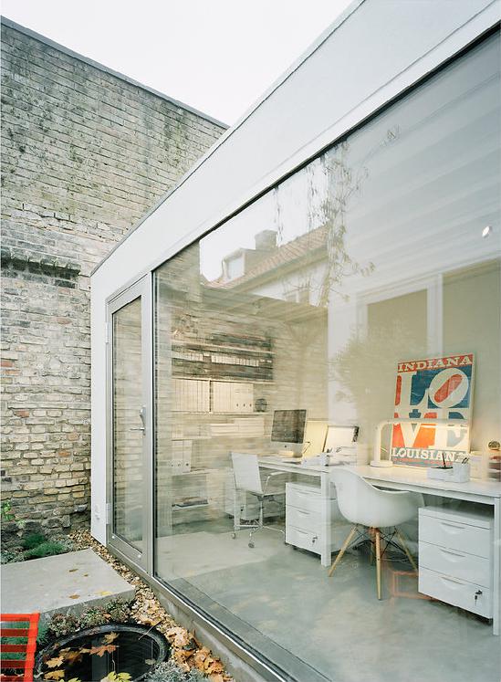
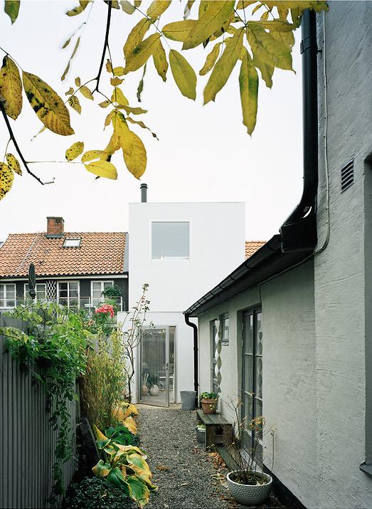
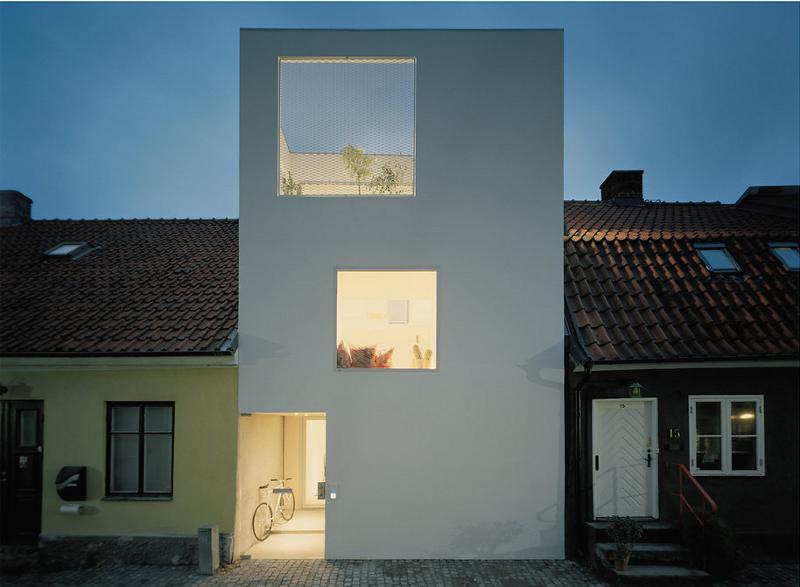
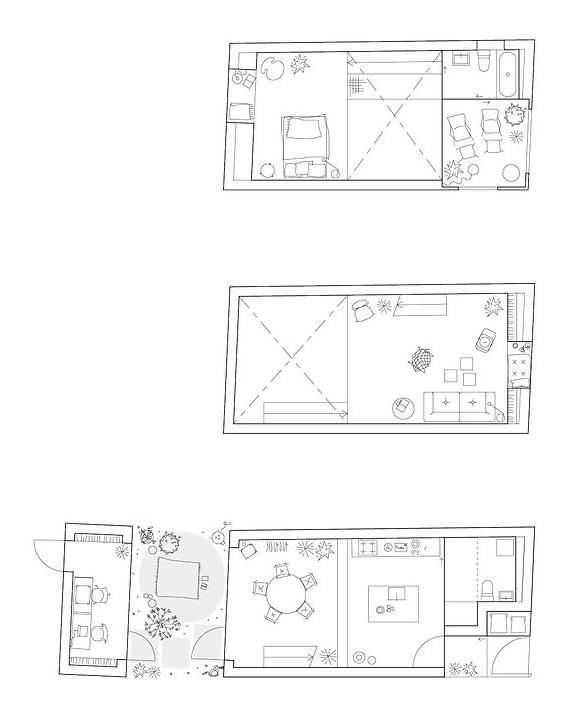
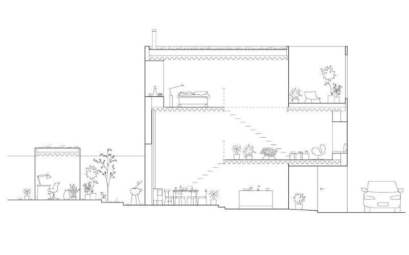
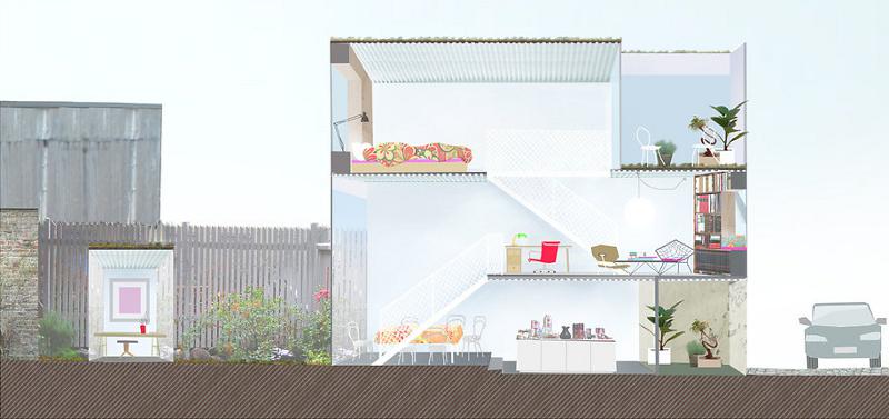
“Townhouse in Landskrona. The narrow site is sandwiched between very old neighboring buildings. Three thin slabs are projected into the open volume, softly dividing its functions. The continuous interior space is opening up to the street, to an intimate garden, and to the sky.”
A stylish white box takes root like a weed in a city sidewalk crack, grows towards the sun and shows that it is a beautiful flower. Clever urban infill design by Swedish architectural firm Elding Oscarson.

Leave a Reply to Elin Sejderuna Cancel reply


Inny Dhla says:
What must the neighbors think? They moved into a charming, historic, traditional little cobblestone street… They must be thinking they should have bought the empty lot!
Geez, this blog has really made me realize that inspire of my liberal politics I am such a design conservative! LOL
Ruth says:
This is exactly what I love about Europeans. They don't enshrine their history as if people's quality of life is less important than some old notion of home dwelling.
h says:
I want to move in! Just the right size, style, layout, everything.
Jim Hane says:
It's another all about me and no concern about community. I am a strong supporter of zoning!
AT says:
It is beautiful, but I'd really like to know about what your neighbors think. The house stands out a lot.
Rebecca says:
The inside looks beautiful, really tranquil, but it's a real eyesore from the outside on that lovely old street! Completely amazed that that facade was given the go-ahead.
Chris says:
While the concept itself is rather interesting, looking at the design its inefficient and there is a multitude of wasted space in the entire design. There is so much more room for additional square footage of outdoor green space and indoor floor space. I would consider this particular prooject a failure in that it dows not maximize upon its full potential and in all honesty leaves me wanting, not fulfilled when I look at the picures and the design. It does not fit with the theme of the neighbourhood, its just poorly planned, in the wrong setting and far to "cold" in appearance. A home needs to be functional, inviting, full of warmth and personality. This is nothing of that kind of thing. Very disappointing results and certainly not anywhere near worth publishing.
Elin Sejderuna says:
This house is a migraine inducing eyesore!
It should not belong in between two classic and cosy houses, it fouls the view of the street something aweful.
If I took a picture of that street, I would make sure to NOT get that white cinderblock in the motif.
It could be stylish IF it was situated together with similar buildings, maybe in a grey to black scale, all similar but each a little different, but among these houses, it looks awful, and takes it's place on my list of fugly buildings that should not be allowed anywhere near classic nineteeth century architecture.
My list so far: (If you want to see these grotesque buildings, go get a bucket, a roll of toilet paper and freshly scented wetwipes, sit back, copy and paste the link text into your browser and feel free to vomit.)
The Kristianstad municipal building
Before the defiling: http://www.buf.kristianstad.se/Sarvux/images/radhuset.jpg
…and after: http://sm-cdn.gotamedia.se/kb/09b82b15df95853bcde52f1579496a5b/704/396/archive/01116/BNIr-dhuset4_jpg_1116155a.jpg
The Galleria Boulevard (also in Kristianstad, the town where I live)
Street opposite the abomination:
https://www.google.se/maps/@56.029203,14.159213,3a,75y,314.52h,85.58t/data=!3m4!1e1!3m2!1seGb3d5gy22KPggqFP8bUvA!2e0
The abomination (Galleria Boulevard)
http://media.urbantlokalt.se/2013/10/DSCF0220.jpg
The Louvre glass pyramid. No picture needed. Urgh.
Business Ratings LLC says:
The one eyed house in the hood.
Good one.!
hayley says:
looks awful next to those lovely older buildings, a scar on the face of that town