Displaying posts from November, 2014
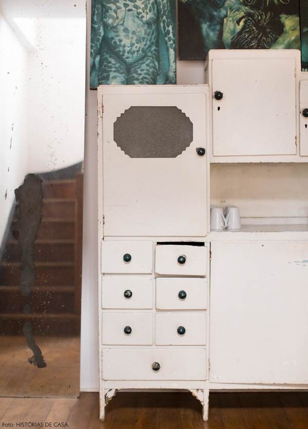
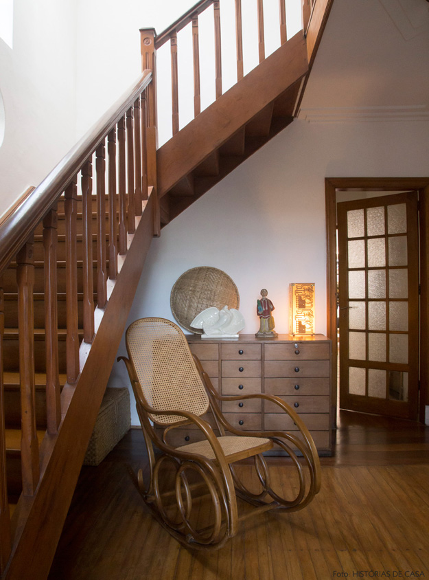
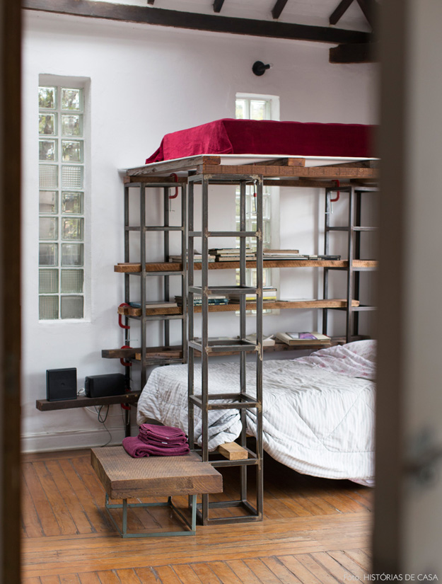
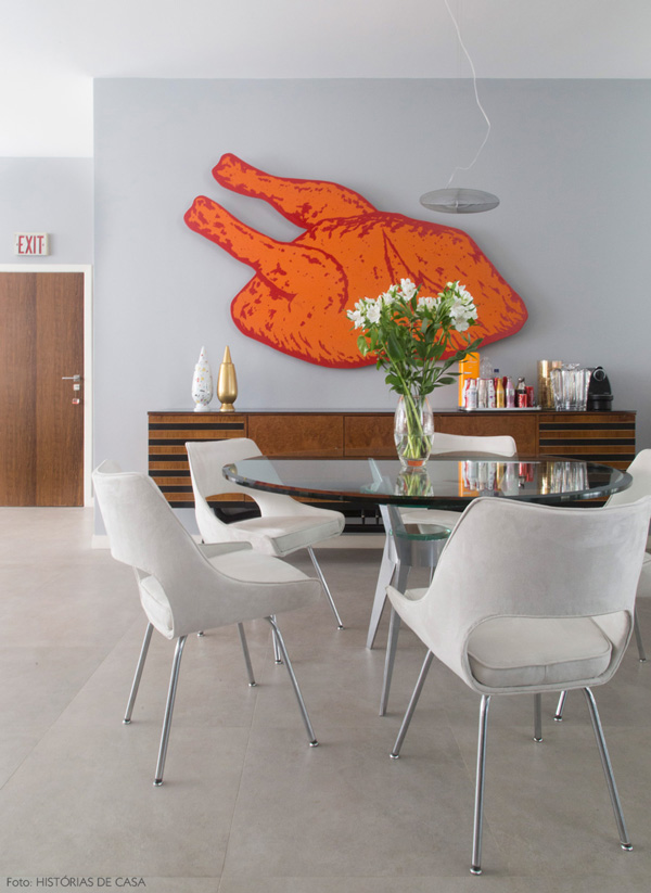
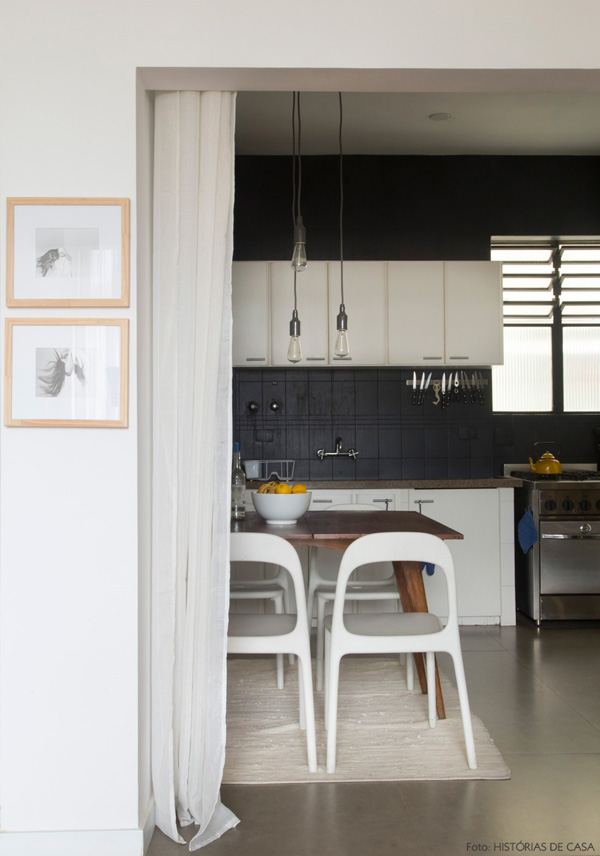
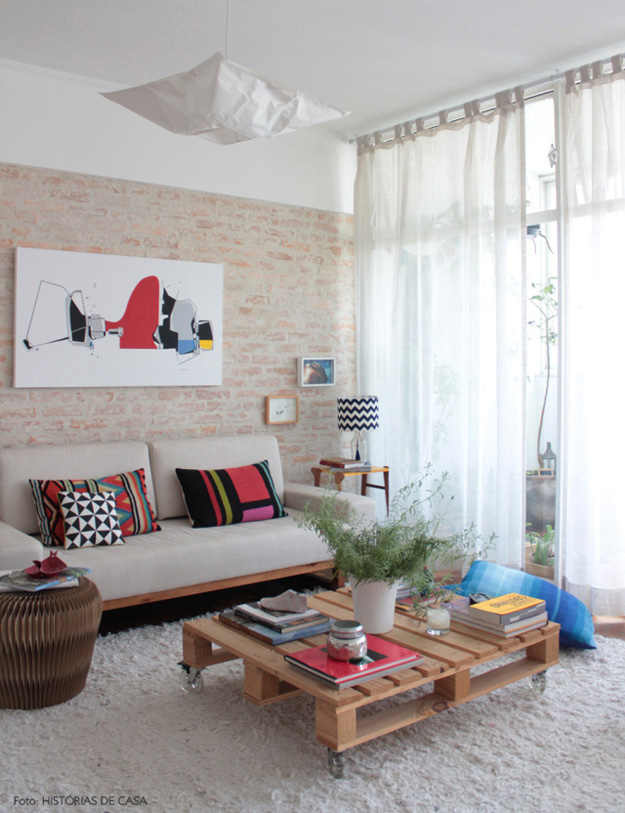
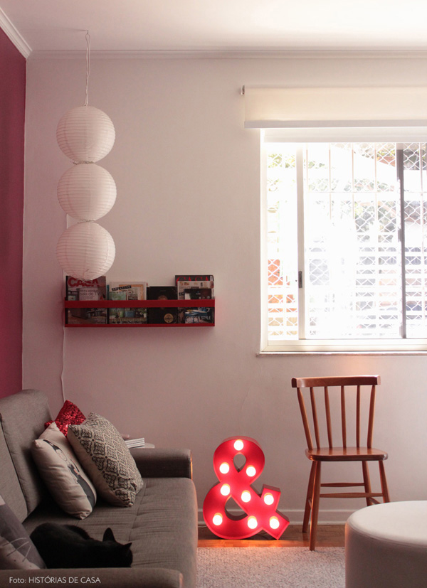
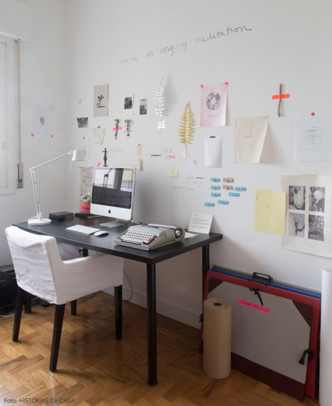
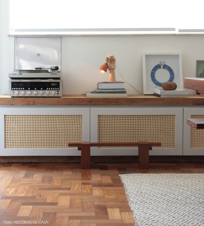
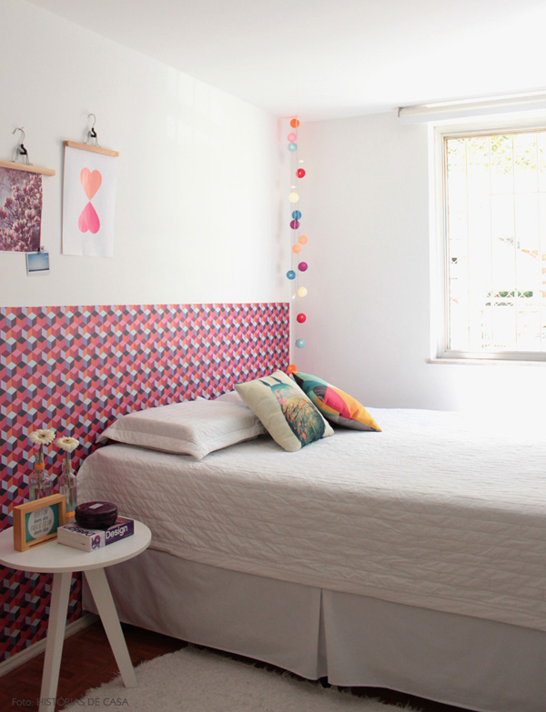
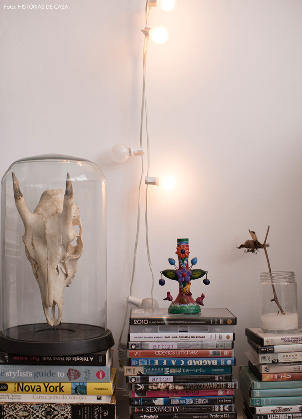
Histórias de Casa
Posted on Fri, 14 Nov 2014 by KiM
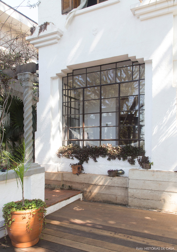
Bruna Lourenço and Paula Passini are interior designers from Brazi who wrote us the other day to share their latest venture – a blog that showcases ‘real’ homes in their city of Sao Paulo. It is called Histórias de Casa. These types of blogs seem to be gaining popularity, which is awesome because I always love seeing how people actually live in their homes, that aren’t all done up and styled to the hilt for a magazine. Another blog to bookmark. 🙂 Thank you Bruna and Paula!
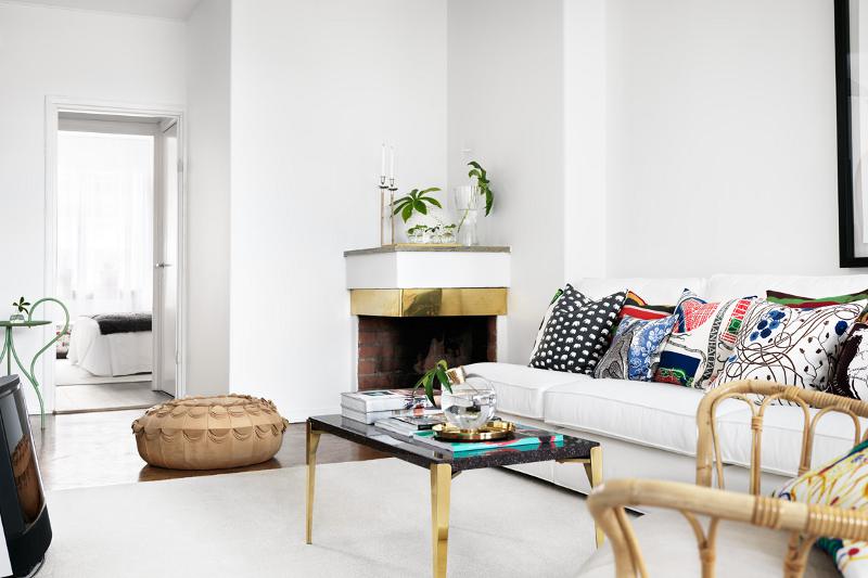
One apartment three ways
Posted on Fri, 14 Nov 2014 by midcenturyjo
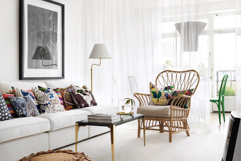
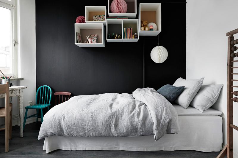
One report, three interior stylists, one apartment, three ways. When Sweden’s leading real estate brokerage firm Fastighetsbyrån wanted to know what effect styling a home for sale had on the price and how fast it sold they enlisted the aid of design psychologist Sally Augustin. Her report shows that home styling works if done correctly. The buyer must connect consciously and unconsciously with the home. They need to imagine themselves living there, moving right in, daydreaming and scheming how to get it. OK we all say. Fair enough. Nothing new there. That could have been the end of Fastighetsbyrån‘s research but… they decided to take it one step further. They took one apartment and let three stylists, Mikael Beckman, Hans Blomquist and Tina Hellberg, mess with our minds and our hearts and make it into their version of our dream home. They put the research in practice. So now there is one apartment three ways and I have one big problem. I can’t make up my mind which one I am moving into. They are all tugging at my heart strings.
First is classic modern by Mikael Beckman.
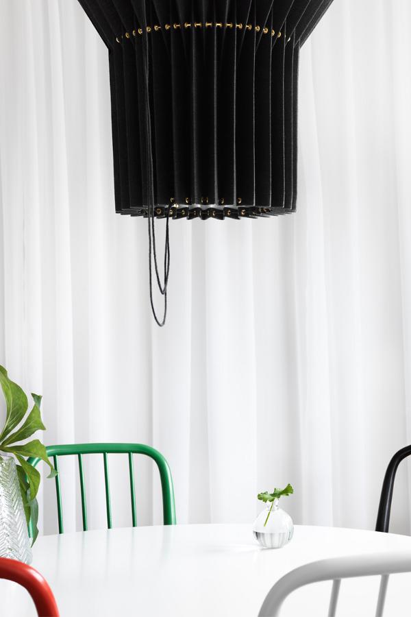
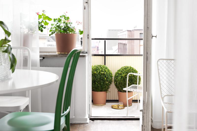

Now Hans Blomquist‘s city bohemian version.
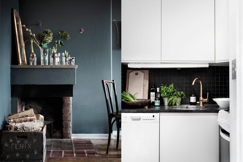
Finally Tina Hellberg‘s modern minialism.
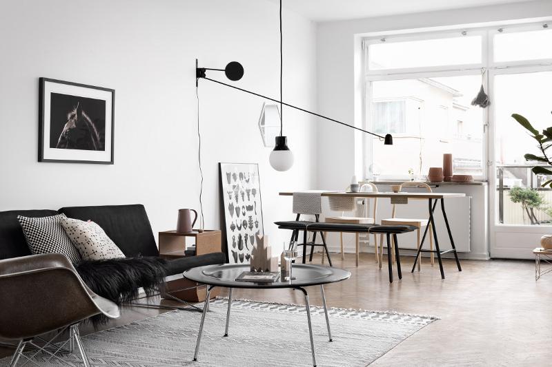
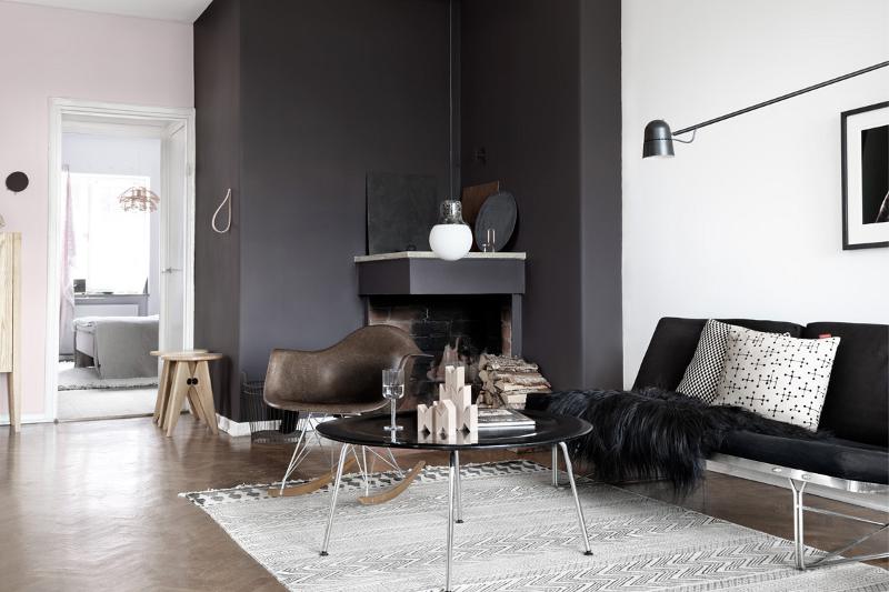
If you pop over to the listing there is a handy way to scroll from space to exact space in the apartment to compare the styles. Photos by Marcus Lawett.
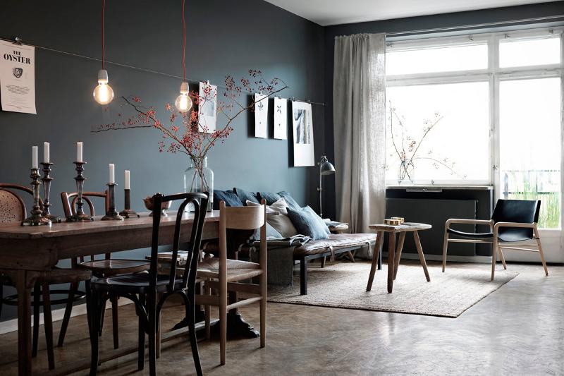
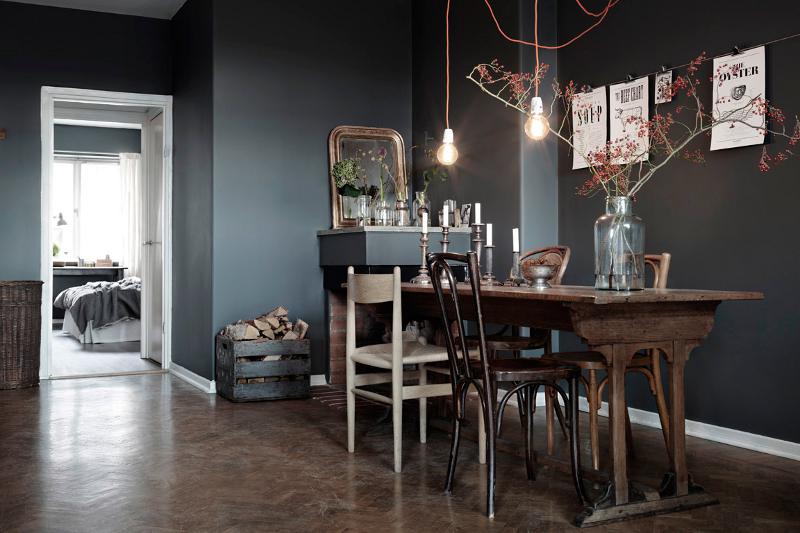
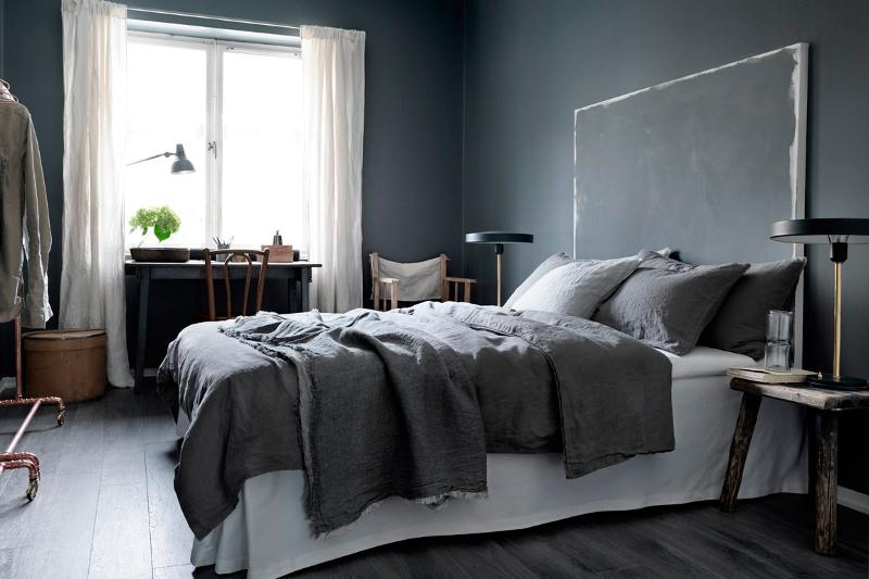
My newly painted living room – part 2
Posted on Thu, 13 Nov 2014 by KiM
So here is part 2 of my living room paint makeover. I think I should begin with a before photo. 🙂
And by the miracle of paint, Farrow and Ball‘s downpipe and plummett in this case, VOILA!
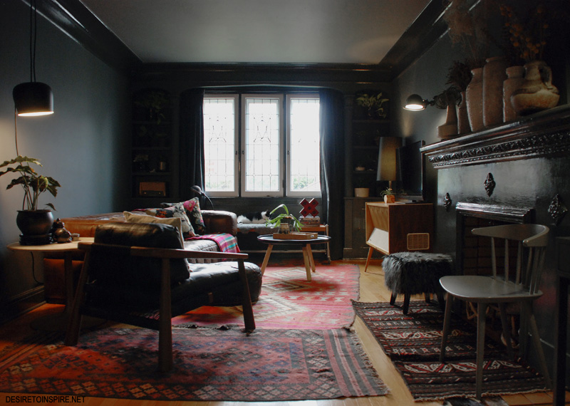
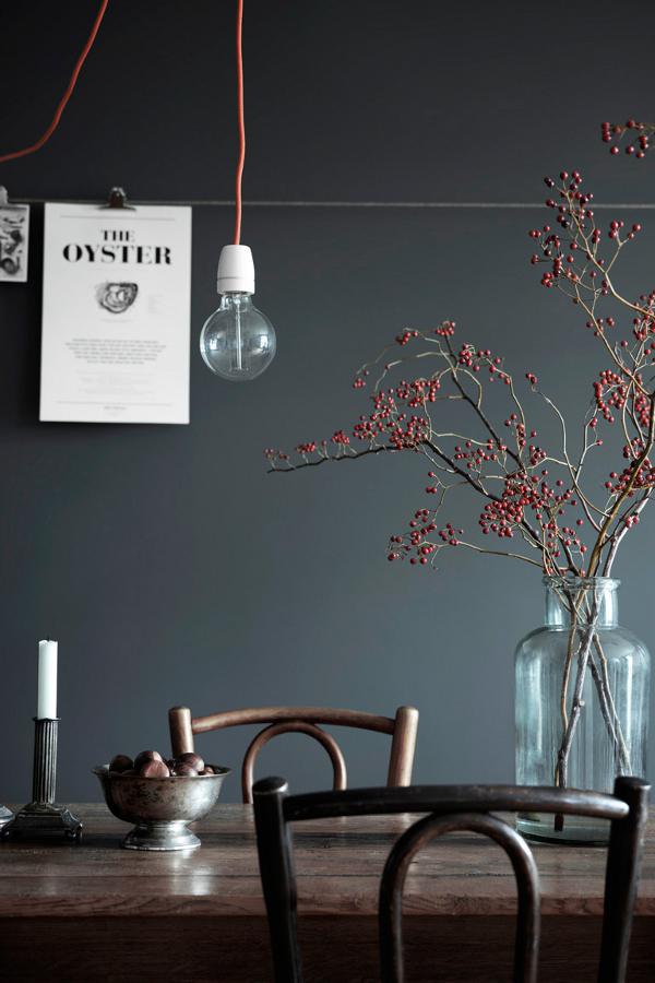
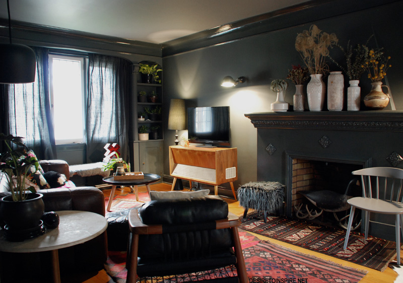
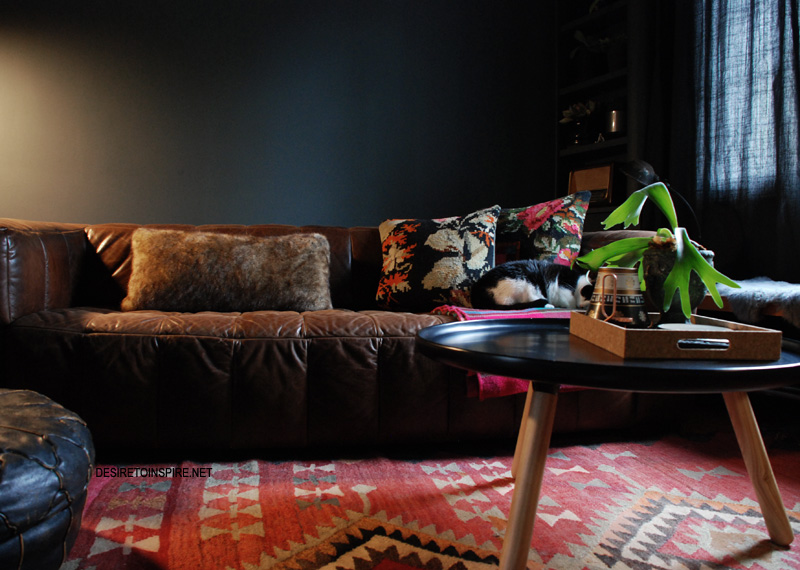
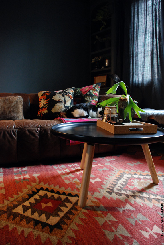
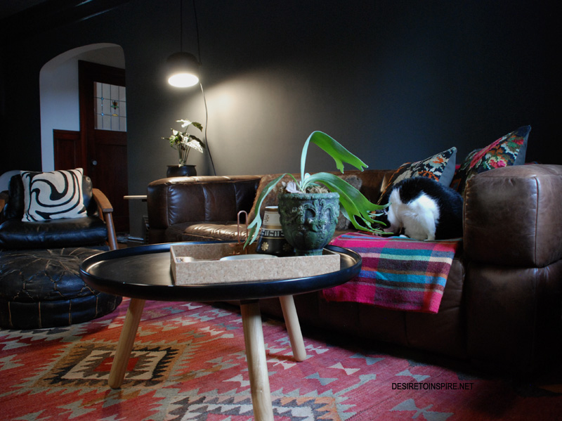
And here is the rest of my living room. It is truly amazing how cozy dark walls like this can be.
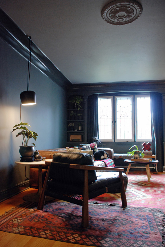
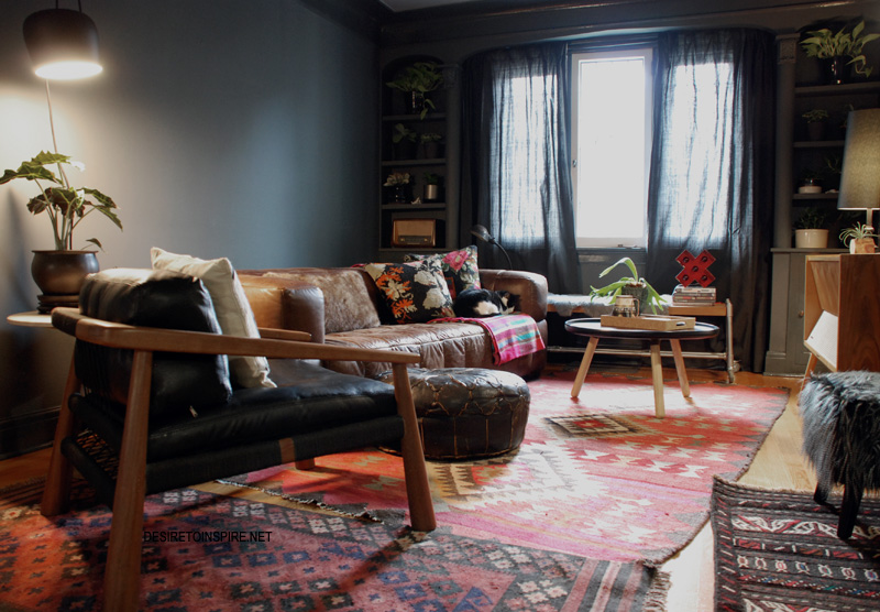
Rugs: Ottawa Antique Market and Third World Bazaar Leather chair: Green Light Shop Sofa: Phillip Van Leeuwen Coffee table: Normann Copenhagen Tablo table via Greyhorne
A side note: there are 9 light sources in this room. And it is still fairly dark at night when they are all on. I LOVE IT!
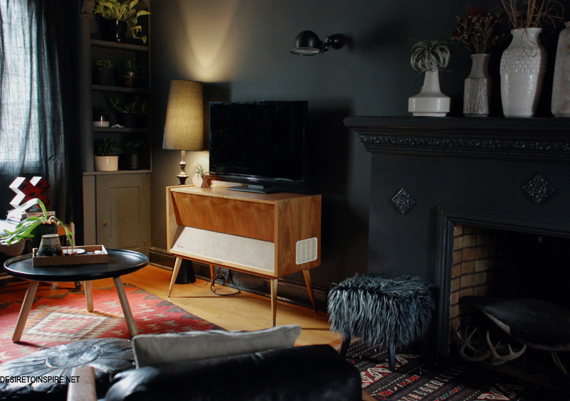
Black lamp: Homesense TV stand: Ottawa Antique Show Air plant holder: na coille Studio Vase: The White Monkey
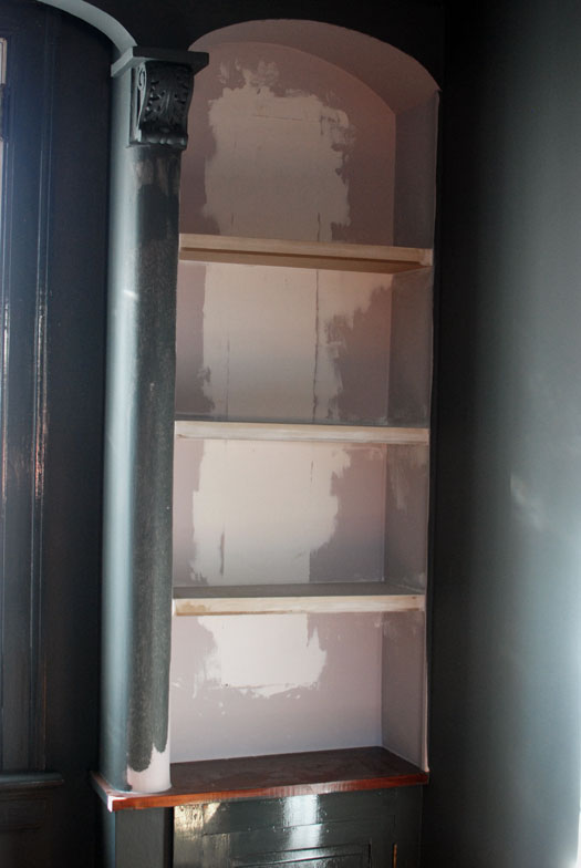
Here is a mid-paint shot of what was happening on either side of the window. If you look closely in the first photo you’ll see there were mirrors inset into these nooks, with little curved glass shelves. GROSS. My husband took out the mirrors and patched the crap out of the remaining gap, and built floating shelves across. I used to hate these columns but now I think they look pretty sweet.
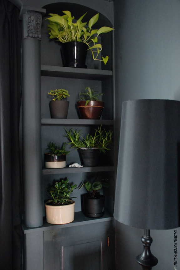
I bought a bunch of plants to fill the shelves in the hopes they would distract from the columns when they grow big and beautiful. Now I don’t really care if they distract or not.
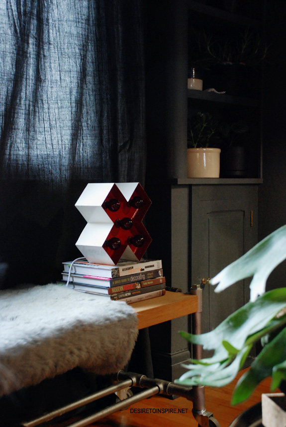
Love this cross light I bought from Scott of Gaslight Electric at the Etsy: Made in Canada show.
Pillows: Ikea and Homesense Staghorn fern: Sparrow Floral Design
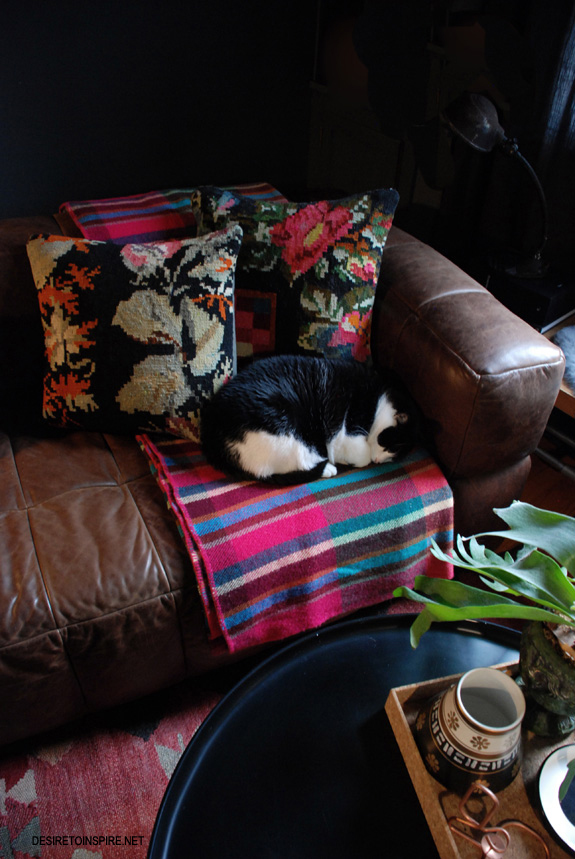
Blanket under Lucky: an antique shop in Prince Edward Island
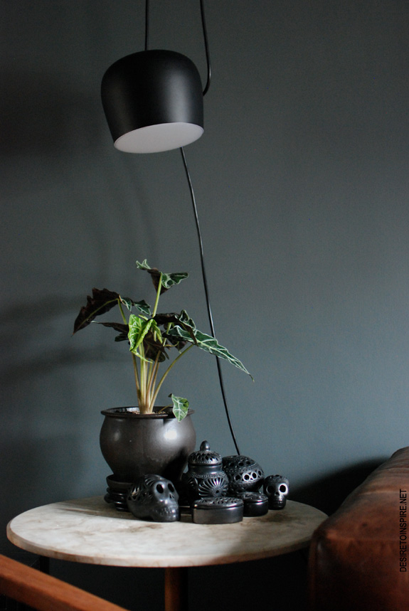
Flos Aim light, and Oaxacan pottery I picked up on a few trips to Puerto Vallarta, on top of an old marble tulip table I think an Italian relative made back in the day.
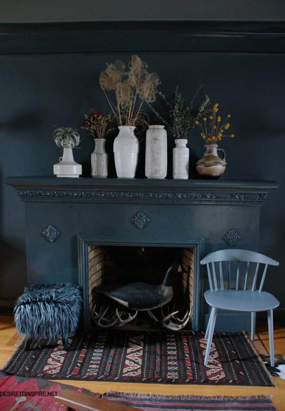
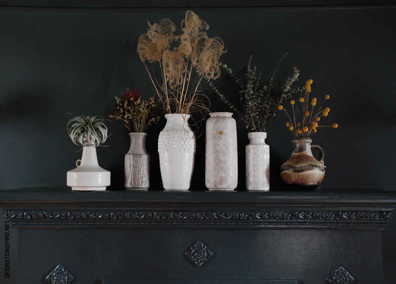
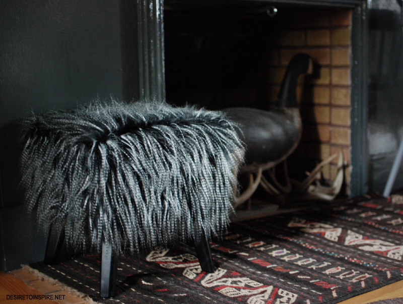
Vintage West German vases filled with dried flowers from around the house (and the coolest Tillandsia from blumenstudio), furry stool I picked up at Homesense Saturday, J104 chair By Hay Denmark via The Modern Shop, rug from Third World Bazaar, goose decoy was a wedding gift from my inlaws, antlers from the wilds of Alberta.

And yaaasssssss, my Jieldé wall sconces on either side of the fireplace. The only gift I have ever received (from hubby) where I was so shocked and delighted that I burst into tears. And now I finally get to put them to use.
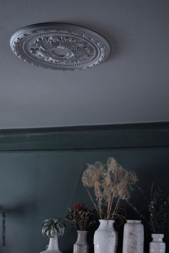
When the painting was done I thought the ceiling looked a little too plain so I picked up a ceiling medallion from Rona for $50
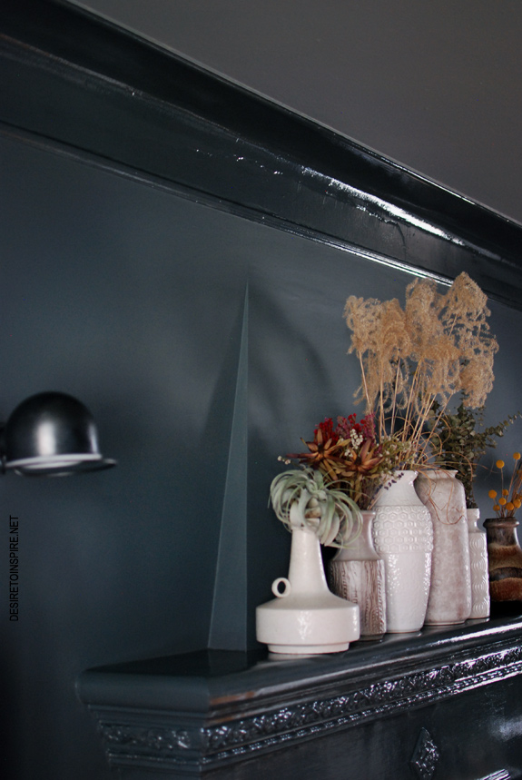
The point of this photo was an attempt to get a decent photo of all of the paint colours/finishes in one shot. Success. 🙂
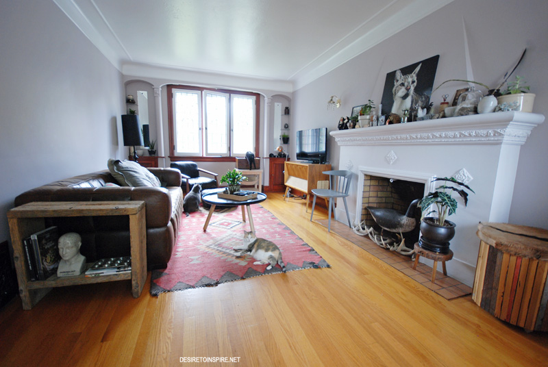
My newly painted living room – part 1
Posted on Thu, 13 Nov 2014 by KiM
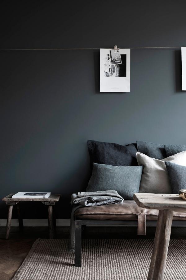
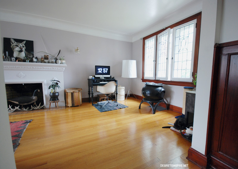
It is finally time to reveal my now very dark living room. This freaking room took me FOUR weekends to complete. What a pain in the arse. And I didn’t even sand the trim like I should have. The result is pretty dramatic and I absolutely 100% love it. Farrow and Ball‘s downpipe is the most beautiful colour I have ever used and it exceeded my expectations. I used it in estate emulsion (flat) on the walls, full gloss for all of the trim and I used plummett in estate emulsion on the ceiling. I wanted to go with downpipe on the ceiling too but my husband was already losing it over the choice of such a dark wall colour so I caved. They are the perfect combination though as both have hints of green.
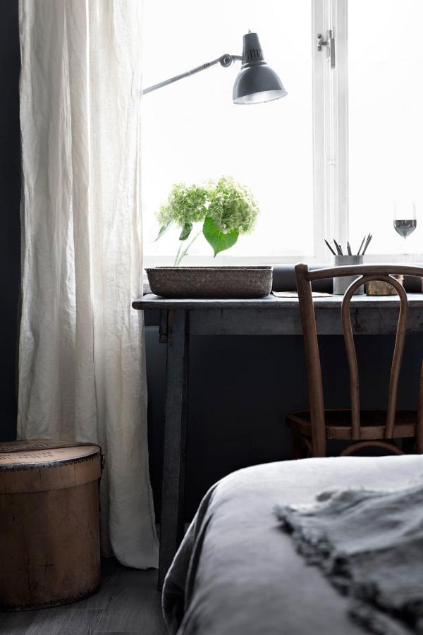
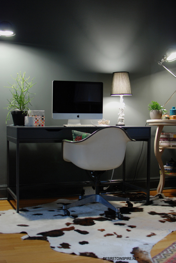
I took tons of photos so I thought I would split this post into 2. This post focuses on one side of the rather long space, where my workspace is located. And I should point out that aside from buying a new desk (my previous one was rickety and too small) everything in this room is from my previous home, so it’s a bit of a work in progress although all the major pieces are staying. (And note that I have alot to learn on photographing such a dark space. It’s so tricky!!!)
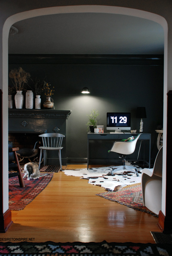
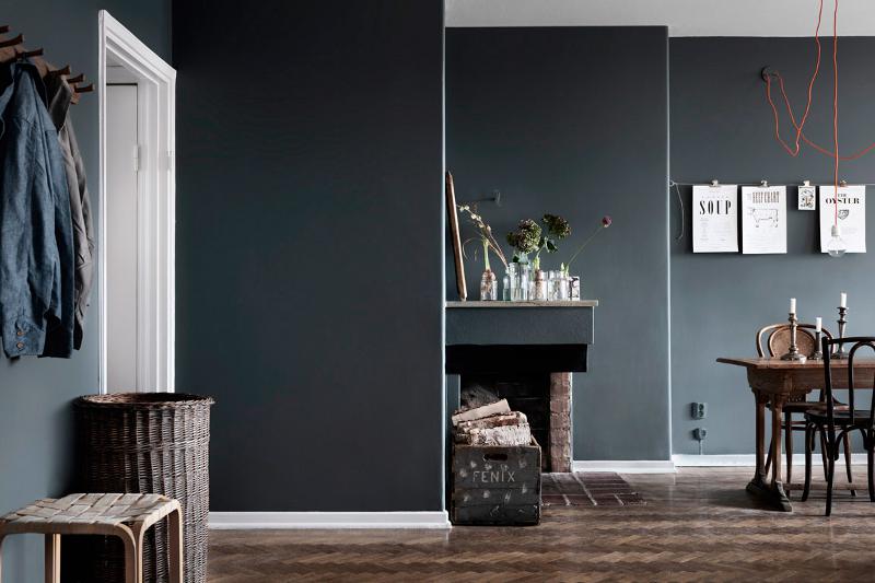
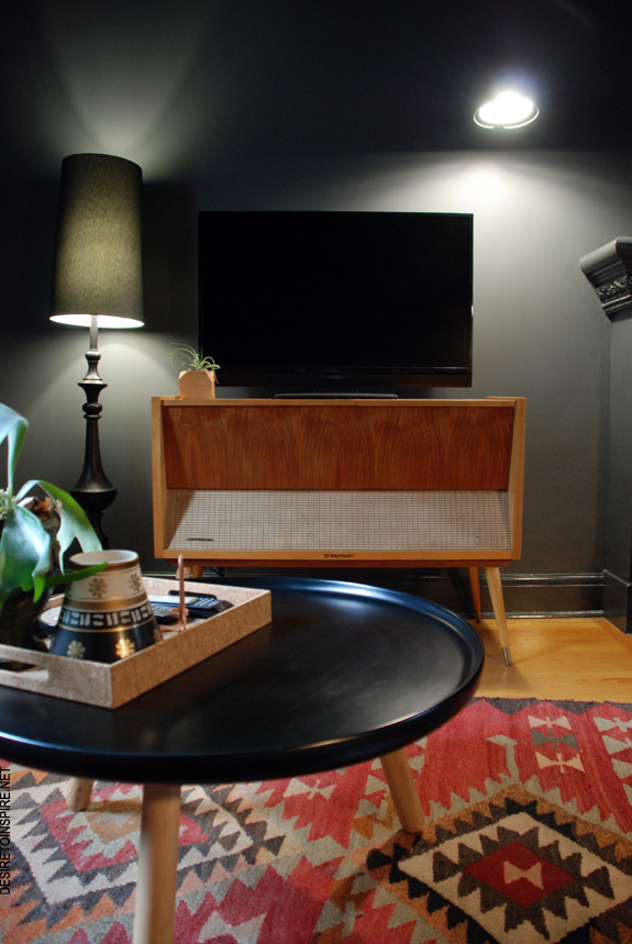
The photo above is the view from the foyer. TV watching/hangout area is to the left of the fireplace (the next post).
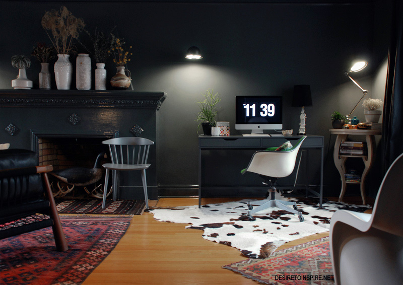
I have rugs all over the floor because the terrible orange/yellow stain on the hardwood makes me pukey. The cowhide needs to be replaced with something darker.
Oh – how about a before shot for impact…
Better now? I would say so!
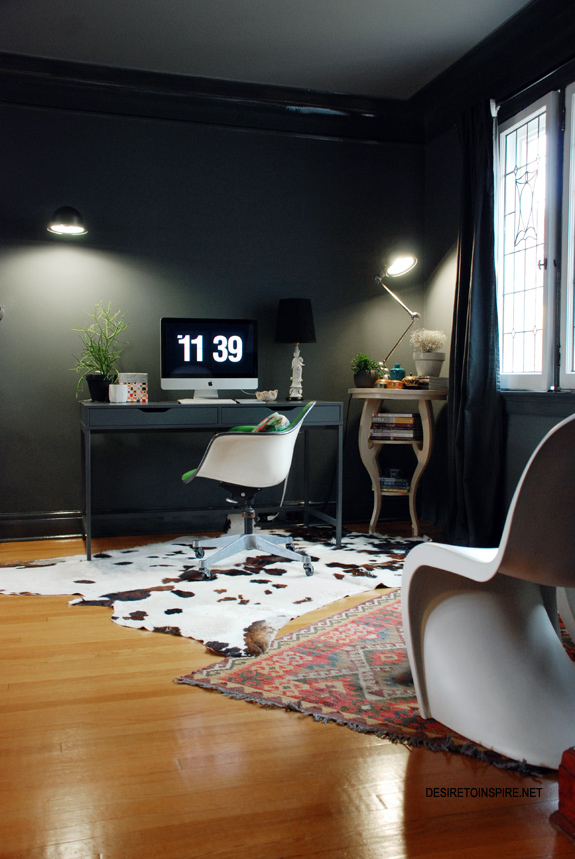
Conveniently, the curtains I bought at Ikea when we first moved in turned out to be almost identical to the wall colour. I came across the desk on my last trip to Ikea (it’s the Alex) – I wasn’t really looking to buy a desk there but it was too perfect in style and size and there’s that same grey again! I liked the idea of going monochromatic in the space. The table in the corner was found at an antique shop in Almonte a few weeks ago. I haven’t figured out what colour to paint it yet. I think it needs a touch of fluro pink.
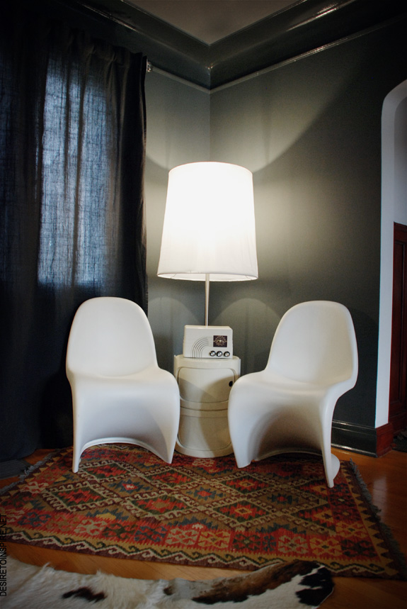
Opposite my desk was supposed to be a cat corner but I decided to hell with that, my Panton chairs needed a new home (the chairs always have faux sheepskins on them and as I look behind me right now, both chairs are kitty-occupied so it’s the cat corner after all!). I’m not happy with this corner so I will be giving it more thought. It is a great place for one of my husband’s revamped vintage radios – gutted with new speakers and bluetooth so I connect to it from my PC to play music. (Hubby is leaving his job after the holidays and doing this and other projects full time *GASP* so do have a gander at his shop – Daff Design)
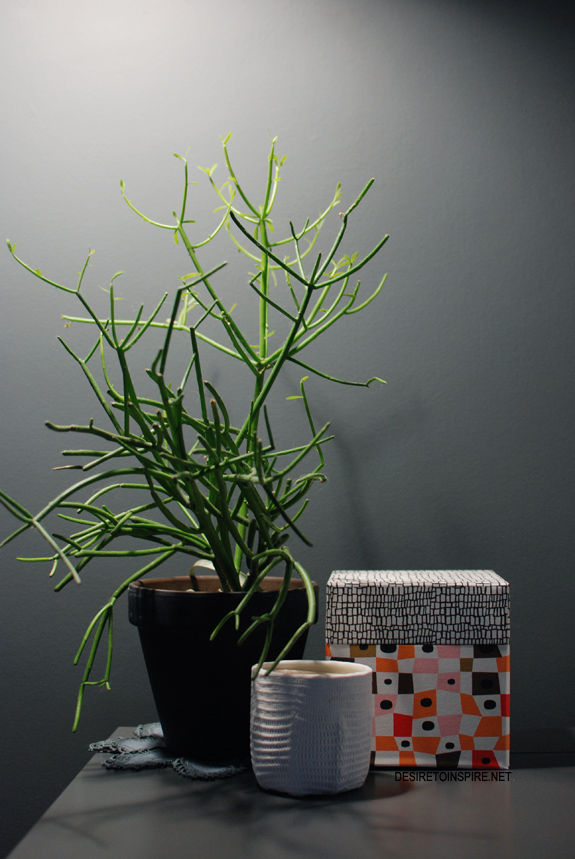
My favourite plant, Mine Design candle from Style Labo and Ikea box.
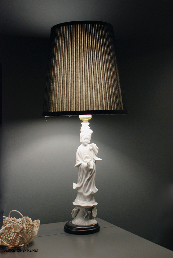
Blanc de chine lamp from eBay I just unearthed from the basement (glad I never had any takers when I was selling this pair) and a doily bowl I made that stored my phone cable and lip gloss.
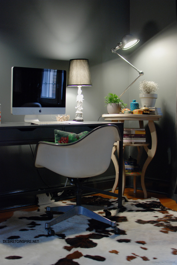
My beloved 2 arm Jielde lights up the corner beautifully.
Pretty Please
Posted on Thu, 13 Nov 2014 by midcenturyjo
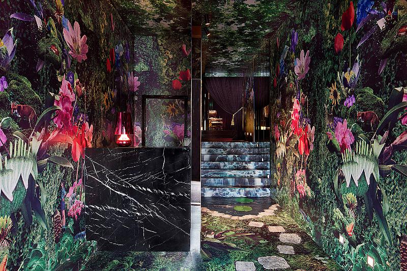
It’s the OTT entrance to a nightclub but my head is spinning with the possibility of including something like this somewhere in my house. Pretty Please. No that’s not me begging. That’s the name of the Melbourne club designed by Travis Walton.

