I am not quite sold
Posted on Tue, 27 Jan 2015 by KiM
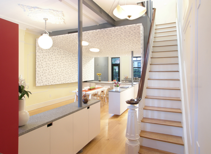
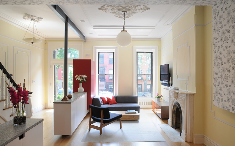
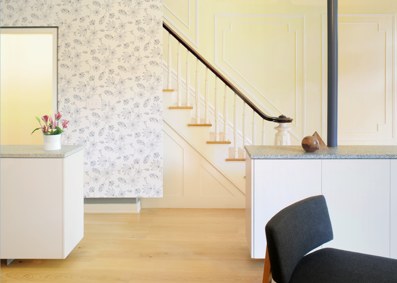
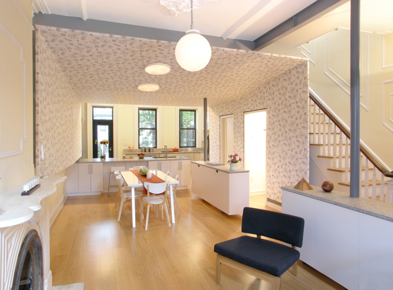
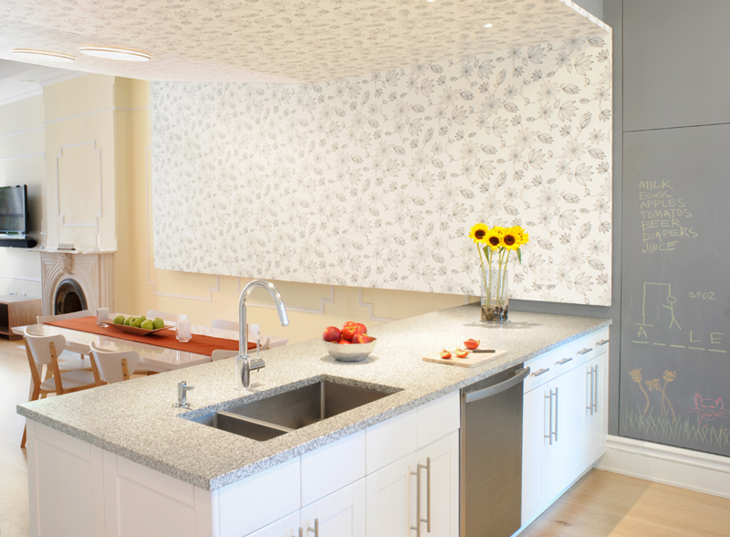
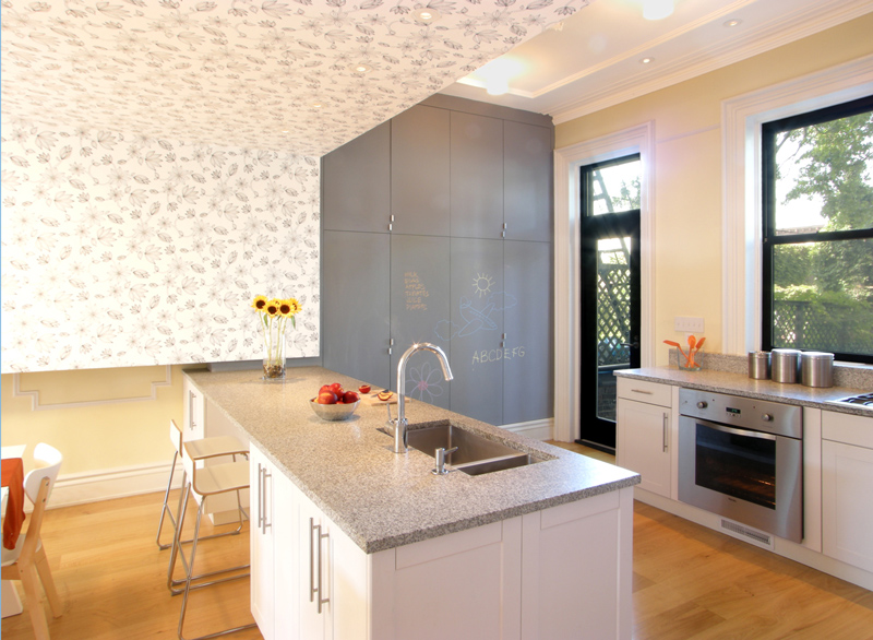
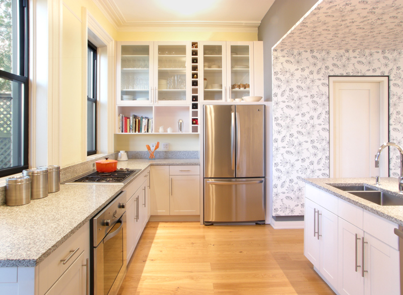
I found myself on the website of James Cleary Architecture a while ago and was…dumfounded by this gut renovation of a Park Slope brownstone. To note in particular, the playful pod that wraps the dining area’s walls and ceiling. The pod gives this space its own presence within the larger room while concealing HVAC equipment and the building’s plumbing risers from sight. Perhaps I am really on the fence with this concept because I cannot tear myself away from the horror of the pale yellow walls, and when combined with red accents and a floral wallpaper that really does nothing for me…but I am finding this “pod” very cavelike and bizarre. I think the kitchen cabinetry set up along the entire space is not really something I would have done either. It is a stunning home and I imagine a vast improvement from before the renovation, but this one is throwing me for a loop. Thoughts?


Kim says:
I'm with you Kim about the color pallet (feels 90's) and the casework in the living room. I went to the arch's website to see the rest of the pics of this house and they used a great frosted acrylic railing upstairs. Why not use that to screen the living area instead of casework if they wanted to separate a foyer? The box idea is cool and I like the compression of space.
moissien says:
It's really jarring and makes the space look like a retail space. It also uses up a lot of wall real estate. I personally hate it and would rather see the ductwork.
Matt says:
Bad taste.
kate says:
like the idea, but needs a different application. I think you're right, the rest of the interior is meh….and that floral pattern doesn't do it any favors.
Darcy H says:
I'm into it. If my friend owned this place I'd be excited to go visit. It's good when things are a bit different.
James says:
I think the moral of the story, as we see time and time again, is for architects to stick to drawings and plans, and keep well well away from interiors.
Blanders says:
The box would have worked better if both sides had connected with the floor.
But even if it had, it's still a terrible abuse of a lovely old piece of architecture. If you want to live in a modernist box, build a modernist box – don't cram it into a beautiful Victorian building!
emily says:
i'm guessing that being in the space is very different from looking at these photographs and seeing the pod…rather than just having it look like a ceiling and wall when you're in the room. the yellow is an interesting choice, but i'm sure the clients love it!
Anna says:
I think they should have blasted out the back windows a la London row homes for more light. The pod gives it too much of a closed in feel for me.
Sonia says:
I agree that architects are rarely effective interior designers. But it occurs to me that the colors and wallpaper may have been insisted on by the owners. I would have a hard time visiting, and can't imagine living there.