The midcentury home of a designer couple
Posted on Mon, 24 Aug 2015 by KiM
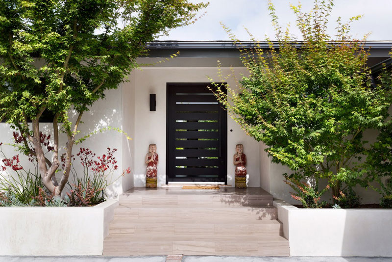
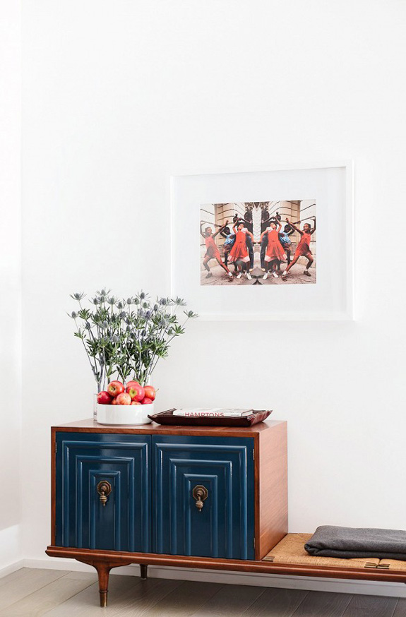
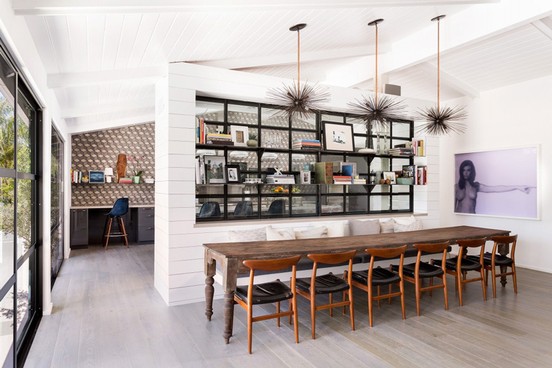
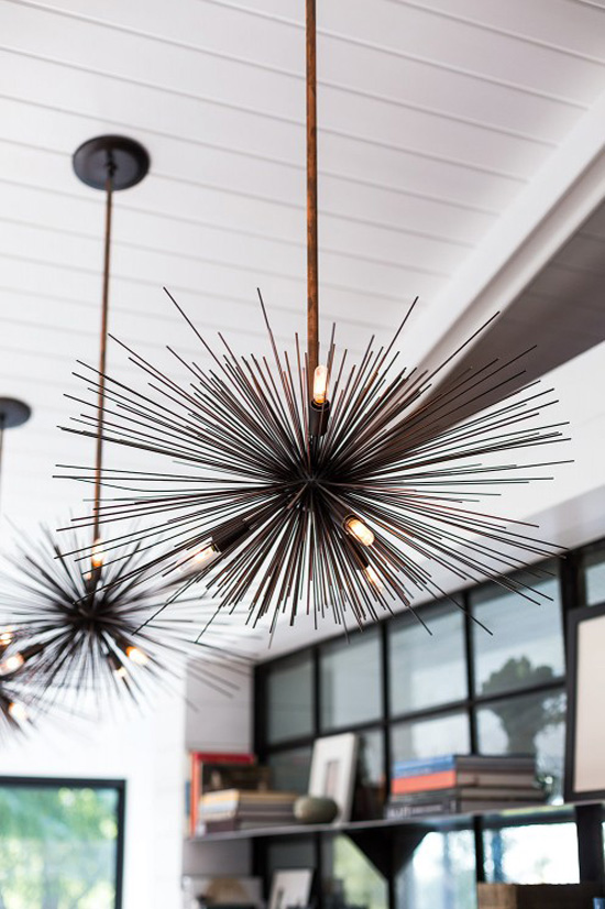
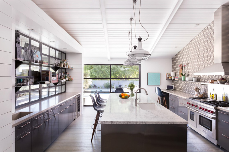
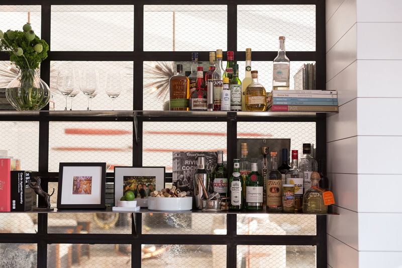
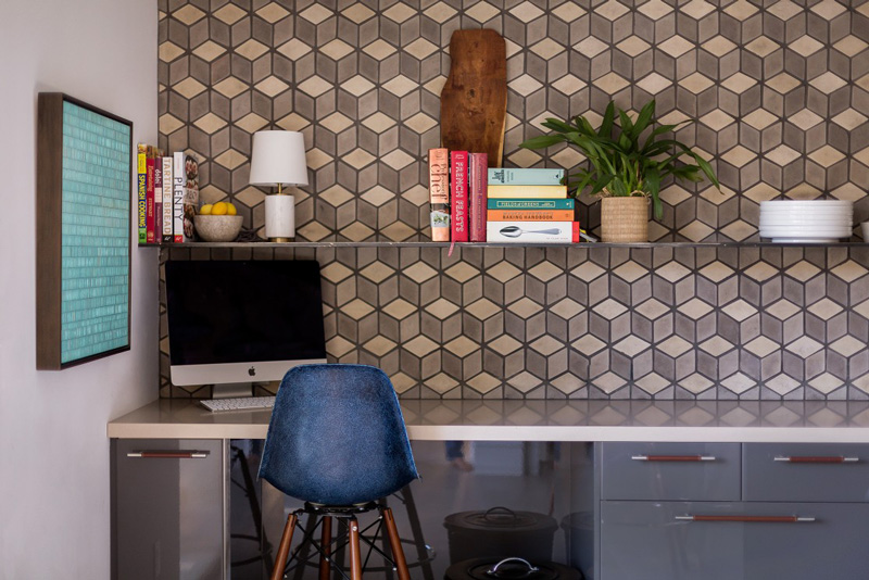
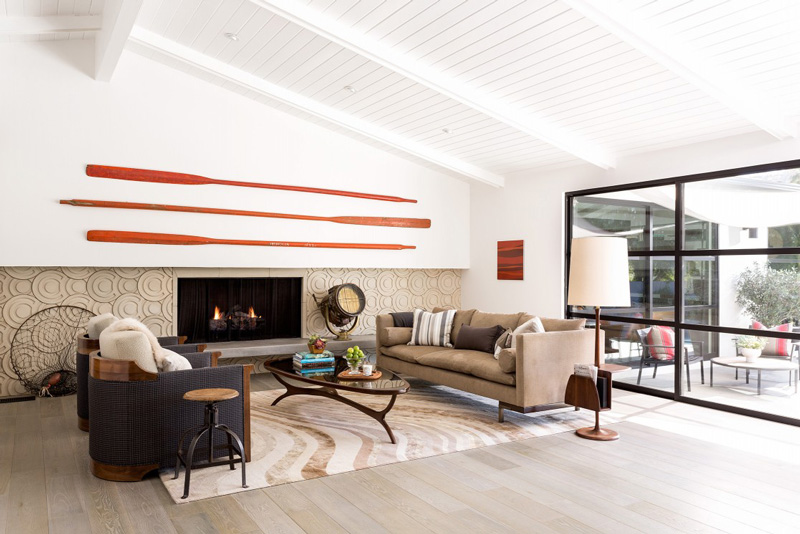
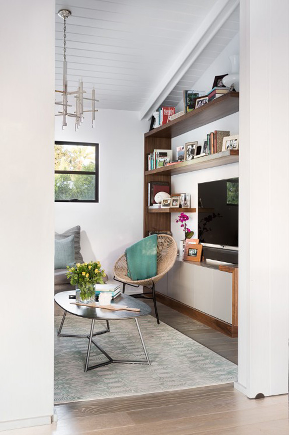
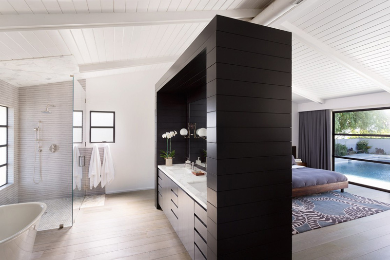
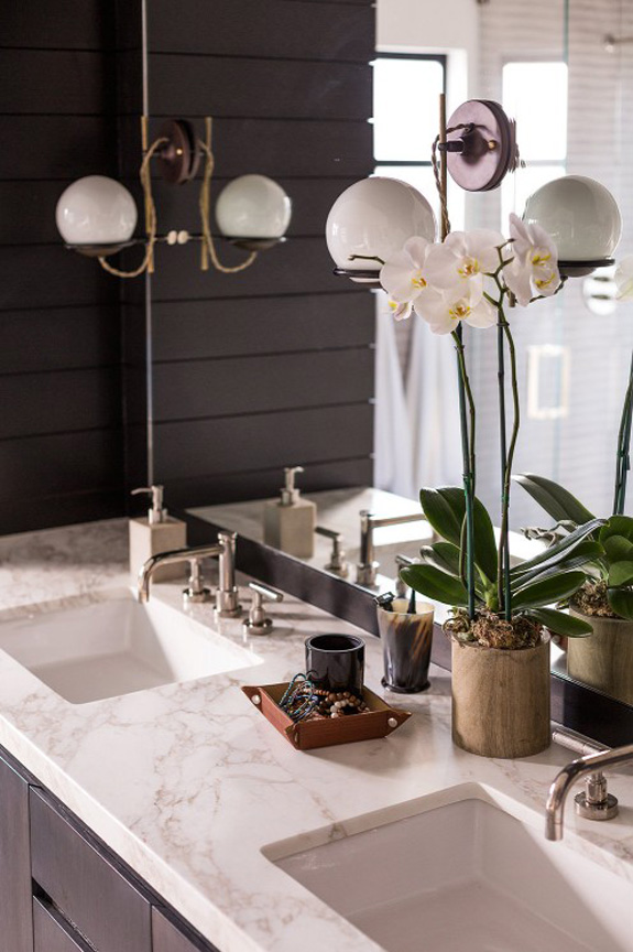
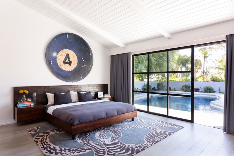
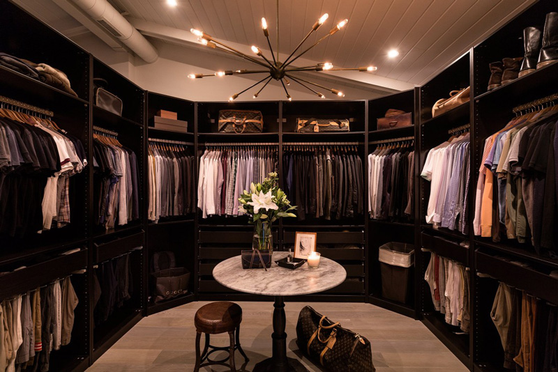
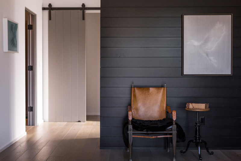
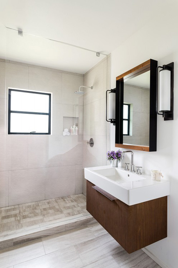
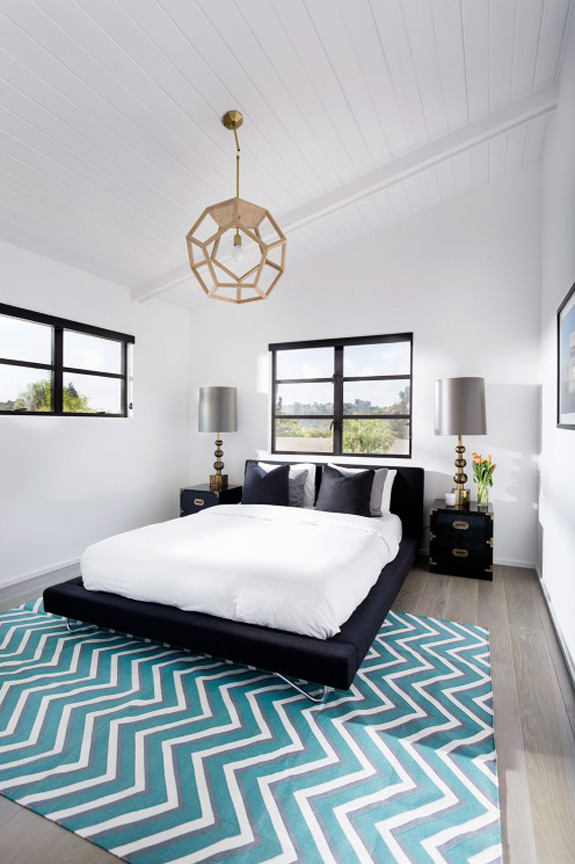
This ranch-style home in the Hollywood Hills is an absolute dream. Owned by designers Ryan Brown and Diego Monchamp of Brown Design Group, they completely renovated the home making it much more open-plan. The new design is much more modern but they added midcentury touches to pay homage to its origins. I adore the kitchen/dining space – and whatdoyaknow, there’s some tumbling block tile again! 🙂


Daniel says:
Yeesh. Tough crowd. I think people need to remember that when magazine shots are taken, a lot of items could be removed and/or re-staged in order to make the photo composition more aesthetically pleasing to the eye. Some of those items might not even be the home owners.
Personally I think this house is stunning. Very inspirational to those who love a Mid-Century look without wanting to live in the 70’s. Modern and clean. Lovely!
ombia says:
I love that big kitchen island, perfect for chatting with friends and preparing meals. I also love huge dining table. Great bathroom and this is amazing
https://www.desiretoinspire.net/storage/allpostphotos/browndesignincrbe_vingette_21-1117×745.jpg?__SQUARESPACE_CACHEVERSION=1440417872556
Some readers should google – staged.
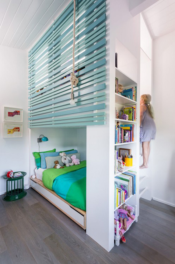
Cute kid's room. This girl is big enough not to be killed by probably fixed wooden blinds. But then, let remove curtains in every single roomd for kid, you know choking hazard…also no lamps with cord, big hazard too. This worls is a horrible place full of hazards brrr…
Brooke says:
Everything about this home is lovely! Perfect balance of higher design elements with a little bit of whimsy…tits, paddles, octopuses and all!!! I read the first comment aloud to my office of interior designers and architects. Thank you for the good laugh! I'm going to pretend that was written as a joke. It must have been, right? The fixed wooden slats as choking hazard? Is all railing a choking hazard? That someone thought anyone would use "blinds" as guard rails…the child would fall through the mini blinds before they ever got the chance to choke on them. Yes. I'm sure the first comment was a joke.
Thank you for always sharing such beautiful work. Your blog is a constant design inspiration.
annie says:
I don't think it's pretentious. And if you removed the (fixed) blind she would topple out of the space at the top. They clearly have money, but they also have great taste (one does not always lead to the other). I don't think I'd ever leave the bedroom – although the kitchen is pretty alluring and that dining table/ area is fantastic. I would love to see it as it is 'lived in' rather than staged for a photo shoot. Overall a beautiful space though.
Deb says:
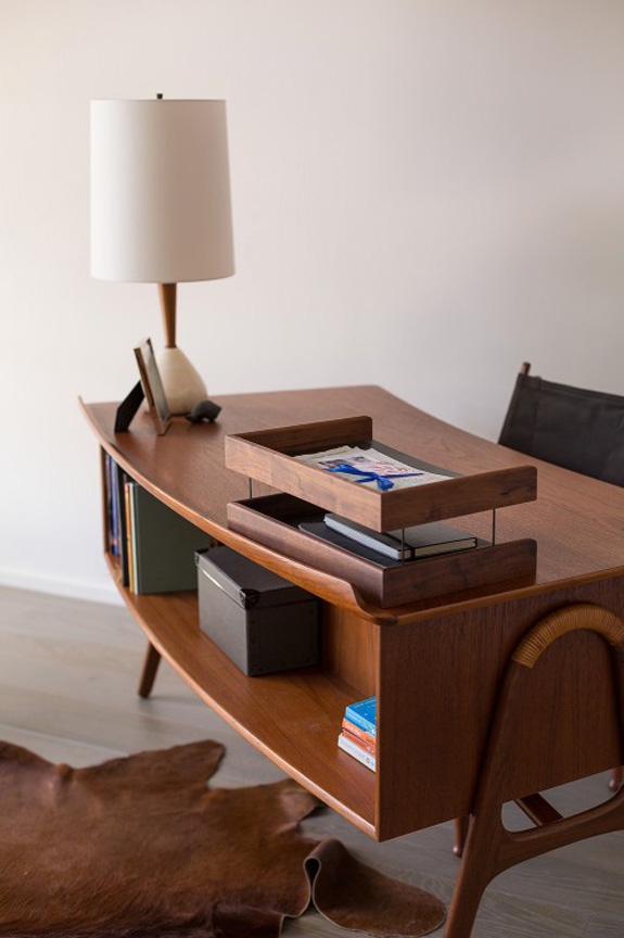
Um…it's not really perfect – there is a wrinkle in the cow hide rug under the desk…
KiM says:
Dammit Deb you noticed that too?! I sat there wondering if the photographer tripped and screwed up the rug and didn't realize until after the shot….probably because I have a cowhide under my desk and I'm always f*cking it up and it drives me mental. Or I'm just a total nutbar.
Holly Hold says:
Pretending WHAT? The slats, yes, those are SLATS on the bunk are colorful, enclosing, yet still see-through to provide a feeling of expansion and ventilation–both healthful. Do you HAVE any children? If you do you may have filled them with inappropriate fear; 3 boys, 5 grandsons, and many cousins, friends, neighbors experience as taught me this — the only kid who gets hurt on what people like yourself deem as dangerous (18" windowsill, 14" off the floor, but TWO AND A HALF FEET fall to the planted area below) is the perfect little son of the neighborhood ass.
I have a suspicion, specious as your remarks are (you who were negative thus far), that you REALLY are, either, ribbing your close, talented friends, OR, you are the ex-partner of one of these lovely people and are just EATEN away with envy.
Blanders says:
Whatever mood stabilisers Samantha Anastasiou is taking, she needs to up the dose. Sheesh.
That said… there IS something a little annoying in this house. Everything is beautiful, verging on perfect… but then of course you'd expect the homes of the 1% to be beautiful verging on perfect. There's no sense here that this couple have ever had to make do, or be creative to get around budgetary concerns. It makes it difficult to empathise with them.
Jaime says:
Samantha wow! Really? Beautiful home!
Nora Moore says:
The open feel of this house is amazing. The light colors probably contribute, but it looks like they opened up the walls as well. The kitchen is so long and has so much counter space, too. That would make holiday baking so much easier if we had more counters. We will have to keep that in mind when we redo that room.