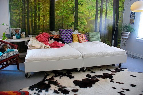
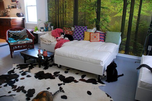
Kim’s comfy couch
Posted on Wed, 25 Mar 2009 by KiM
So I finally got around to getting the instructions for my DIY sofa from my boyfriend and he took a few photos to illustrate some key points. Sorry for the delay folks but I have a terrible memory and have been super busy lately. These are in his words, including the title (which I don’t want to take credit for LOL). (Thanks Jeff!!)
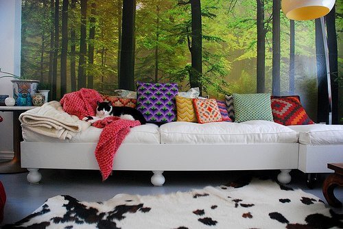
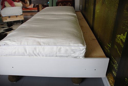
First thing is to measure the cushions you are going to use (we used the Ikea’s Lillberg sofabed cushions). You want the cushions to fit tightly into the sofa. This will keep the cushions fluffy and in place as you get comfy. The pillows should sit 2-3” below your sides depending on the height of your pillows. You can see the difference in this picture:
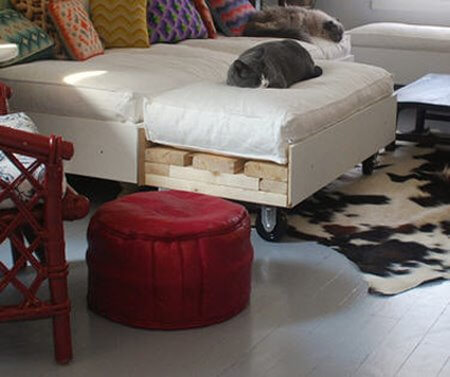
The frame is made from 2×4’s, the width ones that attach to the legs are first and then 2×4 lengths lay on top around the edges.
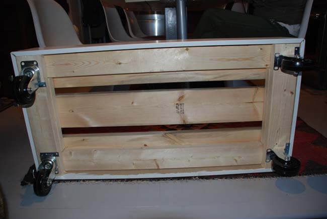
Another 2×4 is cut to fill in the gap so the 2×6’s on top sit evenly.
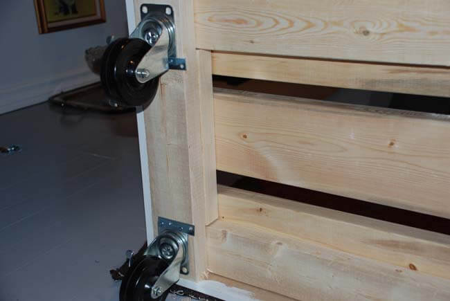
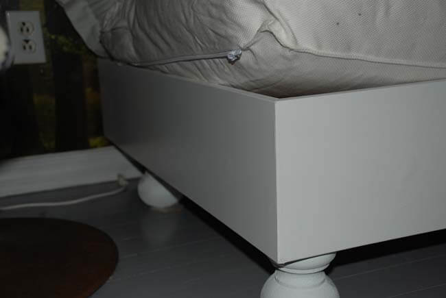
FYI – do not screw your wheels/legs to the couch like this. Use proper screws, something I forgot on the trip to Home Depot. And we’re going to switch out 2 of the casters on each of the 2 moveable pieces to finials, because despite using lockable casters, they still move around too much.
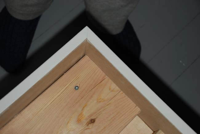
Lay some 2×6’s lengthwise on top. You could use whatever width of wood you want, heavy is good so the couch won’t move around when you are. You can see in the first photo an end view without the MDF.
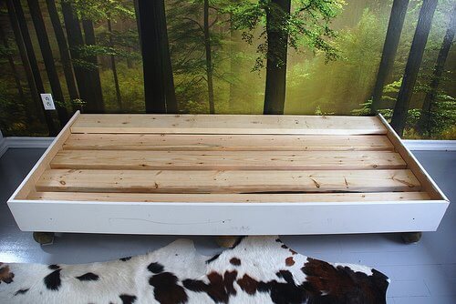
The ledge on the back was made by raising a 2×6 so it would make a space for pillows. If you are going to make a pillow ledge remember to take that into account when making the frame (it was an afterthought on this one).
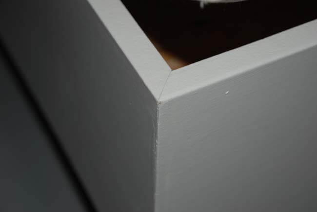
The sides are finished with the MDF and cut at 45 degree angle at the corners.
The MDF we used (8″) is the perfect height to reach from the top of the legs to 2-3” above the frame. The couch sits 12” high to the top of the MDF.
Fill the holes and cracks, prime (we bought pre-primed MDF), paint and accessorize as required (mine still require new pillows – hoping to tackle that ASAP).


Ranch Houses
Posted on Wed, 25 Mar 2009 by KiM
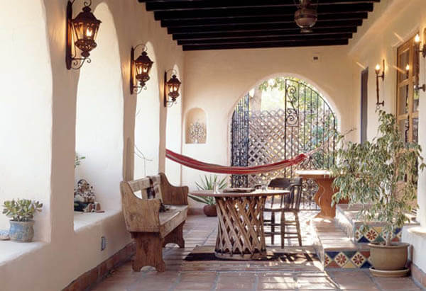
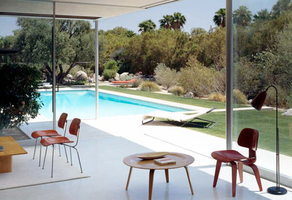
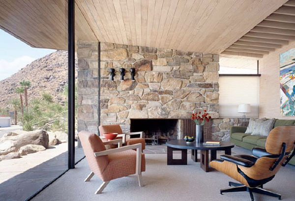
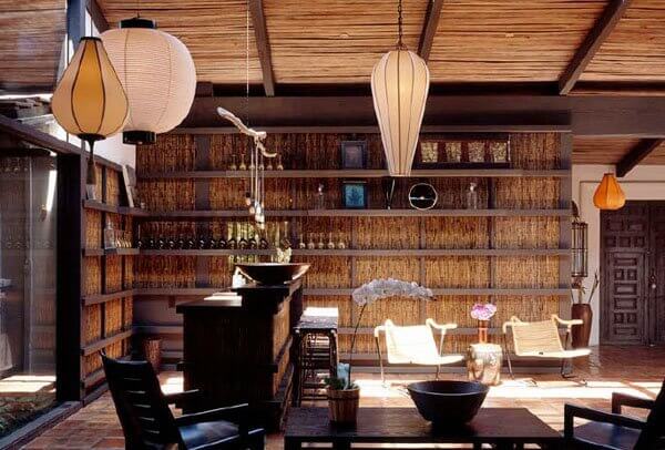
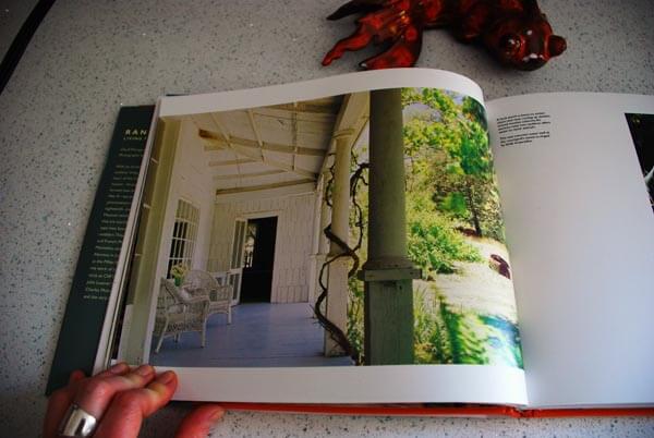
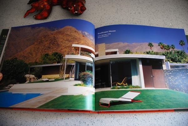
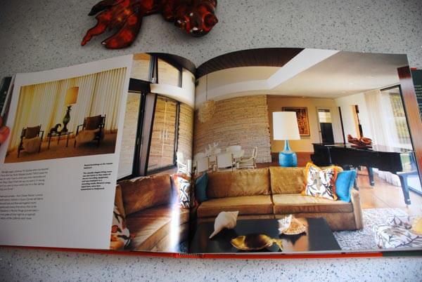
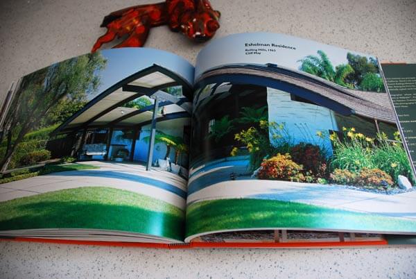
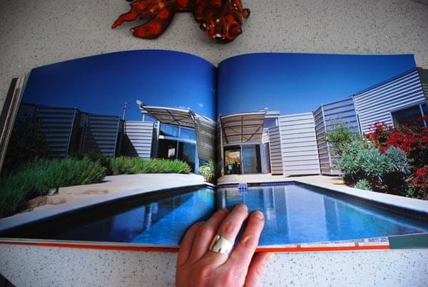
I absolutely adore books. When I received an email a little while ago about a book called Ranch Houses, I was instantly intrigued. I love the style of ranch homes and there are so few of them up here in Ottawa. The architecture of these houses is a popular one, and it’s obvious why, with such huge expanses of windows to join indoor with outdoor spaces. I recently got my hands on a copy of this book, by David Weingarten and Lucia Howard, published by Rizzoli NY, and it my new favourite coffee table book. I only buy books that look great, and this one has the most gorgeous photo on the jacket (and might I add, the cover is a fabulous shade of orange, because that’s important too).
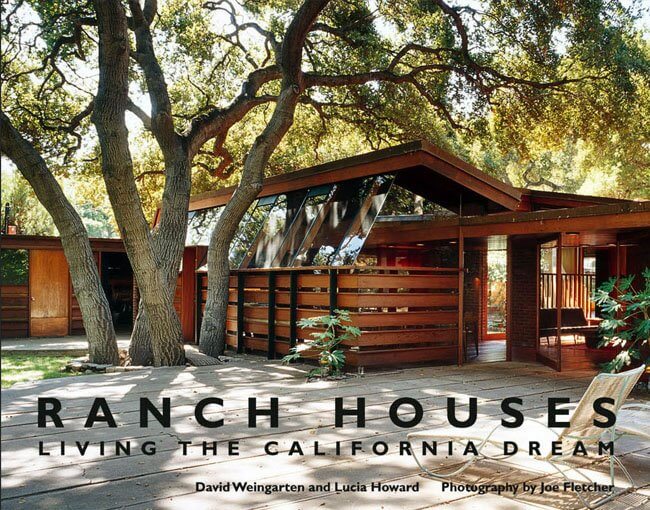
I’ve got to give props to the photographer, Joe Fletcher. The photos are dreamy, and showcase these ranch homes so beautifully. The book features a home that was initially built in 1797, others in the 1800’s and 1900’s and up to 2005. A brief history is provided with each home, as well as photos of the interior, exterior and landscape. I cannot wait until the weekend when I can devour each photo and every word.
Enough teasing – how about a little taste?


House tour on Apartment Therapy
Posted on Tue, 24 Mar 2009 by KiM
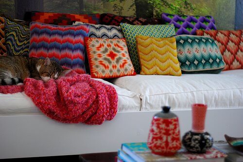
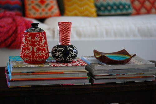
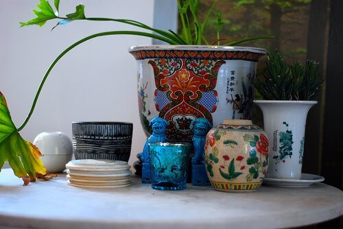
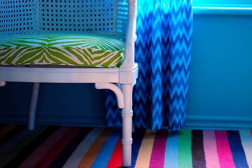
I’ve got big news! I have the honour of having my home featured on a house tour over at Apartment Therapy today. 🙂 Click here for the tour. I’ve been an avid follower of AT for quite some time, and have had some photos of my home(s) included in posts here and there but this is my first house tour. SO COOL. (I’m hoping their readers go easy on the comments as they can often get pretty foul). Here’s a sneak peak of some photos I took for them of nooks and crannies around my house (not sure if these will be included in the tour).

My dream kitchen
Posted on Tue, 17 Mar 2009 by KiM
This blog chronicles my entire kitchen renovation from start to finish. Greentea Design has provided me with their solid wood kitchen cabinets, and I’m taking care of the rest.
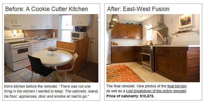
If you’d like to be brought up to date, check out my kitchen remodel blog for an archive of previous posts. I posted recently some before and after photos, and for this final post I’d like to share some photos I took for Greentea, the interview they have added to their website about my renovation, and a video tour of the kitchen.
My kitchen is complete, and I am ecstatic at the result. I can finally say that I have my dream kitchen. It is beyond my expectations, and every time I walk through my front door and see it, I can’t help but smile. I am never going to want to sell this house. I can’t imagine leaving this kitchen behind. I’d like to take this opportunity to again thank the folks at Greentea Design. They made this dream come true for me, and I am so grateful (and shocked) that they agreed to this partnership. It was alot of fun and hard work (on both our parts) and they were so patient and helpful throughout the whole process. I hope I can get in a trip to Toronto sometime soon so I can finally meet them and see their showroom. So thank you Greentea Design – you guys ROCK and I’m so proud to have a Greentea kitchen.
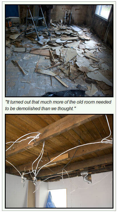
To start this post off, I wanted to invite you to check out the interview Greentea did with me that is now published on their website. They’ve divided it into 3 parts – Planning, Demolition and Installation, and the Finished Kitchen. What an honour to have my renovation featured on their main page. Here are some photos they’ve included in the interview.
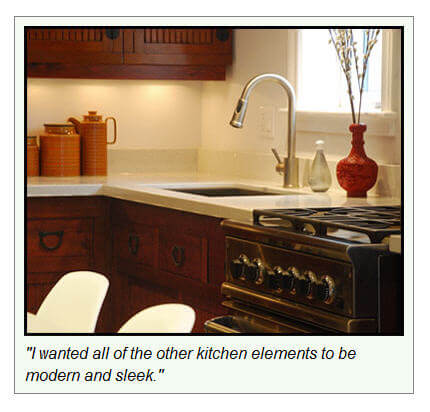
I took some photos not too long ago for Greentea that really showcase the cabinetry so I thought I’d share some of them. (For the purpose of getting decent shots of the cabinets, the dining table and chairs were pushed into the living room).
For more final photos, and to see my video tour (complete with cat shenanigans), click HERE.
A chair revamped, and a dilemma
Posted on Fri, 13 Mar 2009 by KiM
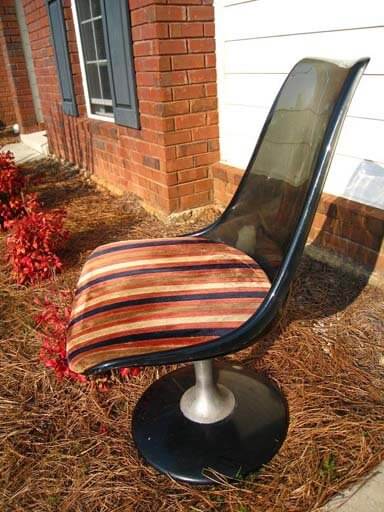
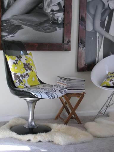
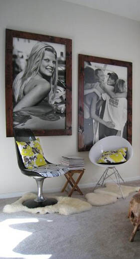
We received an email from Doreen that I HAD to share: I love everything mid-century modern and therefore, I thought I would share a recent find with you. I went to a local antique/thrift store last weekend. I had been hoping to find a mid-century modern chair one day here in Columbus, GA. Never thought, I would! My luck was about to change this time! I went in and could not believe that they had a Chromcraft chair for sale that was in good condition. Now comes the best – the price tag! It was priced for $38 and I ended up getting it for $30!!! Can you believe it! As soon as I bought it, I went home and cleaned up the whole chair and polished the chrome base. Even though I kind of liked the retro cushion cover it came with – it was dirty and it did not really fit in with my decor. Therefore, I re-upholstered it with a black and white fabric that I had gotten from IKEA. I took before and after pictures that I am going to attach to this mail. I paired the chair with another recent find. The white chair I bought new and I love the look of both chairs together. The two black and white pictures you see on the wall behind the chairs are old Abercrombie & Fitch boards and I just made the frames myself.
She did such an amazing job on the chair, and her vignette is fantastic! Love the huge framed ads and the frames are perfect. Kudos to you Doreen!!
We also received an email from Jen who is looking for some advice on her living room: I am hoping you and your readers can inspire me. I am having a mental block regarding what colors to interject in the attached room (paint/trim, window coverings, accessories). I have searched through endless blogs, magazines, etc, and I am having a real hard time. We are keeping the furniture (minus the speakers/lamp/entertainment center). We are adding in the loop media center/file hutch from crate and barrel. Our style is organic modern and we want this room to feel warm and cozy.
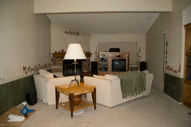
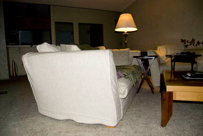
For more information check this post she published on her blog. She has removed the wallpaper (YAY!) and is thinking about bright white trim, dark warm gray below the chair rail, and light warm gray above the chair rail. I was thinking more brown tones as opposed to grey (and I always lean towards grey) because of the fireplace colour, but if the carpet is grey, then I would go with a grey with alot of brown in it (and I’m seeing orange accents, mixed with maybe some acid green). I would keep the colour below the chair rail only slightly darker than above, because it just emphasizes the narrowness of the space. It sounds like Jen is putting her new entertainment stand where the existing one is, which I’m not loving. I would put it to the left of the fireplace, and maybe have the couch to the left of it facing the far window, and chair in front of the patio doors, angled towards the couch. Narrow rooms are very tough to organize as I know very well having lived in a couple narrow houses. So if anyone has any suggestions please leave a comment for Jen!