The epitome of good taste (70s that is)
Posted on Mon, 31 Mar 2008 by midcenturyjo

Retro time again and this week I am flicking through the pages of a must have design book from the 70s. How to Decorate Without a Decorator, A Realistic Guide to Interior Design by Mary Gilliatt, Thames and Hudson, London, 1977. Even now it has the feel of a quality tome. Big glossy pages and pictures from the homes of the rich and famous. How could it be anything but the height of good taste if it was by one of London’s leading decorators? This is just the first of many plundered, I mean scanned, forays into Mary’s world. I draw your attention in particular to the what appears to be upholstered truck tire seating (eek!), the graphic dominoes (sigh!) and the salon standard wall mounted hair dryer above the world’s grooviest chair (OMG!).
 |
 |
 |
 |
 |
 |
Jo’s place and an ugly duckling
Posted on Sat, 29 Mar 2008 by midcenturyjo
My rattan obsession has lead to an unhealthy amount of time stalking eBay. It has paid off though. I bought the ottoman above. In actual fact I was the only bidder on this ugly duckling but I knew it would one day be a beautiful swan. This poor little “50s bamboo and jaguar retro footstool” is a Franco Albini ottoman. One sold recently in the States on eBay for $315 and if you don’t want to hunt for your own here it is on 1stdibs ($495 small and $695 large). After checking the photos of the interior and exterior and cross referencing with every photo I could find of Franco Albini ottomans I was ready to bid. My little ducking was a steal at $75 AUD ($69 USD). I’m waiting for its arrival to lovingly clean and perhaps shellac it and probably to kindly dispose of the mangy REAL fur pillow. Still on the hunt for a peacock chair but there may be a development there as well. Can’t say too much might jinx myself.
WINKS
Posted on Sat, 29 Mar 2008 by midcenturyjo
WINKS – weekend links. Here we list what has come in during the week, things we’ve found and things we think you’ll want to see. If you’d like to see your blog or website featured email us and if we think it fits with our readers we’ll link you. So what’s in this week?
- Lynne from lovedreamliveathome is having a wonderful competition to win this original painting by the talented Taos artist Sage Moon. More details here. Thanks Lynne!
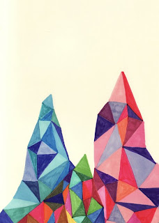
- New prints in store for Jaime of the fabulous blog Design Milk. Not only does Jaime write one of the coolest blogs she is such a talented artist. I’ll be ordering my Rocky Mountains No. 2 soon!
- Double dipping for Jaime today as she also emailed about exciting new items in her online store Vitamin D(esign). Love that last print “Internal Growth” by Wolfie and the Sneak.
- New at Jonathan Adler are these too too groovy ink drawings by Don Carney. Each piece is framed in one of a kind vintage frames and are just the prescription for that touch of fun in your interiors. Jonathan and the gang call it ye olde meets gothic meets mantique meets botanicals. Available at his New York and LA stores.
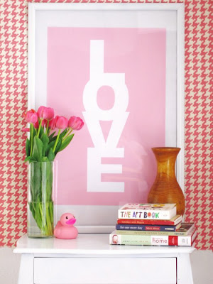
- Jennifer Ramos of Made by Girl emailed to let us in on her new prints. “I’d like to introduce you to our newest set of poster designs called “LOVE Candy”. At this time we’re launching 4 sweet colors: Lemon, Pretty Lavender, Cotton Candy & Sky Blue. These cute pieces of art are suitable for mounting in a dining area, office, bedroom or even a child’s room! We call them Love Candy because the colors are reminiscent of candies & sweets and they deliver a message of LOVE to any home, its that simple. Available size: 16 X24 Price $25 each. They are currently available via my Etsy shop and then via my main site.” Love these and Jennifer always styles her product shots so beautifully. Click over and check out her fab designs.
- New blog alert. Susan Snow lives and works on Prince Edward Island, Canada. She’s the design diva behind Moving Designz Interior Decorating and her recently opened store “Moving Designz Home & Cottage”. (It apparently feeds her addiction to great design and shopping.) You would think she’d be swamped with all these creative pursuits but she has started her blog Susan on Design. Thanks for sharing Susan. It’s full of eye candy!
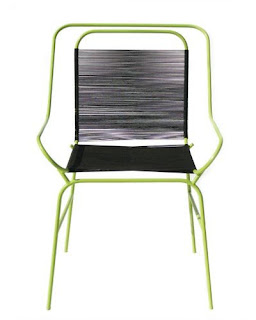
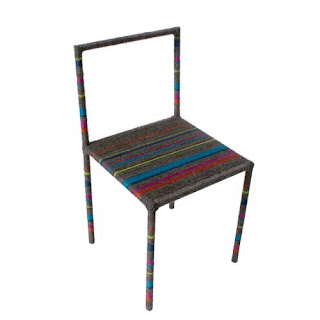
- Cris McCall at Tinlark Gallery, Hollywood California emailed “I wanted to let you know that on April 12, 2008, Tanya Aguiniga’s installation ‘Lineation’ opens at Tinlark Gallery in Hollywood.’Lineation’ marks the first time the artist will integrate the process of weaving with furniture to create an installation. Each chair will have a 30 foot train hand woven on a loom. This train becomes the seat, backrest, ceiling and eventually creates an environment around the chairs. ‘Lineation’ explores personal space, barriers, interconnectedness and dependency.” If you’re in the area do check it out.
- Finally I saved the best to last. I received an email from Rodolfo Rocchetti from Tappezzeria Rocchetti. Rodolfo is a master upholsterer in Rome. His website features all the usual finely crafted upholstery and drapery that you’d expect (with an Italian influence) but what astonished me and truly convinced me of Roldolfo’s talent are his art pieces. LOOK AT THESE SOFAS! OMG! And for the animal lovers out there these are all made from faux fur. I don’t know whether to laugh or cry with joy. And you must see the 2 headed cow sofa on his website. La ringrazio Rodolfo!
 |
 |
 |
 |
 |
 |
 |
 |
 |
 |
Carlu Seaver
Posted on Fri, 28 Mar 2008 by midcenturyjo

Let’s end the working week on a high note with these simply stunning shots styled by Australian stylist Carlu Seaver. Do not miss this impressive portfolio. It’s just so gorgeous and so inspiring. I’m blown away by the styling talent we have here in Australia!
 |
 |
 |
 |
 |
 |
 |
 |
Temporary beauty lasting impact
Posted on Fri, 28 Mar 2008 by midcenturyjo


Scott Weston emailed with pictures of what he calls perishable architecture (and I call one amazing party space). I’ll let him explain.
“Thought you might like to see a project we term perishable architecture. A dinner party for the latest Nokia 8800 phone based on the reference to light. We hand glittered all shapes & sizes of lanterns & they looked spectacular. The model demonstrates to the Client our design intent & then the remaining images show the real object. We even designed laser cut black leather placemats- very cool!”


Cool?!!! The whole event looks spectacular! How long did it take to stop finding glitter where you least expected Scott? Scott and his design team have an impressive portfolio of this sort of temporary beauty. You can find more of Scott’s work that he has shared with us here and here.


