Just gets better with time
Posted on Tue, 25 Oct 2011 by midcenturyjo
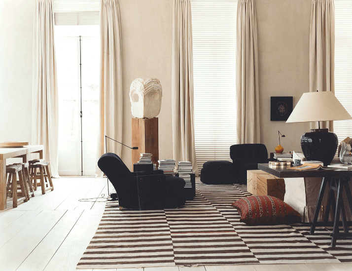
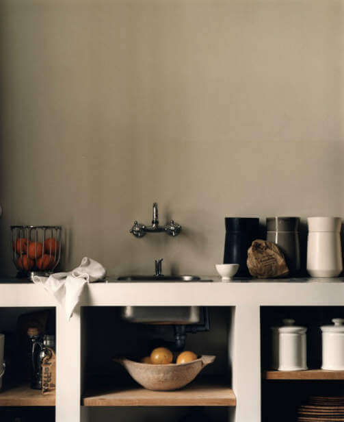
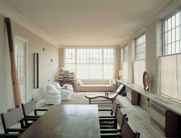
Rooms ripped from the latest pages of the your favourite magazine, right? Would you believe that this Antwerp home by Vincent Van Duysen was designed in 2001. It’s so fresh. So now but still so timeless. Fads come and go but 10 years later we can look at these photos and say not only fashion forward for the time but just right for now.
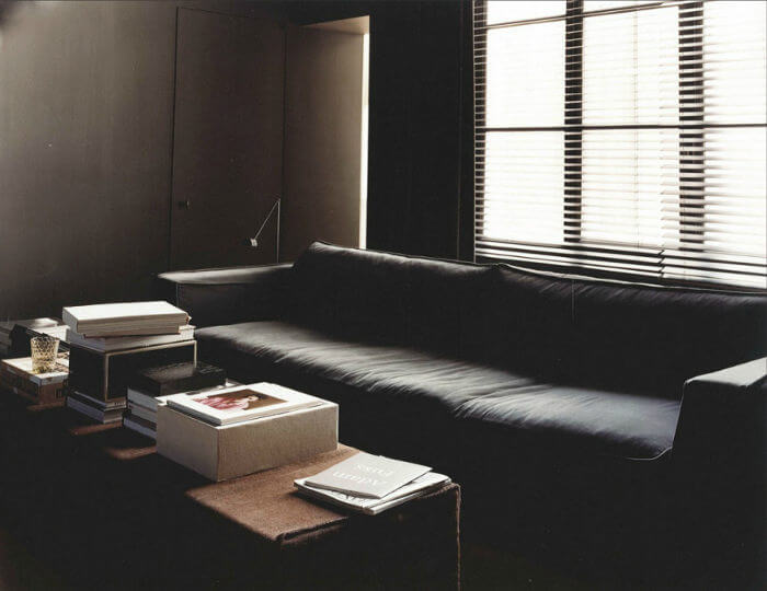
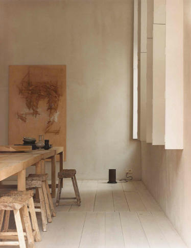
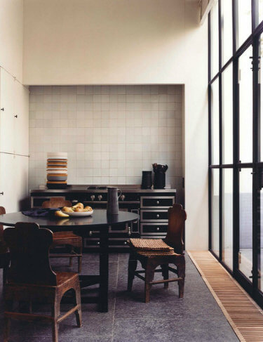
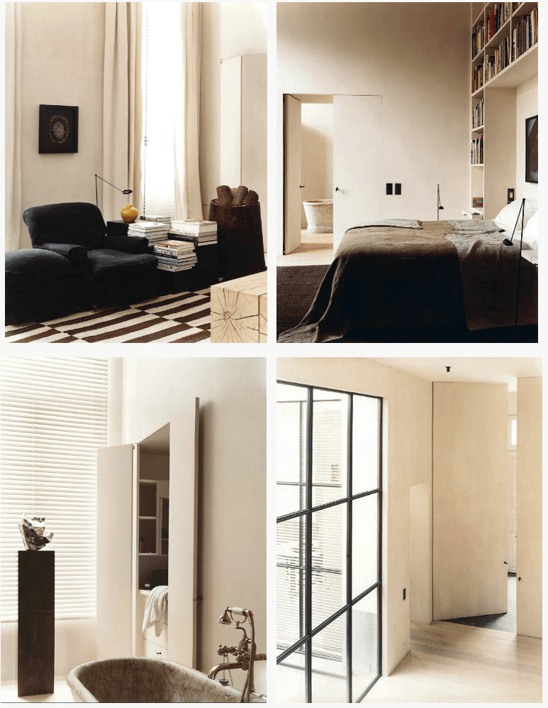
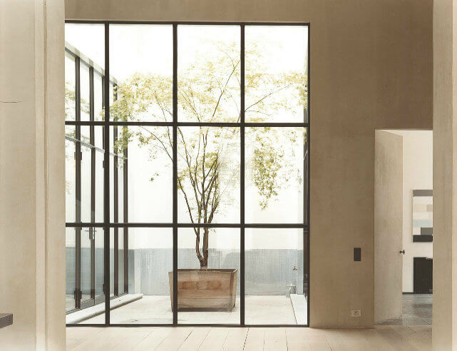
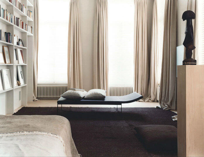
And 1998. Yes 13 years old.


Light lust
Posted on Mon, 24 Oct 2011 by midcenturyjo
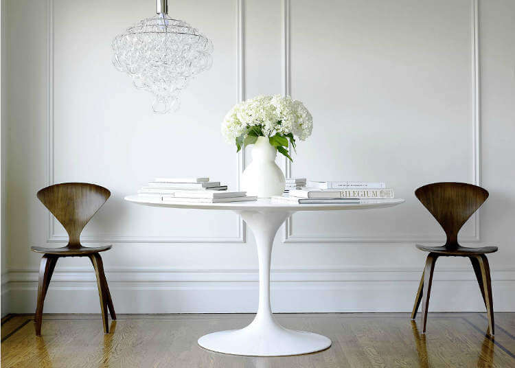
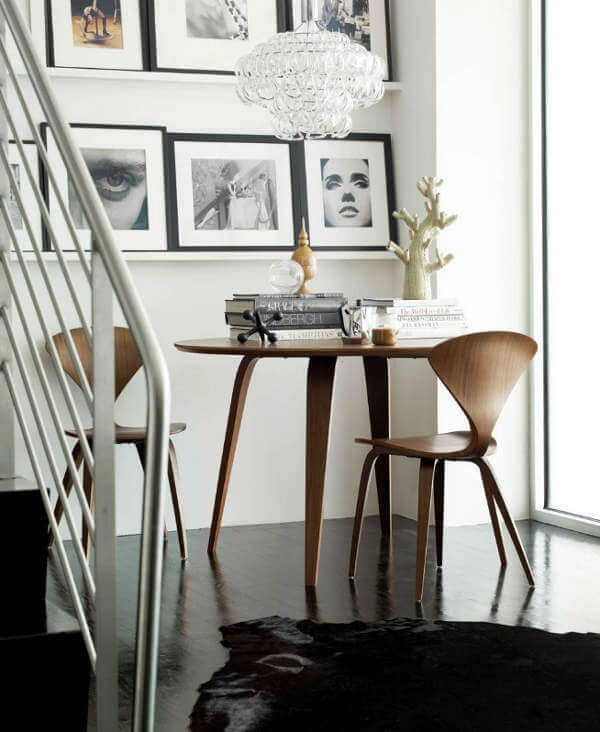
I love the Giogali chandelier designed by Angelo Mangiarotti in 1967. Love. I’m thinking of one in my dining room. I’m also loving these fabulous photos featuring the Giogali in all its glory by Jim Bastardo (via Big Leo). Makes my decision so much easier. Just what a good commercial photographer should do. Capture an image that captures your dreams. (You can see Kim’s post on Jim Bastardo here.)
The latest from SWAD
Posted on Mon, 24 Oct 2011 by midcenturyjo
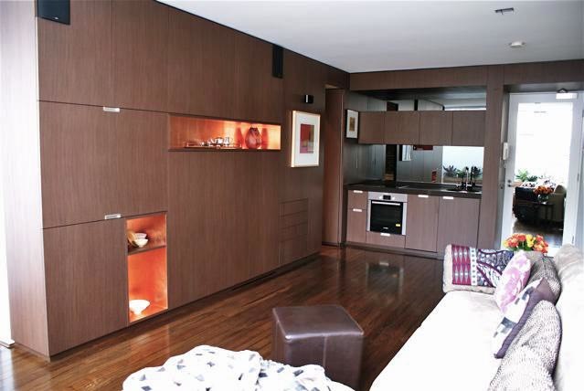
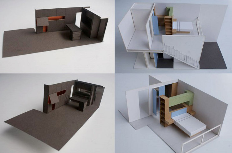
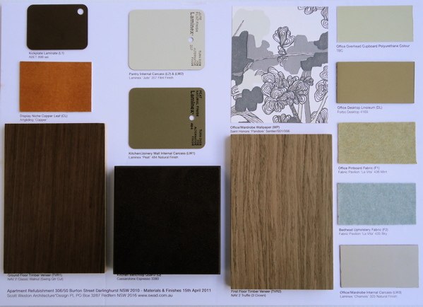
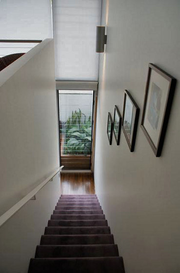
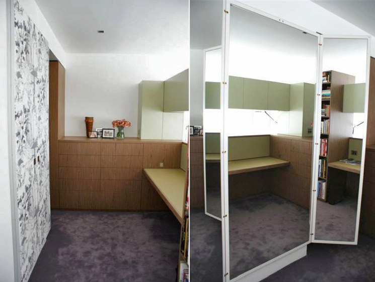
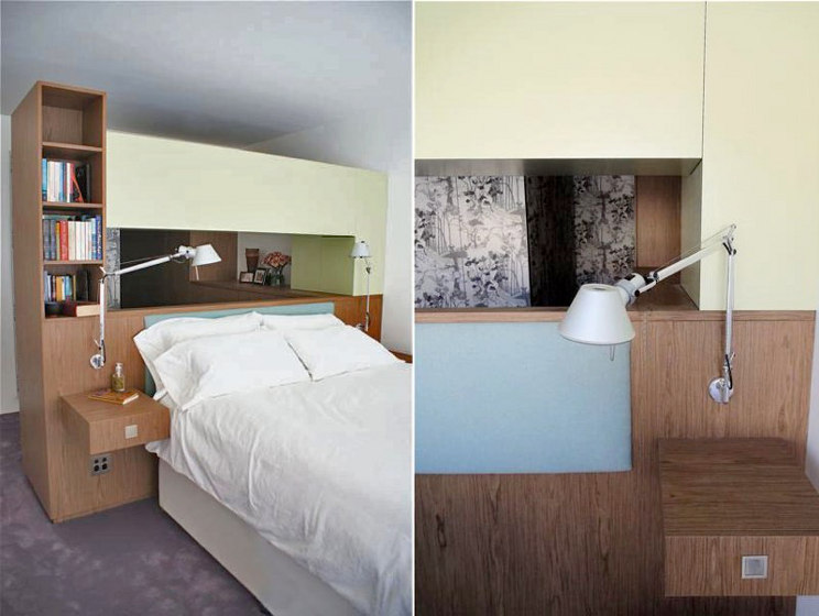
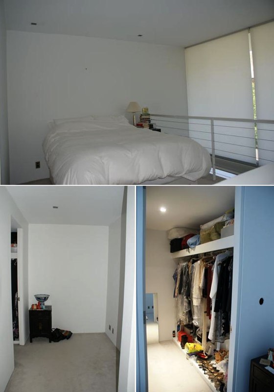
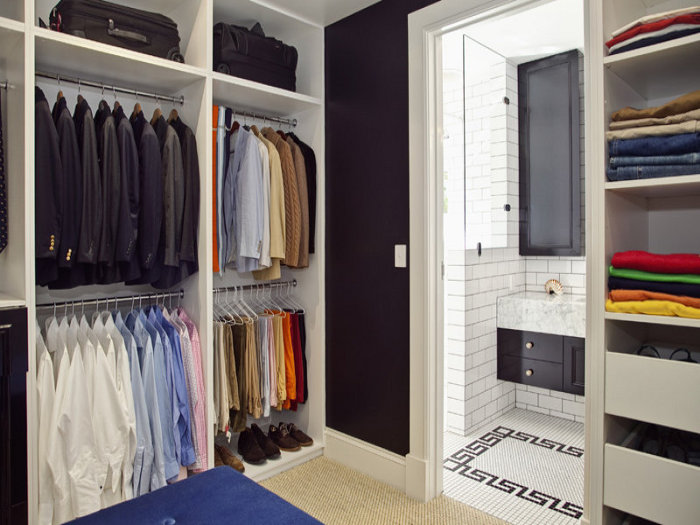
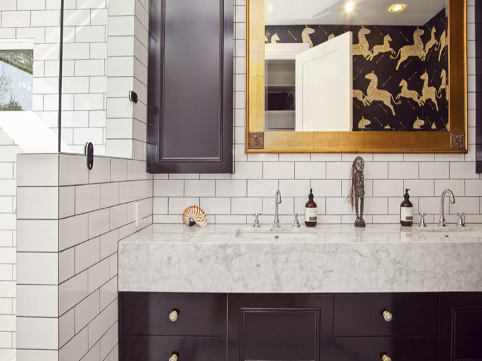
I get so excited when I see an email from Australian architect Scott Weston in my inbox. He has been a regular on Desire to Inspire for quite some time now as he generously shares his latest projects. What gets me so excited though, is that not only are his projects so inspiring in their colour choices, storage solutions and great design, Scott generously gives us an insight into his design process, material selections, plans and models. The complete package. Today is no different. I’ll let Scott explain SWAD‘s latest work.
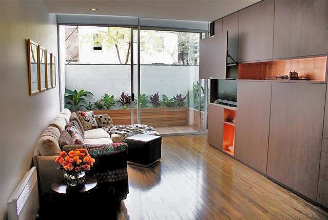
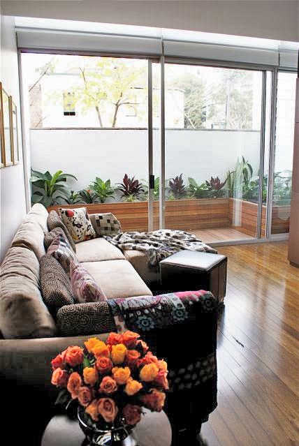
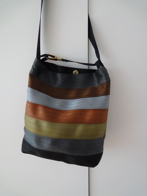
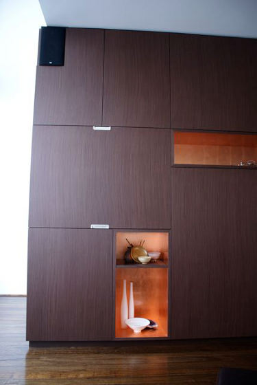
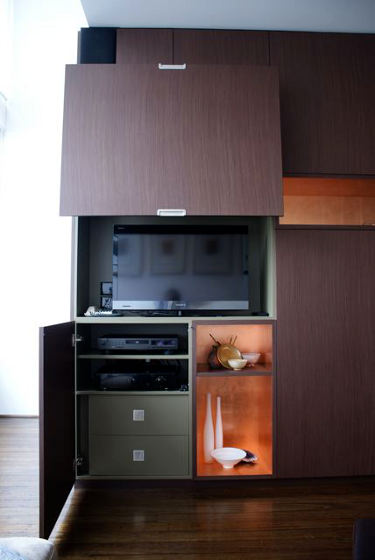
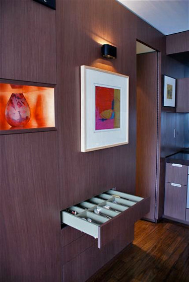
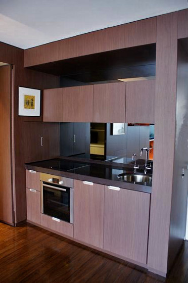
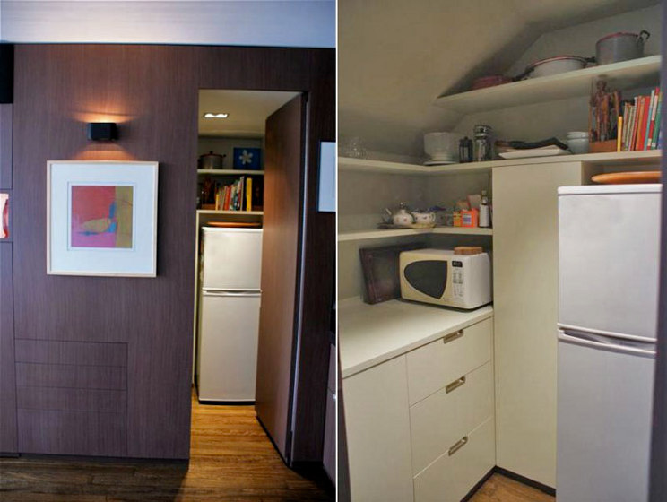
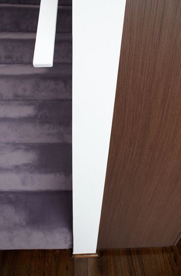
It’s been a while since I shared what we have been up to in SWAD world. We have just completed a 70m2 apartment in Darlinghurst for a female doctor who sold her house up in the blue mountains and is now living full time in the city. The existing apartment was ‘surprise surprise’ a cold white bland space devoid of any personality but had great natural light. The general colour scheme of materials and finishes was generated by the Client’s favorite colours as shown by the handbag with it’s walnut, powder blue, copper, olive green and silver grey palette. On the ground floor we designed a continuous floor to ceiling walnut timber ‘hero wall’ 500mm wide x 5626mm long that concealed everything. The bespoke cabinetry housed TV, stereo, speakers, flexible shelving, electronic push touch drawers and secret walk-in pantry all finished in a light olive green. To break up the scale and planar shape we inserted linear and vertical niches that were hand finished in copper leaf and reflect beautifully both natural and artificial light. The return end wall housed the kitchen wet area and appliances and we used grey mirror to reflect and give the illusion of greater depth to the room and reflect the new landscaped external balcony room. The pantry is a great exercise in planning and design and reminds the Client of being on board an airplane or ships galley with everything having it’s own specific place.
Upstairs the existing ‘white blandness’ continued with a bedroom, separate inglenook office and a rather dark and dingy wardrobe room. Walls were demolished and the entire room was opened up and the joinery insertions seamlessly defined the three functional activities of bedroom, office and robe. A light crown cut timber was used for the general robe wall and extended out to form the office and framework for the upholstered bedhead. A beautiful grey green hand drawn wallpaper with pistachio green overtones was selected to define opposing walls and to house a concealed triptych mirror and cupboards to the robe corridor. The office borrowed on the flavours of eau de nil with a desktop of powdery olive linoleum and a cashmere pinboard in a similar hue. Turning the corner there is a vertical library shelving system and facing the window the oversized king size bed with powder blue cashmere bedhead. Direct and indirect strip lighting creates great visual drama to the spaces and the finishing touch being the grey/lilac carpet that ties both upstairs and downstairs together very elegantly. The Client took a leap of faith about the lilac carpet as I said many a time convincing….. that if we did just brown carpet the whole space would become very flat and the visual interest would not be there. Very happy Client and a pleased Architect.
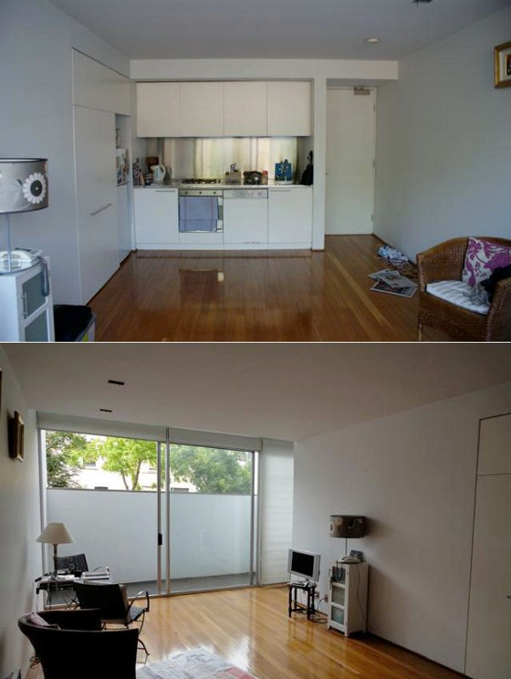

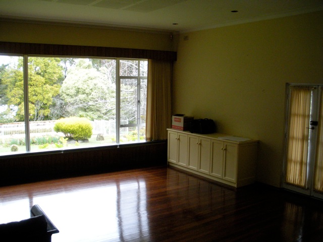
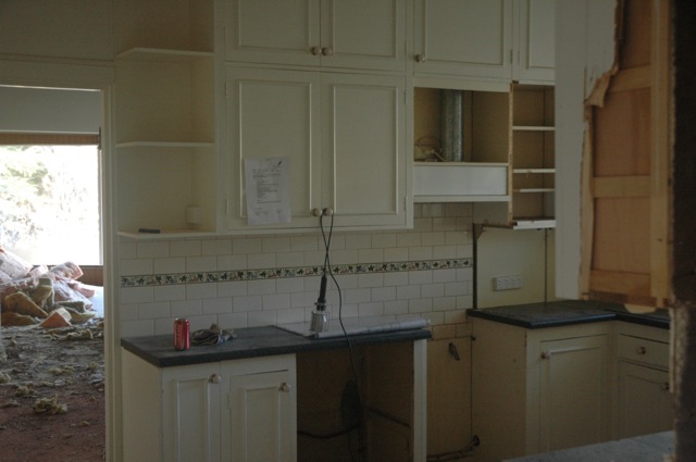
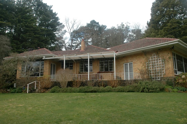
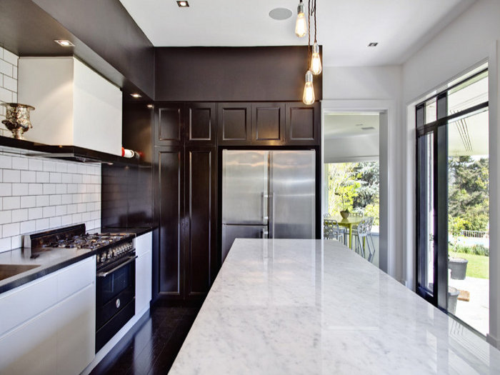
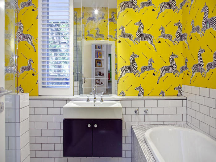
Reader’s home before and after
Posted on Sat, 22 Oct 2011 by midcenturyjo
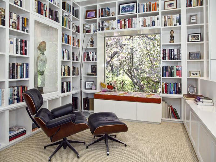
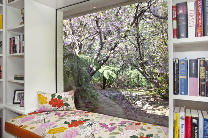
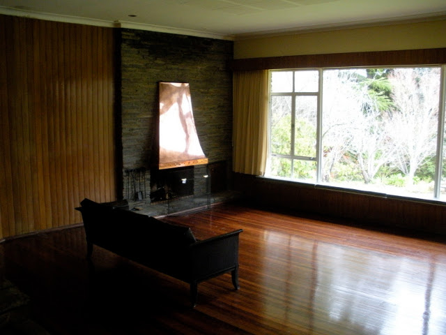
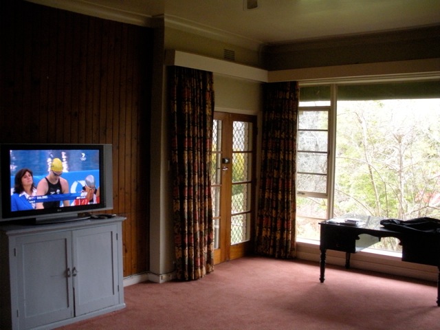
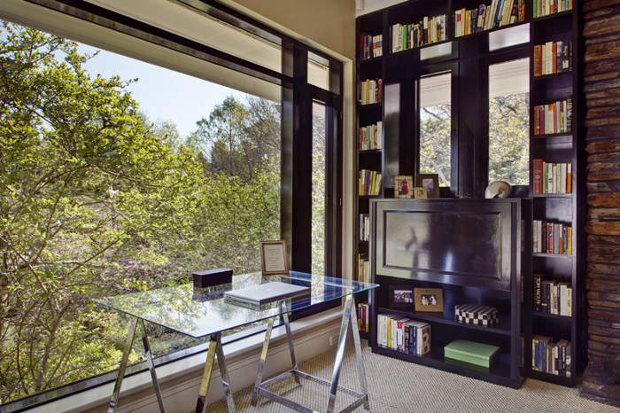
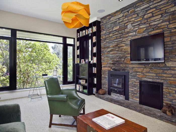
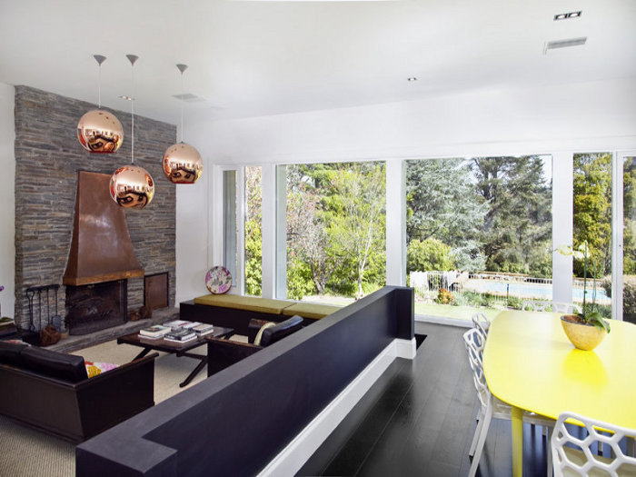
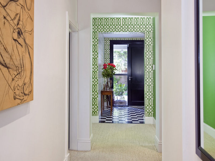
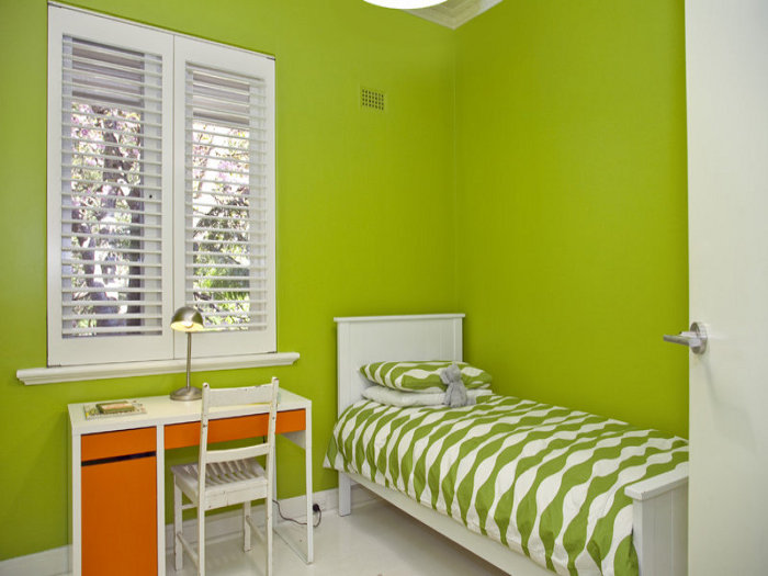
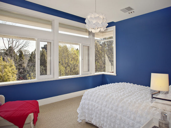
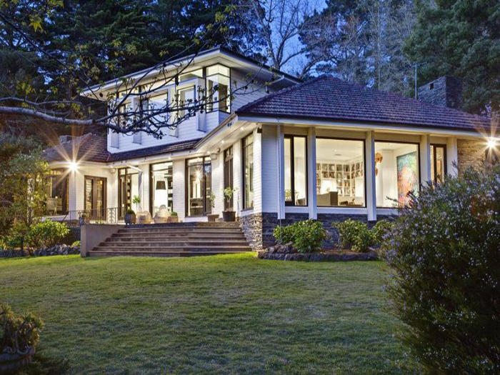
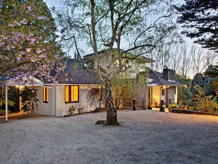
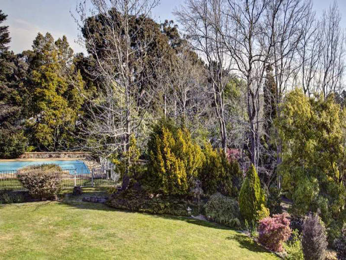
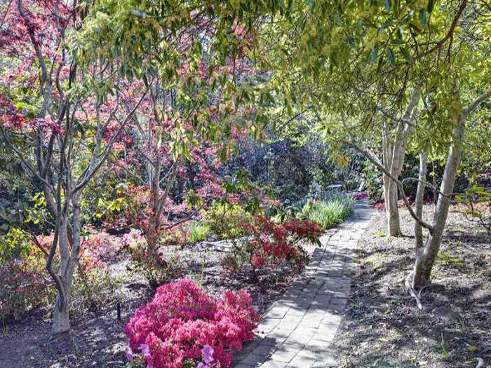
Kate emailed from the Adelaide Hills in South Australia. “After being inspired by you both so many times, I wanted to share an outcome that you helped inform. We recently completed a soup-to-nuts renovation. It was a long slog, but we finally got there and we’re thrilled. Thank you for providing inspiration during the design phase and critical creative lifts when it seemed like it would never end and I was running out of steam.” Kate describes the original house on her blog as “Outside: yellow bricks, small aluminum-framed windows, and lots of lattice-work pergolas. Inside: a rabbit’s warren, with too many doors leading into lots of pokey rooms and a front door that entered directly into the family room where the refrigerator sat.” Here are some befores…
WOW Kate what a wonderful home… now! I can’t believe the change. My favourite spot? The library. Oh and the kitchen. And the ensuite and the garden. I’d love to see your home photographed for a magazine. Some of you will realise that the shots Kate has shared are real estate listing photographs. Yes it’s true. Kate and her family have worked so hard to create this miracle and now it’s on the market. (Link here.) Good luck with the sale Kate and make sure you share your next renovation!


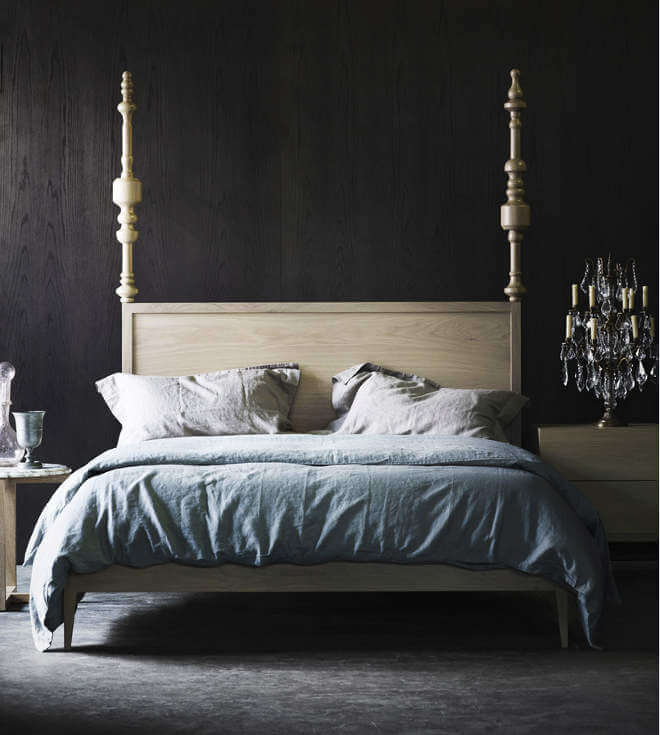
Black beauties
Posted on Fri, 21 Oct 2011 by midcenturyjo
Love the styling of the latest range by Australian furniture designers Zuster. Fabulous furniture. Wonderful “rooms”. Seriously how sexy are those American Oak legs on the Sabrina Lounge! By turning to the dark side the sisters have found the perfect counterfoil to their new range. Inspiring. Beautiful.


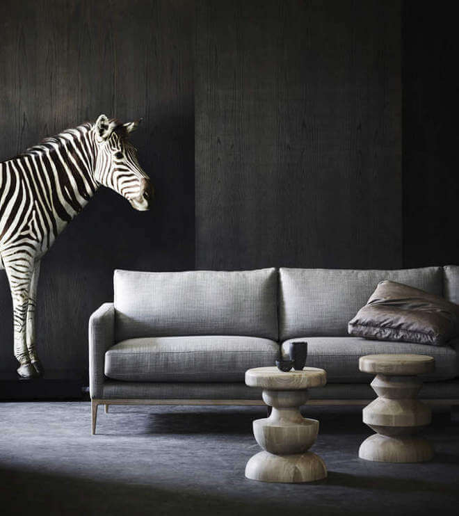
P.S. The zebra is a resin model. The partridge … well that’s not.