Displaying posts labeled "Brass"
The Rooftop bar at the Quarryman’s Hotel in NSW, Australia
Posted on Sun, 28 Jun 2020 by KiM
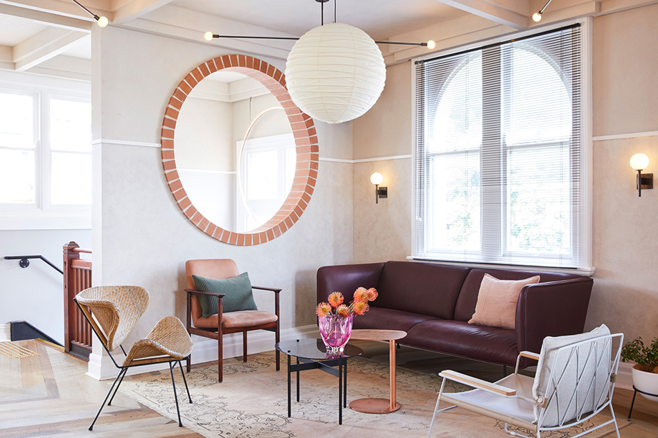
Killing Matt Woods was inspired by the mid century modernism and the gardens and architecture of Palm Springs when designing The Rooftop bar at the Quarryman’s Hotel in Pyrmont, NSW, Australia. “The Rooftop” aims to attract the diverse crowds which populate the many creative offices & aims to attract the diverse crowds which populate the many creative offices & studio spaces within the Pyrmont peninsula, & hopes to give this City fringe suburbs occupants a genuine alternative environment from which to dance the night away. The circles that repeat throughout the space and the reclaimed multi-coloured timber floor make this eye-catching and really special.
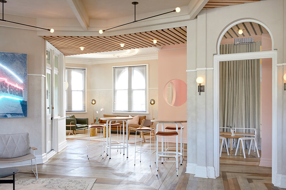
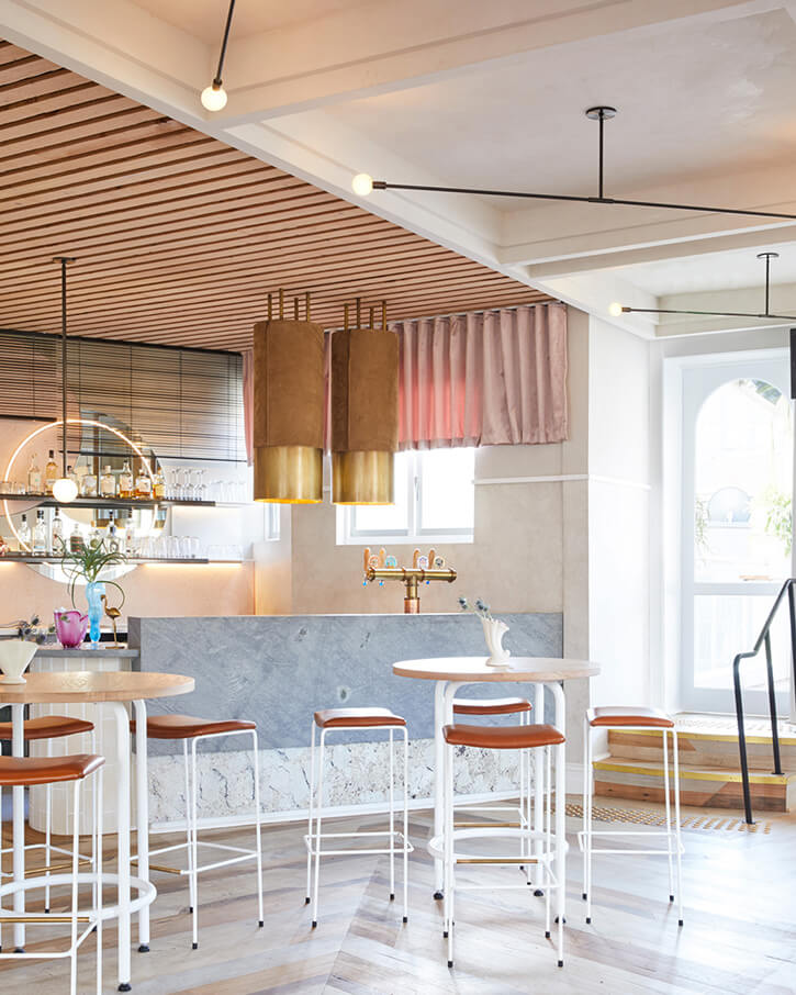
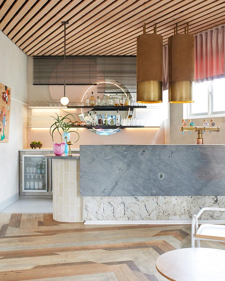
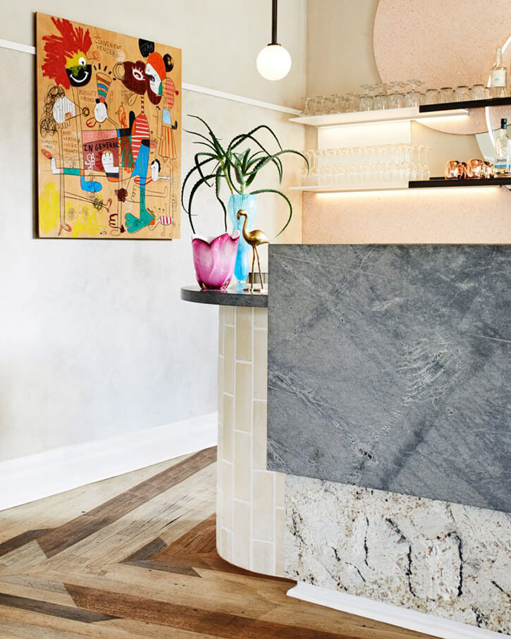
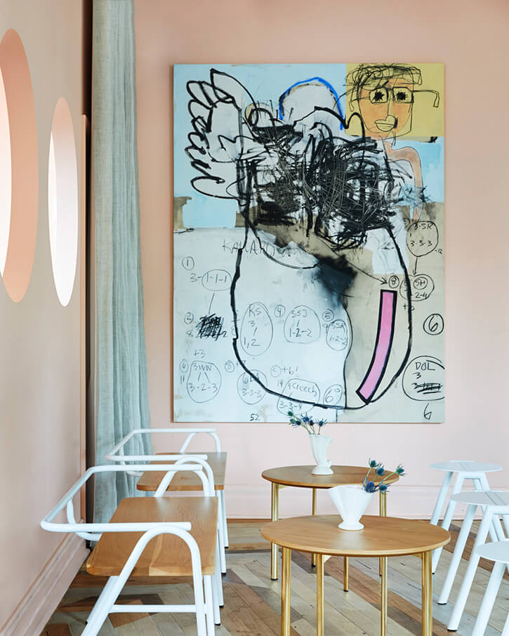
Photography: Dave Wheeler
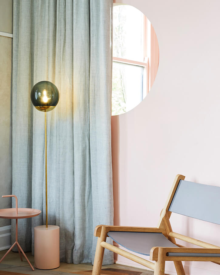
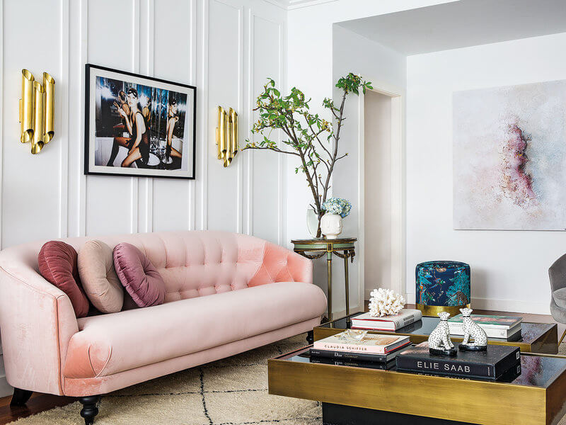
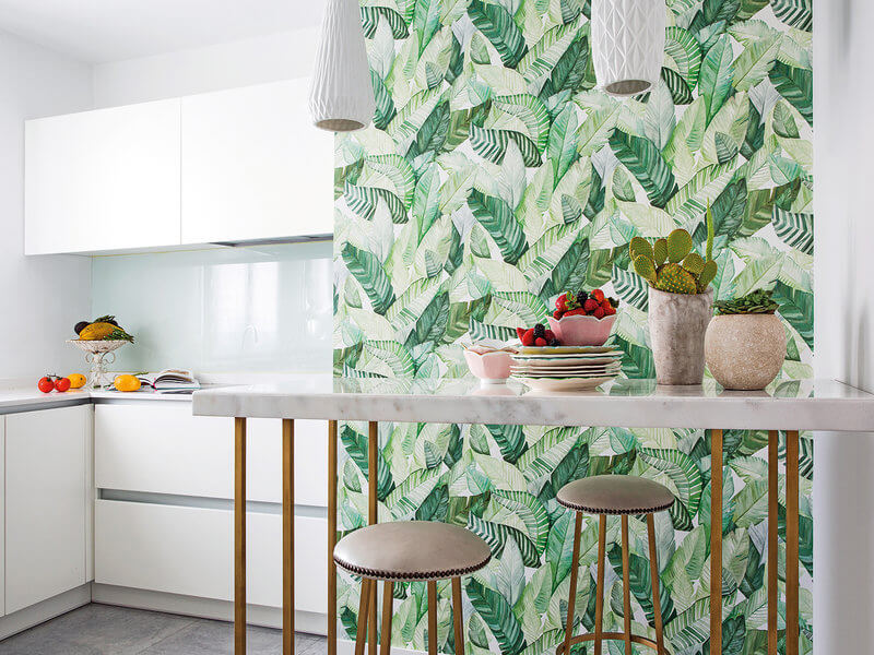
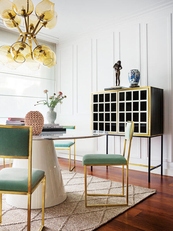
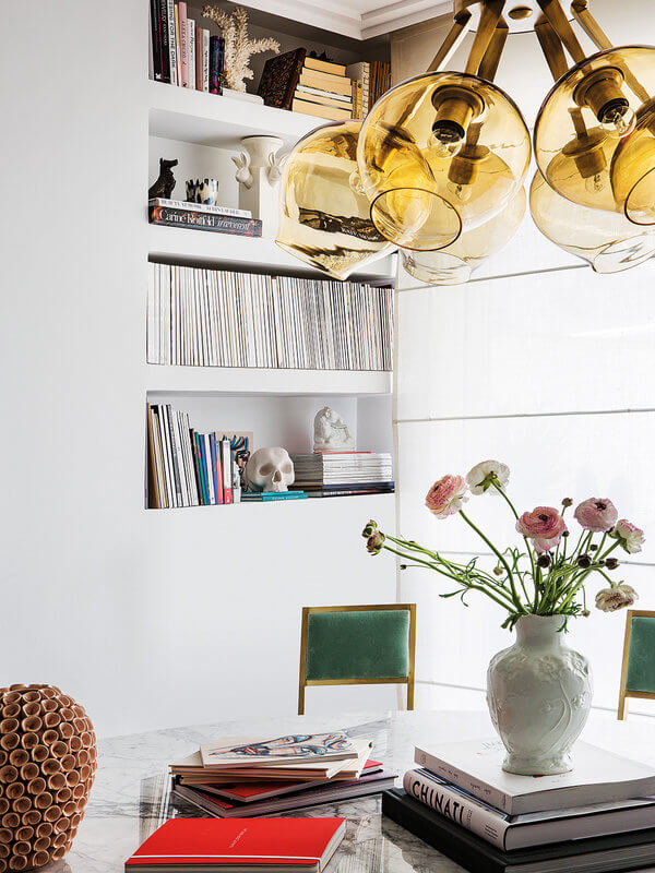
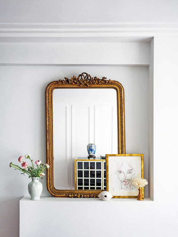
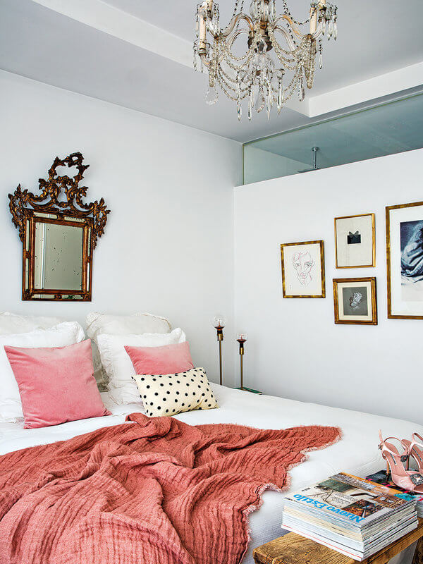
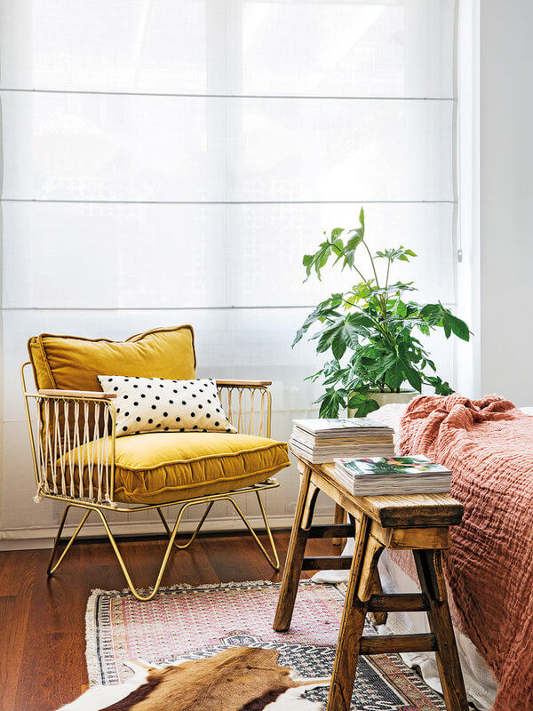
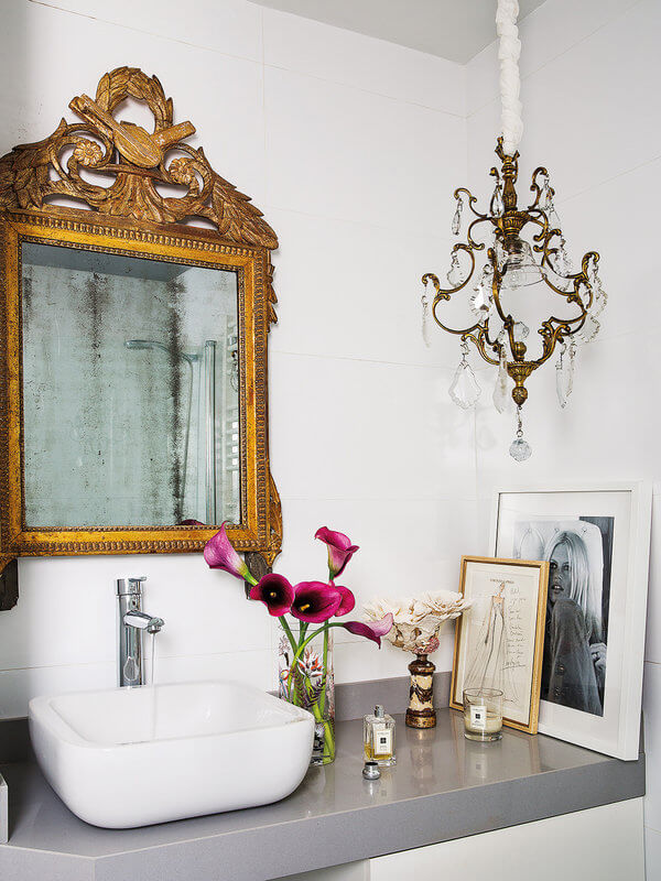
A Madrid apartment with feminine glam touches
Posted on Sun, 21 Jun 2020 by KiM
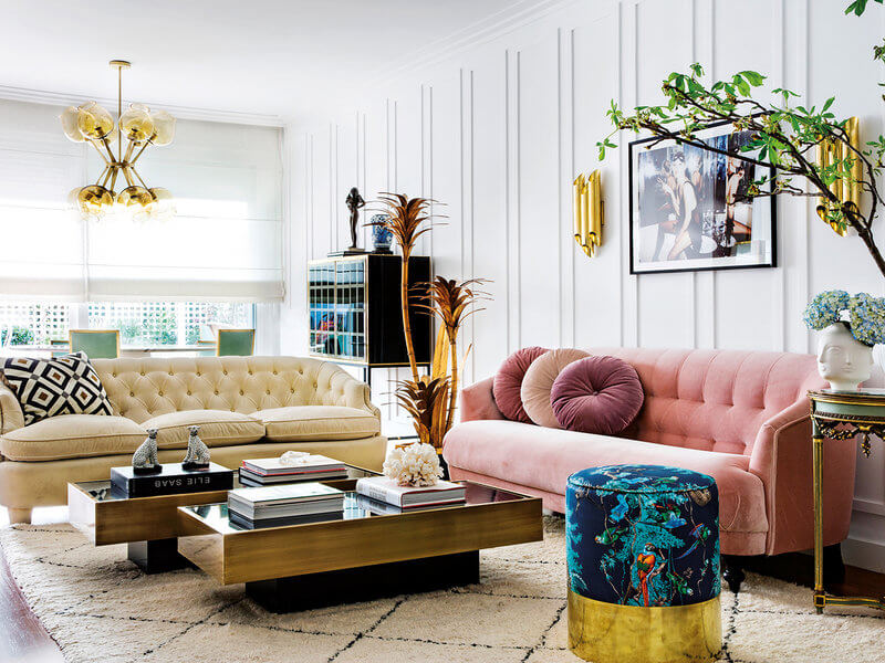
I love this really pretty apartment in Madrid, home to Paula Ordovás, fashion journalist, influencer and blogger at Mypeeptoes. A pink sofa, brass accents, ornate mirrors and chandeliers give this space a feminine glam vibe. Some fun vintage finds are throughout – my favourite being the brass palm tree lamp from the 40’s in the photo above. SO FUN! Via Nuevo Estilo, photos by Pablo Sarabia.
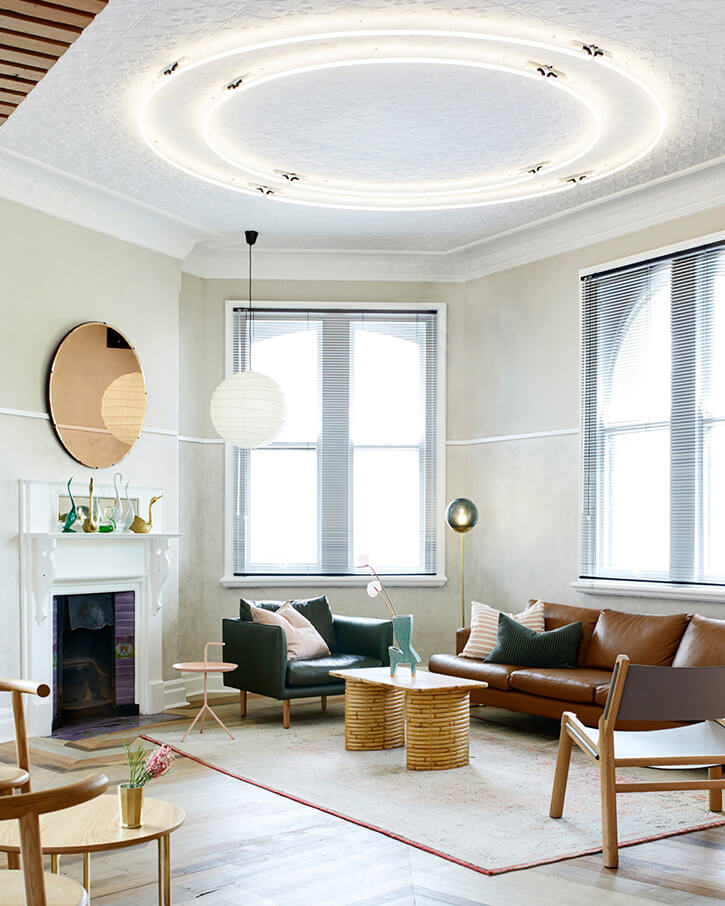
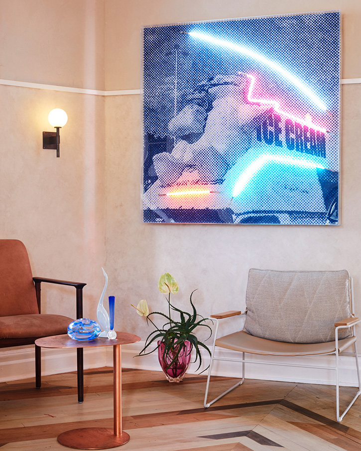
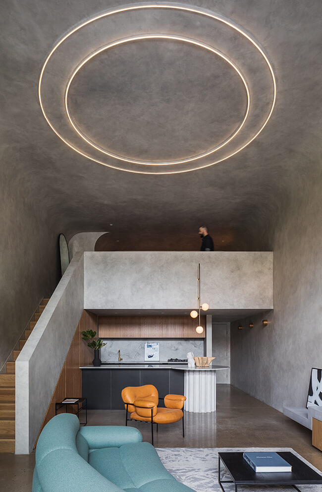
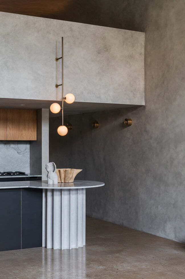
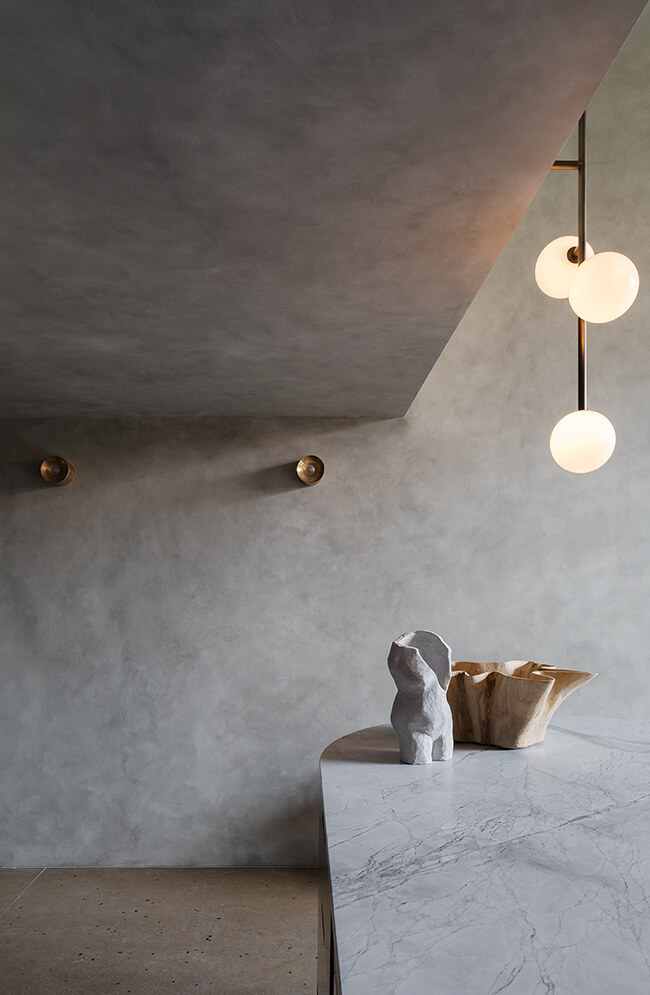
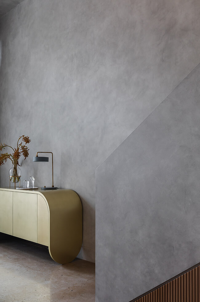
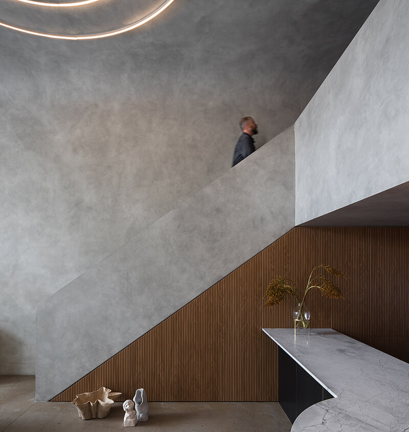
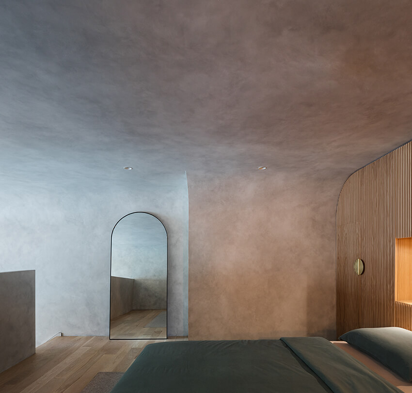
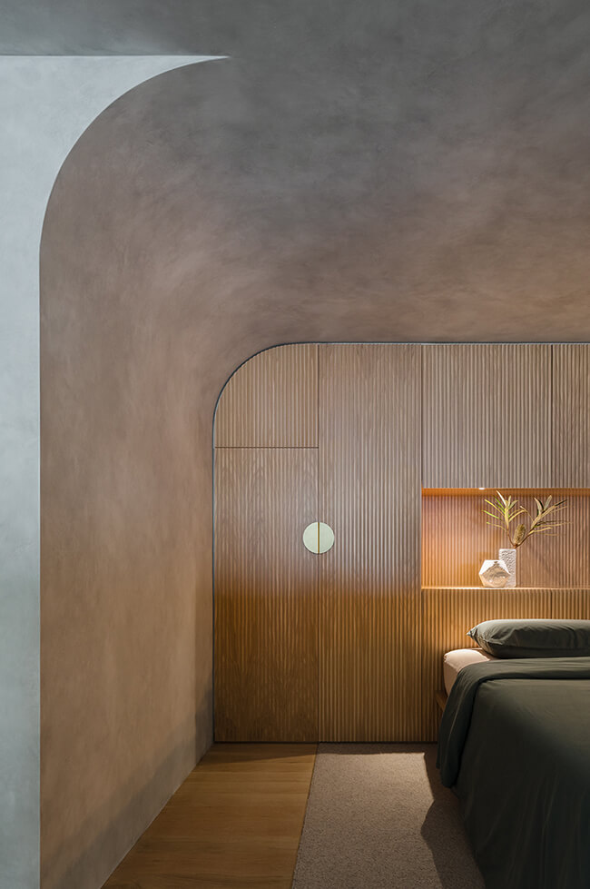
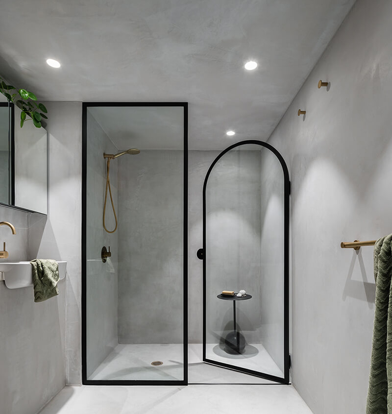
Perfect Storm by Killing Matt Woods
Posted on Wed, 10 Jun 2020 by KiM
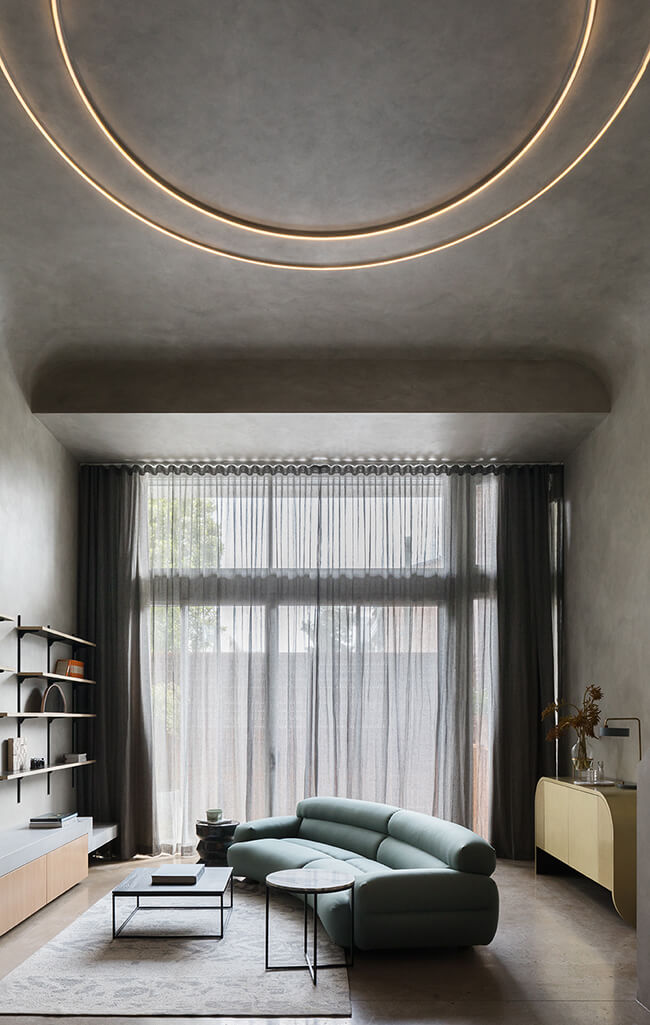
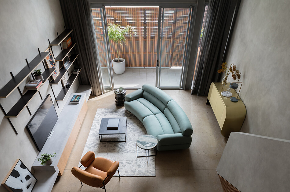
I’m not sure I can ever really get behind minimalism, but this converted warehouse in Sydney transformed into a concrete bunker of sorts is really quite beautiful. That curved ceiling and the 2 story impact of it is spectacular. It’s incredible that such a simple architectural detail could add so much interest. I also love how the curve is found throughout the loft (sofa, console, mirror, shower door). Brutalism with a cocooning impact. Designed by Matt Woods.

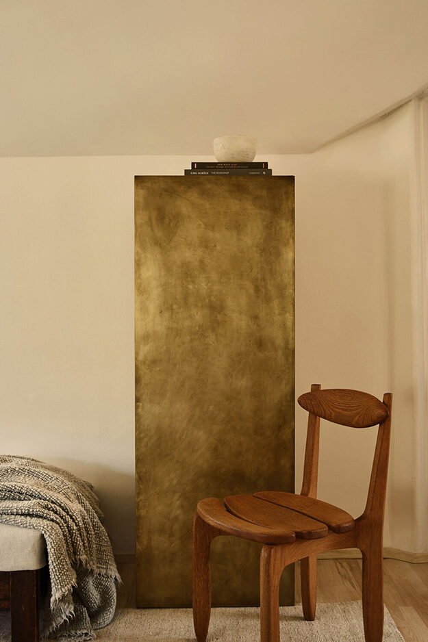
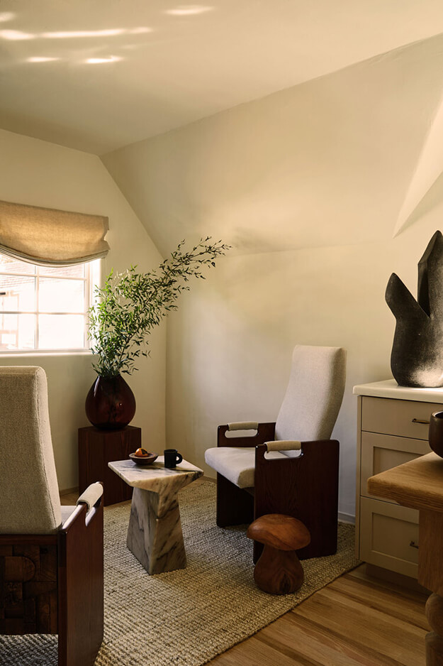
A fine balancing act
Posted on Tue, 26 May 2020 by midcenturyjo

It’s all about balance. A balance between crisp and modern and rustic and weathered. Rough versus smooth. A hint of scandi with a dose of Aussie. Light versus dark. Formally structured and sensuous and tactile. A fine balancing act indeed. Hunters Hill House by Handelsmann + Khaw.
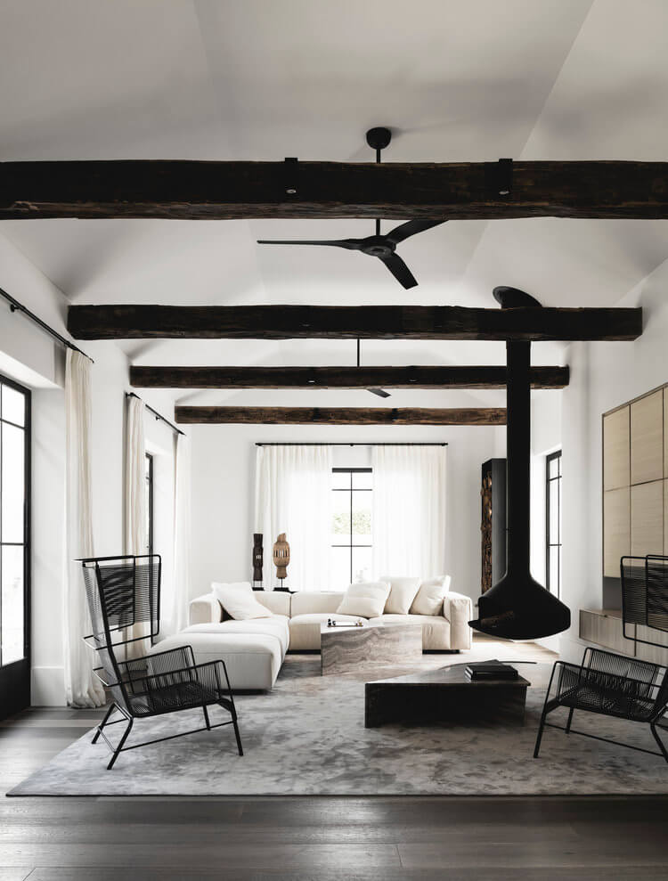

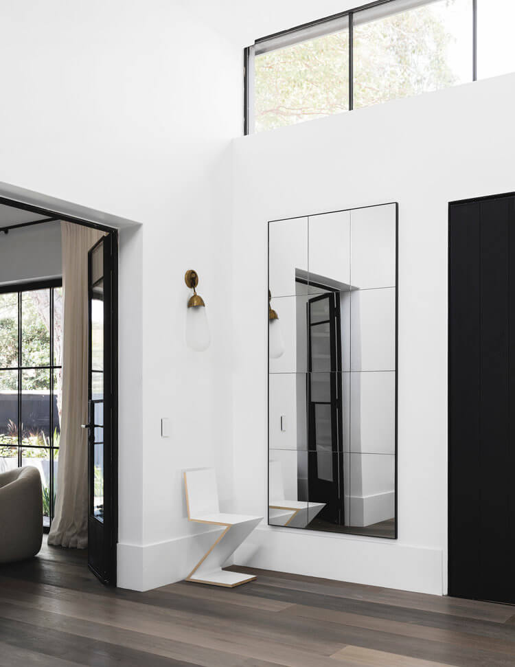

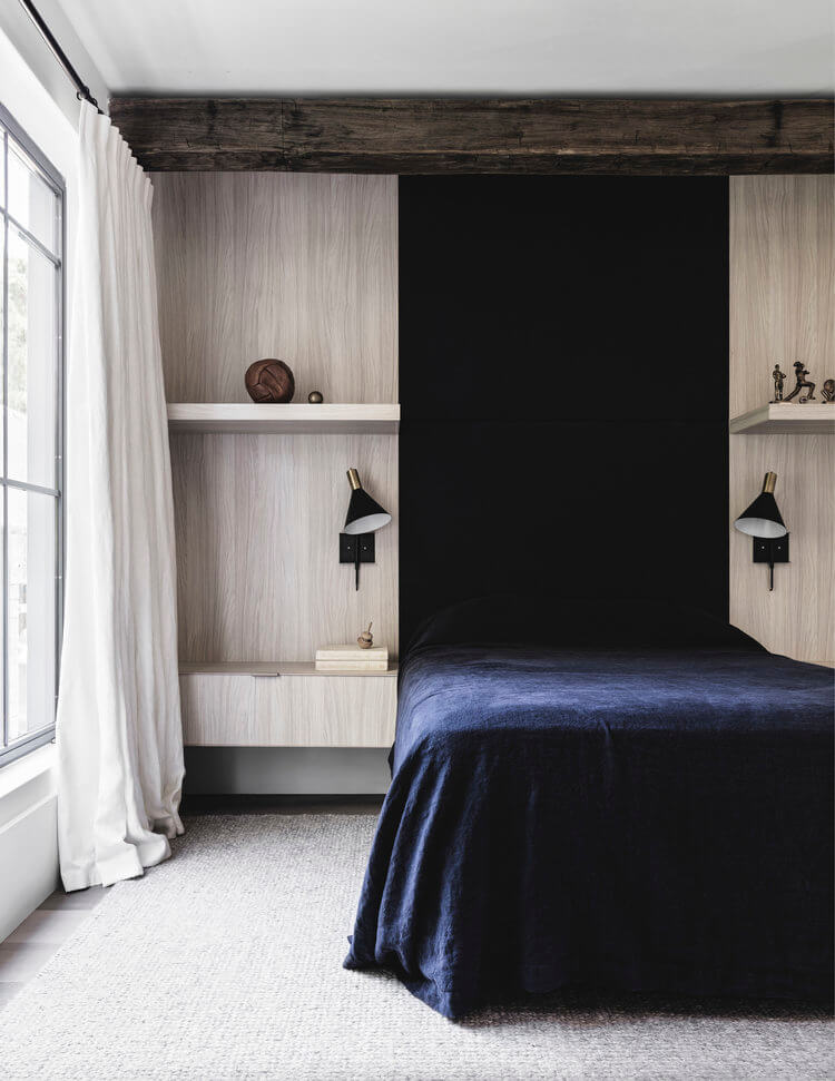
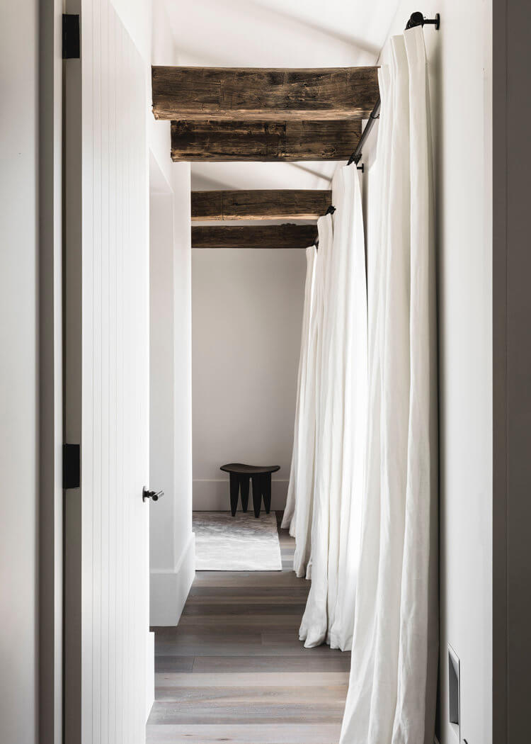
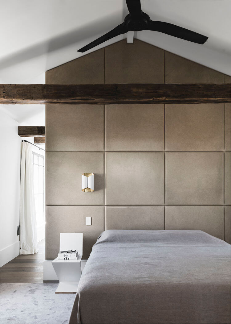
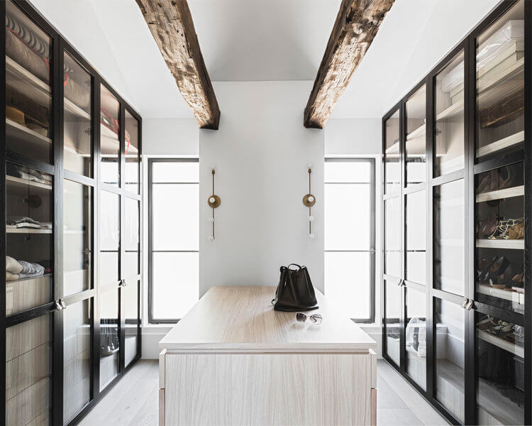
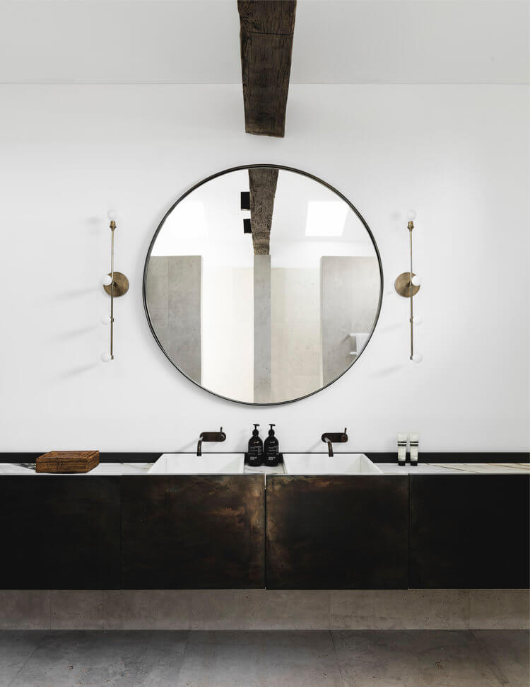

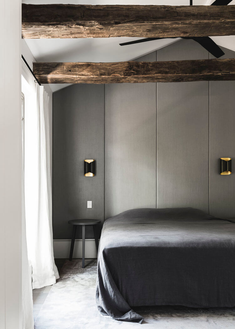
Photography by Felix Forest
A pied-à-terre in a Tudor home
Posted on Mon, 25 May 2020 by KiM
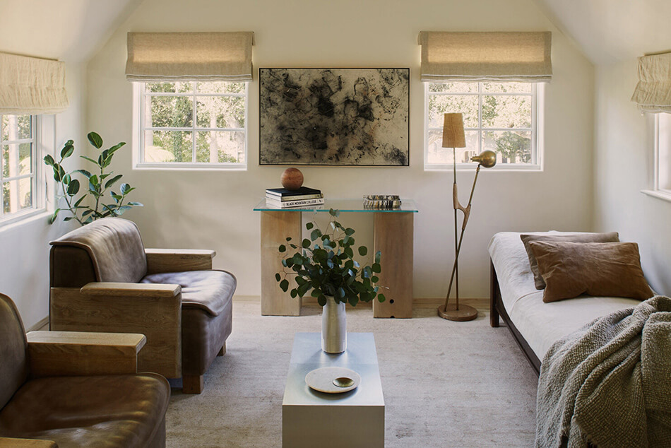
Simplicity with neutrals and textures, creating serenity. Corinne Mathern was hired to convert the 1000 square foot second floor of a 1925 Tudor residence to a well appointed one bedroom apartment. The space was tragically chopped up into five offices that masked the building’s angled ceilings and made them burdensome instead of beautiful. Corinne’s client wanted a light filled apartment with elements that nodded to traditional Tudor elements but with modern hues. The angles of the ceiling and the coved windows drove the design for this space. The lines created a soft, sculptural feel that we placed focus on by minimizing the door and window trims throughout the home. “The instant I saw the property, I knew the space had the potential to be a beautiful, light filled apartment with a serene, open feel.”
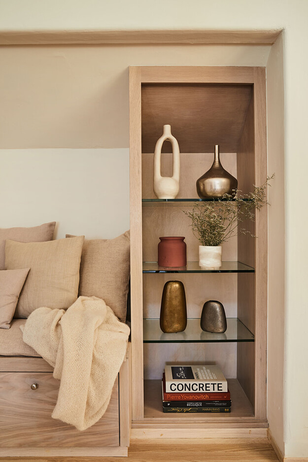
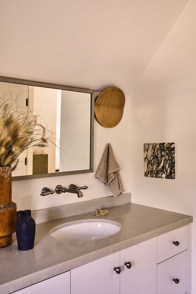

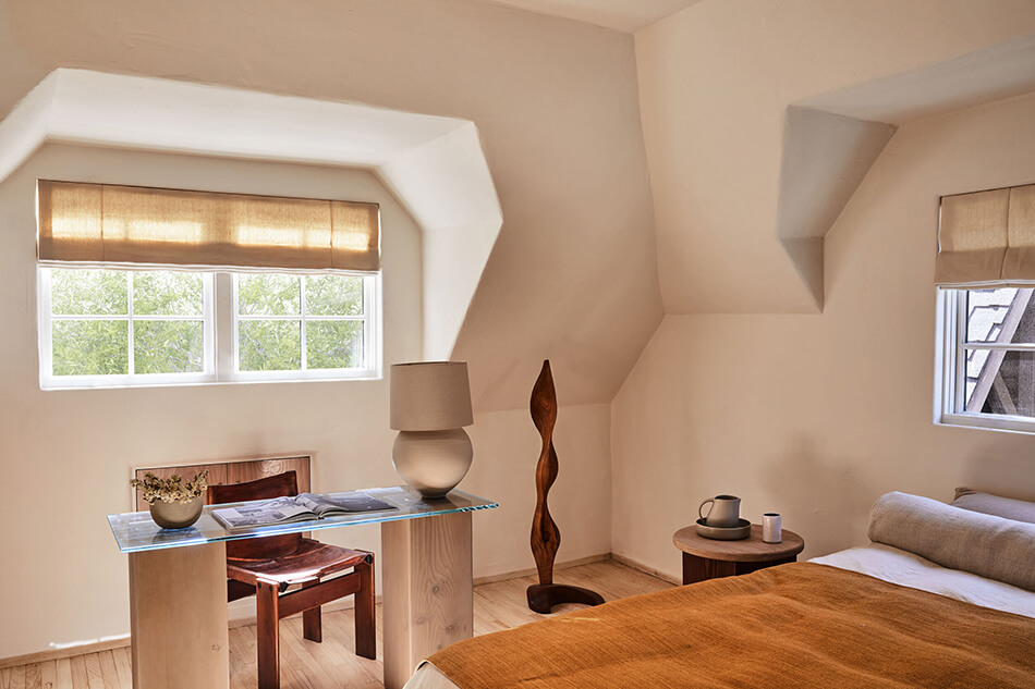
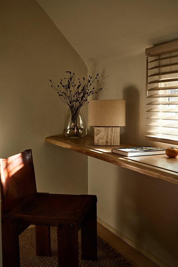
Photography by Sam Frost

