Displaying posts labeled "Colour"
Farrow & Ball’s 9 new colours
Posted on Thu, 11 Feb 2016 by KiM
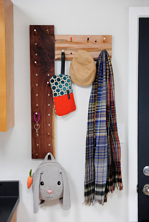
I am a bit late posting this but on February 1 Farrow & Ball, the best paint company in all the world, launched 9 new colours (bringing their very modest total to 141). I received a press kit the other day and I am even more excited about these new incredible colours than I initially was. If that’s even possible.
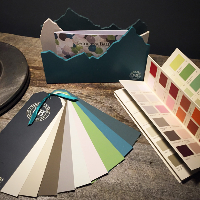
(Pardon the crap photo – I am only ever home during daylight on weekends)
These new shades are magical, and I am just dying to give some of them a try in my house. Let me do a little introduction.
Shadow White. A perfect warm, off-white with a bit of grey.
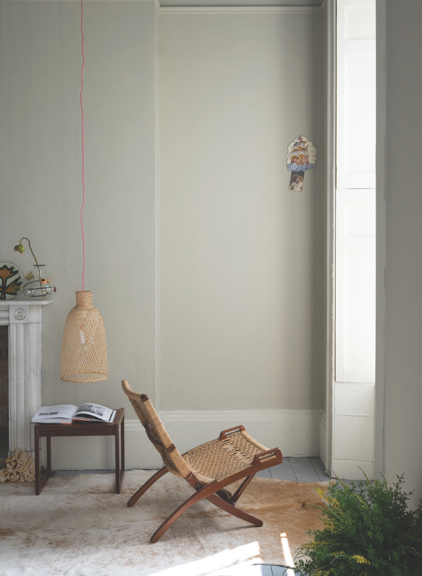
Drop Cloth. The perfect “dirty muddy white”. It reads neither too yellow nor too grey making it the perfect colour for those who are wary of the fashion for grey and avoid tones that are too cream.
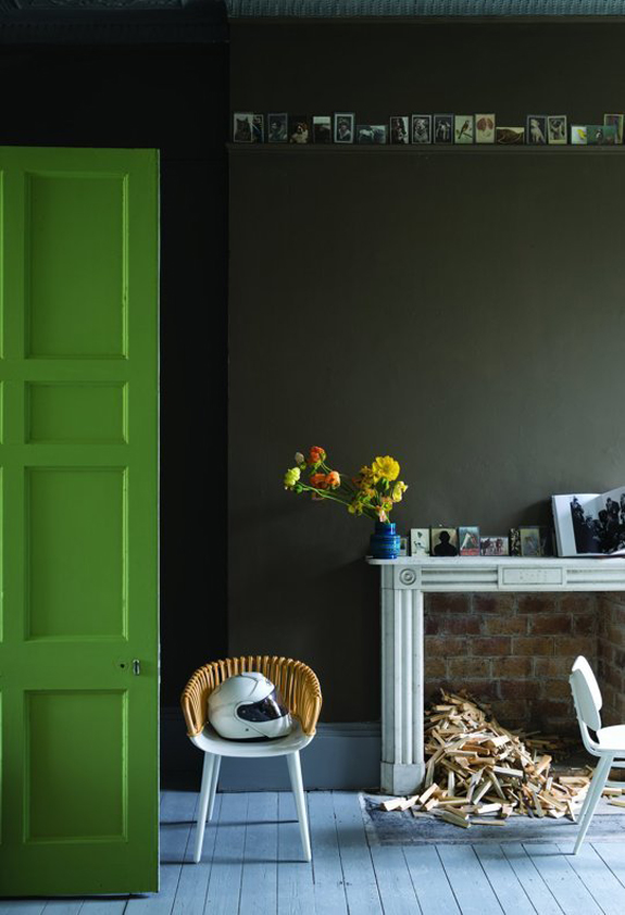
Salon Drab. Nothing drab about this dreamy brown! Its richness is extremely appealing and will create rooms that have mid-19th century authenticity despite being perceived as the perfect ‘chocolate’ for the modern home. Perfect for darker north facing rooms to make them feel cocooning and cosy.
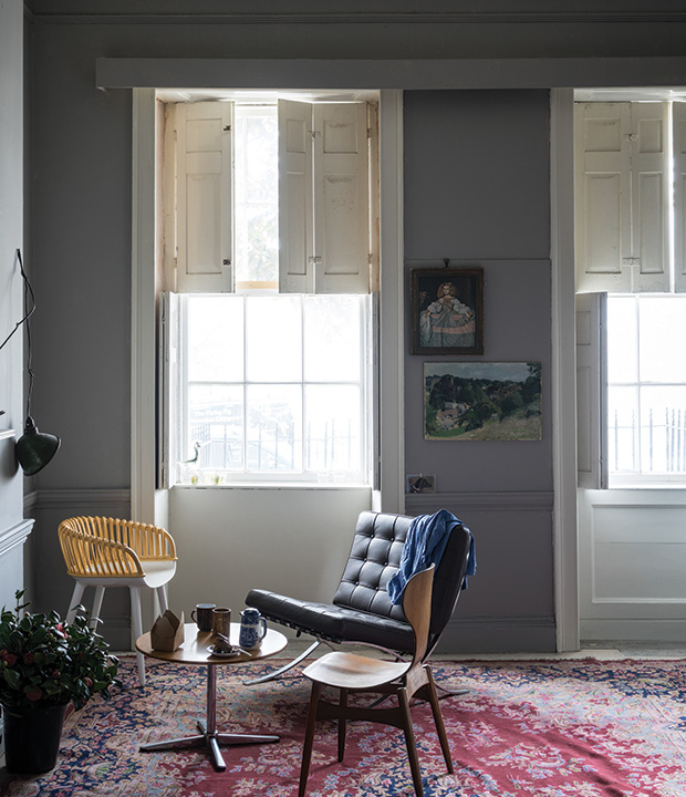
Worsted. A gritty grey with lots of brown in it. The perfect medium shade for a room where you just don’t know what to do. It goes with everything.
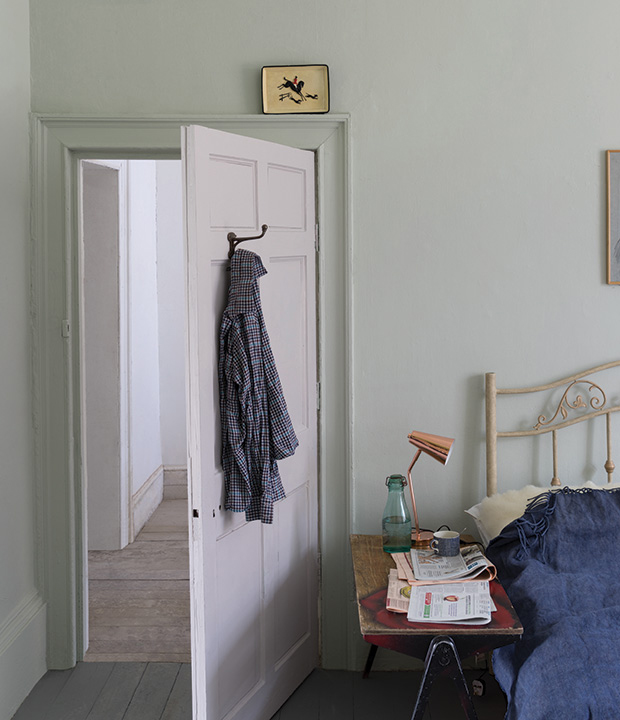
Cromarty. A very pale blue/grey/green. Such a soft subtle shade. Its ease of use means that it can create the softest of rooms which are neither too blue nor too grey. It is the perfect tone for those who like to keep things soft and muted.
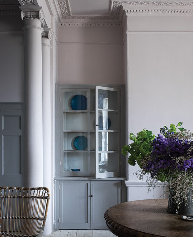
Peignoir. A subtle, grey-ish pink. And coincidentally almost the exact colour my dining room currently is as I realized when I sampled it a few weeks ago. Peignoir will create the most humble, blushing interior as it is the softest of pinks containing a great big dose of grey. Its romantic feel makes it an obvious bedroom choice for a traditional home but it will add a certain charm to any modern living area.
Yeabridge Green. An unusual green shade that would be amazing in a room filled with plants. A true avocado green.
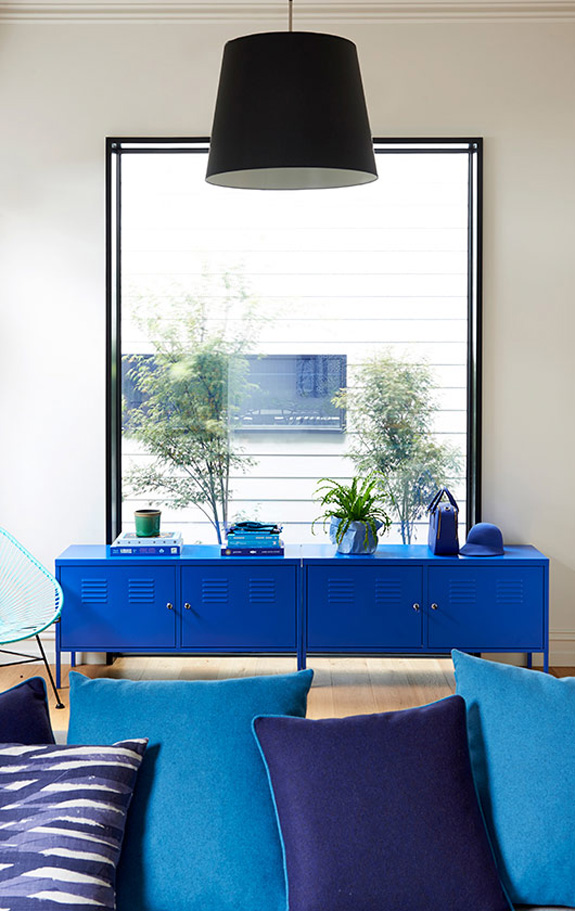
Vardo. Finally Farrow & Ball has a teal! But this one is so unique – it appears blue, then green, then grey. I imagine it would look completely different depending on the light.

Inchyra Blue. I will admit that this colour may be my favourite of them all. I have GOT to find a room to use this in! To some it reads grey and to others green, but what is for certain is that it is the perfect alternative to charcoal for use on walls in contemporary homes. In west facing rooms Inchyra Blue will look stronger and less coloured in the morning but become more blue as the day progresses.
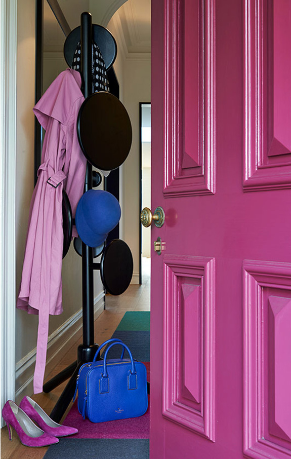
O Residence
Posted on Wed, 10 Feb 2016 by KiM
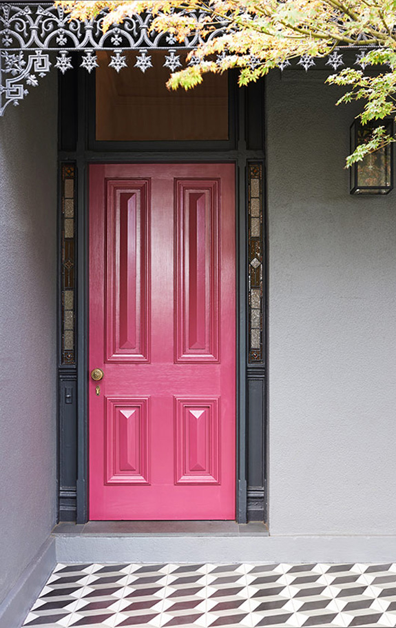
When you start with a bright pink door with black trim and tumbling block tile it should be called the OHHHHHHHHH Residence. Add some bright yellow and royal blue inside…. OHHHHHHHHH YESSSSS!! Designed by Melbourne-based interior architecture firm Studio Tate.
Happy midcentury
Posted on Fri, 5 Feb 2016 by KiM
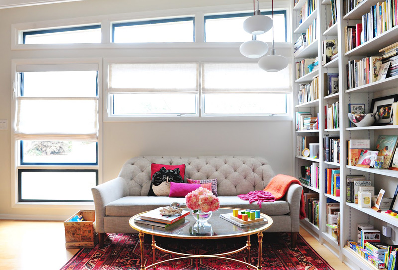
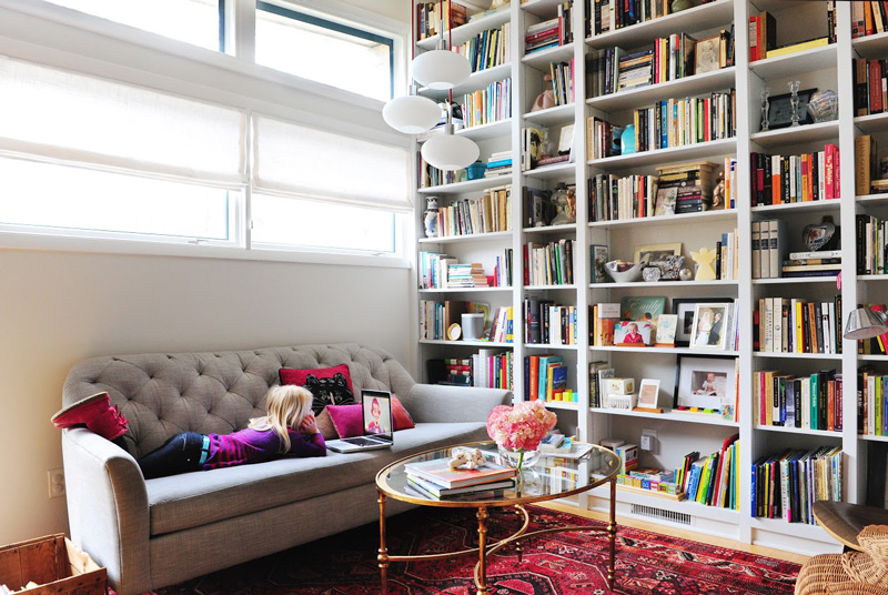
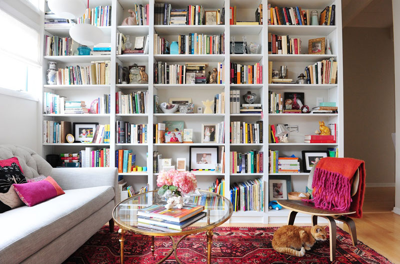
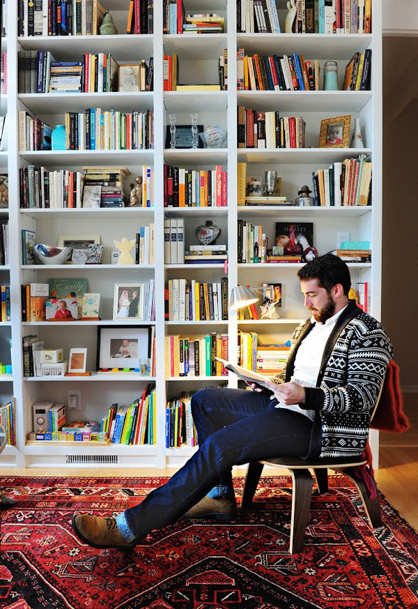
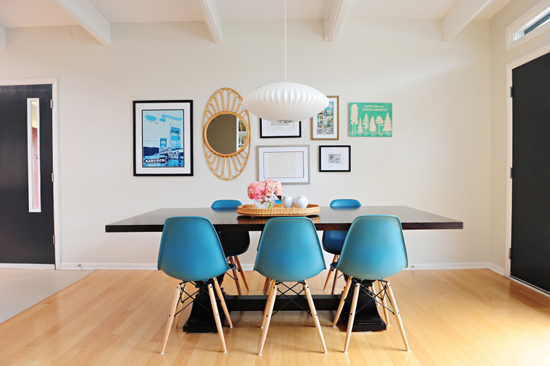
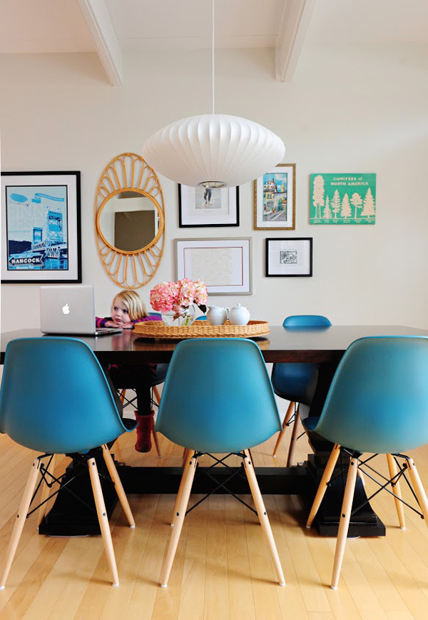
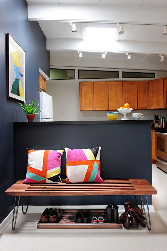
I have a fantastic makeover to share with you today sent in by the folks at Indiana-based Susan Yeley Interiors. Let me start right off the bat with some before photos. From totally boring…..
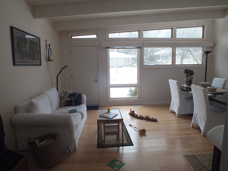
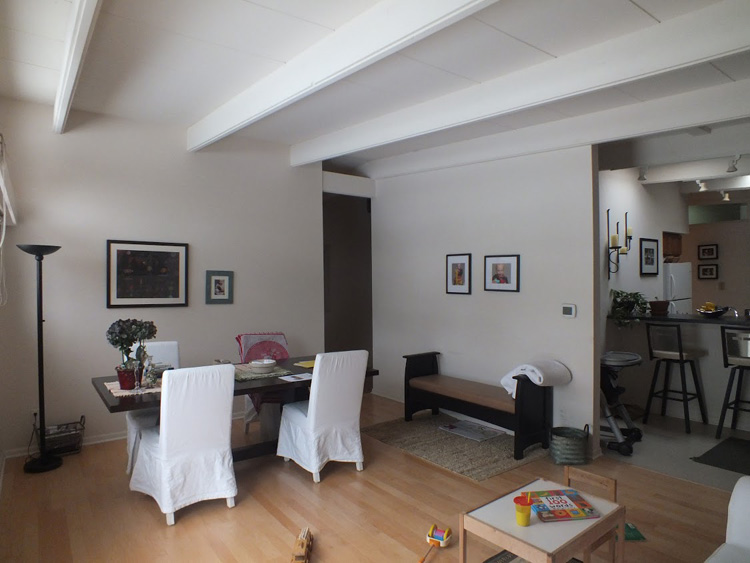
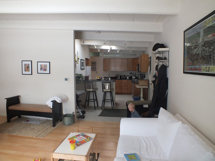
…to totally awesome with a midcentury vibe!! Here’s the scoop: This small midcentury home south of campus has great bones but lacked vibrancy—a je ne sais quoi that the clients were searching to savoir once and for all. SYI worked with them to nail down a design direction and furniture plan, and they decided to invest in the big-impact items first: built-ins and lighting and a fresh paint job that included a beautiful deep blue-green line around the windows. The vintage rug was an Etsy score at an awesome price, but only after the client spent months scouring options and sources online that matched the vision and dimensions of the plan. A good year later, the West Elm sofa went on sale, so the client took advantage; some time after that, they painted the kitchen, created the drop zone/bench area, and rounded out the room with occasional tables and accessories.
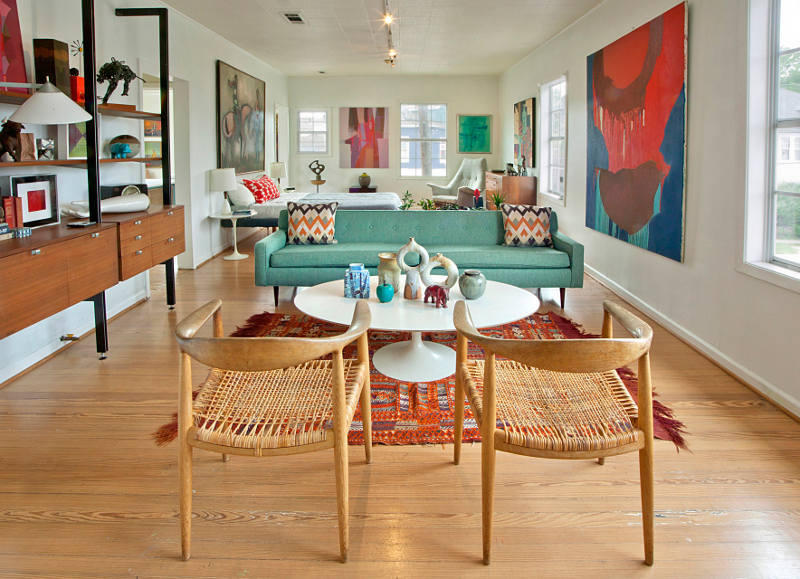
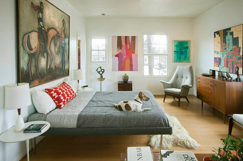
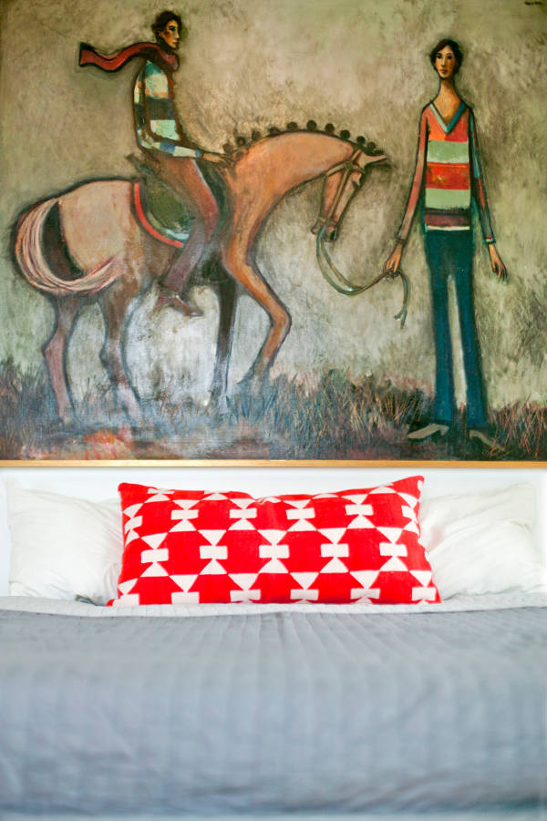
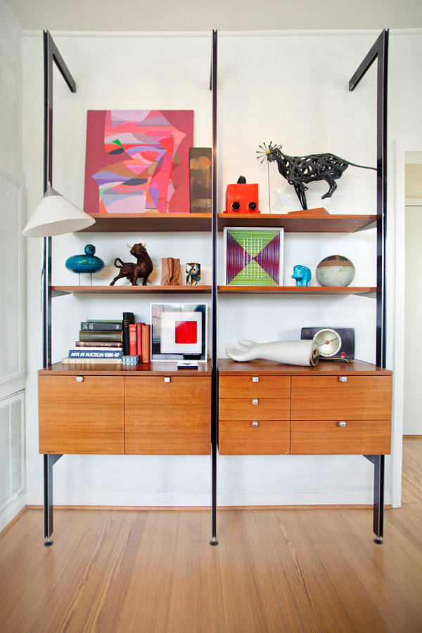
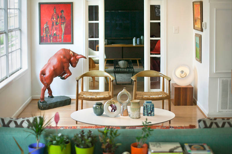
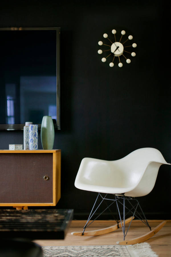
Midcentury marvellous
Posted on Mon, 25 Jan 2016 by midcenturyjo
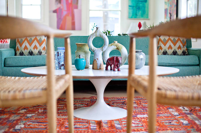
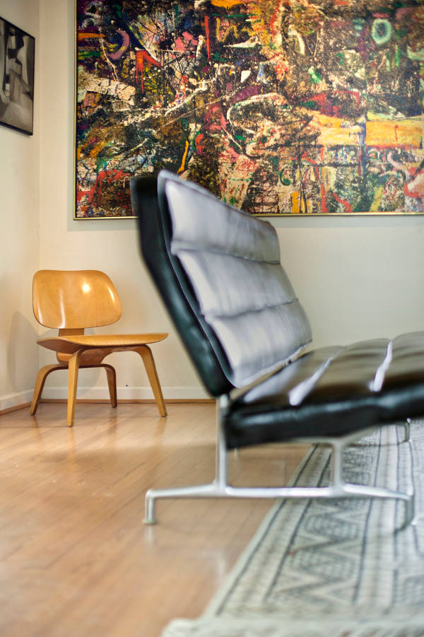
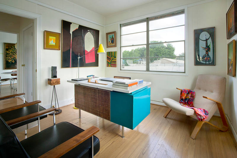
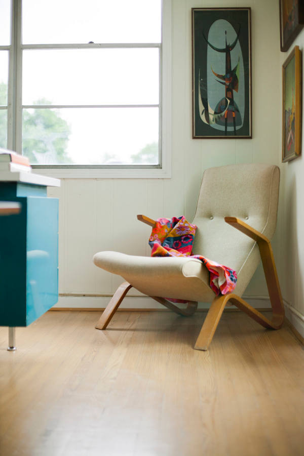
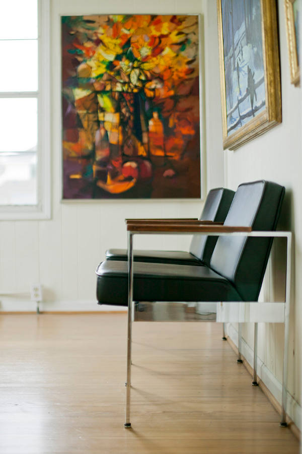
I can’t make up my mind what I like better about this apartment. The stellar midcentury furniture collection, the equally impressive art selection or the fact that it is alive with colour and light. I know I’d move in in a heart beat. They don’t call me Midcentury Jo for nothing. Fairview from the portfolio of Chris Nguyen of Analog Dialog.

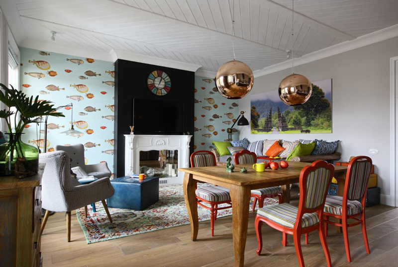
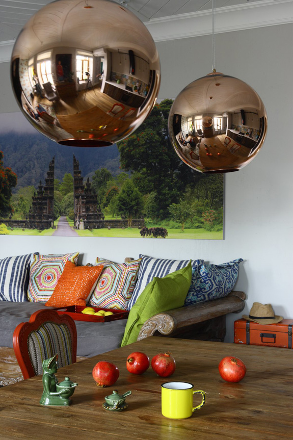
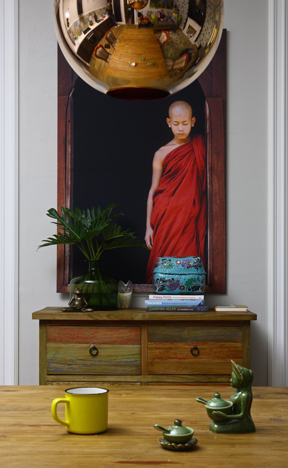
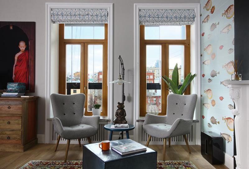
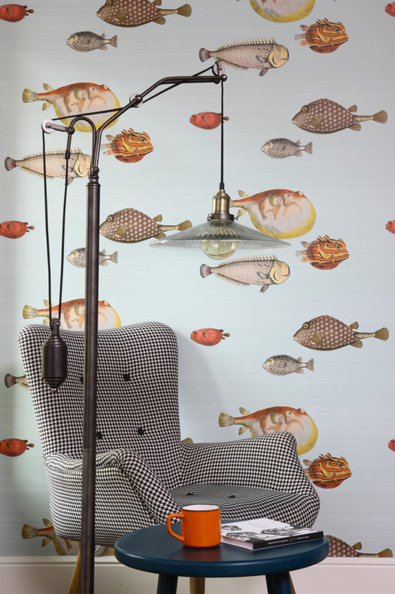
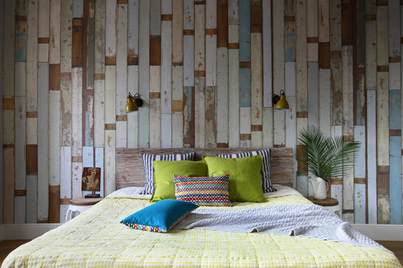
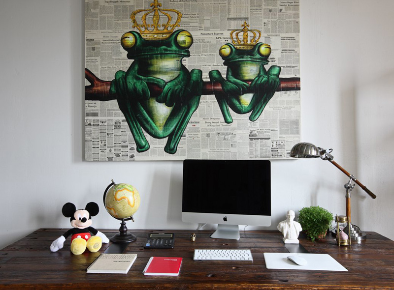
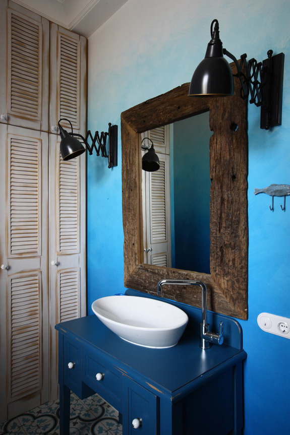
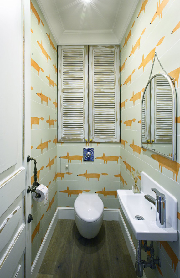
An eclectic apartment in Moscow
Posted on Sun, 17 Jan 2016 by KiM
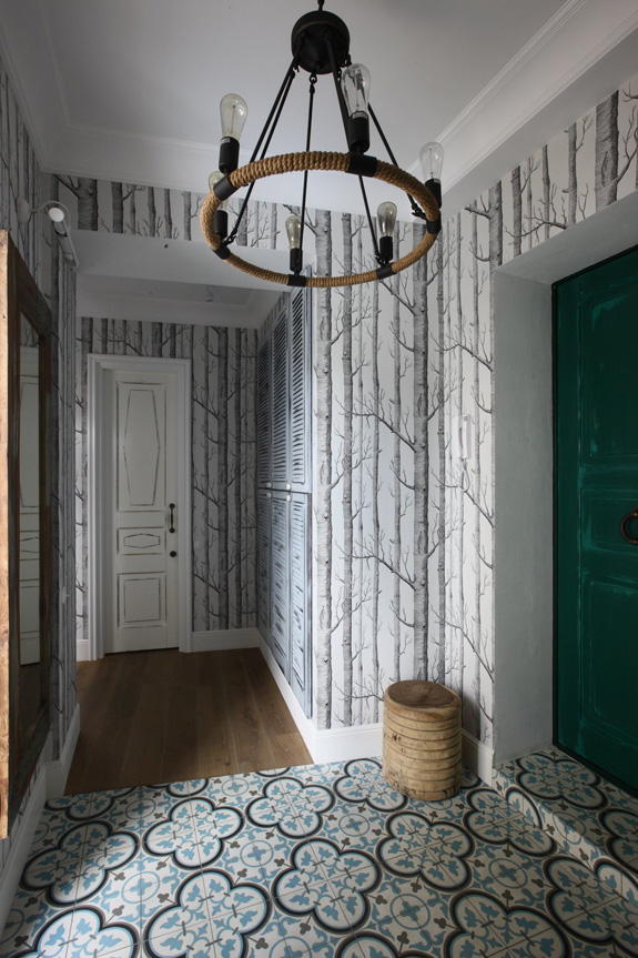
I spotted this fun apartment in Moscow featured on The Village and had to share. It is wonderfully eclectic and is filled with some of my favourite things – patterned encaustic tile, fun wallpapers, copper lights, and rustic furnishings. The modern mixed with global vibe makes this a funky little getaway in the city. (Photos: Michael Stepanov)