Displaying posts labeled "Colour"
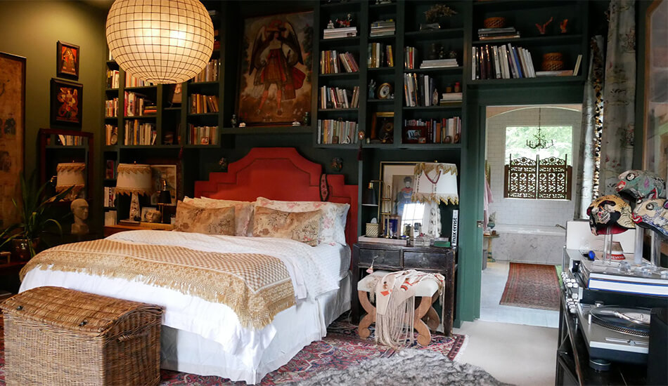
Pierce & Ward update – part 1
Posted on Thu, 26 Mar 2020 by KiM

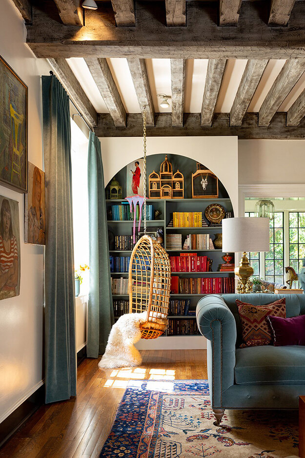
It has been a while since Jo first featured the work of L.A. and Nashville based designers Louisa Pierce and Emily Ward of Pierce & Ward. This talented duo is still going strong with maximalism and a flourish of colour, pattern and texture. Intriguing layers that make you stop and take in every inch.


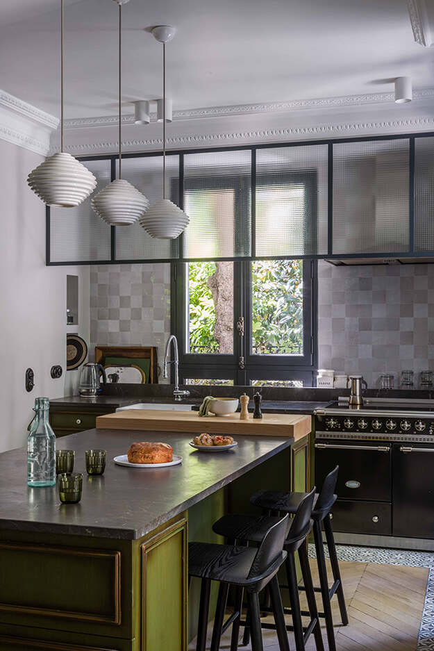
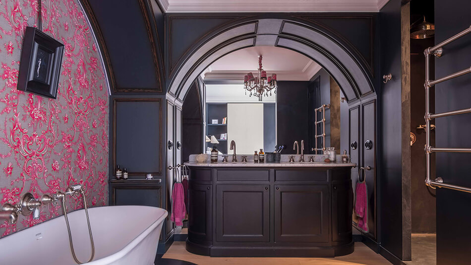
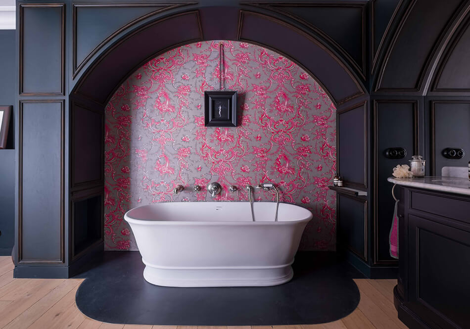
A renovated home in the heart of Paris
Posted on Tue, 24 Mar 2020 by KiM
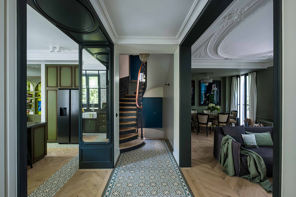
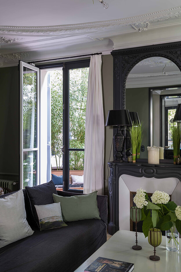
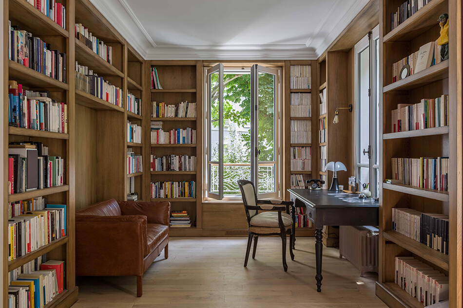
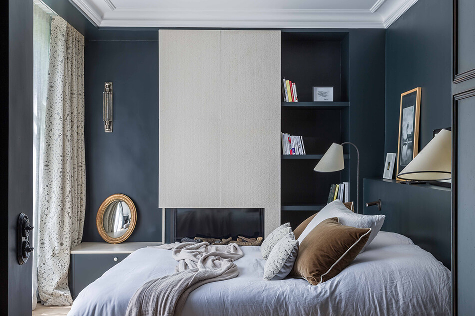
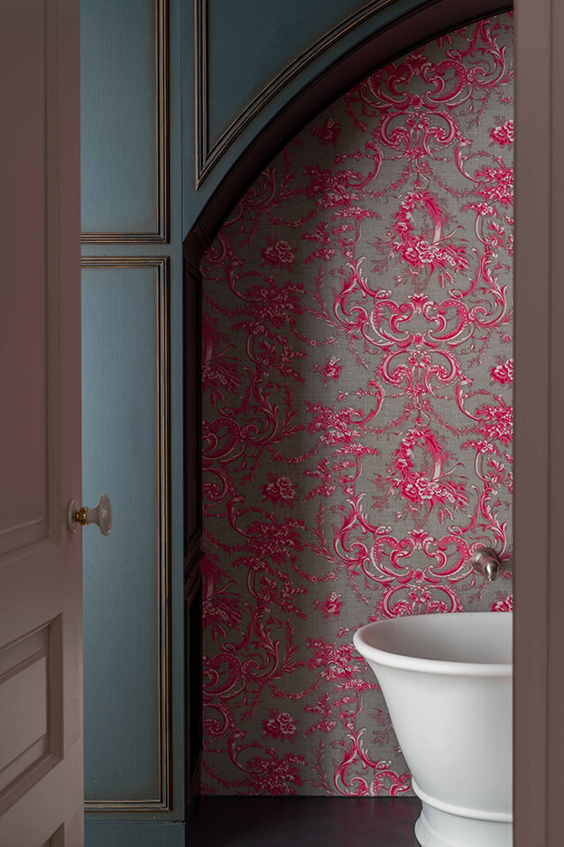
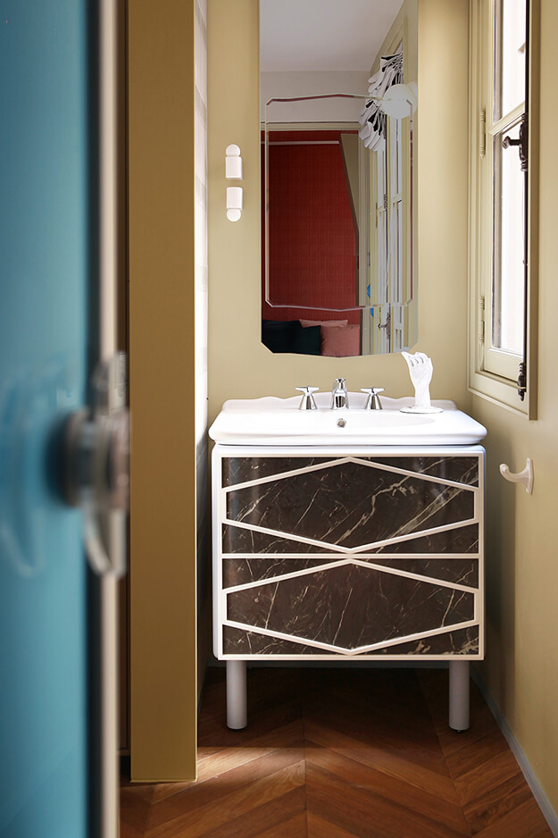
We have featured several projects by French design firm Agence Véronique Cotrel (the latest and unforgettable one was here) and this was is a must-share. The colour green is a favourite of mine and I love how it is used quite liberally throughout the main floor. The firm opened up this downtown Paris home creating larger spaces and much more light coming in from the garden (with the help of some newly added French doors). The floors were all redone and arches added into the kitchen (that include mirrors to keep the space open). Many more changes were made to make this home really beautiful and functional.


Sunday dining at a restaurant
Posted on Sun, 22 Mar 2020 by KiM
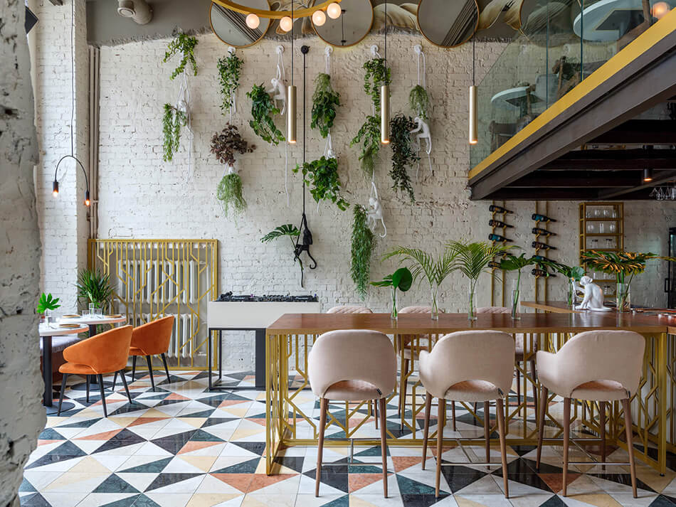
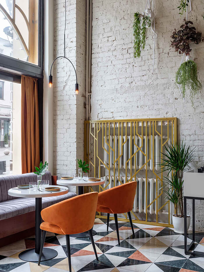
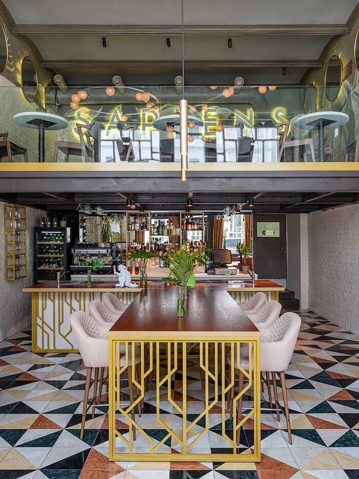
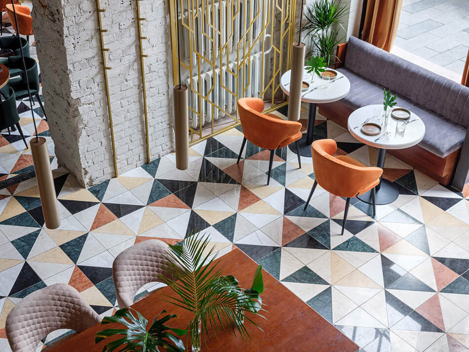
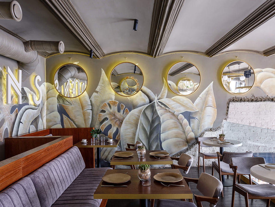
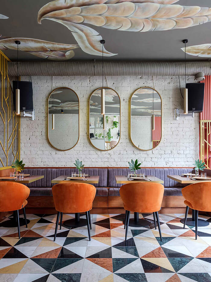
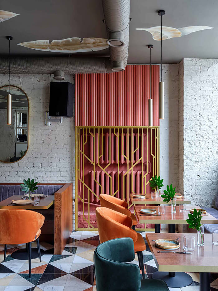
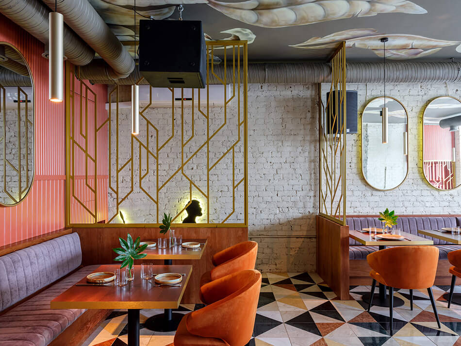
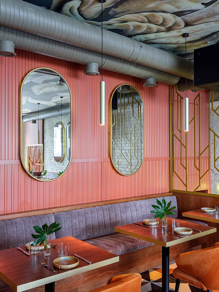
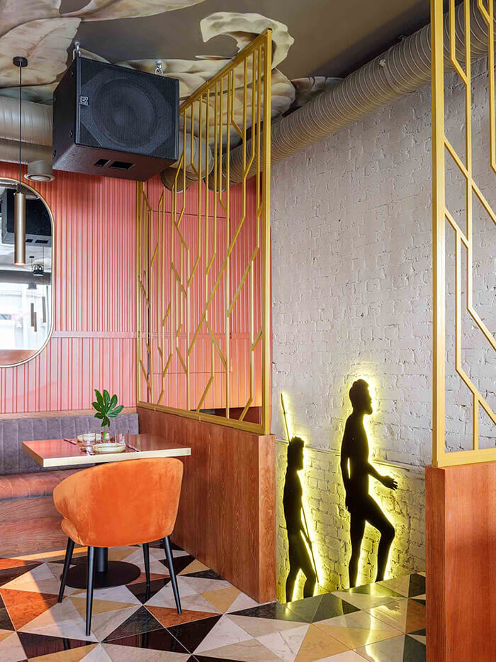
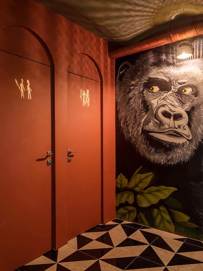
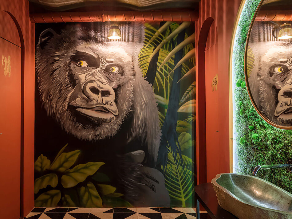
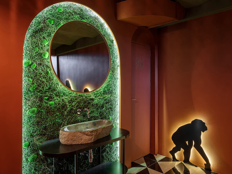
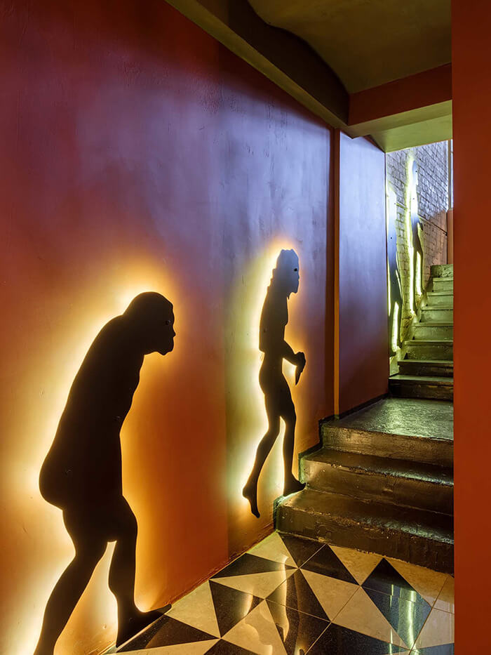
This restaurant would catch my eye in an instant if I was walking by. The floor alone would have me walking in and asking for a table 🙂 Sapiens Est Kitchen & Bar in Moscow designed by architectural bureau Golden Heads.
Goals: To create a bright, memorable interior that reinforces the name SAPIENS, which refers to “intelligent man”, for whom communication is important. The space was supposed to allow guests the opportunity to talk peacefully with one another and encourage making new acquaintances.
Solution: The restaurant was divided into 2 rooms. A bar area with a guest table connected to the bar counter was placed in the first. Whitish brick walls, contrasting with a geometric floor pattern and a vivid mural on the ceiling, made the interior bright but neat. The high ceiling made it possible to augment the first room with a balcony for private events. The second room with its soft seats and subdued lighting is closer in functionality to a restaurant. Here, those who want a more relaxed and intimate atmosphere will be comfortably accommodated. We emphasized the name of the establishment with the help of an ironic art piece: five figures decorate the wall along the stairs to the second room demonstrating the gradual development of man – from pithecanthropus to homosapien.
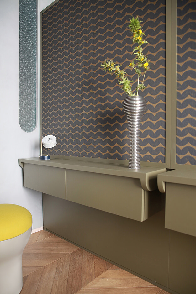
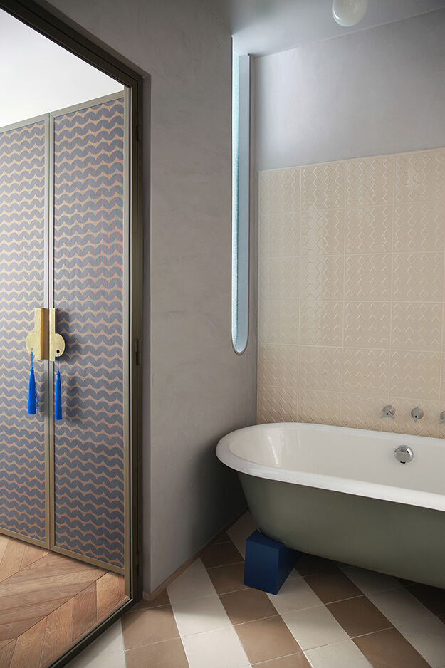
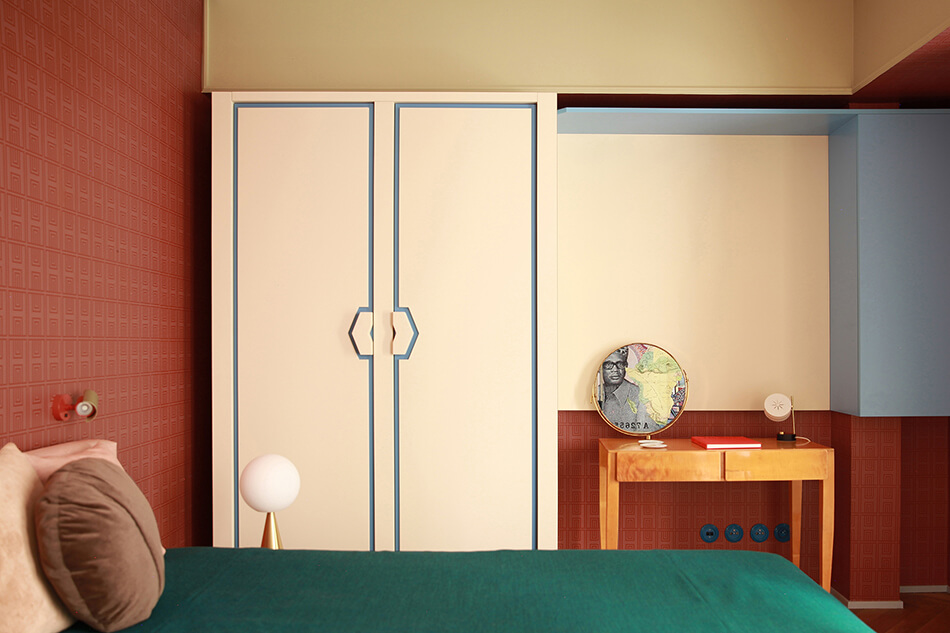
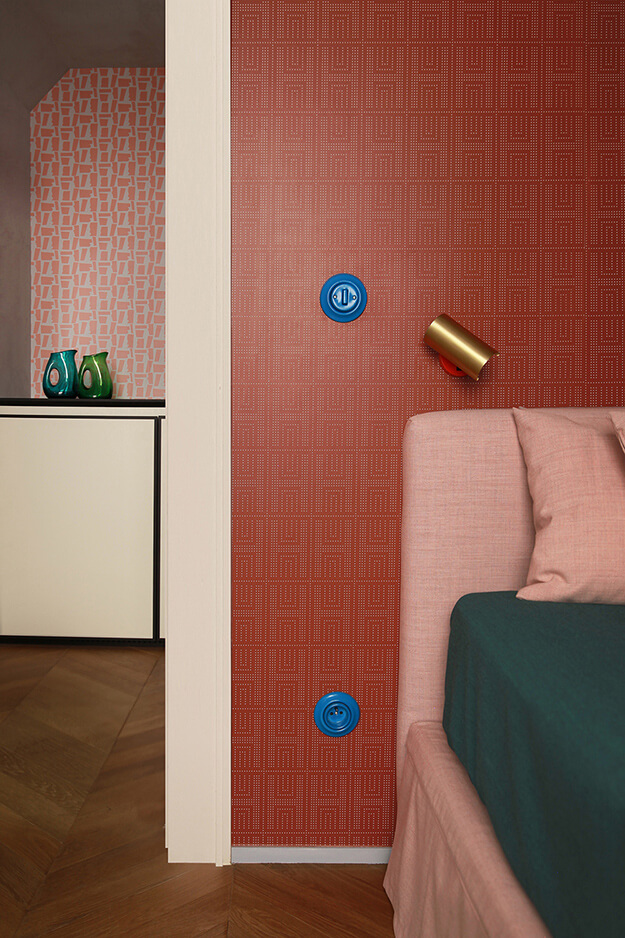
An explosive mixture
Posted on Mon, 16 Mar 2020 by KiM
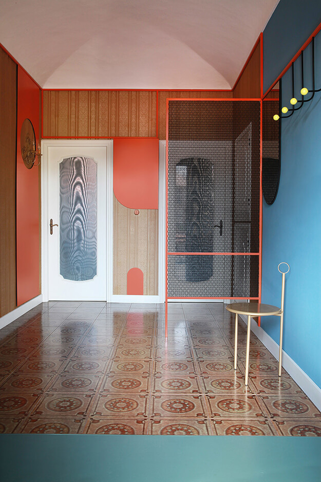
Another wonderfully unique project by architecture firm Marcante Testa that I had to share.
The house was, and is, a stratification of styles and materials that represent the lives of the previous inhabitants including General Candido Sobrero twin brother of Ascanio (inventor of nitroglycerin) which was followed in the early twentieth century by Countess Costanza Arminjon, the one who sold part of the property to the grandparents of the current owners, a pair of twins of whom only one decided to live there. It has long been our desire to create an interior where we can maintain and enhance these past elements by making them a collection of memories, materials and feelings. This proposal met favorably the client’s desire to preserve that family atmosphere which reminds him of his childhood spent with his brother in his grandparents’ house.
Starting from the entrance, the metal structure, which characterizes the external staircase, returns as a connecting element between the various rooms and, to define new furnishings and functions and at the same time, surrounds the old wallpapers, and the wall lamp, also it is the object of the past. A strip of resin connects the kitchen, entrance and living area to take us to the bathroom area where the plain color contrasts with the designs of the old ceramic tiles. In the living area, the original wood have been preserved inside which new furnishings are inserted such as the small theater with its curtains that hides the TV. Also in this room, the metal structure frames the old wallpapers and becomes a false ceiling, coffee table and dividing wall.
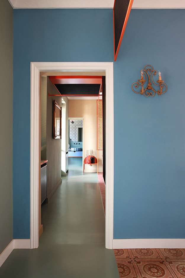
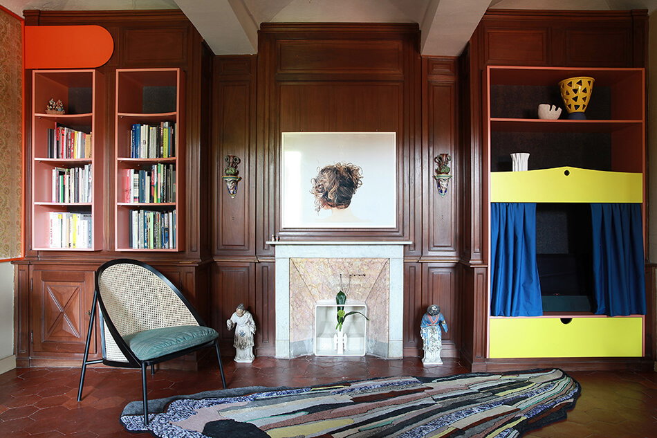
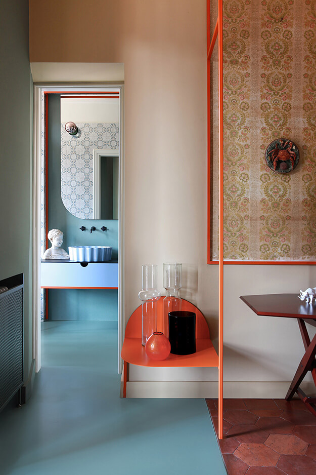
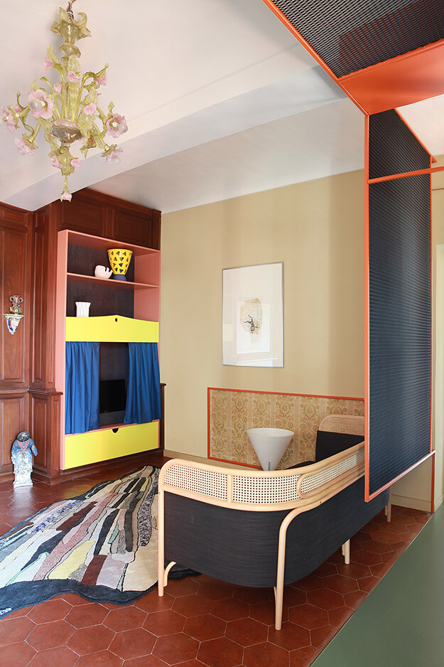
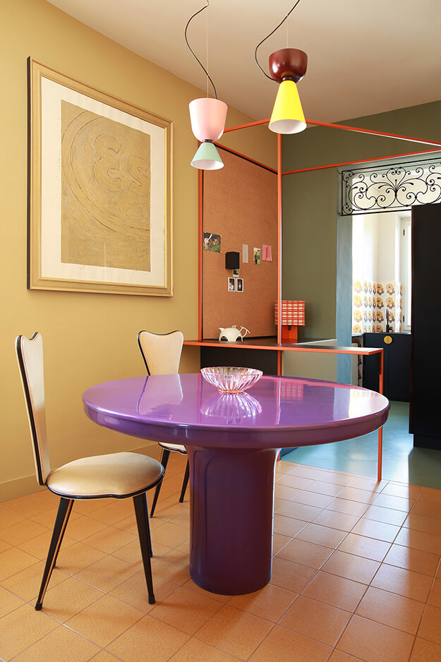
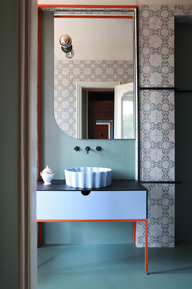
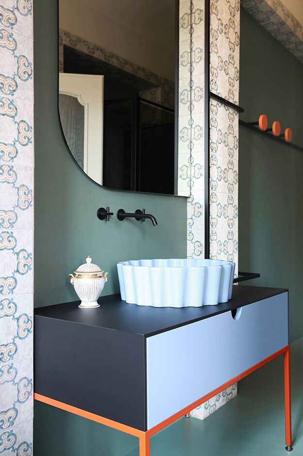
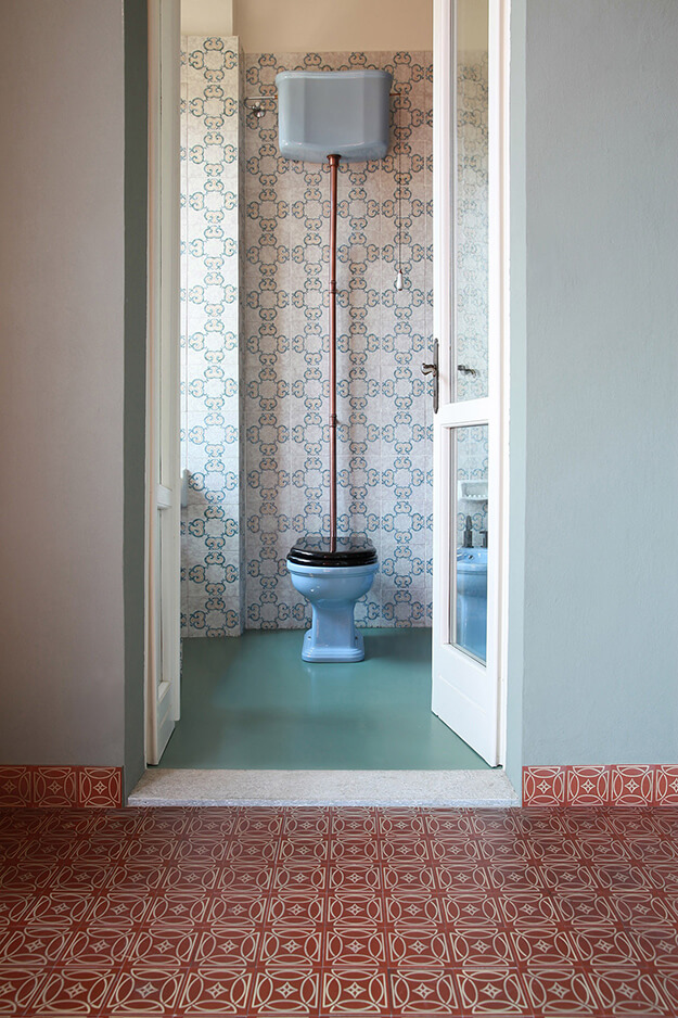
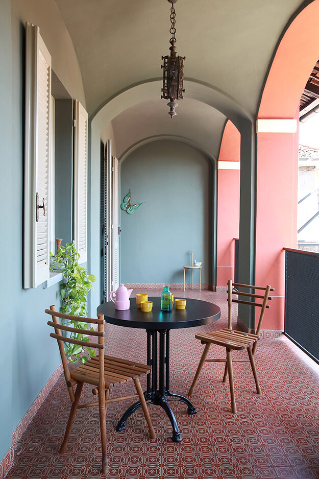
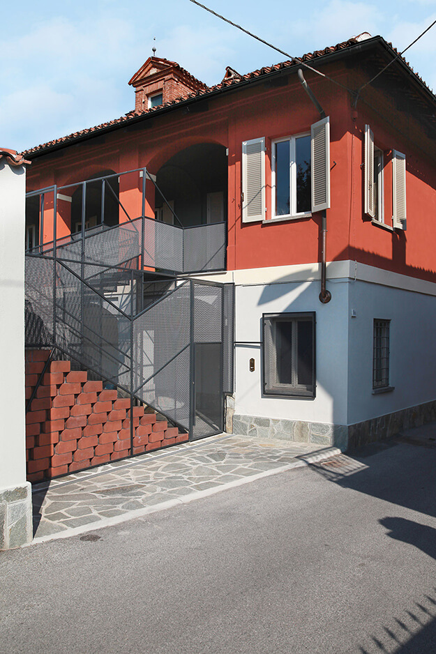
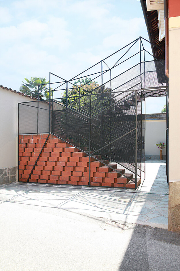
Photos: Carola Ripamonti
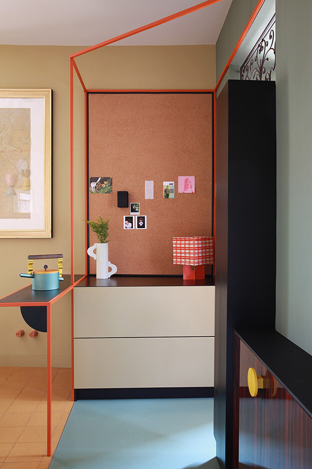
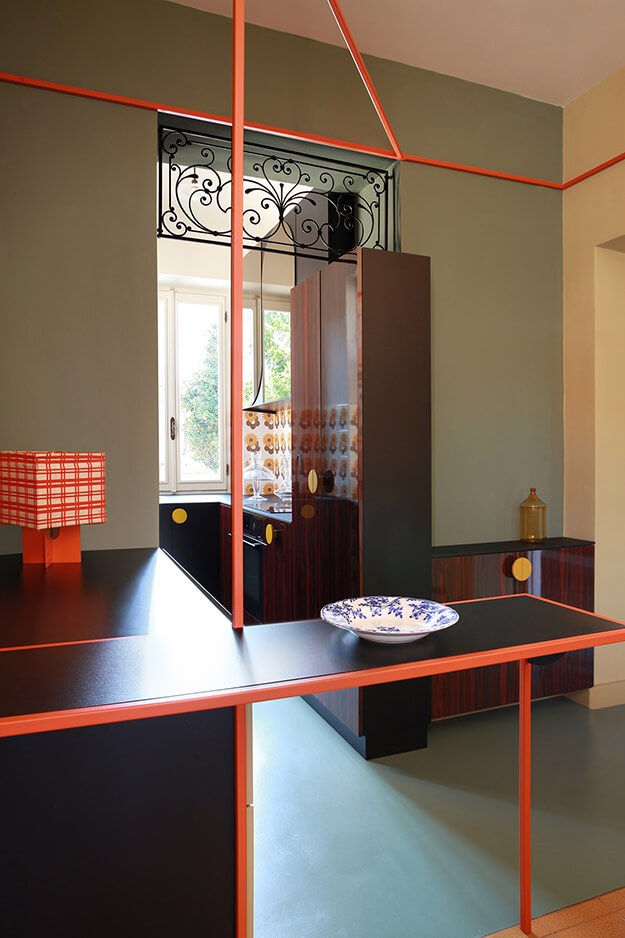
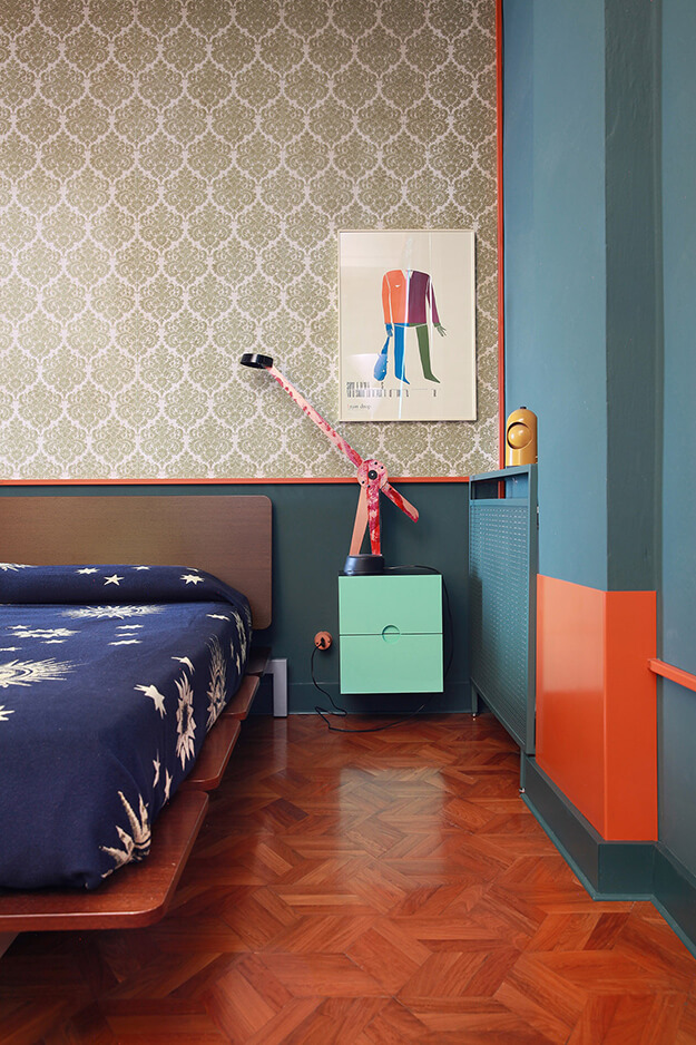
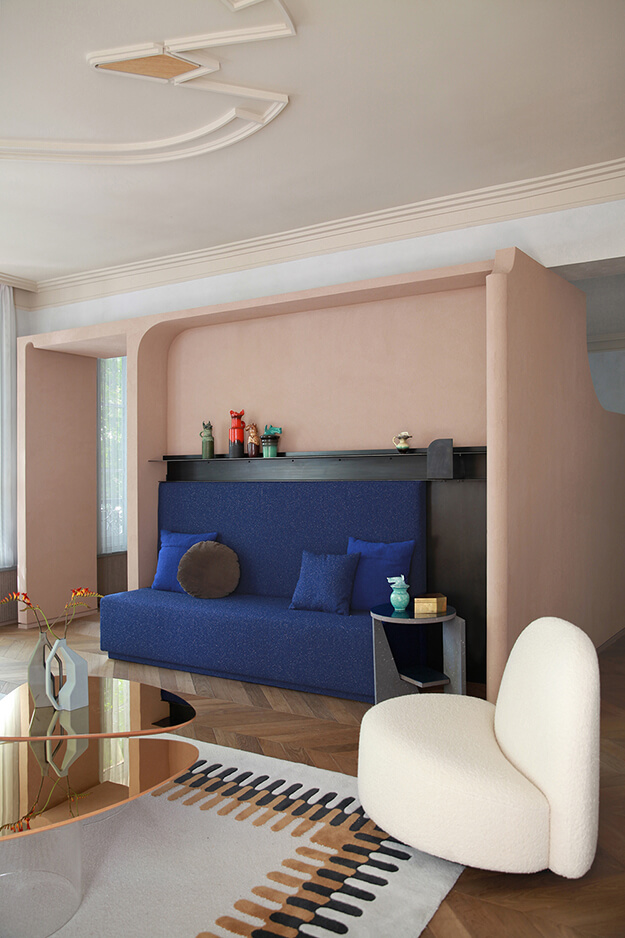
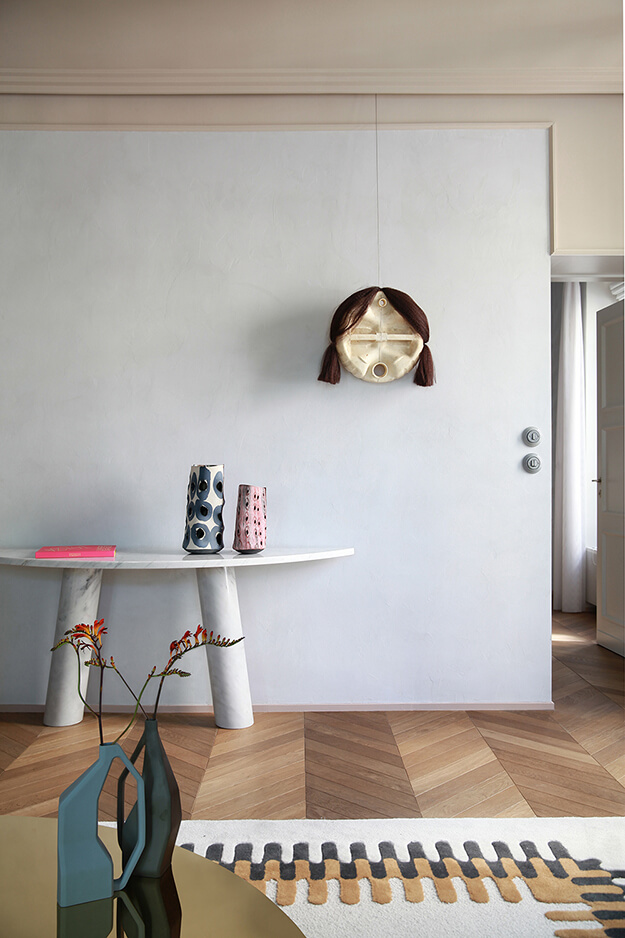
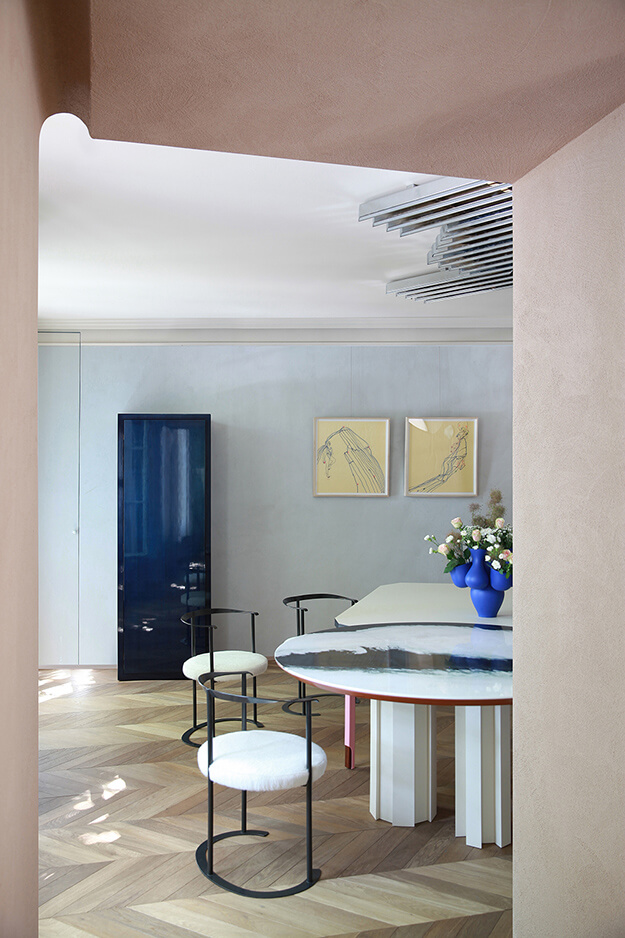
La mesure du temps
Posted on Mon, 16 Mar 2020 by KiM
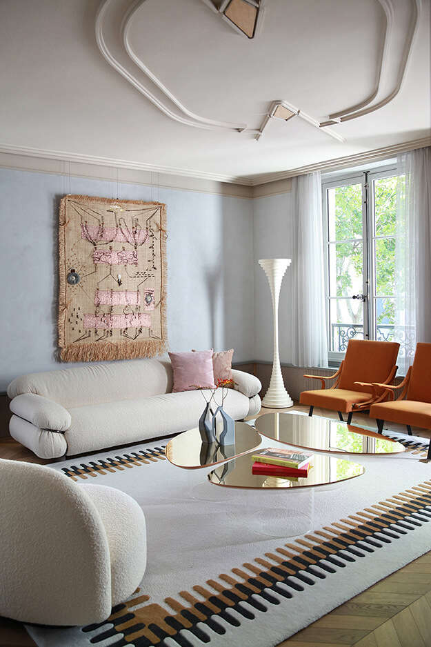
Each and every project by Italian architecture firm Marcante Testa completely blows my mind. I guarantee you will not see their colour combinations nor the attention to details they include in their projects. For example, in this Paris apartment renovation check out the ceiling embellishment in the first photo. And the arch of the doorway in photo 5. BLOWING. MY. MIND. And I nearly dropped dead when I spotted the kitchen. It is almost as tiny and similar in layout to mine and will for sure be used as inspiration when I get around to renovating mine.
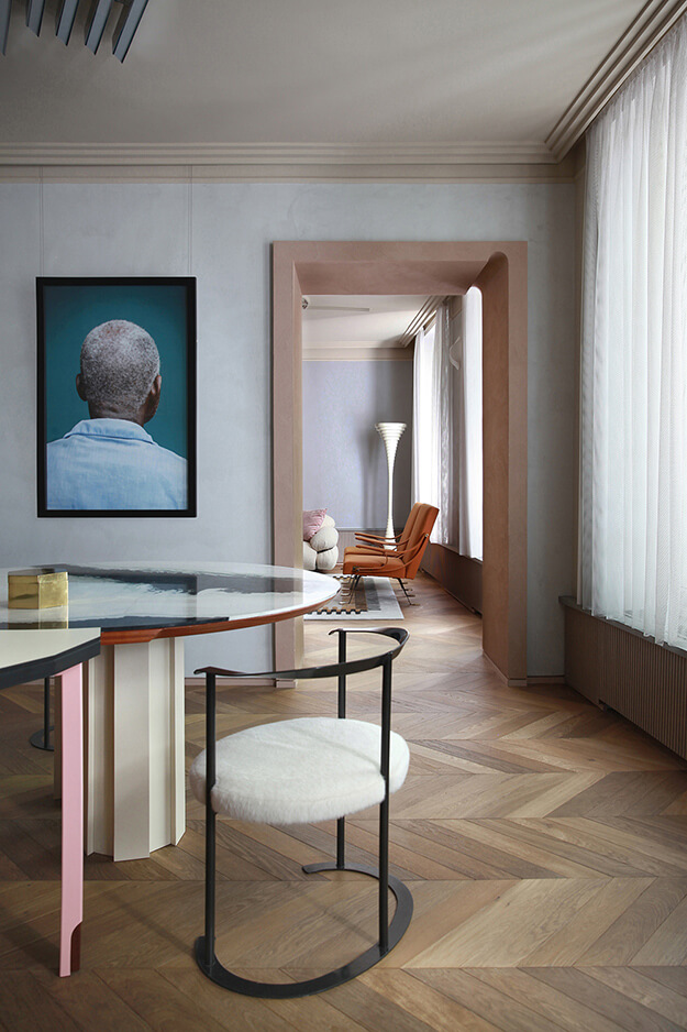
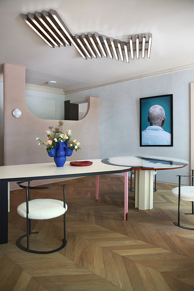
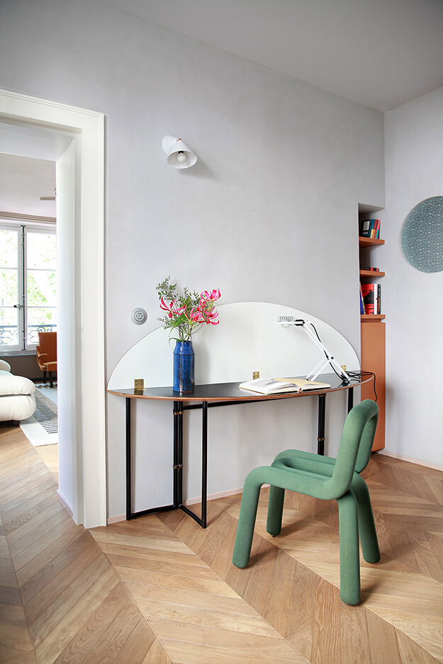
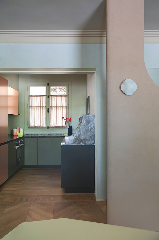
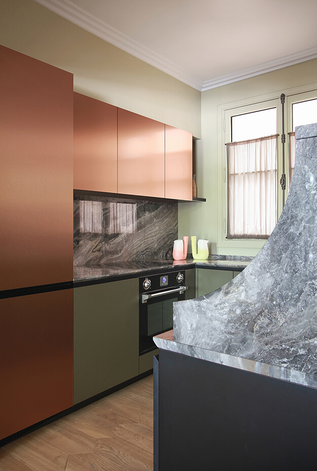
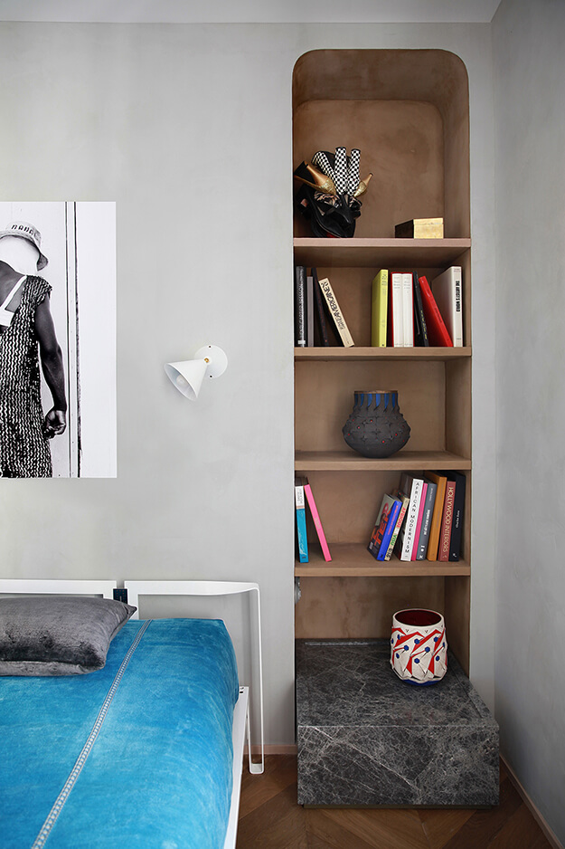
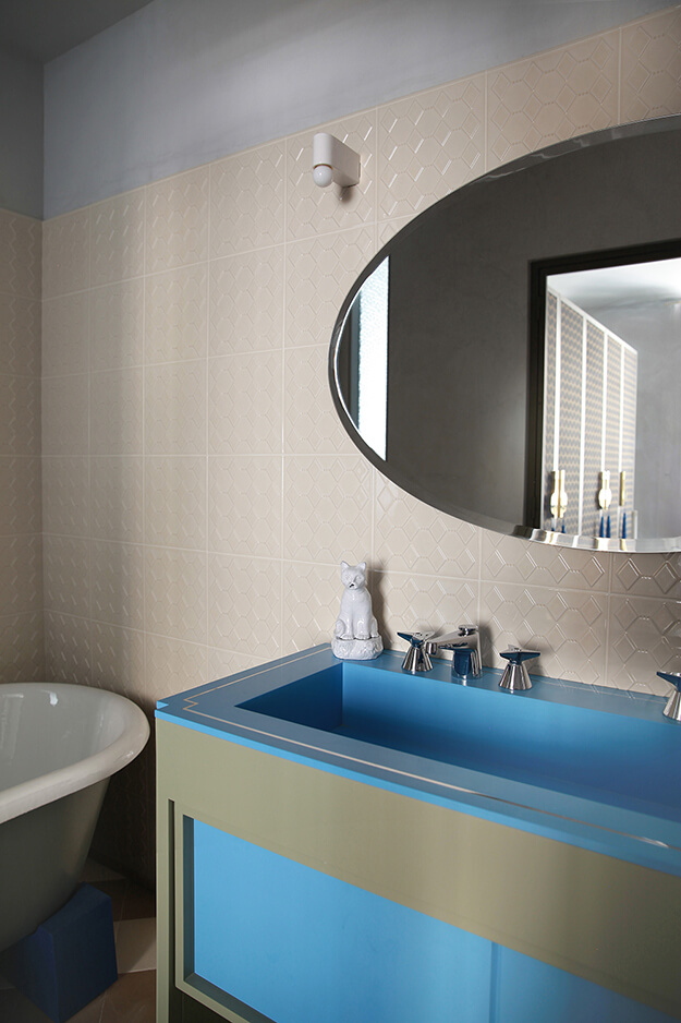
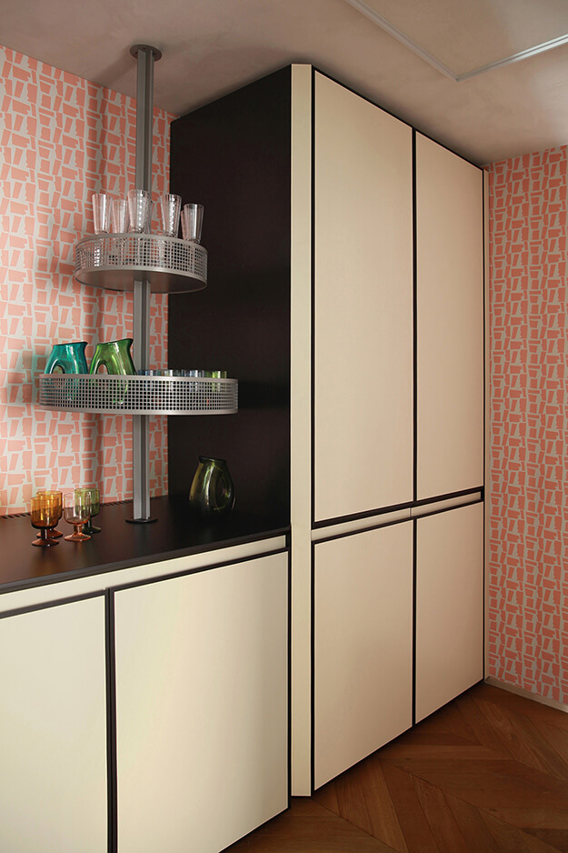
Photos: Carola Ripamonti

