Displaying posts labeled "Minimalist"
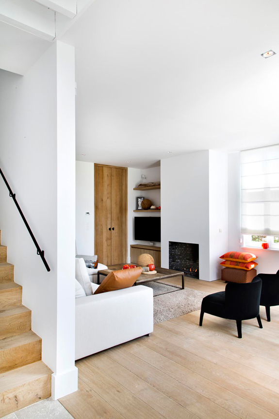
Old is new
Posted on Wed, 22 Apr 2015 by midcenturyjo
A modest budget but a beautiful, subtle renovation by Sonelo Design Studio. Old becomes new with simple, clean lines and a limited, muted palette. No wonder the Theresa St Residence is shortlisted for Australia Interior Design Awards 2015.

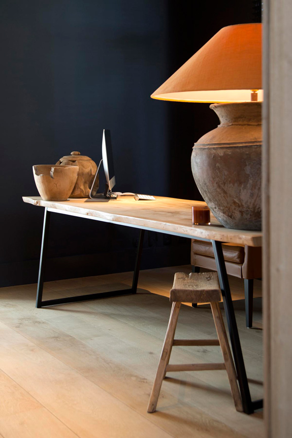
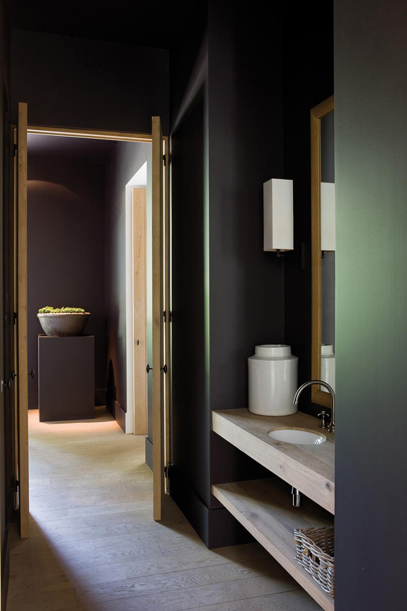
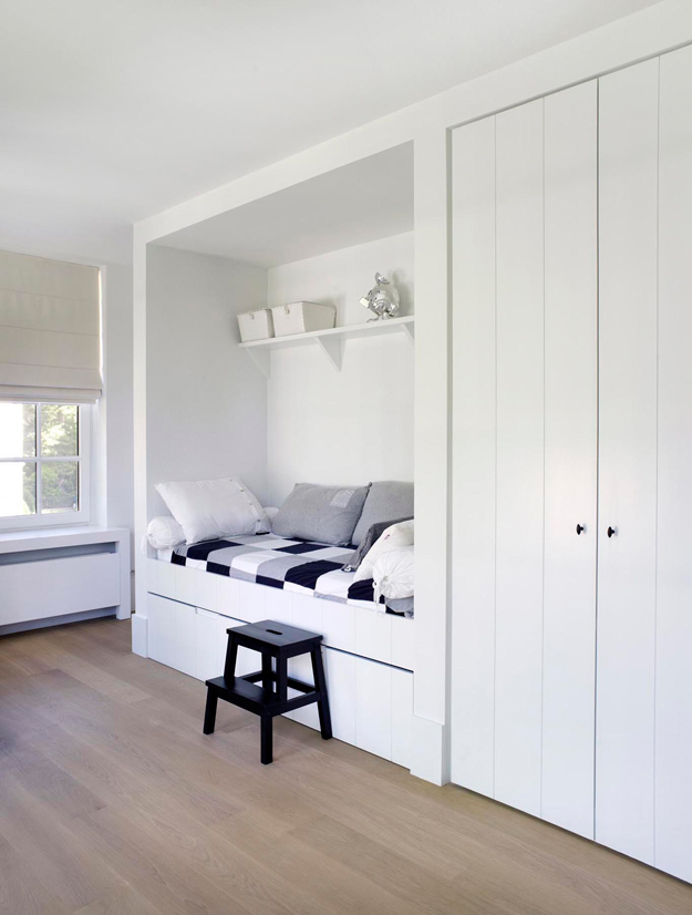
I will never be a minimalist, but after clearing out 2 rooms of crap to make room for the feral cats (and now it’s piled around the house), I wish I could be. Instead I will stare dreamily at photos such as these and wonder what it would be like. Via Belgium architecture and design firm Oscar V.

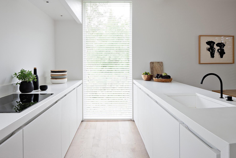
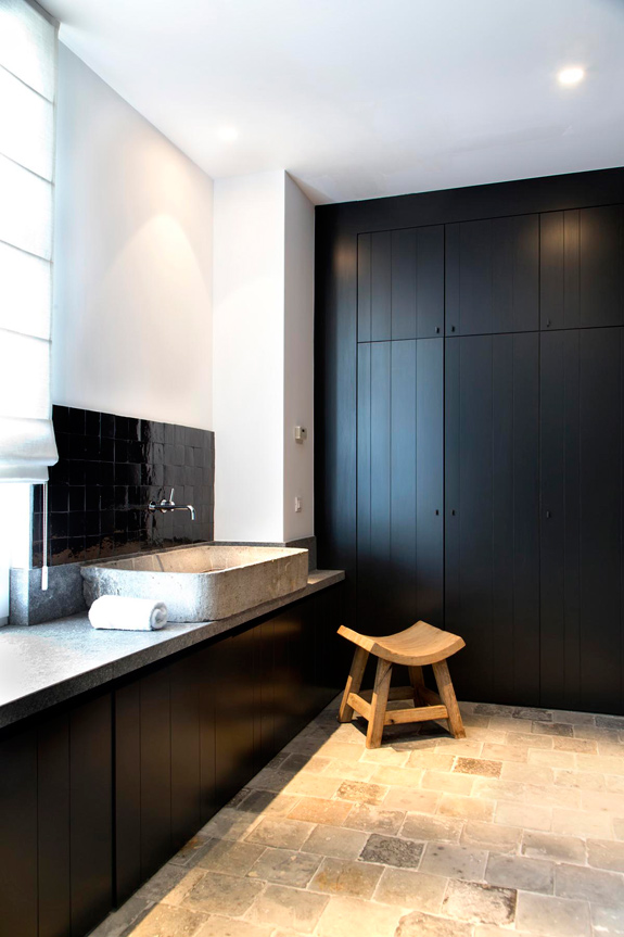

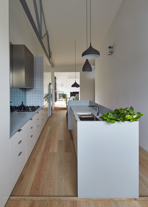
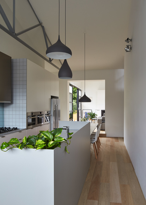
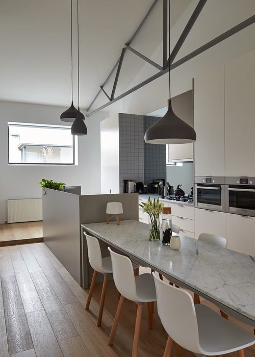
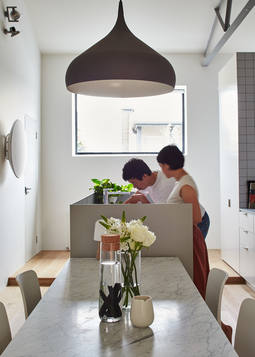
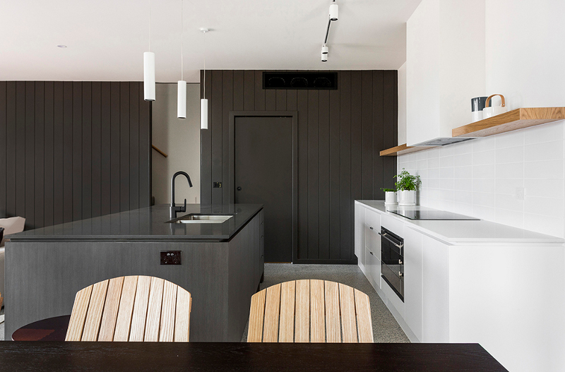
As simple as black and white
Posted on Mon, 13 Apr 2015 by midcenturyjo
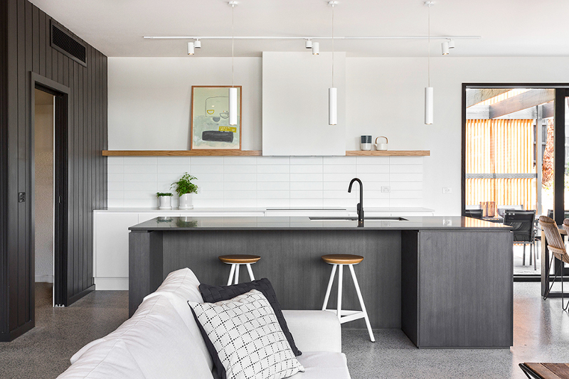
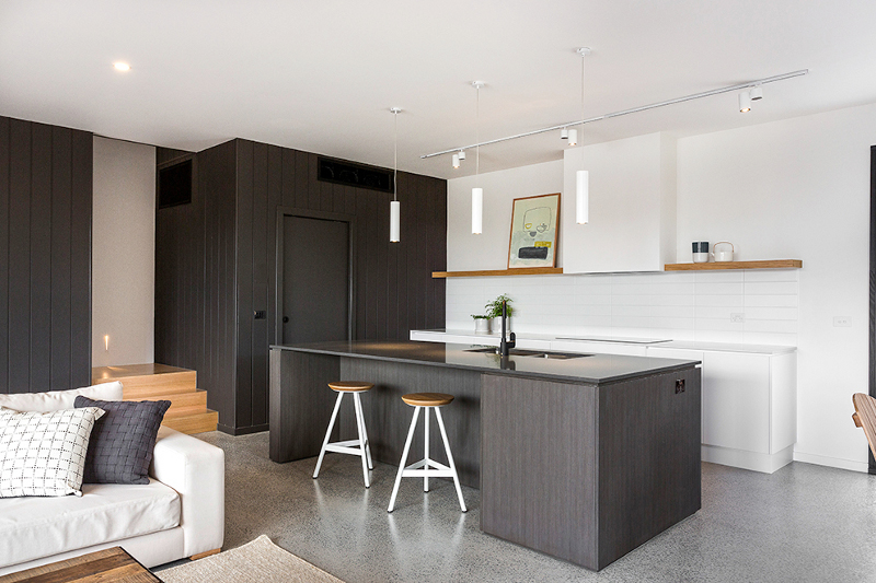
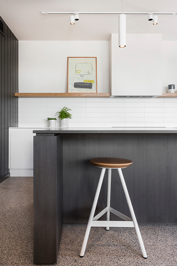
Clean lined, contemporary kitchen in stylish black and white by Sisällä Interior Design. Warmly minimal, deceptively simple. Plus it helps to have a butler’s pantry.
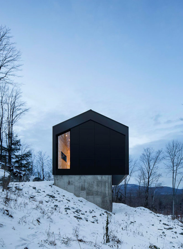
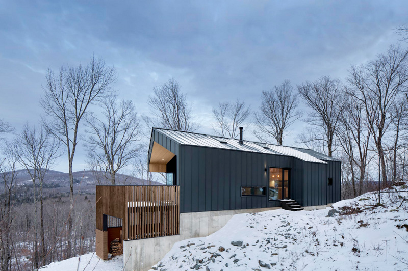
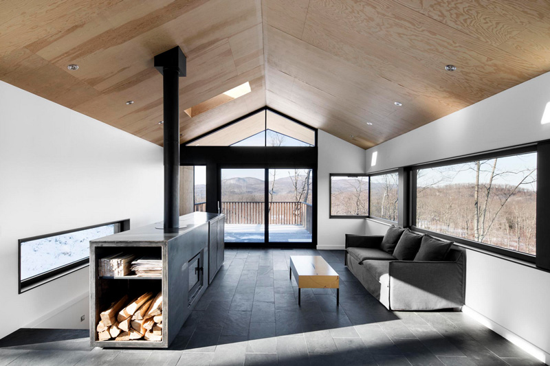
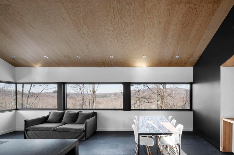
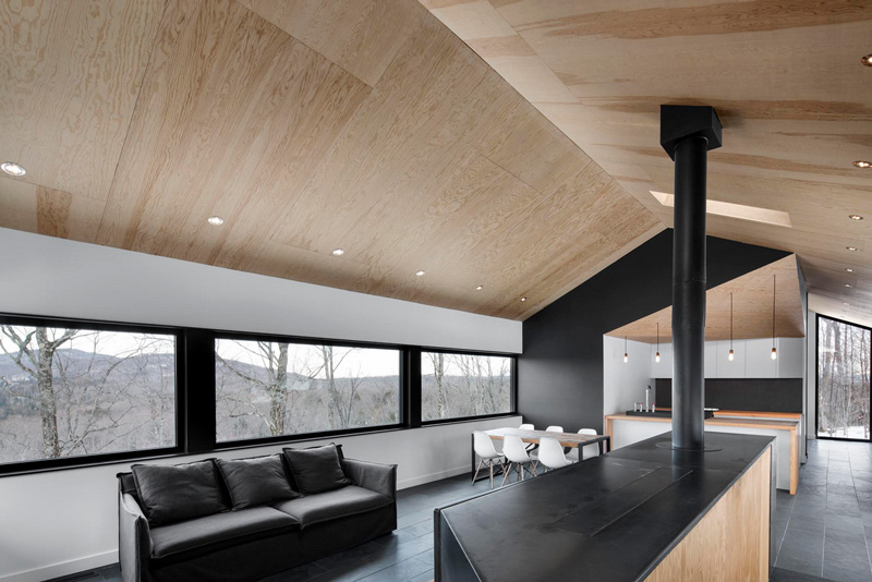
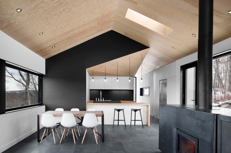
Cantilevered in the woods
Posted on Tue, 10 Feb 2015 by KiM
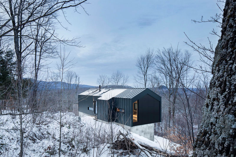
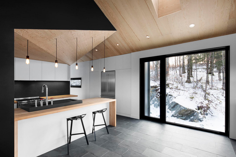
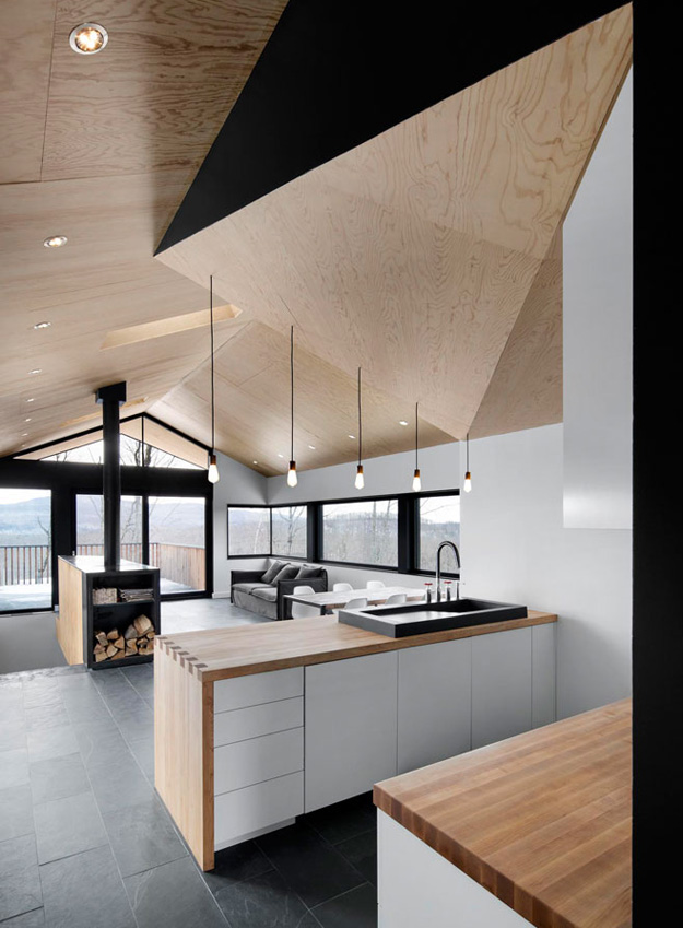
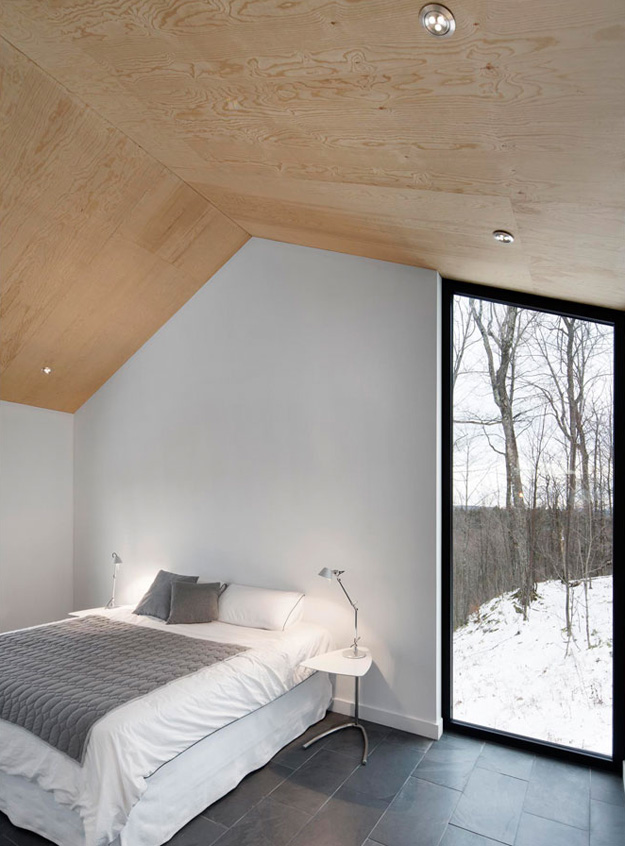
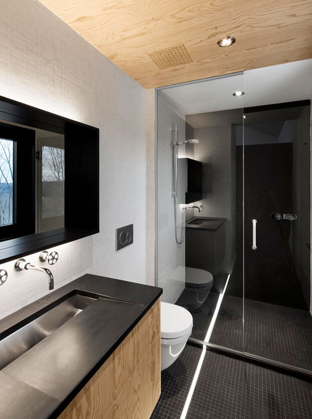
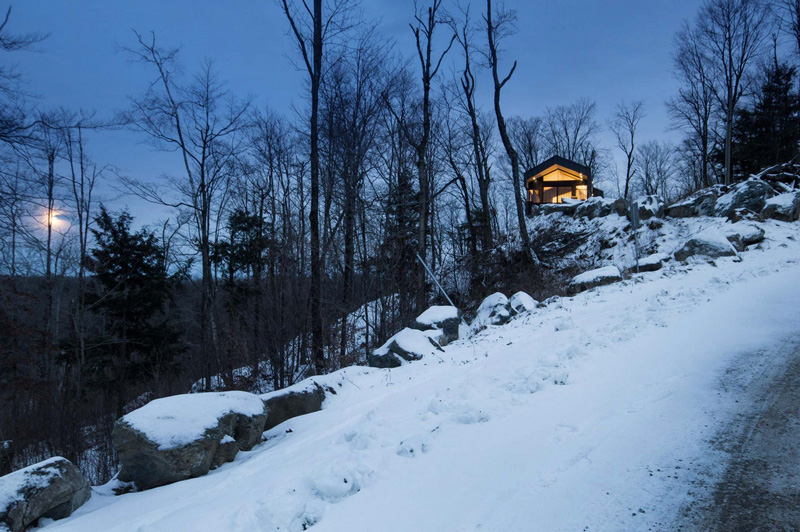
You know your friends would be bugging you constantly to spend boring winter weekends at your cabin if this was yours. And in the summer? Absolutely! Another perfectly executed home by _naturehumaine. Having bought a beautiful plot of wooded land in Quebec’s Eastern Townships, the client dreamt of building a country house that would be in perfect symbiosis with its natural environment. The house is characterized by two stacked volumes; a wooden clad volume anchored into the mountain supports a cantilevering ground floor volume above. This gable roofed volume raised into the air gives the sensation that the house is floating amongst the trees. Vast views of Mount Orford and the valley below are framed by a long horizontal strip window. The kitchen and master bathroom are carved out of a black volume at the center of the house dividing living spaces from the master bedroom.
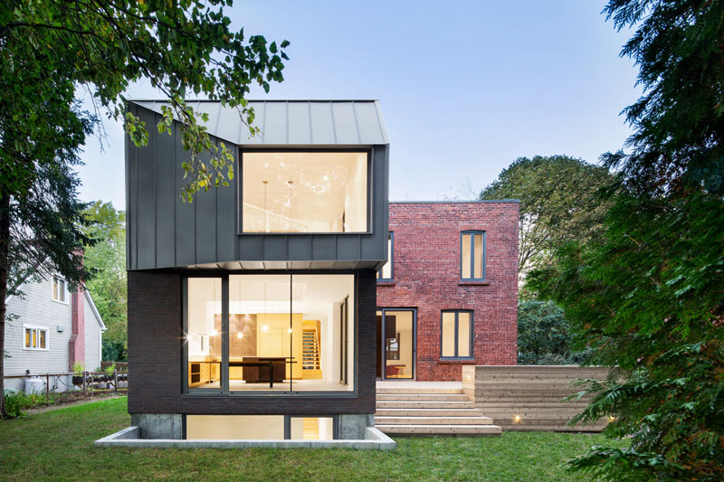
Half old, half new
Posted on Tue, 10 Feb 2015 by KiM
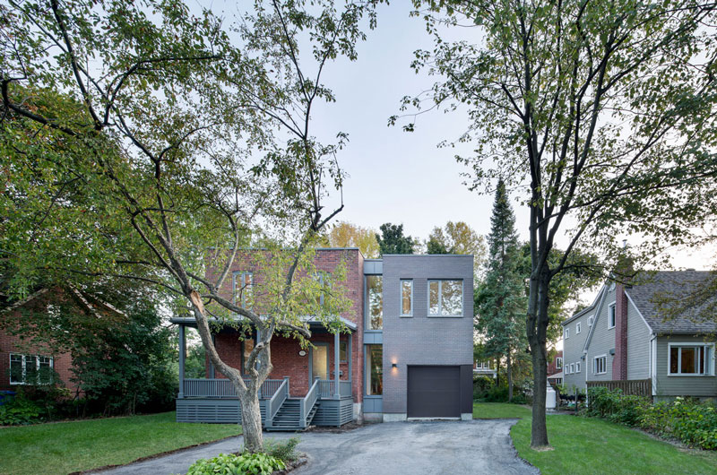
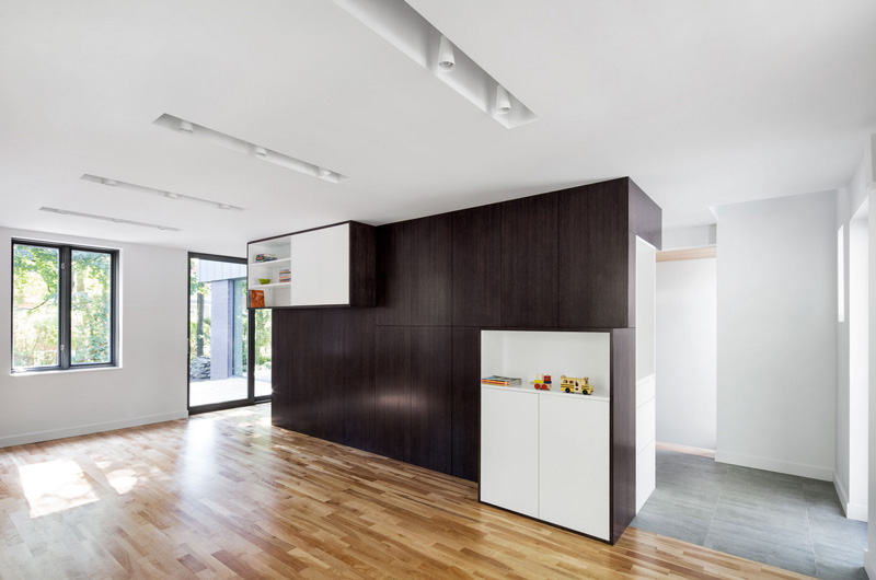
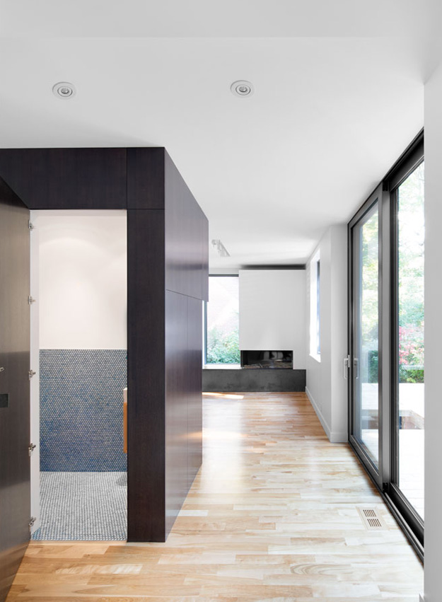
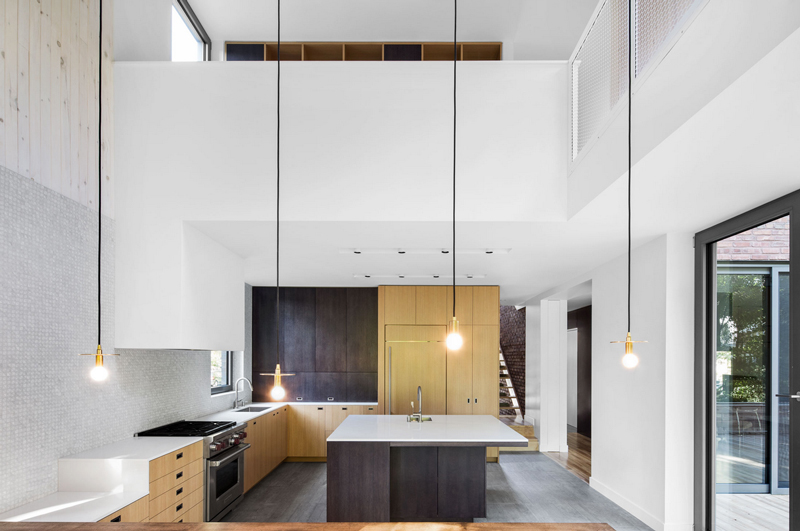
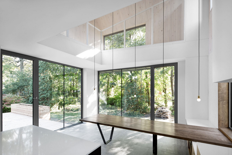
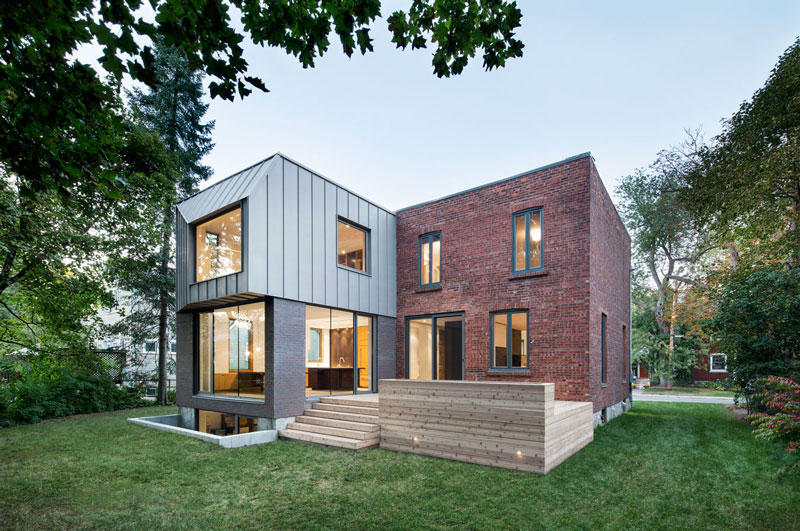
One of my favourite Canadian architecture firms continues to impress me with their ingenuity and attention to detail. _naturehumaine blew me away with this home in Montreal. The clients had outgrown their 1920’s house on a large lot on Montreal’s south shore. They wanted a contemporary extension that would harmonize with their existing house and highlight and expose the structural brick. The existing house and the extension were separated by a glazed volume where the vertical circulation of the house is located. The extension is organized into 2 intertwining volumes. A brick volume makes up the base and becomes the support for a steel clad volume that projects out into the backyard. The ‘sleeping basket’ is found at this projection where a large window frames the foliage. This becomes a space to relax and gaze out towards the garden as well as an area for the children to play while maintaining contact with the kitchen and dining spaces below.
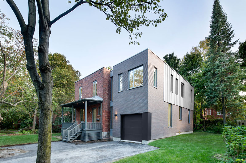
The new extension is subtle in its detail, and with a flat roof line matching the old house, seems to blend fairly seamlessly.
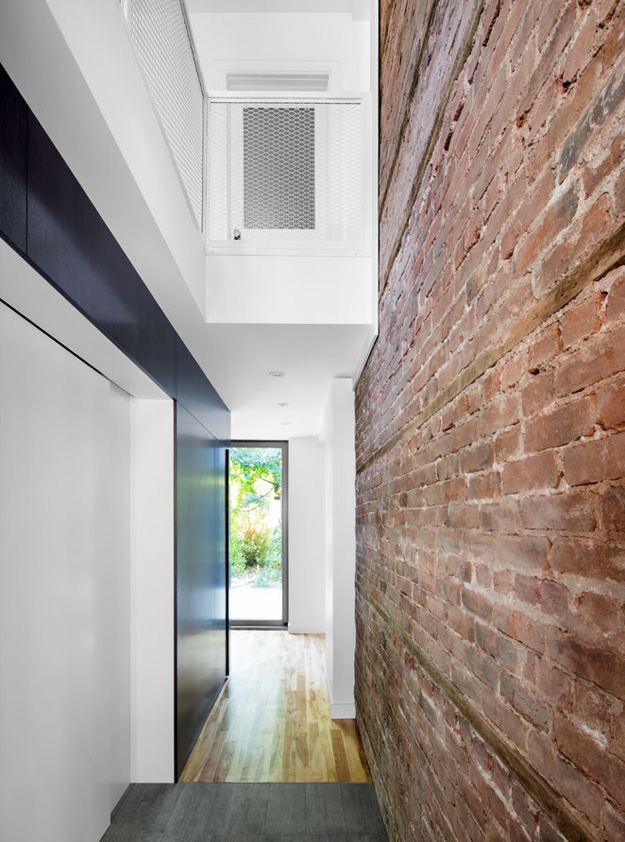
Of course, because they are brilliant, _naturehumaine kept the brick of the old part of the house exposed. AS THEY SHOULD. 🙂
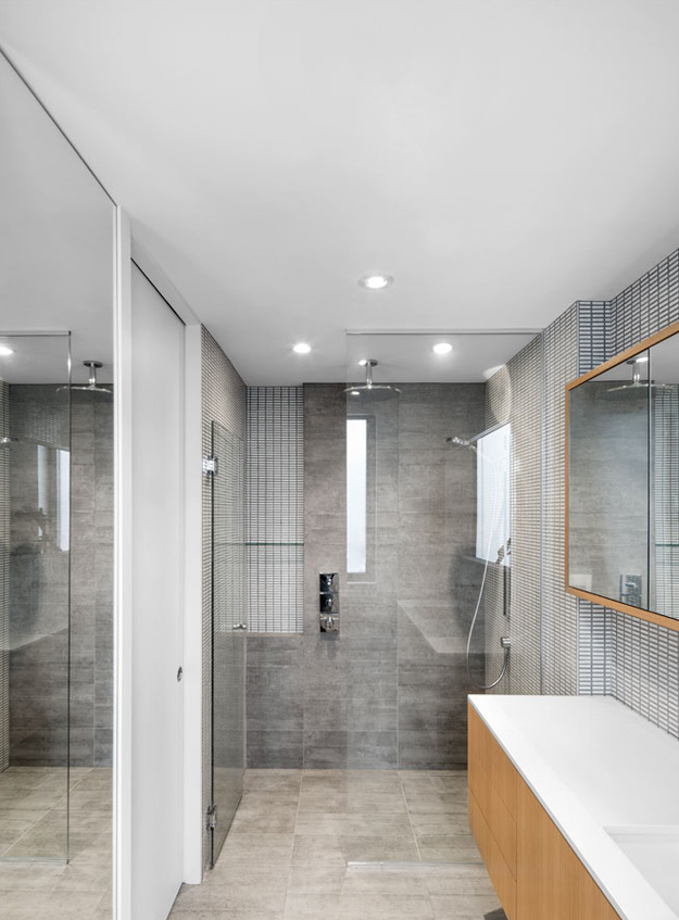
Are you sick of pot lights too? LOOK WHAT THEY DID HERE!!!
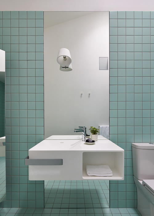
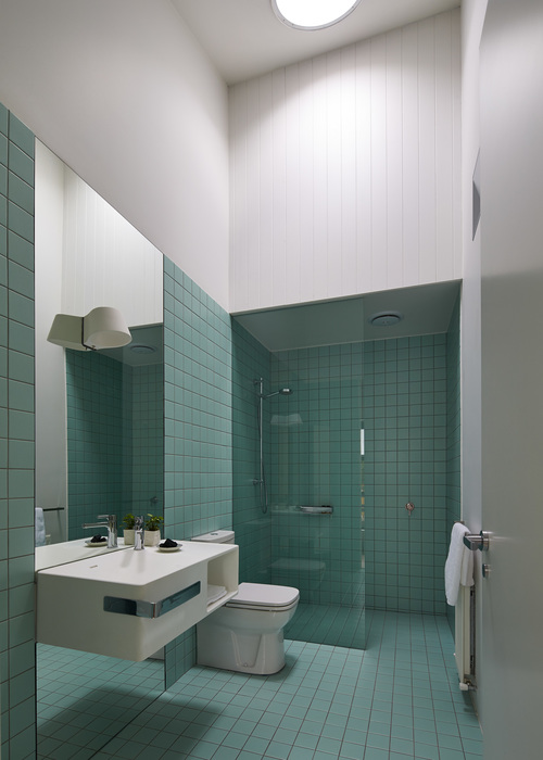
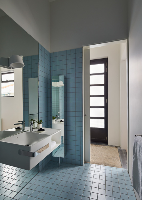
That storage pod thing is pretty cool, housing a ‘secret’ powder room.
A simple streamlined kitchen with 2 colours of cabinetry I never would have thought to put together…but it looks fantastic.
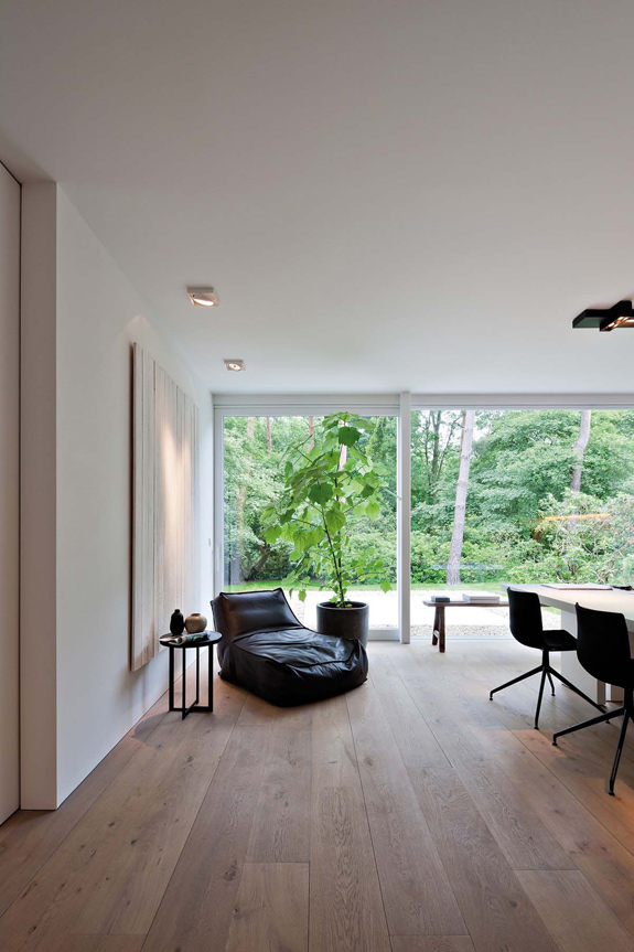
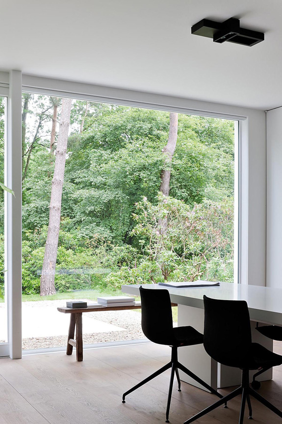
A perfect spot for massive sets of doors and windows. What a beautiful view of the surrounding trees.
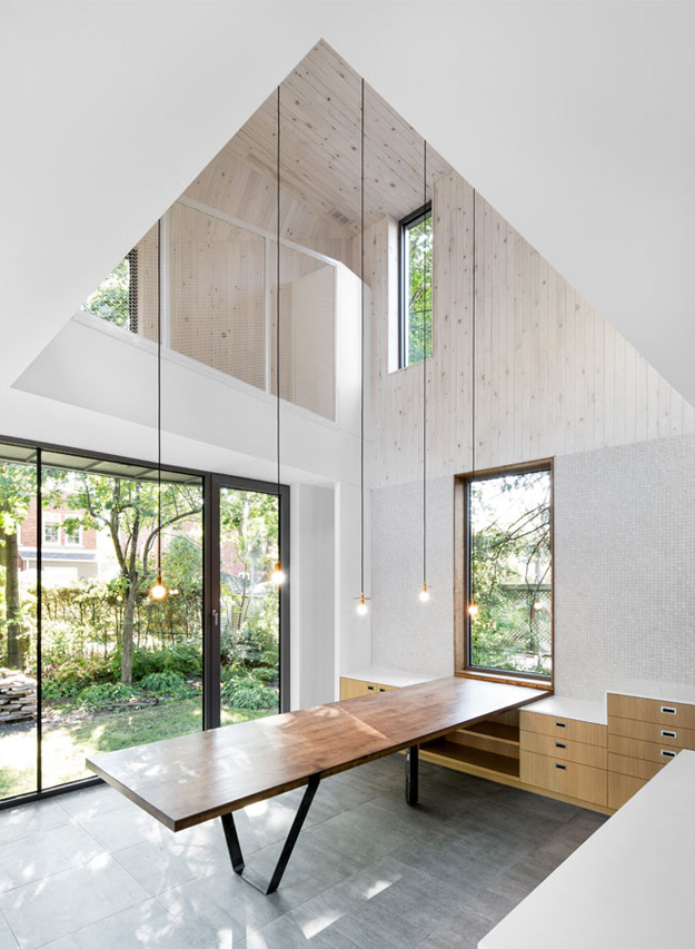
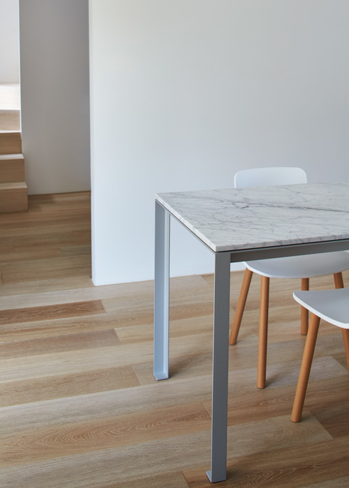
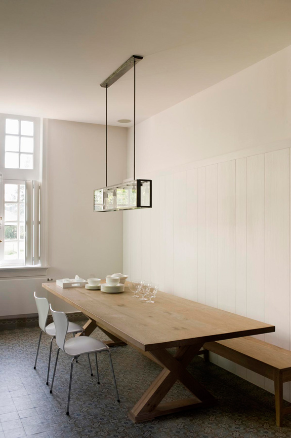
Where mosaic tile meets pine paneling. I love this table connecting to the window, and how the hanging pendant lights emphasize the height.
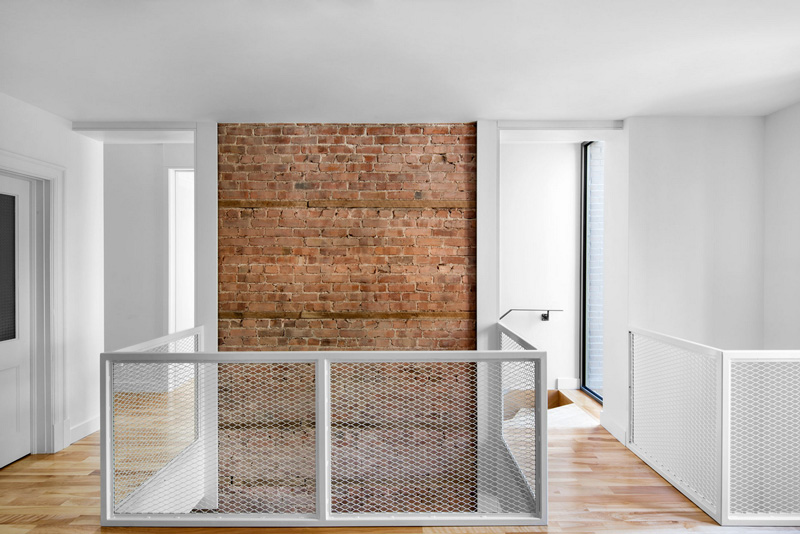
This is beautiful, how the section of brick is framed.
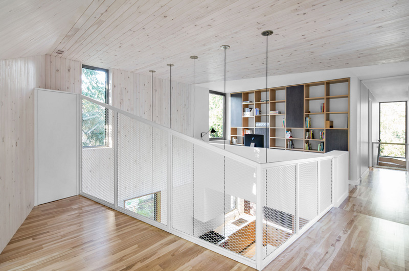
My dream office is back there.
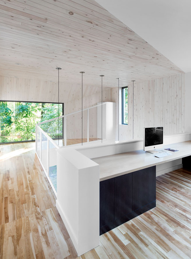
It would be like working in a tree house.
(More features of _naturehumaine’s work here, here and here)

