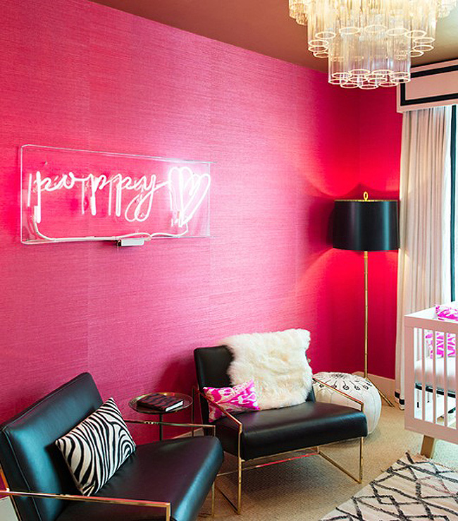
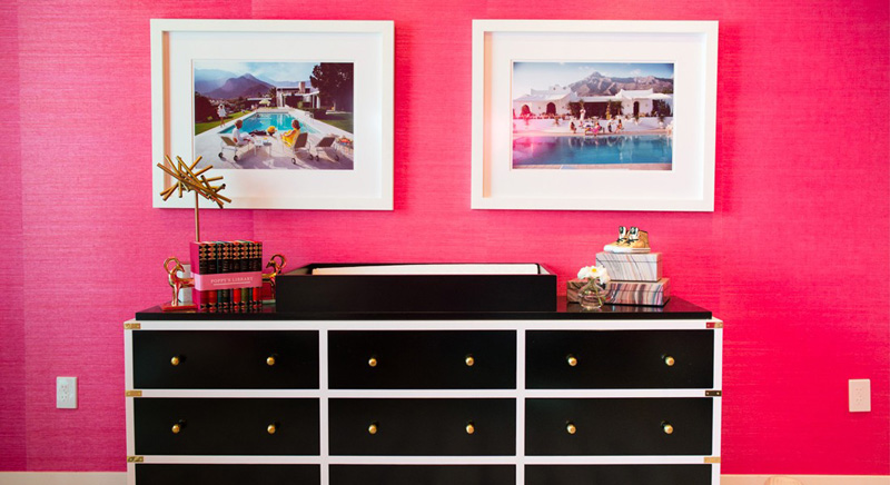
Displaying posts labeled "Pink"
Life.Style
Posted on Wed, 8 Jun 2016 by KiM
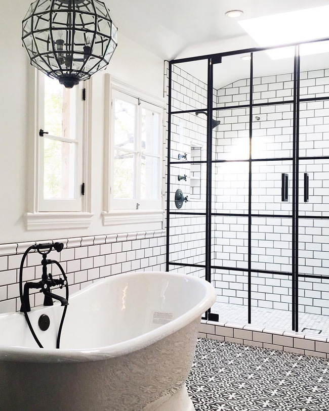
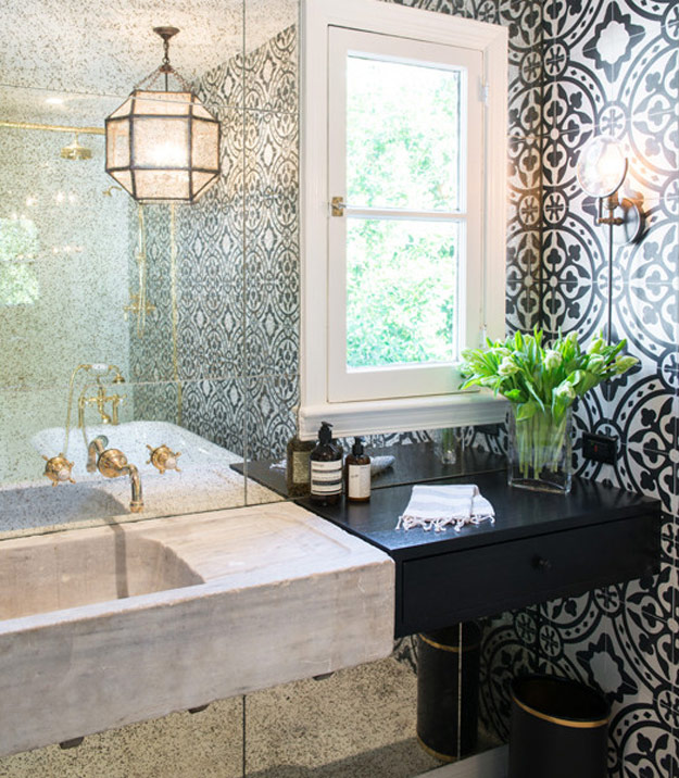
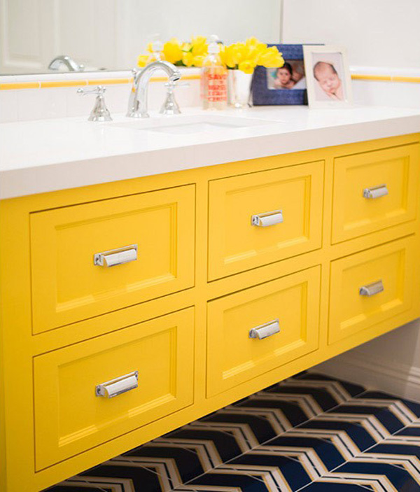
Shannon Wollack and Brittany Zwickl of LA-based interior design firm Life.Style. are all about bold statements. Bright colours often used in large doses, graphic tiles and shiny brass make for some sexy spaces that are fun and dramatic. The bathroom above is everything and then some.
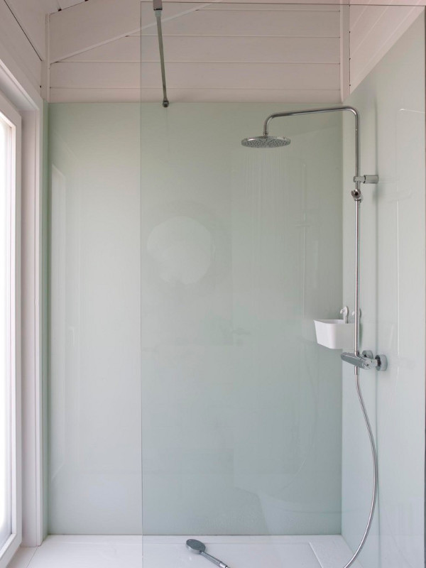
High House
Posted on Mon, 9 May 2016 by midcenturyjo
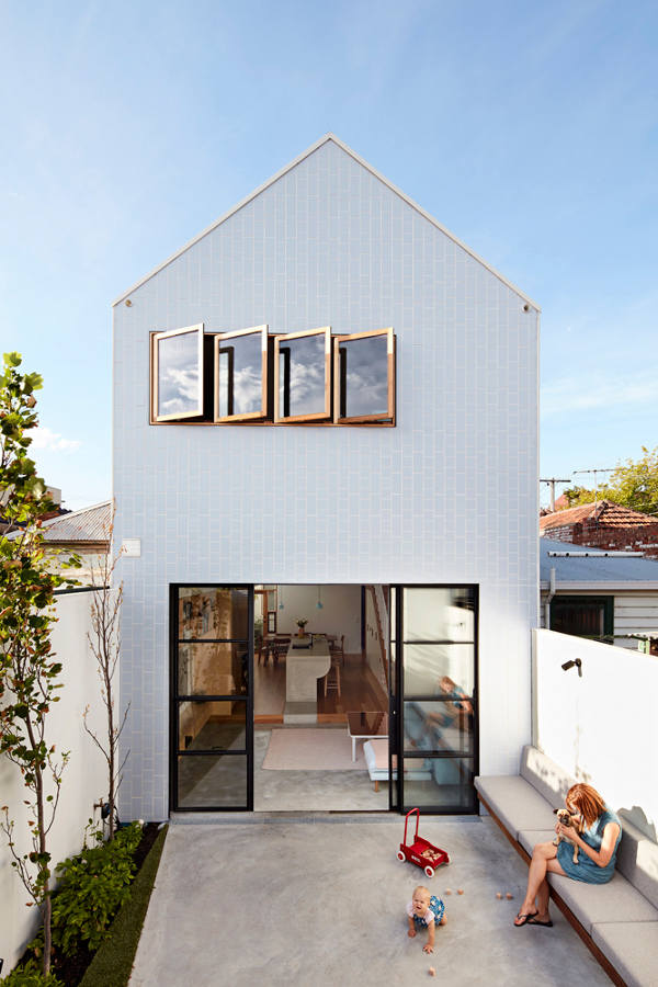
It may only be 5 metres wide but as the architectural firm Dan Gayfer Design explains it’s all about “… a high level of functionality, flexibility, interaction and detail in a house with high ceilings, a high roofline and high levels of natural light.” It’s also high on style. The perfect partnering of spatial design and good looks. What can I say. It really is a High House.
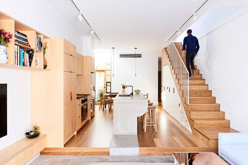
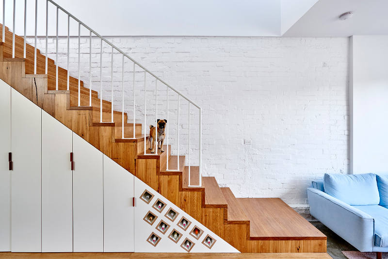
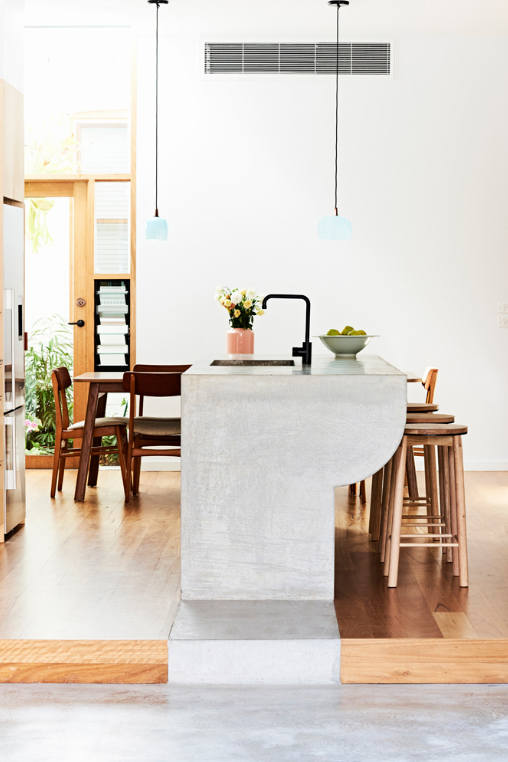
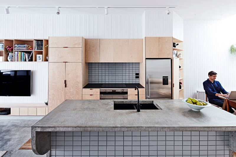
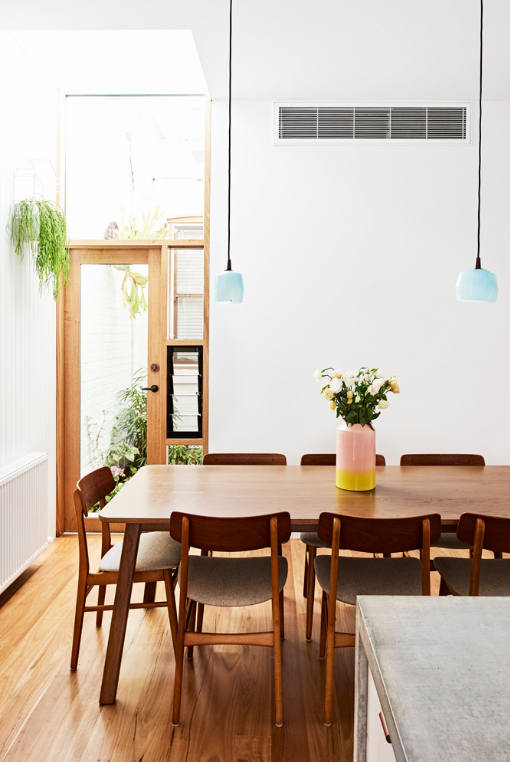
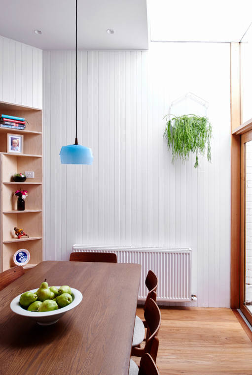
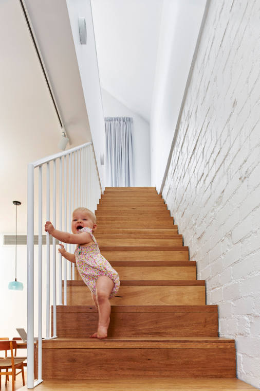
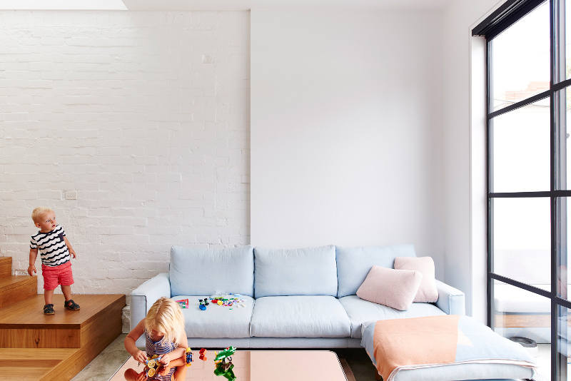
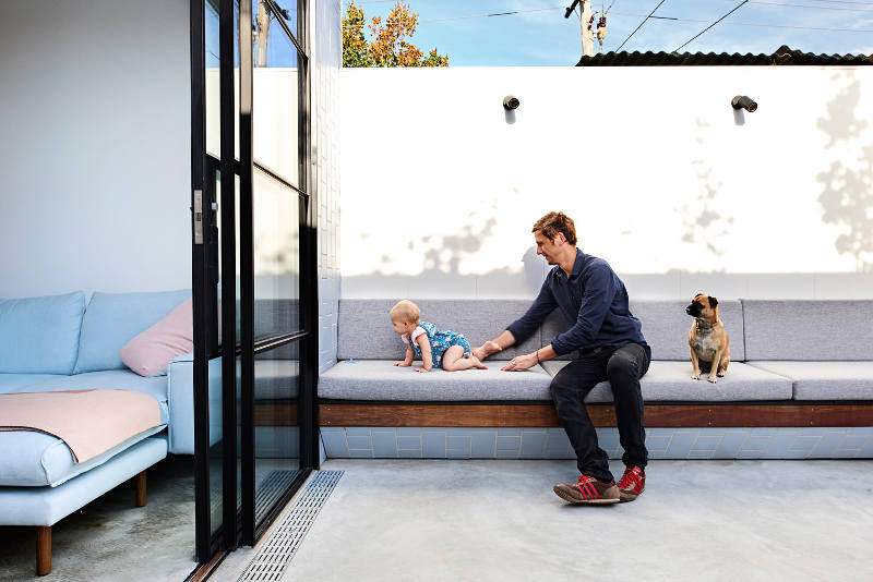
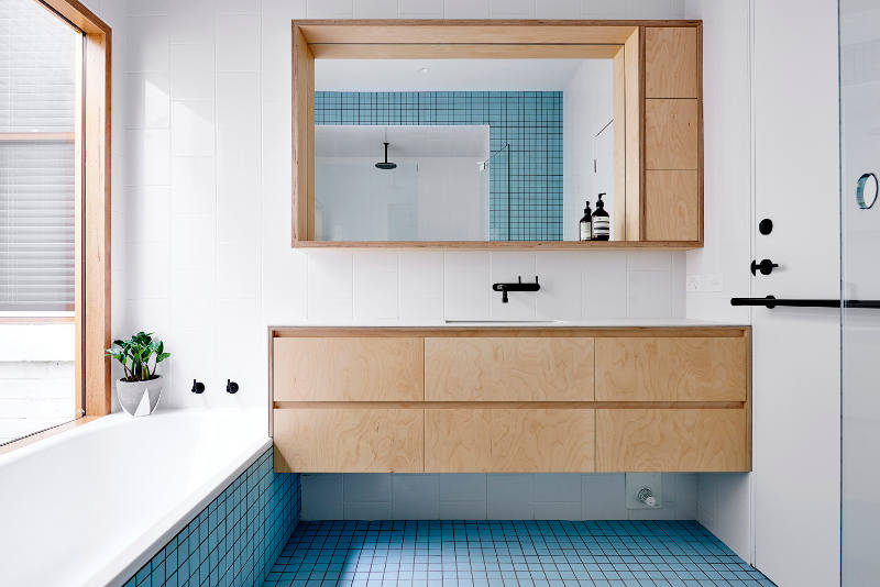
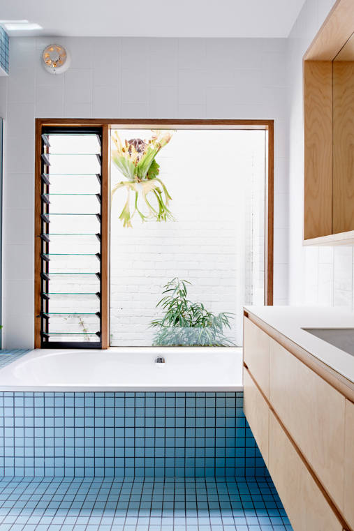
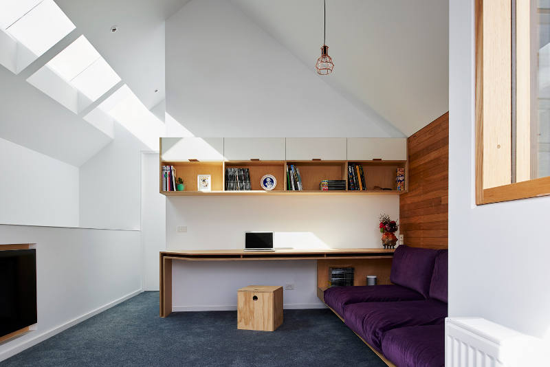
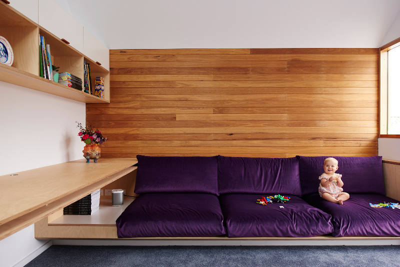
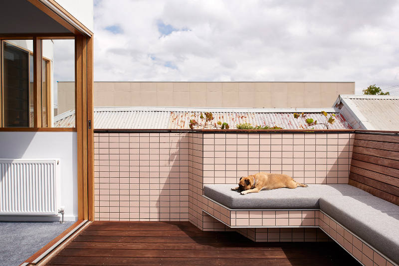
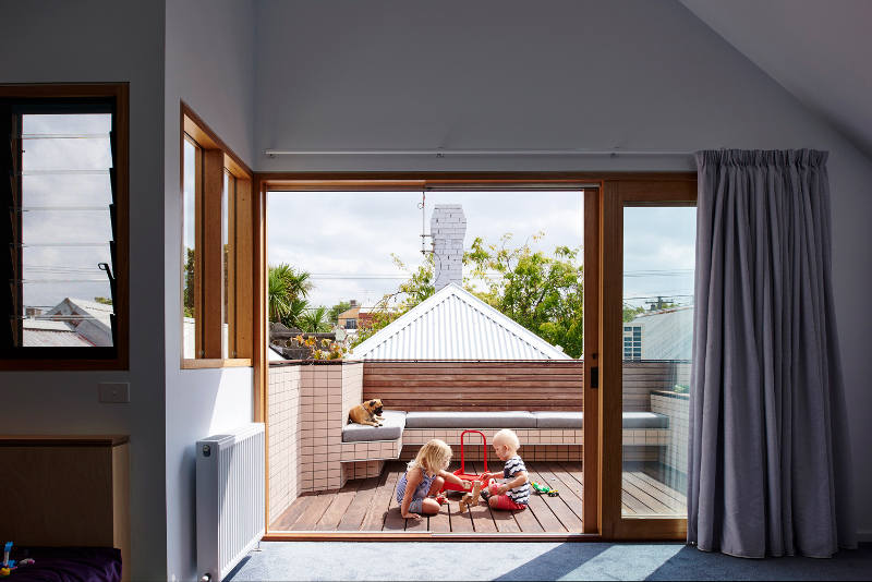
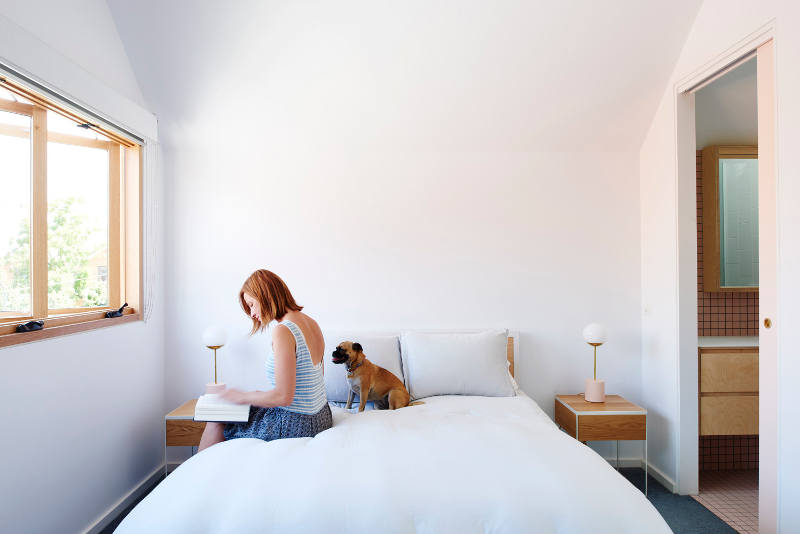
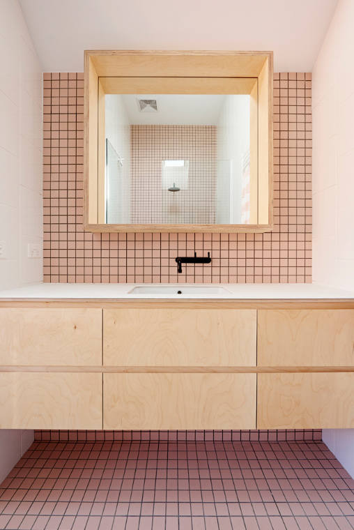
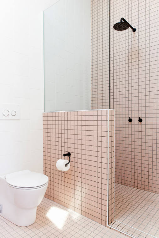
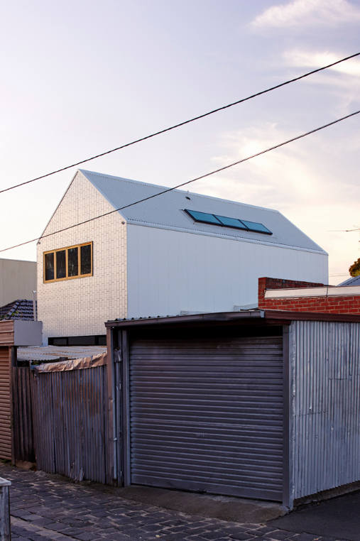
Photos by Dean Bradley
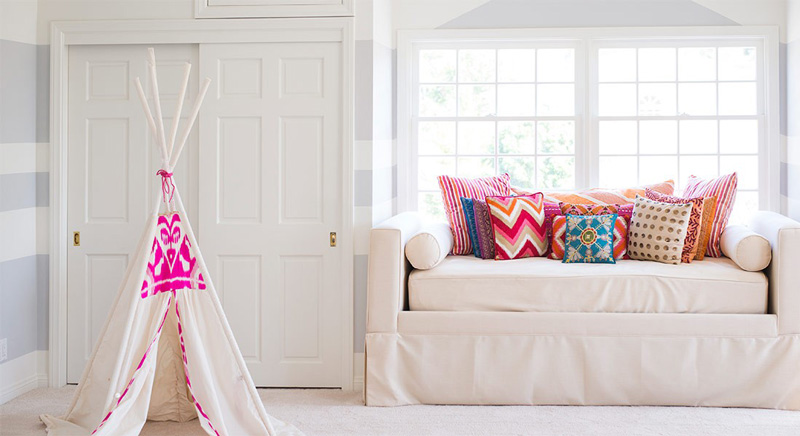
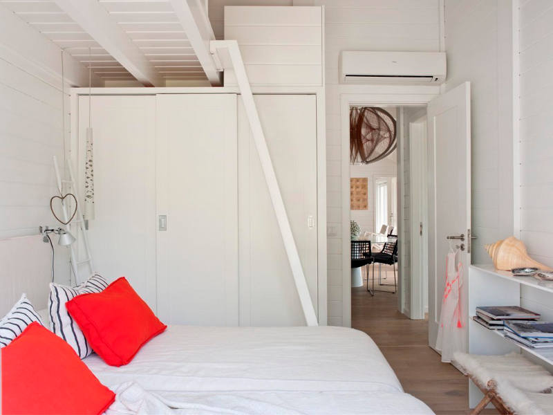
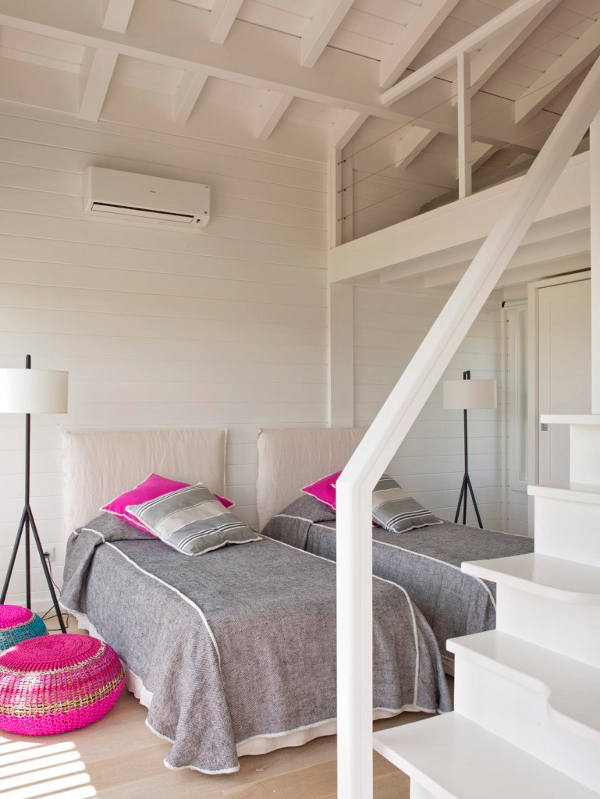
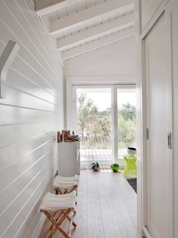
Beachy pink
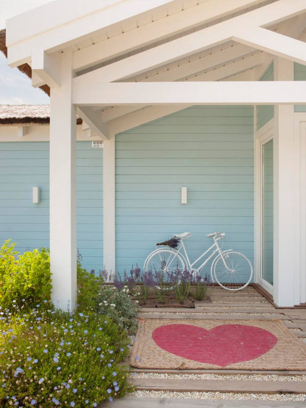
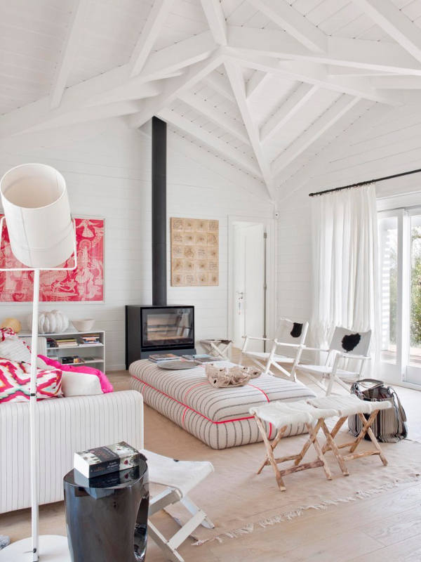
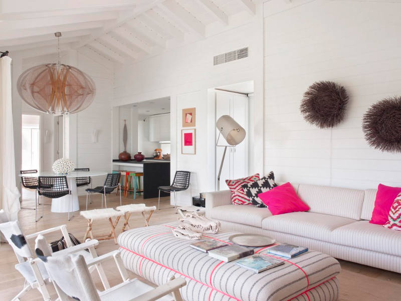
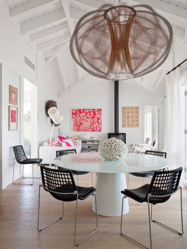
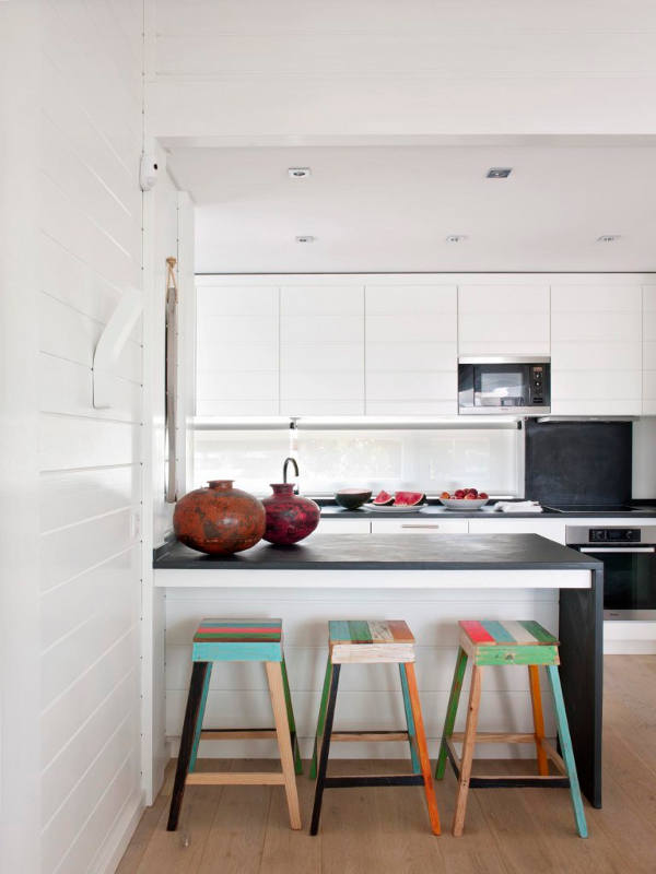
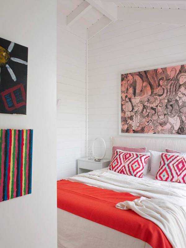
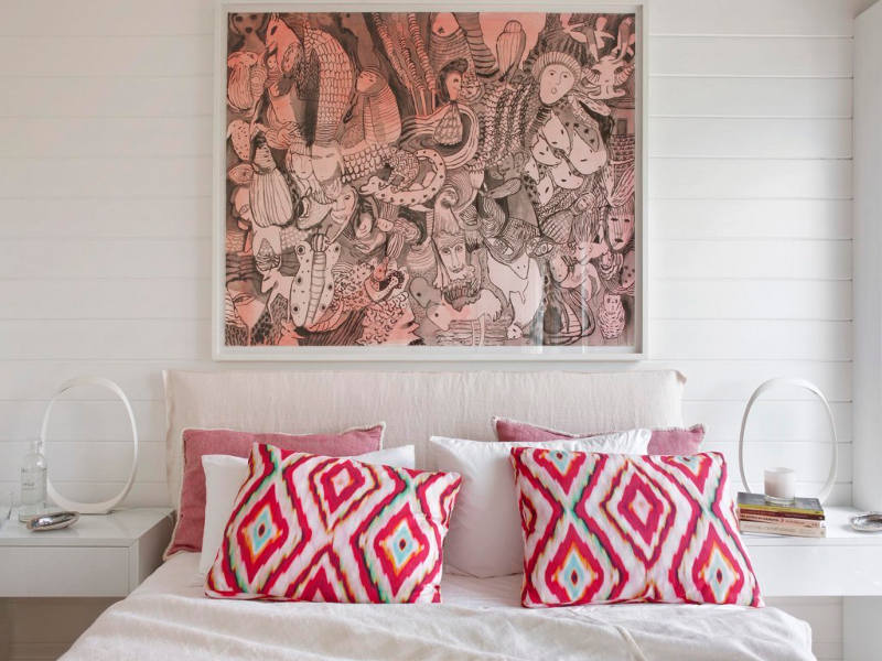
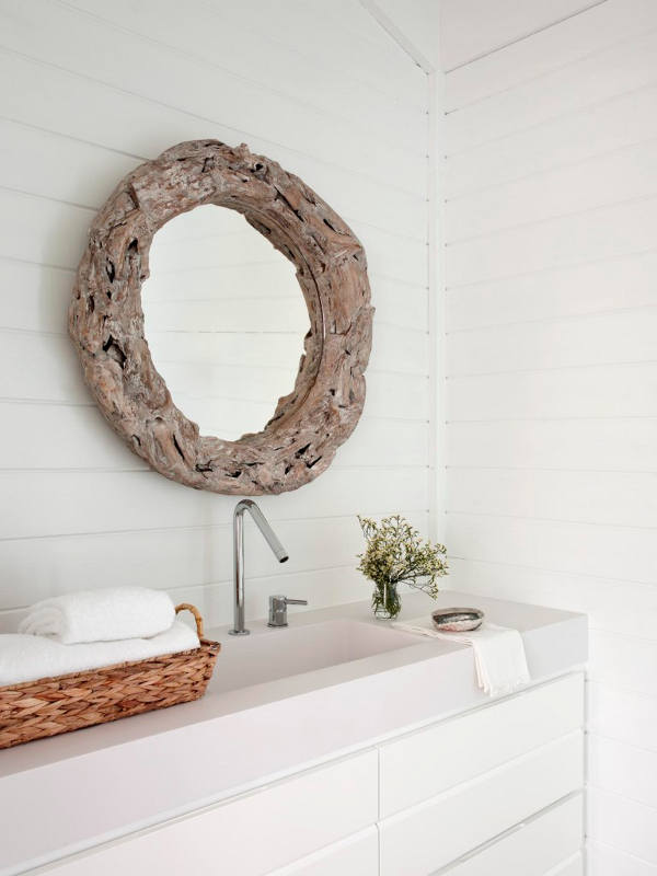
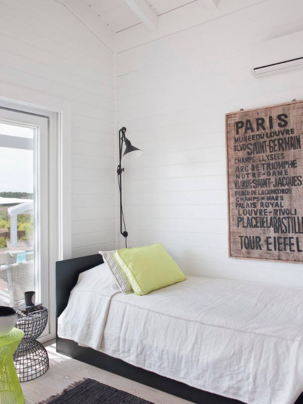
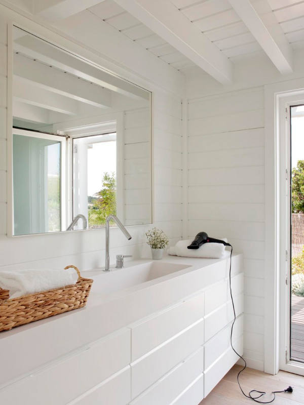
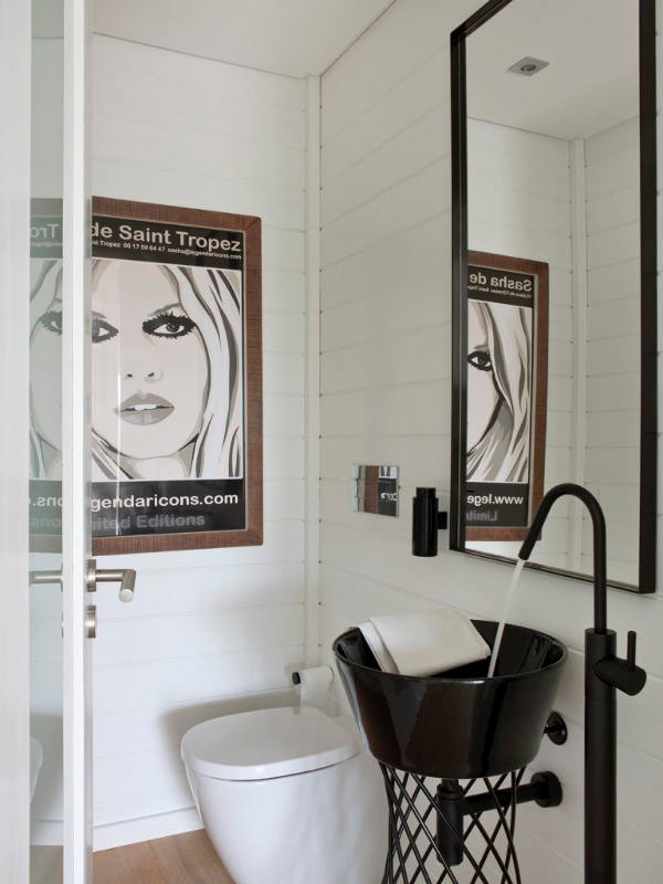
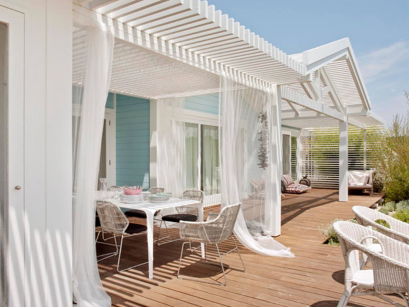
Posted on Mon, 29 Feb 2016 by midcenturyjo
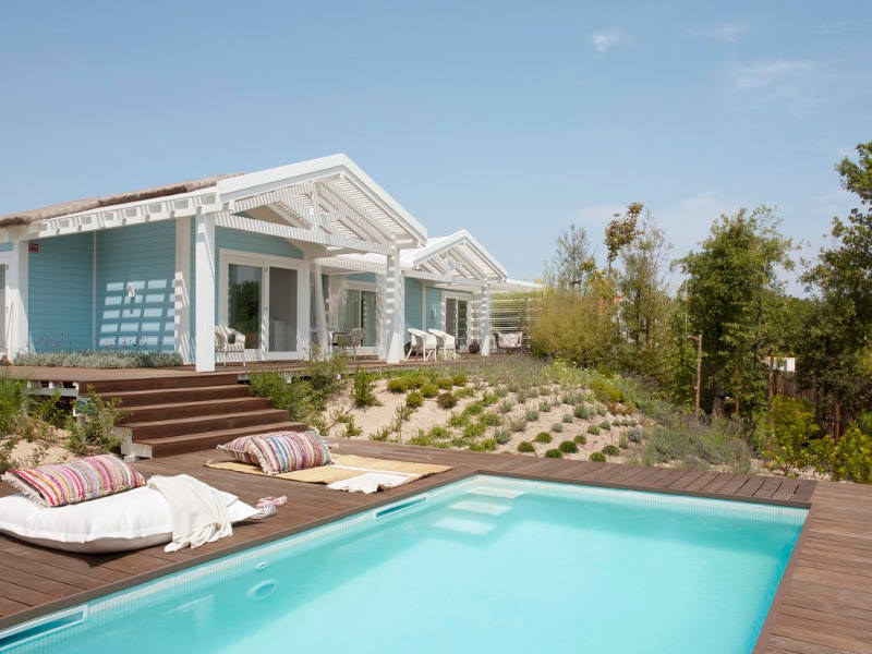
Think beach house think white painted walls and accents of blue and sea green. Perhaps that should be pink or melon or citrus green. This modern family holiday home takes a fresh look at the beach theme with its hot fruit flavoured colour hits. Light, bright and stylishly relaxed. Just what you want for your vacation retreat by the sea. Cabana com Arte in Comporta, Portugal by Lisbon-based architectural and interior design studio Sa Aranha & Vasconcelos.

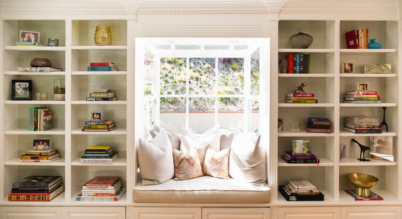
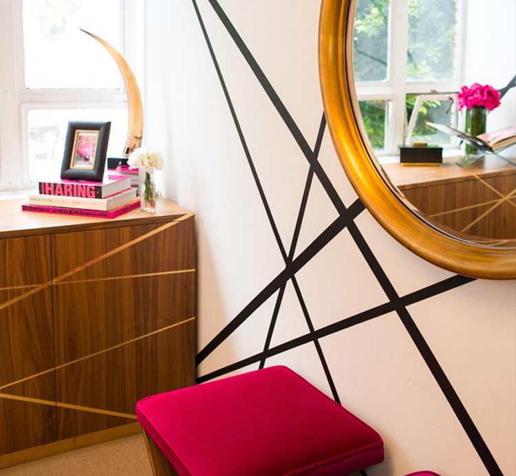
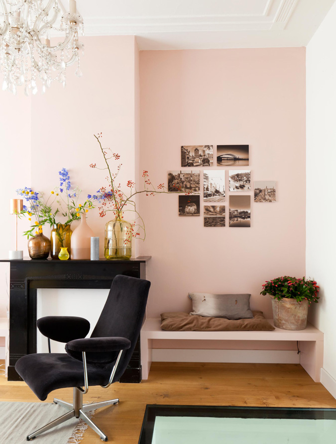
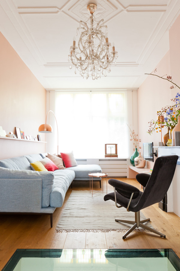
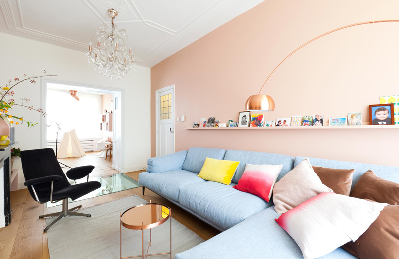
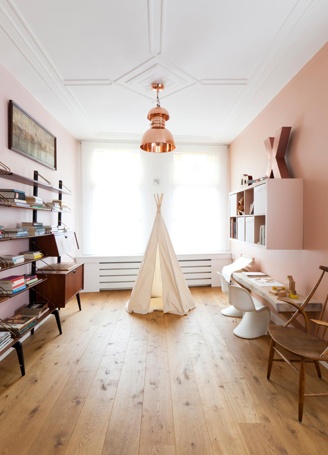
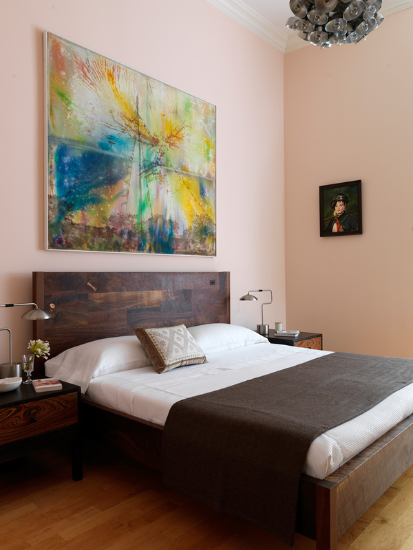
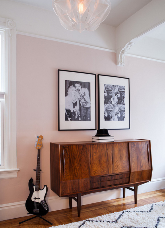
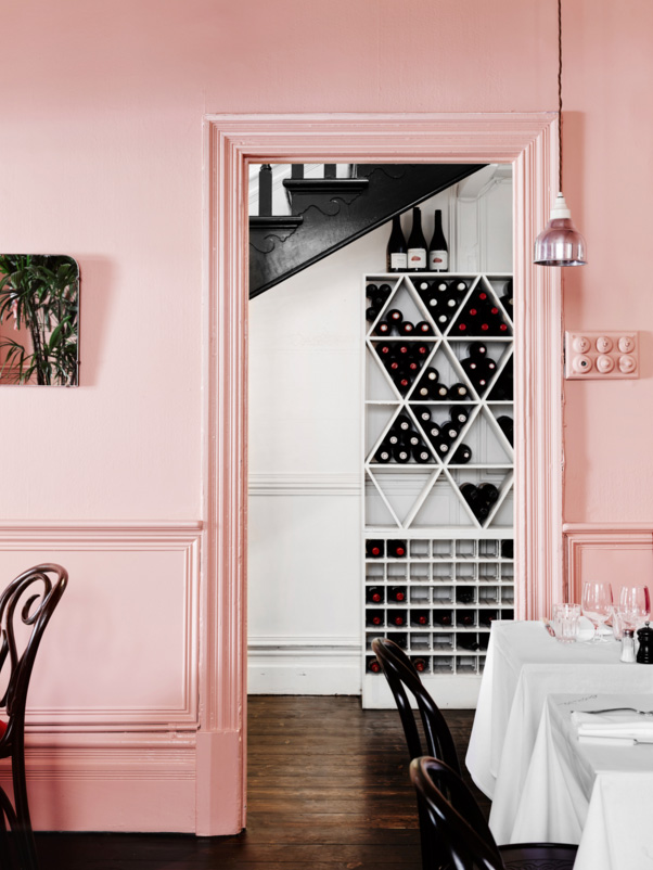
A bit more pale pink inspiration
Posted on Tue, 19 Jan 2016 by KiM
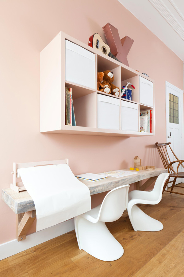
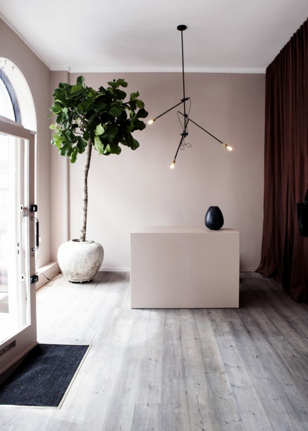
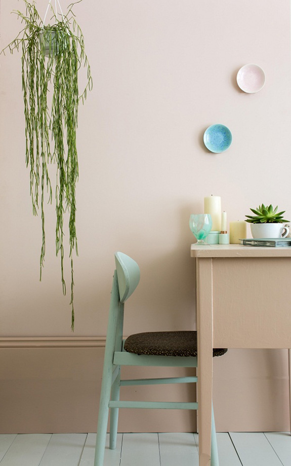
Pale pink walls
Posted on Tue, 19 Jan 2016 by KiM
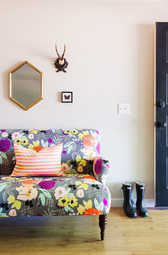
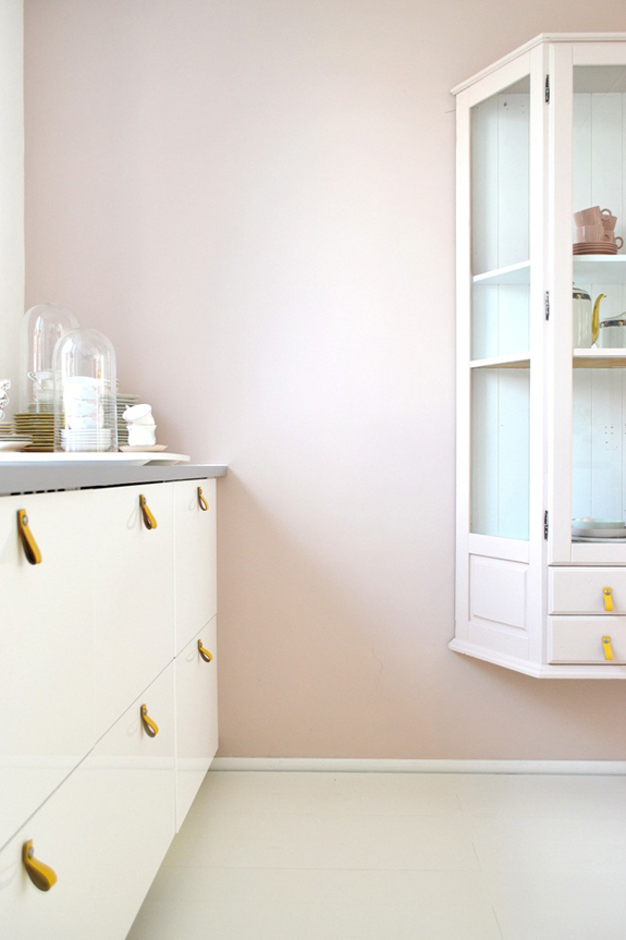
I have been wondering for months what to do with my dining room. Dark? Bright? Wallpaper? I don’t have very good recent photos because I hate the room – this one is the most recent that shows a decent amount of the space. (The floors are now stained grey!) Nothing has really stood out until I suddenly started thinking about pale pink. Then I started thinking about pale pink with dark grey trim. Then I started getting very excited. I am pretty sure pale pink is the route I want to take with the walls (trim will probably just be the same colour or a shade darker so it’s not too choppy, and the doors maybe the black blue of the foyer…and not sure about the ceiling). I have been eyeballing Farrow & Ball‘s Pink Ground, Setting Plaster and Calamine. I think Pink Ground on walls and Setting Plaster on trim could be really gorgeous. I have sent a request for samples so those are on the way. In the meantime, I went looking for inspiration and found all kinds of pretty pinks. And based on the first 2 photos, I think I need heavy velvet burgundy drapes.
Yvonne Koné’s shop (Farrow & Ball’s Pink Ground) LOOOVE THIS!!! So pretty with grey floors – mine are a couple of shades darker than this.
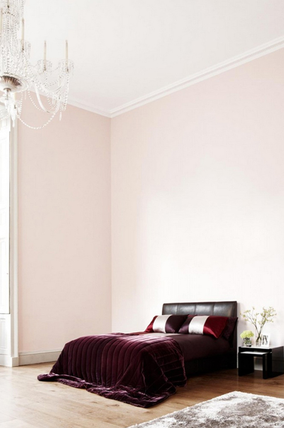
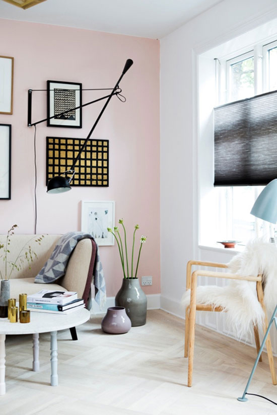
Photo: Tia Borgsmidt Styling: Mette Helena Rasmussen
Katie Lydon (Farrow & Ball’s Pink Ground)
Farrow & Ball (Pink Ground on wall and Setting Plaster on trim)
Style Me Pretty – Caitlin Wilson
![]()
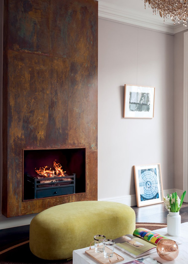
Marie Claire Maison (Farrow & Ball’s Elephant’s Breath)

Atlanta Homes & Lifestyle – Laura Walker
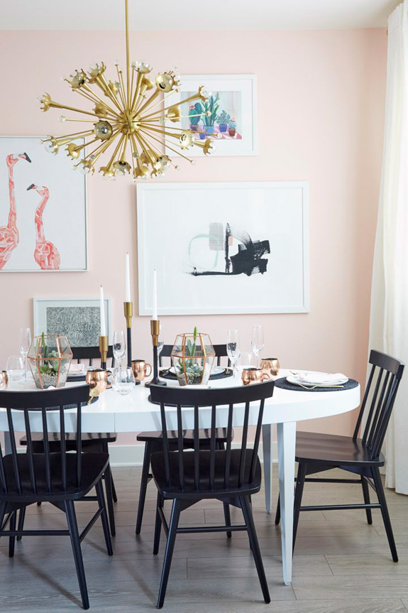
Flack Studio – a little bright but Jo pointed it out to me and it is so gorg I had to include it

