Displaying posts labeled "Reader’s Home"
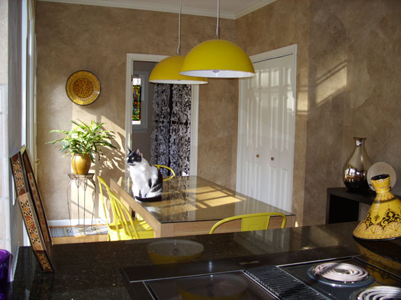
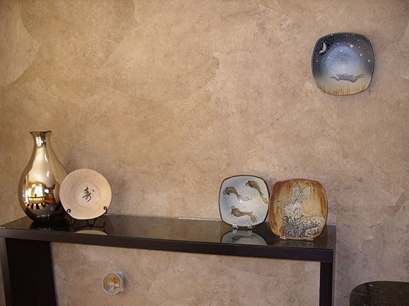
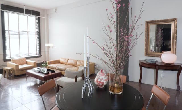
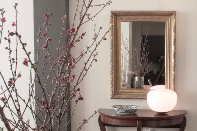
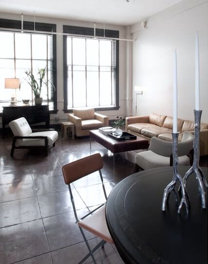
Sandra’s dining room makeover
Posted on Tue, 26 May 2009 by KiM
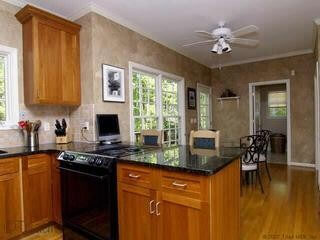
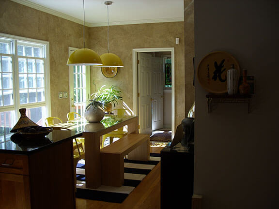
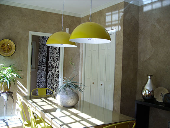
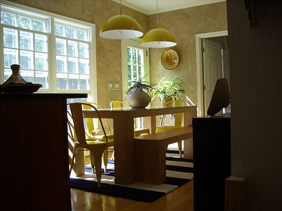
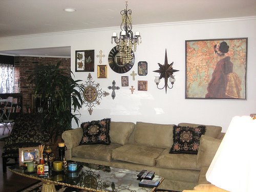
Sandra sent us an email the other day with a project she wanted to share: “In the past you’ve posted pics of my cats Lulu & Schmoo (see here and here) & I recently finished redoing the small dining rm in my 1st ever home & thought I’d share. The before pic shows how the dining room is located just off the kitchen. I’m not sure why, but previous owners put a ceiling fan way off center in the room. Because the hole made in the ceiling to accommodate the fan could not be easily covered up, I decided to just put 2 lights over the dining table (even though I originally wanted just 1). It took about 7 months to complete only because I waited for each piece in the room to go on sale. The only things I was willing to pay full price for was the pottery by a local potter, Charlie Tefft: http://www.ctpottery.com/”. What fantastic choices she made – particularly the Marais chairs and pendants. LOOOOOVE the yellow!!! Great job Sandra and thanks for sharing it with us!
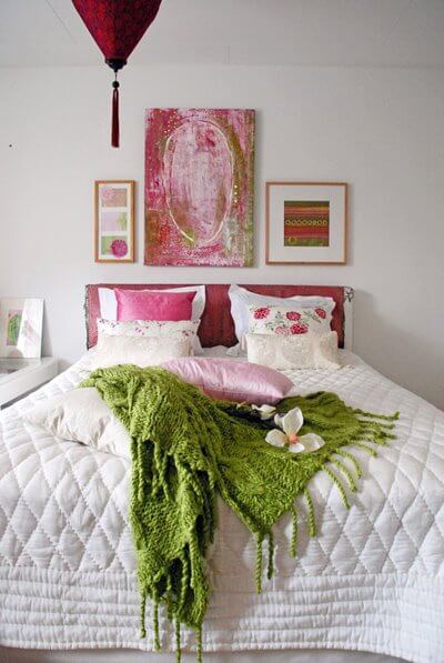
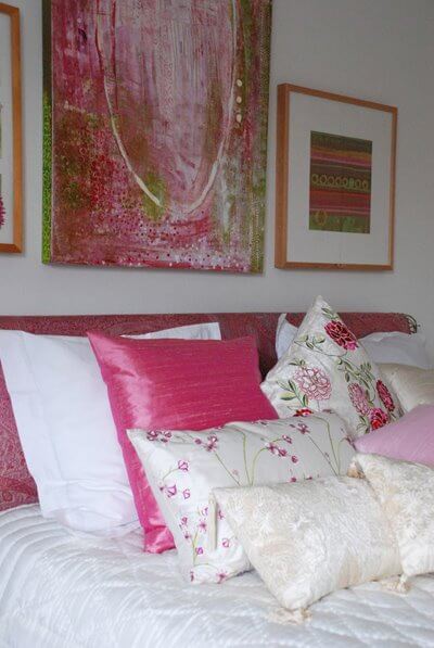
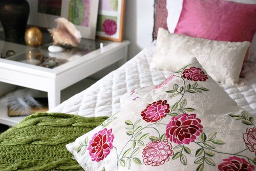
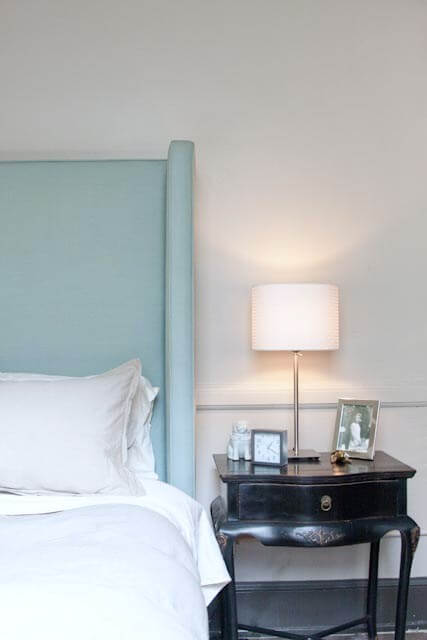
A bedroom perfect for spring/summer
Posted on Mon, 27 Apr 2009 by KiM
Pethra of the Swedish design blog Design & Inredningsbloggen, wanted to share with us a bedroom she styled for her mom. It’s sooooo pretty, with lots of white and pink accents (my favourite!). In my opinion this is a perfect bedroom to bring in this new season. Lovely Pethra! (see more photos here)

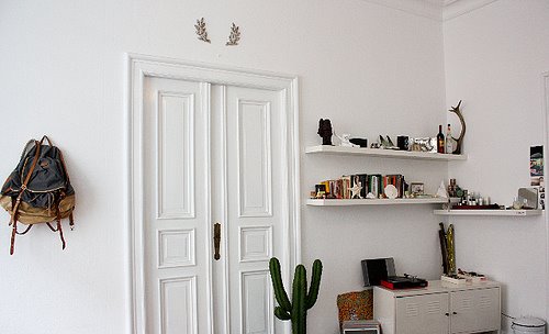
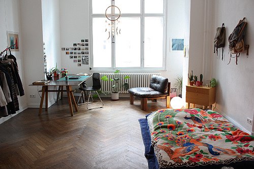
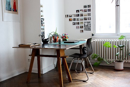
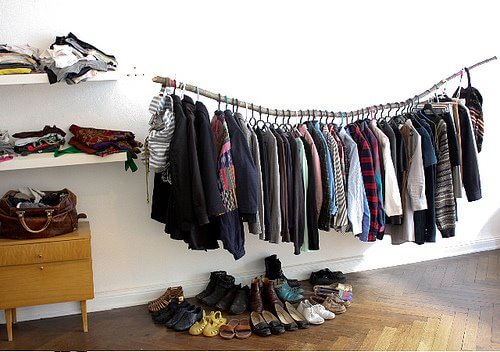
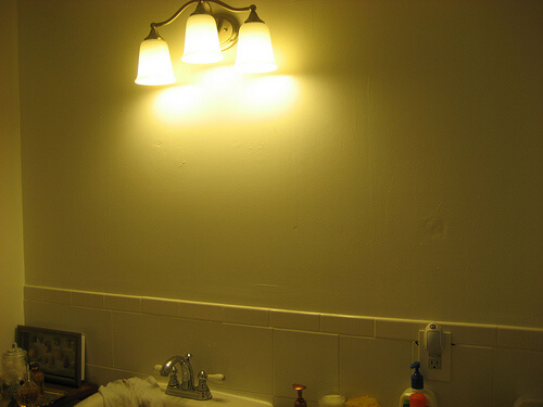
Reader’s homes
Posted on Tue, 21 Apr 2009 by KiM
We have received several emails recently from reader’s who wanted to share their homes so I thought I’d feature a bunch of them today.
The first is from Melody, of the blog me melodia. The following photos are of her friend’s bedroom in Berlin. She posted them on her blog for a new series she’s working on of her friends’ interior spaces. It’s such a comfy, relaxing space, and I ADORE the branch used to hang clothes!


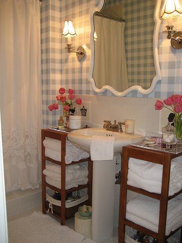
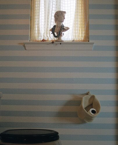
We heard from Julie of Belle Vivir who recently made over her bathroom. She sent us some before and after photos. What a huge difference! I love the colour scheme and the totally cute toilet paper holder. Bathroom redos always make me jealous, as mine are embarrassingly horrid. I’m taking notes. (Click here for more photos).
Jen Venegas sent us a really sweet email the other day. A 25 year old woman who loves the notion of people turning their home into something that’s a direct reflection of themselves, Jen just moved into a home and has been having fun making it her own. Her income is somewhat limiting (I hear ya), but she makes do with garage sale finds, and sort of prides herself on that (I hear ya again!). It excites me to no end that junk finds are making their way into so many people’s homes, as it adds so much character to a space when it’s not all item after item found in any major home decor store. (Jen, I will send you a great big virtual kiss if you hang your art much lower – I’m so anal about that).
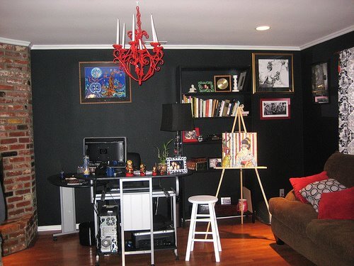
Claudiu of Cluj, Romania wrote us wanting to share his work-in-progress home. He’s an artist and his creativity is evident throughout his home, inside and out. The kitchen looks so cozy, and I love that he took his artwork to the exterior of his house as well.


Thanks to everyone featured here for wanting to share their homes with us and our readers!
Evan’s incredible loft….and a dilemma
Posted on Tue, 21 Apr 2009 by KiM
Evan emailed us looking for some help. Knowing our readers, I’m sure there will be lots of great advise provided that he can run with – just wait till you see what he’s working with!
Evan just moved to downtown Los Angeles and he’s facing his usual dilemma – he starts off strong and then doesn’t know how to finish. “As usual I rushed into buying things that I wish I could replace but that will have to wait. My problem is I always end up at this point and don’t know how to finish or were to go from here. I know something HUGE over the sofa will help and the building offers to paint two walls…should I take them up on their offer and most important – which two walls and what color? FYI: It’s only been two months and I’m already looking to replace the dining table, cocktail table and entry hall table. I am notorious for rushing into things especially when I’m on a budget.”
I was rendered speechless when I saw Evan’s photos. The space ROCKS, and I love just about every piece of his furniture. So how about I show you all the photos, then I’ll give my 2 cents and I’d love it if you guys could pipe in with ideas for Evan as well.
First thing is I would definitively paint 2 walls out, especially if the building is offering. I would paint the wall your sofa is on, and the long wall opposite up to the bathroom. (I’m guessing that area is the bedroom?) I do agree that something really large over your sofa would be great to really showcase the height and size of the space. If you want the sofa wall to be a bit of a bold accent colour then perhaps you should chose some artwork and then choose a wall colour that will highlight the art. The loft seems to get so much light from those windows, so you might even be able to get away with a dark colour, like a chocolate brown for drama. Or even black!! That being the case I’d chose artwork on the lighter side. The other wall I would do a concrete grey because I am a huge fan of grey as a neutral. It will go with everything. As for the furniture I agree about losing the dining table…and chairs. They look way too small and insignificant. I like the rest of the furniture ALOT, but the console table with the mirror above – I’d paint that out black. It looks too traditional with the rest of your furniture. While you’re at it paint out the mirror too. 🙂 A huge rug in the living room and another under your dining table and you’ll be good to go!
I think I’ll stop there and turn it over to everyone else. (Thanks for sharing your home with us Evan! Hope we can help!)
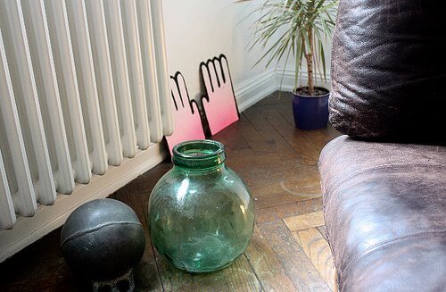
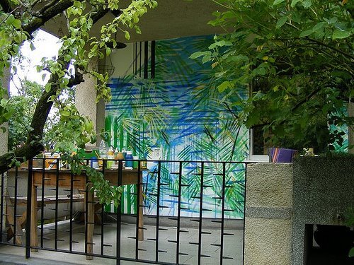
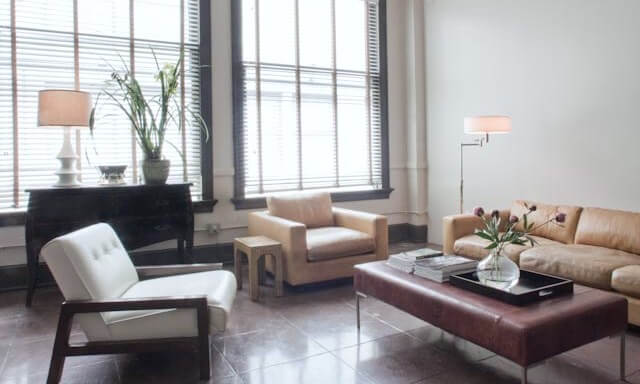
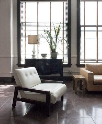
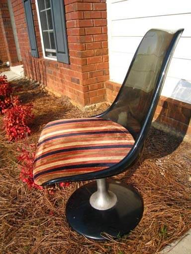
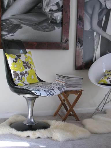
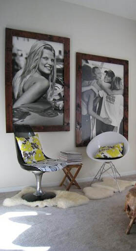
A chair revamped, and a dilemma
Posted on Fri, 13 Mar 2009 by KiM
We received an email from Doreen that I HAD to share: I love everything mid-century modern and therefore, I thought I would share a recent find with you. I went to a local antique/thrift store last weekend. I had been hoping to find a mid-century modern chair one day here in Columbus, GA. Never thought, I would! My luck was about to change this time! I went in and could not believe that they had a Chromcraft chair for sale that was in good condition. Now comes the best – the price tag! It was priced for $38 and I ended up getting it for $30!!! Can you believe it! As soon as I bought it, I went home and cleaned up the whole chair and polished the chrome base. Even though I kind of liked the retro cushion cover it came with – it was dirty and it did not really fit in with my decor. Therefore, I re-upholstered it with a black and white fabric that I had gotten from IKEA. I took before and after pictures that I am going to attach to this mail. I paired the chair with another recent find. The white chair I bought new and I love the look of both chairs together. The two black and white pictures you see on the wall behind the chairs are old Abercrombie & Fitch boards and I just made the frames myself.
She did such an amazing job on the chair, and her vignette is fantastic! Love the huge framed ads and the frames are perfect. Kudos to you Doreen!!
We also received an email from Jen who is looking for some advice on her living room: I am hoping you and your readers can inspire me. I am having a mental block regarding what colors to interject in the attached room (paint/trim, window coverings, accessories). I have searched through endless blogs, magazines, etc, and I am having a real hard time. We are keeping the furniture (minus the speakers/lamp/entertainment center). We are adding in the loop media center/file hutch from crate and barrel. Our style is organic modern and we want this room to feel warm and cozy.
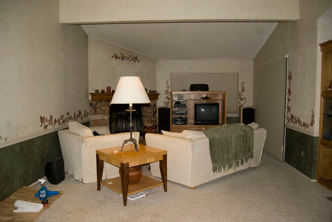
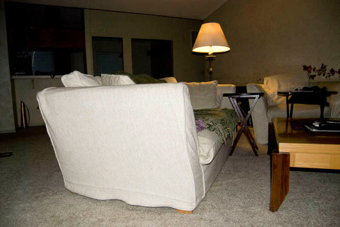
For more information check this post she published on her blog. She has removed the wallpaper (YAY!) and is thinking about bright white trim, dark warm gray below the chair rail, and light warm gray above the chair rail. I was thinking more brown tones as opposed to grey (and I always lean towards grey) because of the fireplace colour, but if the carpet is grey, then I would go with a grey with alot of brown in it (and I’m seeing orange accents, mixed with maybe some acid green). I would keep the colour below the chair rail only slightly darker than above, because it just emphasizes the narrowness of the space. It sounds like Jen is putting her new entertainment stand where the existing one is, which I’m not loving. I would put it to the left of the fireplace, and maybe have the couch to the left of it facing the far window, and chair in front of the patio doors, angled towards the couch. Narrow rooms are very tough to organize as I know very well having lived in a couple narrow houses. So if anyone has any suggestions please leave a comment for Jen!

