Displaying posts labeled "Shelving"
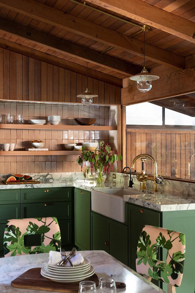
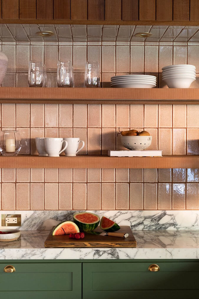
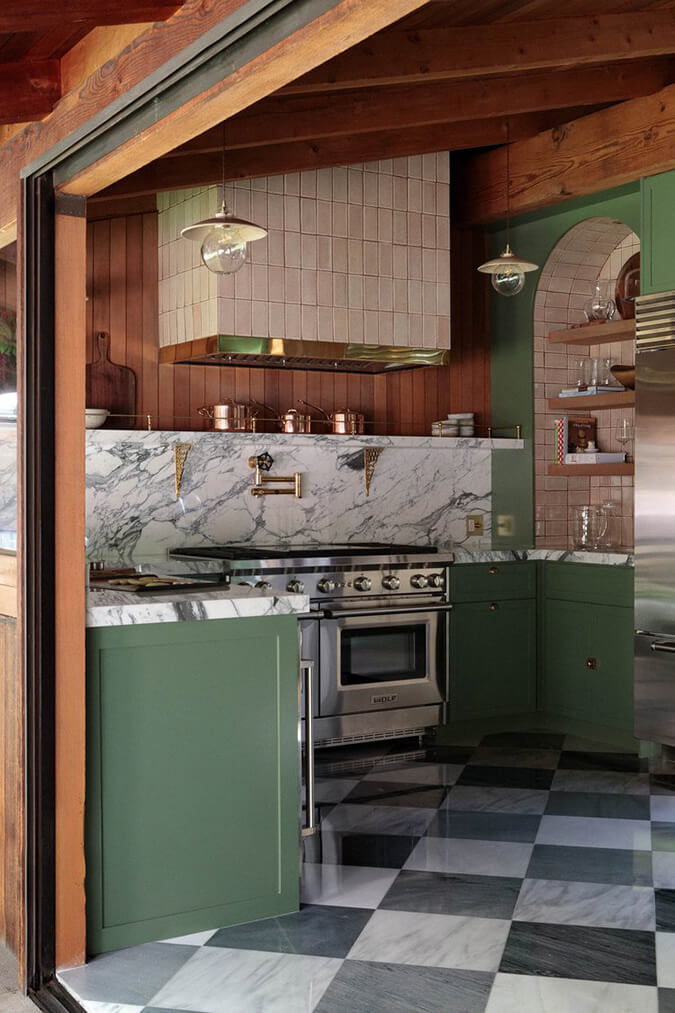
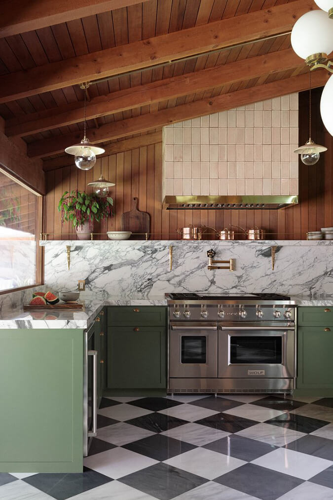
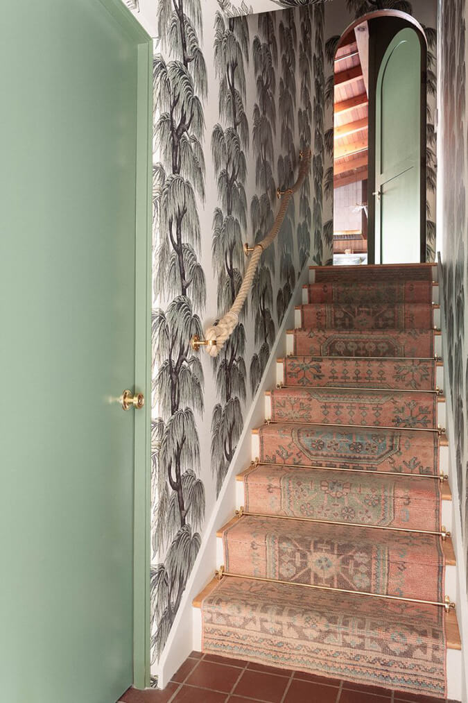
Tropical forest vibes in this renovated kitchen
Posted on Wed, 18 Oct 2023 by KiM
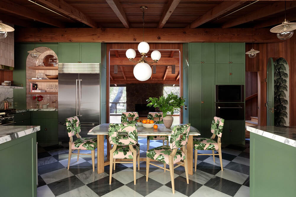
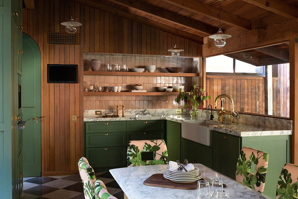
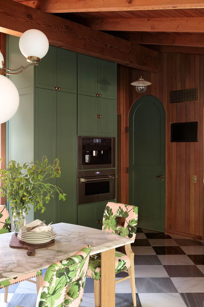
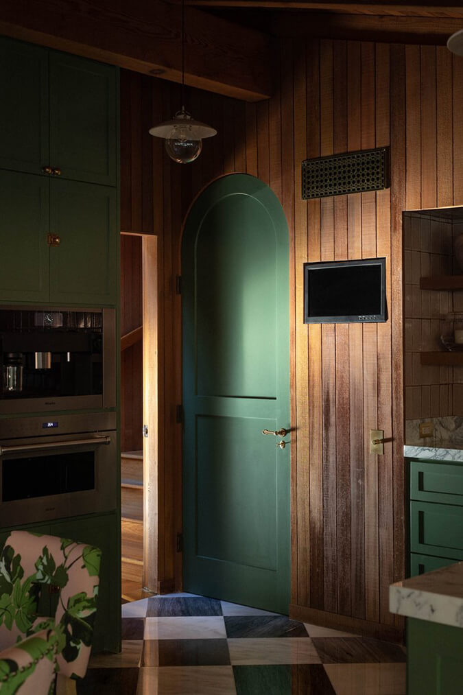
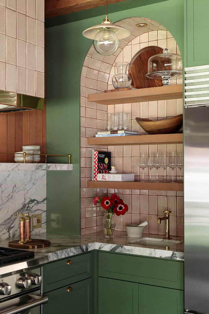
What is not to love about this kitchen?! It has EVERYTHING on my kitchen wish-list – cabinetry painted in the prettiest green (Calke Green by Farrow & Ball), black and white checkered tile floor, marble and tile backsplashes, a big Wolf range, and the pièce de résistance – original wood paneling and ceiling/beams that were sandblasted and refinished. It’s PERFECT. Designed by Jaqui Seerman. Photos: Jess Isaac.
Stylish in Valencia
Posted on Tue, 17 Oct 2023 by midcenturyjo
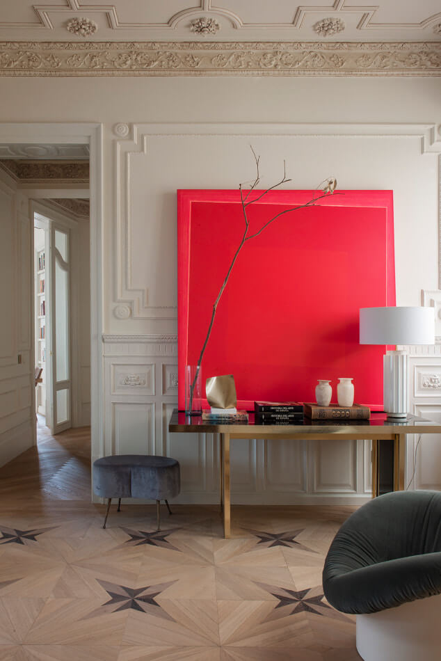
Ornate plaster details and stunning floors set the stage for a sophisticated mix of mid century, traditional and contemporary pieces in this Valencia home by Estudio María Santos. Timeless and functional yes but always with that certain something, that style. Favourite details? Dining in a library and the art … and the vintage design classics … and … and …
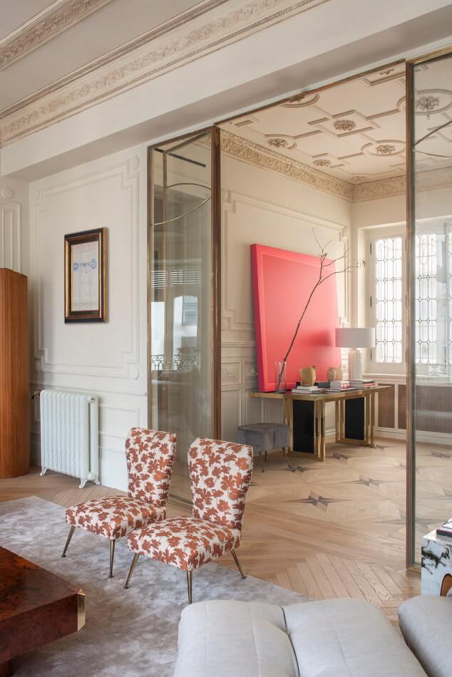
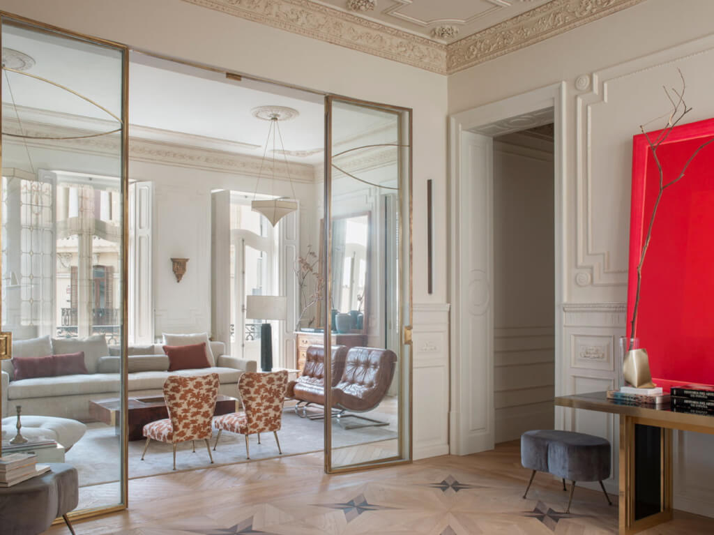
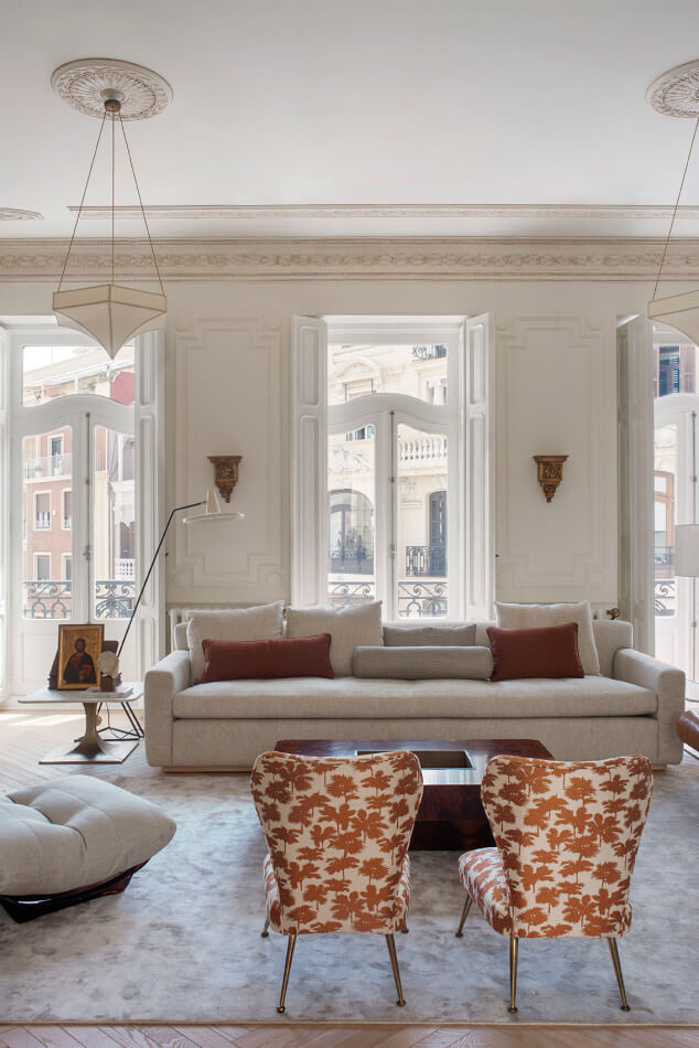
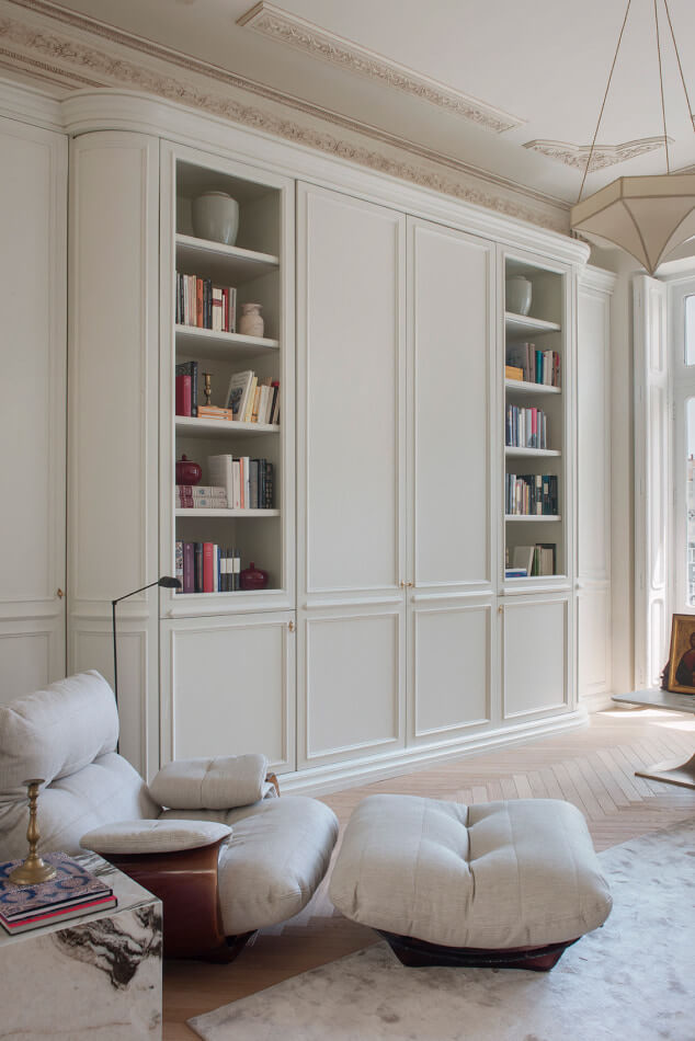
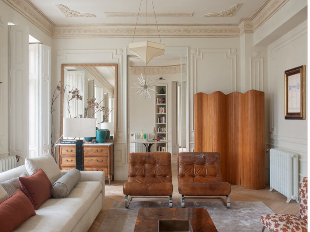
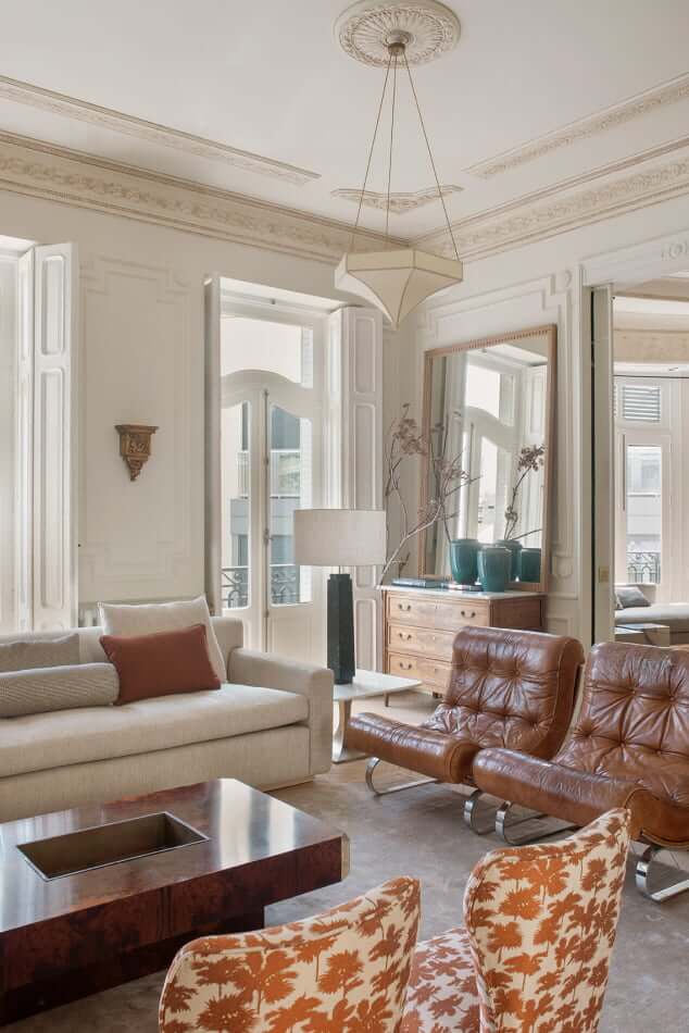
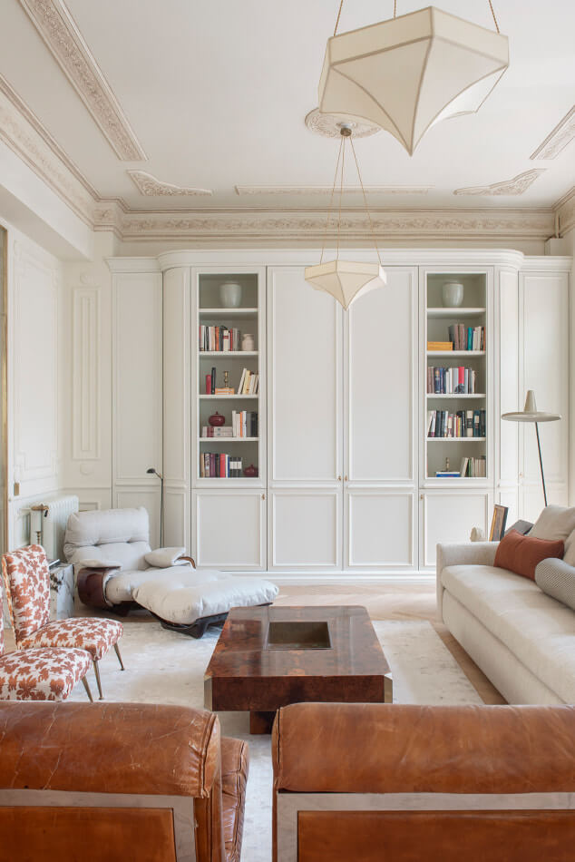
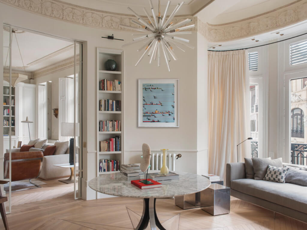
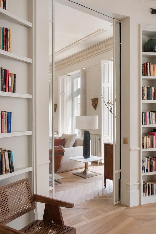
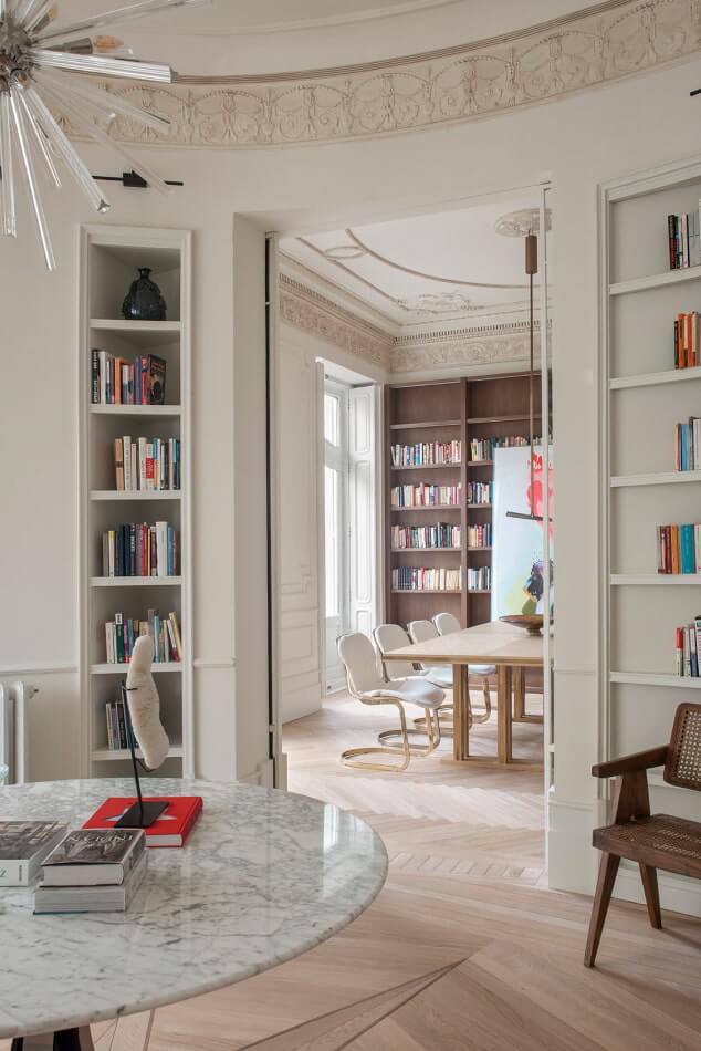
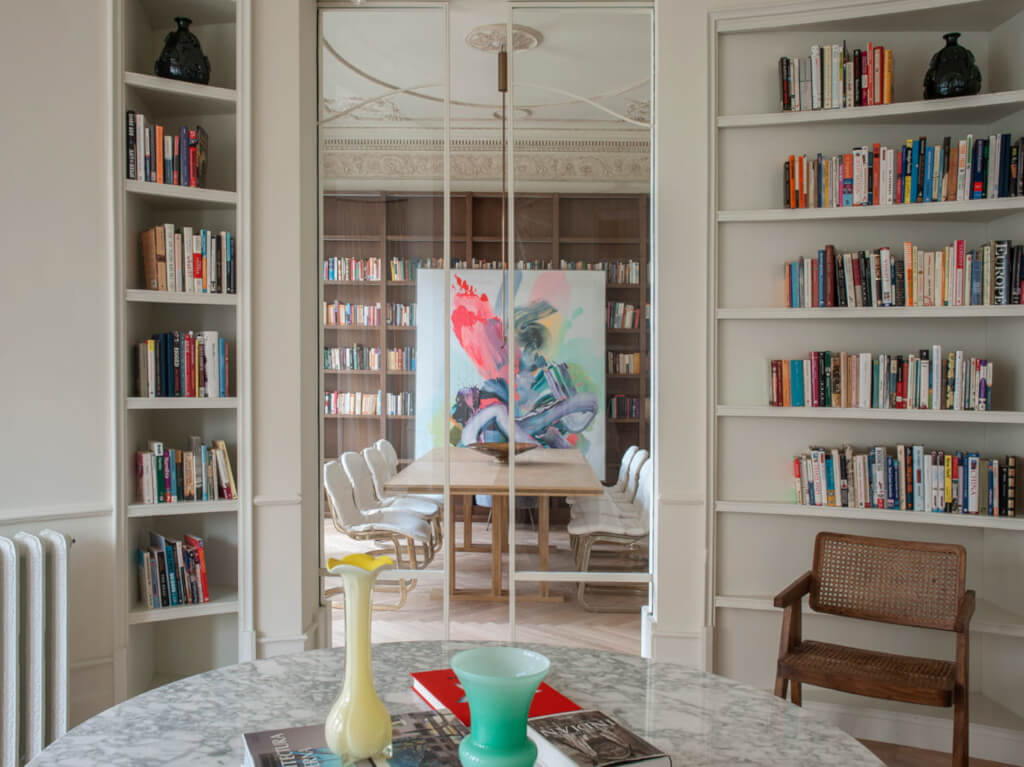
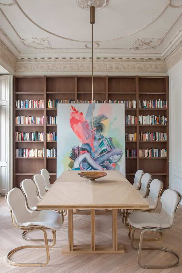
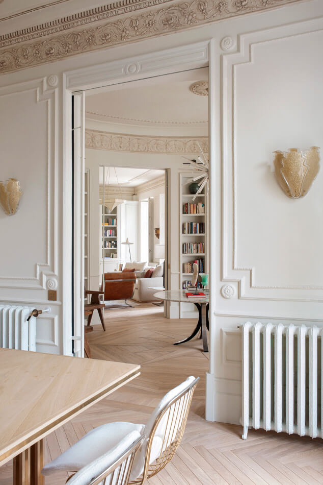
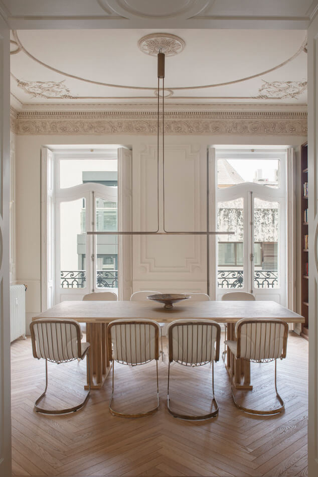
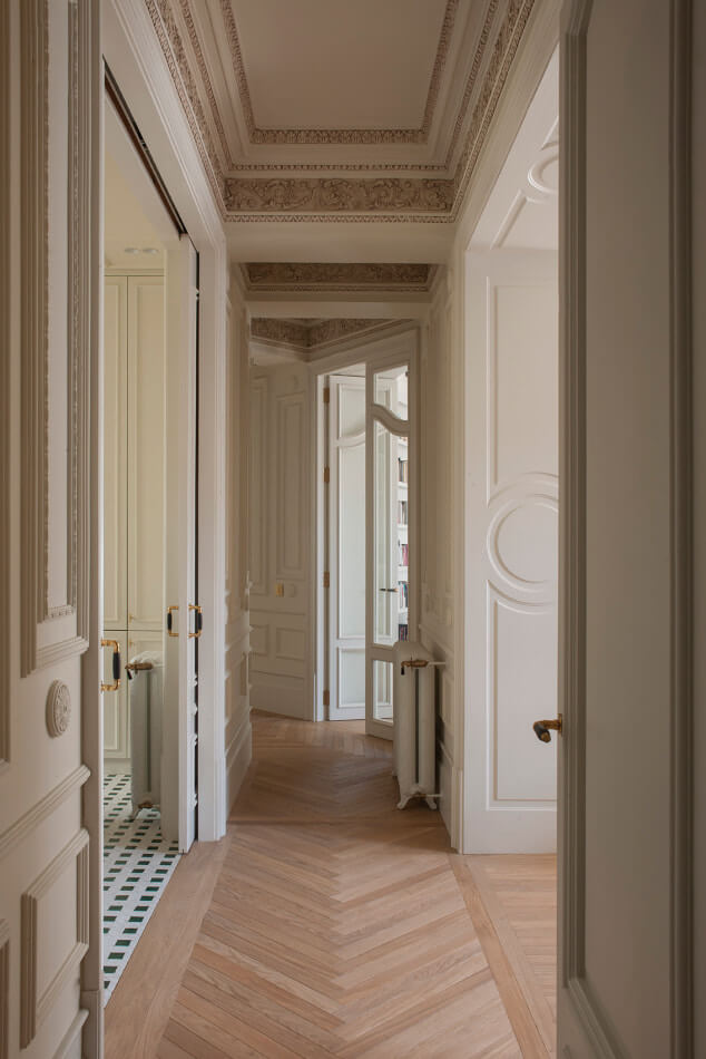
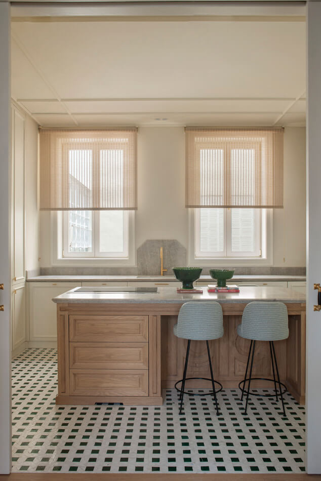
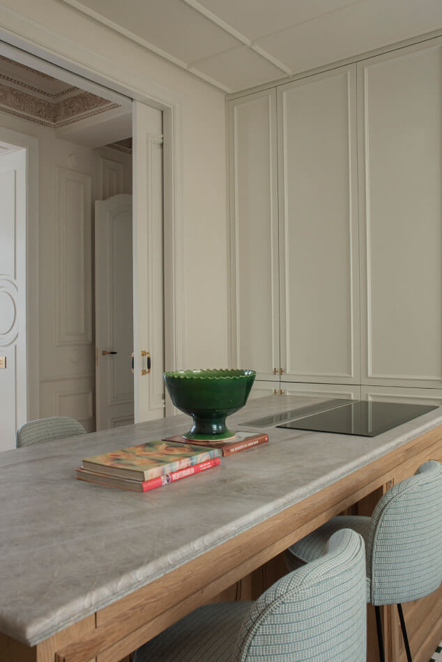
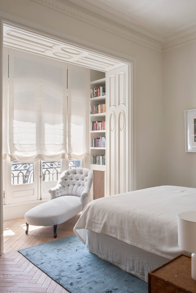
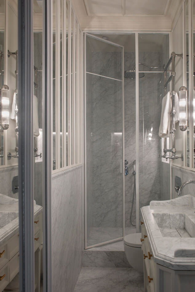
Photography by Montse Garriga.
Stylish apartment living
Posted on Fri, 13 Oct 2023 by midcenturyjo
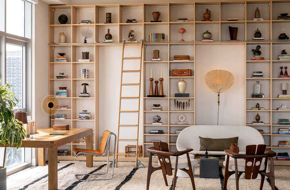
From its super stylish library to a bedroom I find myself wanting to create in my own home this Allison Island apartment by Studio Santos is as hot as the Miami summers. Think casual chic with a selection of individual, standout pieces.
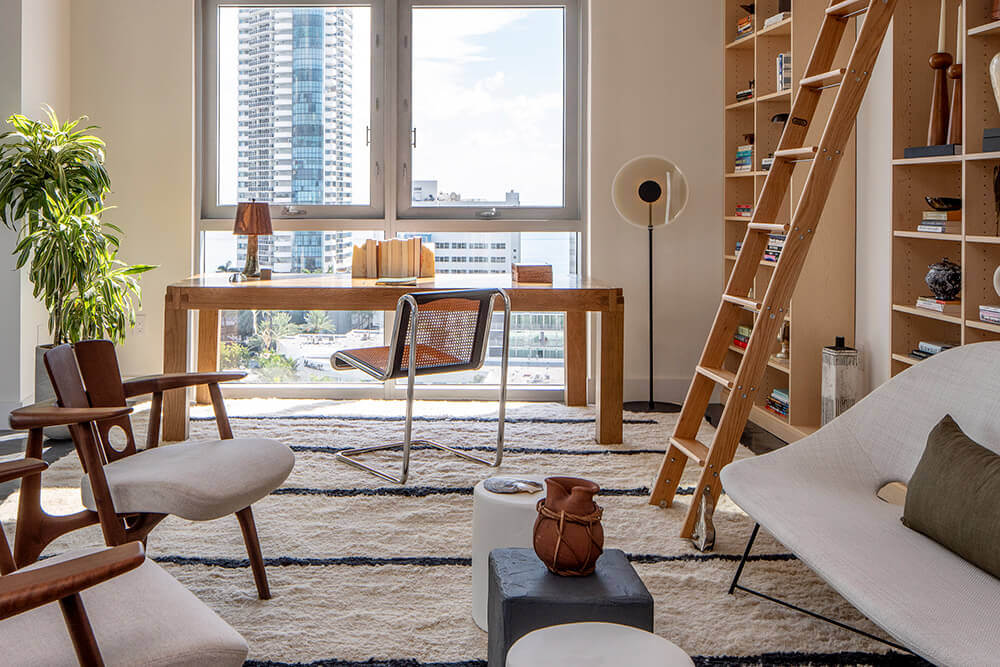
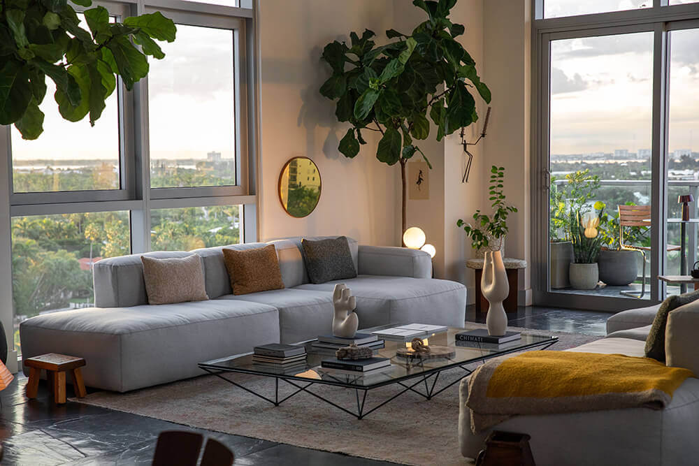
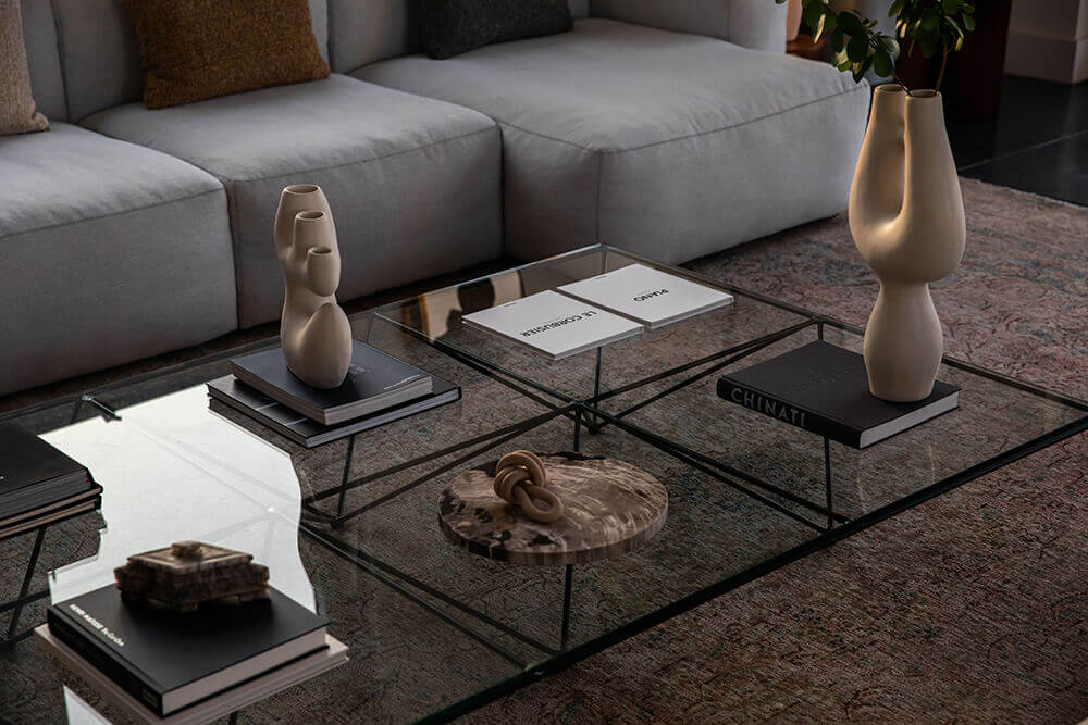
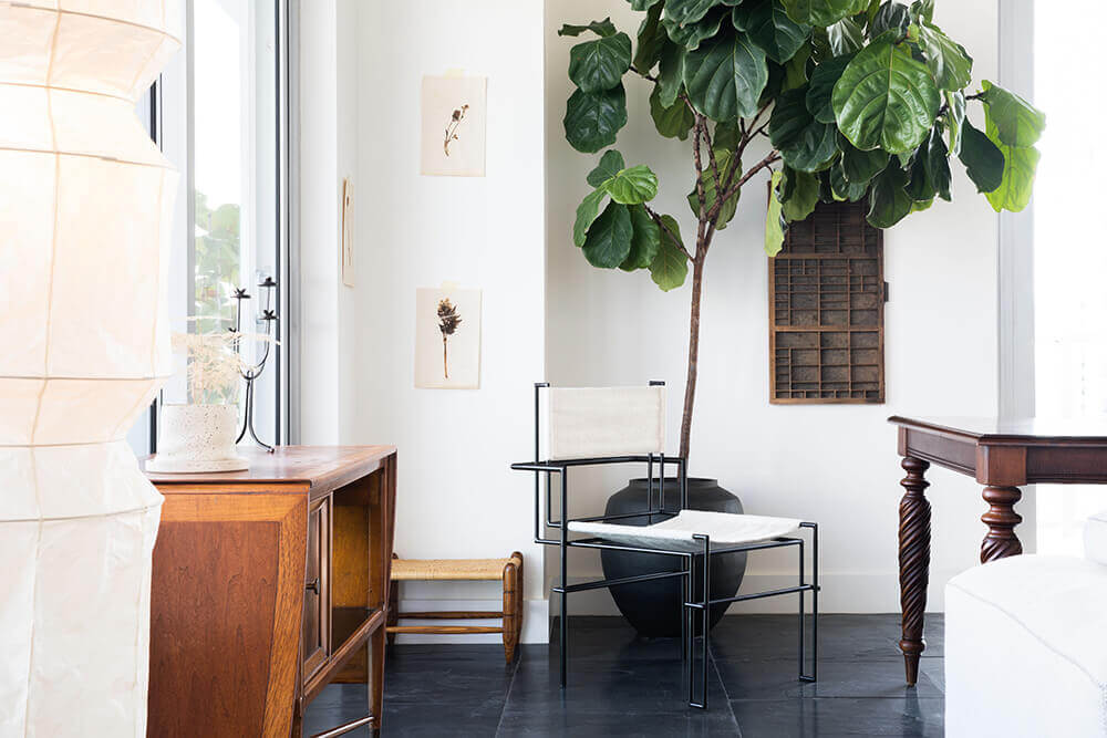
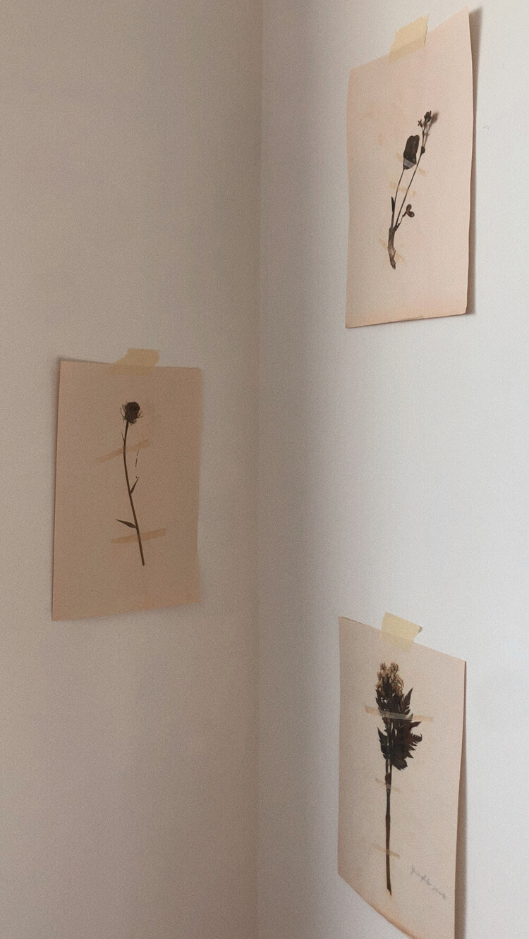
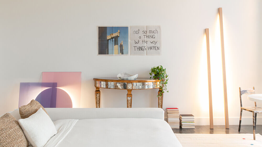
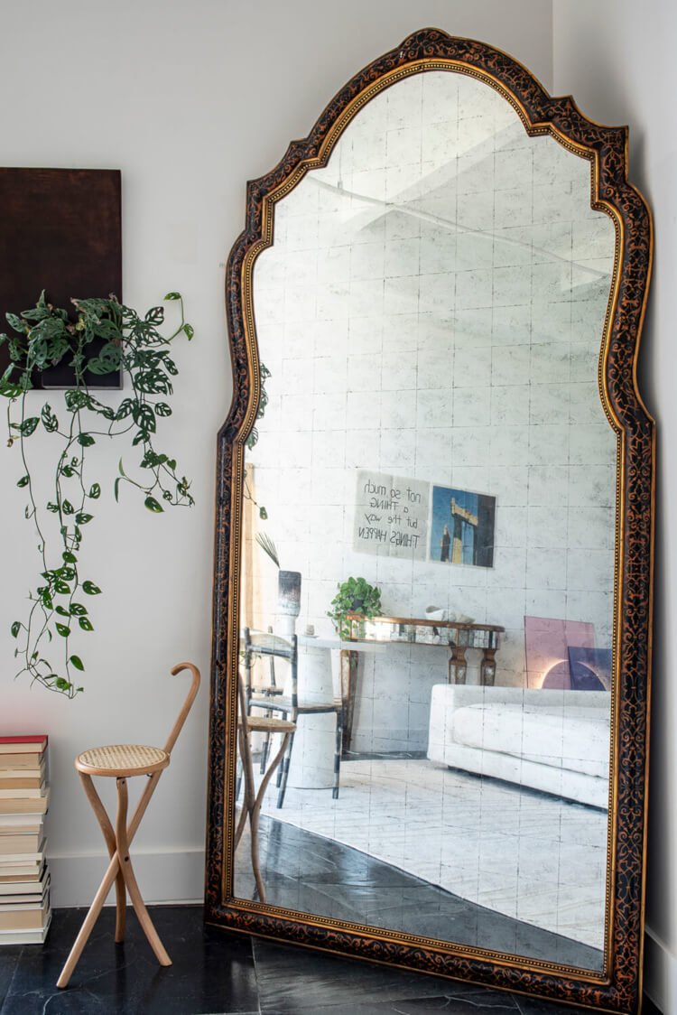
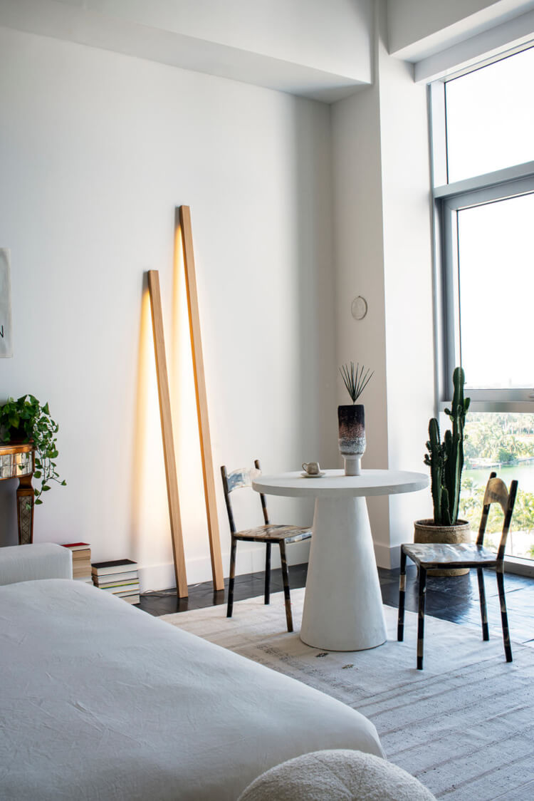
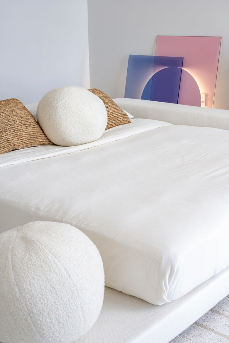
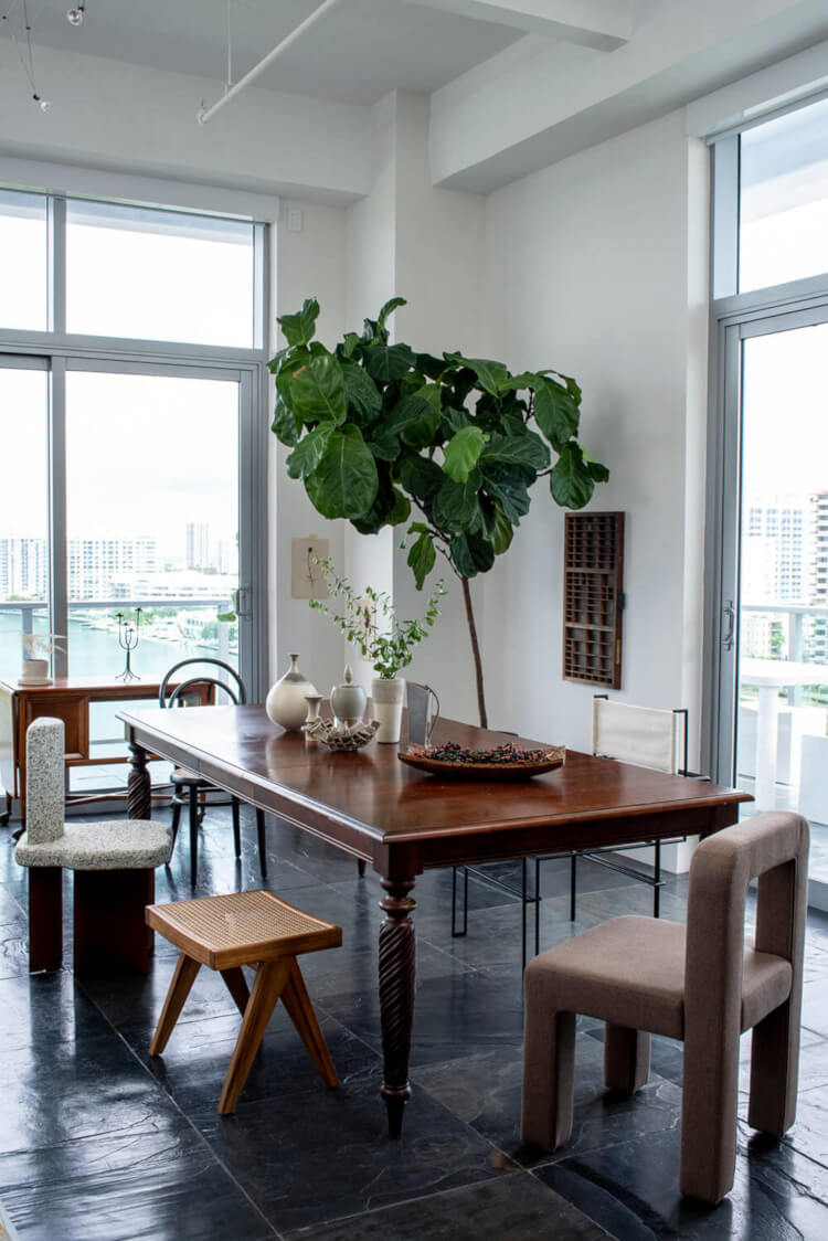
Photography by Michael Stavaridis.
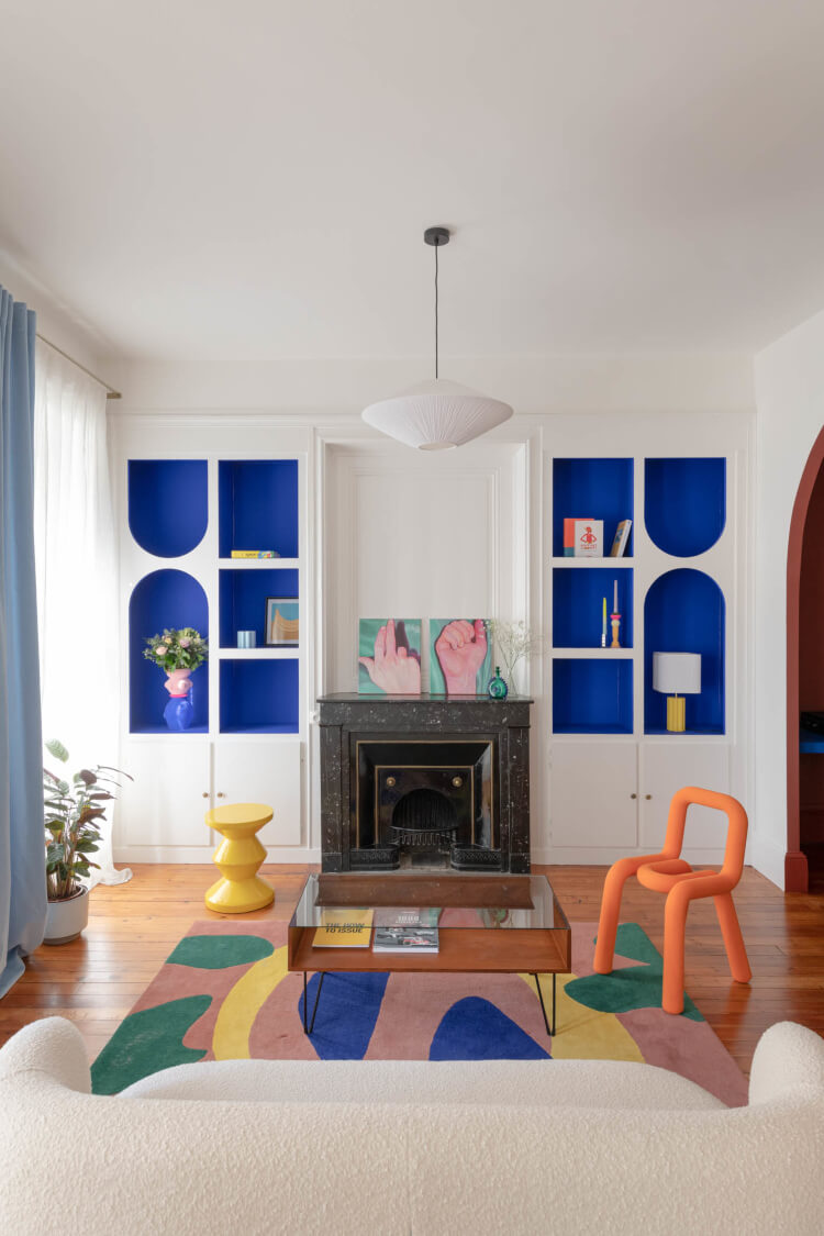
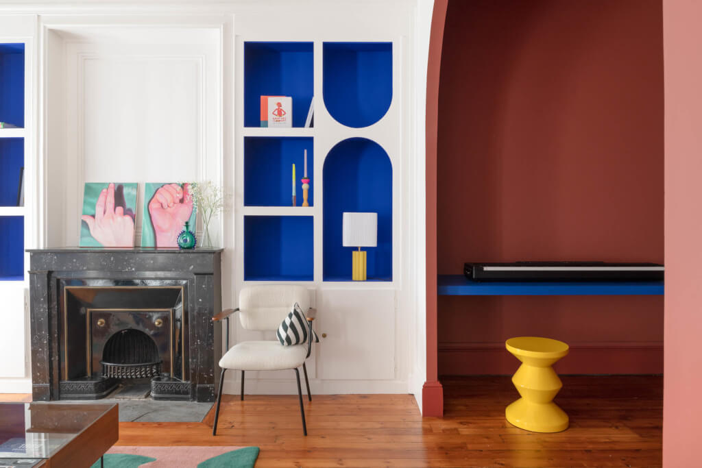
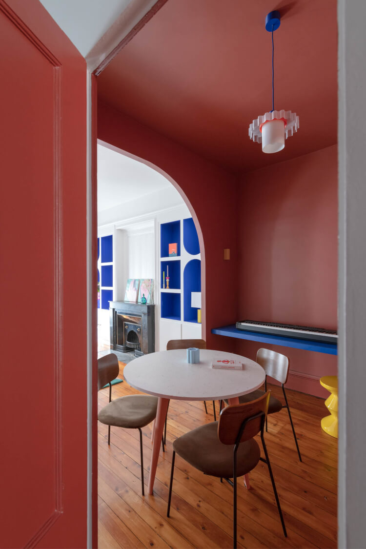
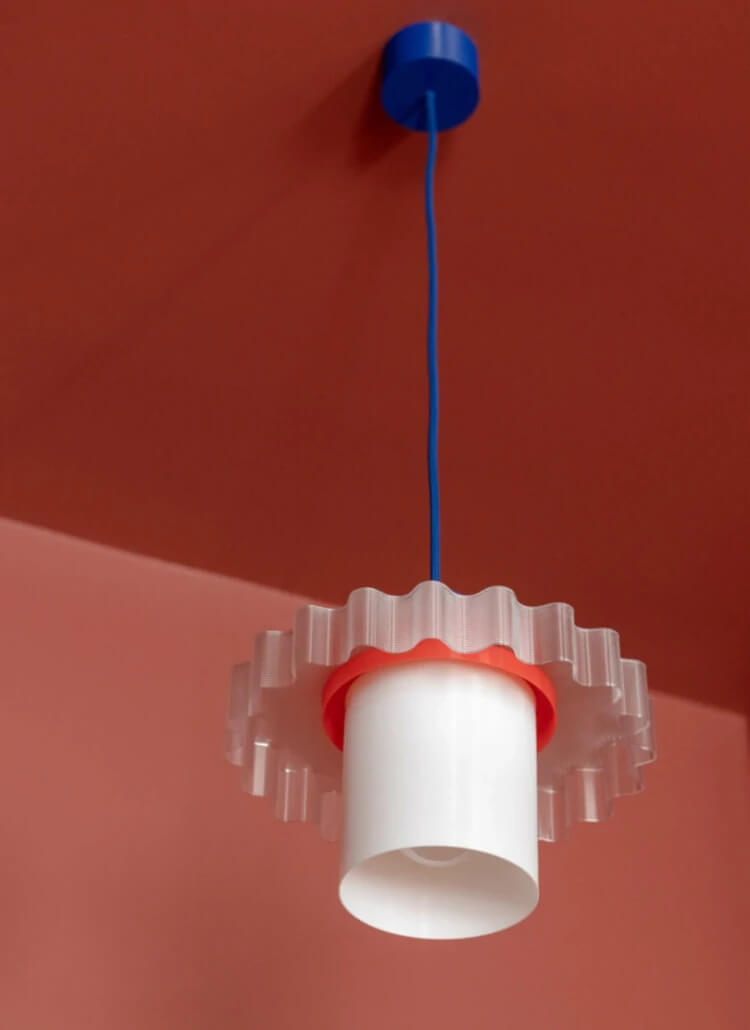
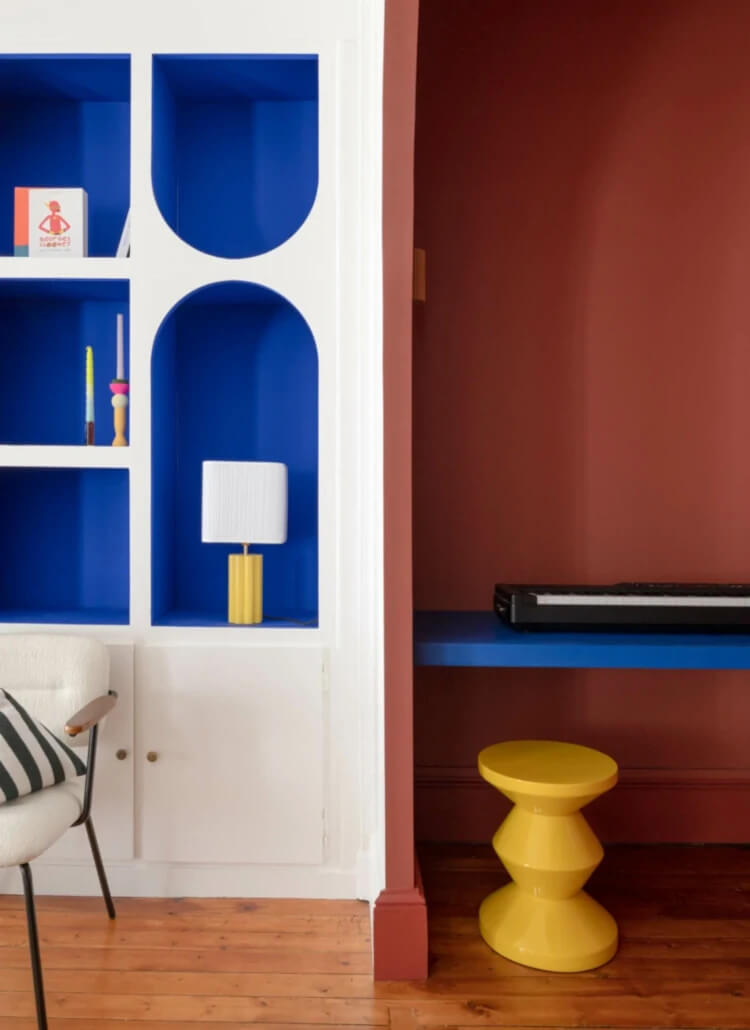
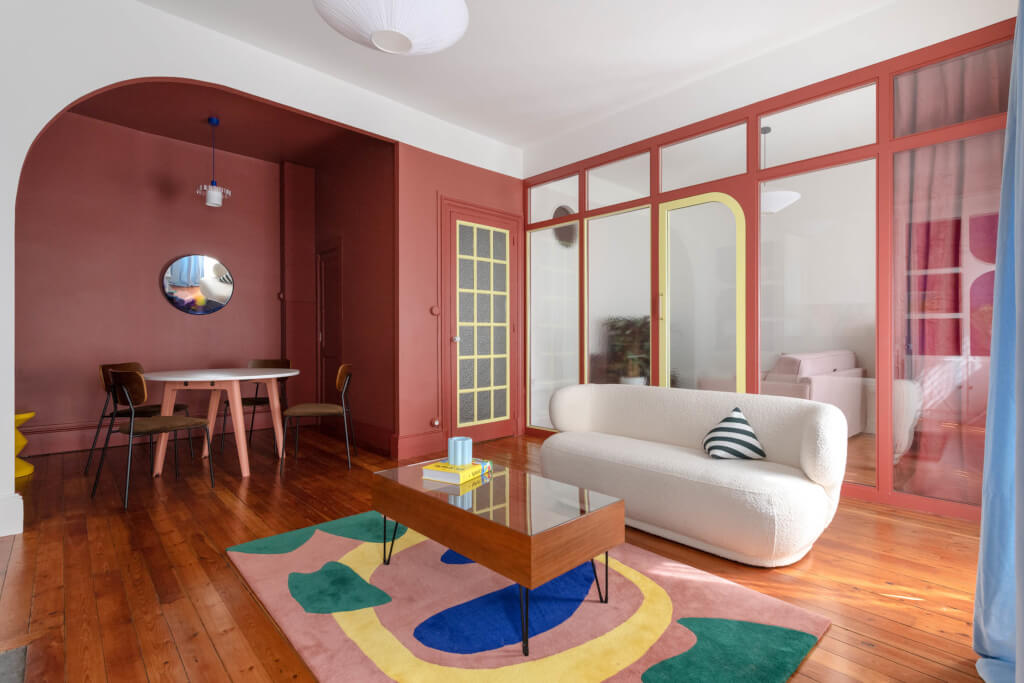
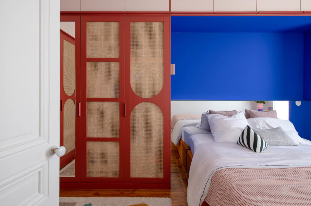
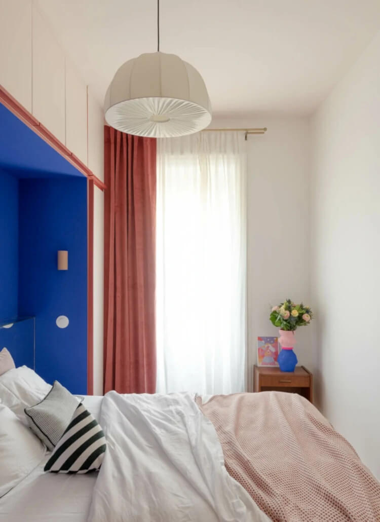
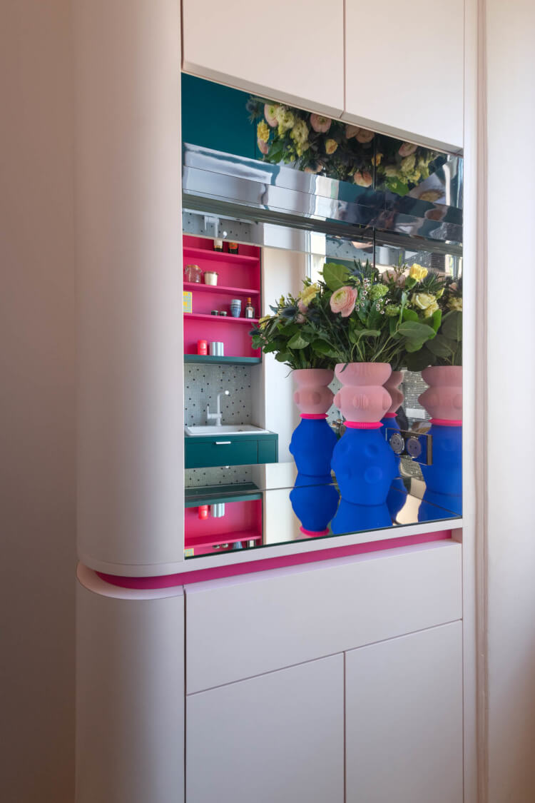
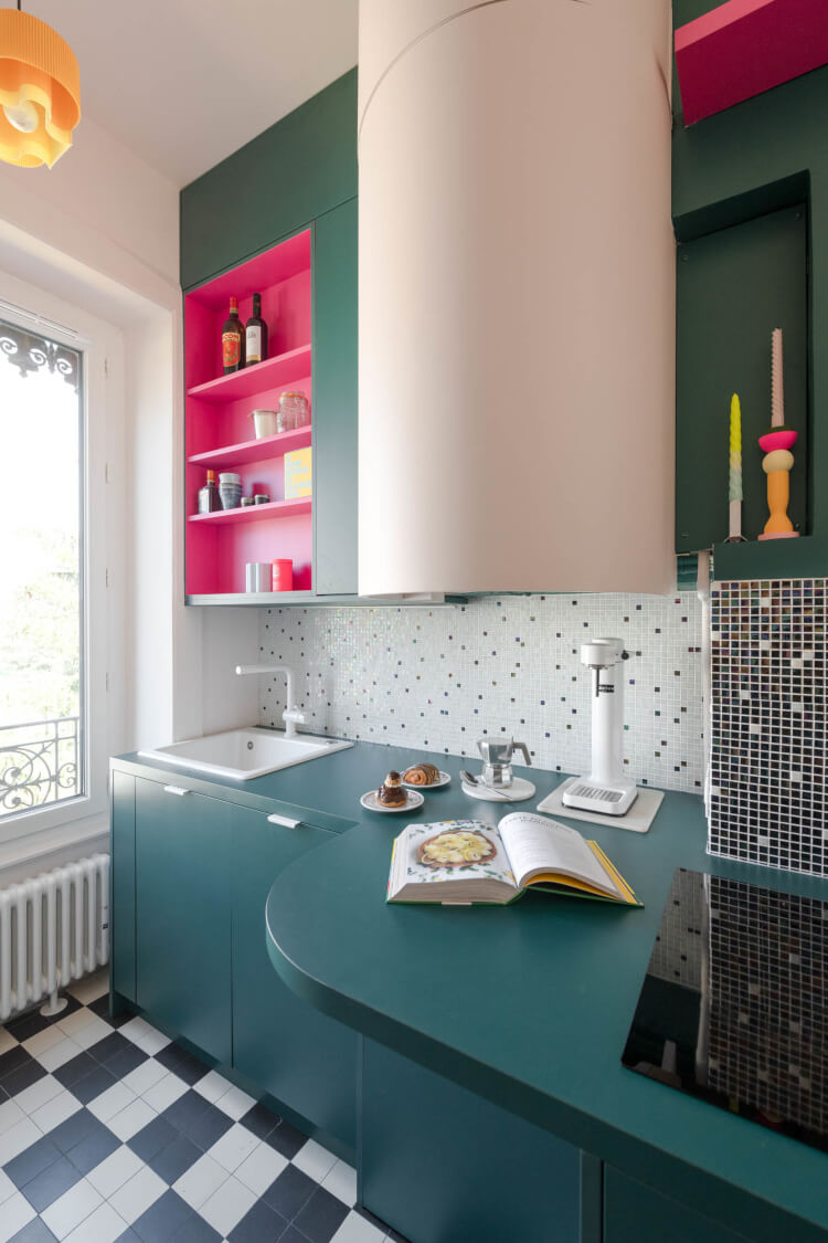
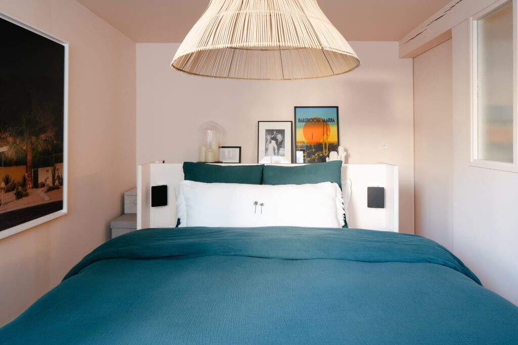
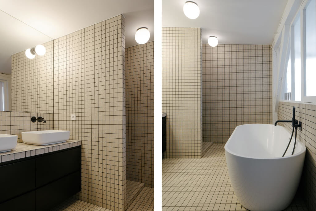
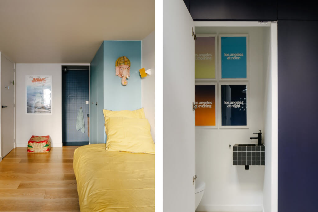
A vibrant kaleidoscope of colours and creative design
Posted on Tue, 3 Oct 2023 by midcenturyjo
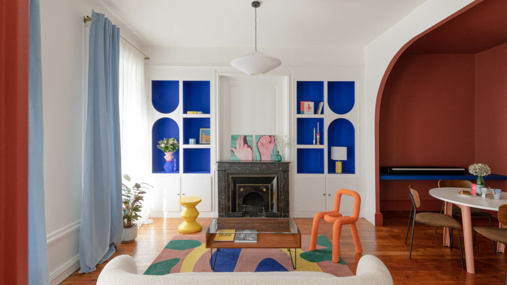
In 2022, a vibrant transformation took place in the heart of Lyon’s Croix-Rousse district. A 65 square meter apartment underwent a complete renovation, orchestrated by the skilled hands of studio CRAIE CRAIE. The space, once outdated, was reborn with a burst of lively colours and playful volumes, a testament to the studio’s distinctive graphic identity. The renovation preserved the apartment’s unique features: a small, colourful kitchen flowed into the living area, adorned with a black-and-white checkered floor reminiscent of an American diner. The transformation journey extended to every corner, from a cleverly optimized kitchen with vibrant green accents to a bedroom seamlessly integrated with custom storage. The bathroom, adorned with shades of green and pink, retained its classic charm with a touch of contemporary flair. Throughout the home, thoughtful details like vintage handles and strategically placed mirrors added a touch of whimsy. This apartment, a testament to CRAIE CRAIE’s ingenuity, offers a living space and a visual feast, a fusion of past and present, brought to life through a vibrant kaleidoscope of colours and creative design.
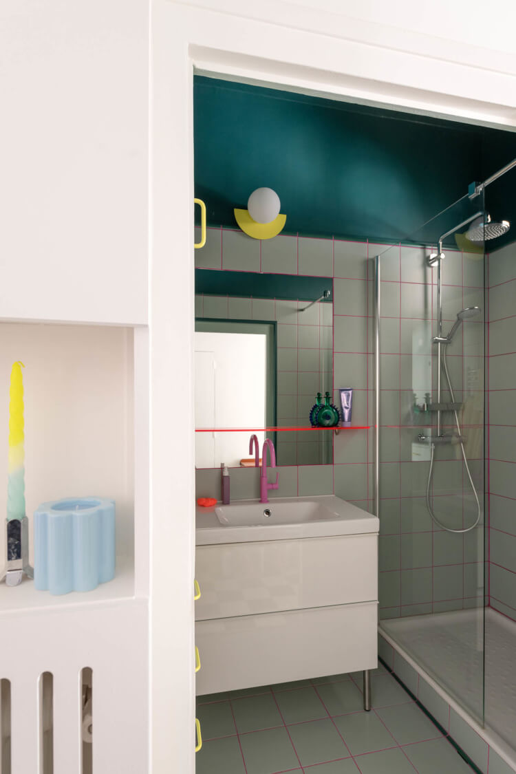
A successful landing
Posted on Fri, 29 Sep 2023 by midcenturyjo
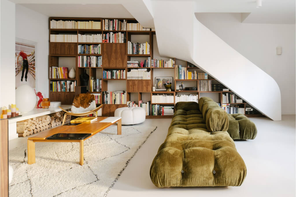
After six intense years in Manhattan, the owners asked interior and furniture designer Bateaumagne to transform this former artist’s studio hidden in a leafy courtyard in Paris’ 6th arrondissement. They created a spacious loft-style living area on the ground floor, preserving the studio’s artistic essence with modernist walnut woodwork. Upstairs, vibrant mid-century colours define the rooms, while Winkelmans tiles adorn the bathrooms. Their eclectic choices, like the Cameleonda sofa and Verner Panton chairs, resulted in a harmonious and artistic family-friendly space.
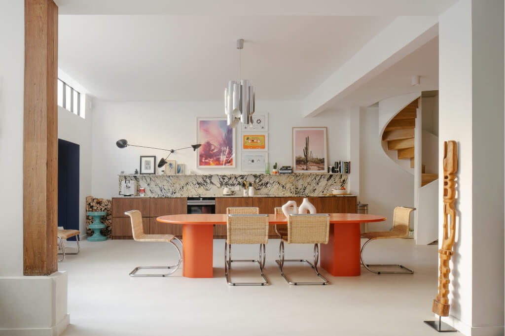
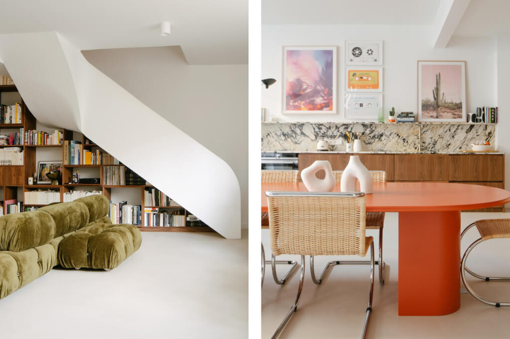
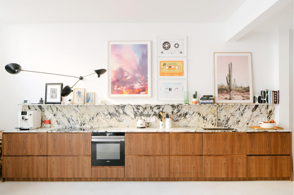
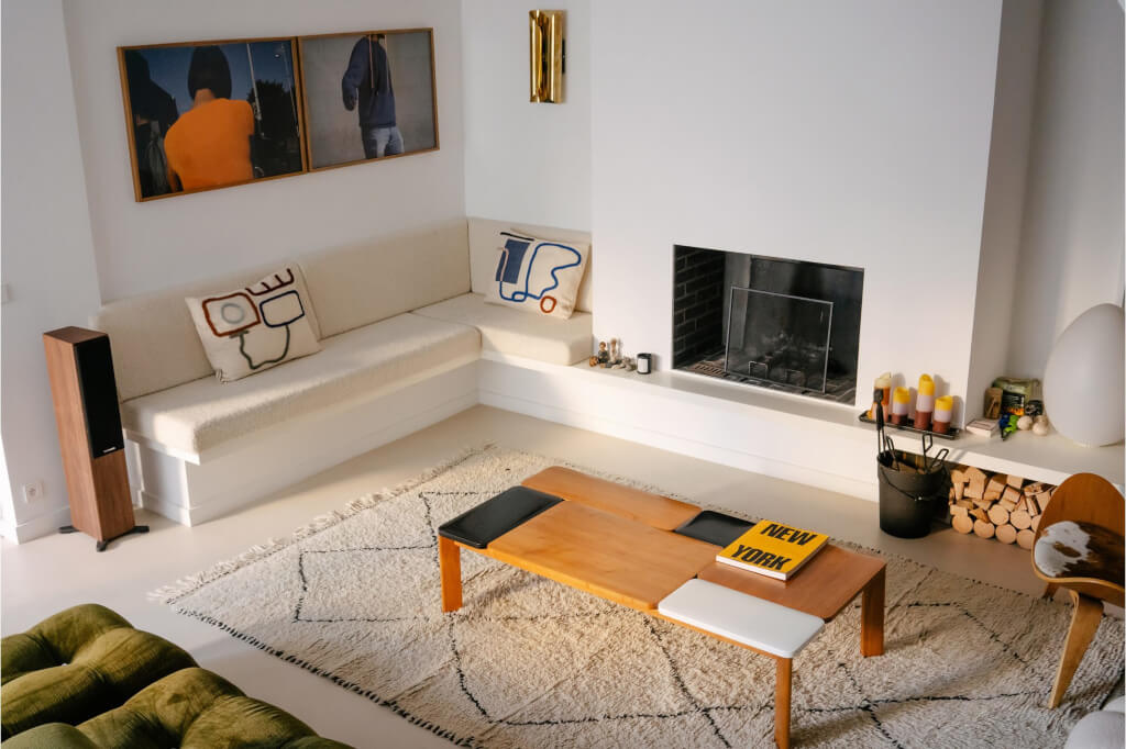
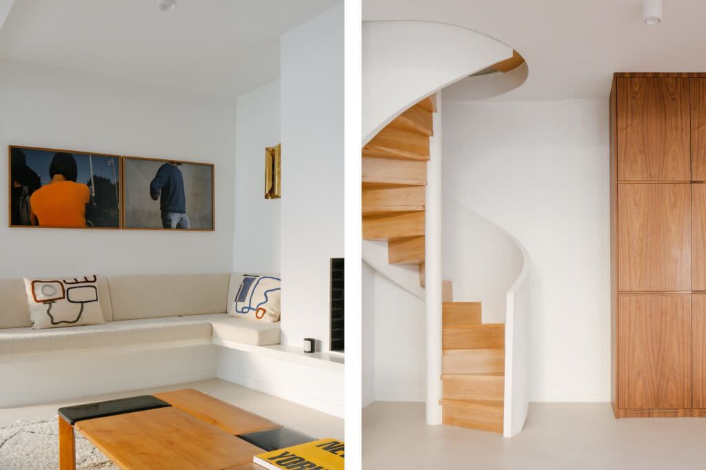
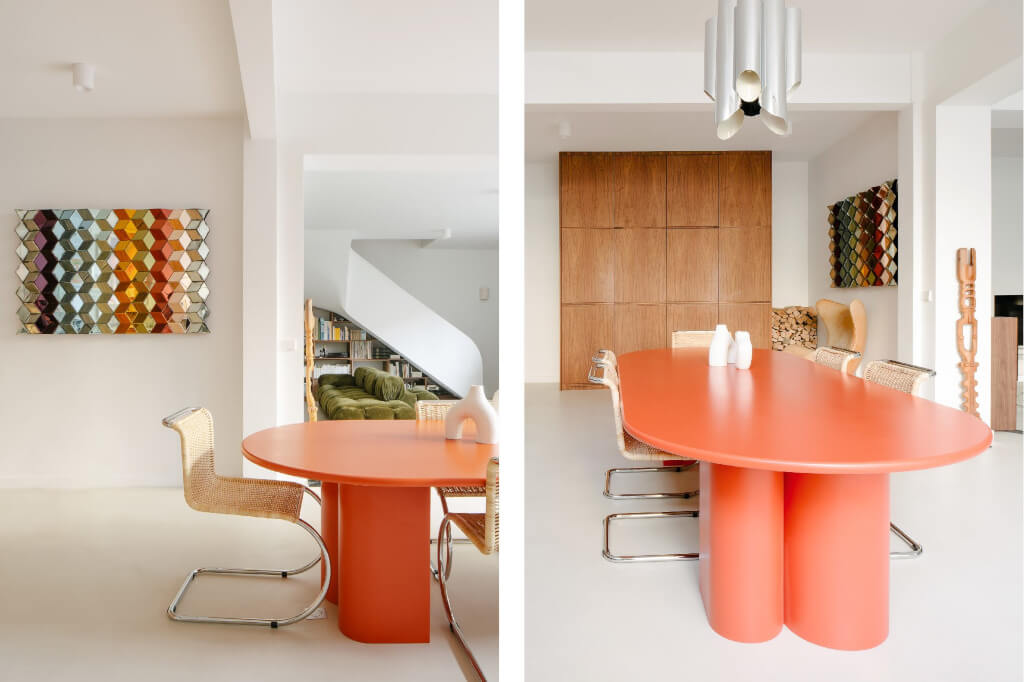
Photography by Giaime Meloni.

