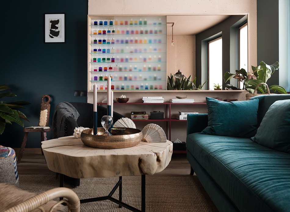
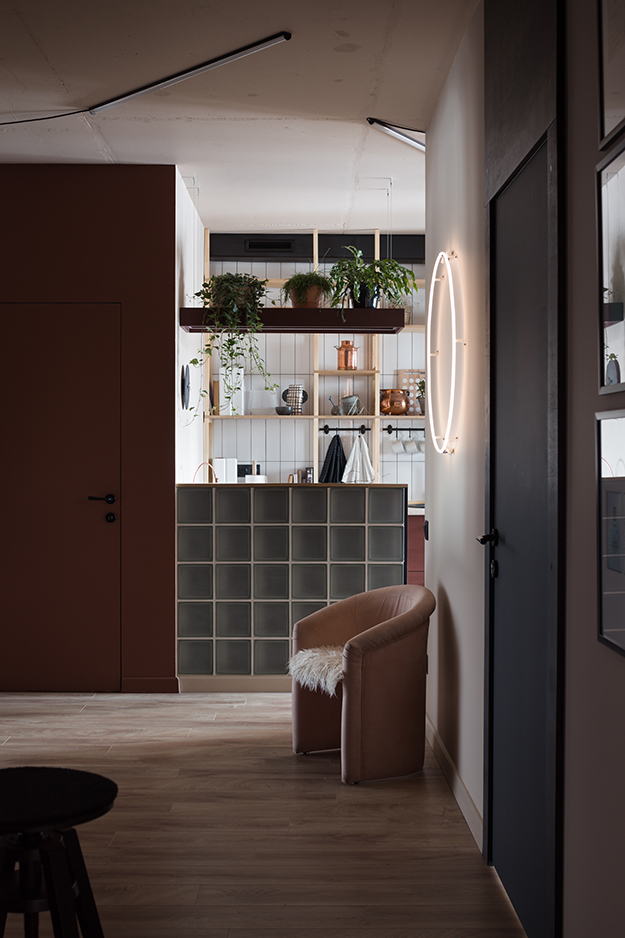
A studio with style
Posted on Fri, 22 Jun 2018 by KiM
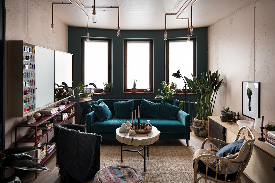
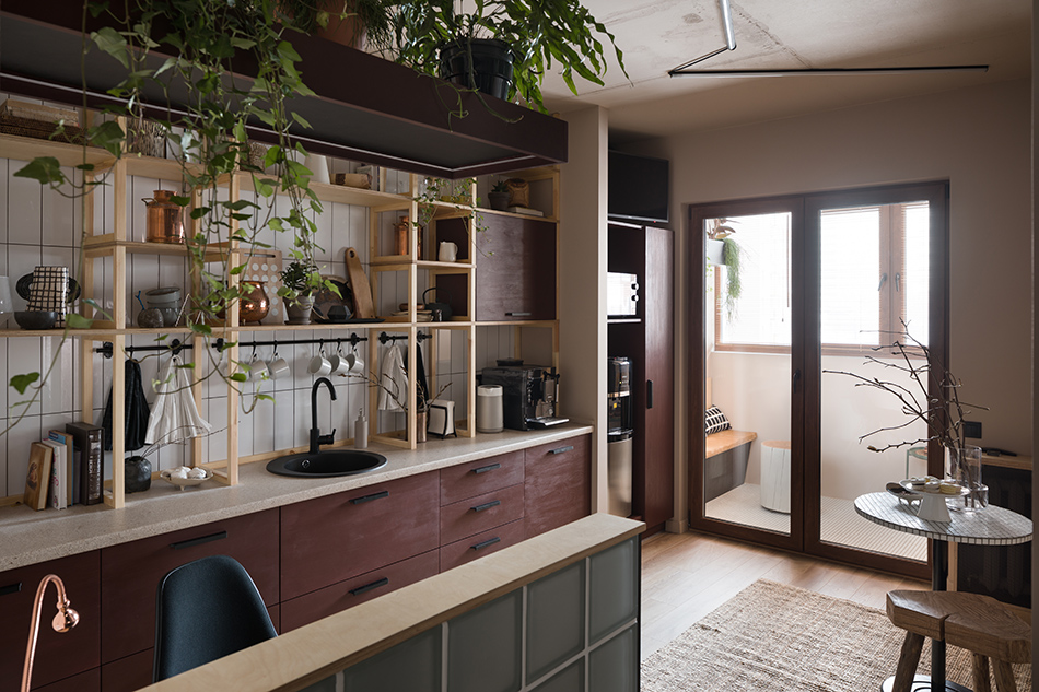
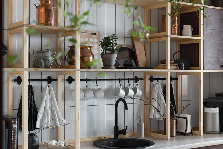
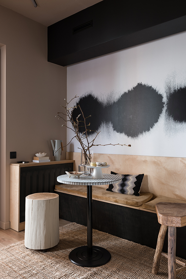
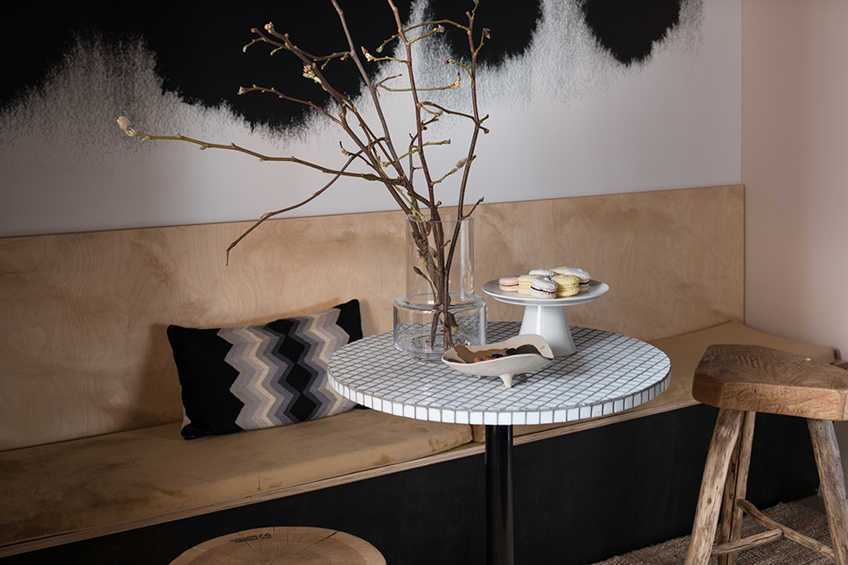
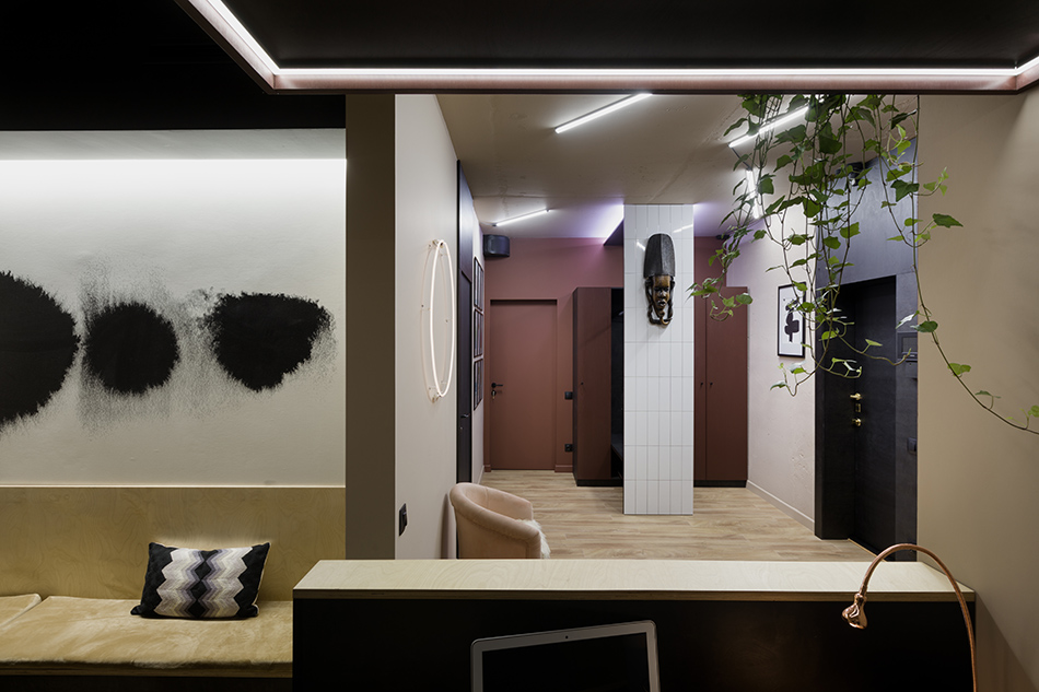
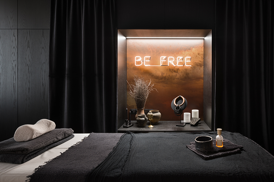
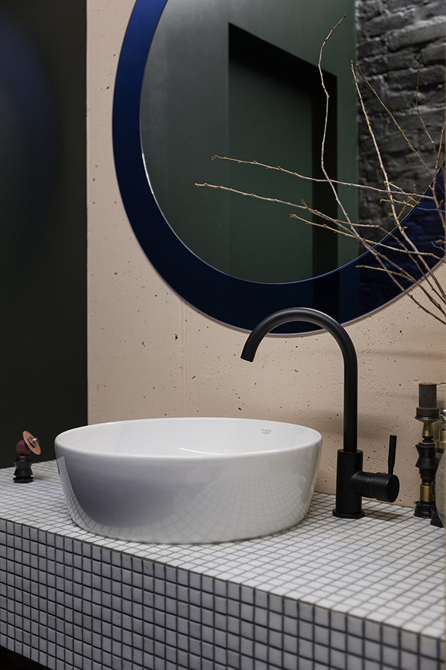
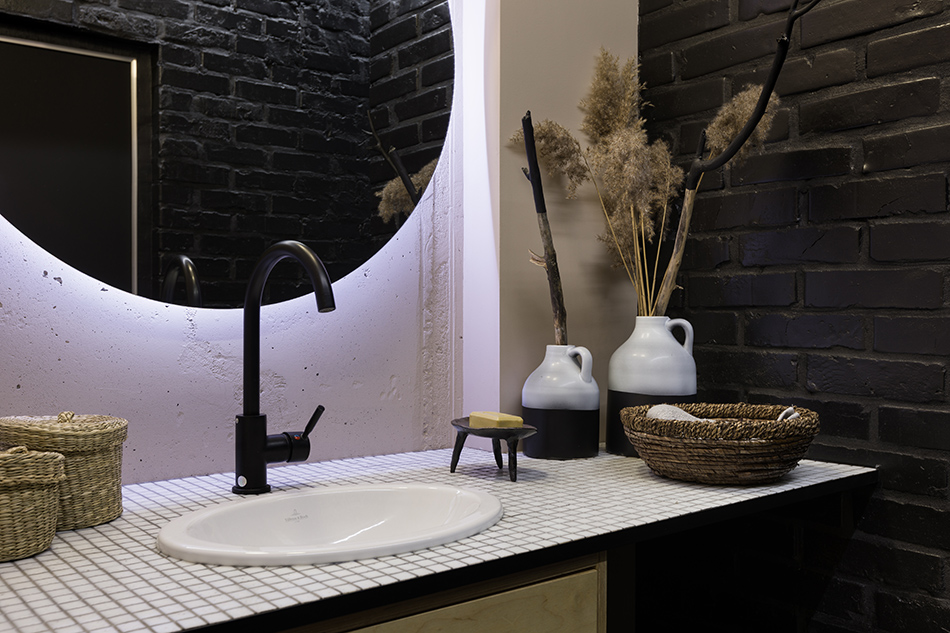
Before I get into this post, just a quick note of apology for the outages that keep happening with the blog. Our blog host is upgrading their servers and apparently there’s nothing we can do. So frustrating! Hopefully this will be over very soon. 🙁 Back to this post which is a wonderful distraction from all of that. A big thanks to Olga Fradina for sharing this project of her with us. Here are the details: The customer had a long-nurtured dream of a new studio for her counselling. It all started from the recent redesign of the Yoga room under my direction that pushed the customer to fulfilling her dream as soon as possible. The only request was the functionality – the presence of kitchen, reception and tea room, massage room adjacent to a shower room and the room for Aura-Soma consultations with a special rack. And the budget was the only limit. The colour scheme of the massage room is the Desert Rose (Paint and Paper Library) shade. The kitchen-living room area was originally designed in a cold colour set, but during the project implementation we decided to change it for the warm one, more comfortable for perception and allowing for relaxation: the walls in the vestibule and the kitchen are of Regency Fawn (Little Greene) shade, furniture in the kitchen– Georgetown (Paint and Paper Library) shade. The key element in the Aura-Soma room is the rack with the illumination, designed by Olga Fradina Interior Design, that contains the bottles of oil for this special type of colour and aroma therapy created by the Englishwoman Vickie Wall 20 years ago. The walls are of Dutch and Scottish sky shade – Hague Blue and Inchyra Blue (Farrow & Ball). One of the key decorative elements in the massage room is the niche decorated on the back wall with the printing of clouds printed on canvas from Olga’s photo and the fluorescent inscription “Be Free”. I love everything about this – the warm colours used, the unique kitchen design, the simple wood banquette, the copper/neon niche…
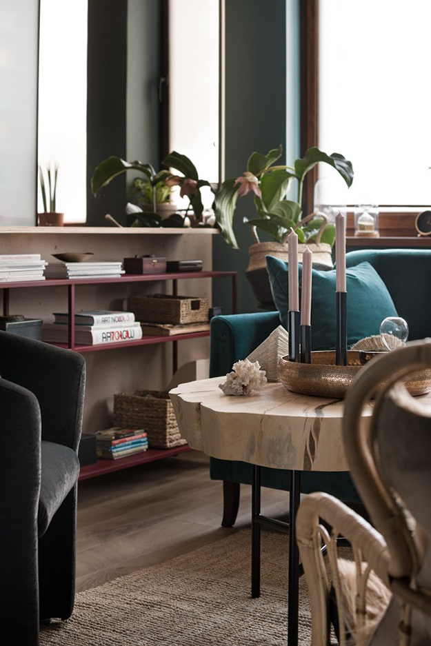
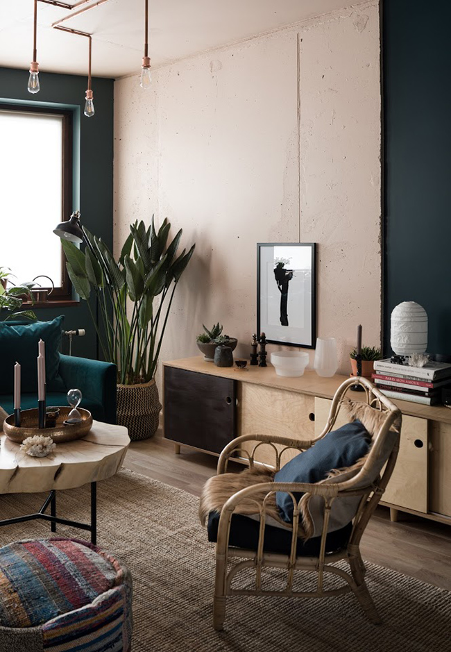
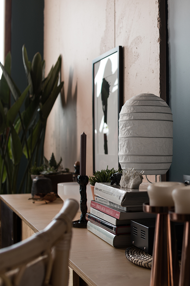


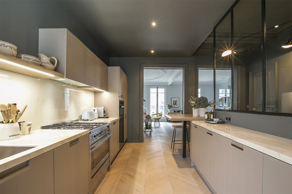
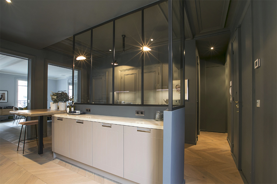
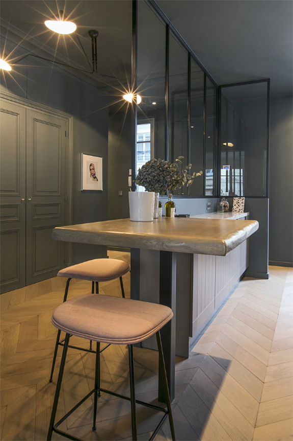
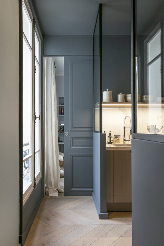
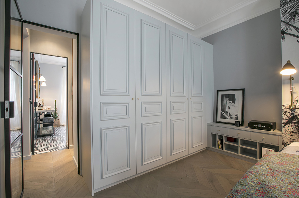
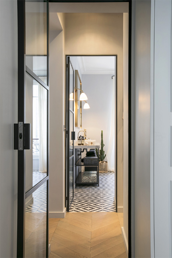
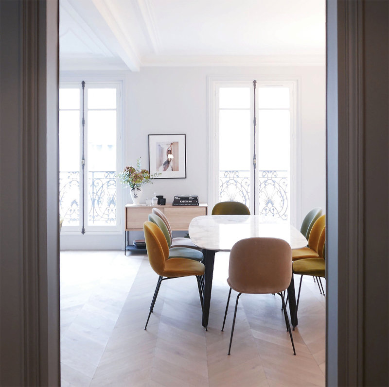
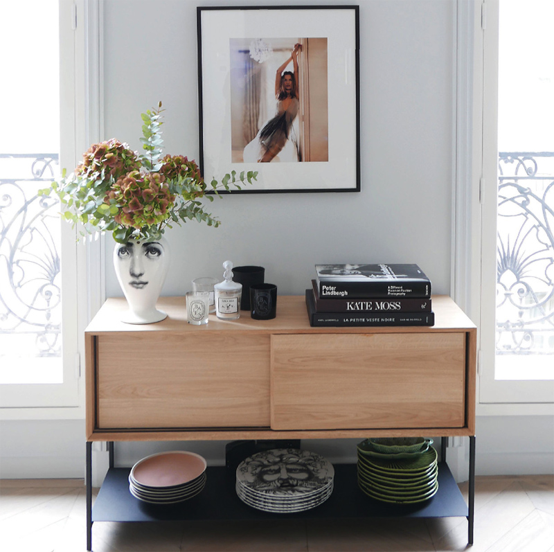
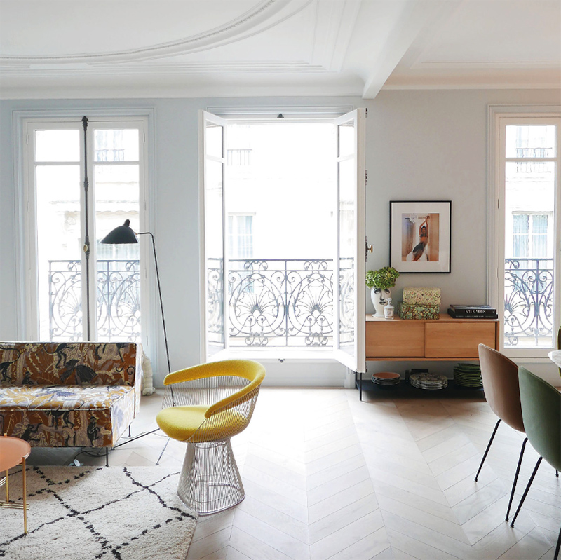
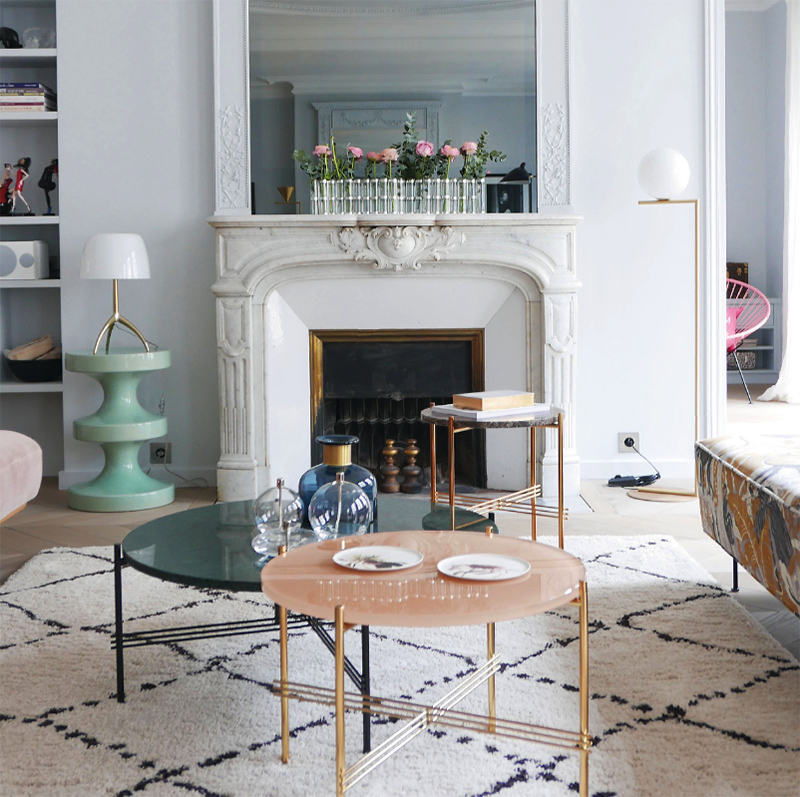
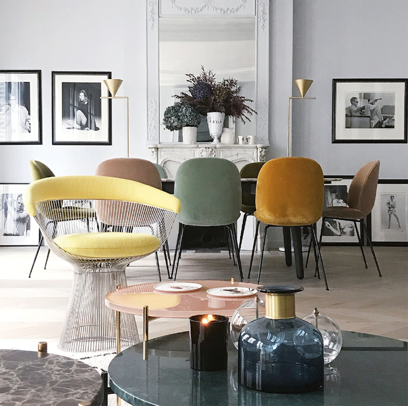
L’appartement Jardin des Tuileries
Posted on Fri, 22 Jun 2018 by KiM
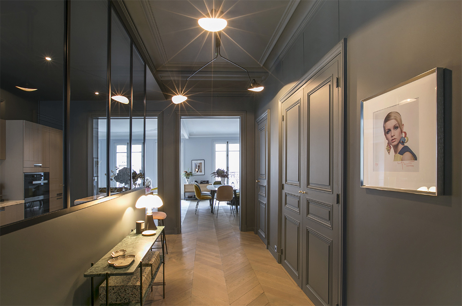
After having watched the dearly departed Anthony Bourdain’s Layover episode in Paris while eating dinner last night, and seeing such a beautiful space like this apartment in le Jardin des Tuileries, I could totally see myself living it up in that incredibly unique city. (And I speak French!) L’Appartment Parisien did a wonderful job adding some understated elegance here. And that multi-coloured set of Gubi beetle chairs has me totally sold.

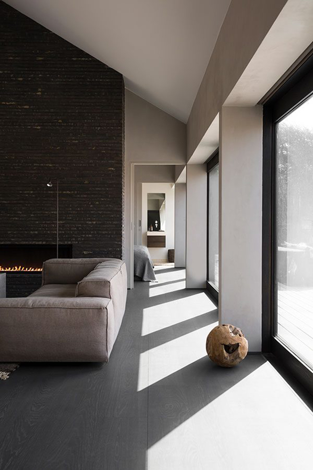
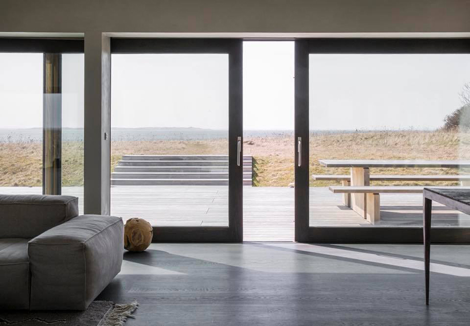
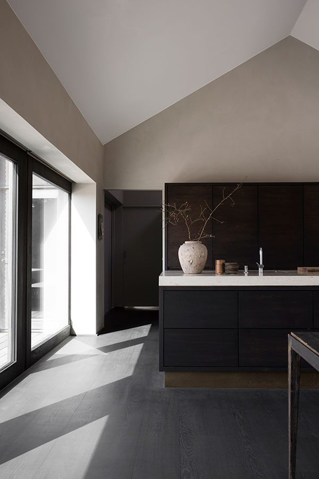
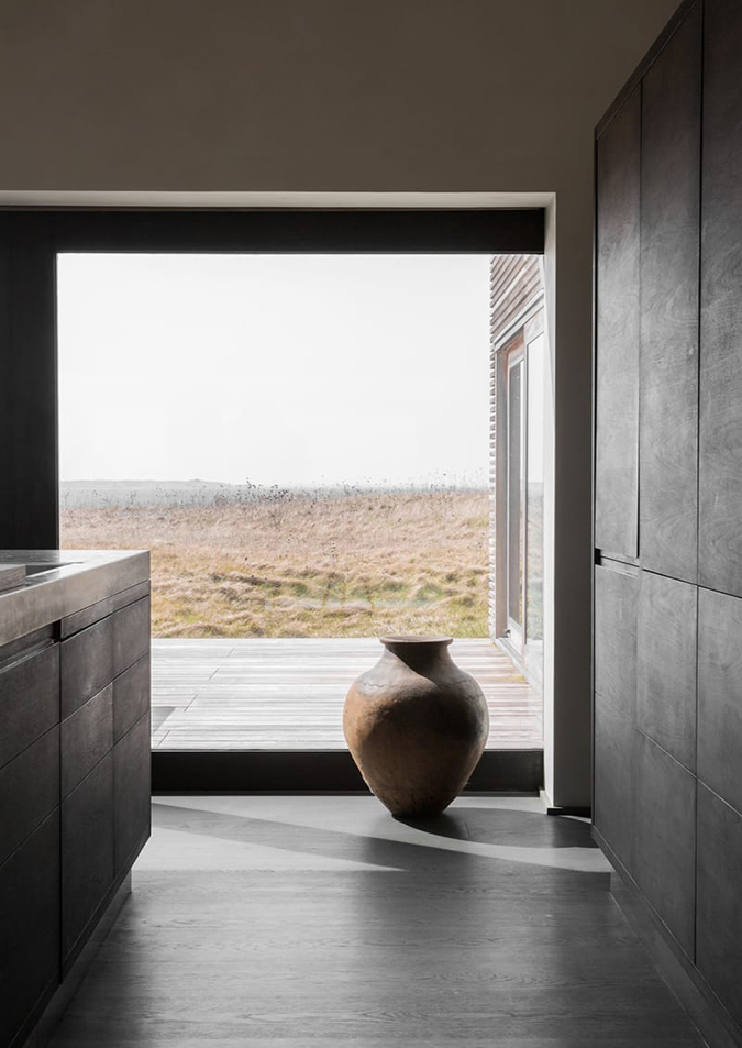
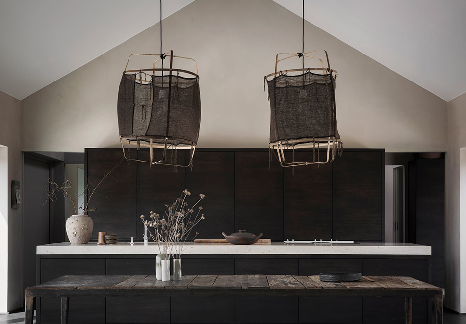
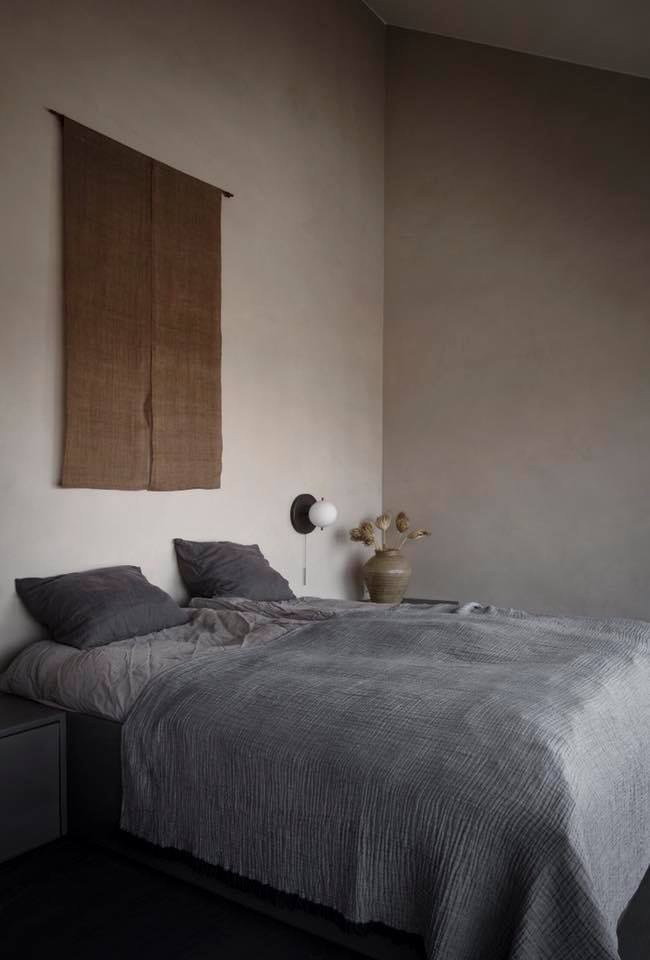
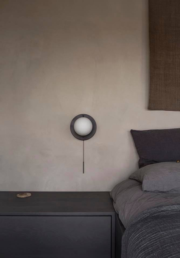
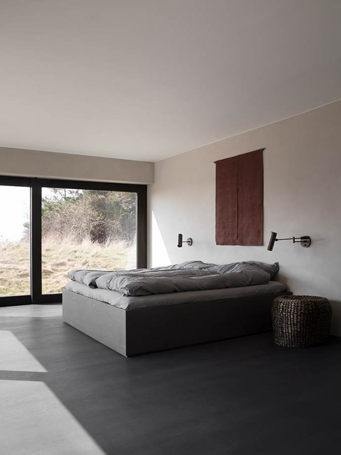
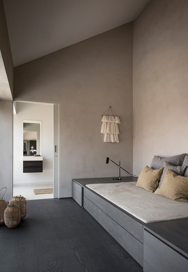
Seaside abode
Posted on Wed, 20 Jun 2018 by KiM
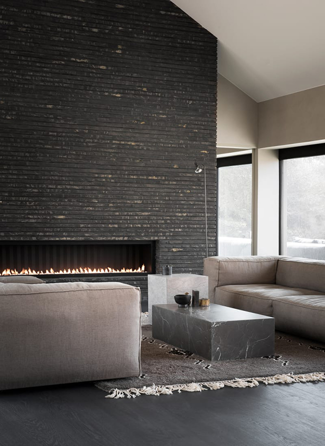
When simplicity is key. I think having a minimalist summer cottage would be an amazing thing. This beauty is by Norm Architects. Scandic-Bohemian feels and barefoot luxury is found in this renovated and modernized coastal home in a quiet and secluded corner of Denmark, where Japanese zen aesthetics and danish cottage style charm come together, boasting subtle, nordic luxury and eclectic design elements.
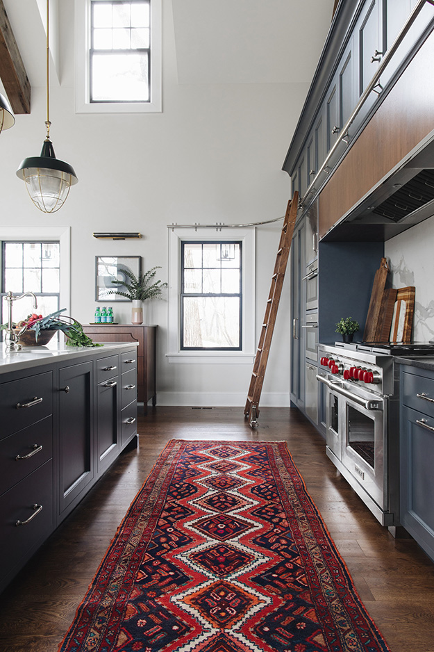
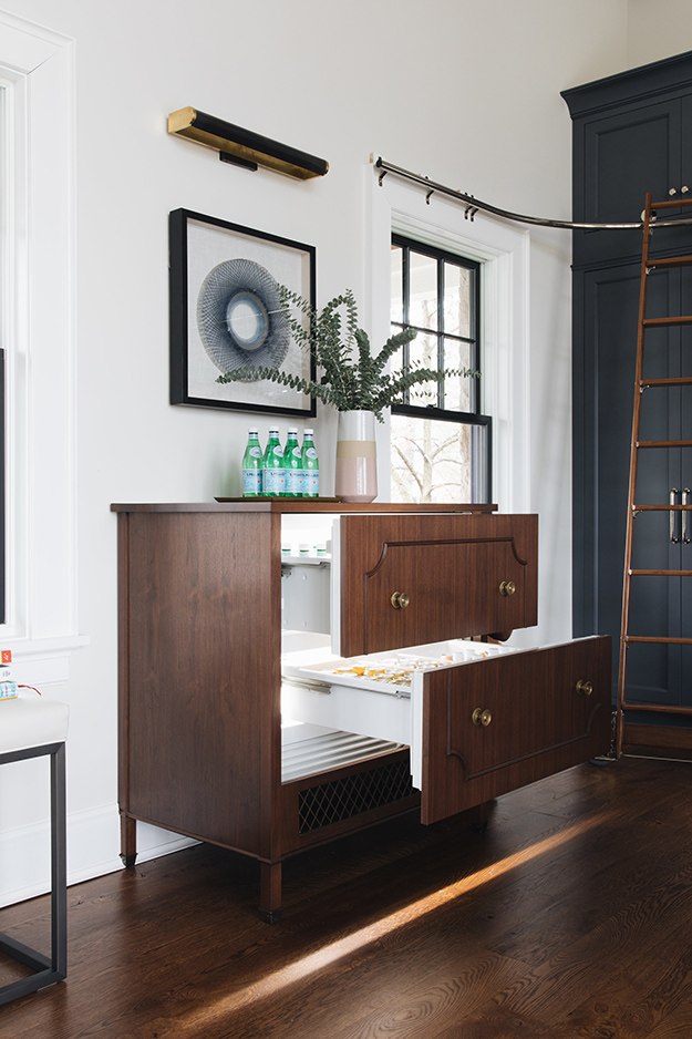
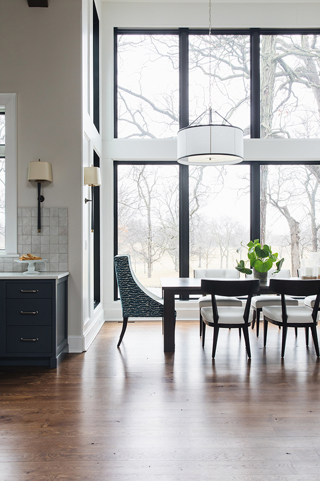
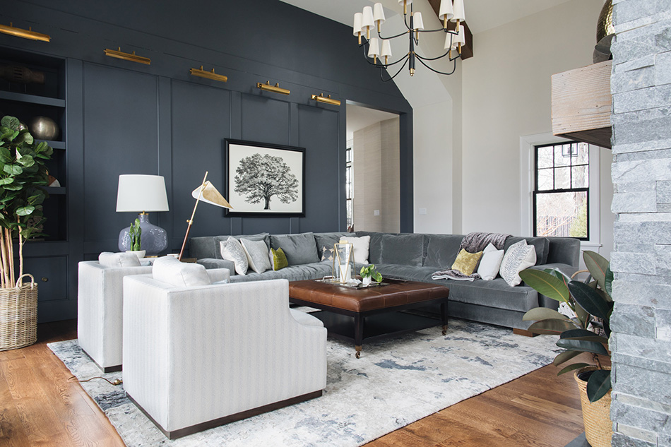
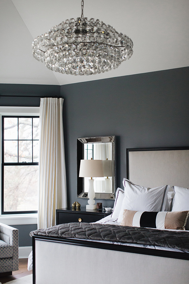
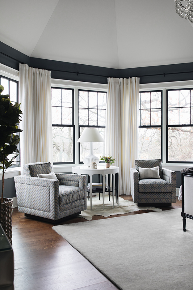
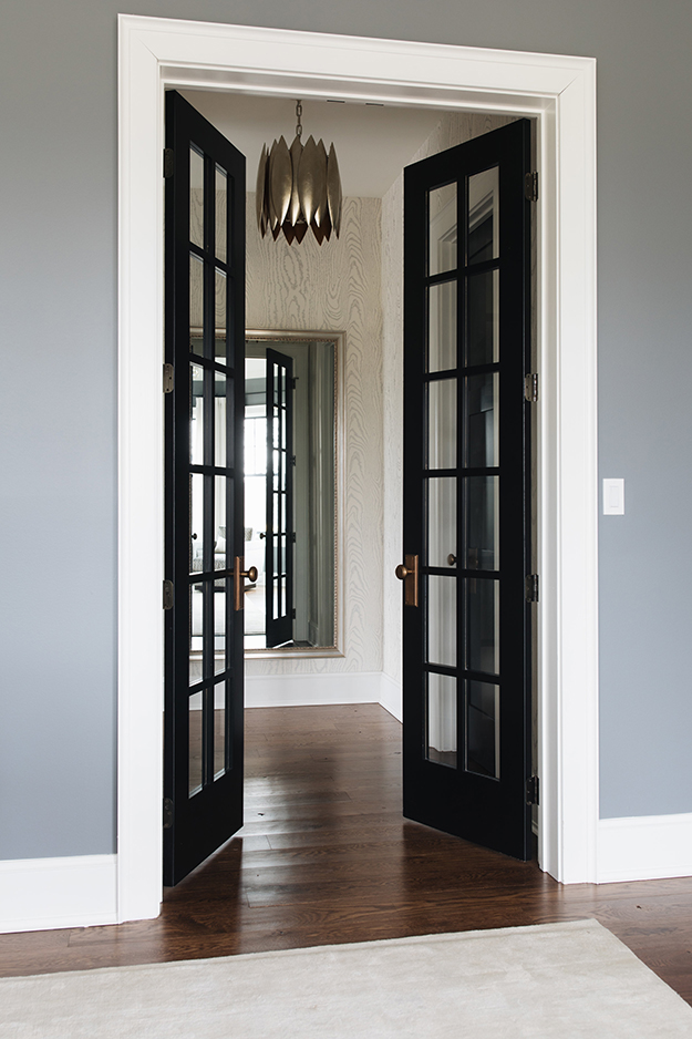
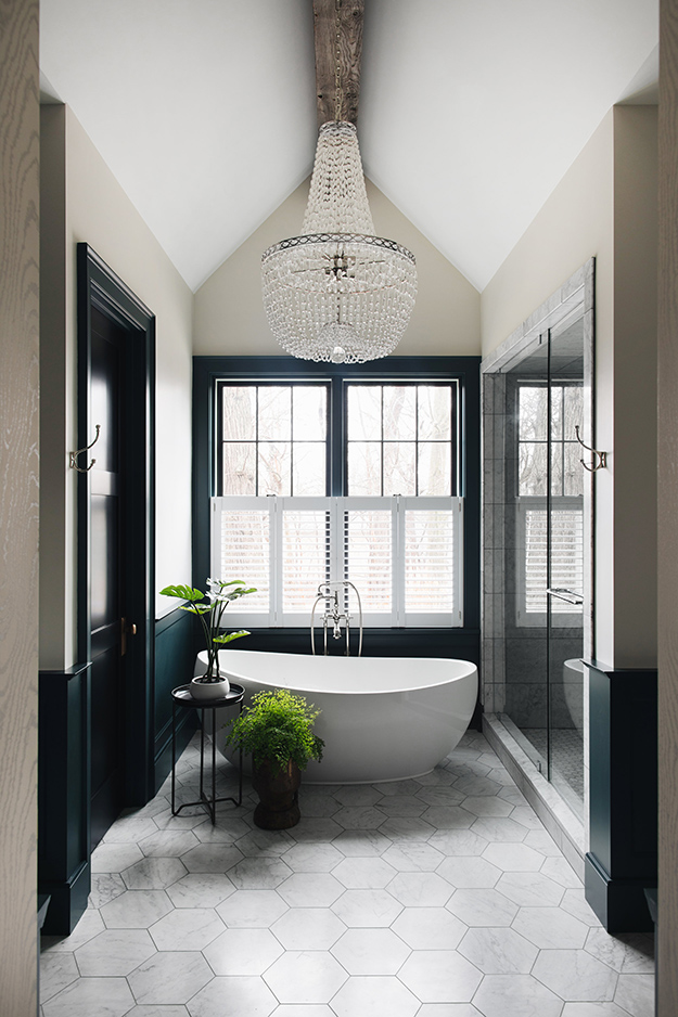
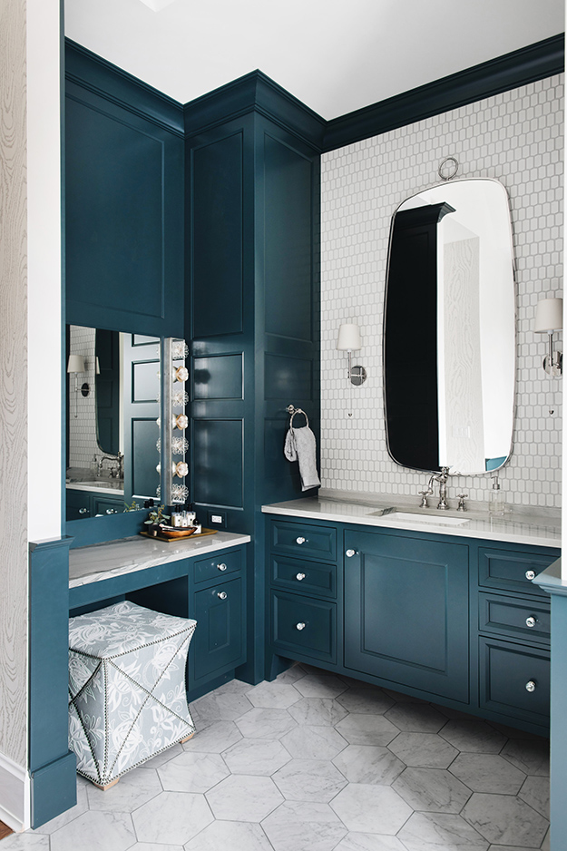
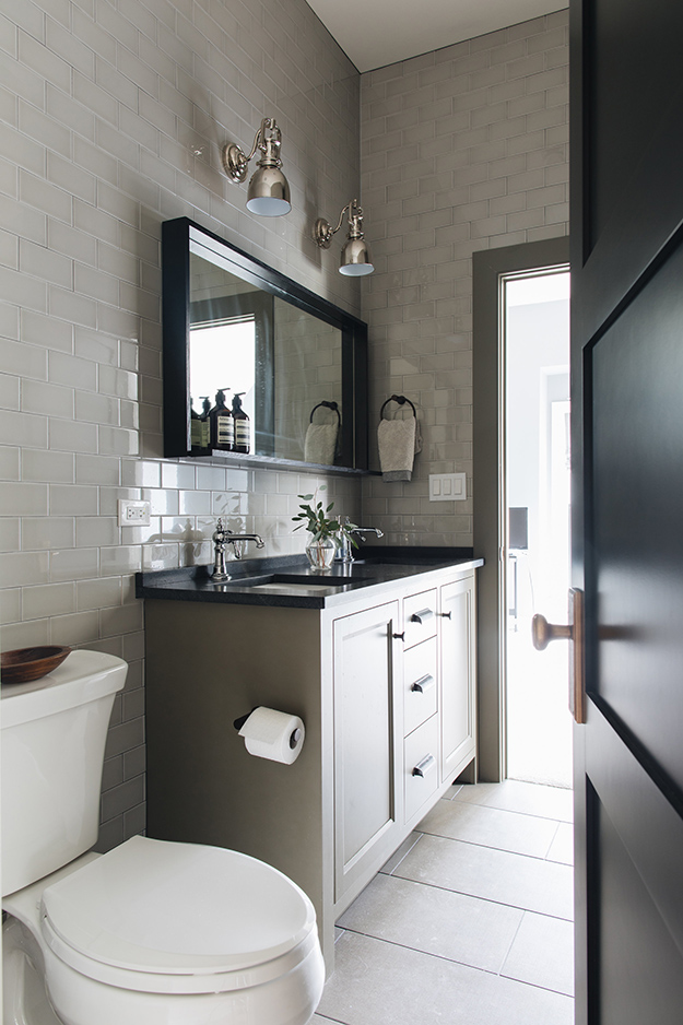
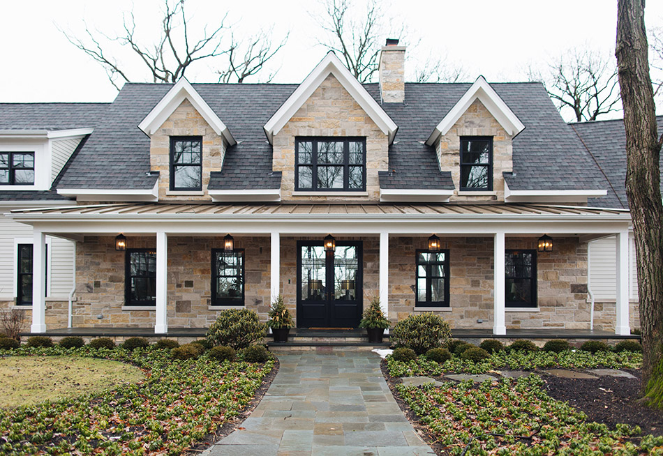
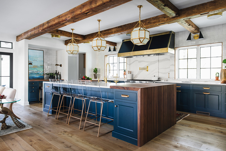
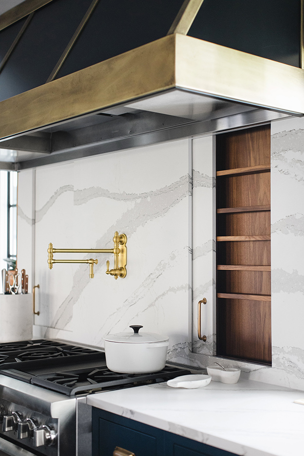
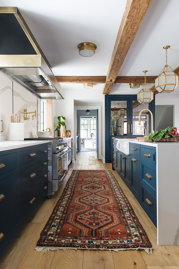
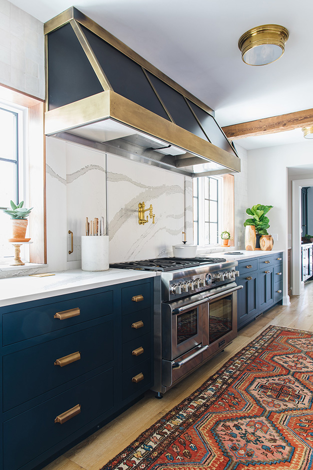
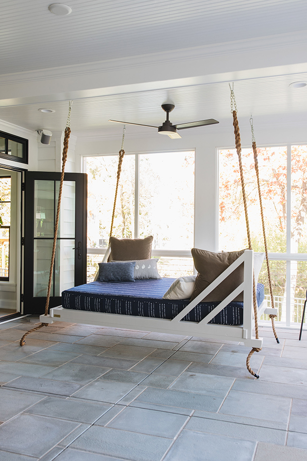
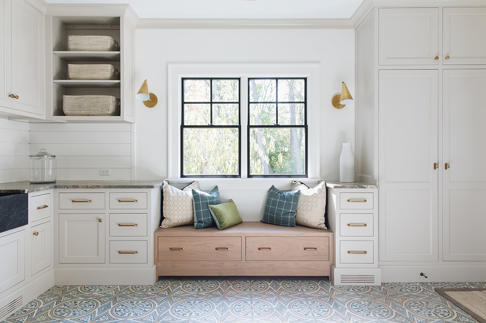
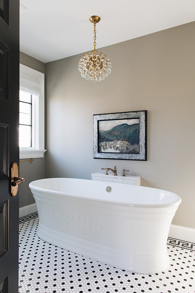
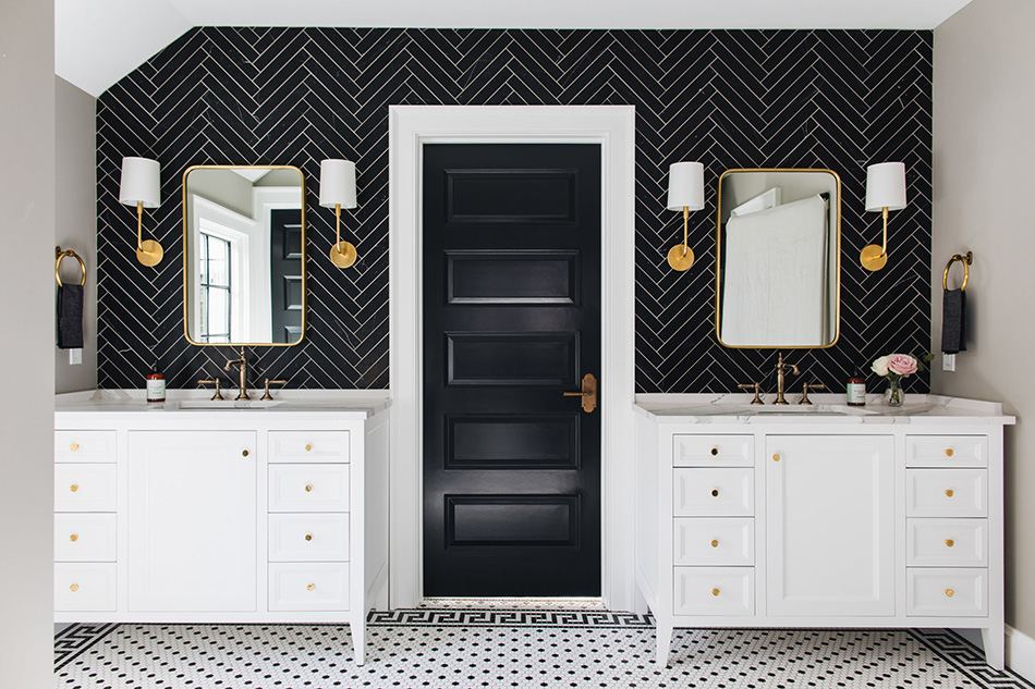
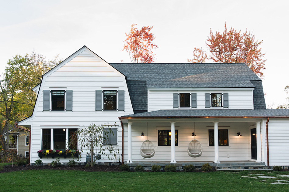
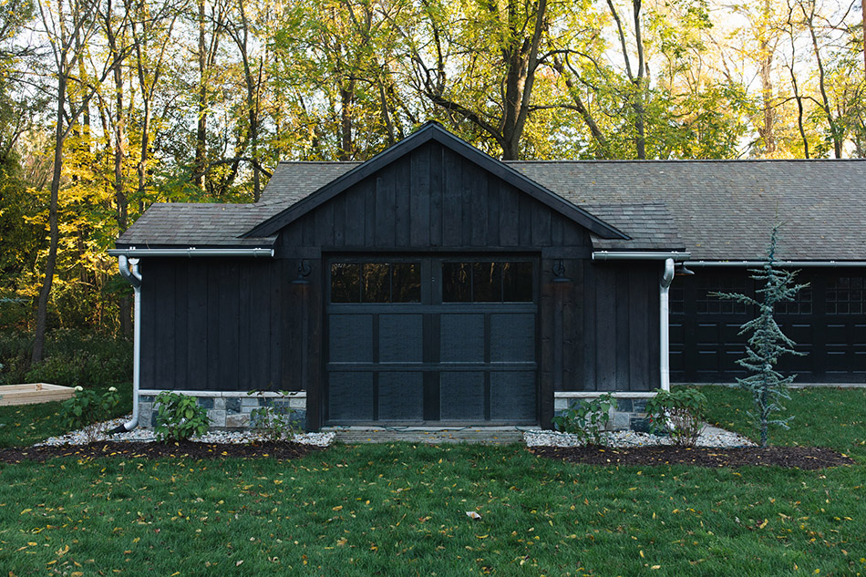
More proof Jean Stoffer loves blue
Posted on Wed, 20 Jun 2018 by KiM
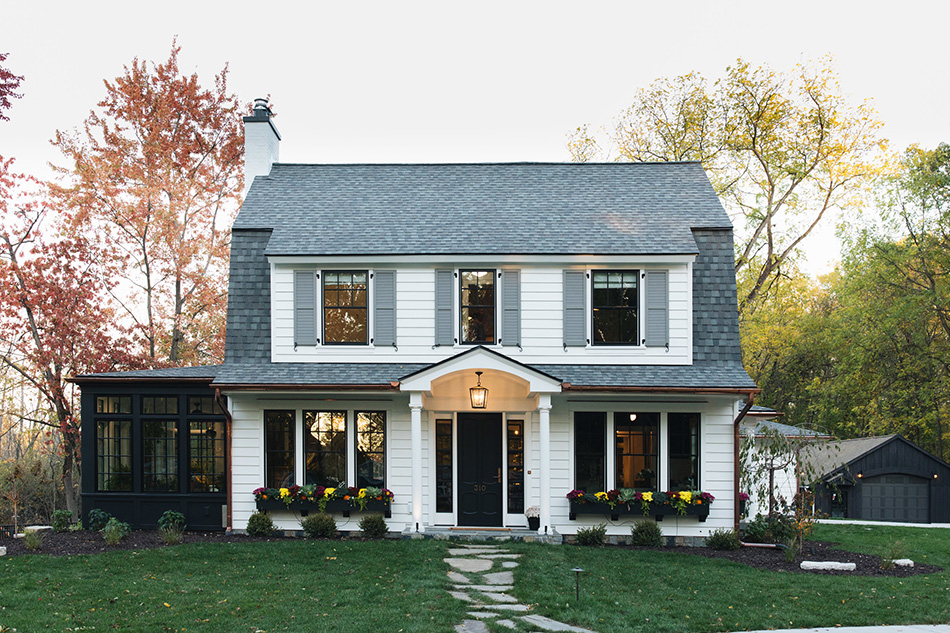
Once again Jean Stoffer Design shows her love of blue in this beautiful Michigan home. Alongside the blue, brass accents really glam things up and WHOA her tile choices are spot on here. And the exterior is absolutely gorgeous too as a bonus. All of the black detail really modernizes it.
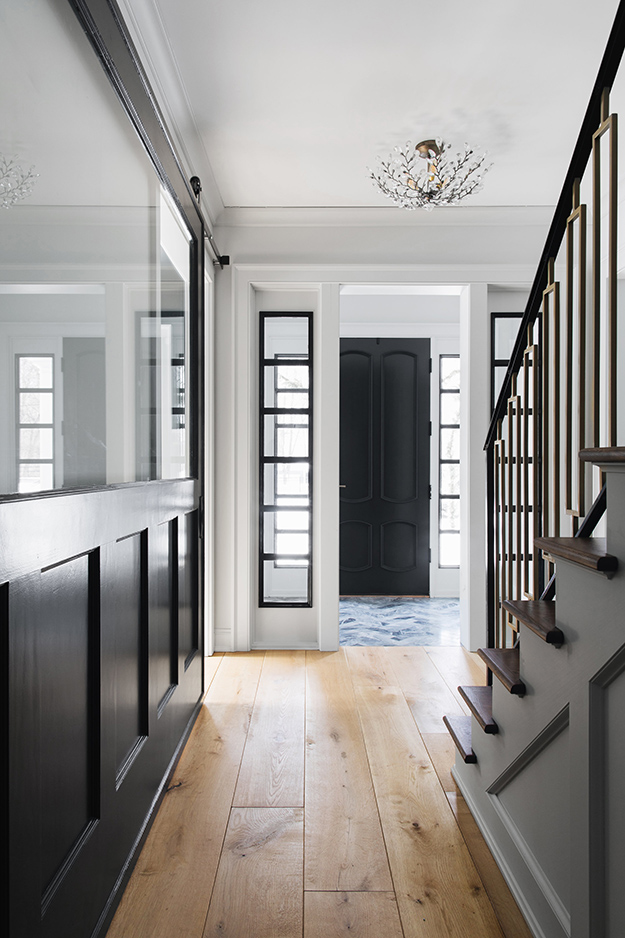

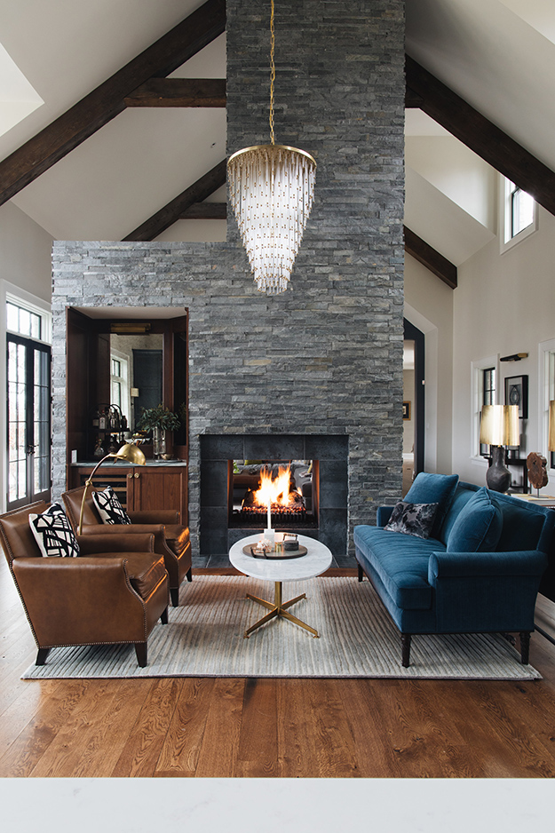
Blue and grey
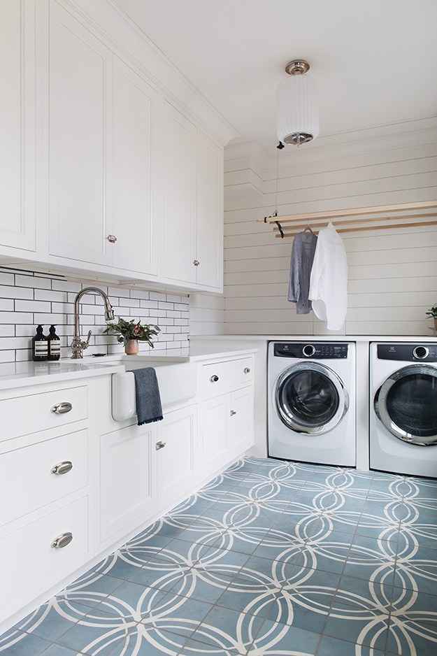
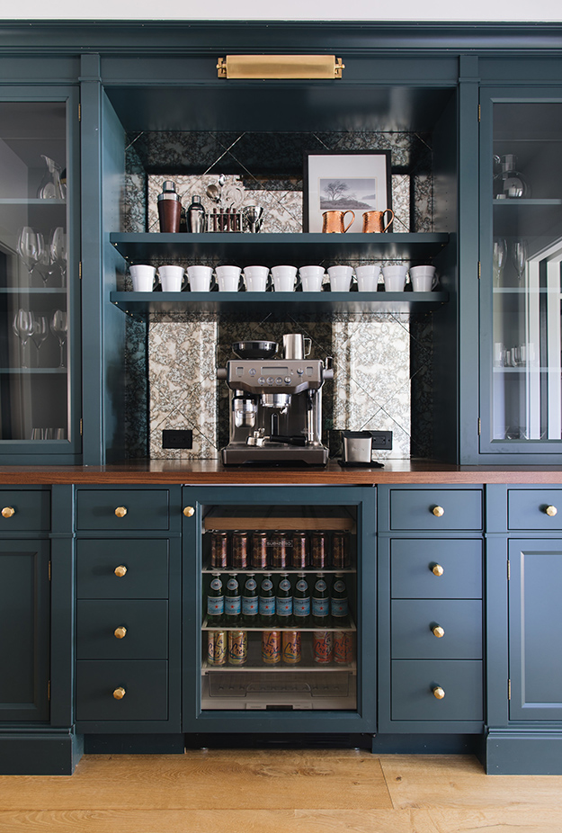
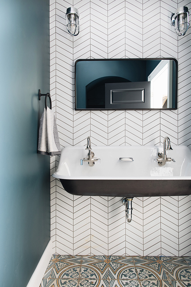
Posted on Mon, 18 Jun 2018 by KiM

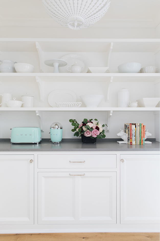
I put it out there on Instagram over the weekend that I hate the colour blue. And because of that I repainted the walls in my kitchen from blue to a deep brownish red. Also to note I did comment that I occasionally come across a blue cabinet kitchen that I think works really well. This home featuring a blue cabinet kitchen by Michigan-based designer Jean Stoffer Design are one of those “works really well” situations. In fact throughout the home are accents in various shades of blue and I quite like it.