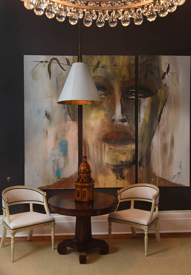
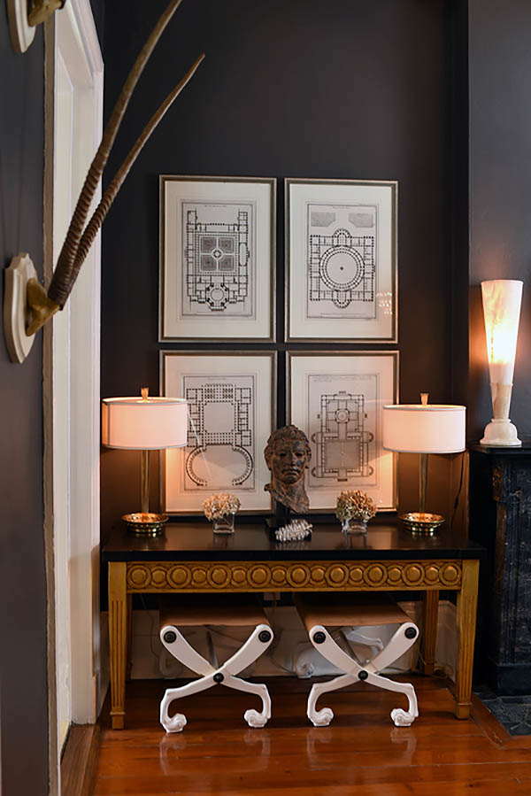
A refined bachelor’s apartment in New Orleans
Posted on Wed, 25 Oct 2017 by KiM
Loving this apartment in the New Orleans French Quarter designed by Ty Larkins, perfect for a young bachelor lawyer who happens to be a traditionalist. The client initially asked us to decorate his apartment with antiques and pieces with history. Luckily, we convinced the client he needed to mix in modern furnishings and artwork into the overall design because we believe there is nothing more staid than an old house filled exclusively with old furniture. The resulting environment is traditional space designed with a modern sensibility where French antiques are mixed with just the right dose of modern pieces coupled with a decidedly masculine color palette creating bold contrast and interest.
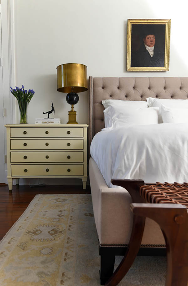
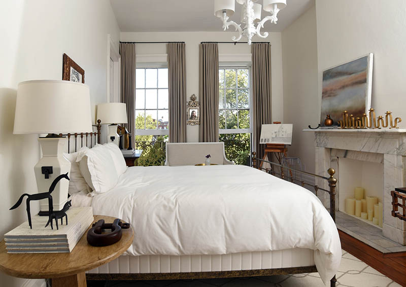
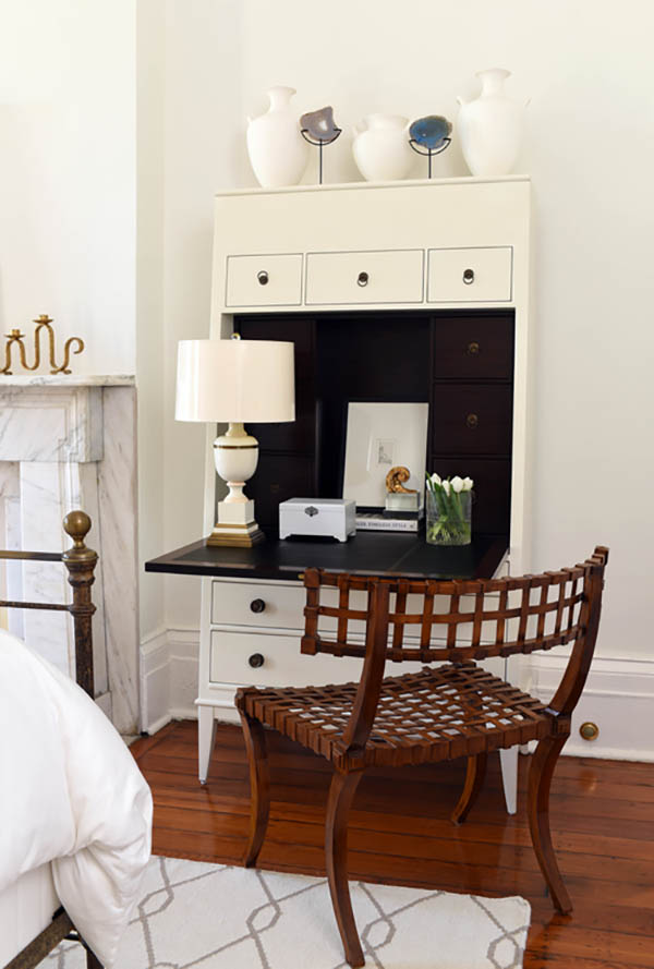


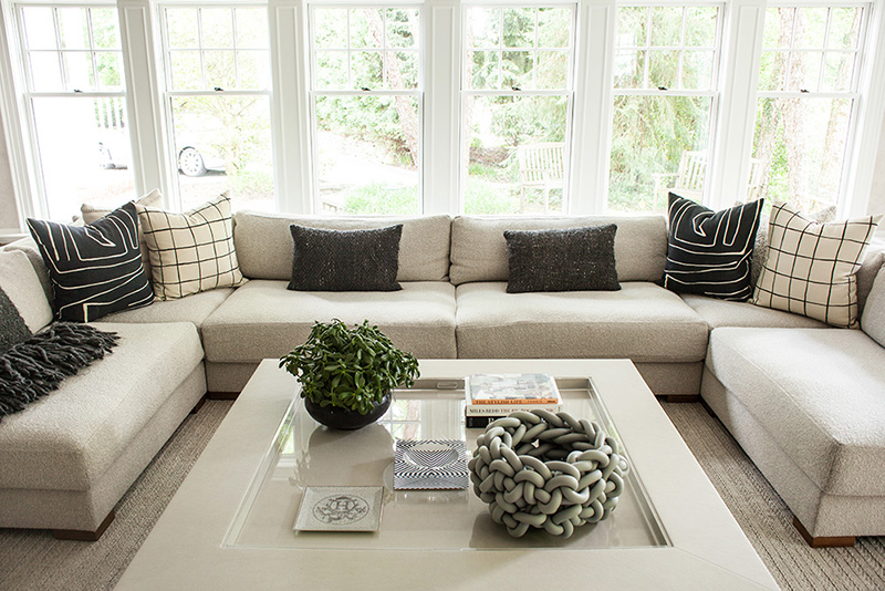
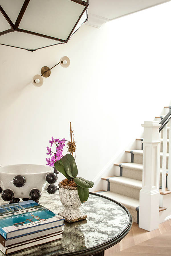
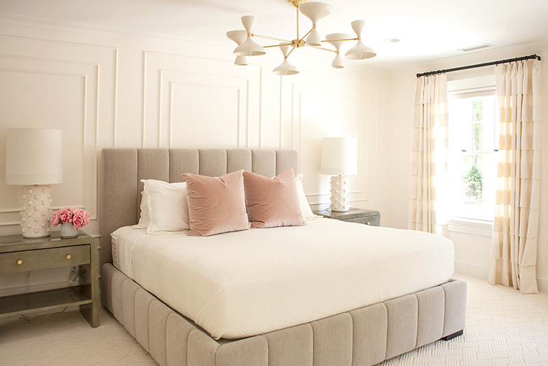
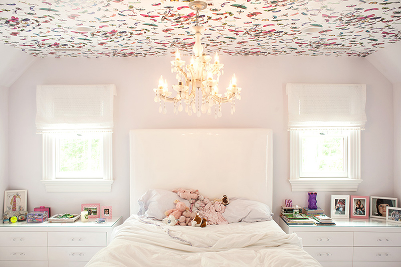
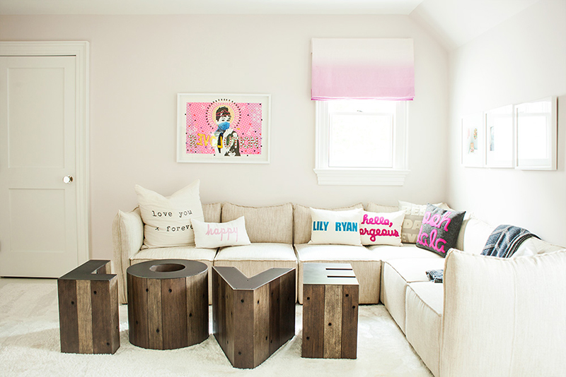
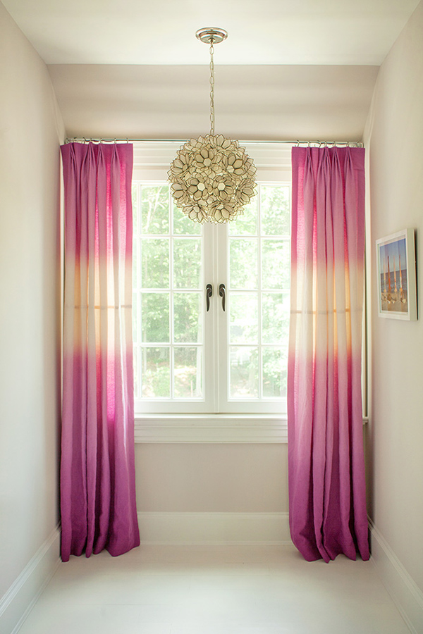
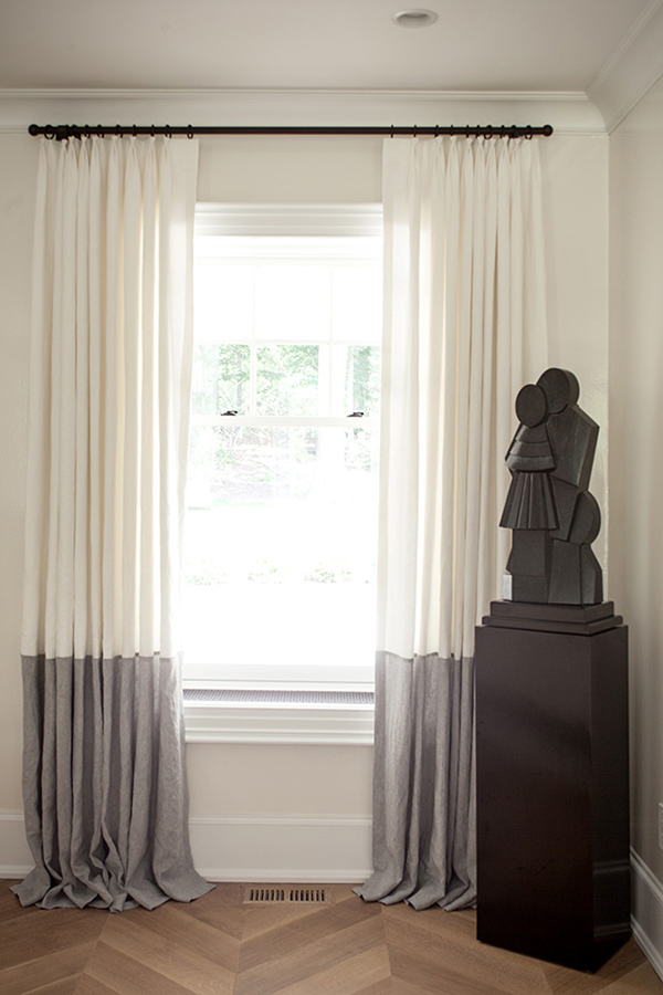
Understated elegance in a New Jersey home
Posted on Wed, 25 Oct 2017 by KiM
This Short Hills, New Jersey home is another project by talented designer Michelle Gerson that is mostly toned down in the colour palette (with one exception as you will easily spot below) but again has a bit of an art deco feel. In this home Michelle took more of an understated elegant approach. Still loving it!
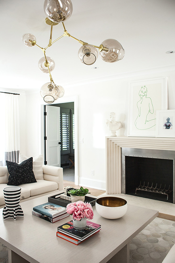
Penthouse sophistication
Posted on Tue, 24 Oct 2017 by KiM
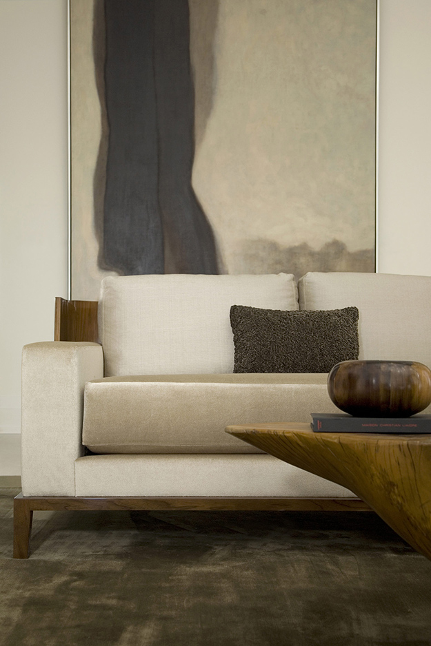
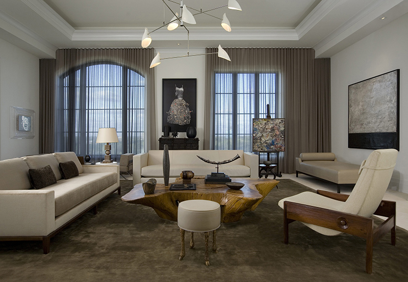
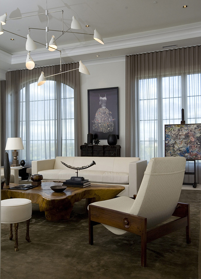
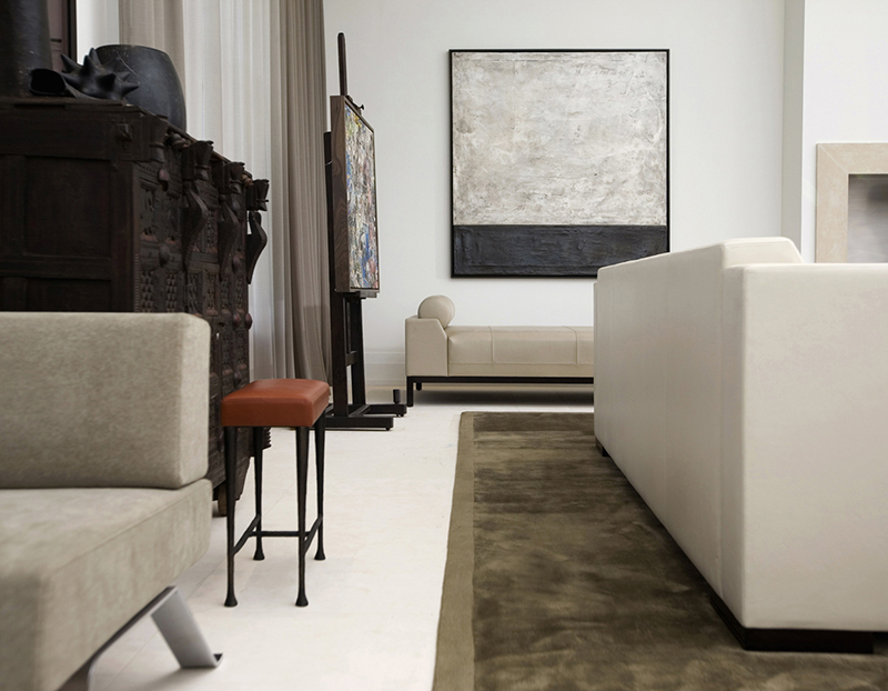

LOVE the earthy neutral colour palette of this penthouse by Peace Design. Sophisticated and beautifully curated.
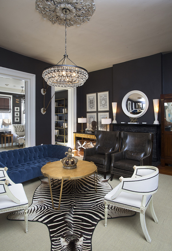
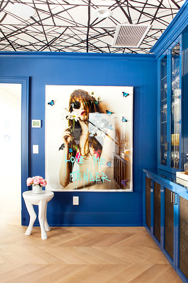
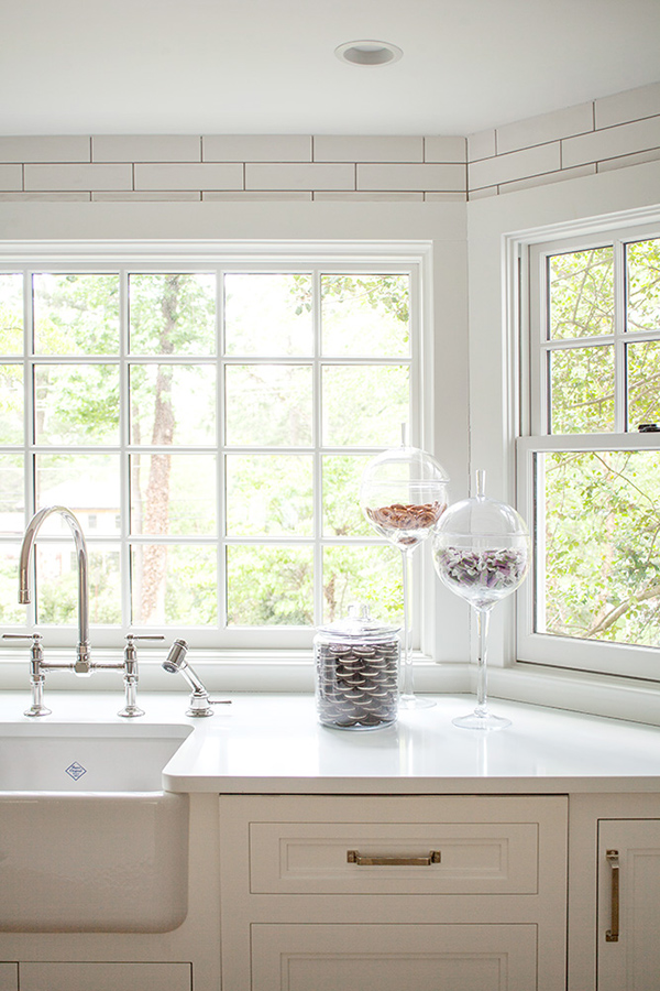
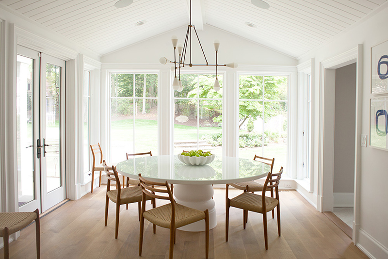
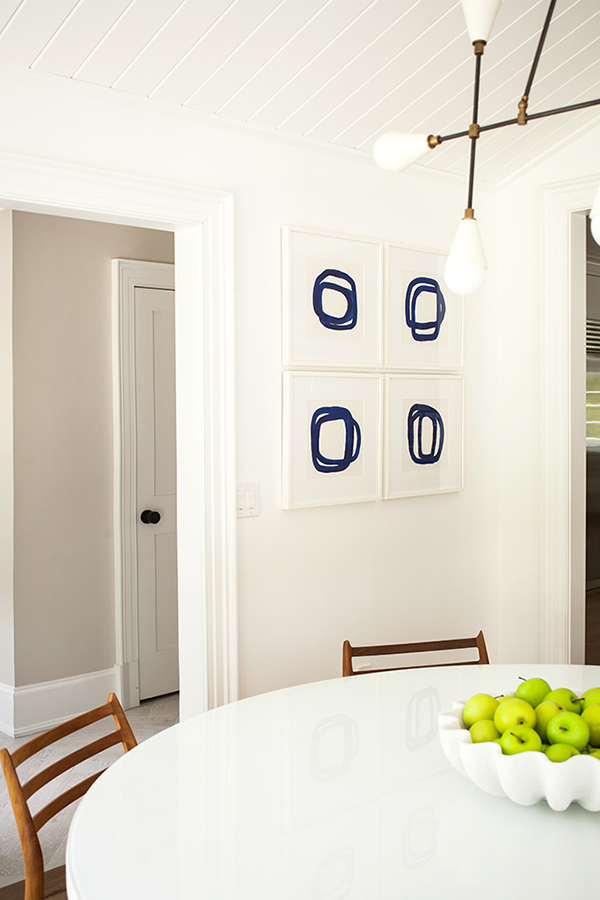
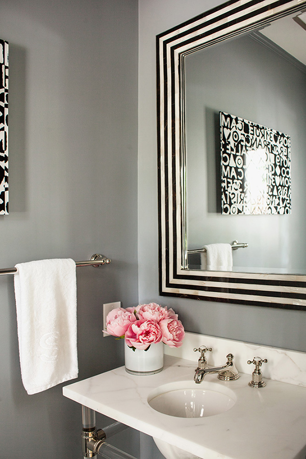
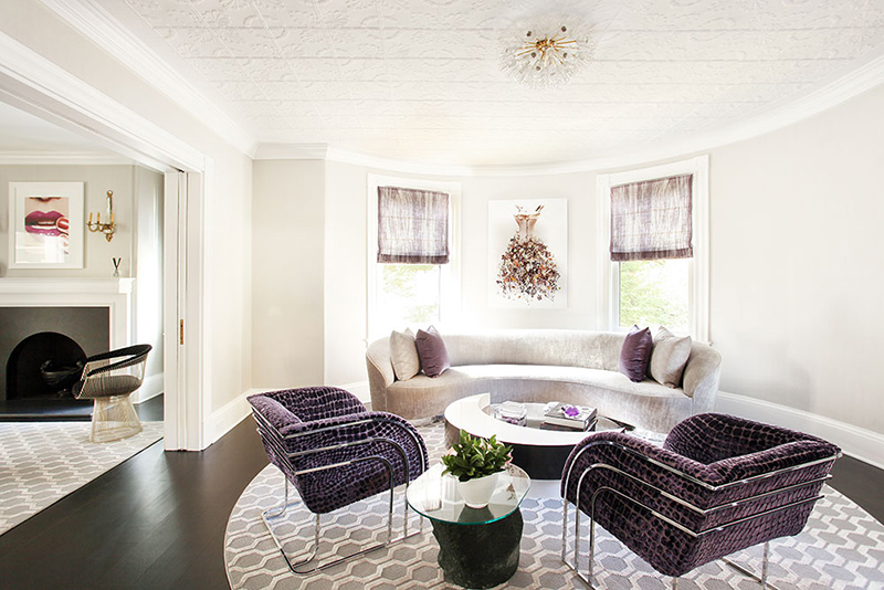
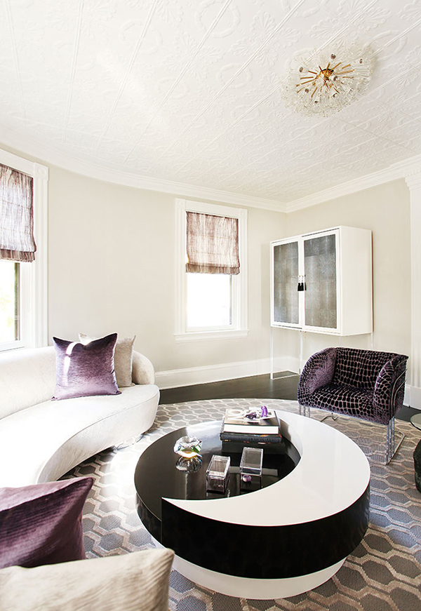
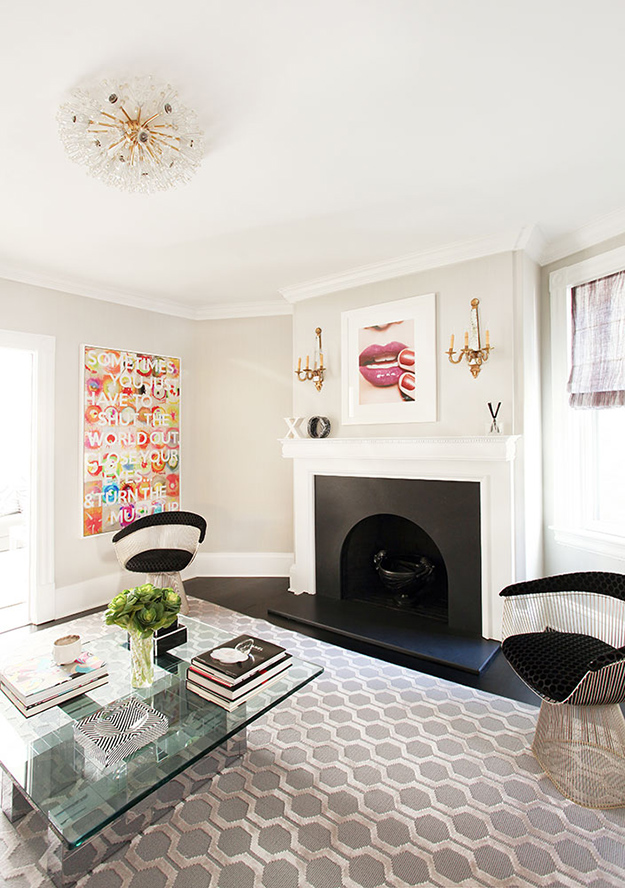
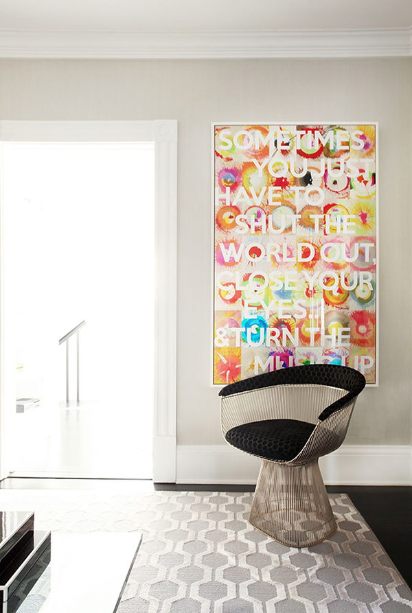
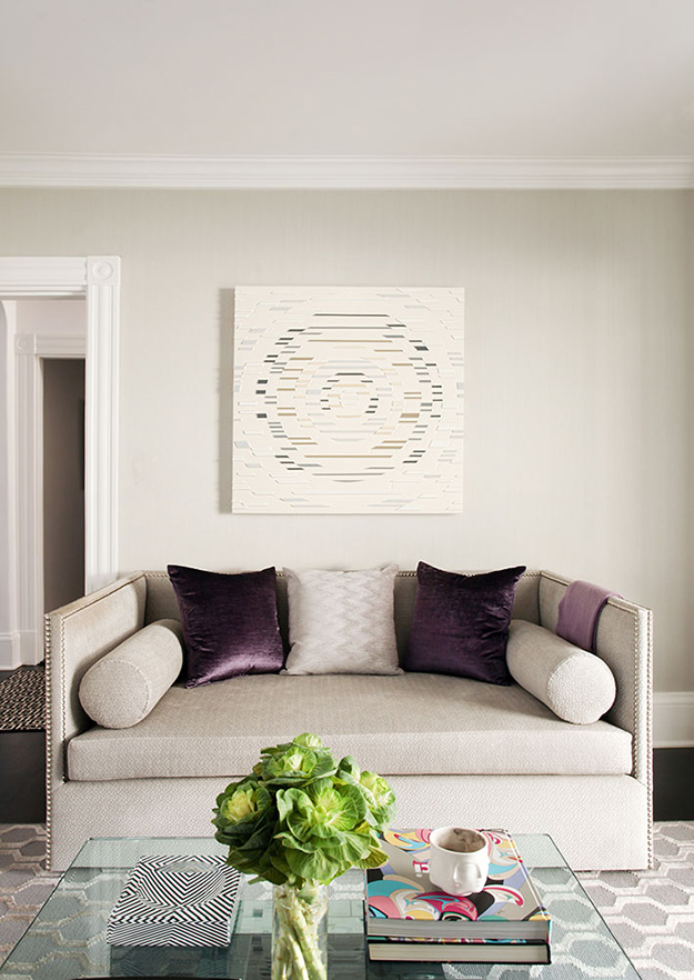
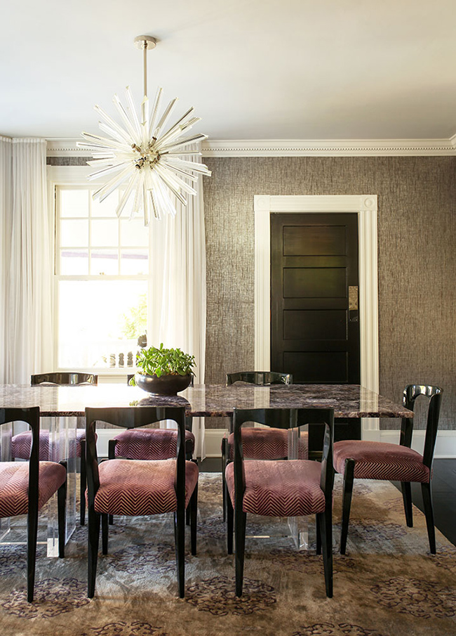
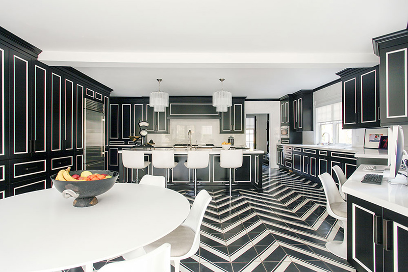
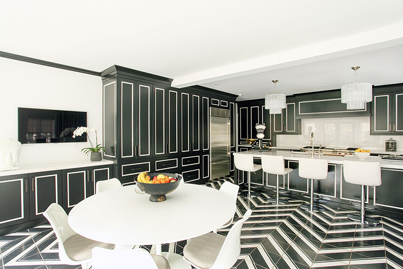
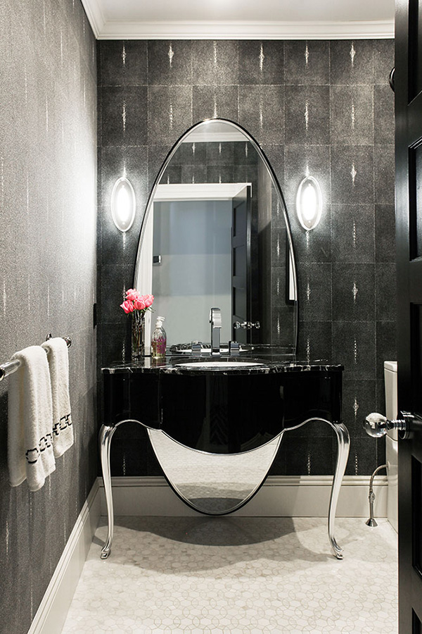
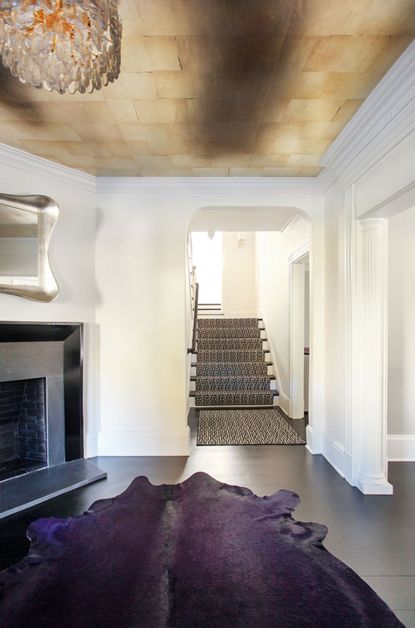
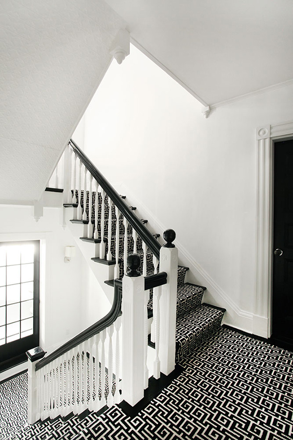
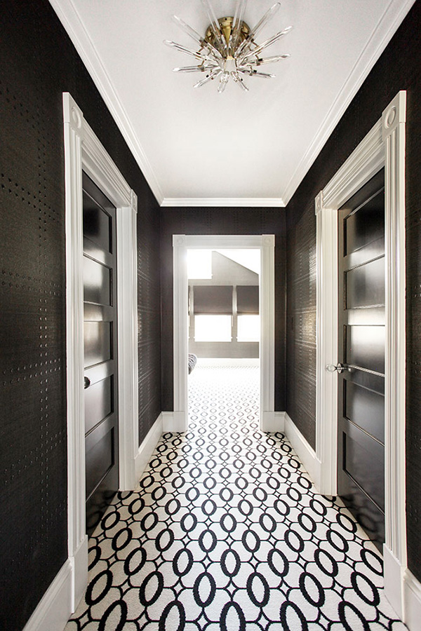
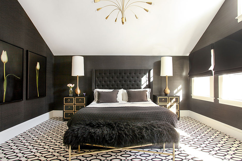
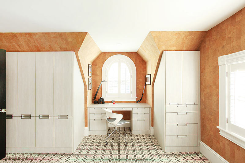
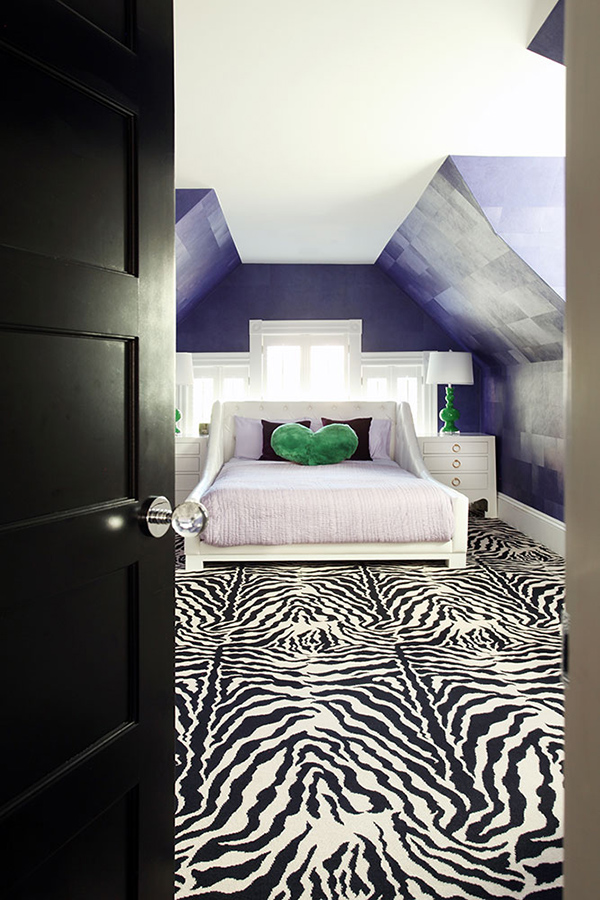
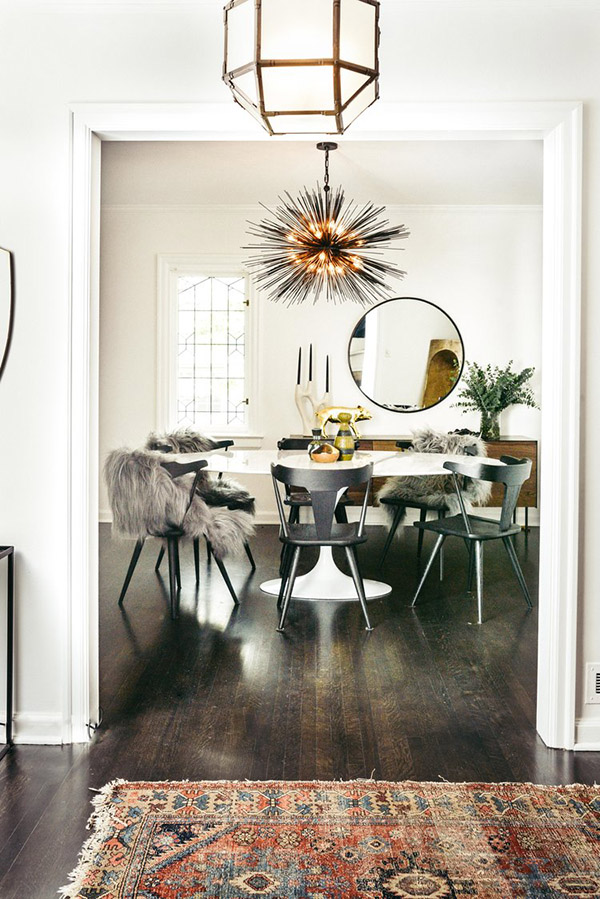
Hollywood Regency in a Boston Victorian
Posted on Tue, 24 Oct 2017 by KiM
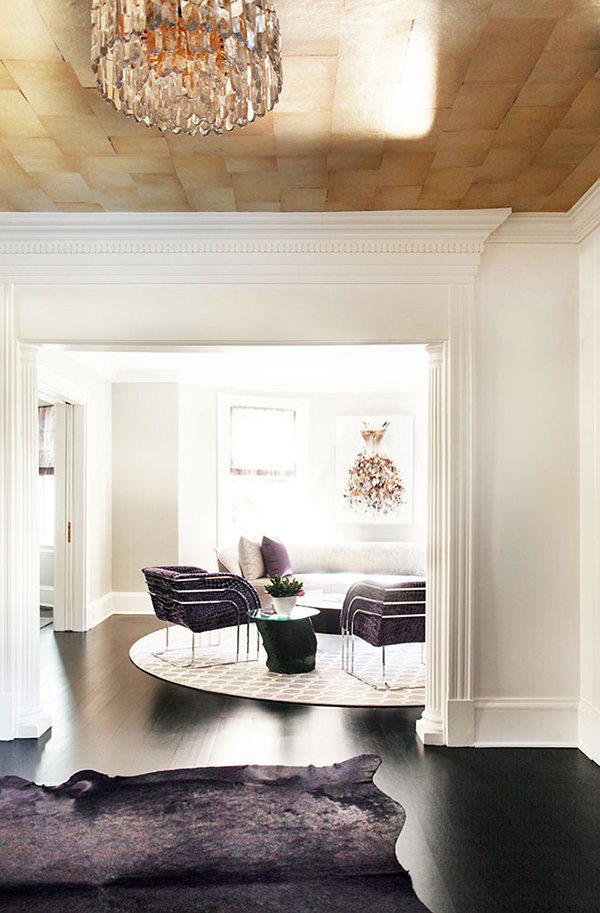
This Boston Victorian designed by Michelle Gerson is elegant and luxurious with some bold statements in Hollywood Regency, art deco fashion. Like the kitchen. Agreeably not for everyone but if Michelle’s client was after some drama, she sure delivered!! And that dining room is absolutely stunning.
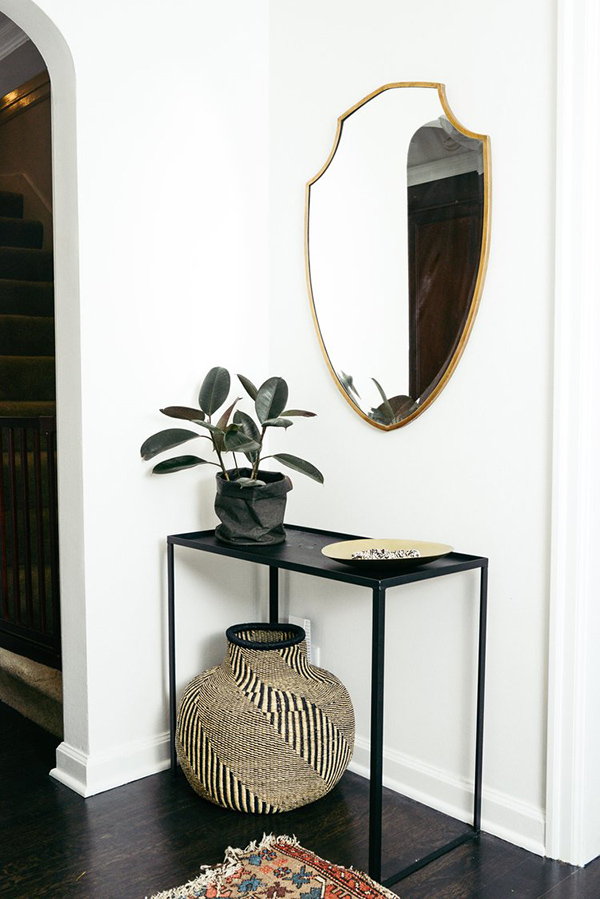
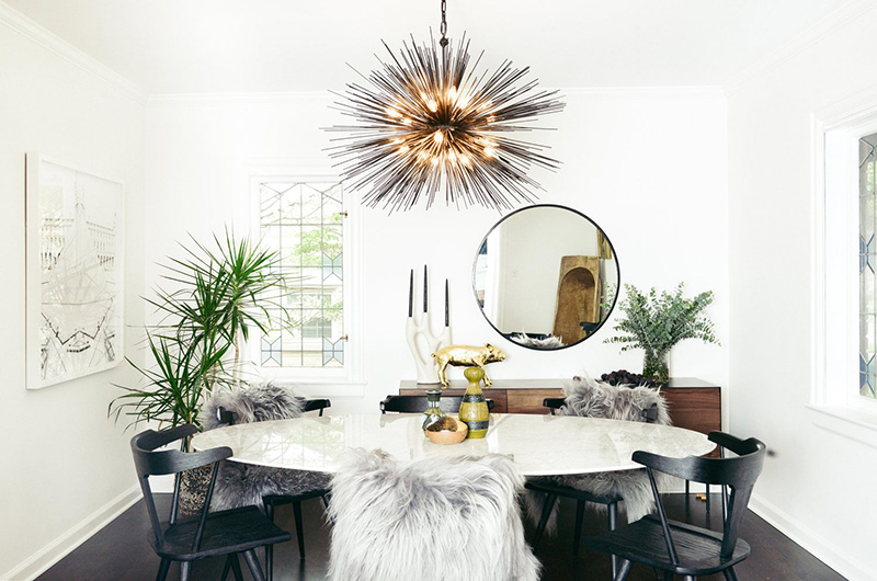
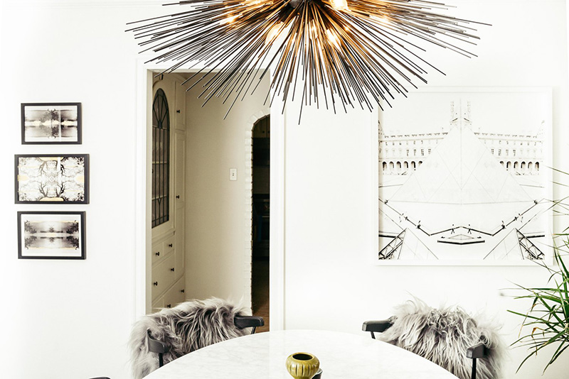
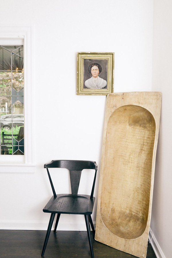
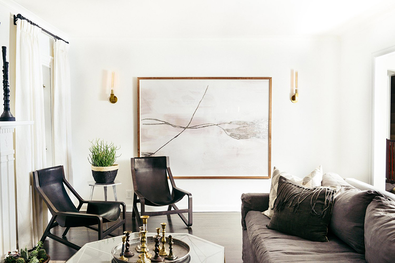
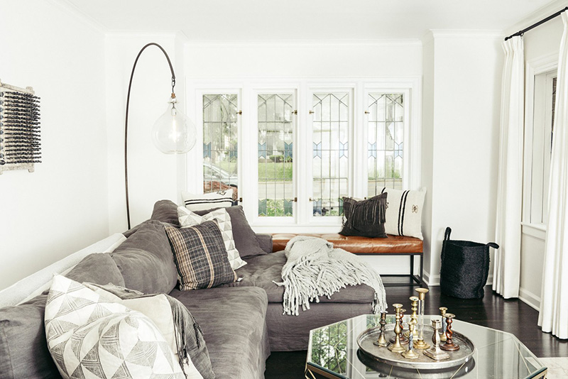
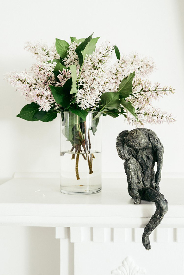
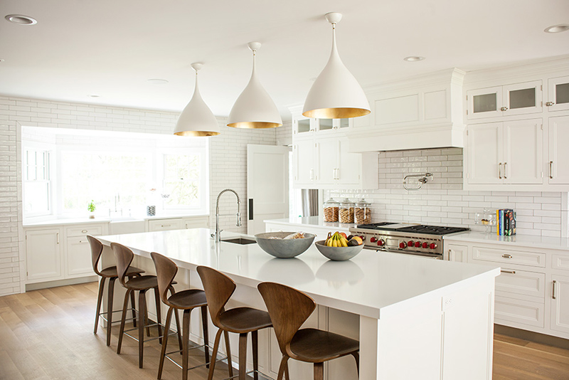
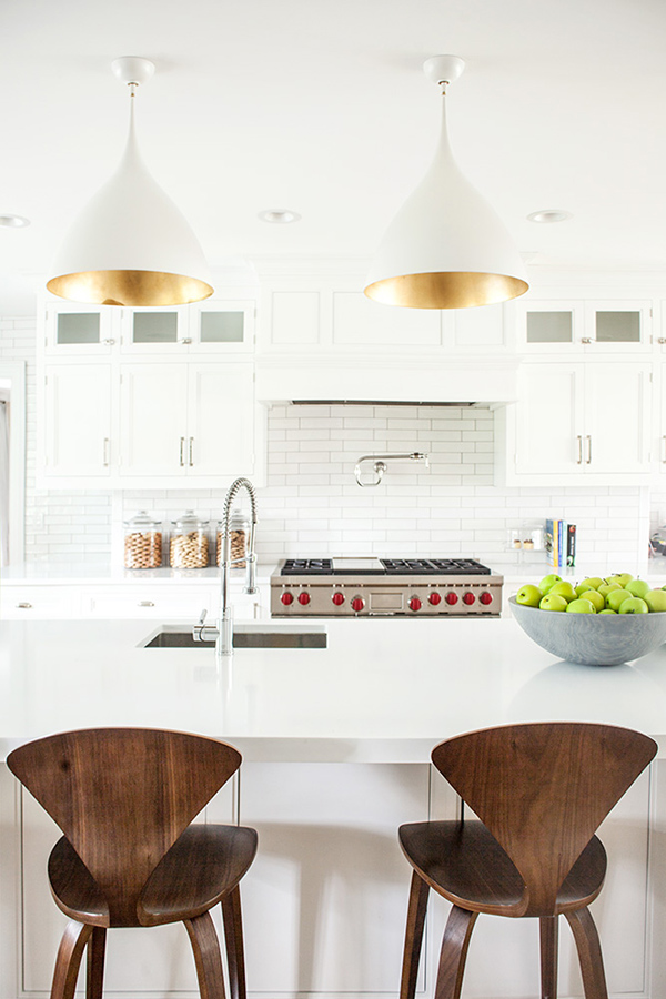
An eclectic Tudor by Haus Love
Posted on Mon, 23 Oct 2017 by KiM
This eclectic Tudor home designed by Indiana-based design firm Haus Love has a modern aesthetic and a neutral colour palette with black accents that has me completely captivated. I could stare at this all day. Dark furnishings against a white backdrop is always soooo good.