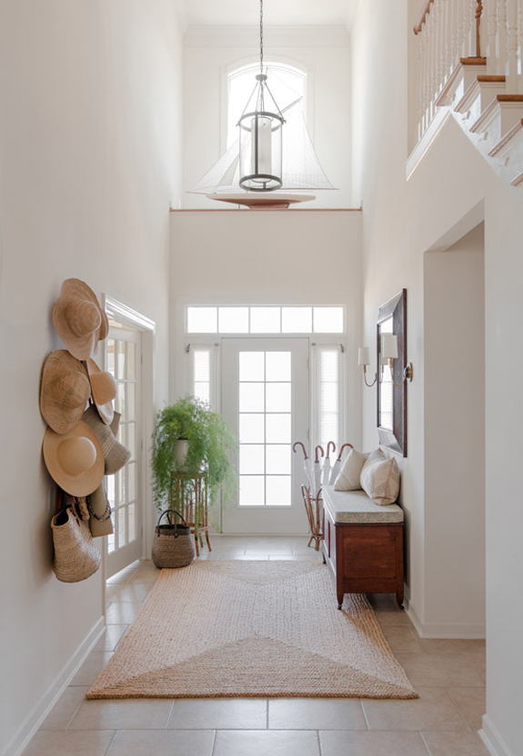
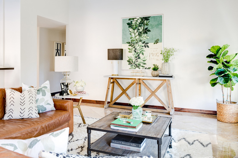
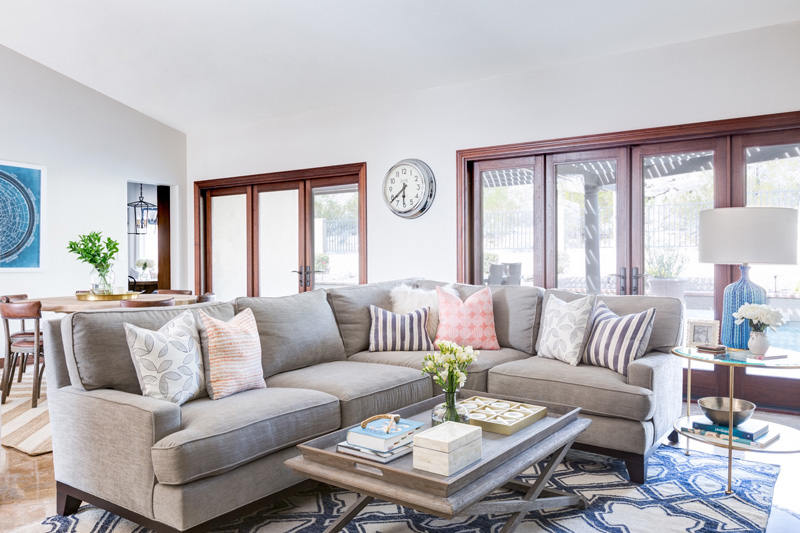
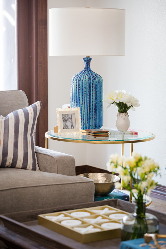
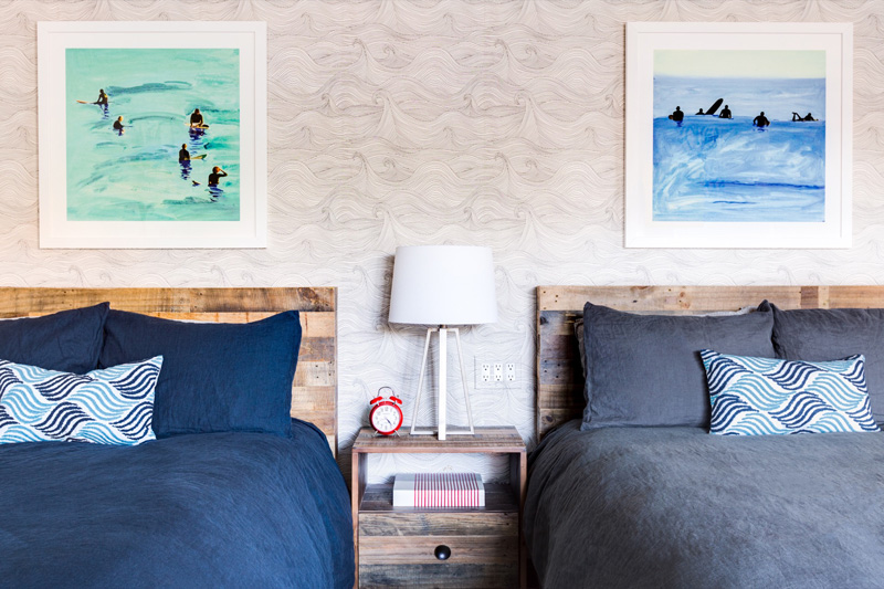
Nautical vibes with Matthew Caughy
Posted on Fri, 7 Oct 2016 by KiM
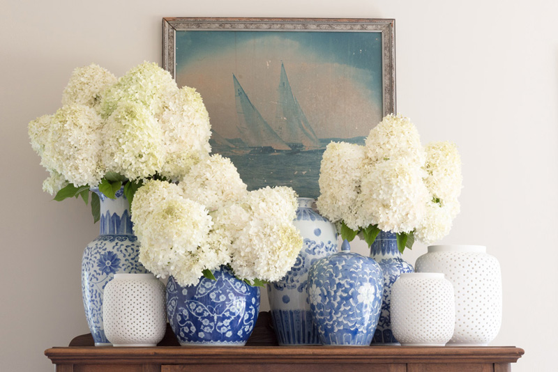
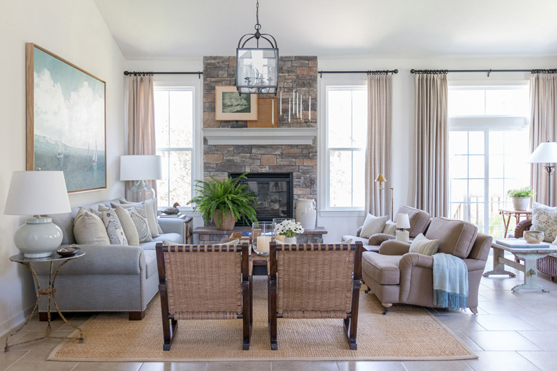
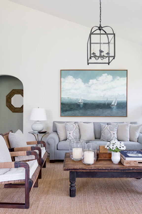
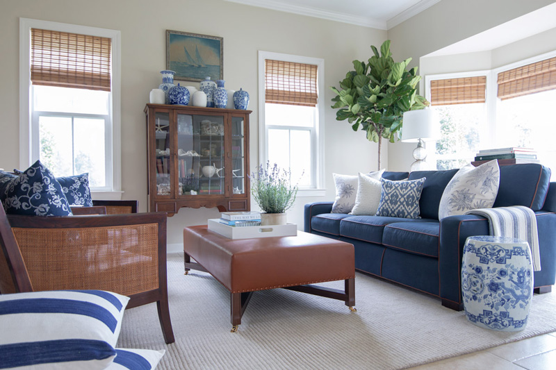
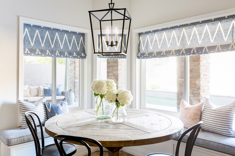
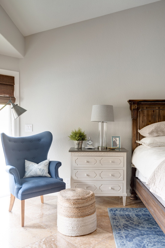
Shades of blue, grey and white, sisal rugs, plants, bamboo, sailboats…something tells me New York City interior designer Matthew Caughy is inspired by all things beachy and nautical. This combination of elements makes for such soothing, timeless and casual spaces. Add in a vignette of vases filled with glorious white hydrangeas and I am smitten.
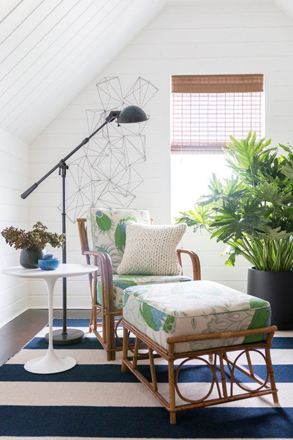
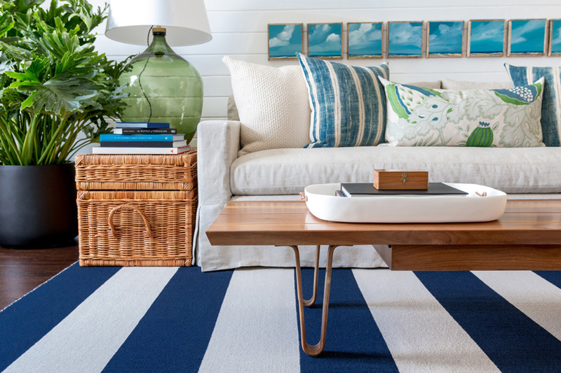
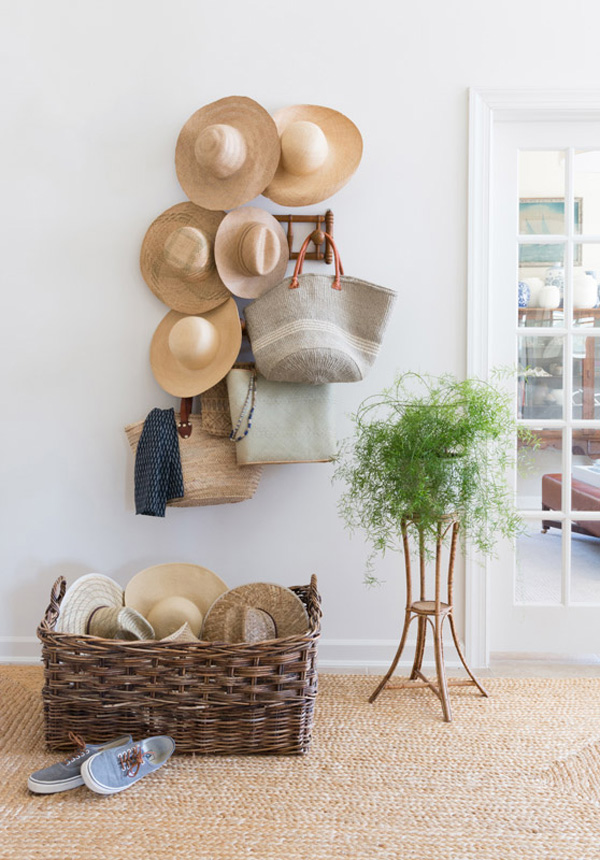
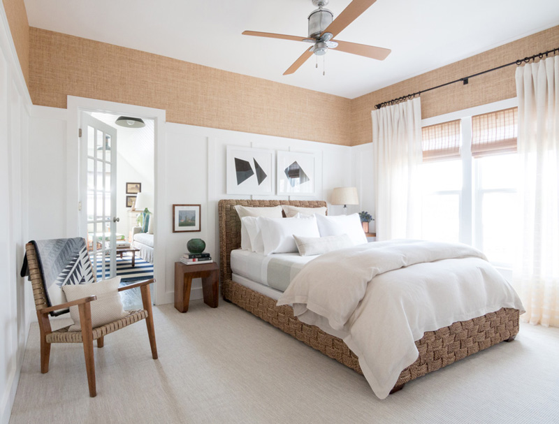
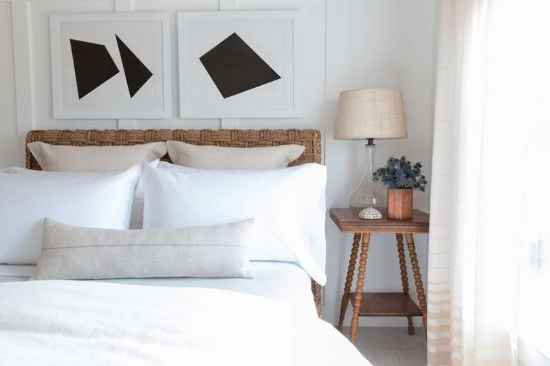
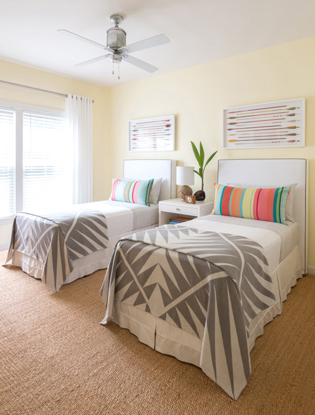


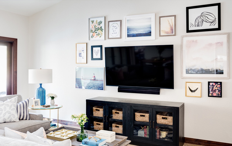
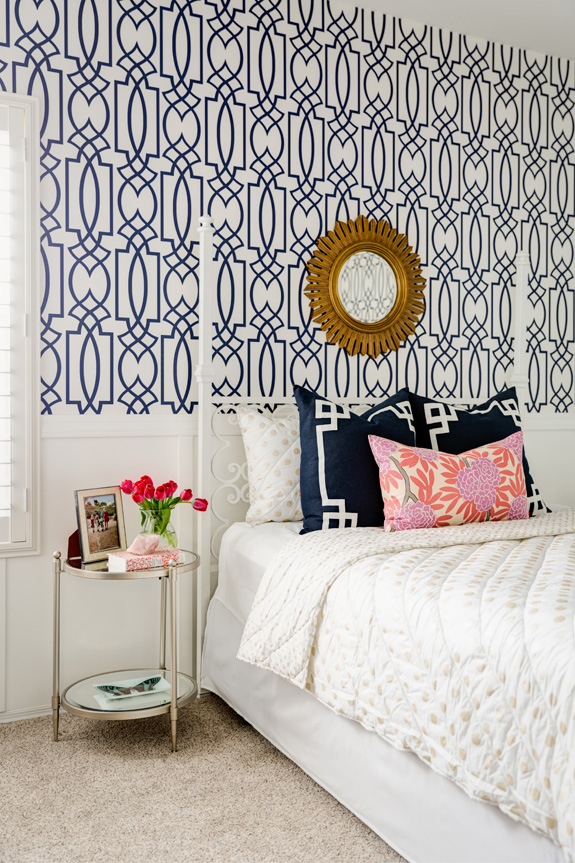
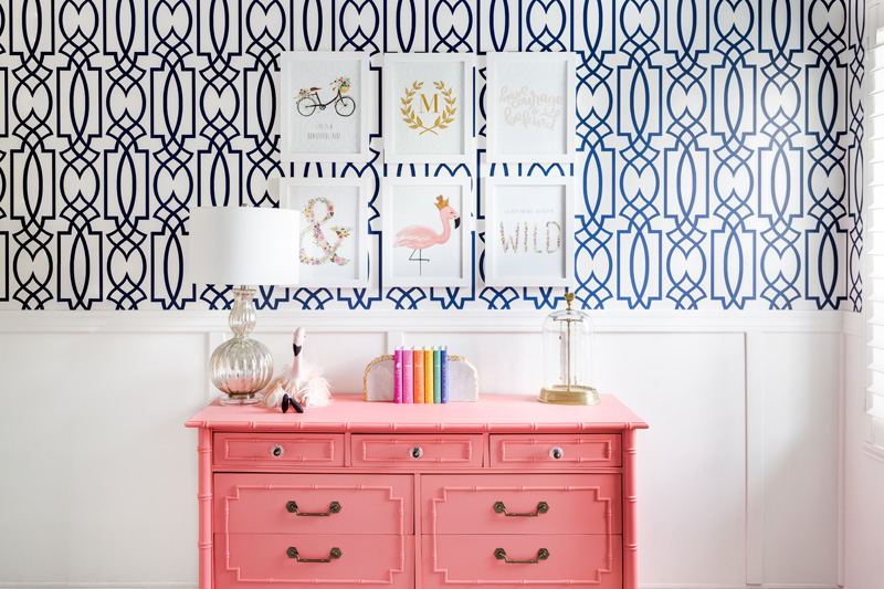
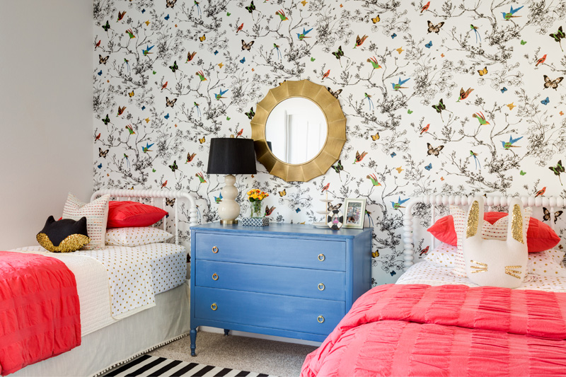
Lexi Westergard Design
Posted on Thu, 6 Oct 2016 by KiM
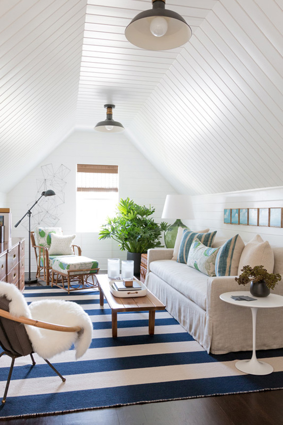
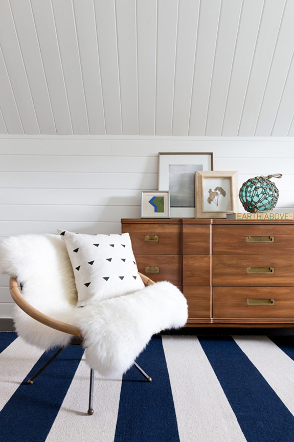
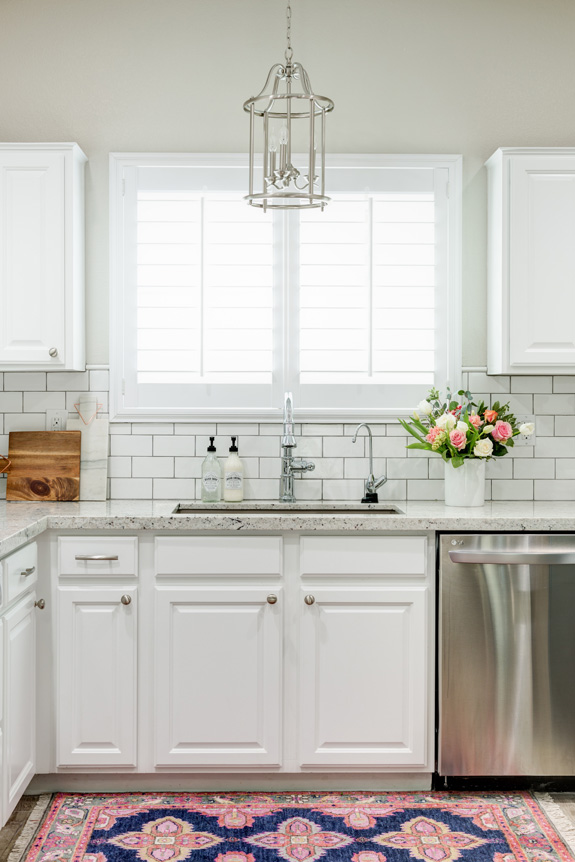
Clean, bright, fresh, with a touch of elegance and an unquestionable level of comfort I think we all strive for in our homes. Arizona-based interior designer Lexi Westergard clearly enjoys dabbling with pattern and textures, and colour in just the right amount, with furniture in a variety of styles. Loving these spaces from several projects she has worked on.


My credenza makeover
Posted on Wed, 5 Oct 2016 by KiM
Yesterday I shared my dining room makeover, so today I thought I would show you what happened to my credenza. Some may love, some may hate, but it’s working for now so I am going to enjoy it until I can maybe afford something fancy.
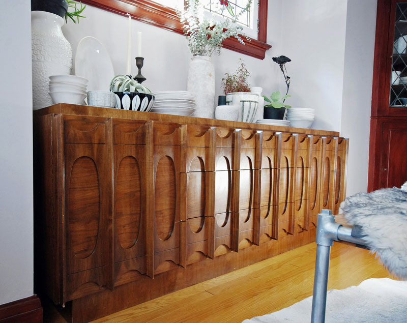
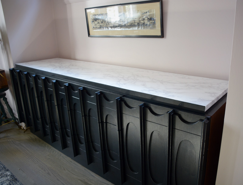
Soon after we moved in I noticed Benjamin Curran was selling a bunch of pieces of this walnut veneer (??) vintage furniture in Montreal so off we went with my mom’s massive SUV and trailer and picked up this credenza, a headboard, 2 side tables and an armoire. All for an awesome price (or free because some of it he just wanted to get rid of). I loved the somewhat brutalist pattern in the doors and still do, and it fits PERFECTLY in this alcove (7′ long). It has SO much storage with pull out drawers behind the doors on the left and right sides and drawers down the centre.
Pre-makeover of the room it was pretty cute. But then we went and refinished the floors grey. Then I had that hemlock dining table made (blonde and grey wood). After that the orange tones of this credenza were just AWFUL. We looked into buying Ikea kitchen cabinets to fit in the alcove and getting a marble top made but the cabinets alone with shelving/drawers inside would have been over a thousand dollars. YEAH. NO. And I could not find anything this long that wasn’t a gazillion dollars.
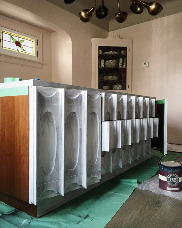
After much thought, I committed the worst crime of all and painted the credenza. It was a bitch of a job but in the end, saved me a ton of money until I can afford something totally fabulous.
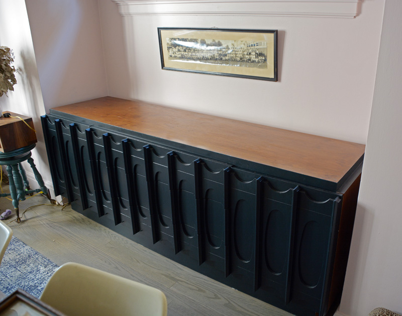
I painted it Black Blue by Farrow & Ball that I used on the alcove windows and doors. I figured this was the safest colour choice, and I wanted the dining table to stand out and this to blend in more. It sat like this with an unfinished top for several months. Why you ask? Because I was determined to purchase a piece of white carrara marble for the top because I am obsessed with white carrara marble. Husband called around and we got several insane quotes for around $3,000. UH NO THANKS. Seriously?! We managed to find one place who offered to cut us the piece we needed for $800. I was game, and we visited their warehouse, then the showroom, then the warehouse, then the showroom (why we had to do this I still don’t know) and several emails in between and I was all CAN YOU JUST CUT ME A DAMN PIECE OF MARBLE ALREADY? So guess what happened? Absolutely nothing. After a few emails asking when our marble would be ready, we never received a response. I was fed up at this point and decided these people could go to hell, and I came up with a PLAN B. I enlisted husband to search online for a really nice looking white marble contact paper. And he found a roll on eBay for a grand total with shipping of $50.77.
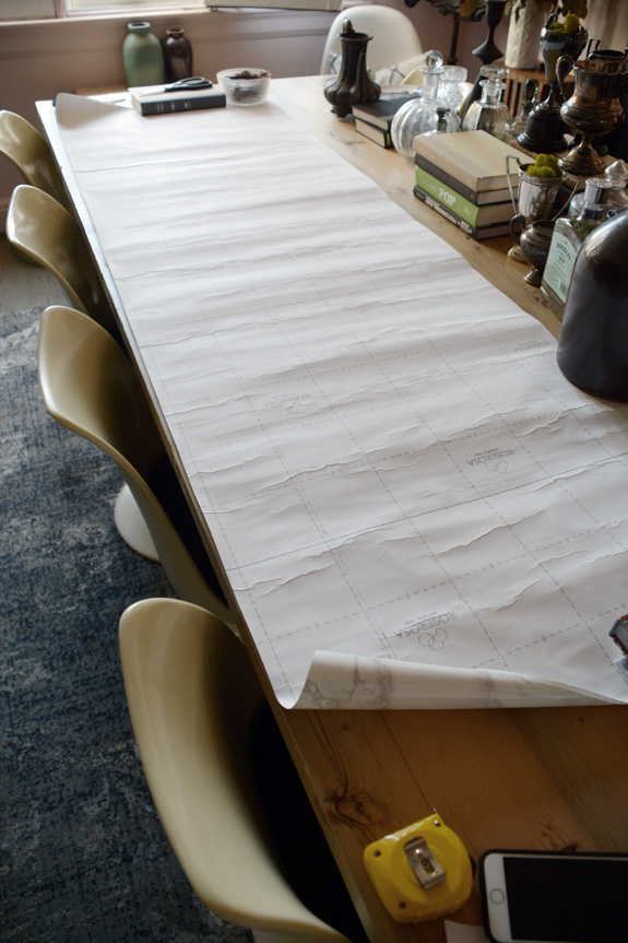
I was nervous that I would screw up the measurements and cutting but I managed to do a decent job.
I had curled the ends over the side in this photo and not done the front yet, but I realized this would not fly as this paper was VERY thick so I cut the sides off and re-cut separate side pieces. The beauty of this whole project is that this credenza had this raised part on the top so when covered in the paper it looks like a really thick piece of marble. I think in the end this looks better than if I had of stuck a piece of marble on this already raised top.
I sooo dig the pattern on the front of this beast. Too bad I didn’t shut the middle drawer tight. YEESH!
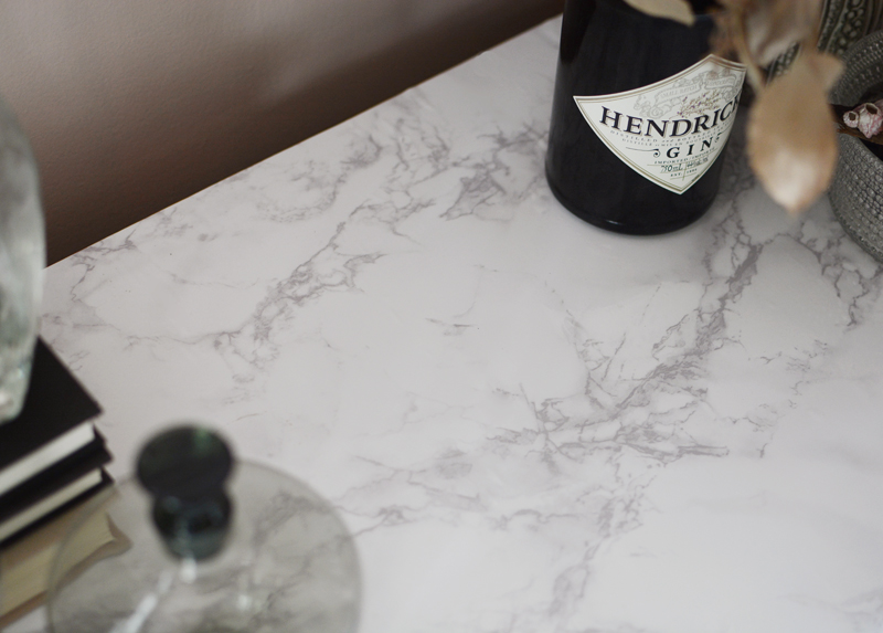
Here’s a detail shot of the marble pattern. There are some air bubbles that I need to poke out, and I probably should have installed it with one of those squeegee things to really get the air out but I was a contact paper virgin and didn’t know any better.
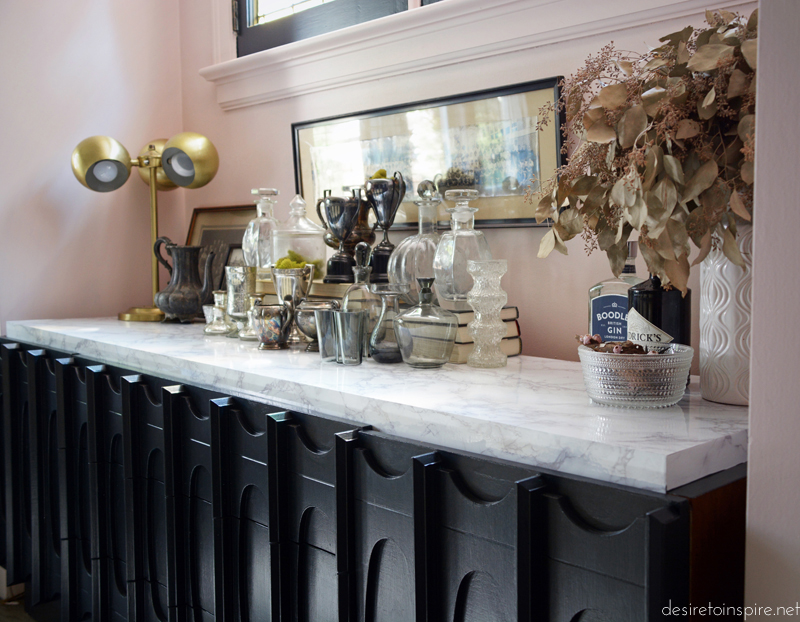
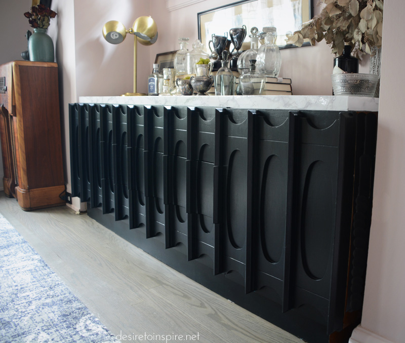
And voilà! My credenza transformation. 🙂
My dining room makeover
Posted on Tue, 4 Oct 2016 by KiM
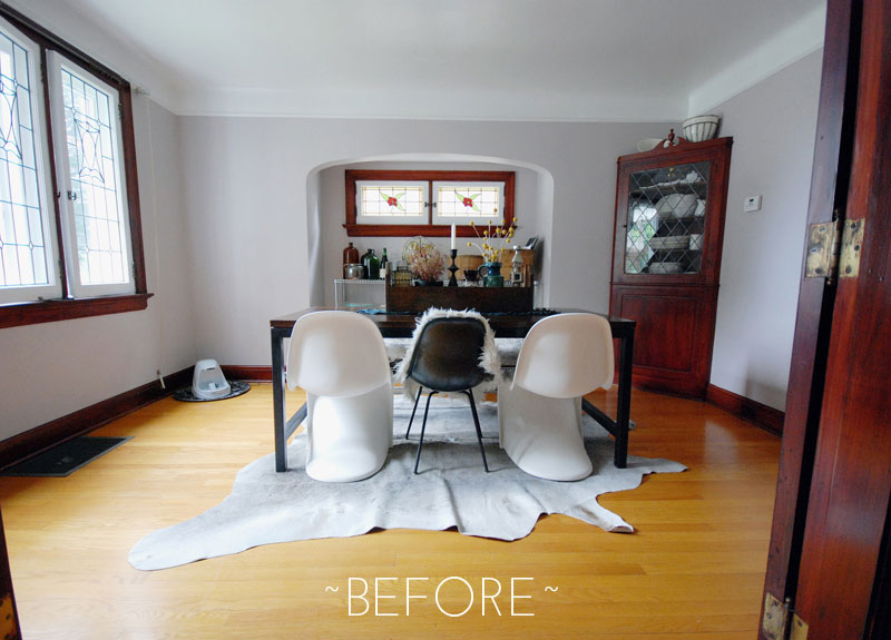
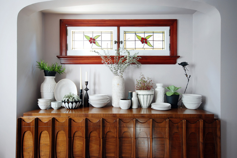
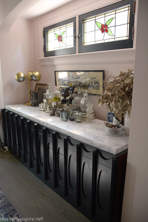
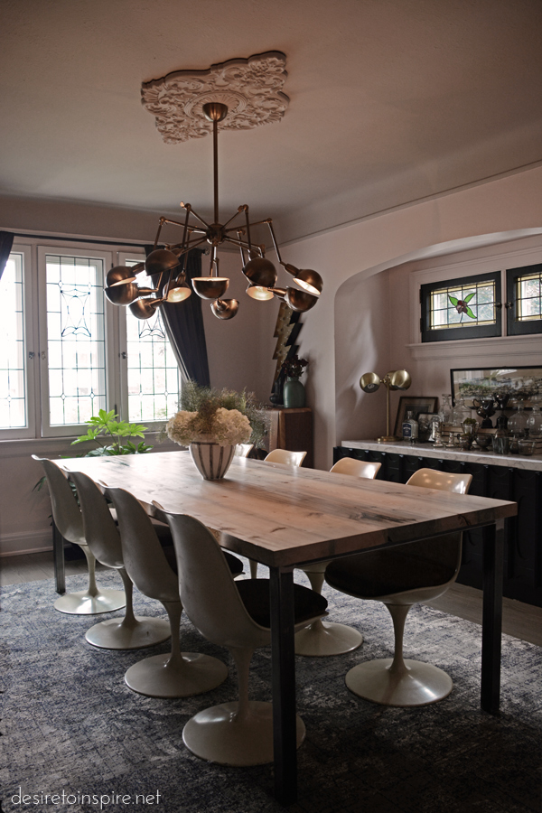
Progress on my house has been slow, and every room had finishing touches that never seemed to get done, like stupid baseboard trim. Thanks to a photo shoot of my home a couple of weeks ago (so exciting!!!) my husband and I finally completed the majority of the rooms, and I spent last weekend shooting the dining and living rooms. More photographing required, but it is a good start, and today I would like to share my dining room in its current state (I say that because I am always changing things around and on the hunt for decor items that are more fab than what I currently have). So above is what the space looked like right after we moved in. Boring white ceiling that did not showcase the amazing curve, horrible HORRIBLE mahogany coloured stain/varnish/crap on all the window trim, doors and corner built-in. All of the hardwood on the main floor is oak and was stained this hideous yellow/orange. Whoever thought red trim and orange floors was a good idea was a complete moron. The previous owners took the chandelier with them and left us with nothing hence the lack of overhead light. The table was the rather small and narrow one from our last house with some random chairs and a bench. This room needed a COMPLETE overhaul. Note: The photo above was taken with a very wide angle lens – the room is 10’x14′ and the alcove is about 1.75′ deep.
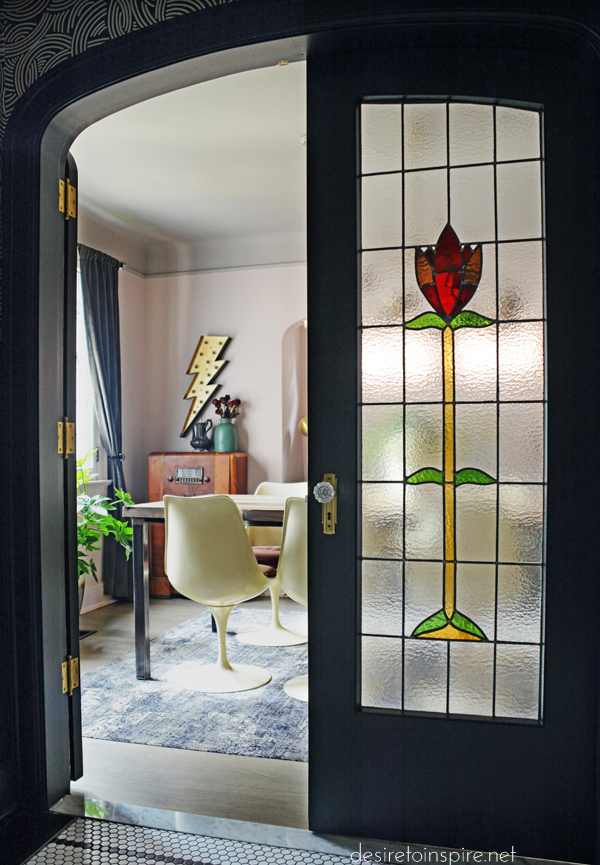
A little peek into the room because I had to show you what the gorgeous curved double doors with stained glass leading into the room from the foyer look like. These doors slay me. They are so freaking fabulous. Especially now that they aren’t mahogany!!! The colour is Black Blue by Farrow & Ball.
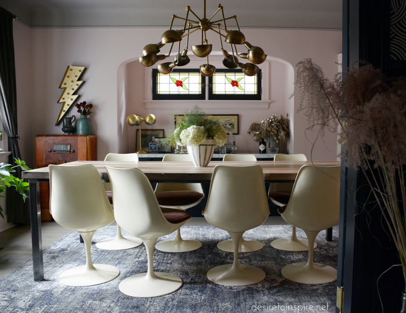
And this is the space now. All new everything!
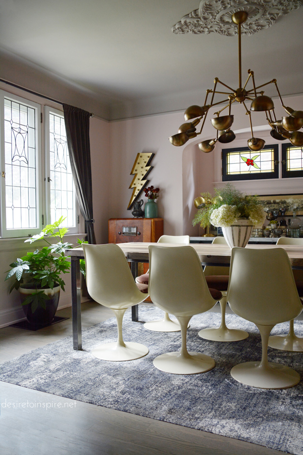
The vintage reproduction tulip chairs and credenza I picked up in Montreal from Benjamin Curran. The paint is Calamine on the walls and baseboards and Dove Tale on the ceiling by Farrow & Ball. I have gone dark with most of this house so I decided to go with light colours in here for something a little unexpected and to make this house not seem so cave-like. And mostly so my family will stop poking fun at me.
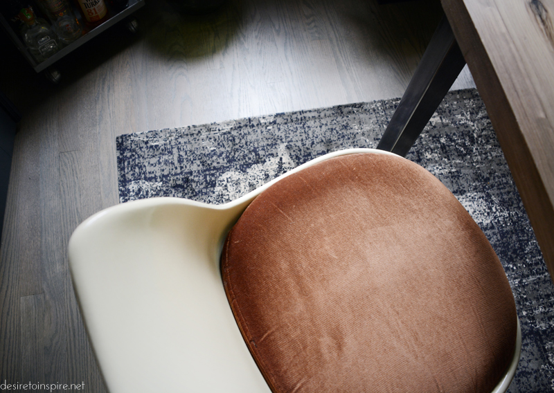
The cushions are upholstered in brown velvet which is not my first choice but given I have many cats, velvet is really the way to go. One day I will have new cushions made (the foam is basically disintegrating) and upholster them in something crazy like red or a deep burgundy. The rug I picked up at Homesense, and its super duper low pile makes it the easiest rug to clean I have ever owned. We had the floors refinished and had about 2 colours to choose from in the grey family (annoying) so we went with Minwax’s classic grey. Luckily I love how they turned out.
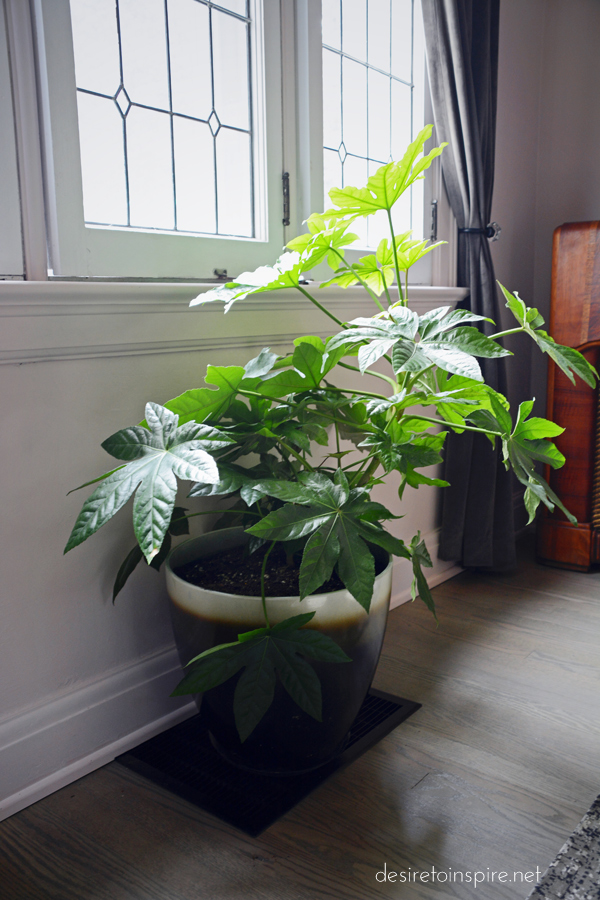
Rona is my all-time favourite source for plants. Their selection is ridiculous and prices are amazing. This guy was I think $16. The pot is maybe from Rona too. (I could use a newer, better one. Maybe in brass).
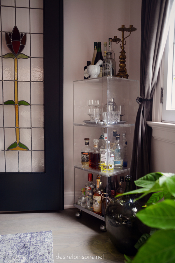
To the left of the plant in the corner is my version of a bar cart. I hunted for one for months and could not find anything suitable for the space so I went up to my dressing room, pulled all of my shoes out of these plexi cubes, hauled it downstairs and filled it with booze. It was formerly used at a Club Monaco I worked at years ago as a sweater display and when all the old fixtures were getting tossed, I nabbed this. Total score. I have used this in about 8 different applications over the years.

The grey velvet curtains are soooo soft and I love them. Awesome with cats because you can basically shake the fur off. I paid about $80 or $100 for the set at Homesense. Because they have a pocket at the top and they are thick they don’t stay open enough so I had to go get some tie-backs. I found these at Lowe’s for a few bucks. One day I would like to find some super blingy vintage ones.
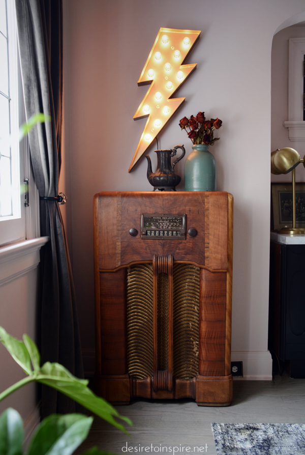
On the opposite side of the room is this special little set-up. This is a vintage radio my husband of Daff Design picked up for a song. He re-attached the funky fabric, re-hydrated the wood, tore out the old radio guts and replaced it with a bangin’ speaker, a subwoofer and Bluetooth! WOOT!!! PARTY IN THE DINING ROOM!!! Items on top of the radio are vintage, and the lighting bolt light is from Gaslight Electric Sign Co.
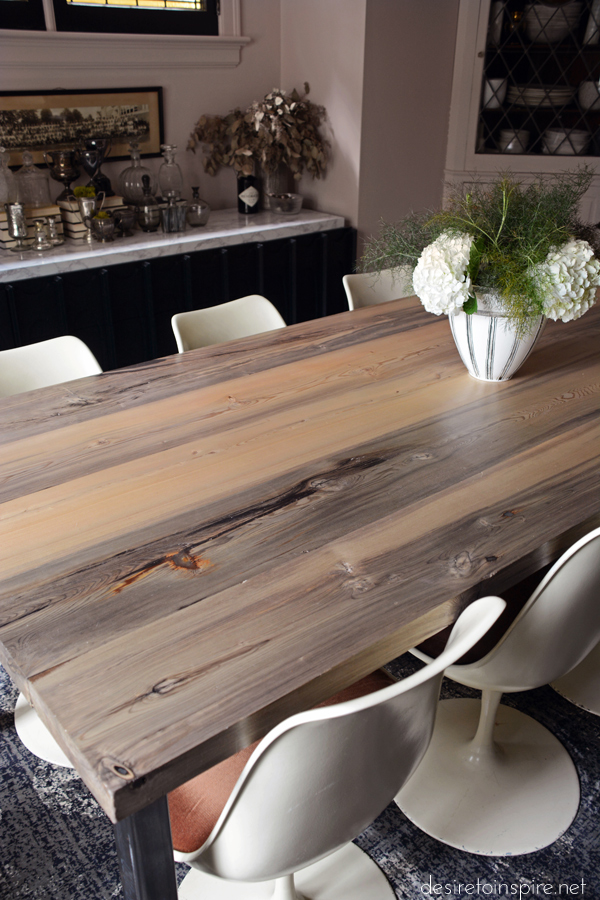
The table was made by my husband out of hemlock that was uncovered about 100 years after being sunk in the Queen’s Wharf in Toronto. The variations of colour in the grain, particularly the grey, is absolutely incredible. My husband had a little help from Matt Wallace at Ottawa City Woodshop, and had the simple raw steel base made by ReVolvd.
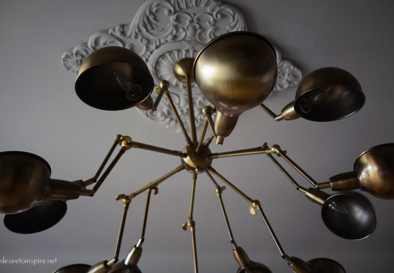
We found this light fixture in Montreal at Phil’z. It seems to be a big hit with anyone who comes over.
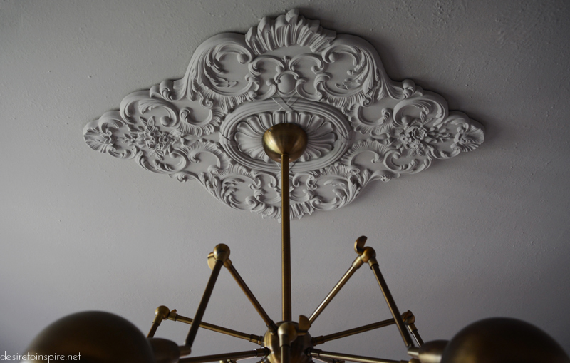
I adore ceiling medallions and I placed an order a little while ago for a whack of these for just about every ceiling fixture in the house (from Decor Group). This one is gorgeous and is perfect ceiling bling.

Some fennel and hydrangeas from blumenstudio left over from the photo shoot in a vase from Green Light District.
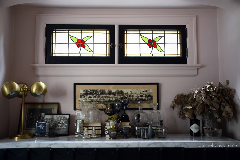

I’ll talk more about my credenza in another post. It looked nothing like this when I purchased it. On it are my collection of glass and silver and some antique class portraits.
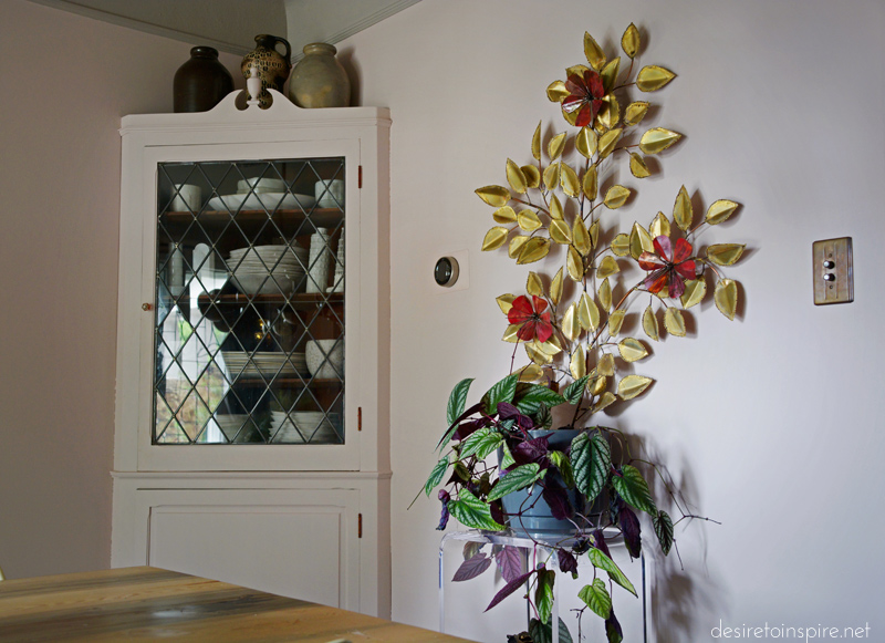
I found the metal wall sculpture a few weeks ago when I was in Montreal getting my tattoo sleeve completed. It was from the same store I purchased the lucite pedestal below it – Cité Déco Meubles. Plant again from Rona. We replaced all of the noticeable switch plates and outlet covers around the house with antique brass art deco style ones from House of Antique Hardware. And because that damn thermostat is right there on the main dining room wall I splurged on one of those cute Nest thermostats from Home Depot.
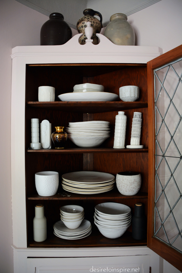
This built-in hutch is filled with my favourite dishes EVER – South African Wonki Ware from Green Light District, some West German pots and vases to fill the voids, some treasures from Italy and the best salt & pepper bottle grinders by Menu.

I could not get a decent photo of this swinging door that leads into the kitchen but had to share anyway because swinging doors are so rare these days, and it has this really cool glass panel to push on. (We always leave it open).
I really love this room 🙂
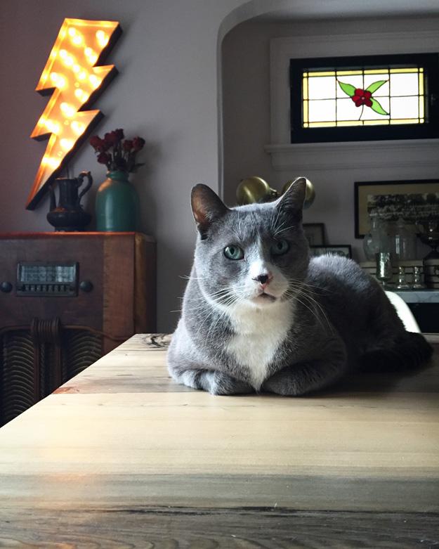
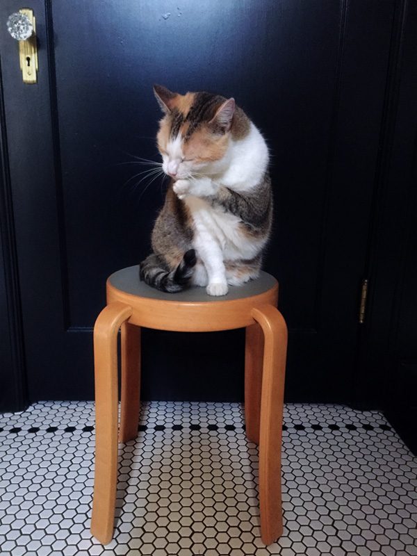
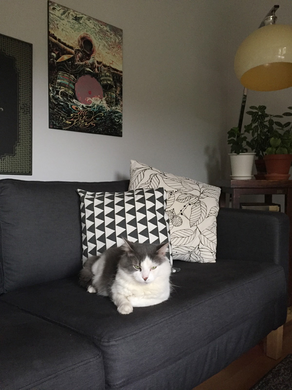
Monday’s pets on furniture
Posted on Mon, 3 Oct 2016 by KiM
If you would like to participate in the Monday’s pets on furniture series please send photos, your name, location and a brief description to kim[@]desiretoinspire[.]net, or hashtag your photos #DTIpetsonfurniture. Thanks!
This is furry Lars, I like to brood on cat’s eggs! 😀
– Nicholas (Rome, Italy)
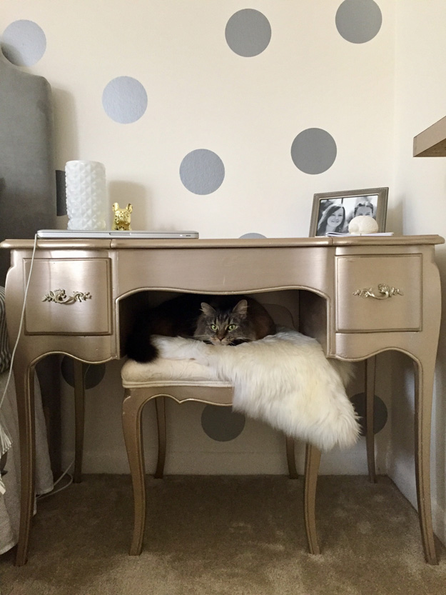
Marnie the cat naps on a faux fur rug draped across the stool of a vintage vanity table in Chicago, IL.
– Sara
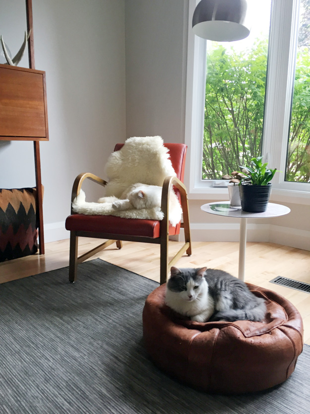
A couple of photos my sister sent me of her cat Carl hanging with newly adopted cat from the Humane Society, Spencer. The 3 cats (including Zoe whom they adopted at the same time as Spencer) took no time to get used to each other. 🙂
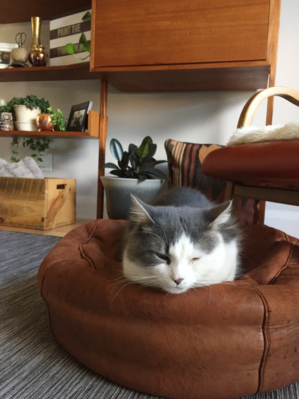
And a couple from me. Felix bugging me while I ate breakfast on my day off. Felix was recently diagnosed with lymphoma and seems to be doing well on the medication the vet prescribed. And one of Phoebe on my newly acquired Magnus Olesen stool.