Displaying posts labeled "Blue"
A west coast Edwardian with east coast character
Posted on Fri, 5 Sep 2025 by KiM
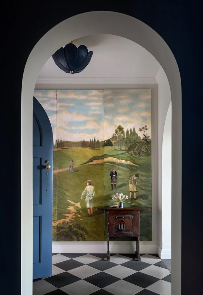
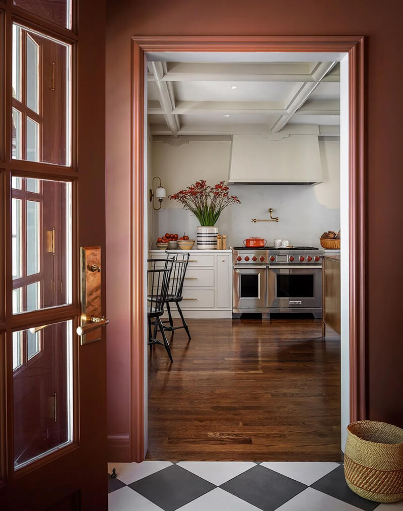
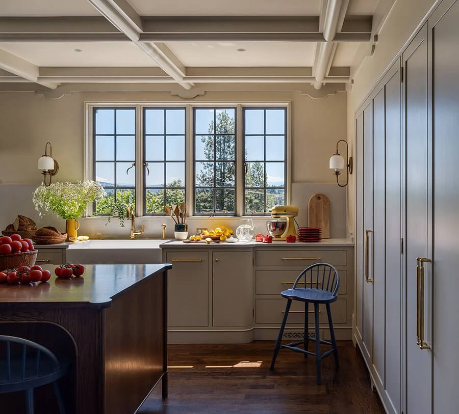
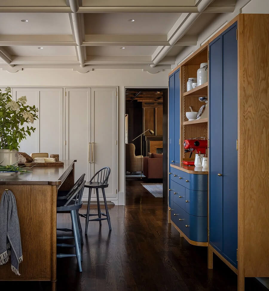
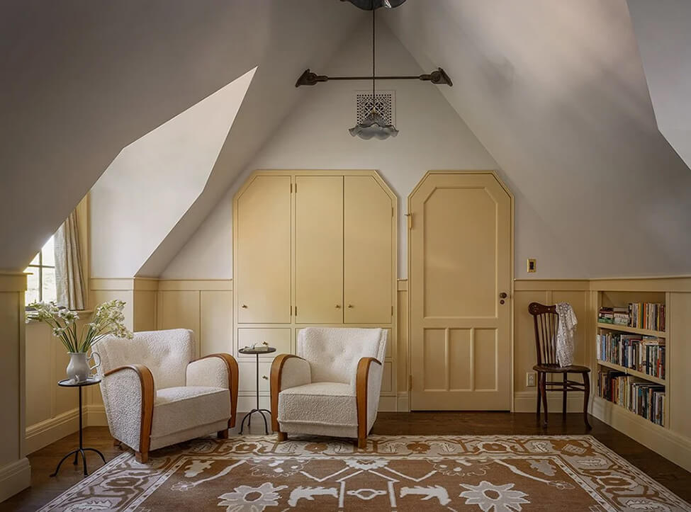
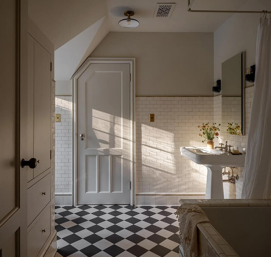
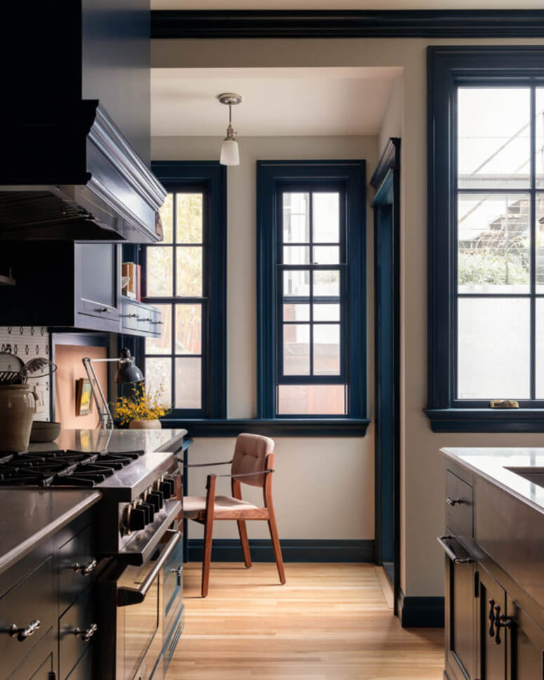
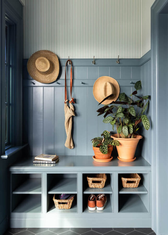
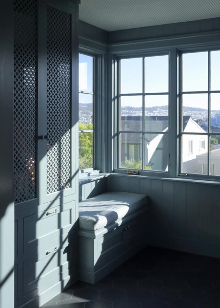
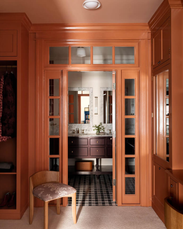
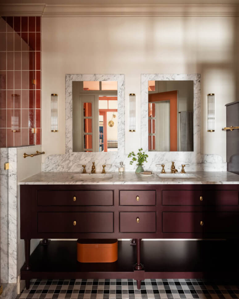
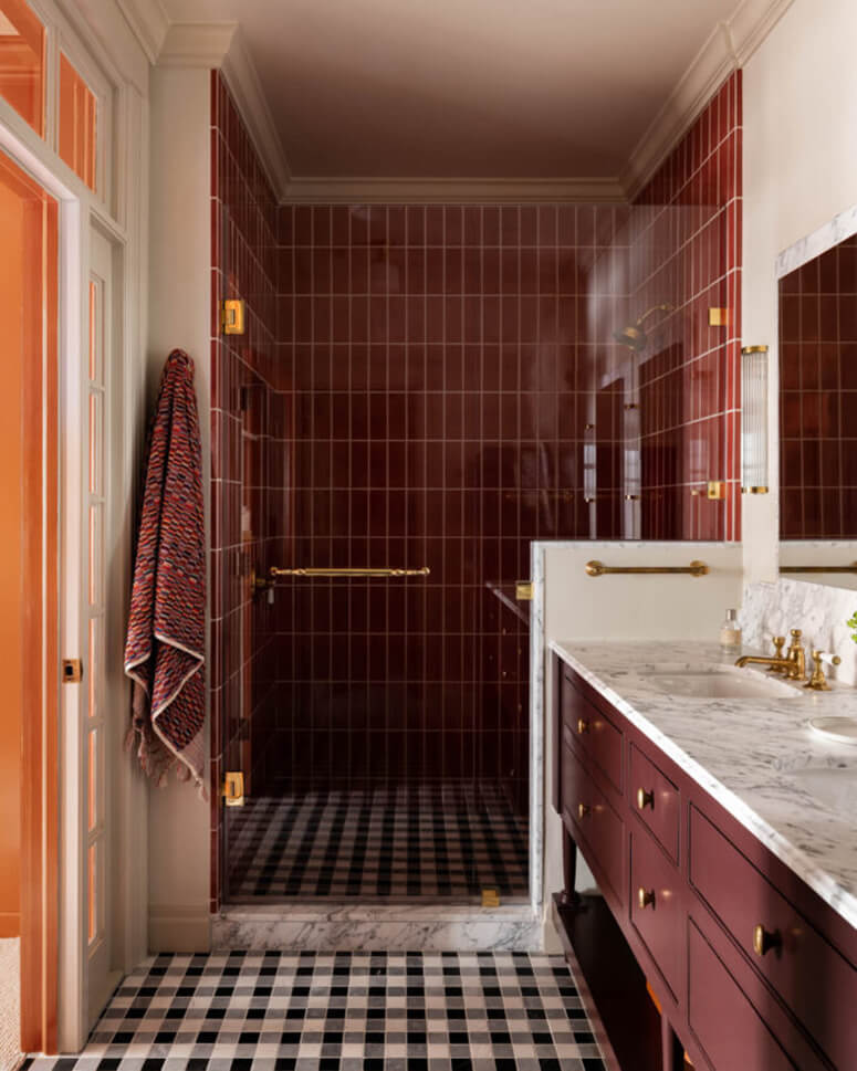
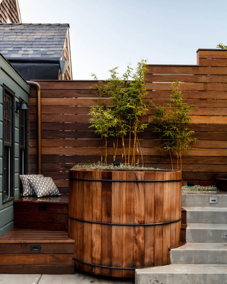
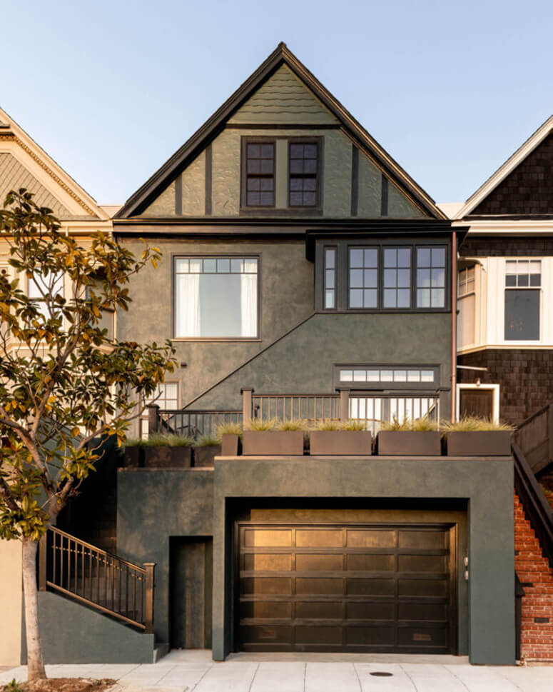
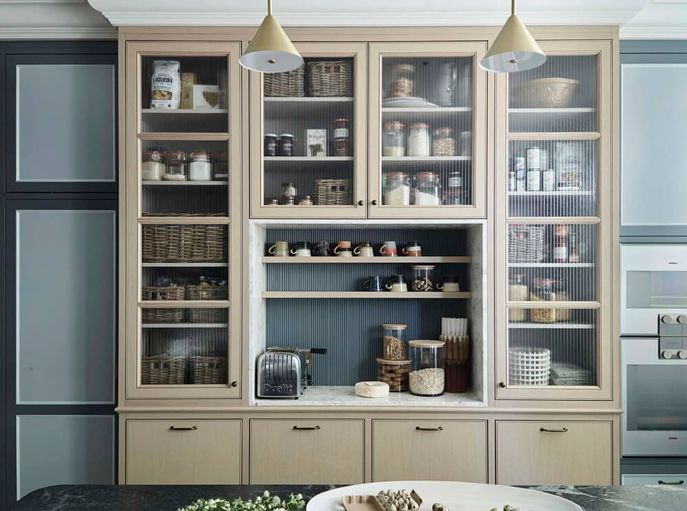
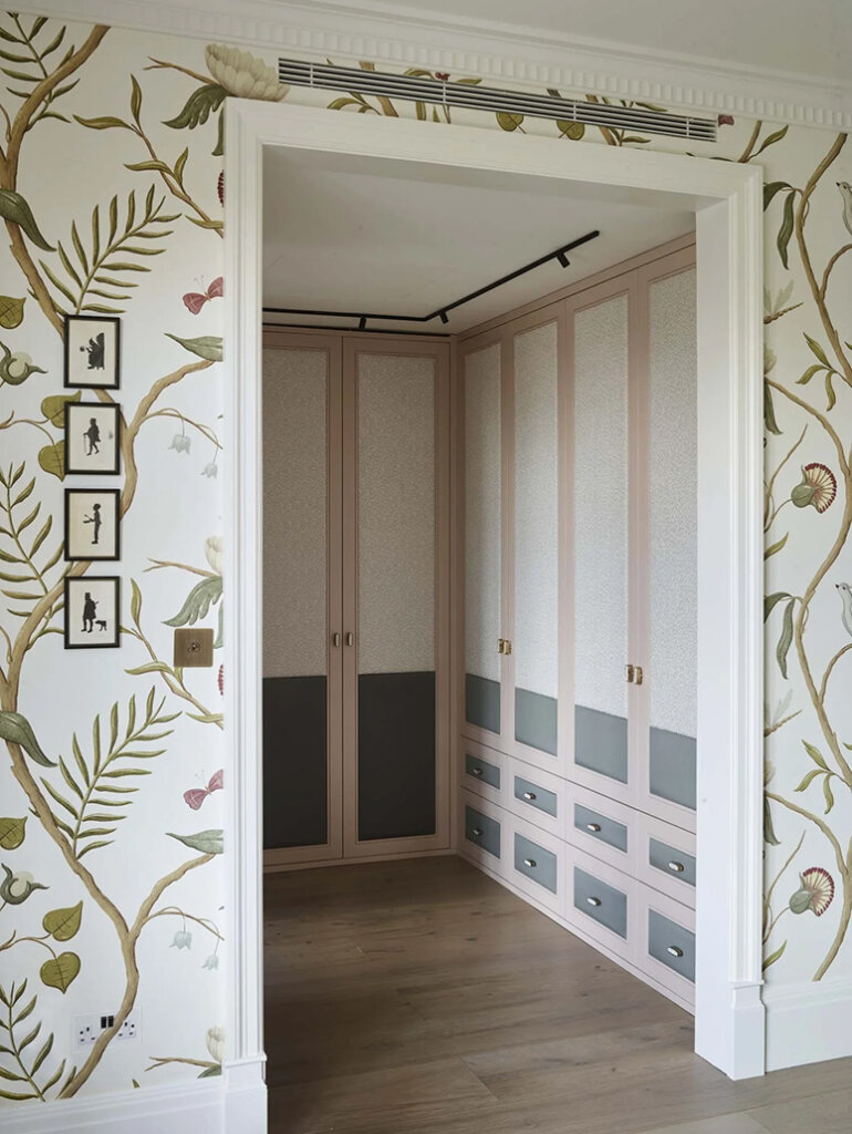
A formerly Brooklyn-based family, now settled in San Francisco, embarked on a comprehensive renovation and addition of their 1913 Edwardian-style cottage in Glen Park. The family aimed to infuse East Coast character into the design, boldly selecting colorful cabinetry and a bouquet of mixed patterns. Landed prioritized retaining the nostalgic and historic integrity of the century-old home by designing custom carpentry, drawing from Federal and colonial-style profiles, featured prominently with a suite of extensive millwork. Glass elements in doors, transoms, and side lites were strategically introduced to optimize daylight in the hillside abode. Nooks and niches were injected throughout the space to inspire impromptu workspaces and cozy areas to sit by a window and indulge in avid reading habits.
This home is now brimming with exuberance and the colours used are so impactful. Such a spirited vibe for a family to create memories in. Photos: Haris Kenjar.
Adding some youthfulness to a Colonial revival home in Atlanta
Posted on Thu, 14 Aug 2025 by KiM

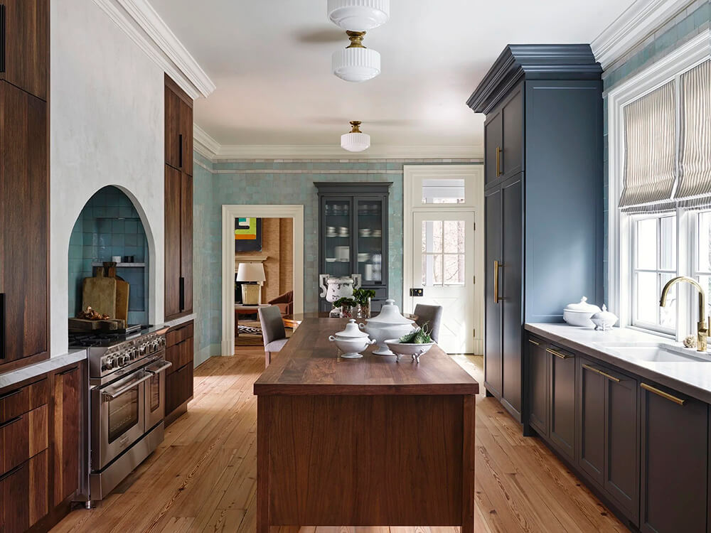
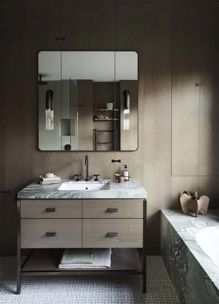
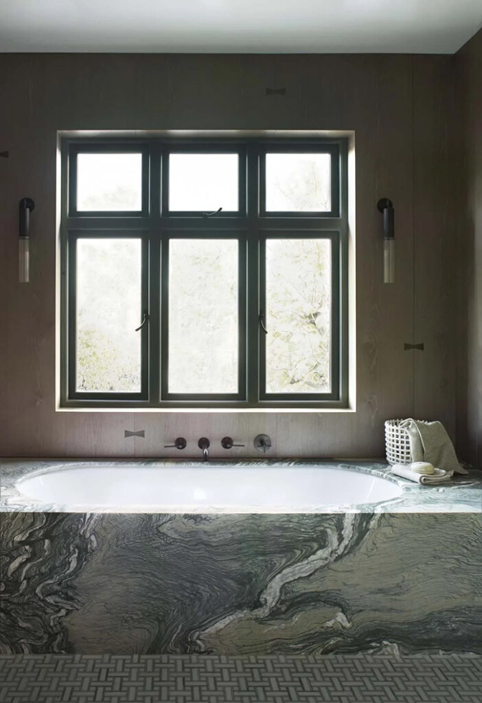
Designed by renown architect Norman Askins, we were tasked with thoughtfully renovating and designing this Nancy Creek Ridge home for a young Atlanta family. A full renovation of the kitchen allowed us to drench the walls in a beautiful zellige tile which beautifully bounced light around the intriguingly laid out kitchen. Custom millwork and an island crafted to emulate a large antique work table created the ideal kitchen for the family – perfect for both the large holiday gatherings they often host and the intimate nights as a family. Throughout the rest of the home, we balanced a vivid art collection with a palette both soothing and surprising. Pattern and texture blend throughout the home from the geometric wallpaper in the foyer to the lush brass inlays of the primary bath. The end result showcases the beauty of a design that can push the boundaries of a historic design into a timeless future.
I love the juxtaposition of light and dark in this home, and use of colour in a really sophisticated way. Such a moodiness and warmth, with a touch of elegance. Designed by Bradley Odom. Photos: Mali Azima.


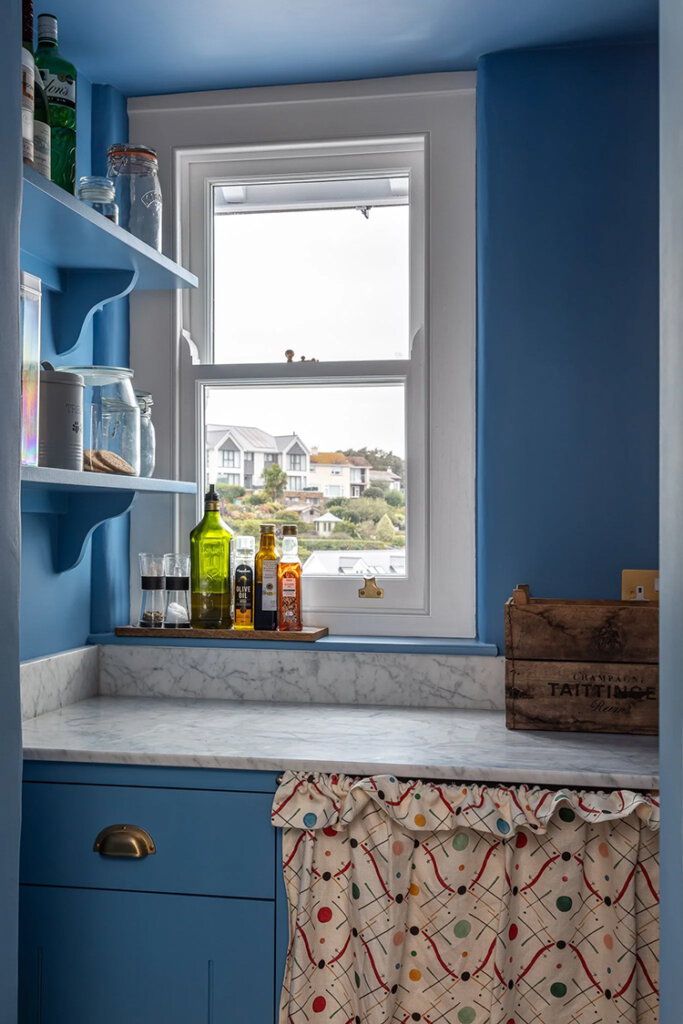
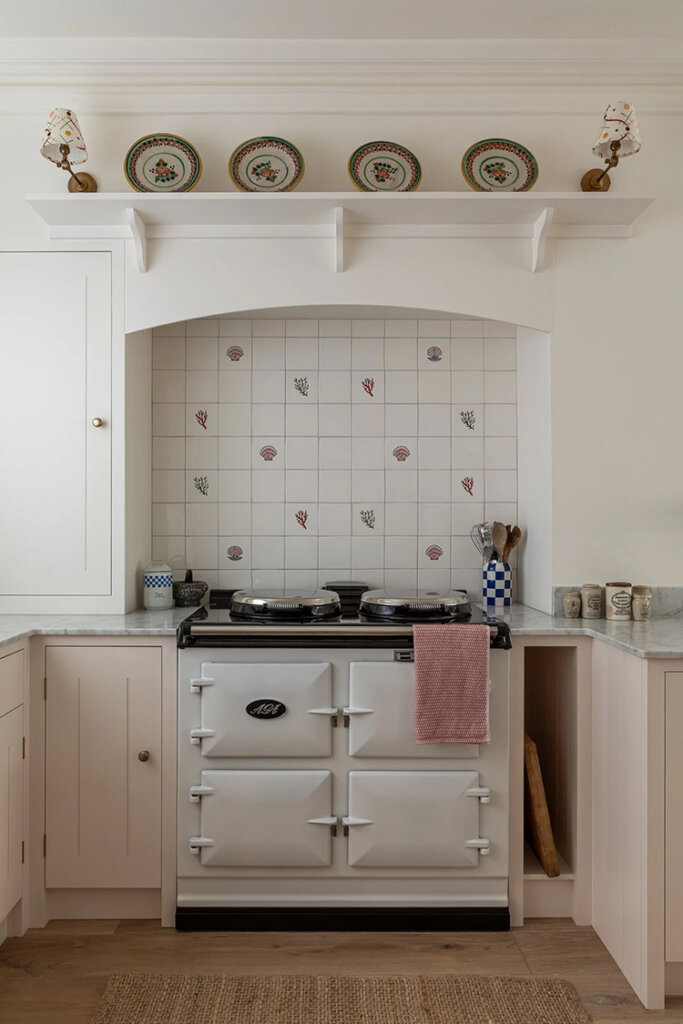
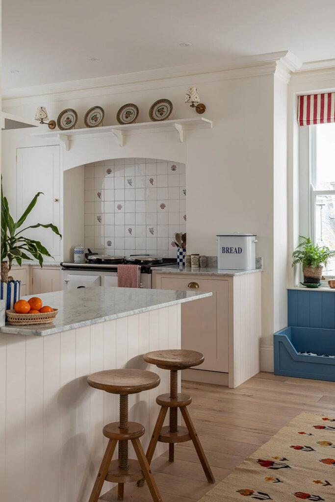
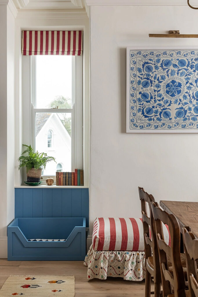
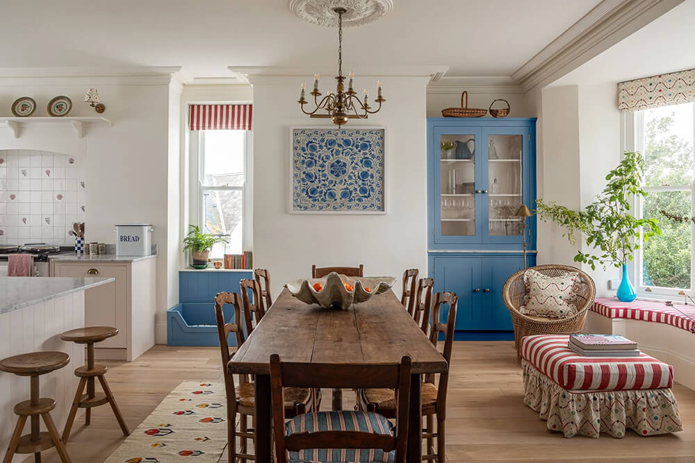
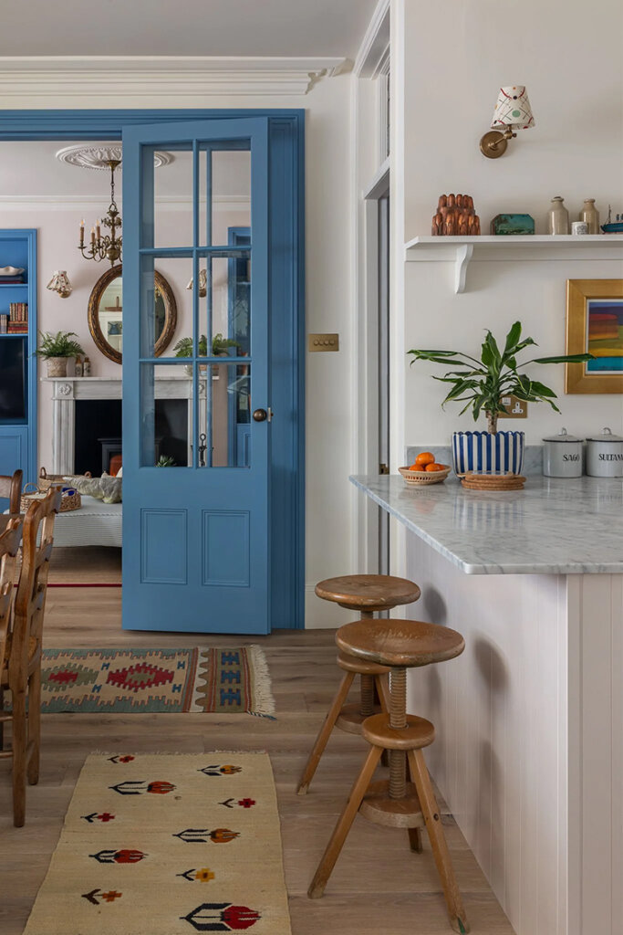
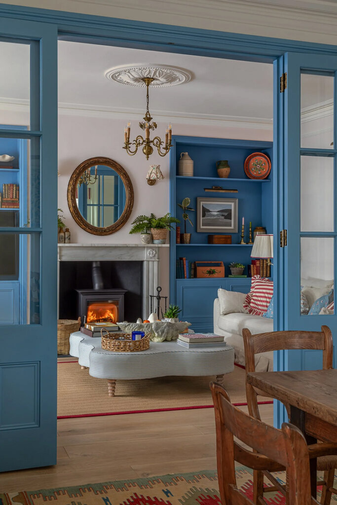
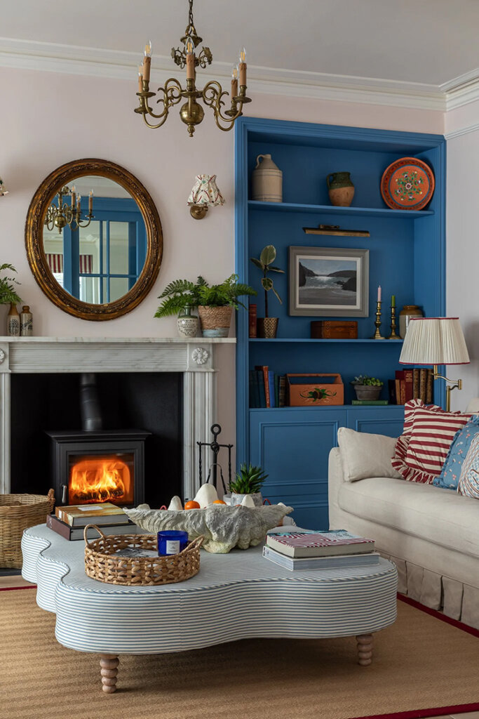
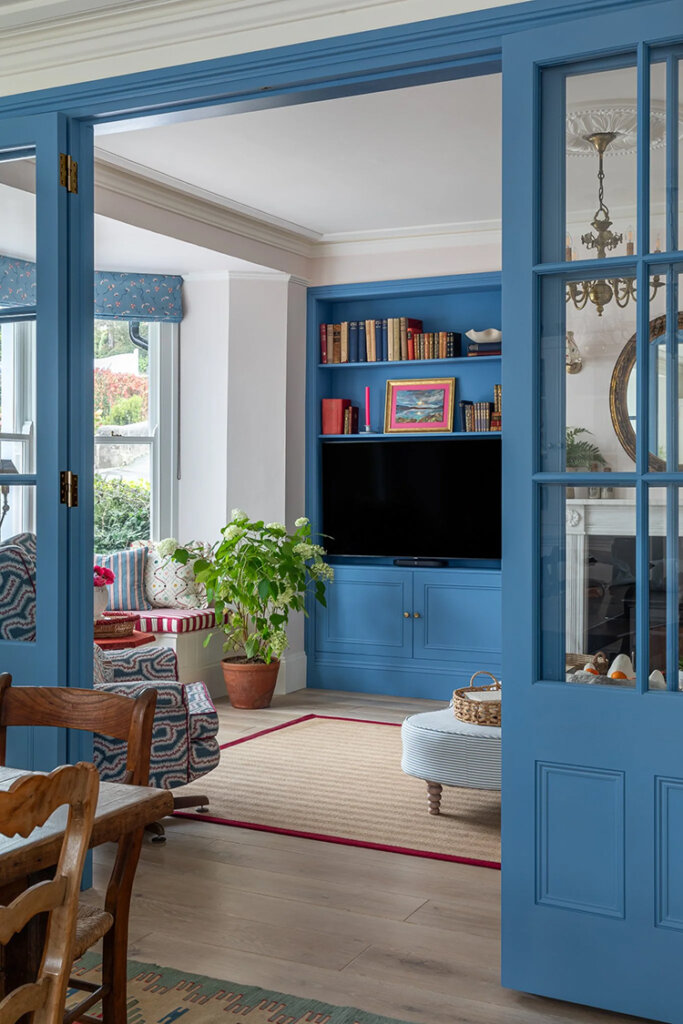
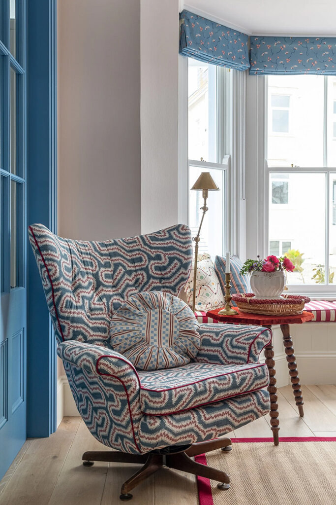
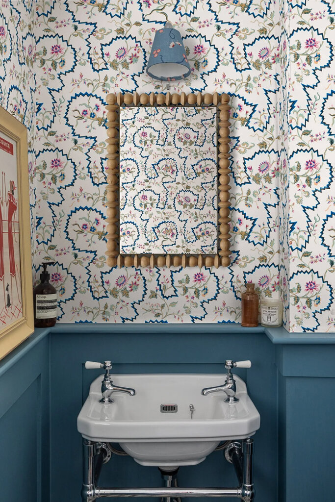
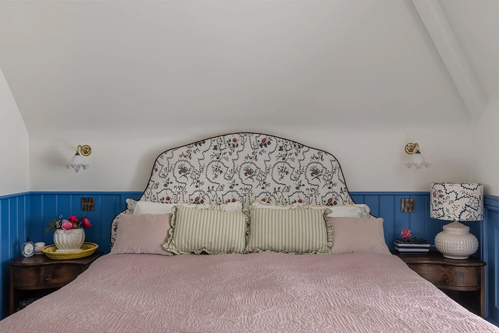
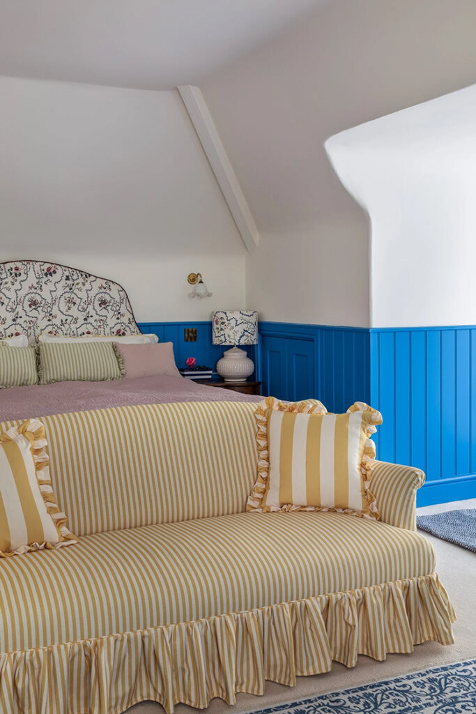
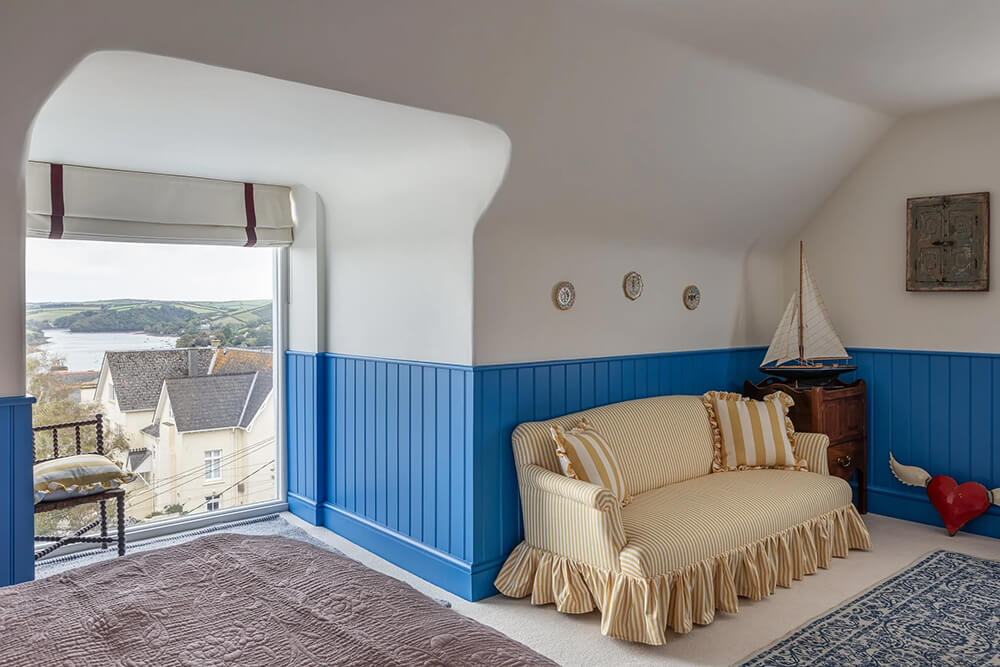
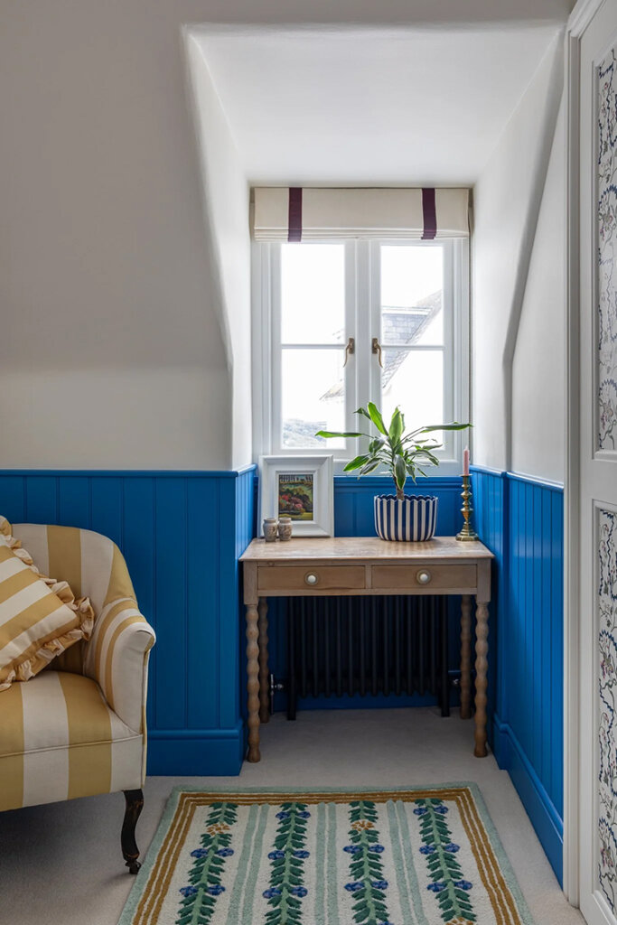
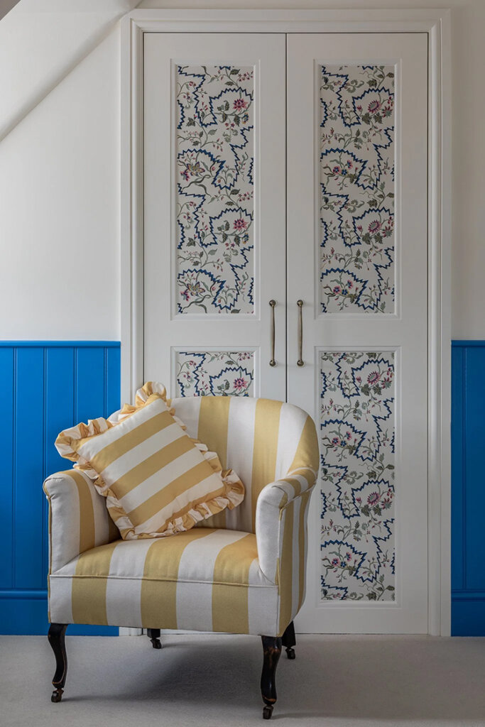
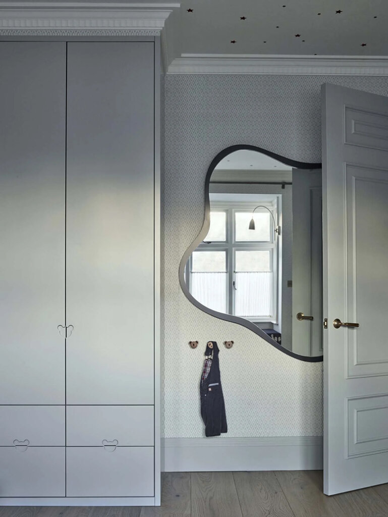
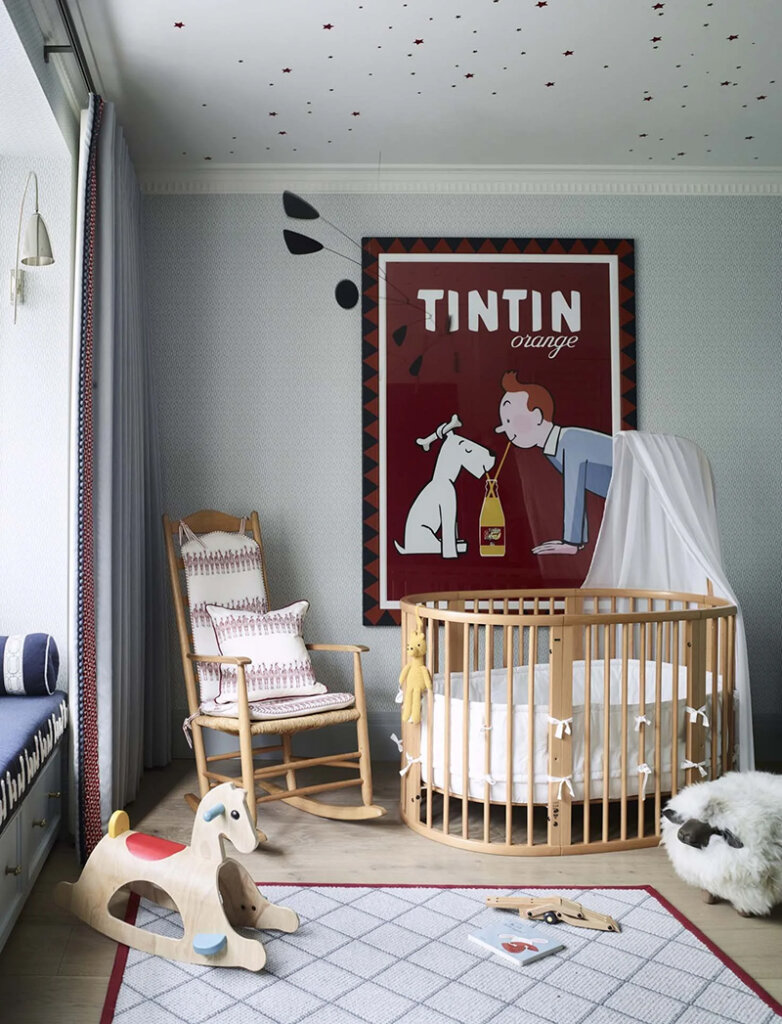
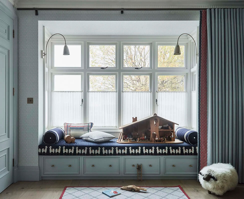
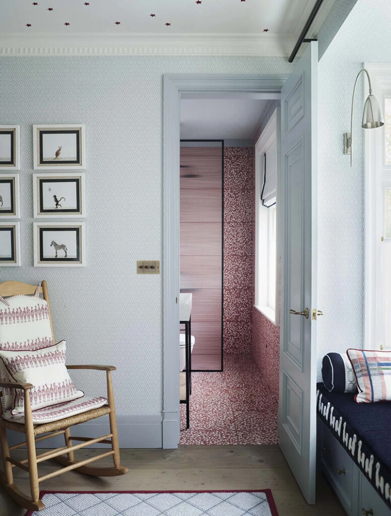
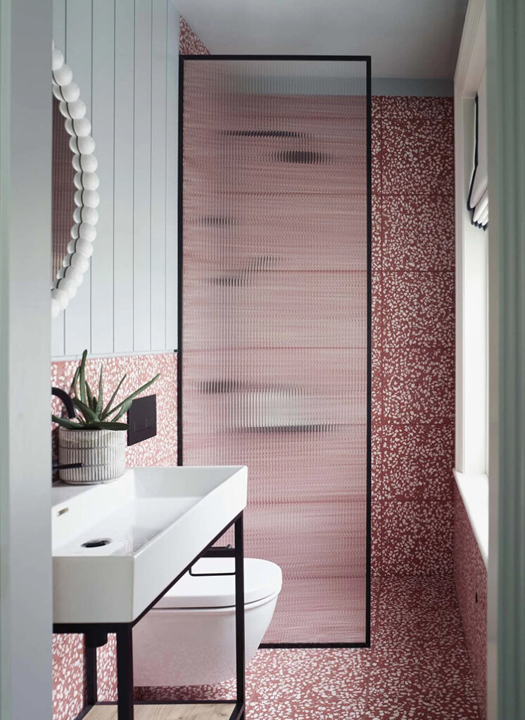
A bright, coastal cottage in Devon
Posted on Tue, 12 Aug 2025 by KiM
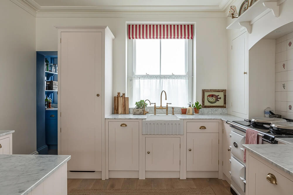
When you have views of the gorgeous coast of Salcombe, Devon it seems logical to go with a seaside vibe in this Victorian family cottage. Lots of white, blue, red and yellow and some really fun stripes, which I am always a fan of, makes this home really inviting and playful and brings the outdoors in. Designer Sarah Southwell really hit the nail on the head here. Photos: Jonathan Bond.
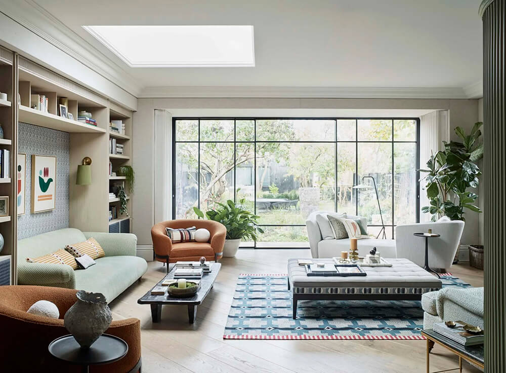
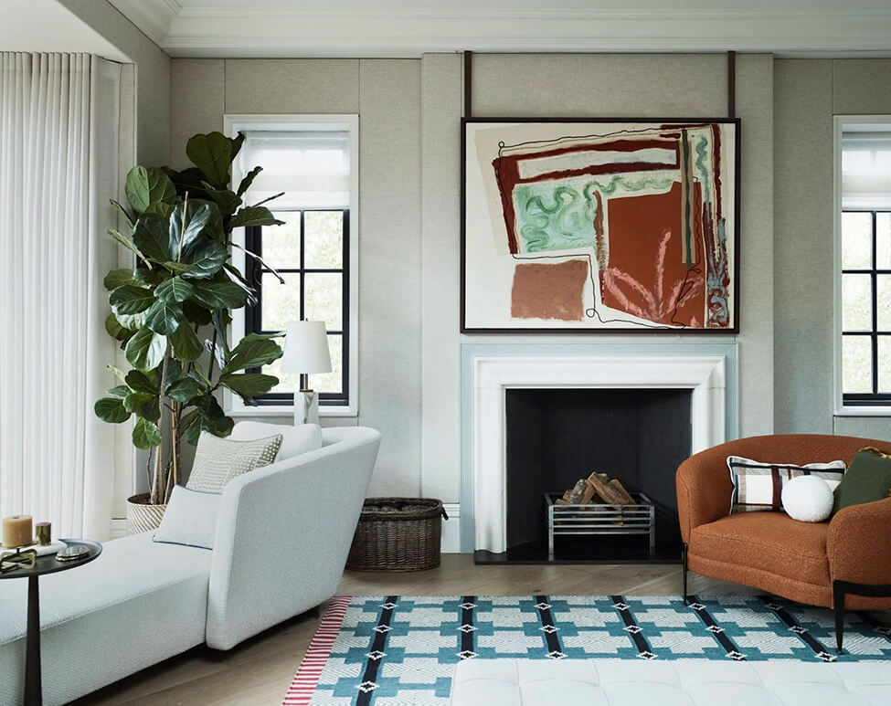
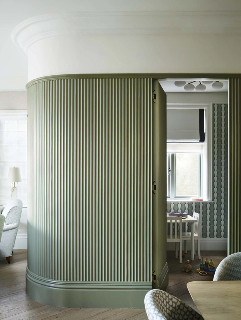
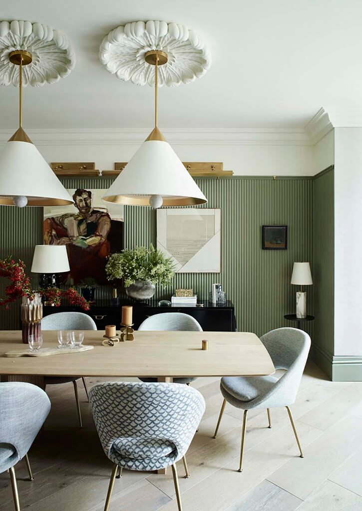
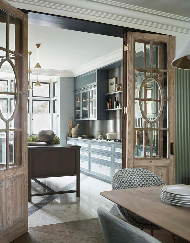
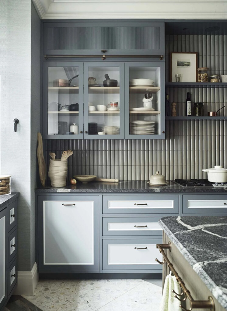
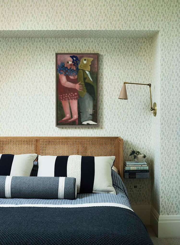
The contemporary family home of a designer couple in Wimbledon
Posted on Fri, 8 Aug 2025 by KiM
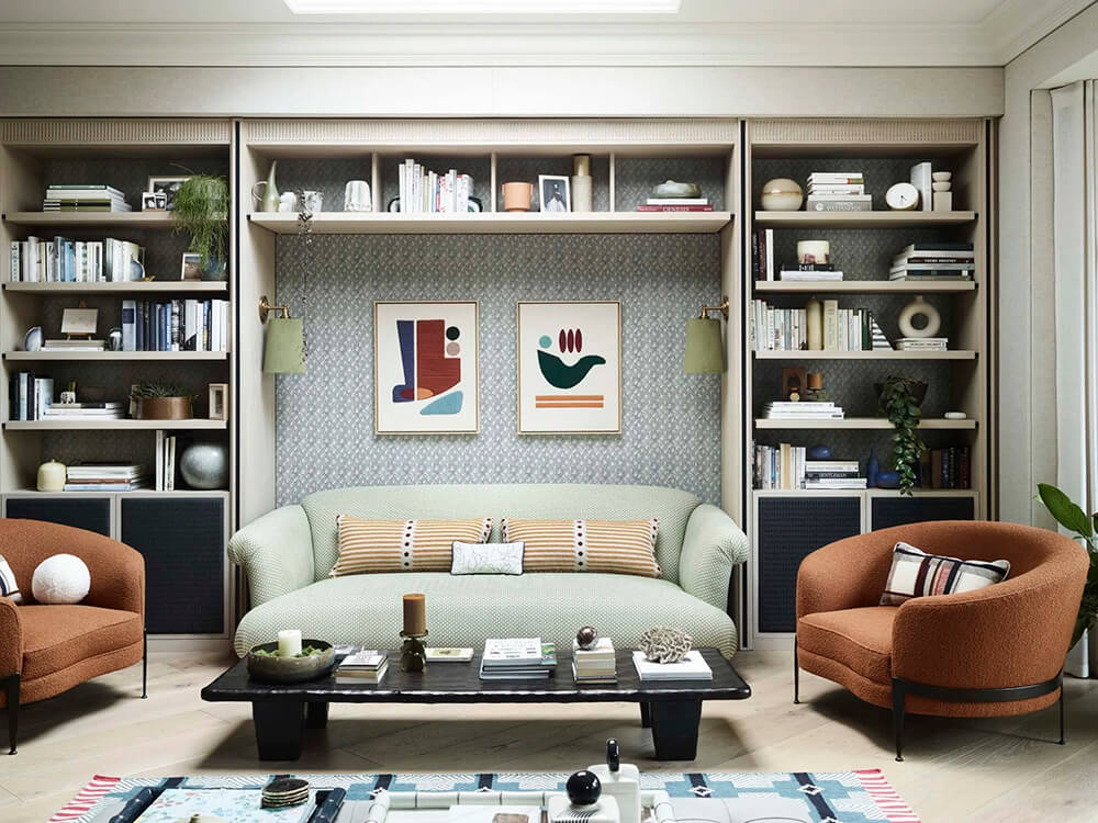
Without wanting to compromise on the design direction, a lot of planning time went into ensuring the house delivered on achieving next level design details whilst remaining a functional and liveable space for a young family, which has frequent children parties and playdates to contend with. We designed the house to be, for the most part, a peaceful haven for us to relax with family and friends in. One of the big requirements was we wanted to create a living room space that allowed us to look out towards a garden brimming with plants to provide year-round interest – this is where Irene had a lot of fun with the design. The traditional ‘front room’ was disposed of and in its place we installed a hard-working kitchen that faces the road, which allowed us to have a larger living room at the back looking towards the garden.
A beautiful home for a family to enjoy with lots of joyful colours, patterns and architectural details that really make this home thoughtful and special. Designed by Irene Gunter and Ian Hazard of Gunter & Co. Photos: Mary Wadsworth.
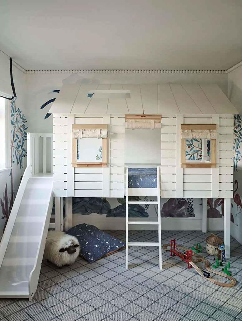
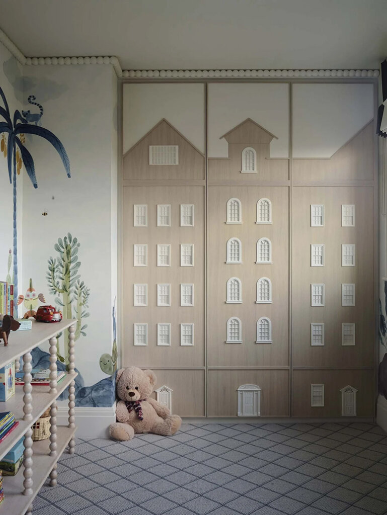
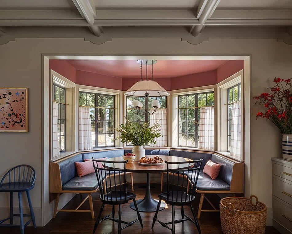
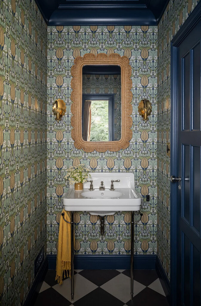
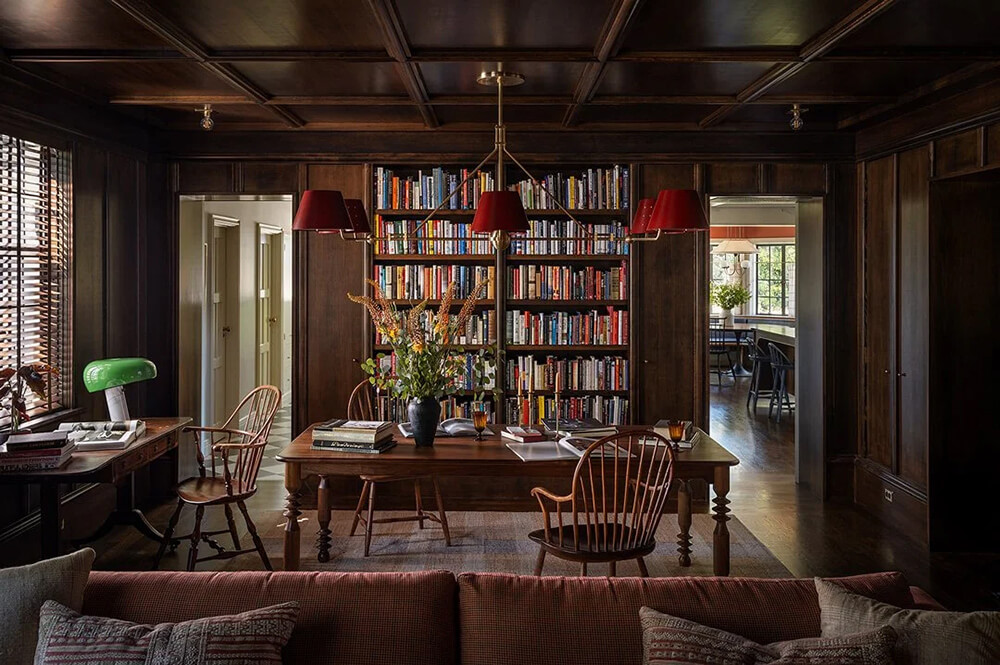
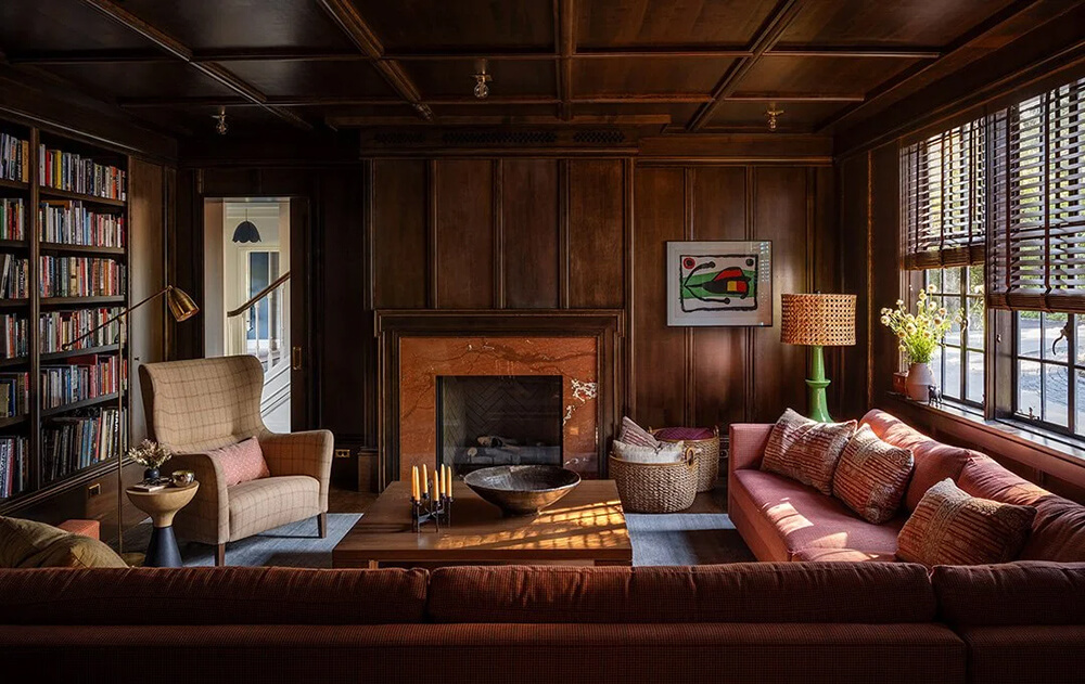
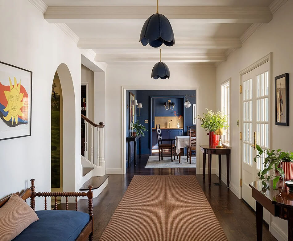
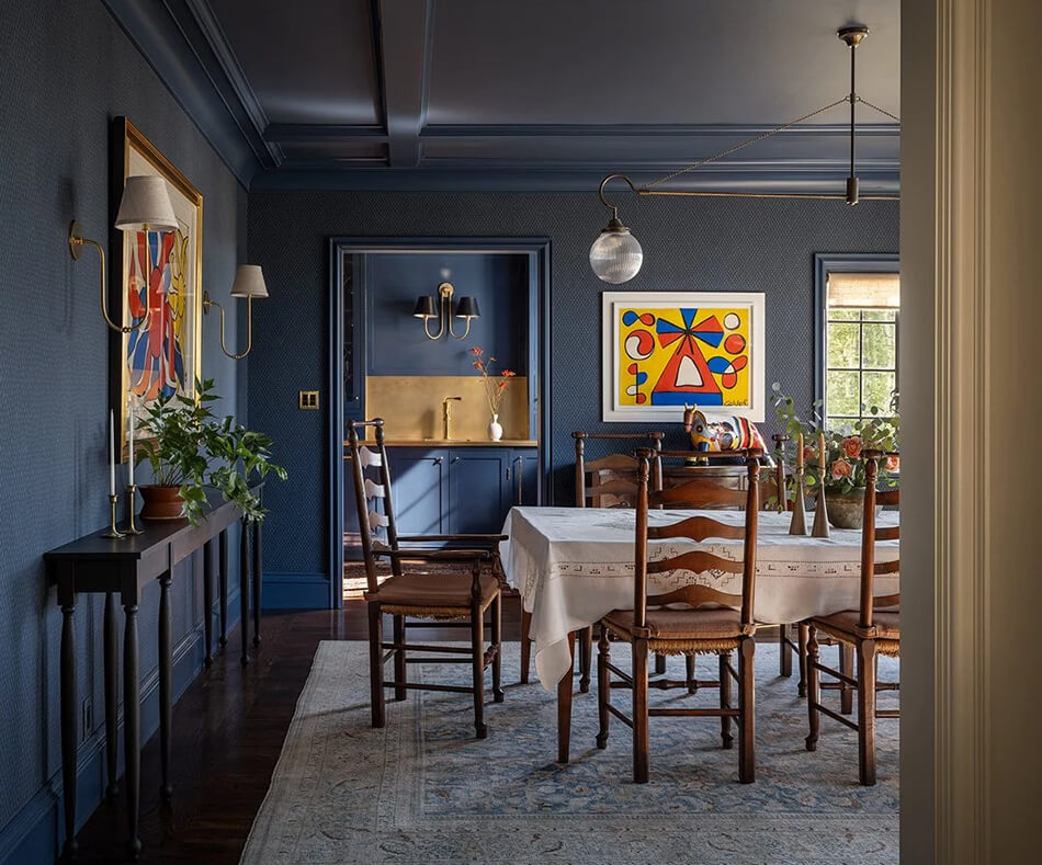
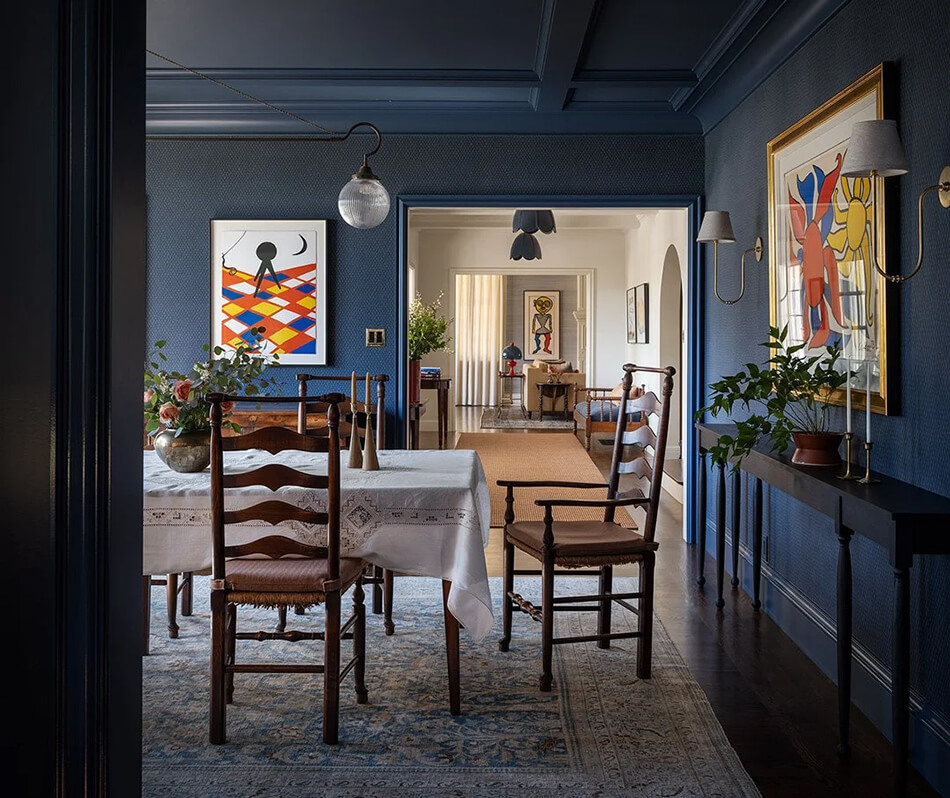
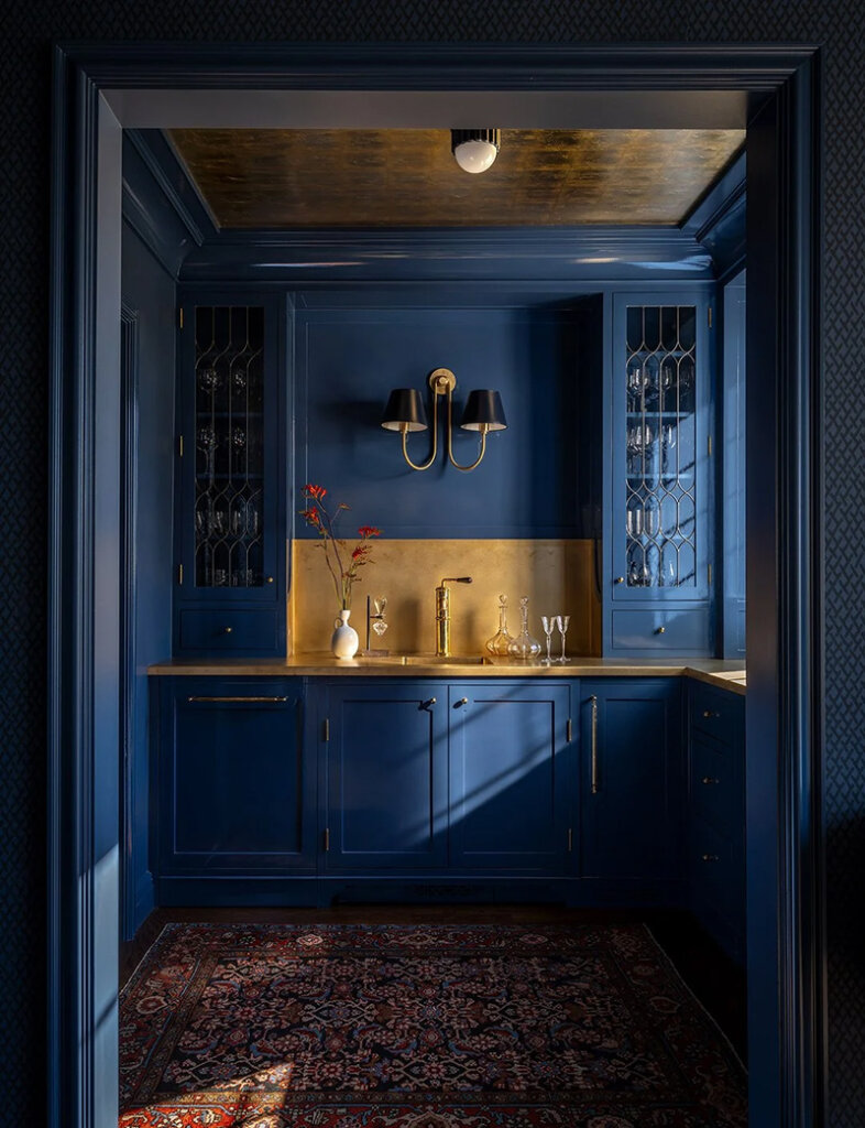
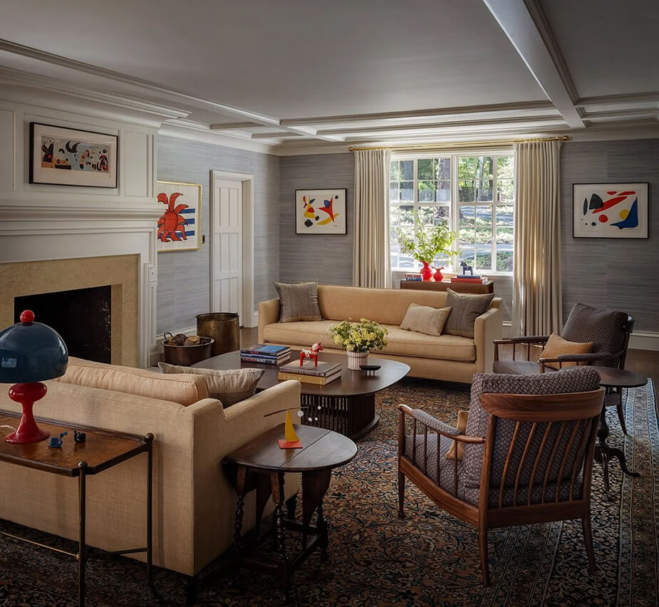
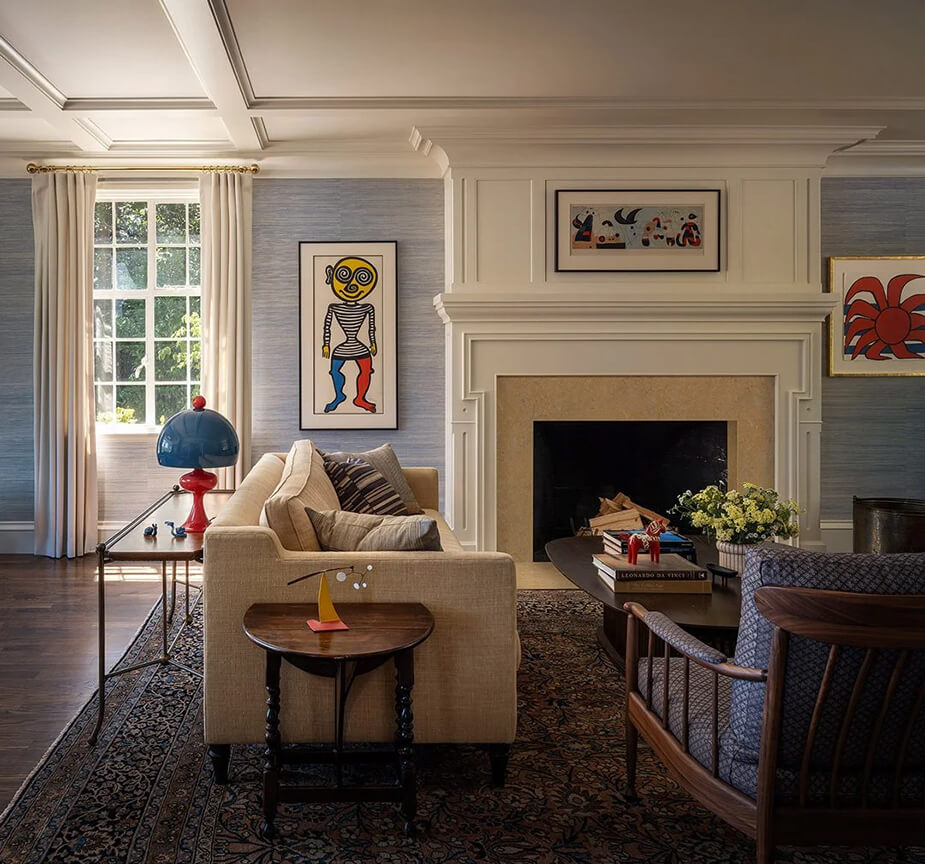
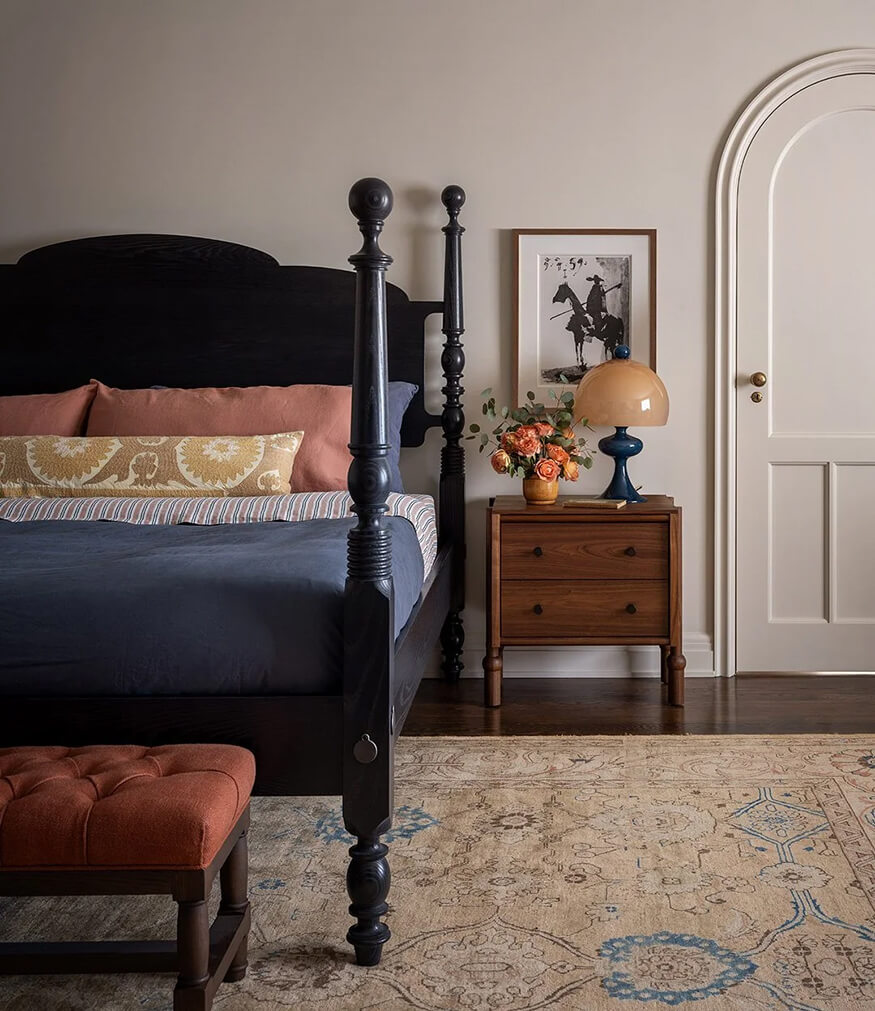
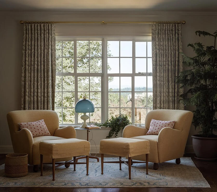
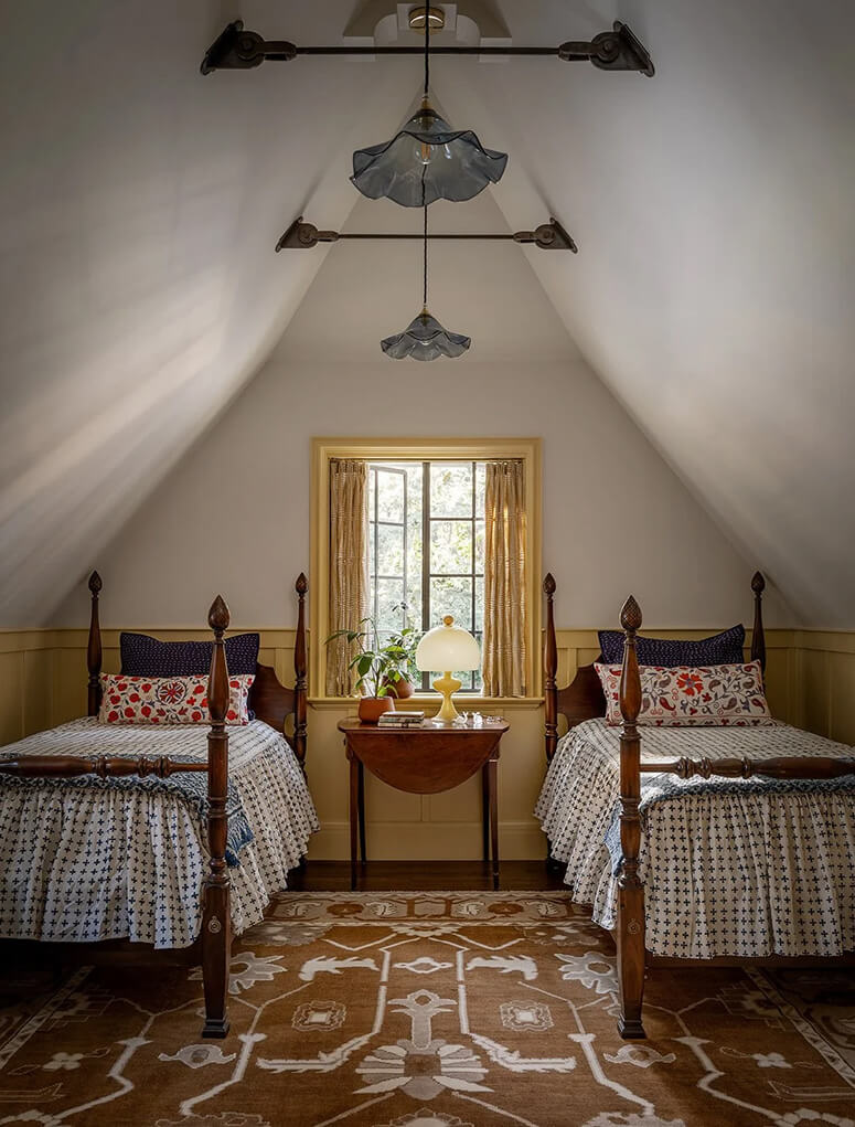
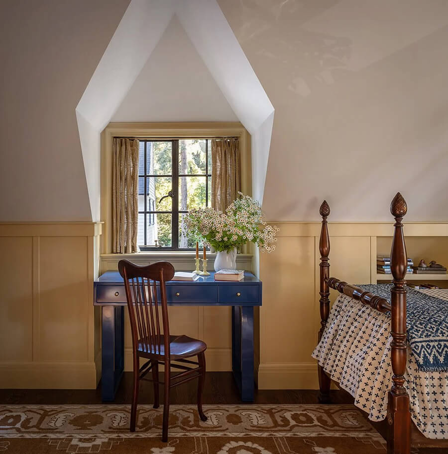
An early 1900s Arts and Crafts home with an impressive modern art collection
Posted on Wed, 6 Aug 2025 by KiM
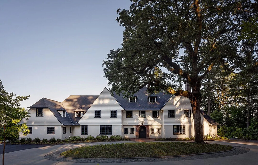
In addition to refurnishing the house, we also undertook an extensive renovation; adding a standalone three-car garage and converting the existing attached garage into a mudroom, a laundry room, a paneled-wood family room, and an expanded kitchen. Our clients, who had inherited an impressive art collection of primarily Calders, Miros, and Picassos, described their style as ‘East Coast preppy,’ and so we accepted the challenge of marrying that aesthetic with the bold, primary colors and forms of the iconic modern artworks. We developed an interior color and material palette in the reds, blues, yellows, blacks and whites of the art, but with each of those colors softened and muted. The result is a house that feels right for the art, right for the clients, and right for the house.
Jessica Helgerson does it again, creating some vintage magic in this beautiful home but somehow managing to work in this modern art collection and have everything make sense. I love how cohesive it all is by using those primary colours throughout (though in very manageable shades). Photos: Aaron Leitz.