Ethereal hue part 2
Posted on Fri, 11 May 2007 by midcenturyjo
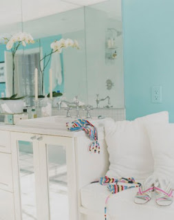
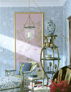
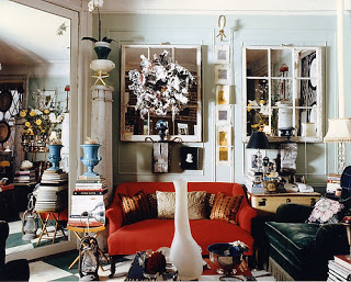
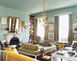
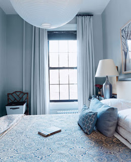
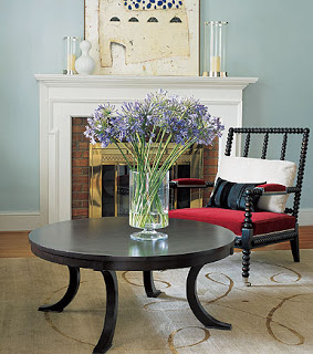
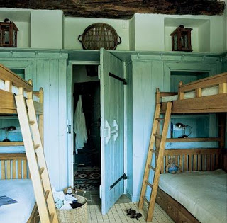
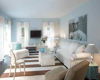
More of those faded vintage blues and greens. Can’t get enough. Cool and elegant they are evocative of the aquamarine of the sea or the delicate tint of birds’ eggs and lend a sense of airiness to a room.
Leave a Reply to Emily Cancel reply


kim. says:
So pretty!!! But what’s up with the art in the last pic??? (EEEEEK!!!!)
-Suzie- says:
This should be the colour for my bedroom at the sea (Palazzo Pizzo). And I like the chinese wallpaper panel (cost saving and still beautiful).
Have a good weekend in Australia and Canada,
greetings from Beijing
Emily says:
So many people are negative against celedon and seafoam green. While the latter is a little more drastic, I’ve always loved them. Thanks so much for featuring them!!
eric says:
i’ve always loved the blue bedroom from domino. the pink/chartreuse living room in the same apartment was nice, too.
** Terramia ** says:
Gorgeous post!
Alissa says:
The blue/grey bedroom from Domino was The Photo that got me interested in design. It feels Parisian and almost chilly to me … but it’s somehow ridiculously inviting and comfortable. I have it ripped out and pasted into my design notebook, and I can’t wait to try to replicate a similar ambiance in our new condo.
The Miles Redd one is impressive — it took me a good five seconds to realize the walls weren’t white. Now THAT is a ethereal hue.