The latest from SWAD
Posted on Mon, 24 Oct 2011 by midcenturyjo
I get so excited when I see an email from Australian architect Scott Weston in my inbox. He has been a regular on Desire to Inspire for quite some time now as he generously shares his latest projects. What gets me so excited though, is that not only are his projects so inspiring in their colour choices, storage solutions and great design, Scott generously gives us an insight into his design process, material selections, plans and models. The complete package. Today is no different. I’ll let Scott explain SWAD‘s latest work.
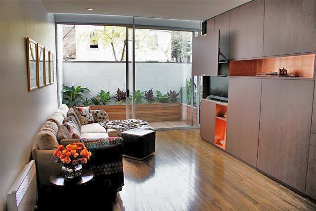
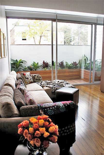
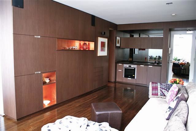
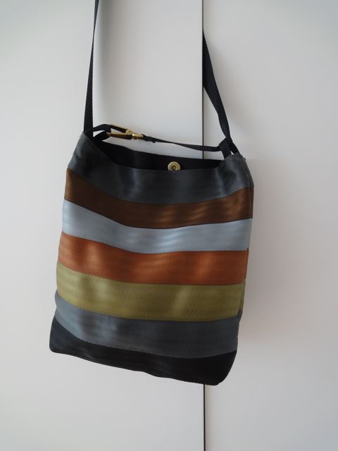
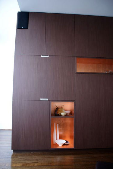
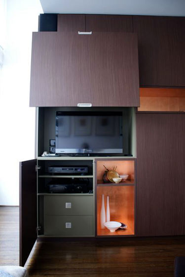
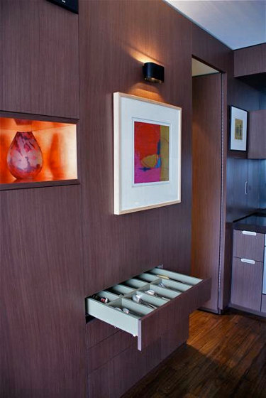
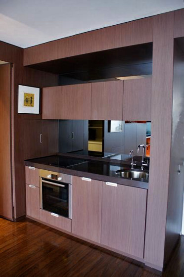
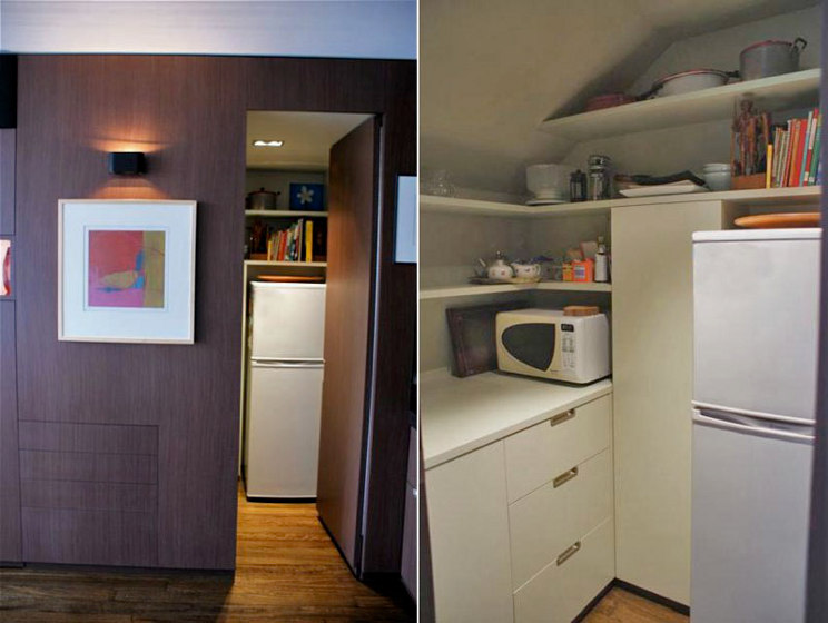
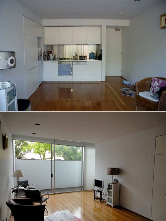
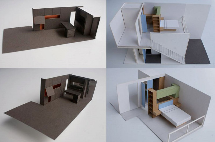
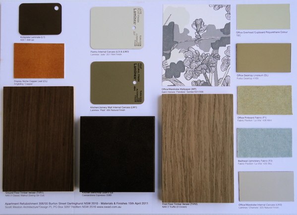
It’s been a while since I shared what we have been up to in SWAD world. We have just completed a 70m2 apartment in Darlinghurst for a female doctor who sold her house up in the blue mountains and is now living full time in the city. The existing apartment was ‘surprise surprise’ a cold white bland space devoid of any personality but had great natural light. The general colour scheme of materials and finishes was generated by the Client’s favorite colours as shown by the handbag with it’s walnut, powder blue, copper, olive green and silver grey palette. On the ground floor we designed a continuous floor to ceiling walnut timber ‘hero wall’ 500mm wide x 5626mm long that concealed everything. The bespoke cabinetry housed TV, stereo, speakers, flexible shelving, electronic push touch drawers and secret walk-in pantry all finished in a light olive green. To break up the scale and planar shape we inserted linear and vertical niches that were hand finished in copper leaf and reflect beautifully both natural and artificial light. The return end wall housed the kitchen wet area and appliances and we used grey mirror to reflect and give the illusion of greater depth to the room and reflect the new landscaped external balcony room. The pantry is a great exercise in planning and design and reminds the Client of being on board an airplane or ships galley with everything having it’s own specific place.
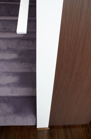
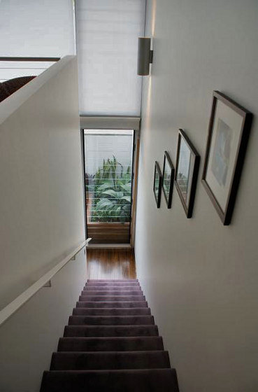
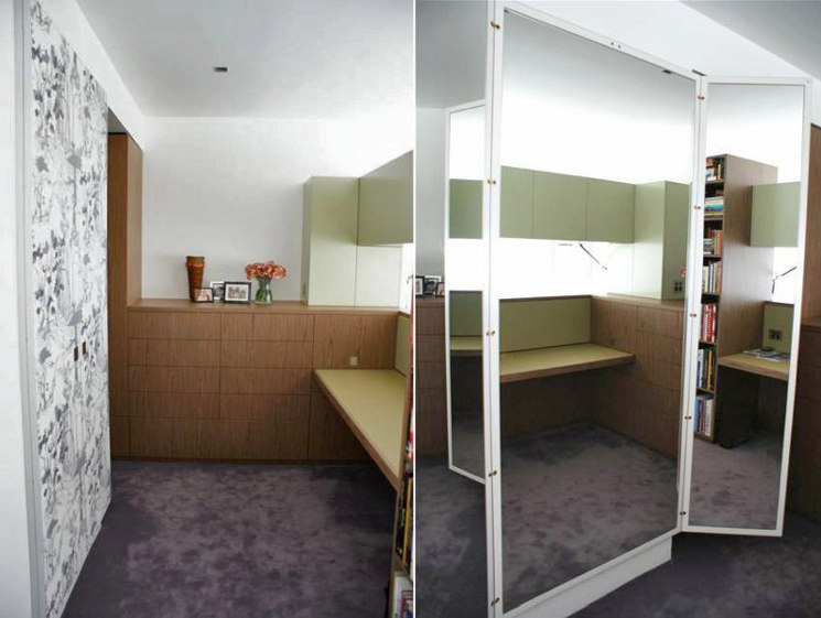
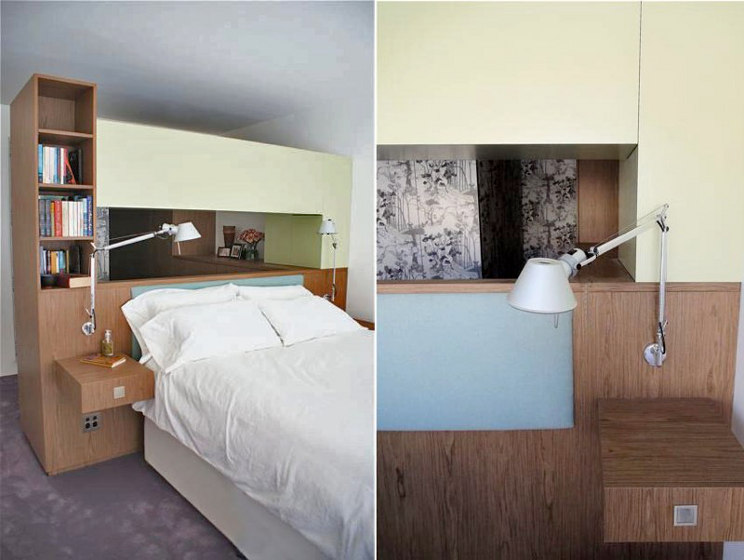
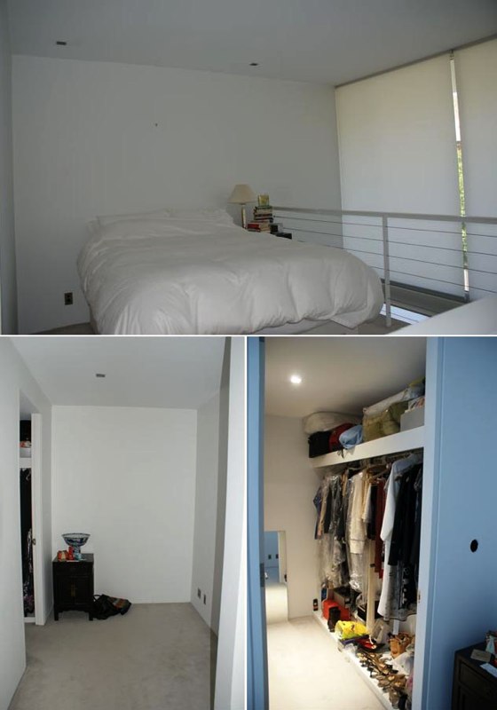
Upstairs the existing ‘white blandness’ continued with a bedroom, separate inglenook office and a rather dark and dingy wardrobe room. Walls were demolished and the entire room was opened up and the joinery insertions seamlessly defined the three functional activities of bedroom, office and robe. A light crown cut timber was used for the general robe wall and extended out to form the office and framework for the upholstered bedhead. A beautiful grey green hand drawn wallpaper with pistachio green overtones was selected to define opposing walls and to house a concealed triptych mirror and cupboards to the robe corridor. The office borrowed on the flavours of eau de nil with a desktop of powdery olive linoleum and a cashmere pinboard in a similar hue. Turning the corner there is a vertical library shelving system and facing the window the oversized king size bed with powder blue cashmere bedhead. Direct and indirect strip lighting creates great visual drama to the spaces and the finishing touch being the grey/lilac carpet that ties both upstairs and downstairs together very elegantly. The Client took a leap of faith about the lilac carpet as I said many a time convincing….. that if we did just brown carpet the whole space would become very flat and the visual interest would not be there. Very happy Client and a pleased Architect.

Leave a Reply to Scott Weston Cancel reply


Scott Weston says:
Thanks Jo for the post and this time if people would like to ask questions about the project I'm more than willing to respond. It would make it a great interactive discussion so let's see if we can create a comment dialogue! Over to your readers. SWAD PL
Lisa says:
I think the TV storage is genius and don't get me started on the hidden galley. Refrigerators out in the open always creep me out for some reason. I'm not sure that I could live in such a small space myself but I guess the two floors help. Taking away some good ideas here. Thanks Scott and DTI.
Lisa says:
Me again. I wanted to ask if that lifting system for the TV door is just the same as the ones you see in kitchen uppers? Something DIY-able?
Scott Weston says:
The gas lift mechanism is from BLUM hardware.
The fridge I agree with you as we can spend lots of money buying something fancy or having it integrated, but eventually it leaks, collects dust and then it needs to be serviced which can be difficult to remove and avoid the carcass being damaged. So to place it in a pantry out of sight yet within reach was a great solution.
I recently gave 30 design students a tour of the apartment and they had seen images beforehand but they were surprised as to how spacious it felt due to eliminating all the visual clutter and housing it behind walls of joinery.
Blondel says:
Where is the dining table? Does it pull down from the storage wall? I see one on the plans but not in the room.
gwyn says:
Modern yet feminine. Nice job. Love the wallpaper. Who makes it? Did you say hand drawn? Better not tell me because I will not be able to afford it.
yoyo76 says:
Cool wall of storage. I was wondering about the space being boxed in but you are right about the fact that reducing cluttter will help. As basically a loft/mezzanine studio apartment it is a clever solution.
Scott Weston says:
Wallpaper is from St Honore UK and is hand drawn as an image but is machine printed with a great roll price and great colourways.
Dining table is yet to come as the Client has just moved in and it needs to be circular in form rather than the fixed island originally shown.
That way is gives the space greater flexibility and we can inject an additional layer of colour and curvaceousness into the space via a detail or chair form and shape.