A jewel of a hotel
Posted on Thu, 16 Aug 2012 by KiM
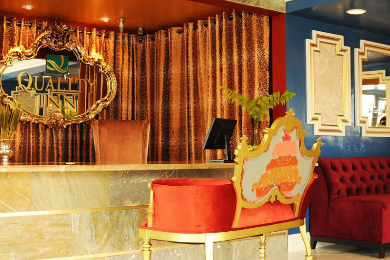
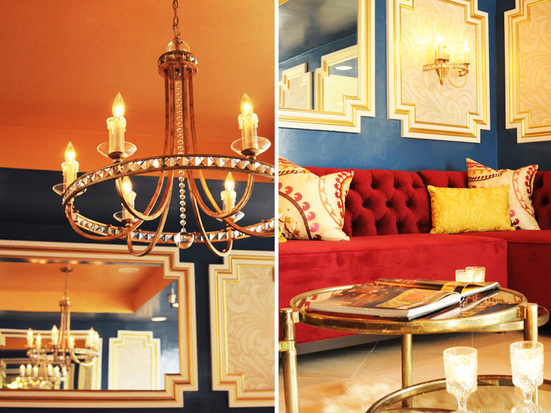
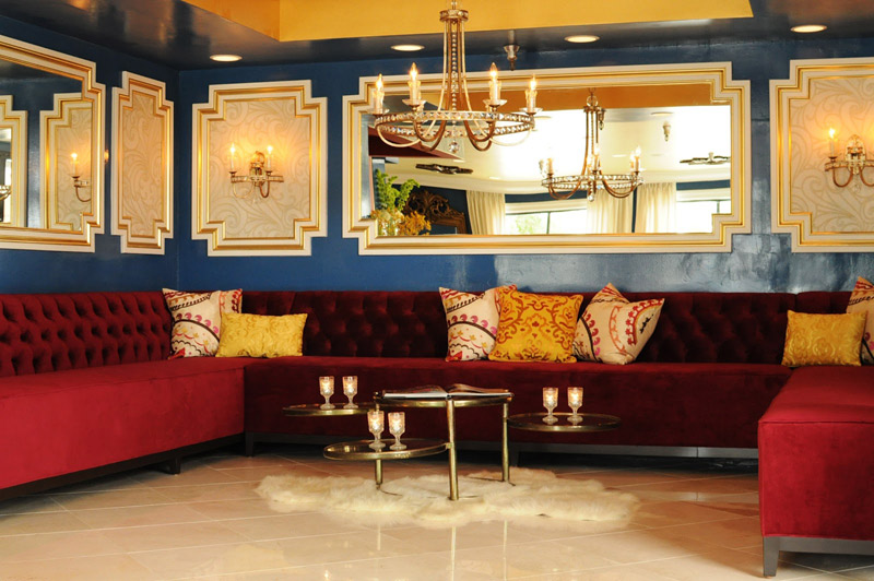
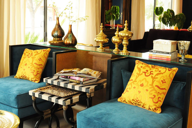
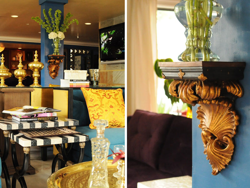
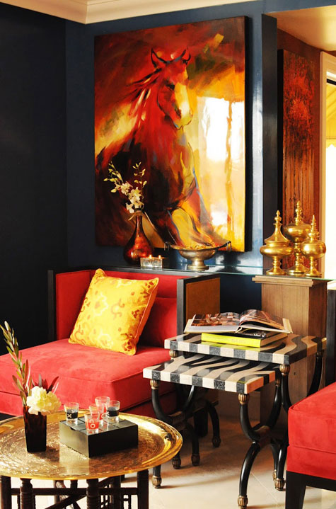
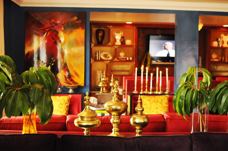
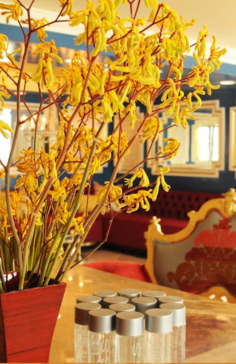
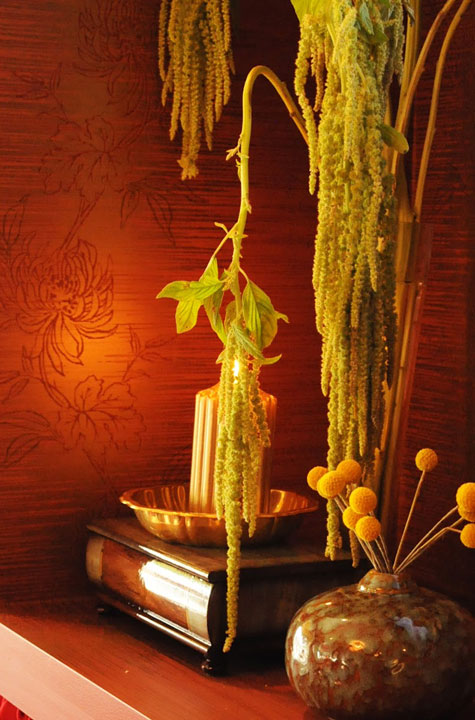
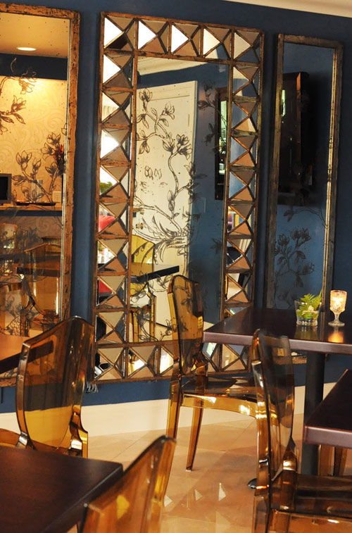
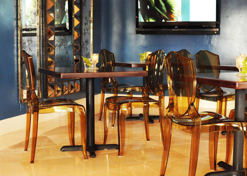
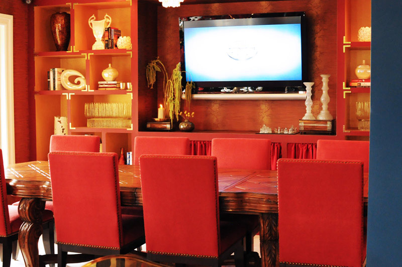
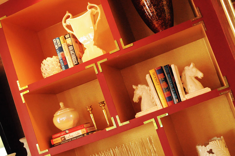
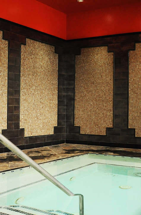
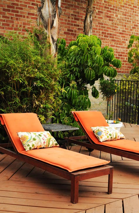
Check out this fabulous Pasadena hotel designed by Southern California interior designer Julie Khuu. I adore the jewel tones, and I love the idea of staying in a hotel whose decor is super glamourous and almost over-the-top – because I love the idea of spending time in a hotel that is on the opposite ends of the spectrum of home. (Anyone feel me here?) I’ll let you read the details on Julie’s blog and I’ll provide you with the eye candy. 🙂
Leave a Comment


Tina Ramchandani says:
Gorgeous hotel. The jewel tones really make the hotel look inviting.
oregonbird says:
Are you aware of how many entries lately have been primary colors? Do I object? NO, not at all… but it seems that whether it's a callgirl's hip pad, or a jewelbox of a hotel, or even a stark white flat — primary colors. In this incarnation, I like those chairs.
Allison says:
Are they affiliated with the hotels in kensington? They bear the same crest and eerily similar amenities.