A worker’s cottage reno
Posted on Fri, 7 Feb 2014 by KiM
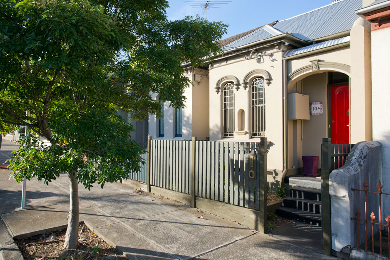
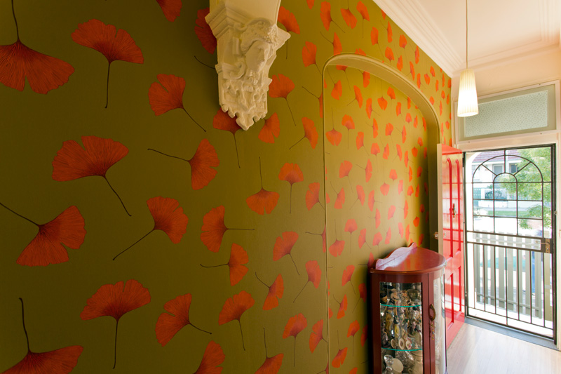
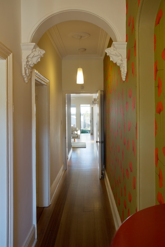
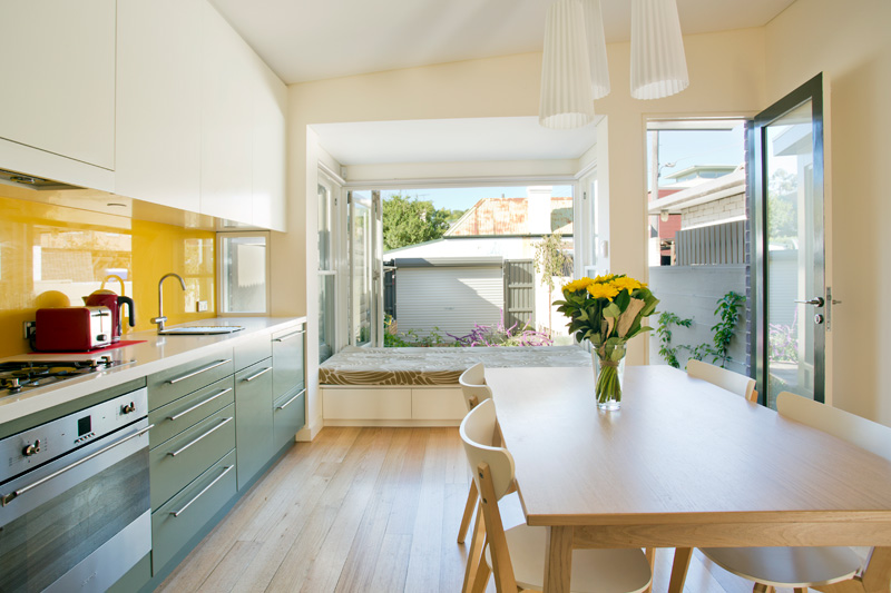
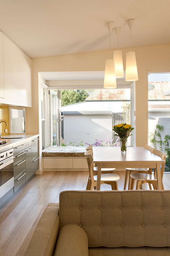
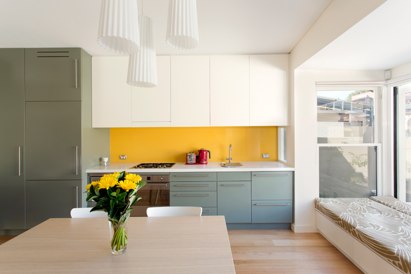
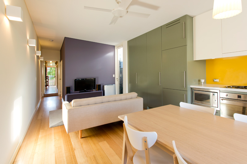
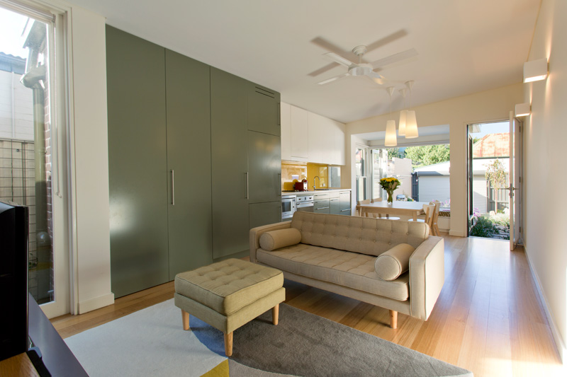
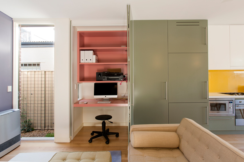
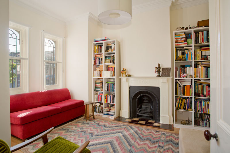
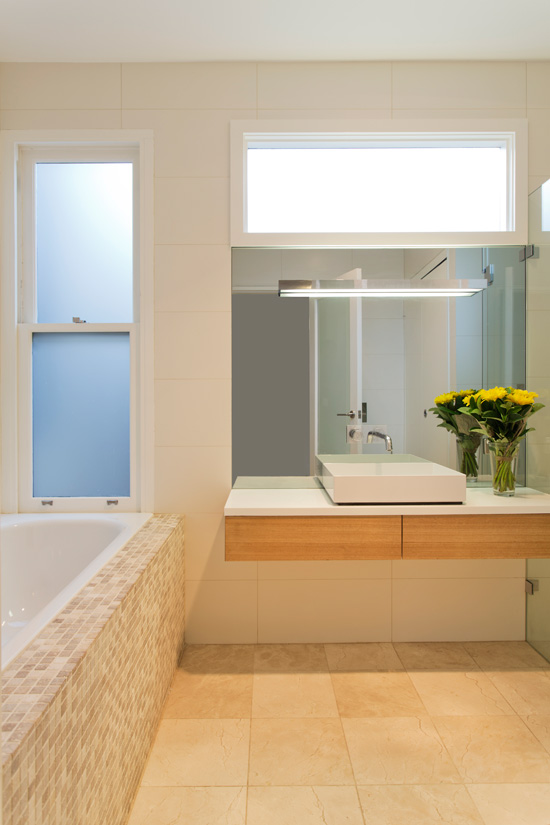
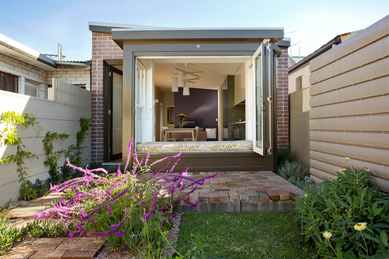
I shared this project by interior architect & designer Jessica Zavaglia, a little over a year ago. She emailed the other day to share another project she worked on with us. The residence is a 2 bedroom workers cottage in Enmore, Sydney. The front rooms were beautiful as is usually the case but the back was a series of small and oddly arranged and propertied rooms that had no relationship to the garden. The little bathroom was at the back blocking the living room from the garden. The owner and the architect after much deliberation made the decision to demolish the back of the house put to the 2 front rooms. This allowed us to completely rearrange the new rear extension the way it should be. Now the new bathroom is in the middle of the house and it has a separate bath and laundry inside. There is a large open plan kitchen dining living area that is a comfortable unified space. We incorporated a study into the joinery not to take up a bedroom and we kept the existing part of the house as more of an intimate space with rich wallpaper down one corridor wall. What a beautiful little home! The wallpaper at the entrance is a fun and bold way to kick things off, and the bits of colour through the main living space adds interest and is a simple way to delineate a space. And a smart touch – the tiny window in the office! Thanks Jessica! (Architect: Danny Broe Architect, Interior Architect: Jessica Zavaglia, Graduate Architect: Christina Sunario, Builders: AK&SB Construction, Photographer: Karina Illovska)


Sparky says:
Sweetissimo!
Evelina says:
I persoally don't like this one. Not my type of colors at all, except the living room with books.
Arianna says:
LOVE THIS!! Am curious to see what it looked like before??
Olivia says:
I think the use of color is well thought through. It's nice to see interiors that have a bit of 'WOW' factor and aren't so modern and minimalist. I could see myself living in this space!
Glenda Miller says:
Hi: The renovation in the back portion of the cottage with simple lines, excellent use of colour, and great use of space is inspiring. One of the best I've seen! Kudos to both architect and interior designer. The only thing I'd like added would be an entrance with a bit of space to hang outdoor gear and to provide a transition between the outdoor and indoor space. However, beneath the existing roof or budget, there may not have been any leeway. Glenda Miller