A red I actually like
Posted on Mon, 6 Jul 2015 by KiM
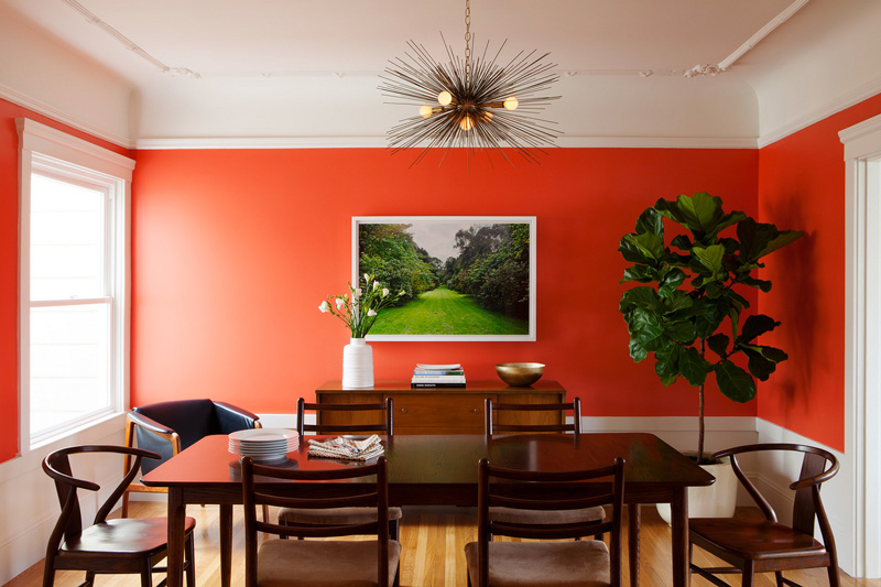
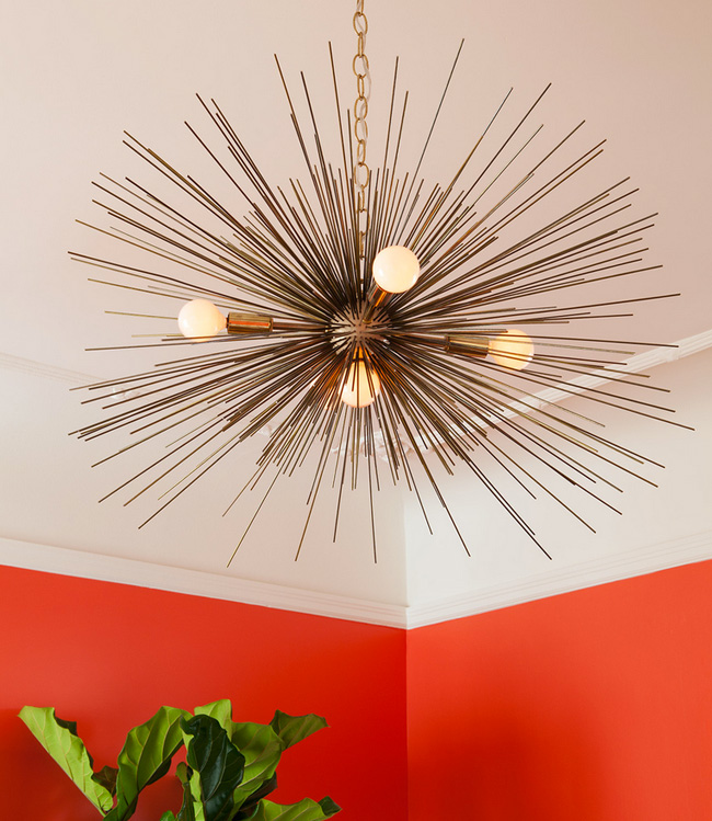
I dislike red in any application. This is the first time I have ever actually liked a red in an interior. Kudos to interior designer Christy Allen for finding this perfect shade – Benjamin Moore’s Soft Glow, a coral red with pink undertones. It’s stunning with the artwork and fiddle leaf fig tree.
Leave a Reply to Adriene Cancel reply


Ruth says:
I agree about red, and I really like this one! The green fiddle leaf fig tree pops out! Penny tile with blue is going in my faves folder. Thanks!
Rebecca Hasenauer says:
Yes!! That's a great red. I HATE most reds. They're just so obvious, and most look either dull or glaring. It's the orange undertones that makes a good red. The only time I've ever worn a red nail polish, it's been My Paprika is Hotter Than Yours. Orange undertones!
Siobhan says:
That looks like orange not red to me.
Sparky says:
This "red" looks much like the color I painted my front door and dining room wall. 🙂
Caroline says:
I love how it becomes light from the sunlight coming through the window. The shade of red is indeed softer.
Adriene says:
Well, I love reds, and have a lot of reds in my house. My bedroom is red. But this, I'm pretty sure is orange.
KiM says:
red…orange…whatever you want to call it.