More pattern play from Widawscy Studio Architektury
Posted on Tue, 8 Sep 2015 by midcenturyjo
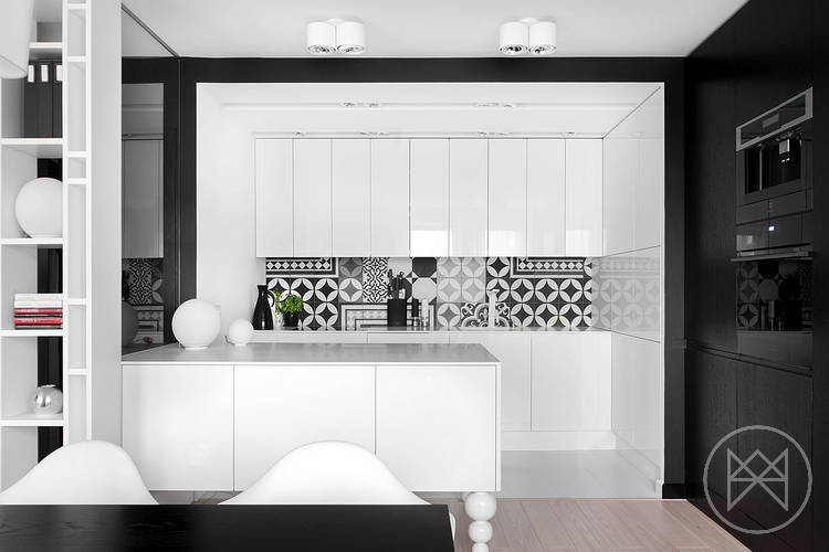
Black, white and pattern. A seriously stylish, modern kitchen with adjoining dining by my new favourite Polish design firm Widawscy Studio Architektury.
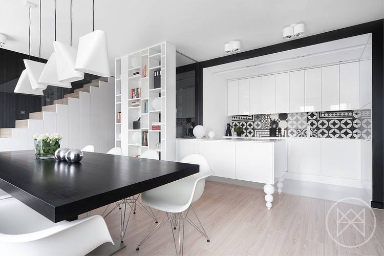
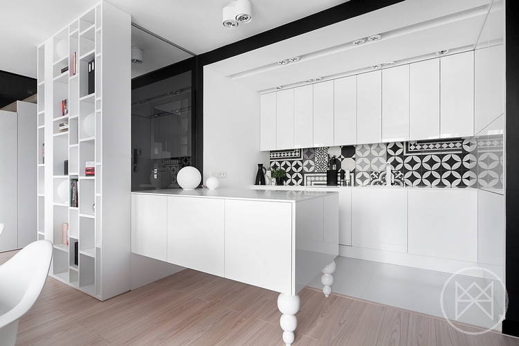
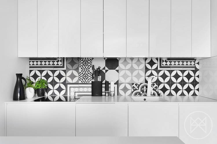

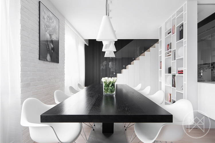
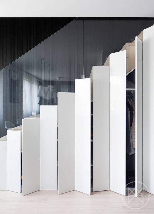

Black, white and pattern. A seriously stylish, modern kitchen with adjoining dining by my new favourite Polish design firm Widawscy Studio Architektury.


Maja says:
Polish design is the best 🙂
maya says:
Lovely space but the design is too conservative, too straight laced. I prefer (although it is still missing that 'something' that makes the space memorable) colourful interior. from the earlier post. At least there, the colour scheme is sophisticated; here is a no brainer, classic, and slightly veering towards predictable, white and black combo.
d of dogland says:
What's missing? Anything that isn't BRAND NEW! It lacks the warmth of a few well-loved treasures, natural items, antiques, etc…
As-is it's too cold and sterile.
aatma says:
Lovely lovely lamps!