A British period home
Posted on Sun, 20 Dec 2015 by KiM
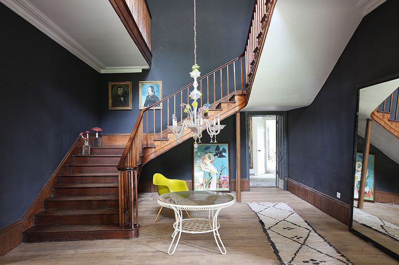
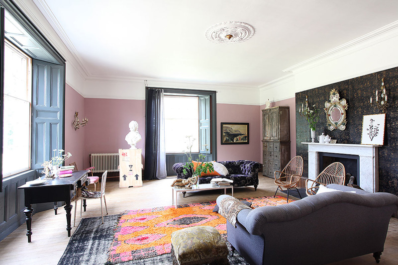
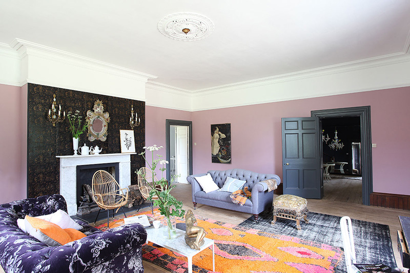
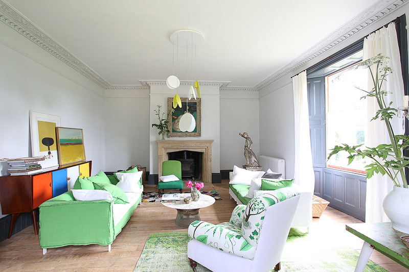
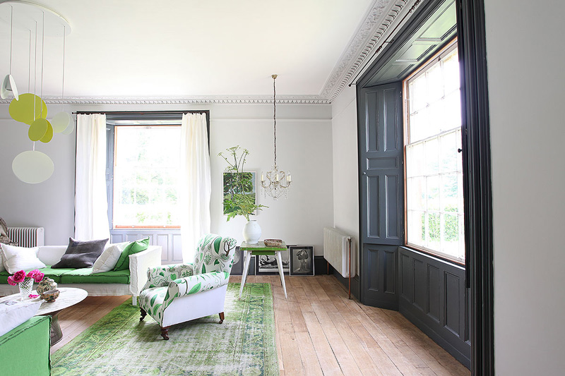
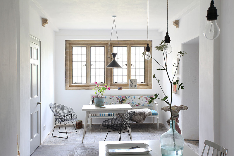
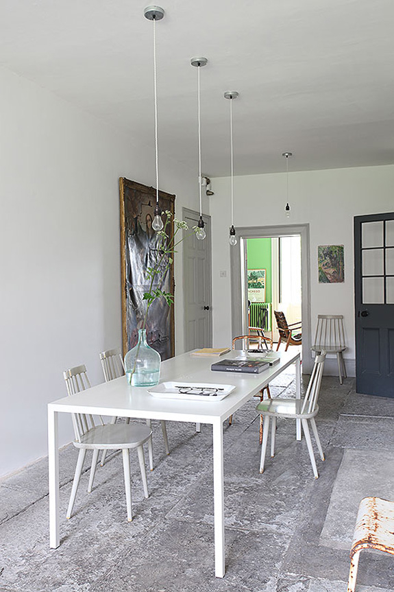
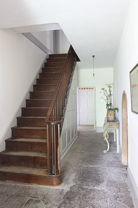
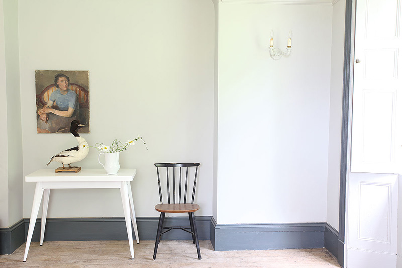
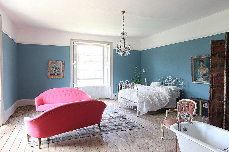
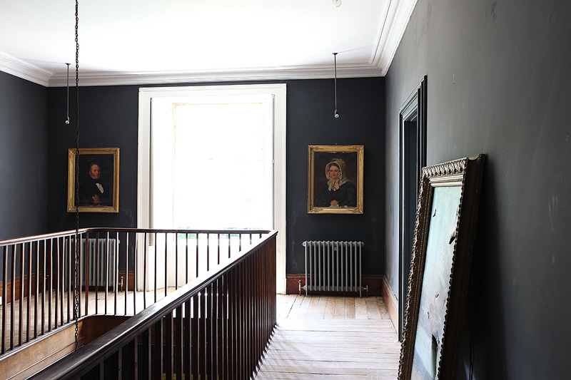
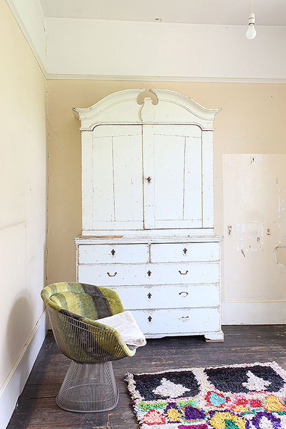
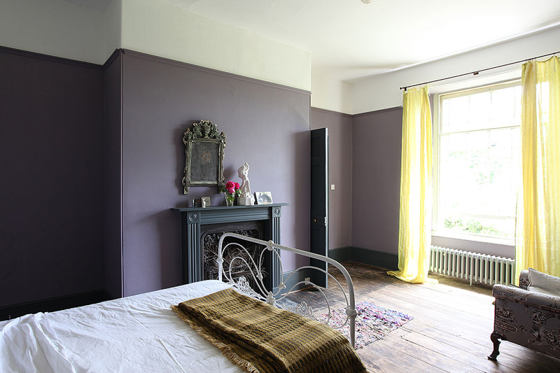
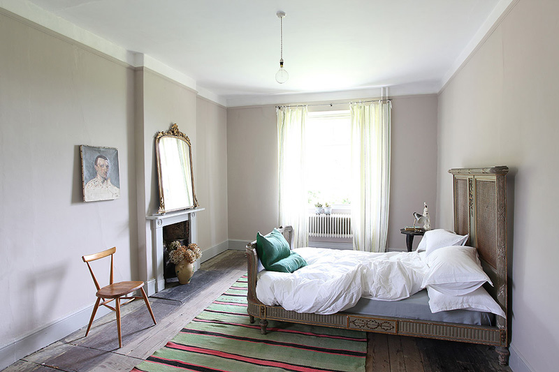
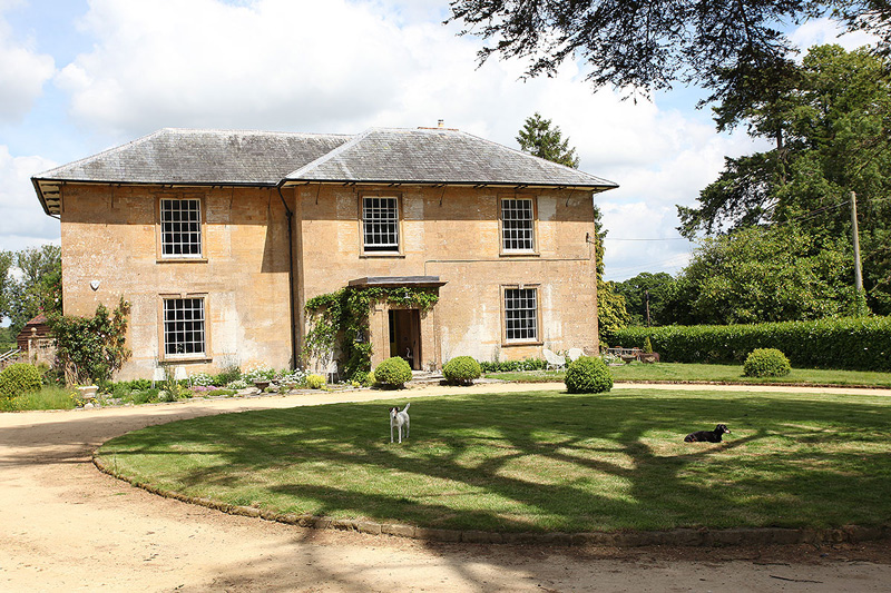
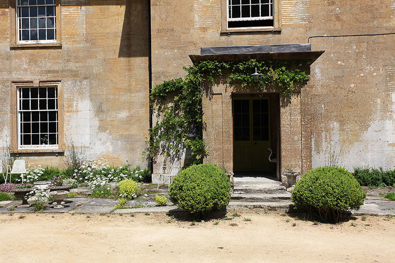
It is the last weekend before Christmas and I have a million and one things I need to get done today because my holidays don’t start until Christmas Day. To avoid a panic, I am attempting to lose myself in this gorgeous period home located in the UK and available as a location home via Light Locations. A random mix of decor styles, it is clear this is a home whose stunning architecture (and large spaces) lend itself to anything you can throw at it. I really wish though that someone had of put a bit more thought into the lighting. I am over bare bulbs and some more sparkly chandeliers (or anything else) would have been stunning here.
Leave a Reply to Carol Cancel reply


Sparky says:
Cute dogs. :o)
Carol says:
Nice wall colours. I approve.
lulu says:
This is definitely not in London! Somerset is deepest rural South West of England.
KiM says:
*sigh* – fixed!
Blanders says:
There's a test I like to apply when assessing a design within gorgeous old architecture like this – if I shifted the furniture, light fittings, wallpaper and paint colours en masse to a 1980s suburban tract home, would it still look good?
The answer here is mostly no. It'd look like a jarring, lazy, colour-blind mess. Truly good design looks good in a bland suburban house… and spectacular in a period mansion.
Monika says:
Stunning bones! Adorable dogs. But… facile trendy takes do not good design make. This is the first time I have ever found a Murano chandelier to look misplaced and inappropriate. Oh, what Ilse Crawford could do with this place!
Lucy says:
I couldn't agree more about the lighting, Kim. The first thing I noticed in that beautiful living room is a CAP on the medallion and no chandelier! And the second thing I noticed was that I would prefer no lighting in the living room to the other stuff throughout the house that just does not work. Sigh.
gold_coaster says:
I think the comments are a little harsh … there's beauty in each space … thank you for posting.
Earle says:
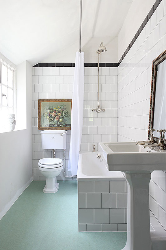
Gosh, I thought the comments were harsh as well. I saw many things that I liked. I liked the spareness and juxtaposition of many of the elements. The 'hanging light bulb' pendants I'm not a fan of, and a new trend that I don't love but is ubiquitously used, however that was not a deal breaker for me. There were a couple of trendy things I'd minus out, and I would definitely hang a chandelier/pendant under that lovely ceiling medallion. Overall though, I loved the green LR and furniture placement, loved many of the furniture pieces (esp. that white hutch-yum!!), loved the classic black/white tile bath, and of course, loved those pretty little cherry-on-top dogs in the yard. I thought it was pretty/fun/interesting and non-ordinary.