Vardo by Farrow & Ball
Posted on Fri, 12 Feb 2016 by KiM
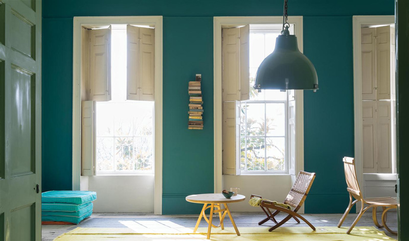
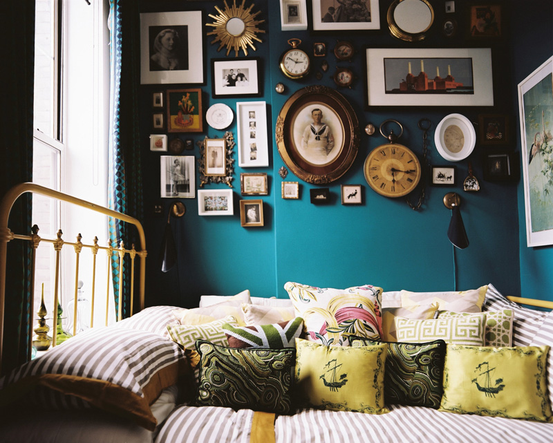
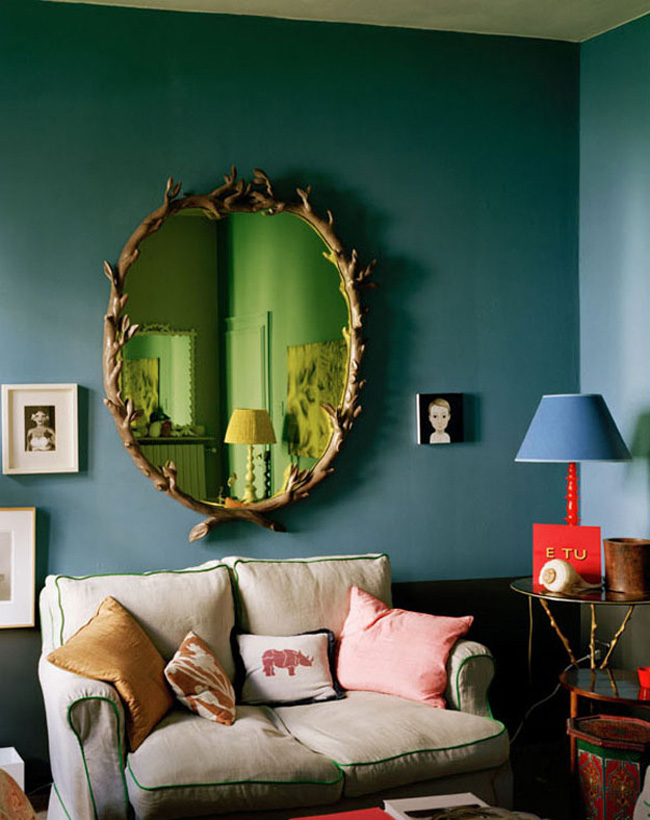
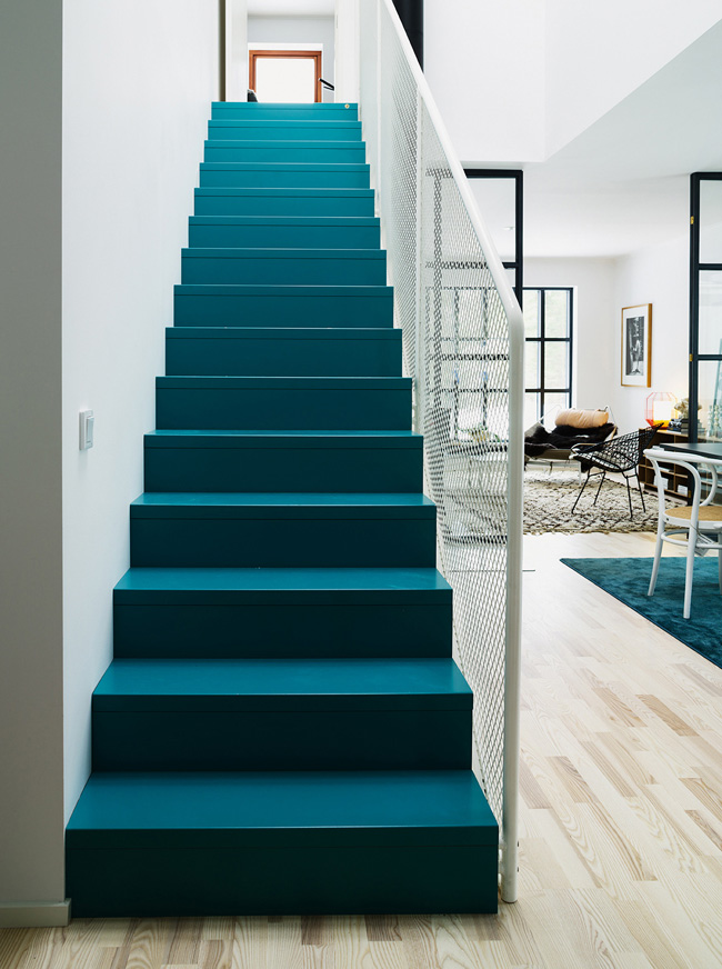
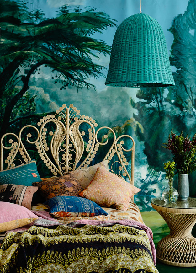
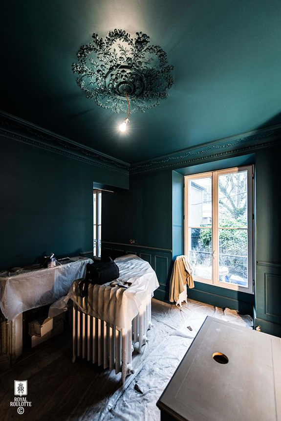
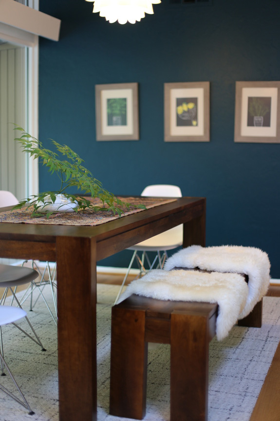
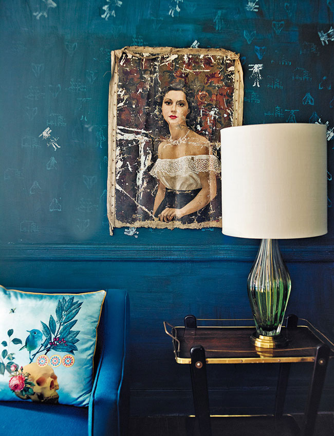
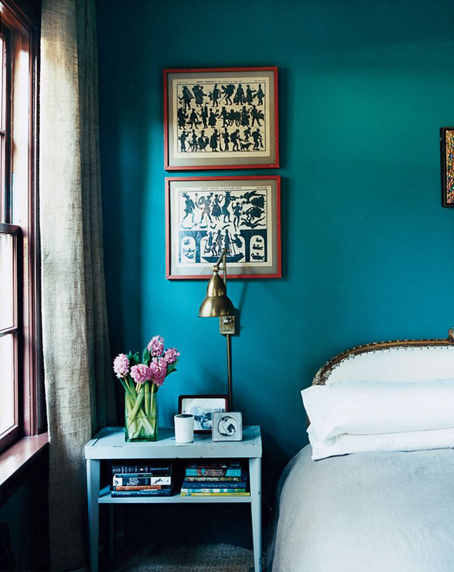
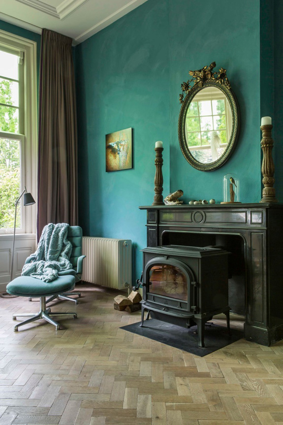
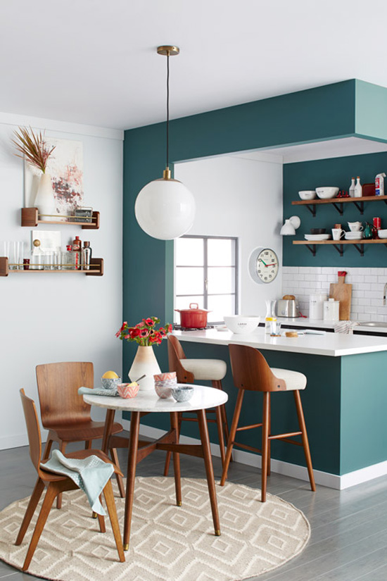
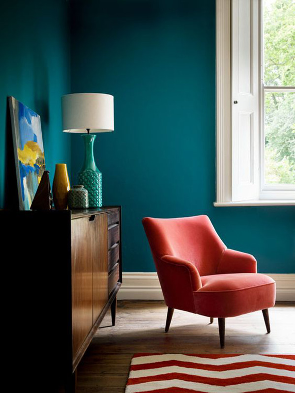
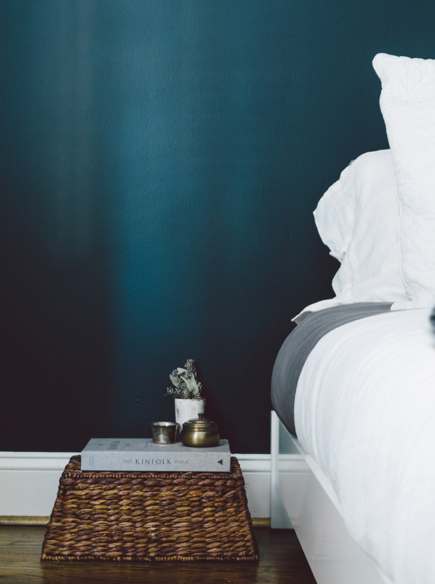
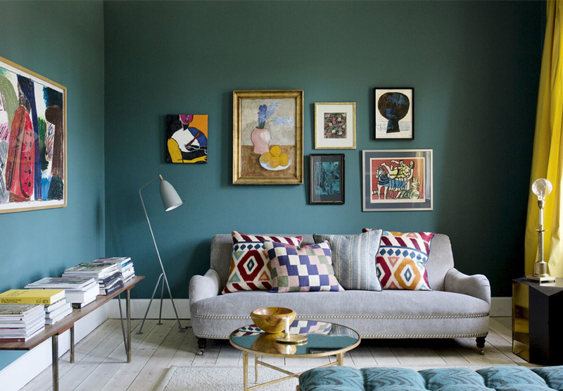
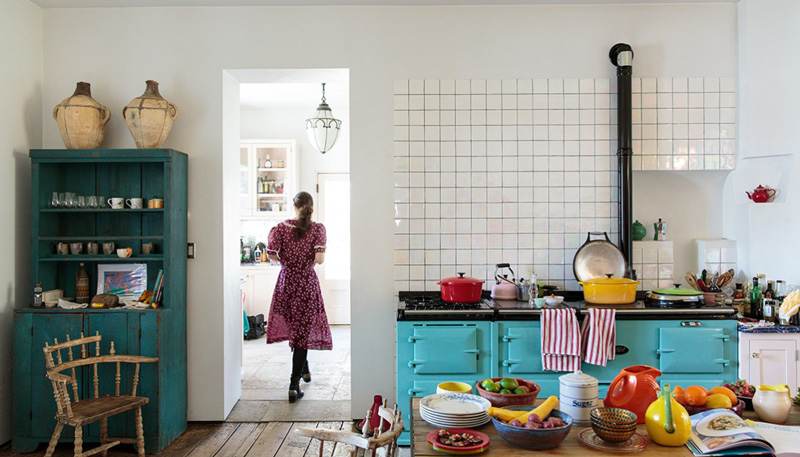
Vardo, the teal that Farrow & Ball never had…UNTIL NOW. If I wasn’t hung up on pink for my dining room, this would be the colour I would use. I find teal shades can be hard to get right. They are either too blue or too green or too bright. Vardo is the prefect mix of blue, green and grey. I may be obsessed with it. I would love to see it on a front door. So I went looking for some Vardo inspiration and here is what I found….
Dirk Jan Kinet via Architectectural Digest Spain

Leave a Reply to Farrow And Ball Oslo – THEOTHERSIDEWITHCHARLES Cancel reply


julia-tagandtibby says:
Um, I love this color! I tried to do turquoise in my dining room but couldn't find the right shade. Saving!
Taste of France says:
It's very beautiful. However, two points: (1) I doubt many people get dragged in to work on weekends in Oslo, where work-life balance is pretty sacred, and (2) one would think twice before wearing a skirt in a place with glass floors!
Farrow And Ball Oslo – THEOTHERSIDEWITHCHARLES says:
[…] Vardo by Farrow & Ball – Desire To Inspire […]