My dining room got a makeover
Posted on Wed, 14 Mar 2018 by KiM
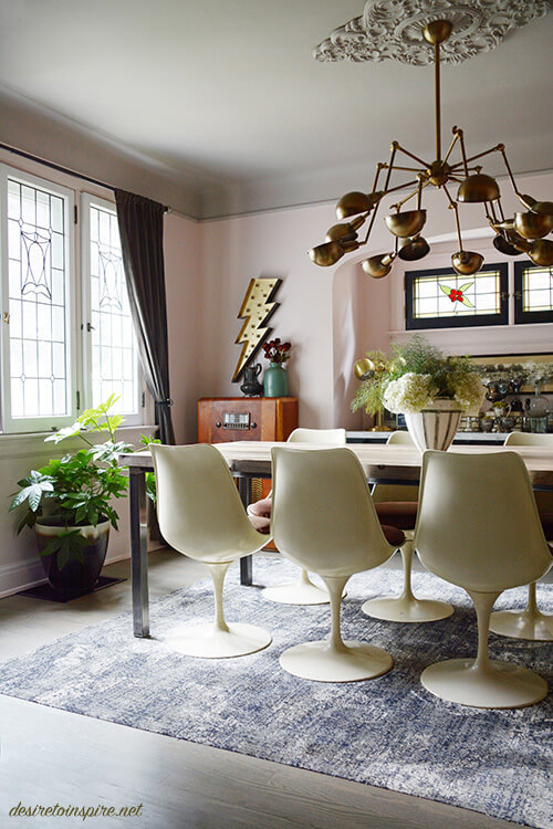
When Christmas was over I was itching for a house project. I wasn’t looking for anything major as I only had a few days to really get into it before the new year, so I decided to give my dining room a makeover. I wasn’t really feeling the colour scheme I had gone with of grey/taupe and pale pink. I found it a bit cold and lifeless, especially when I love cozy, dramatic dining rooms. And since my dining room can be closed off from the rest of the house I knew I could go with something bold. I’ll start with a before photo. And for those of you who lean towards subtlety you may prefer this to the after. 😉
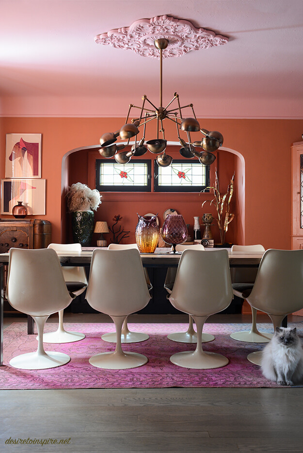
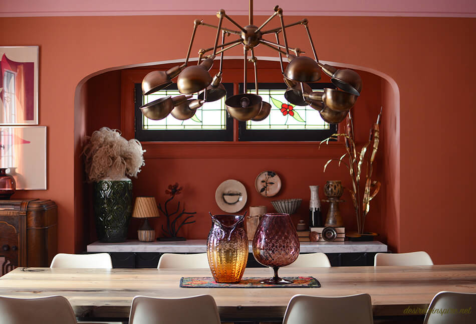
I went looking through Farrow & Ball colours and kept going back to terra-cotta shades. They seemed so warm and inviting. So I went for it! I did a bit of a random colour scheme of pink, terra-cotta and mustard. 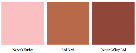
I thought this room could use some dramatic curtains, and thought some crushed velvet in a mustard shade would do the trick. After a bit of digging on Etsy I found the most incredible set of very heavy, vintage curtains that were absolutely perfect. (I’ll include sources for everything at the end of the post)
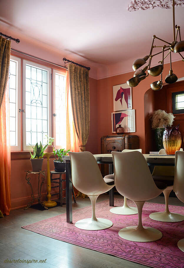
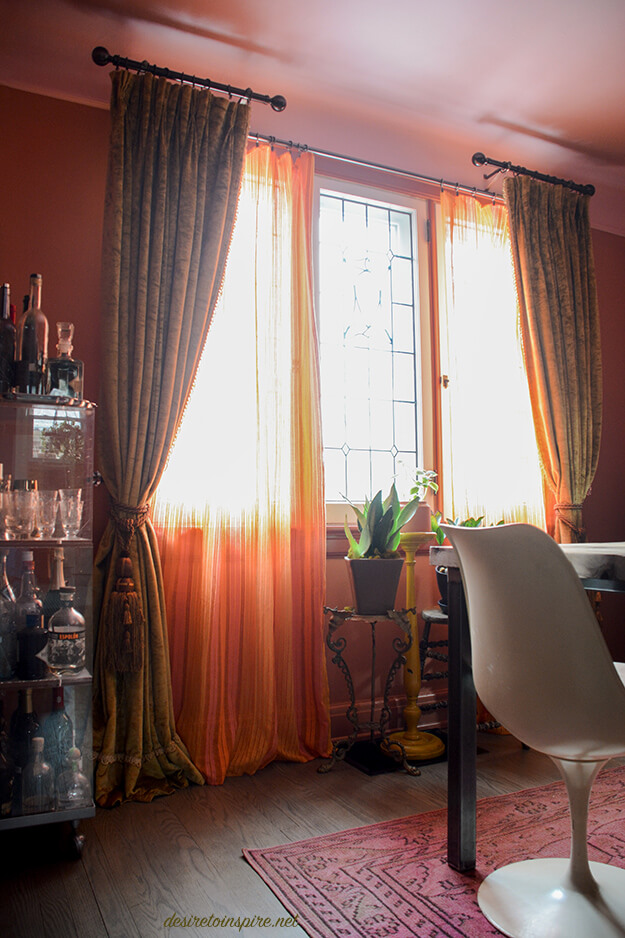
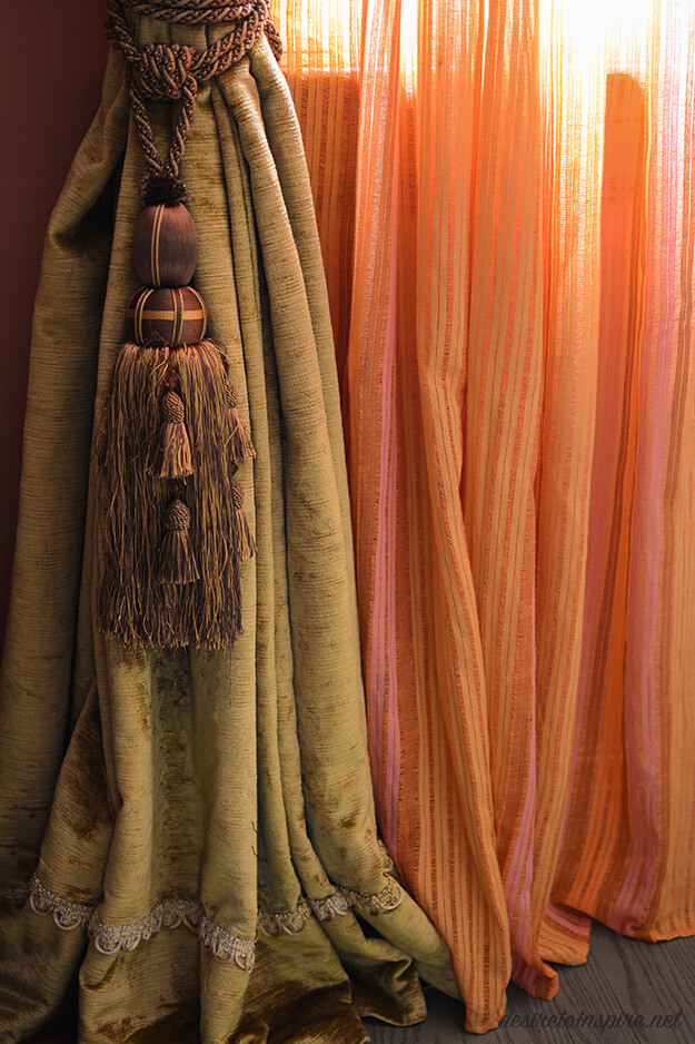
Because the curtains weigh a ton I opted for a short rod on each side for them and found some sheer fabric and had them made into panels that we could easily slide across for privacy. (We live on a busy road so having something that could close so the city of Ottawa can’t watch us eat was crucial). I feel like a legit grown-up now with this curtain set-up, complete with tassels! That scalloped edging at the bottom is also along the inside edges of the curtains and is such a pretty detail.
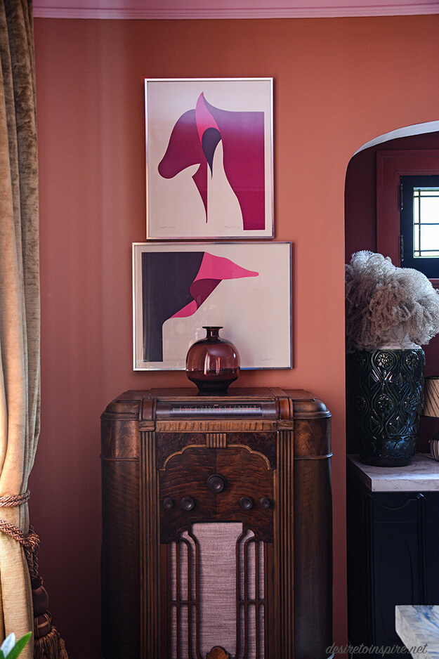
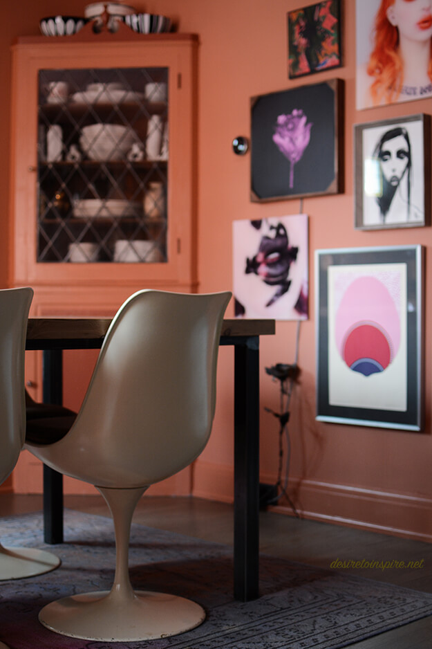
A few weeks ago husband and I drove to Montreal to check out our favourite flea market and I found the art in the photo above (and a third one which you’ll see later). I almost didn’t buy them but thought they were so fun I went back for them without knowing where I could use them. I realized they would be a bold addition of colour in the dining room. I am SO glad I ended up scooping them up.
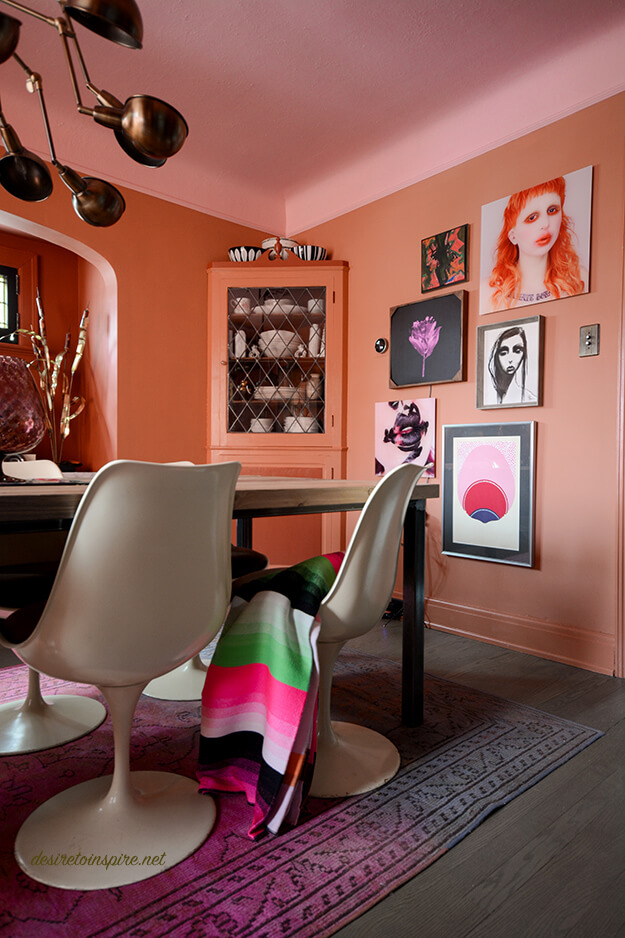
There isn’t much wall space in my dining room so I opted for a gallery arrangement on the only decent sized wall in the room. I had fun coming up with this. 🙂
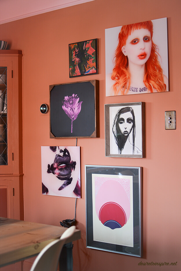
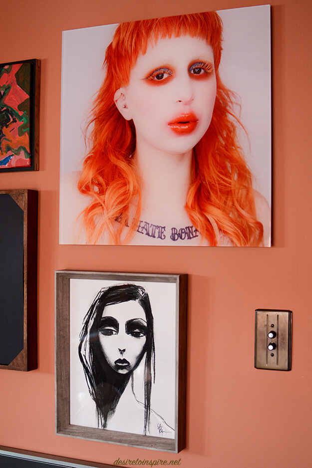
The gorgeous girl with the orange hair and the print of the lips in the previous photo are of my Instagram friend Kelseyanna who kindly sent me copies which I had blown up and mounted on acrylic. The other gorgeous girl is a print by Mel Remmers. Love her!
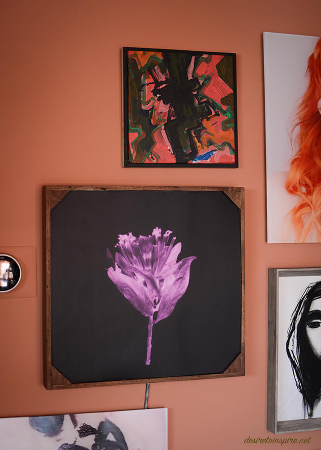
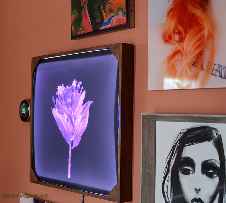
At the top is a canvas painting by another dear Instagram friend Andrea. Below it is a lightbox my husband built for me. Inside is a photograph I took that I turned into an x-ray. Unfortunately it is hard to photograph when turned on but I LOVE how it turned out!
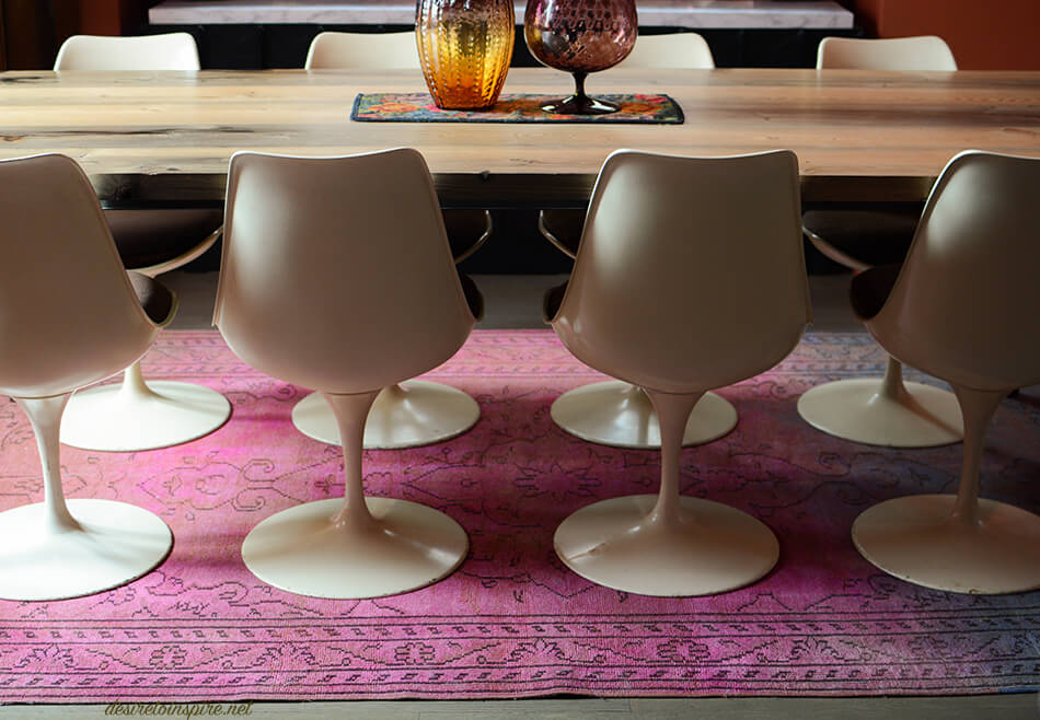
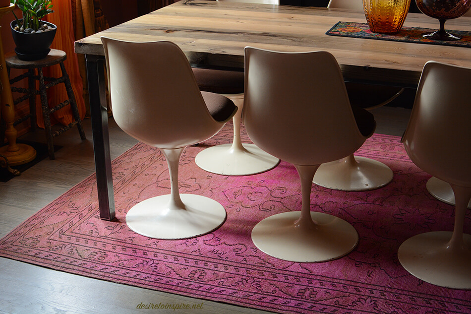
To my amazement I managed to find a rug that had shades of orange and pink in it to bring in the 2 major colours of the space. And it’s a perfect low pile rug for a dining room so sliding these heavy tulip chairs back and forth and cleaning up cat messes is no biggie.
There are still a few things I want to change in here. I found a darling vintage fabric to cover the chairs with (might not have enough to do all though dammit); I want a smaller, oval dining table because this one my husband built is a bit too big; I want a new buffet that is ideally 7′ long like this one. Regardless of those items I am really enjoying this transformation. At first when my husband saw the colours he thought I was insane but he quickly grew to love it too. I also had him on board with the curtain situation despite it taking hours to install/hang everything. Hope you all like it!
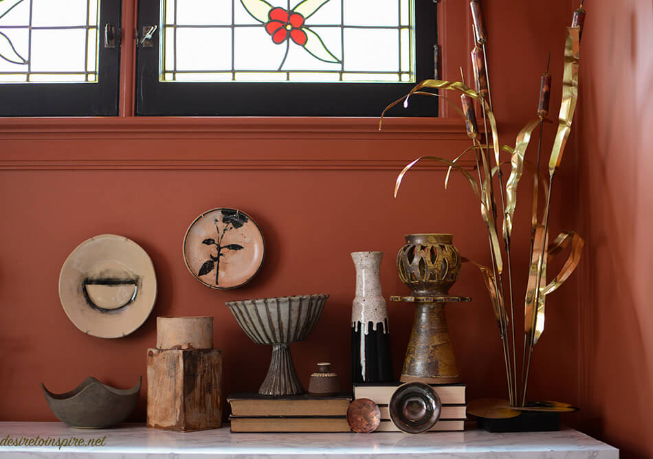
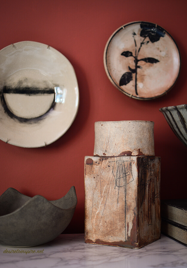
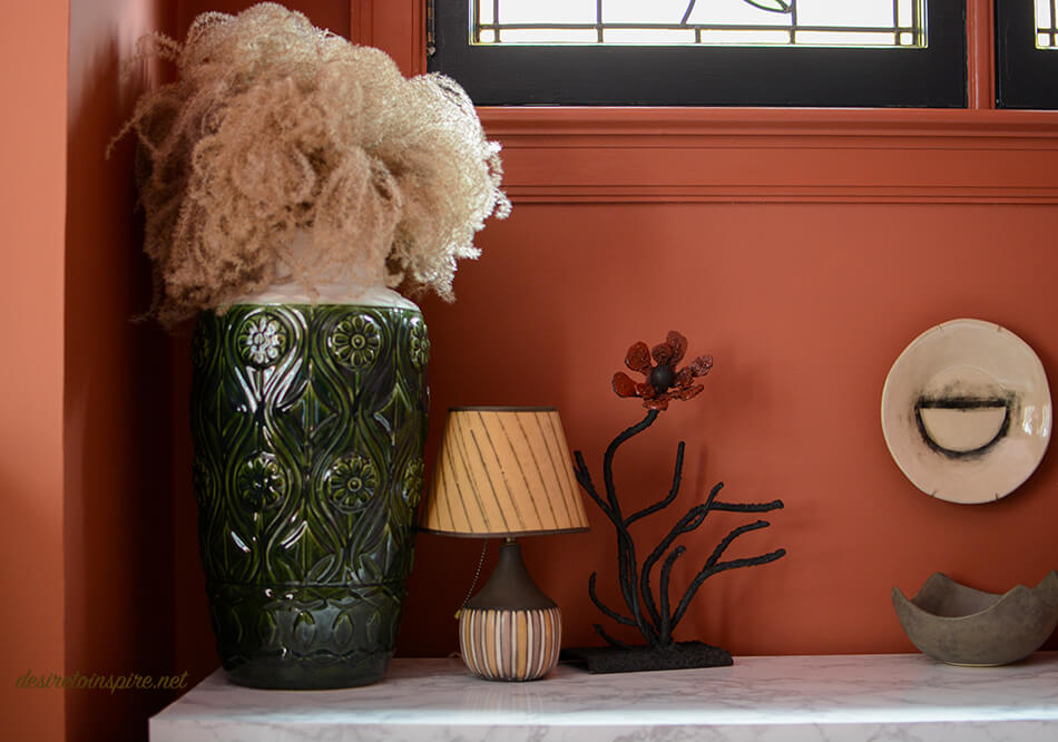
>>>SOURCES<<< wall colour: Red Earth, ceiling colour: Nancy’s Blushes, alcove colour: Picture Gallery Red, velvet curtains: AuDelaVintage, fabric for sheers: bettiecouture, curtain tassels: FabricsTrimsPillows, curtain hardware: Cozzy Coverings, 3 pink and purple signed and numbered prints from Montreal’s St. Michel flea market, vintage radio converted into a Bluetooth speaker by my husband: Daff Design, purple vase on radio & glass owl vase on dining table & most of the vintage ceramics on buffet: Vanier Moderns, plate with semi-circle hanging on wall in alcove & bowl below it & 2 small bowls leaning against books: Le Lou Ula Atelier, plate with flower: L’Arbre et la Rivière, brass reed sculpture & brass plant stand: The Pale Blue Dot, wooden stool plant stand & purple vase on dining table: Highjinx, rug: eCarpetGallery, Hay Denmark blanket and Ferm Living orange pot: The Modern Shop, framed canvas abstract painting: Andrea @hunt.and.scavenge, photos on acrylic: Kelseyanna Fitzpatrick @kelseyannaf printed by PosterJack, print of girl in black/white: Mel Remmers
Leave a Reply to Axie Cancel reply


Gigi says:
Well i have just one question, why do you put up these havy curtains ? I think they flaw the ensemble .
It’s quitte a change you came up with, very bold….
KiM says:
Bold it is! I think a dramatic dining rooms calls for some dramatic curtains. I think anything less would have looked cheap (ie. had I only put up those sheer panels)
Annie says:
I never would have picked those colours but they look amazing!!. Wish I was as brave as you.
KiM says:
Thanks! I honestly never thought I’d pick these colours either. I blame F&B and their limited colour selection 😉
Axie says:
It is very warm, yes, exactly how a dining room should be! I’m usually a cooler color person, but I’m intrigued by the colors, great job, Kim! I may have to go to the paint store..
ps- love the spider light over the table too 🙂
KiM says:
Thanks Axie! Get yer butt to that paint store!!! GO WILD!!!!!
Axie says:
That is the plan this weekend! Thanks for the inspiration!
scott says:
looks great!
KiM says:
thank you Scott!!
ombia says:
I would never come up with this Color Combo, but it Looks great!
KiM says:
Thanks! I never thought I’d like it this much 🙂
Jess says:
This is by far my favorite of the rooms you’ve done in your house! The unusual colors are perfectly beautiful! And the whole look really works somehow, unexpectedly, with the architectural style of your house, which I know you’ve had a bit of a struggle against sometimes (long-time reader of this blog!). And the curtains, the radio!
KiM says:
🙂 🙂 🙂 Thanks so much Jess!!! XOXOXO (and thank you for being a long-time reader of our wee blog!)
b says:
It works because its in the same color value, one is not too intense, bright than the other.
Do not let go of the table. Oversized makes an impact. And your husband made it, after all!
KiM says:
I appreciate my husband’s hard work but the table takes up the ENTIRE space. And the 2 of us sit all the way down at one end. It’s pointless. 🙁
ohHolland says:
So right to go back for those fab pop, companion portraits of bulls (-? or so I think.) Anxious to see the third.
KiM says:
The third is on that gallery wall at the bottom. The one that looks like a boob.
Maverik says:
Well Done!
It’s beautiful and amazing colors. I really like the paintings on your walls and the ceramics over the buffet amazing.
Katie says:
So luxurious! I love the colours you’ve chosen for your ceiling and walls.