Displaying posts from June, 2020
The beauty of beige
Posted on Tue, 9 Jun 2020 by midcenturyjo
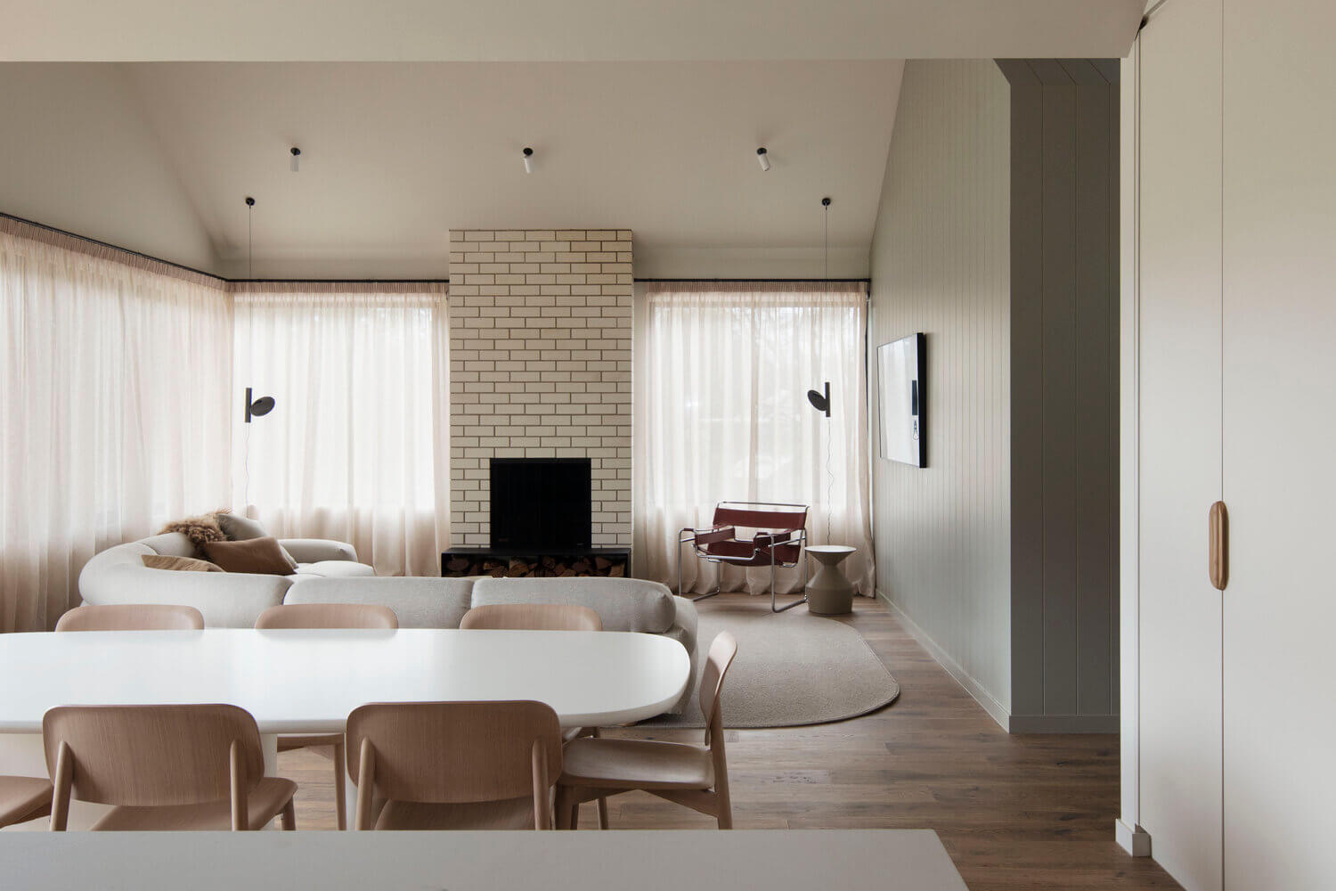
The perfection of putty … or cream, off-white, biscuit, buff, ecru, fawn, mushroom, oatmeal or sand. Call it what you will the colour palette of this beach house on Victoria’s Mornington Peninsula creates a zen like oasis, the perfect getaway from the city’s hustle and bustle. Retreat Residence M by CJH Studio.
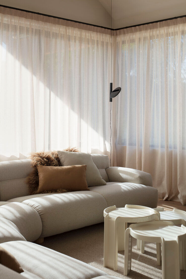
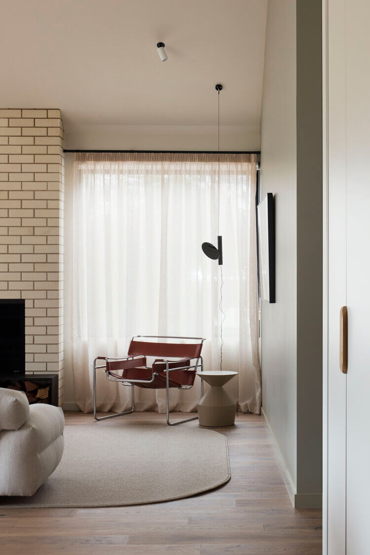
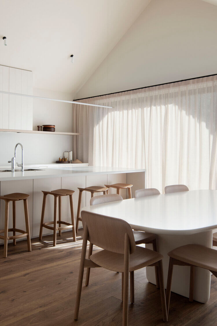
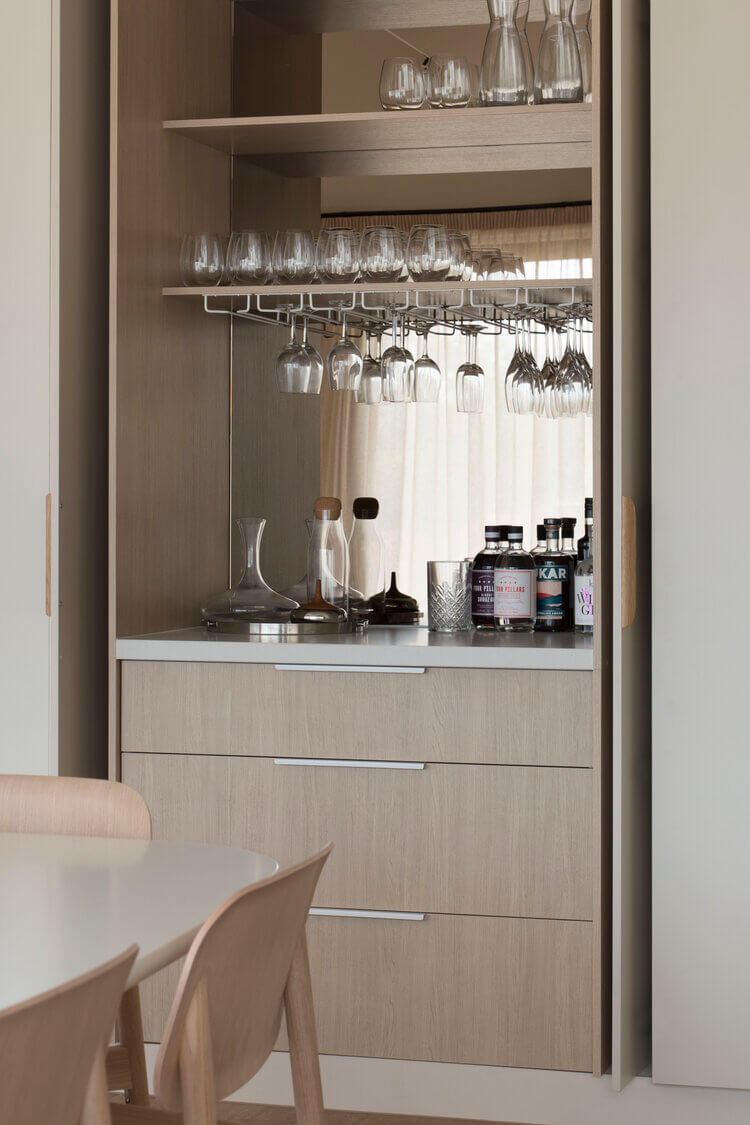
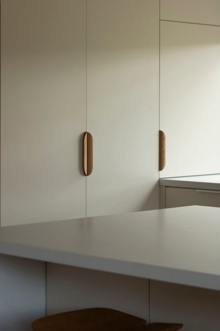
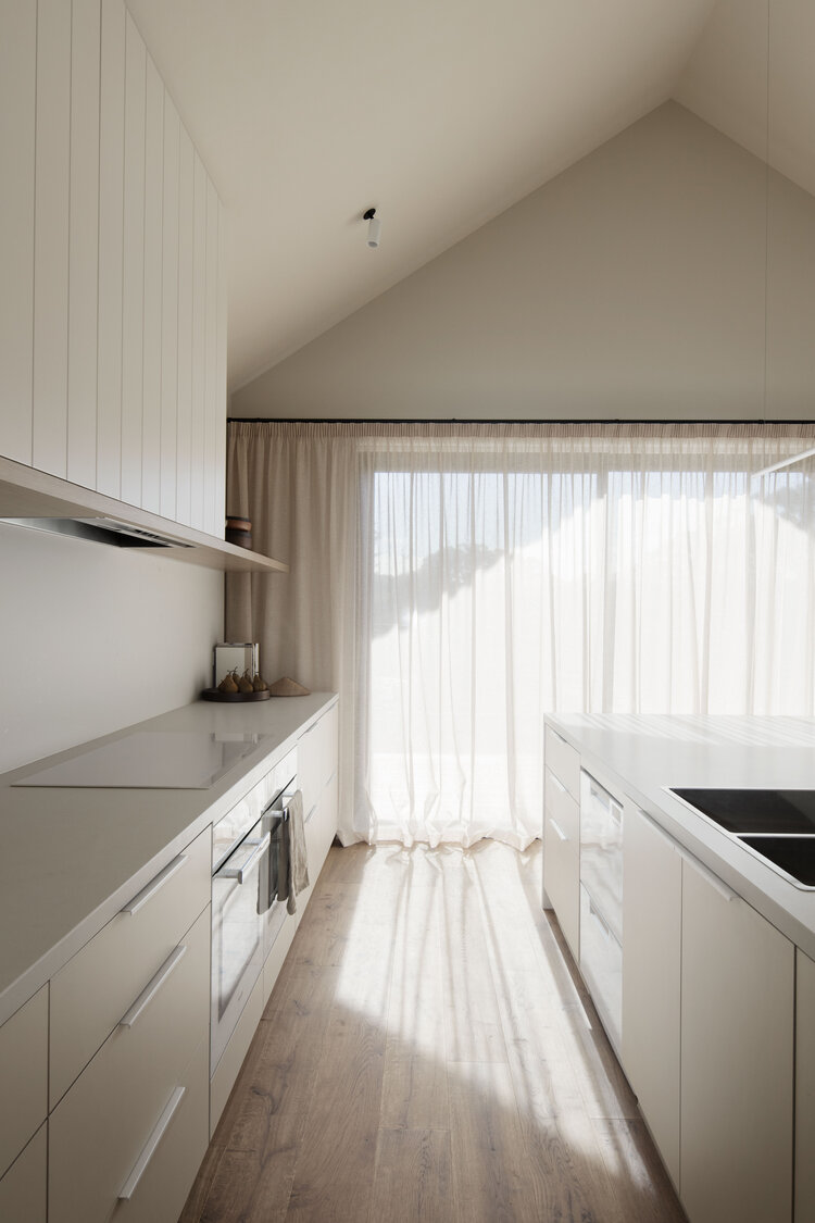
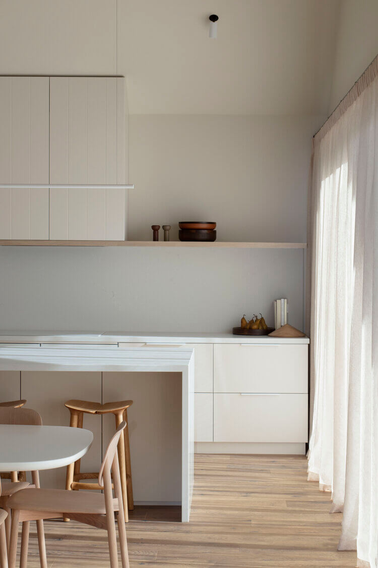
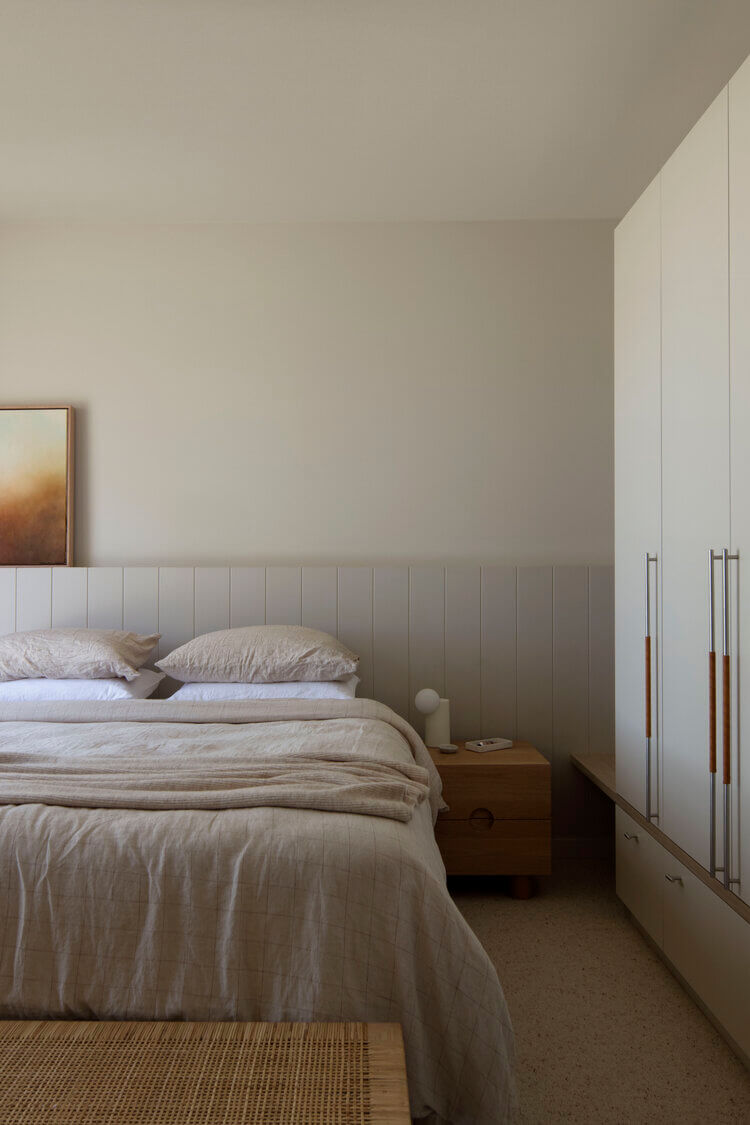
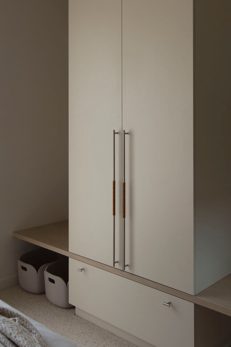
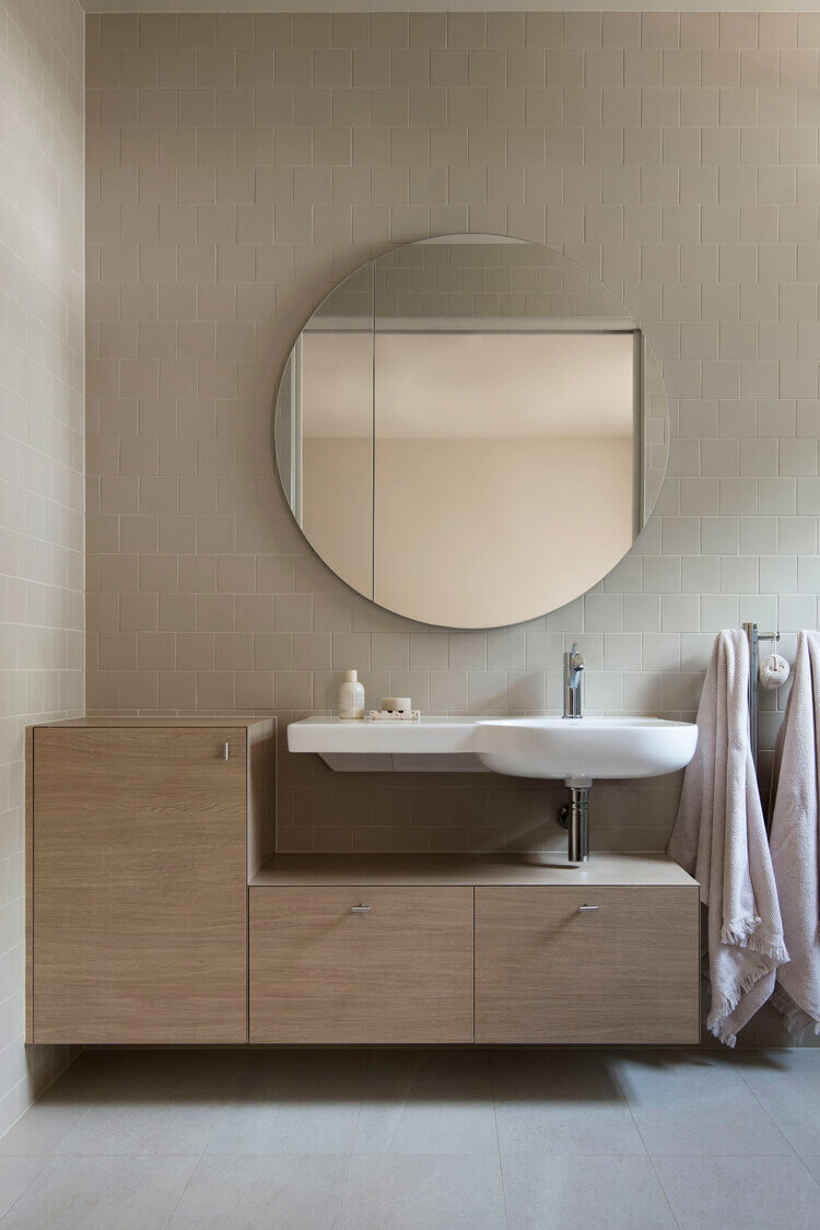
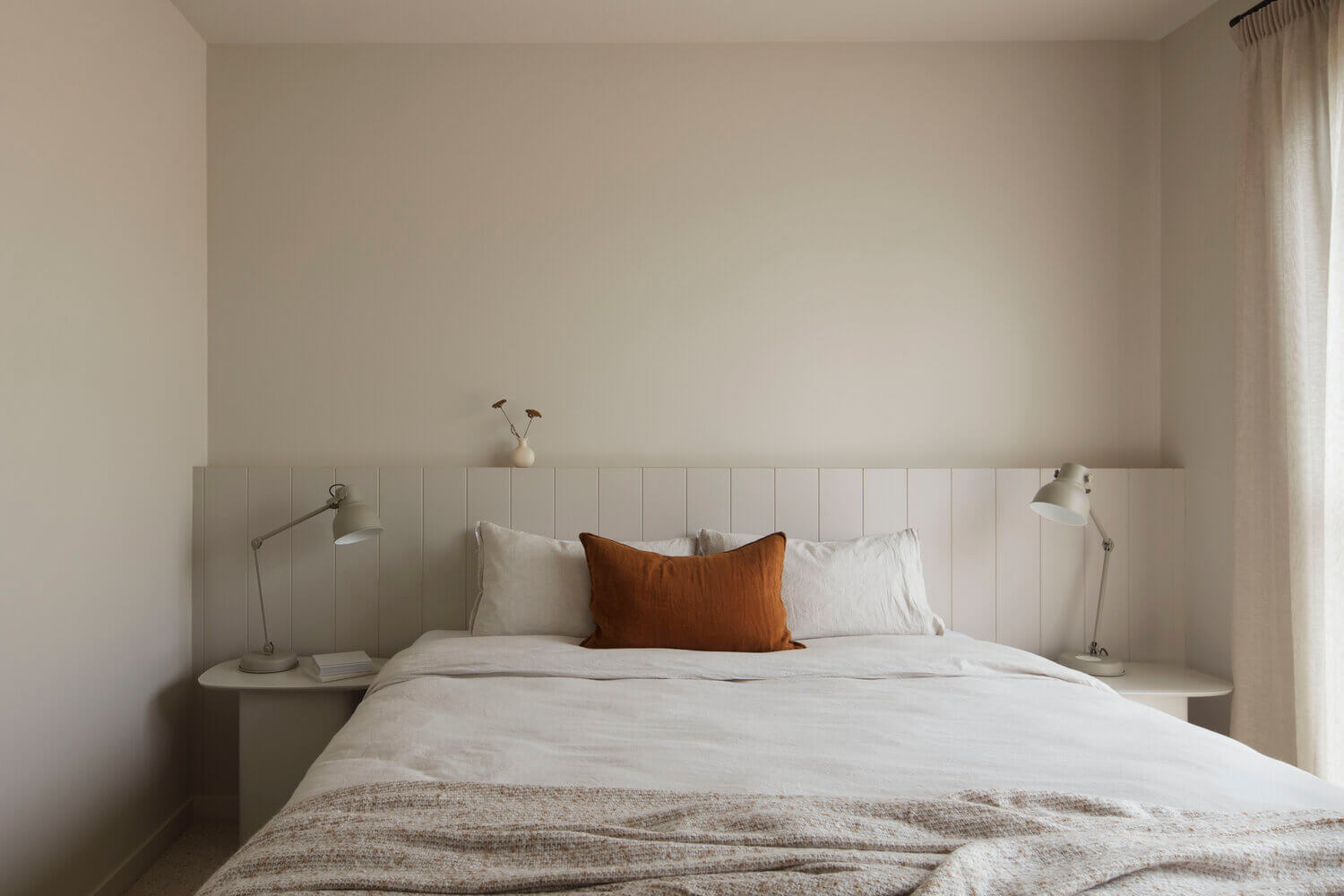
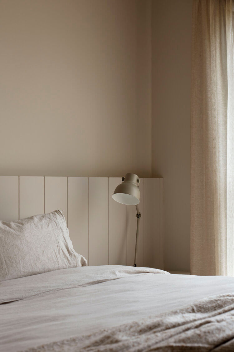
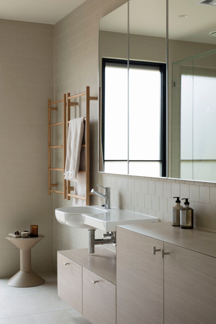
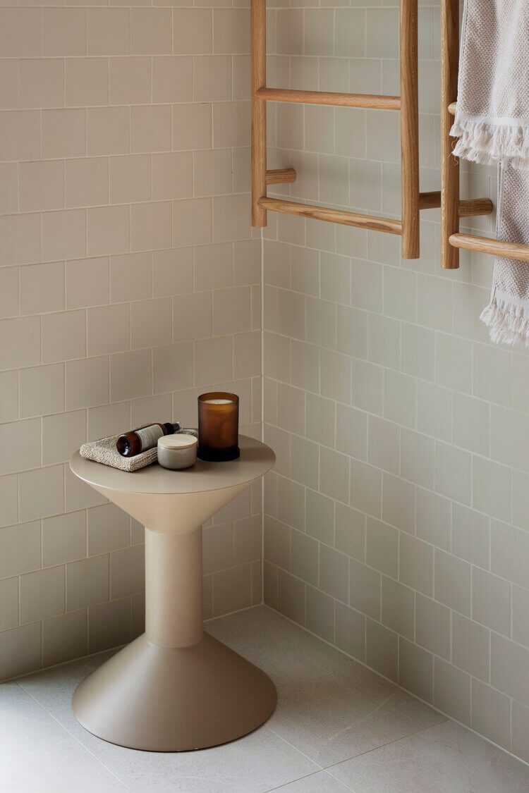
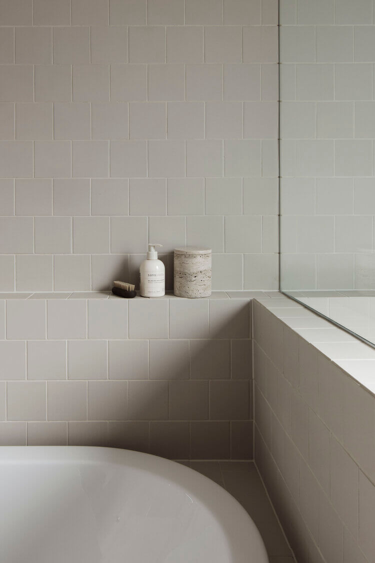
Photography Ben Hosking
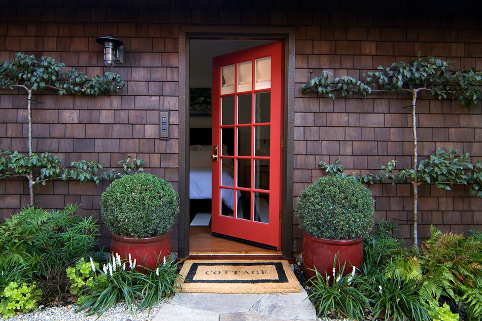
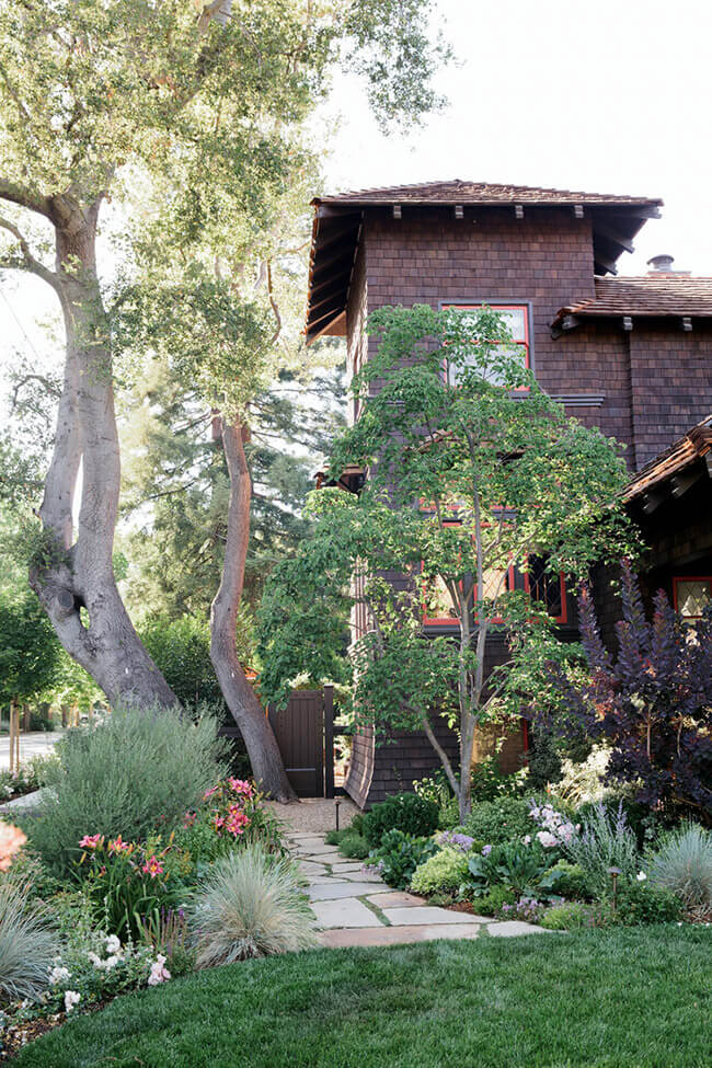
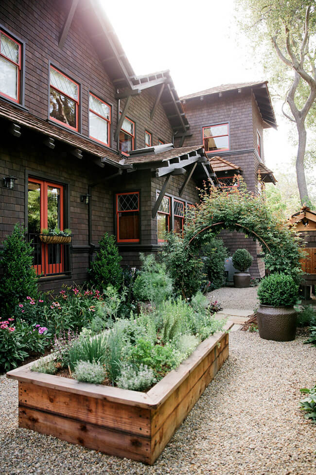
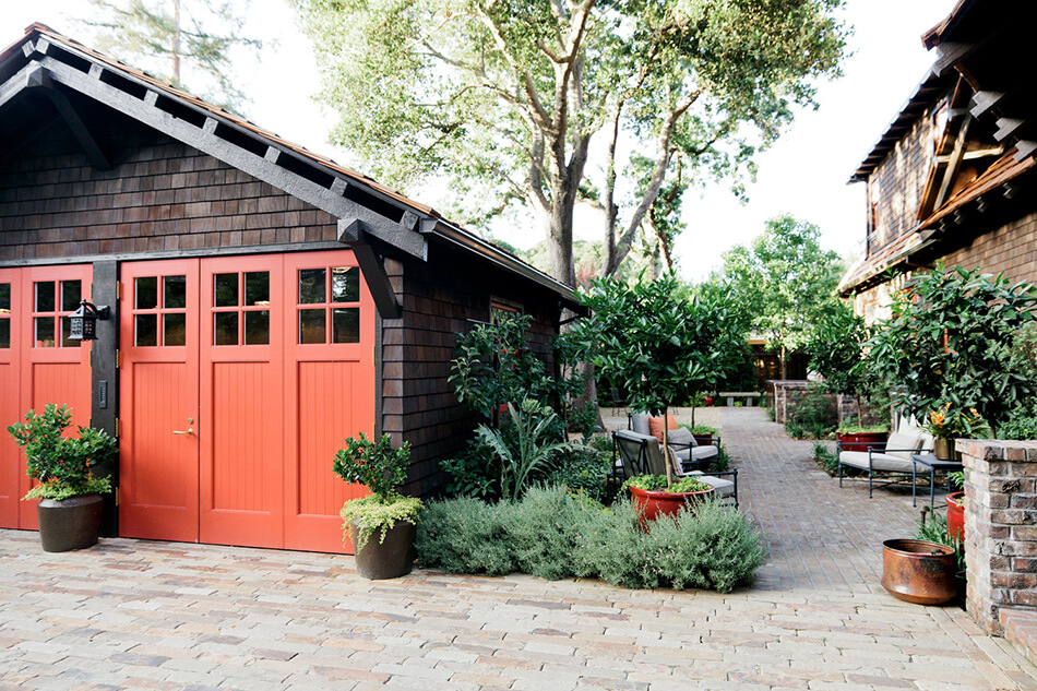
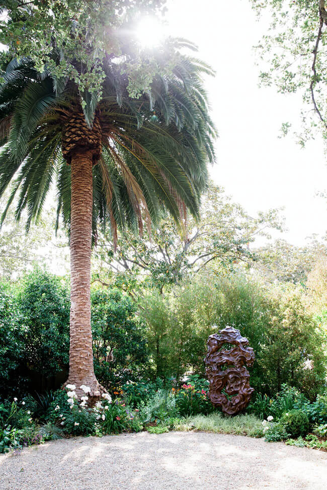
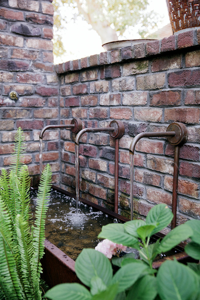
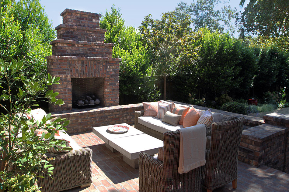
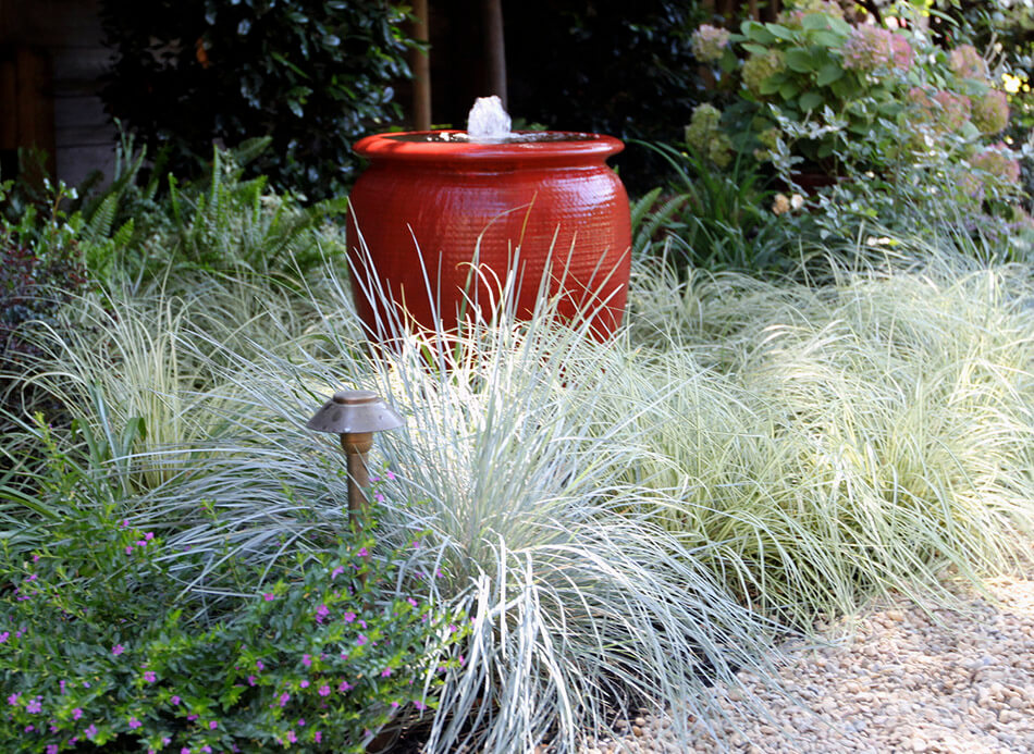
Lush gardens of a Palo Alto historic home
Posted on Mon, 8 Jun 2020 by KiM
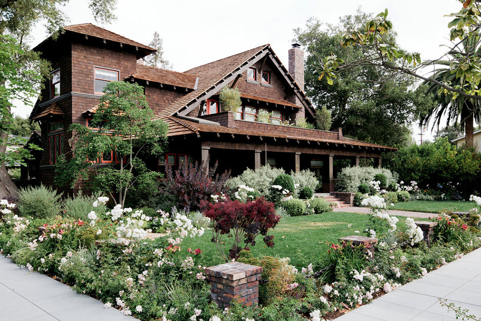
I am head over heels in love with the landscape design of this California home. The bold orange/red painted exterior accents really make everything pop and add a modern touch. Lush gardens hug this 1905 national historic register home in Palo Alto’s Professorville neighborhood. Vibrant homeowners wanted to create a landscape that engaged the neighborhood and featured layered gardens with a Bay Area sensibility. The landscape is now defined by a series of outdoor “rooms”, with flexibility for intimate family gatherings and large social events. Water-use is concentrated in the public facing areas of the site. Highlights include custom recirculating water features, hand-made clinker brick walls, a charming vegetable garden with custom chicken coop and mature perimeter plantings. Designed by Boxleaf Design.

Monday’s pets on furniture
Posted on Mon, 8 Jun 2020 by KiM
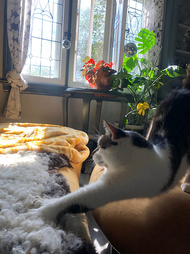
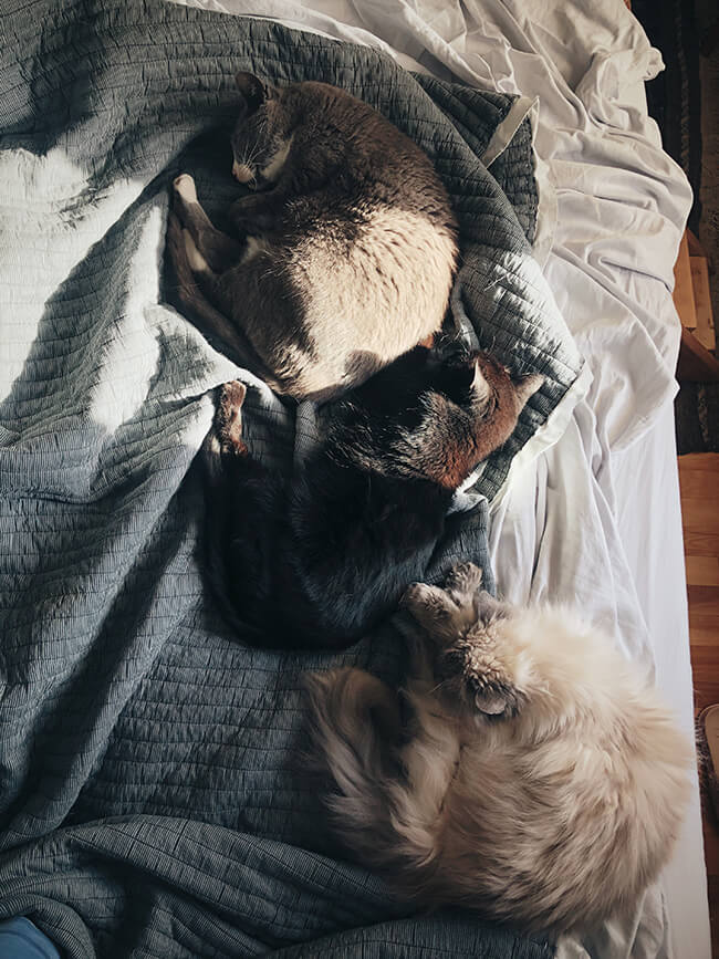
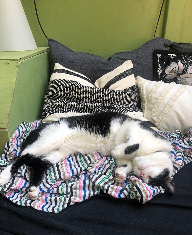
If you would like to participate in the Monday’s pets on furniture series please send photos, your name, location and a brief description to kim[at]desiretoinspire[dot]net, or hashtag your photos on Instagram with #dtipetsonfurniture. Thanks!
Some from me. Bernie coming over for some loving on the living room sofa. This is a fav spot in late afternoons when the sun shines through these windows. Next up is Felix, Mimin and Milo in a line in bed. And lastly Lucky living his best life in the she-shed, which the cats have taken over DAMMIT.
Sunday (pre-pandemic) at a tapas bar/restaurant
Posted on Sun, 7 Jun 2020 by KiM
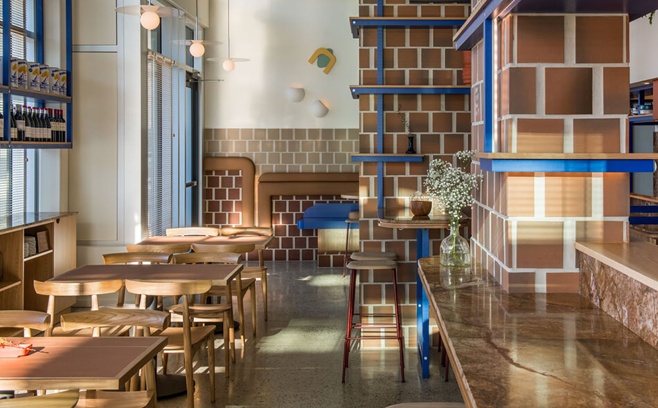
Oh how I would love to enjoy a dinner out on the town again, and to transport myself to Vancouver and this fabulously designed tapas bar & restaurant. Como Taperia is a nod to the classic, centuries-old, standing-room-only tapas bars in Barcelona’s Poble Sec or Madrid’s La Latina quarters. These spaces are tight, acoustics are loud and you may or may not be offered a place to sit, favouring conversation and community over intimacy and comfort. Our access point to the materiality and colour strategy came from one particular reference, Jardins de les 3 Xemeneies, and its three brick chimneys that backdrop the bustling Poble Sec–the only remains of an early 20th century power station built by the Barcelona Traction, Power and Light Company ( a Canadian utility company that operated light and power utilities in Catalonia, Spain) locally known as La Canadiense for the old company’s Canadian electricity production. Opening a tapas bar in Canada, this history acted as a leeway into exploring the vernacular of this neighbourhood, allowing Como to become a contemporary materialization–an homage to all we love about Spain. The rest was an exercise in keeping things simple and fun and letting a few other cool points of inspiration stand out against this backdrop like the punches of cobalt blue reminiscent of Miro and the art program taking Jean Arp’s work as a point of departure. Designed by Ste. Marie.
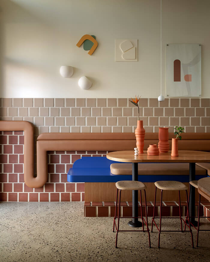
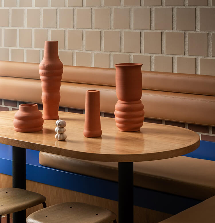
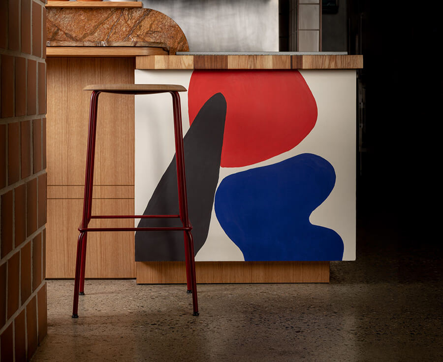
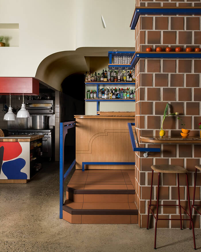
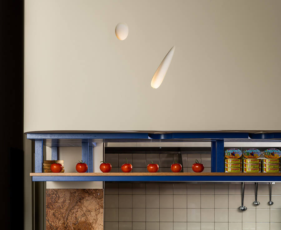
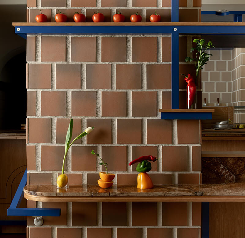
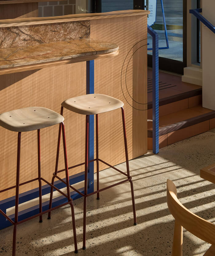
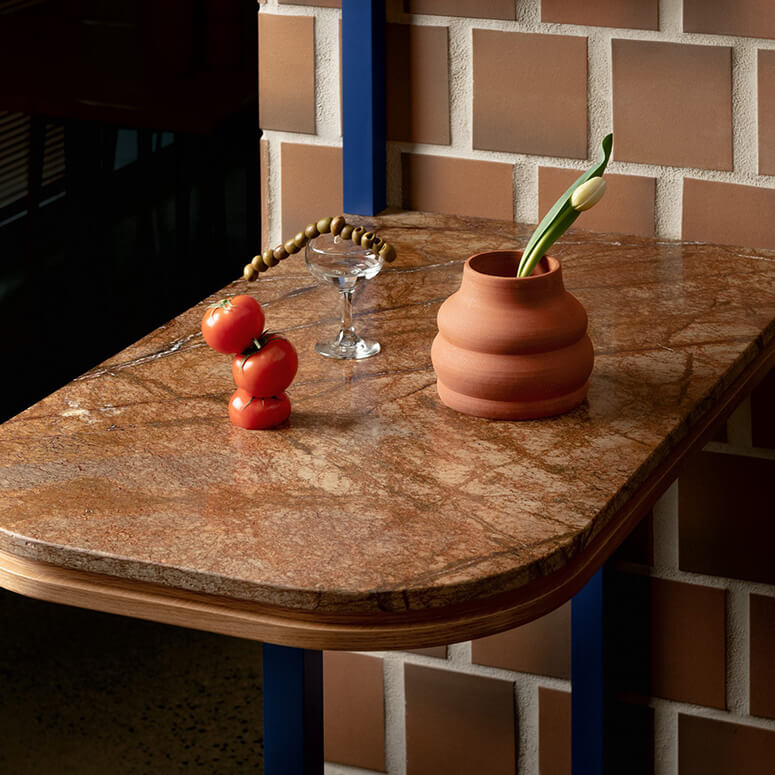
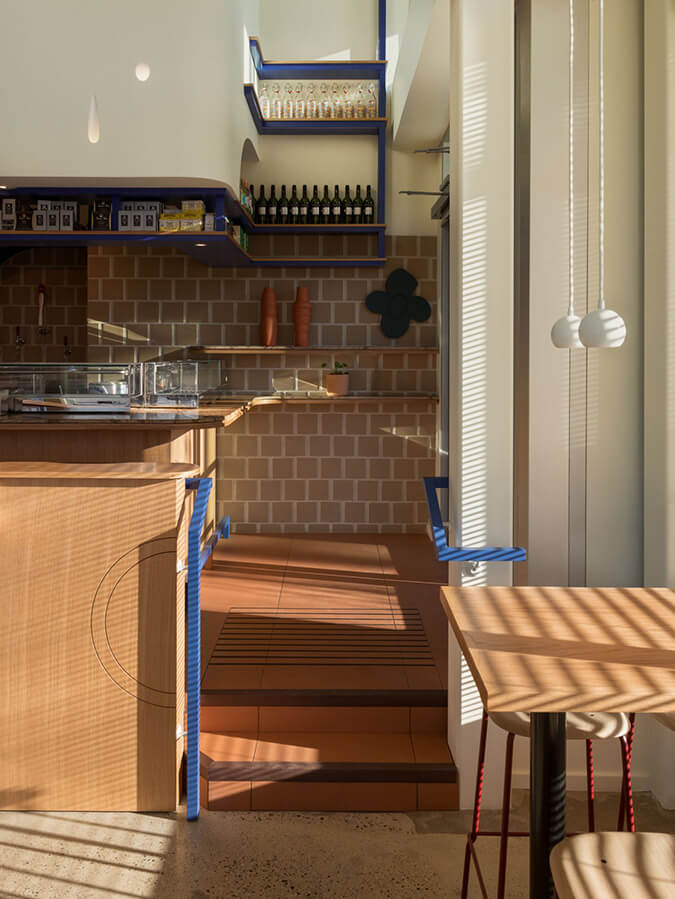
Photography by Conrad Brown
Styling by Kate Richard
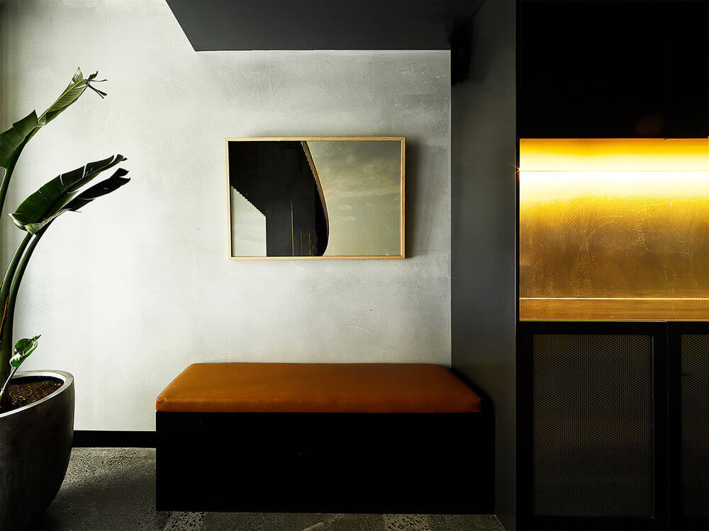
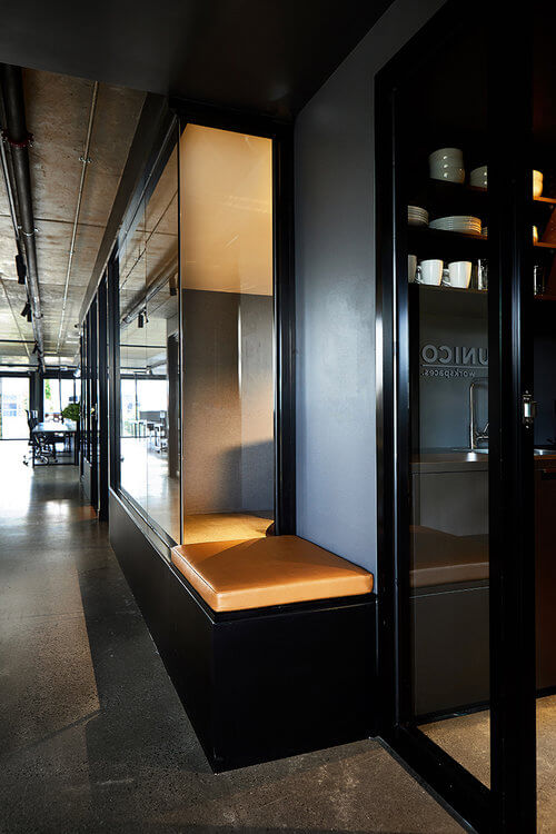
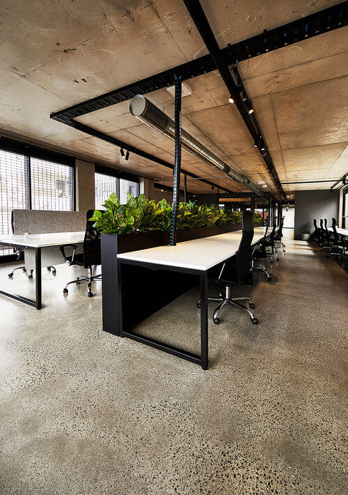
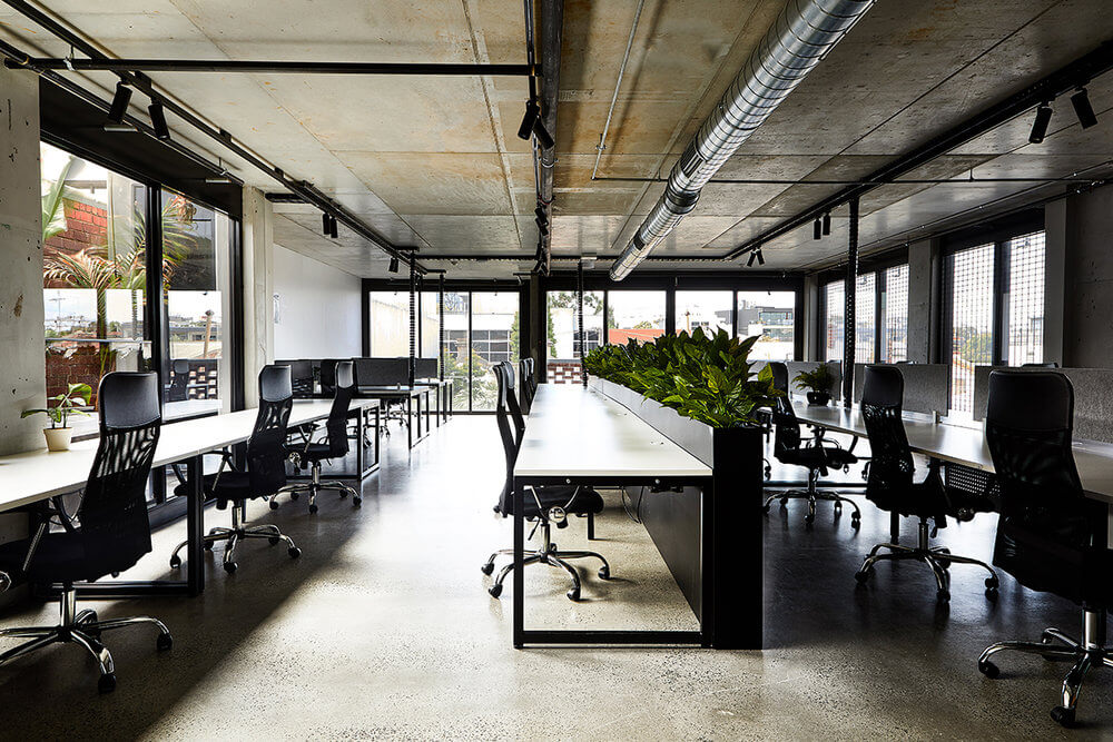
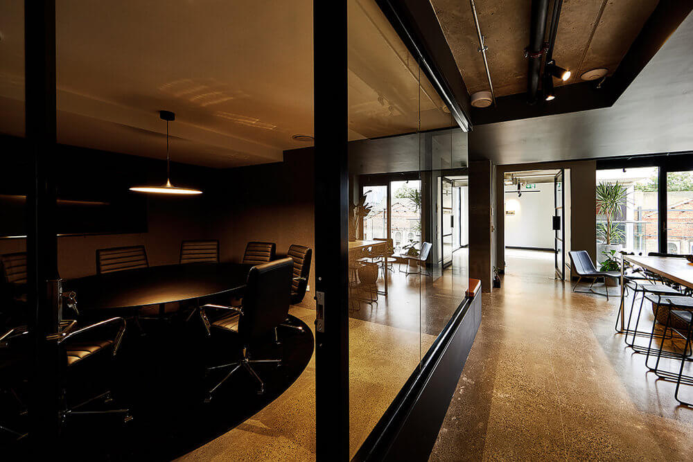
Working on a Saturday
Posted on Sat, 6 Jun 2020 by midcenturyjo
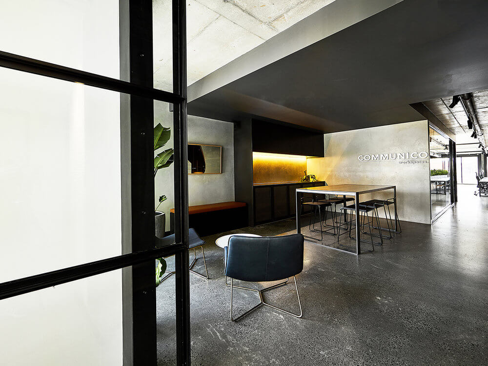
As parts of the world come out of lockdown I don’t think anyone would have any problem dragging themself into the office on a weekend. Most of us would be bolting in if we could. Still helps if it’s somewhere stylish 😉 Communico Workspaces, a shared office community in Cremorne, Melbourne by Pierce Widera.