More Simon Carver
Posted on Thu, 12 Feb 2009 by KiM
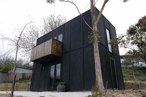
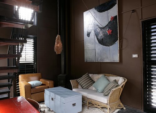
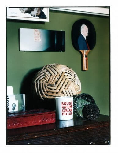
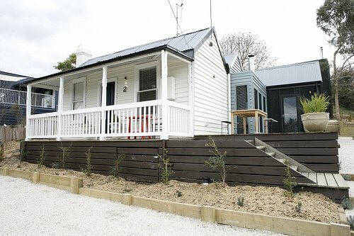
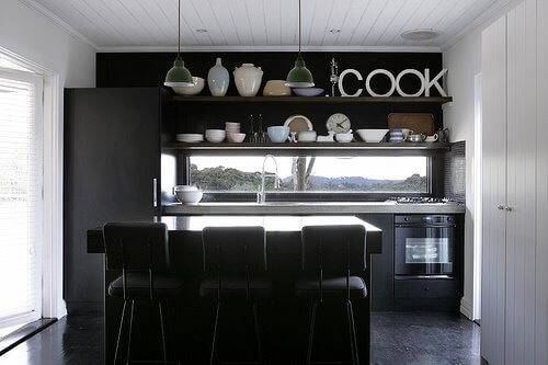
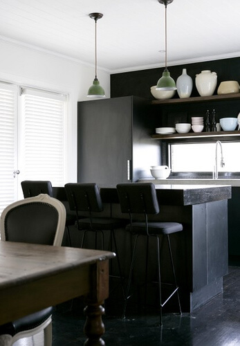
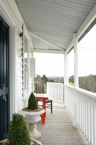
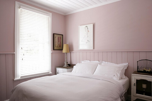
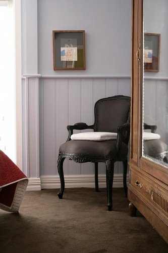
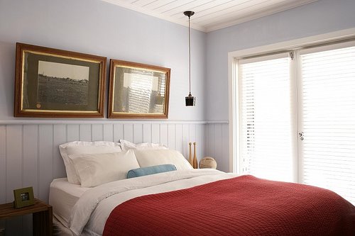
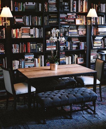
So as promised, here is more of Harts Lane. This is the 2 story studio behind the main cottage. Where the cottage was bathed in white and mostly pale colours (the black wall in the kitchen being the exception), this is dark, moody and very funky. I don’t know which I adore more.
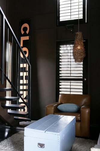
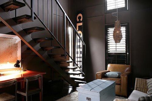
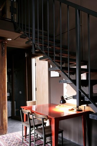
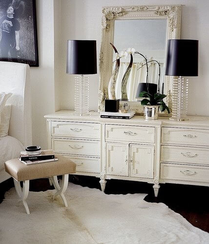
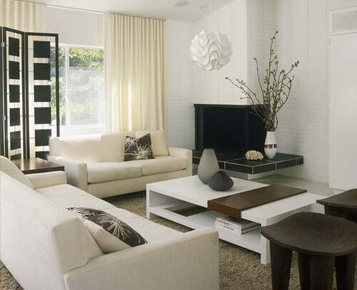
I’m also including some photos of Simon’s other interior design works below because they were too fabulous not to feature. I mean, why stop now?


Simon Carver
Posted on Thu, 12 Feb 2009 by KiM
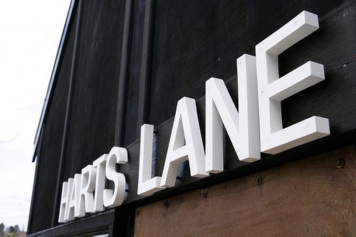
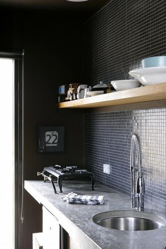
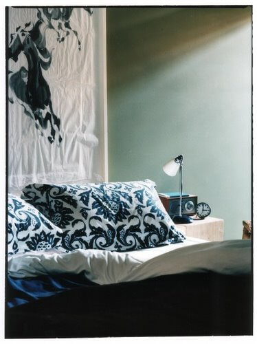
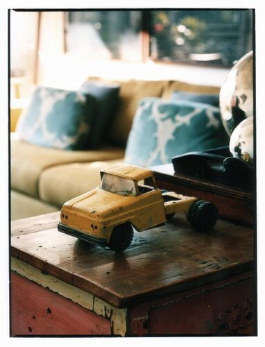
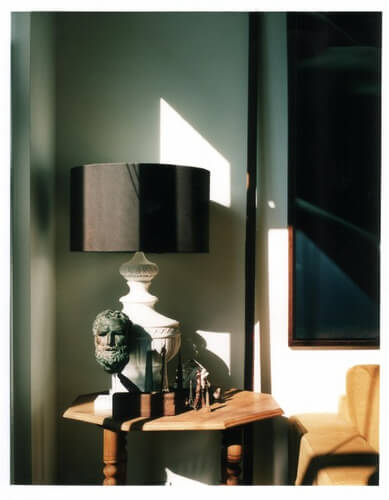
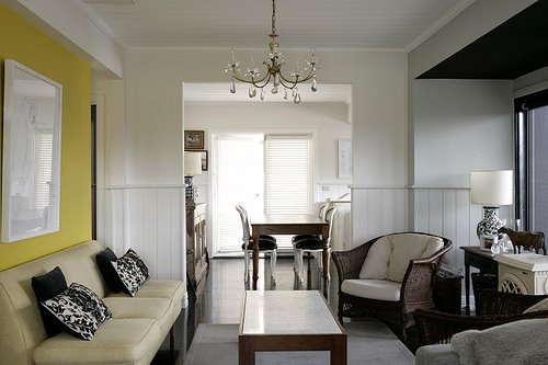
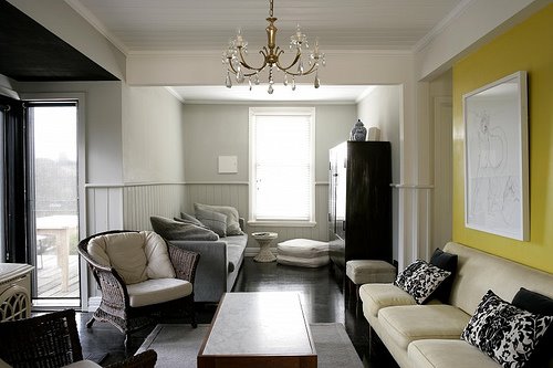
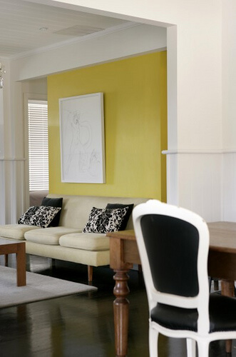
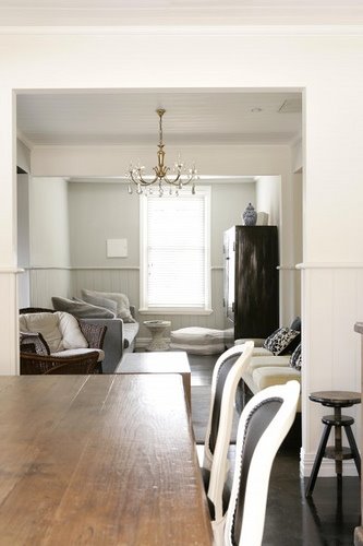
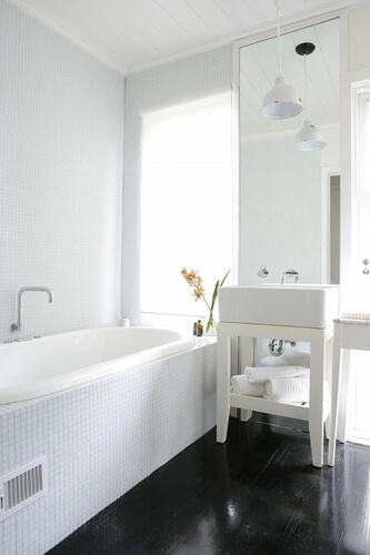
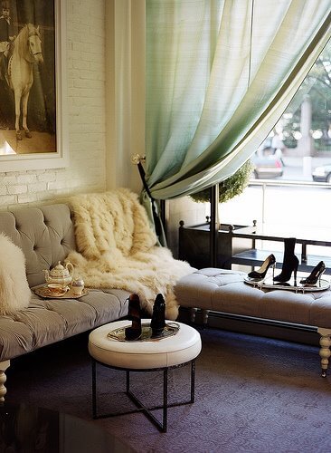
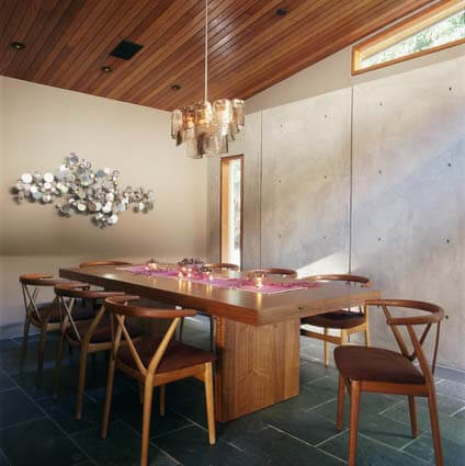
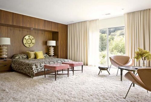
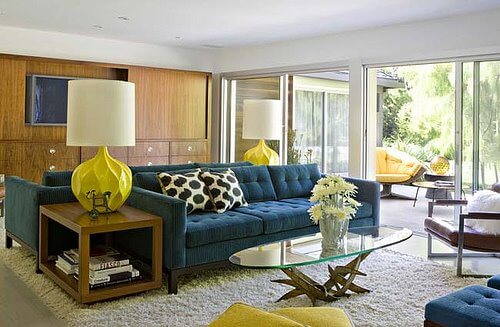
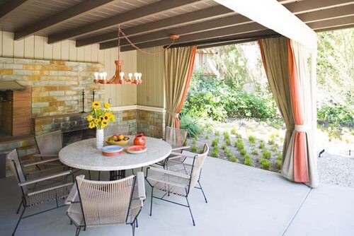
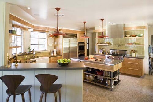
We received an email from Brigid, who wanted to tell us about her friend Simon Carver. Seems Simon and his partner Stuart have a cottage in Daylesford, Victoria, Australia which is avail for rent, called Harts Lane. They renovated and decorated it themselves, and it was featured in Inside Out magazine some time ago. There are 2 dwellings on the site, a white Victorian cottage and a black modern extension ‘Cube’ studio space. The house was decorated with a bit of a country style with artwork by local artists, and features a gourmet kitchen with a polished concrete countertop. The homes, inside and out, are incredible. I have to admit, when I finally got my hands on some photos, I was giddy with excitement to share these with you. This is for sure on my top 5 list of favourite spaces I’ve ever posted on DTI. Seriously, it’s that good. Good enough that this post is of photos of the cottage, and a post later today will be of the studio. See for yourselves. 🙂 (A big thanks to Brigid, Simon and Phil!!)
Ryan Korban
Posted on Wed, 11 Feb 2009 by KiM
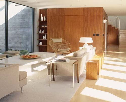
We received an email recently about up-and-coming designer Ryan Korban: “Ryan is a new interior designer based out of New York who has been making quite an impact in the city. He works primarily with young “downtown” types and was recently featured in The New York Times, Town & Country and February’s issue of Domino. A few of his clients include DJ AM, Charlotte Ronson, Alexander Wang, Victoria and Vanessa Traina and James Franco. His youthful approach to city living has been received with much praise for such a new comer. On top of designing both residential and commercial spaces, Ryan is also a co-owner of Edon Manor (high end downtown accessories boutique) and the designer of the store. He is currently working on his first website.” Below is a sneak peak of what you will find on the website when it launches. A bit ‘o Hollywood Regency, a bit ‘o glam…I cannot wait to see the rest of his portfolio!!
Jamie Bush
Posted on Tue, 10 Feb 2009 by KiM
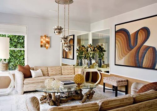
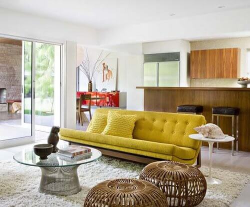
Californian interior designer Jamie Bush “is recognized for his ability to mix period and contemporary furnishings with a fresh and discerning eye. Layering rich colors and textures with exotic and organic elements transforms each of his spaces into an inviting, modern, and unexpected environment.” He has a very impressive portfolio that includes mid-century, modern, minimalist and contemporary designs – all which are guaranteed to knock your socks off.

Paint question
Posted on Mon, 9 Feb 2009 by KiM
Laura wrote us an email with the following:
“I was inspired by this entry to ask you a question. There is a lot of discussion about the perfect white paint, but I have yet to come across a discussion about the perfect off white/cream/beige paint. I know people use it because I see it every so often in Domino. One of the things that I love about Domino so much, is that they talk about paint colors. White is discussed a lot. But, I’ve noticed that if there is a picture of a space with an off white/cream colored wall, the paint is hardly ever mentioned. If the perfect white is so often hotly debated, why not the perfect off white?
I am really looking for the perfect color for a room in my house that I am working on. Just to prepare you for the picture, we had a terrible water pipe leak and as a result we had to tear down most of the left wall and some of the ceiling. You can see in the picture the new dry wall. Also, our windows are very special. They were made from old telephone pole wood. Every window in the house is some variation of this window. I don’t plan on painting the wood or the baseboards. I’ve already painted one bedroom a robin’s egg blue that looks beautiful. I plan on painting the master a light gray (right now it is a horrible yellow). But this room I wanted to do in a cream color. Hopefully, this will be a child’s room someday and I want a nice neutral background that will be able to take on blue or pink accent colors. As you can see in the picture the color that the previous owner’s of the house used is a beige, but it has a lot of yellow in it, which I don’t particularly like.
Here is the room. I apologize in advance for the chaos, but I am still working on the drywall:”
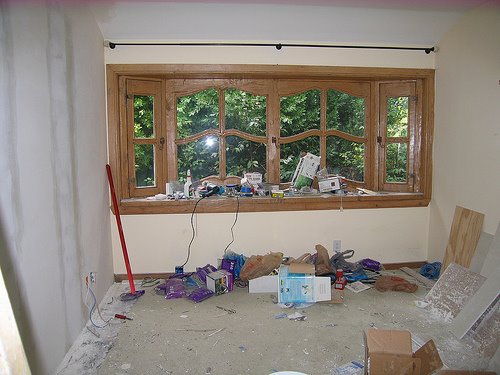
What a beautiful window – and a whole house of them?!?! I am very jealous. I explained to Laura that I had absolutely no experience with off-white, while I always stick to pure white or light grey when I’m looking for a neutral paint colour. My suggestion for a non-off-white would be a light grey as I think it would be really pretty with blue or pink. But I thought I’d throw this out to you guys if anyone has any paint colour suggestions for Laura. What’s your favourite off-white or beige?