European vibes in a Washington home
Posted on Fri, 17 Nov 2023 by KiM
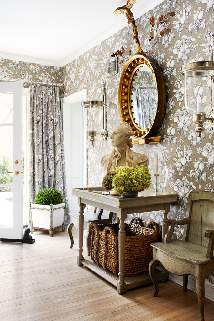
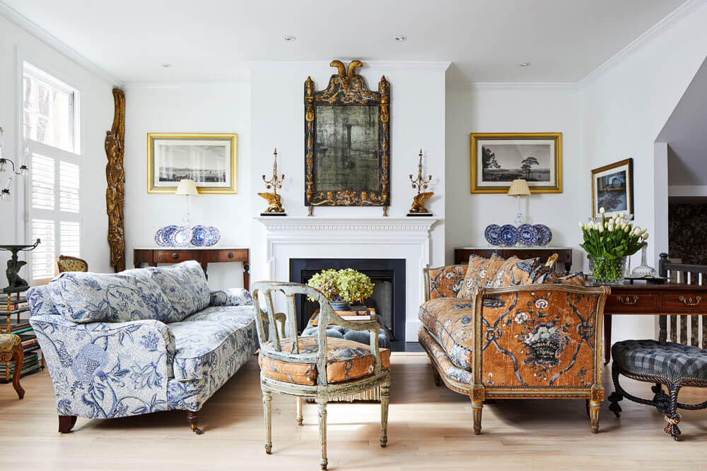
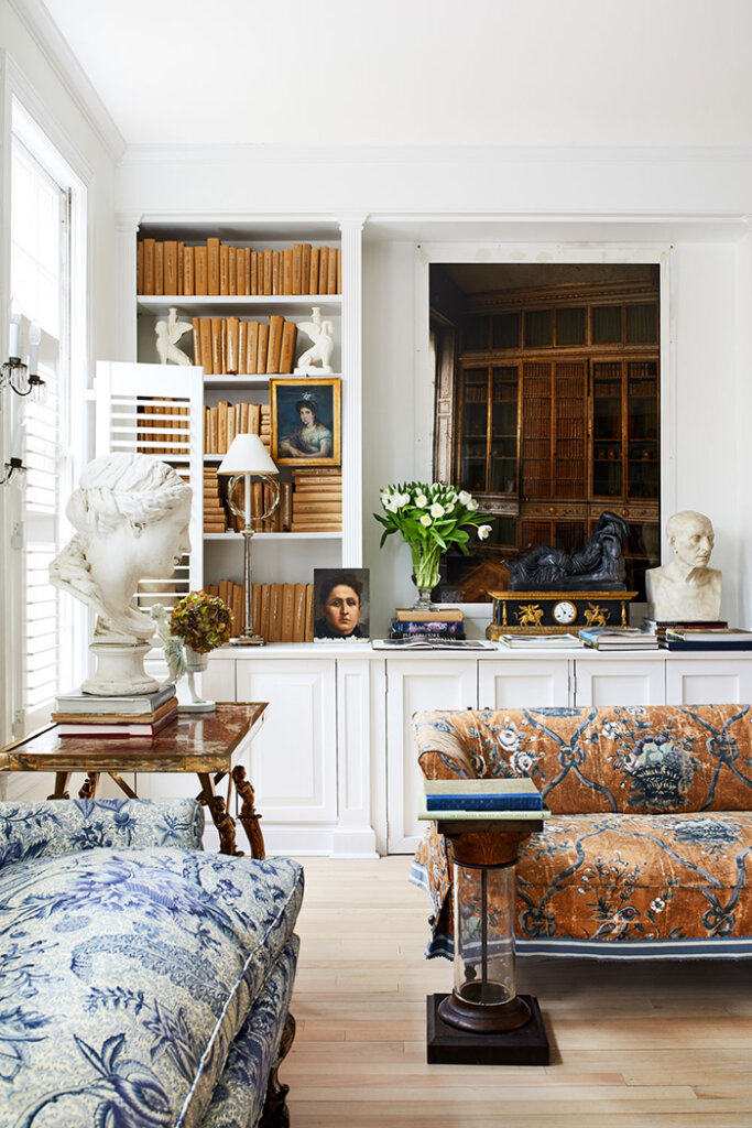
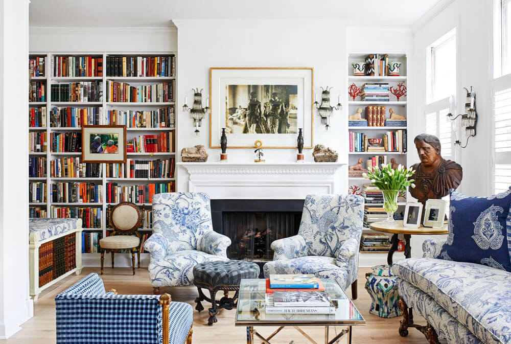
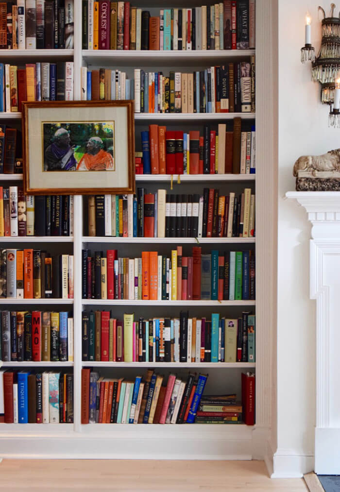
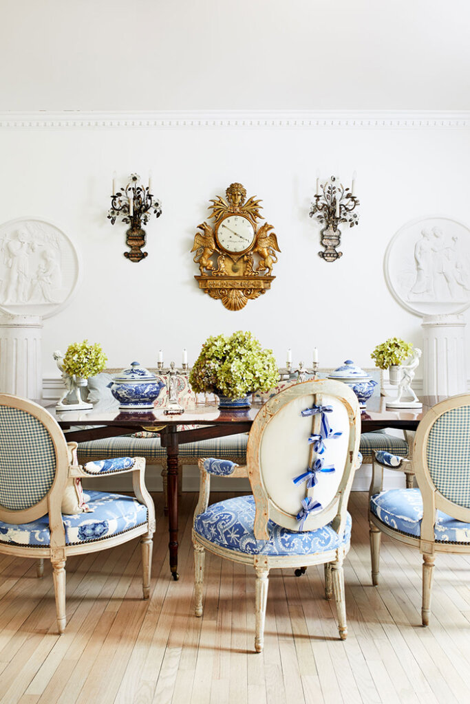
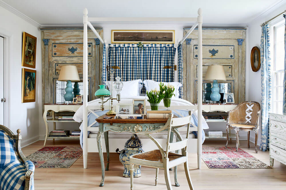
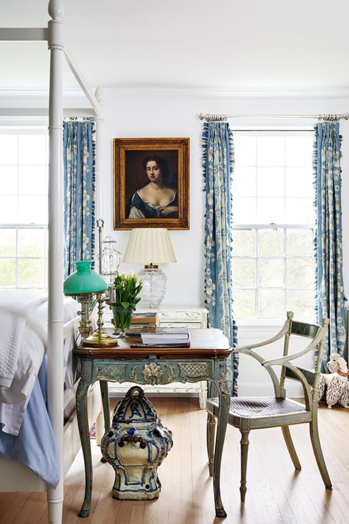
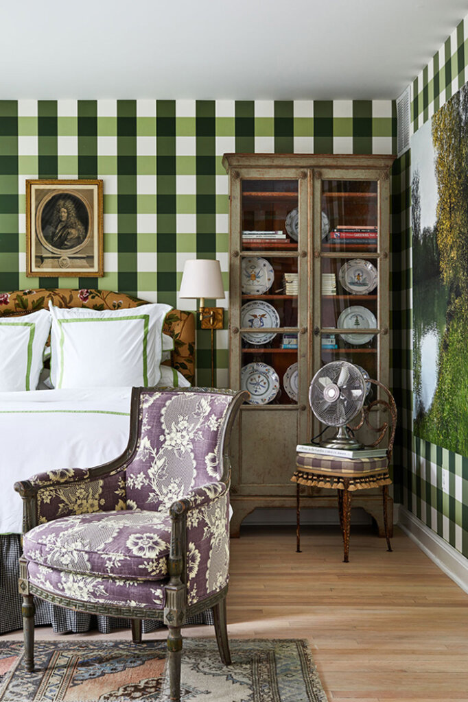
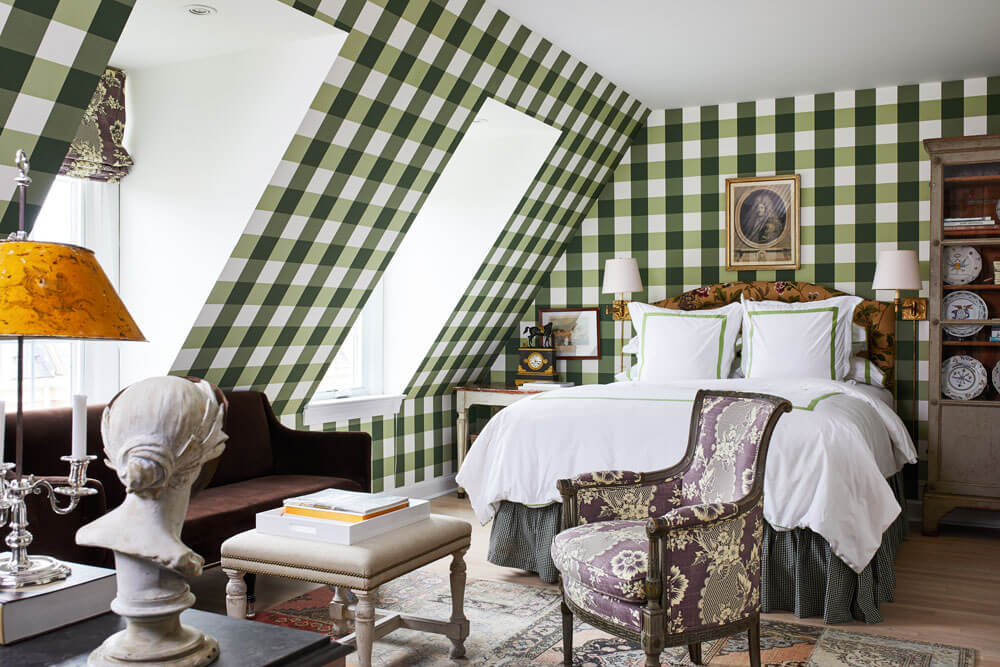
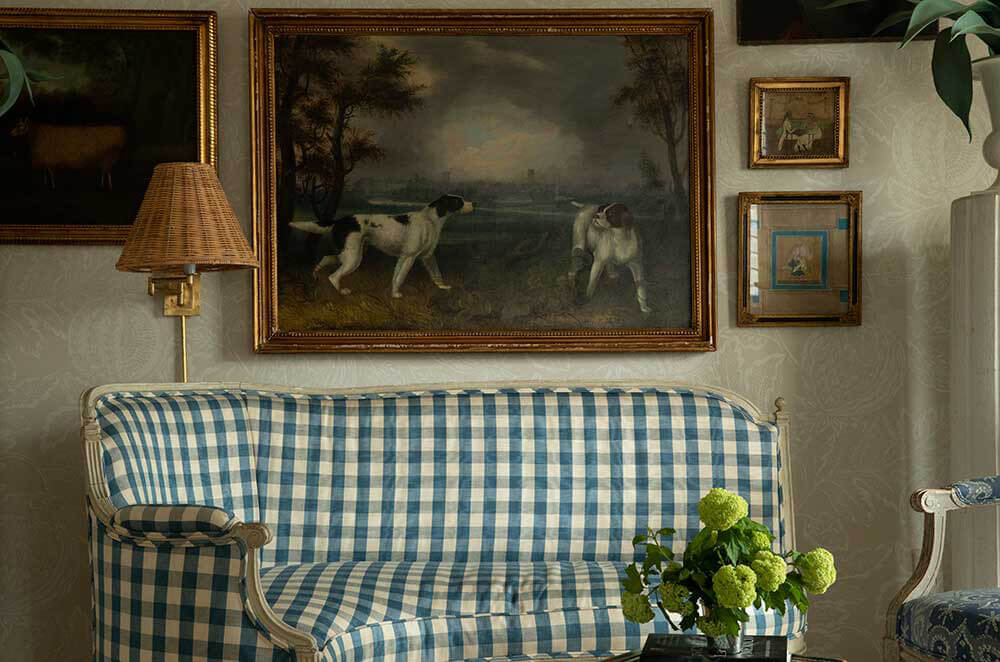
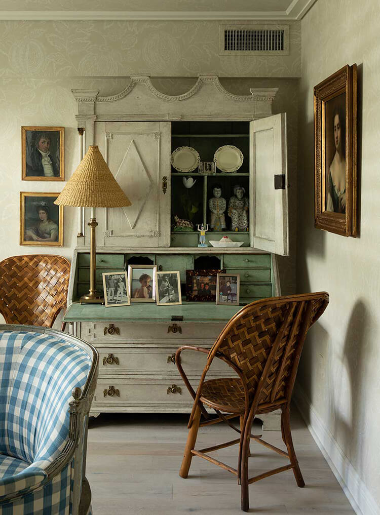
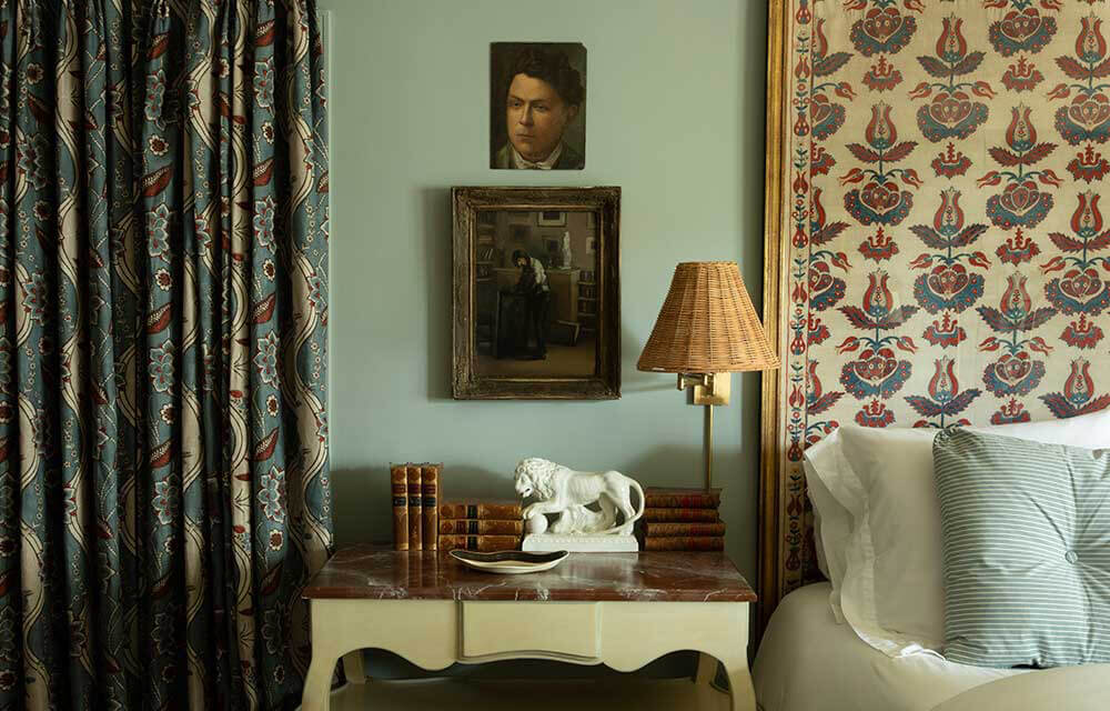
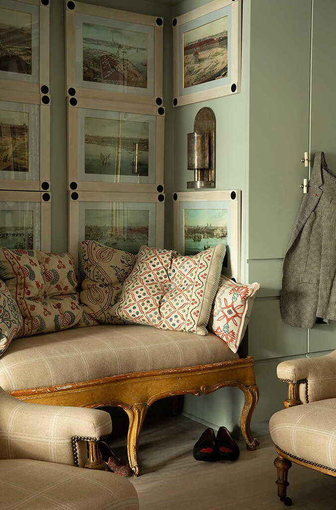
Sharing another unexpected interior by Studio Gusto – this time for a home in Washington, D.C.. What a lovely surprise this would be walking through the front door. Also I am having a serious dose of library envy. A must-have in the next house! Photos: Stacy Zarin Goldberg.
Old world vibes in a Palm Beach condo
Posted on Wed, 15 Nov 2023 by KiM
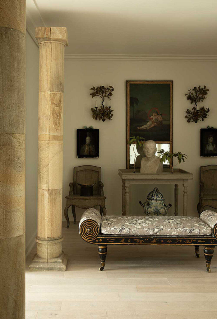
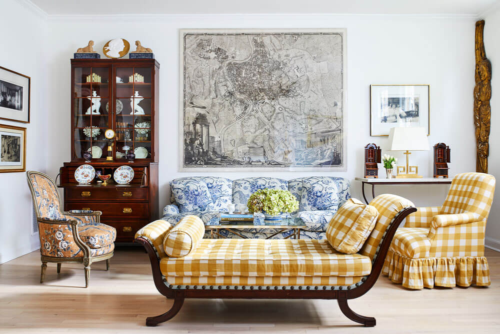
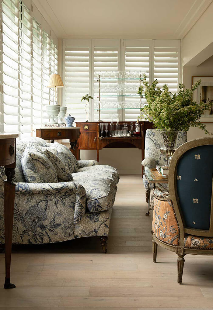
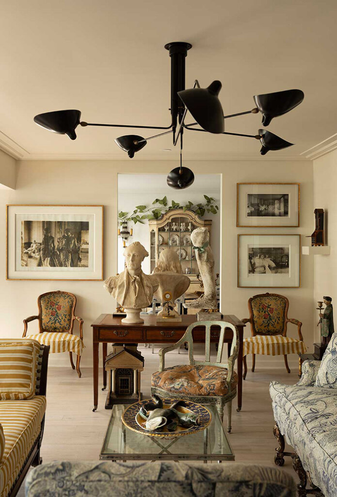
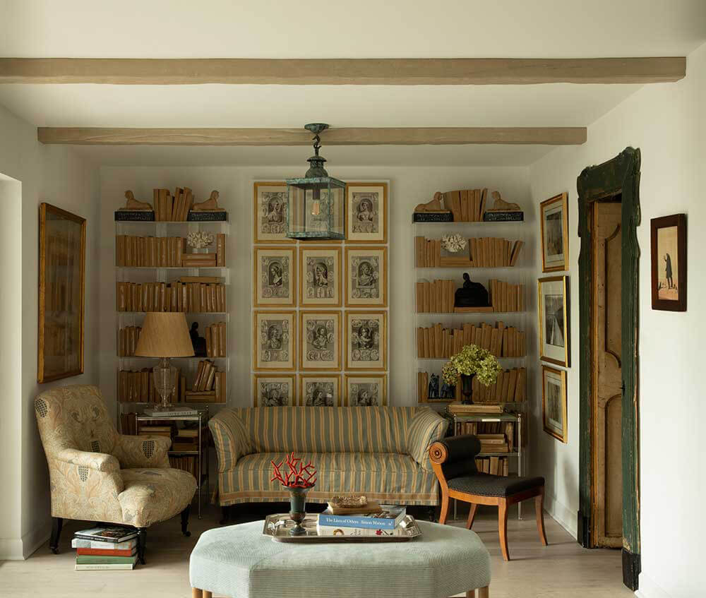
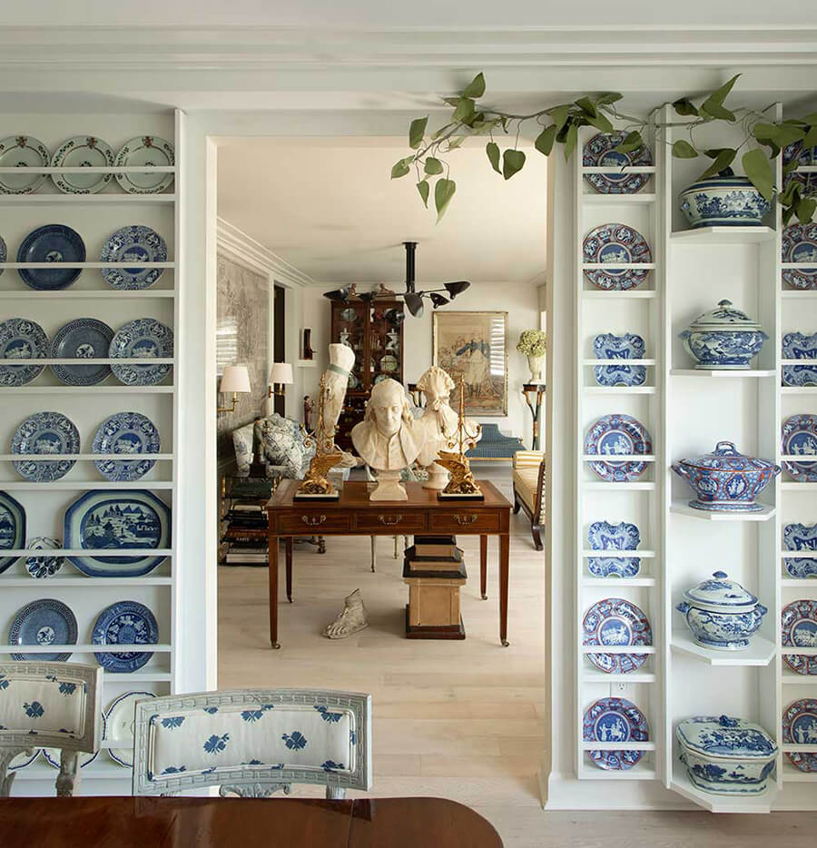
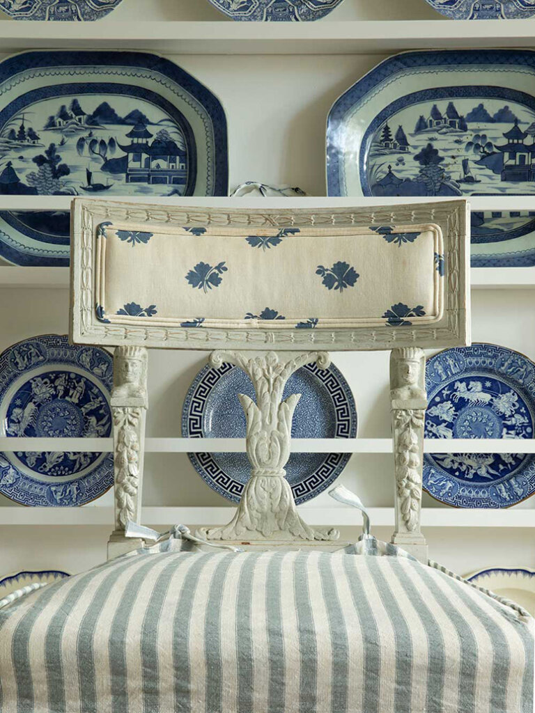
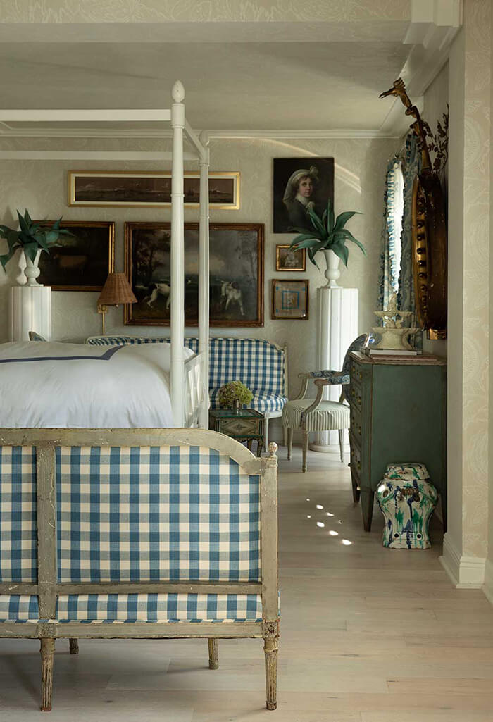
Old world charm and loads of antiques with vibes you would expect in a manor or castle-like setting from one of my Sunday posts, but instead in one of the last places I would expect – a Palm Beach, Florida condo. Architectural details like massive marble columns, salvaged door frames, ceiling beams and a wall of built-ins for dishes helps bring it all together. Designed by Studio Gusto. Photos: Charles Peed.
A few more new books that landed in my mailbox
Posted on Wed, 15 Nov 2023 by KiM
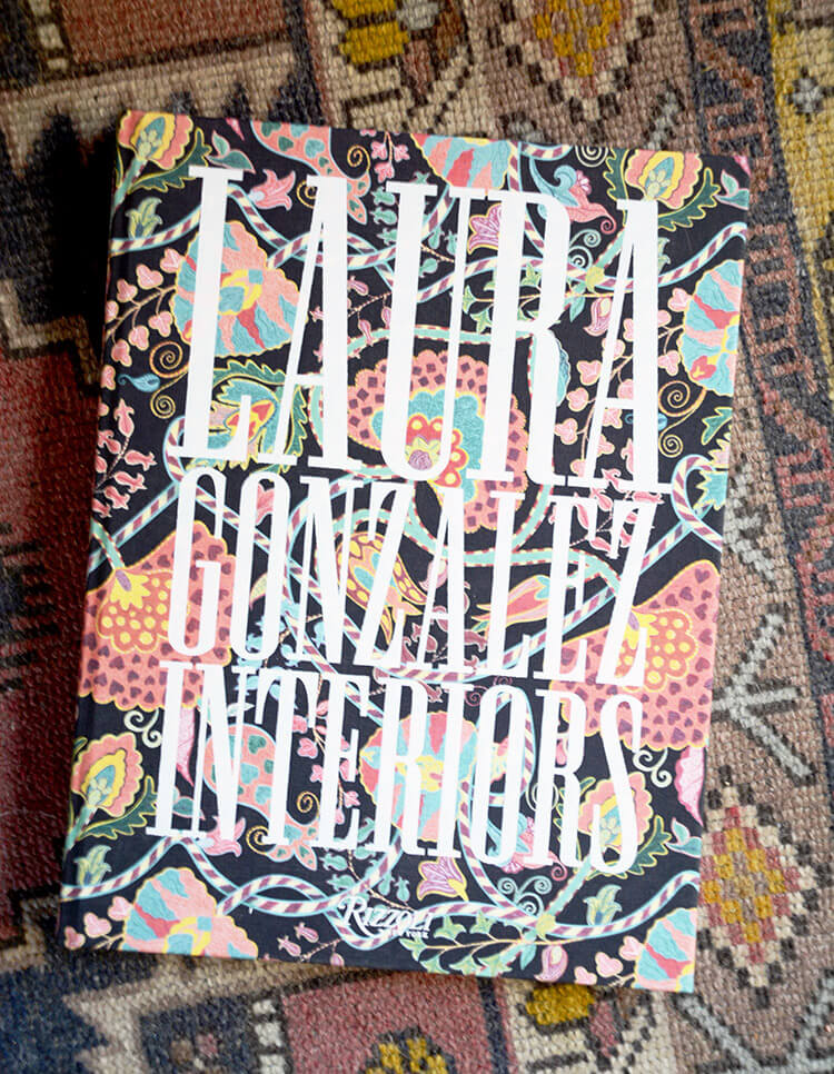
I wanted to share another batch of books that landed in my mailbox lately. All of which are great Christmas gift ideas. Can’t go wrong with a book filled with pretty pictures!
First up is Laura Gonzalez: Interiors, published by Rizzoli (with text by Cédric Saint André Perrin). Known for her chic mix-and-match style, one of Paris’s most in-demand interior designers presents her most standout projects in a highly anticipated debut monograph. A designer and architect renowned for her inventive use of rich patterns, textures, and joyful details, Laura Gonzalez’s interiors exude a vibrant boldness tempered by elegant romanticism. She draws inspiration from a classical world imbued with contemporary sophistication, as well as diverse cultural influences from Chinese and Indian to French and Spanish. Gonzalez’s eye for pairing palettes and her hallmark whimsical touches have transformed her into one of the French capital’s most popular designers, with luxury brands and the trendiest hotels calling upon her know-how.
I was not very familiar with Laura’s work but was pleasantly surprised when I first dug into this book. Her use of colour and pattern and some of the really elegant spaces she has designed makes this a wonderful book full of inspiration. Also, the cover is the prettiest pattern and is cloth so it is the perfect book to put on your coffee table.
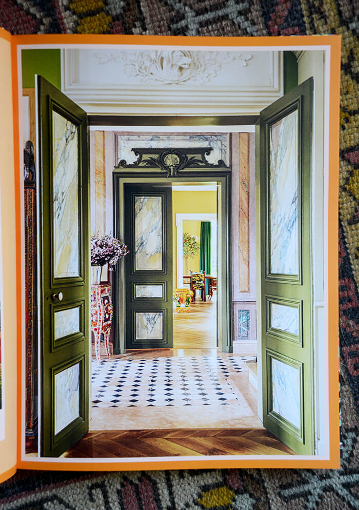
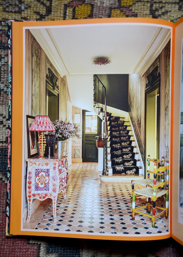
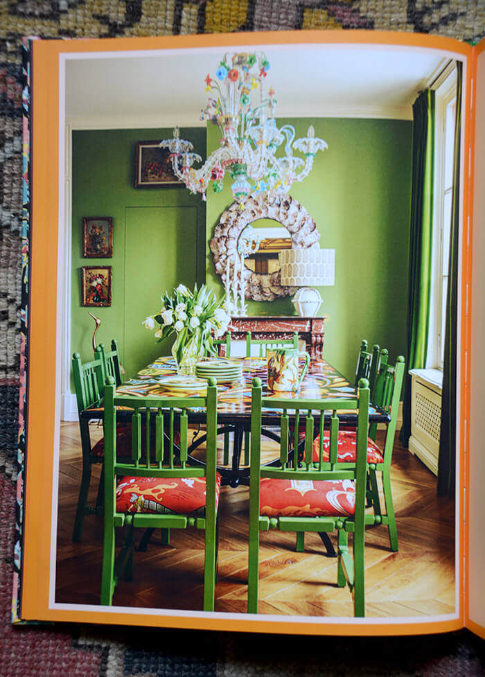
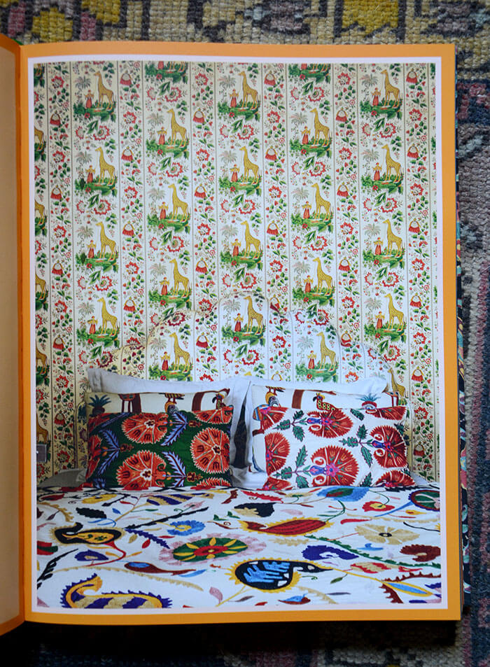
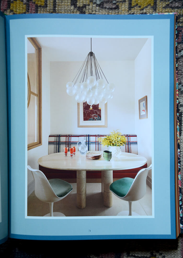
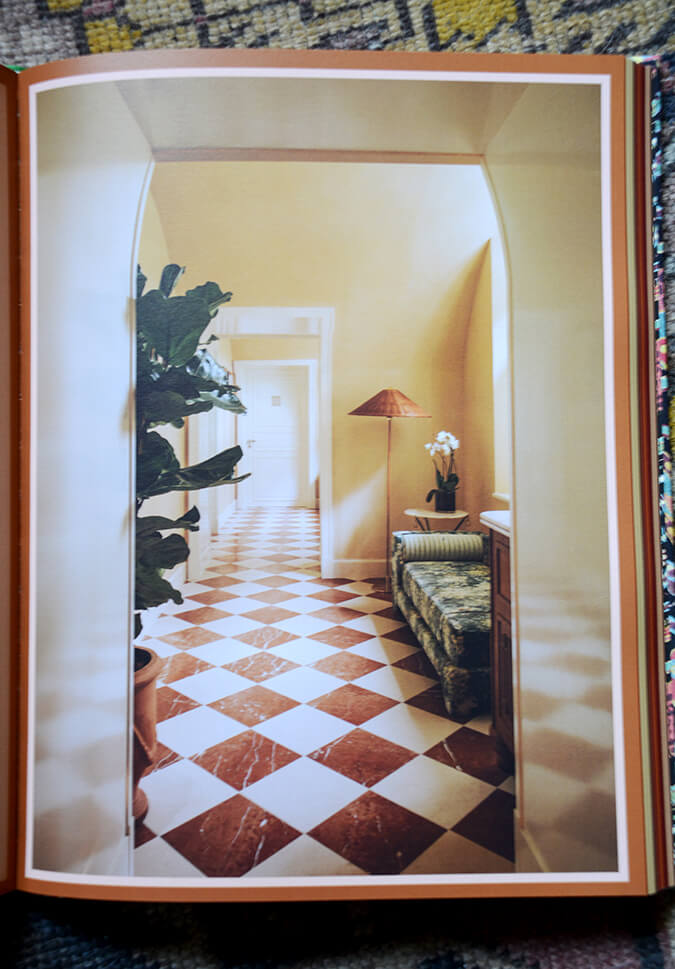
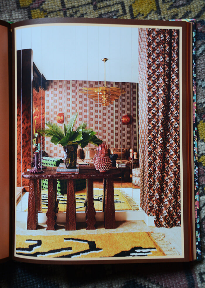
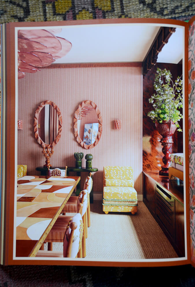
Next up is another beautiful book, inside and out. This is another glorious cloth cover and so pretty sitting out on a shelf. James Boyd Niven: Interior Design by James and Diego A. Flores, published by RIzzoli.
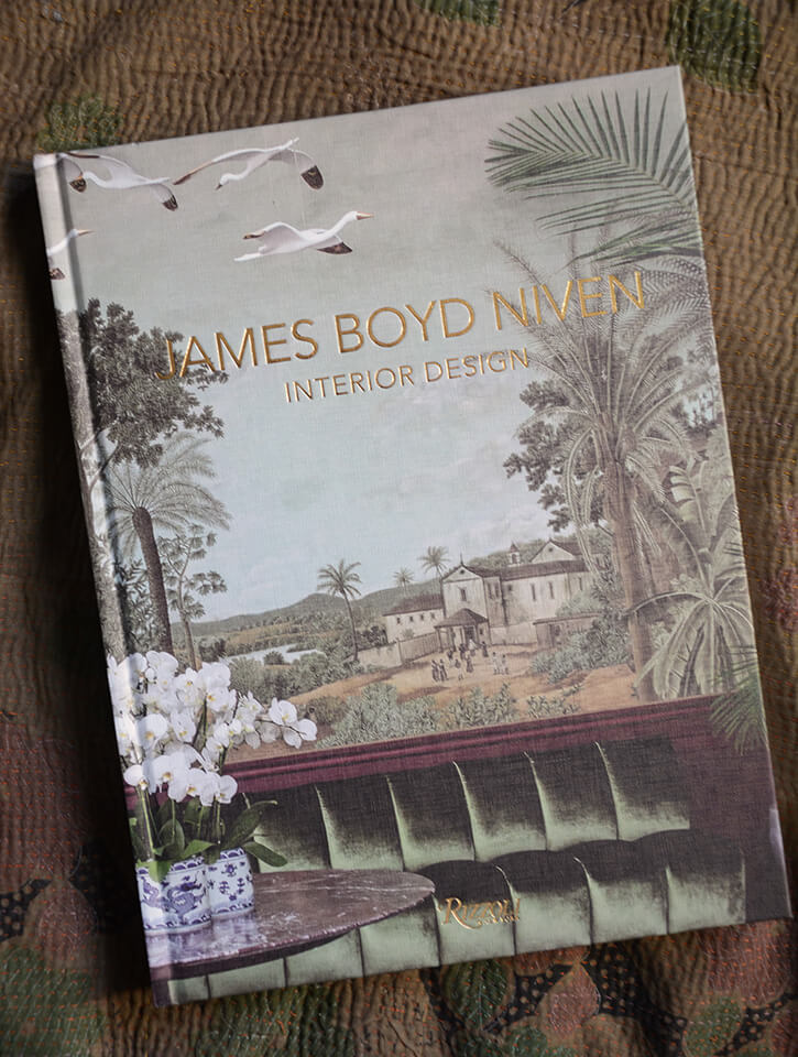
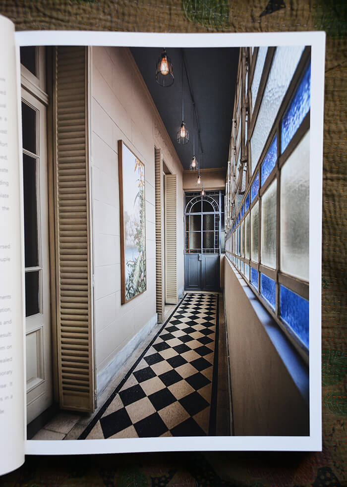
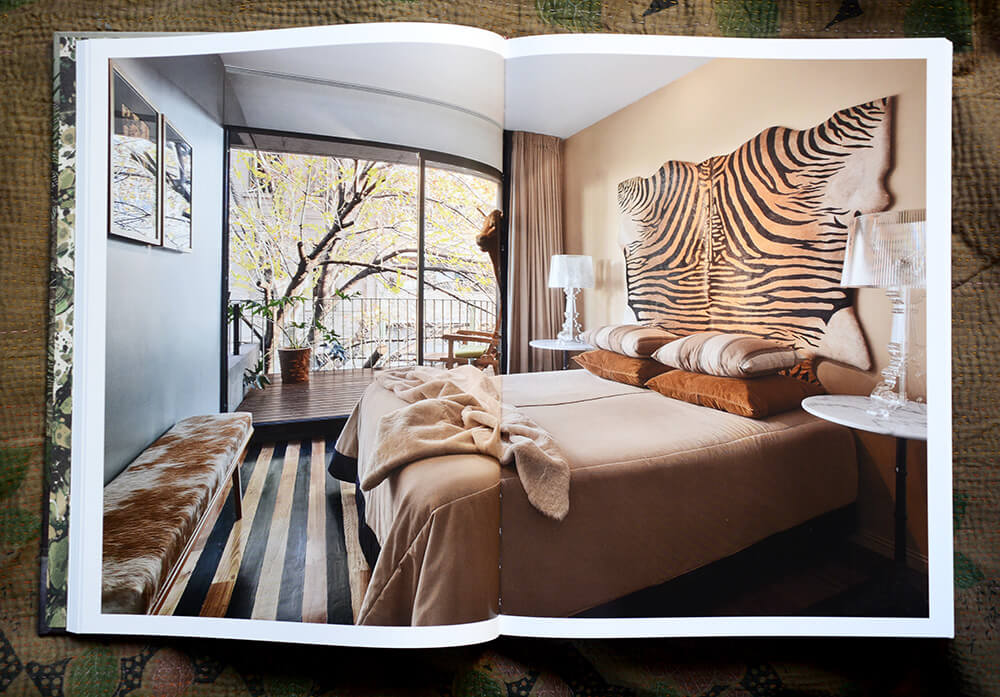
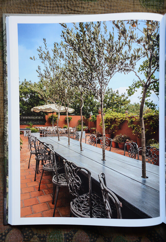
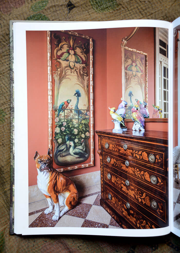
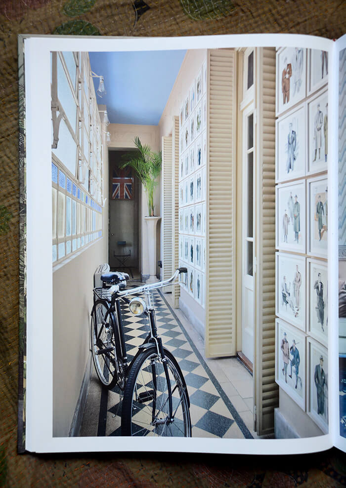
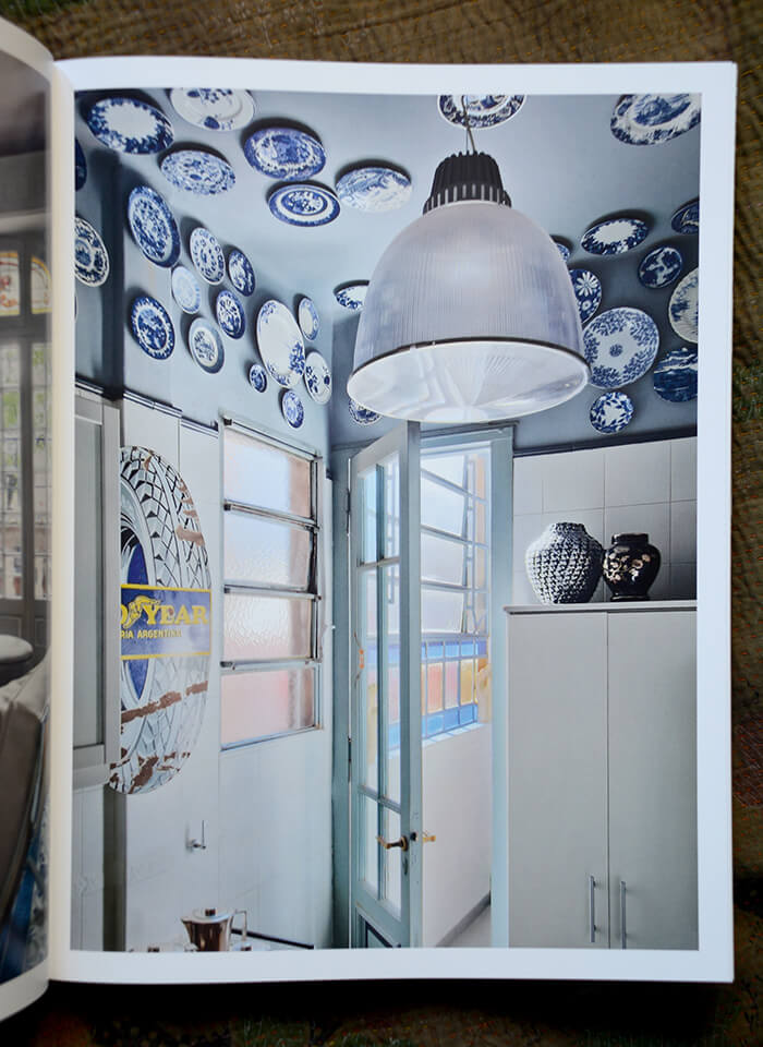
The first book from British-Argentinian interior designer and creative director James Boyd Niven, merging South American cultural and historical references to produce youthful, vibrant design. With five chapters divided by theme and geographical location (Urban/Buenos Aires, Rural/Campo, Austral/Patagonia, Hospitality/Montevideo, and Beach–Horseback riding/José Ignacio, Uruguay), the book features multiple homes illustrating each style through a coherent and amicable aesthetic. The aromas and flavors of these regions are compounded in this book to illustrate the varied South American lifestyles and cultures. A section highlights table settings designed to complement the projects and to tell a story through the five senses.
I was also not familiar with James’ work and found lots of eye candy in this book, though found it a bit disappointing towards the end, feeling like much of the content was just there as “filler”.
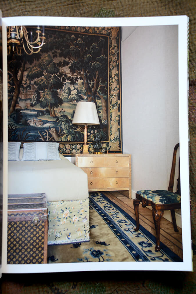
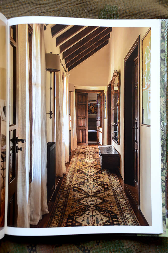
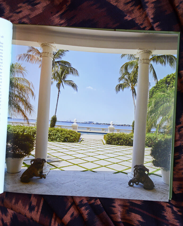
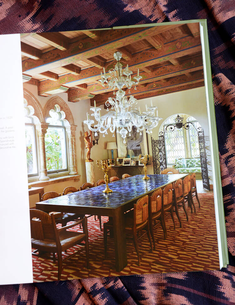
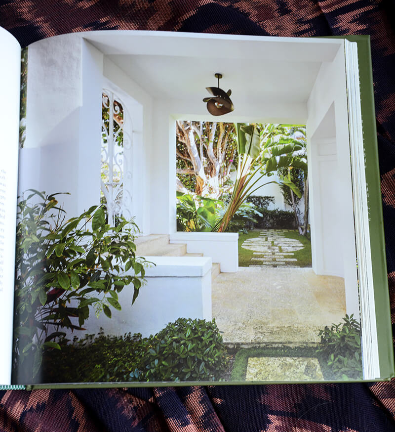
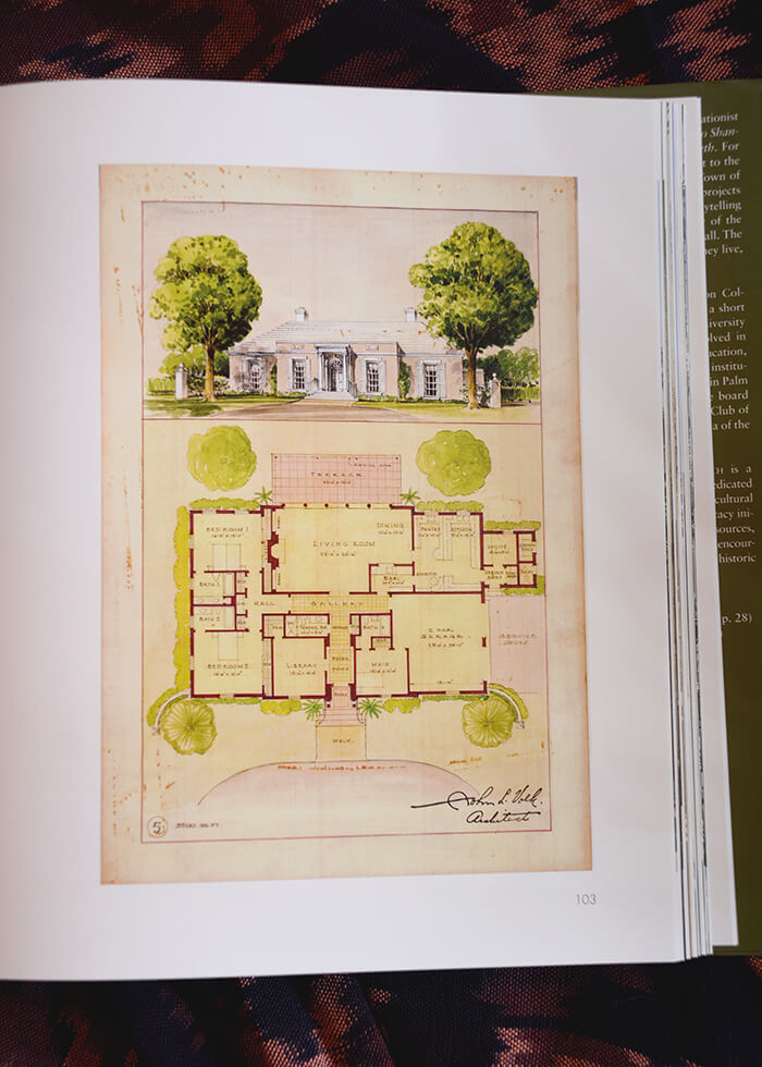
And last but not least, Palm Beach Style: The Architecture and Advocacy of John and Jane Volk. Authored by Jane S. Day, with Preservation Foundation of Palm Beach, published by Rizzoli. This wasn’t really my cup of tea as it was more of a “history book” but would be a great gift for someone who lives or vacations in this spectacular area.
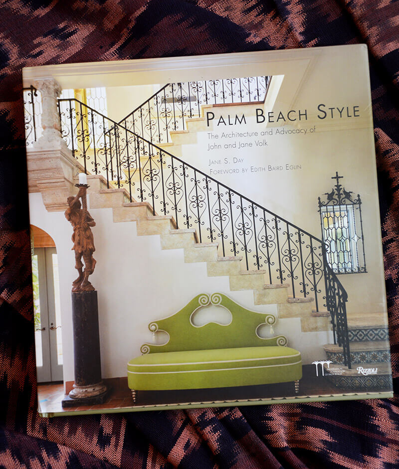
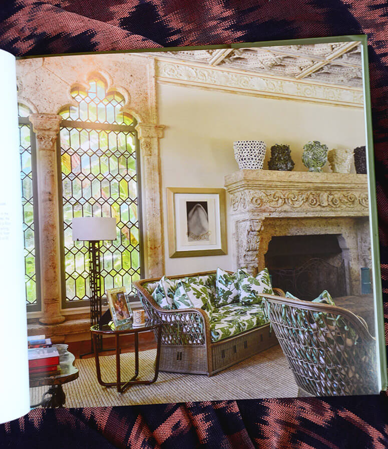
Palm Beach style is the expression of elegance and romance everywhere evident in this paradise and epitomized in the lives and work of architect John Volk and artist-preservationist Jane Volk. Together they conjured up much of the magic that now makes the place. The book explores this unique chemistry and the dazzling homes that are the result. John Volk was one of the “big five” architects of Palm Beach. It was here, during his sixty years of practice, that he was commissioned to design over 2,000 projects, among them the Royal Poinciana Plaza as well as additions and renovations to the Everglades Club. This book is about the Volks, and the part they played in conjuring the spell with which Palm Beach continues to enchant.
Pretty colours and whimsical patterns in an east London town house
Posted on Mon, 13 Nov 2023 by KiM
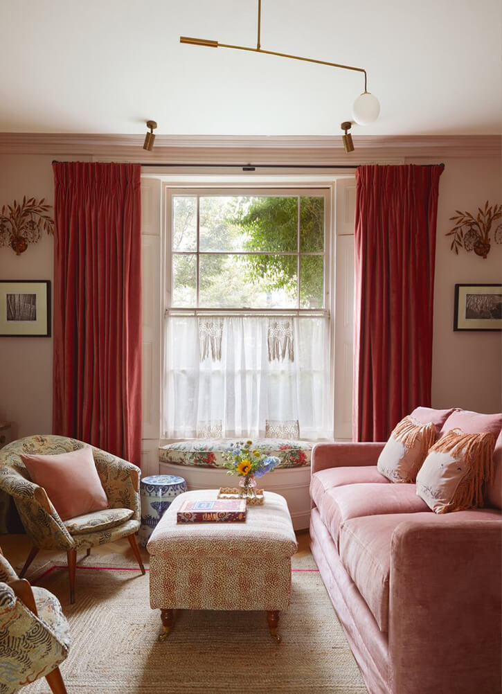
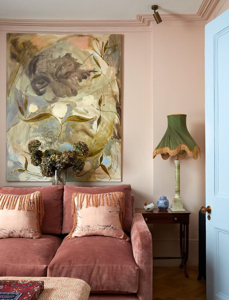
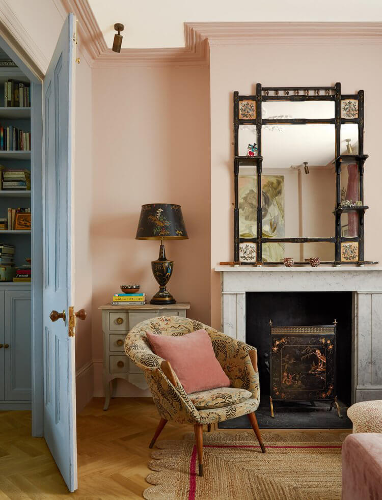
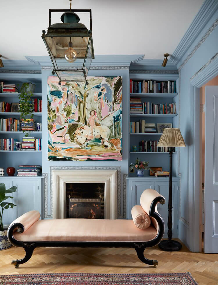
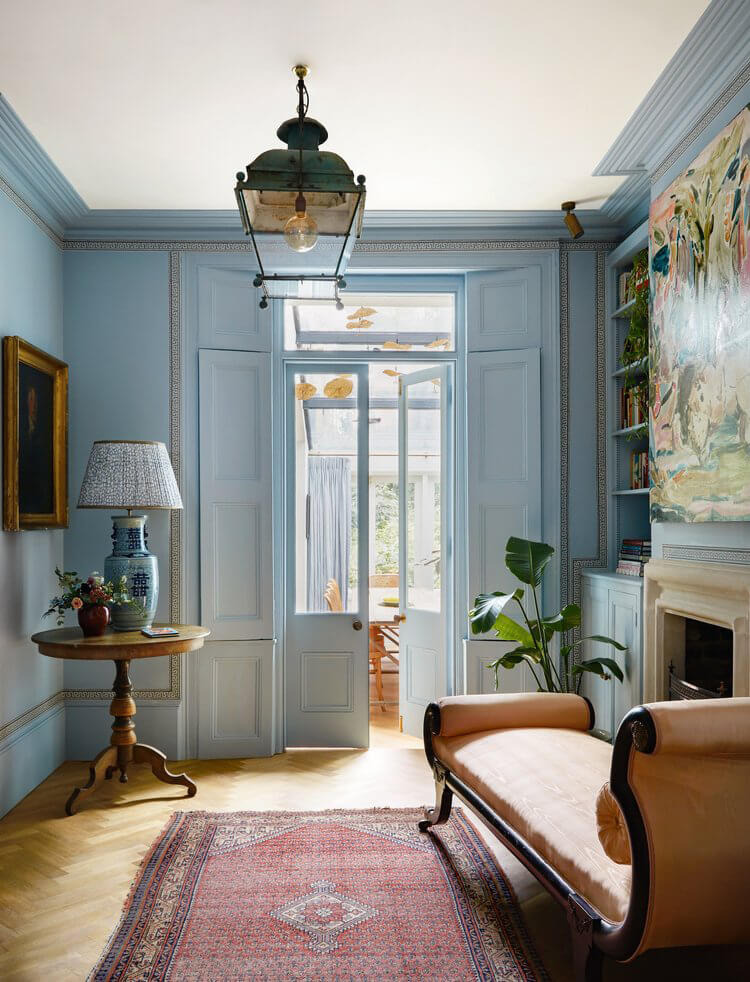
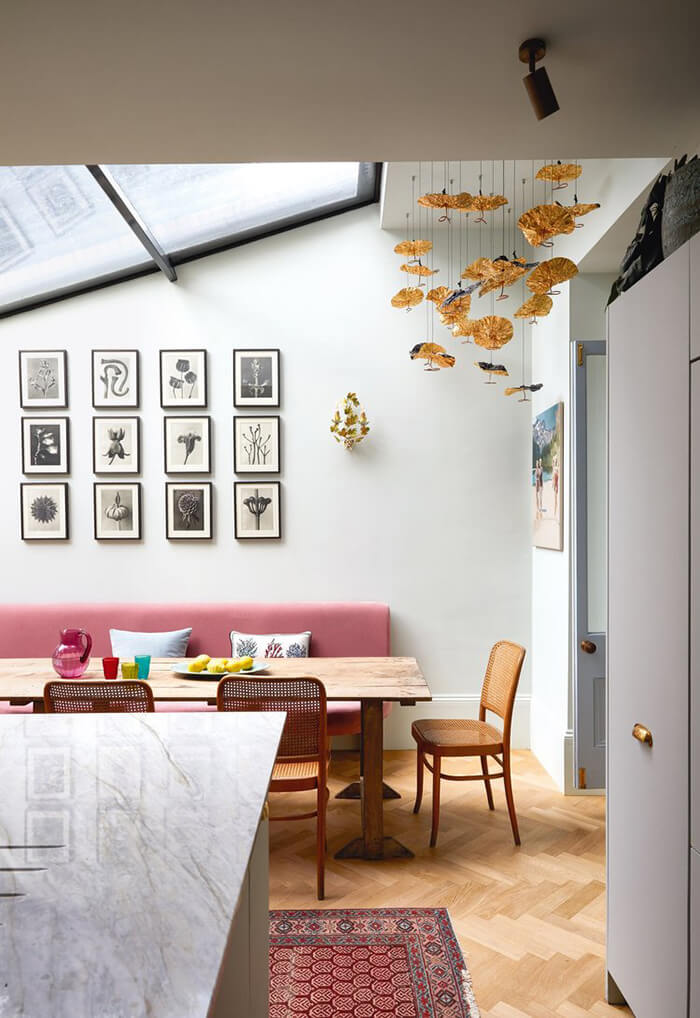
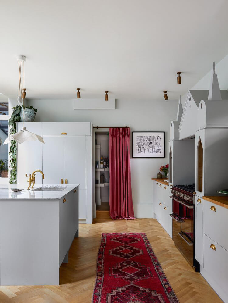
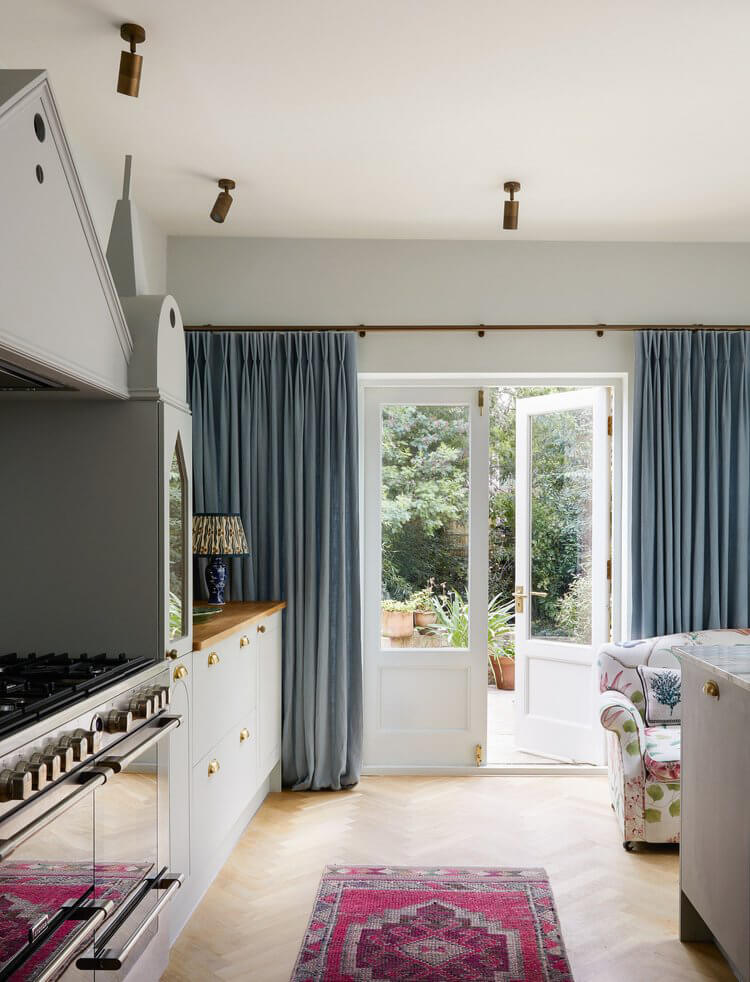
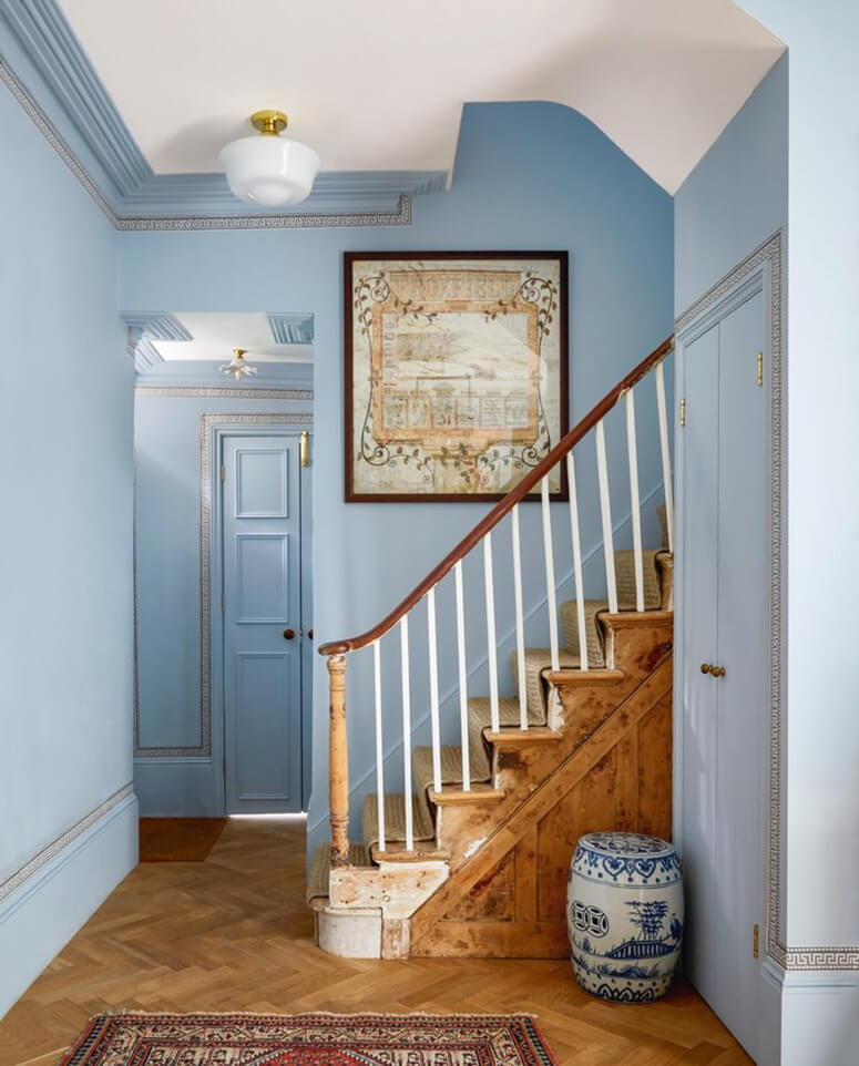
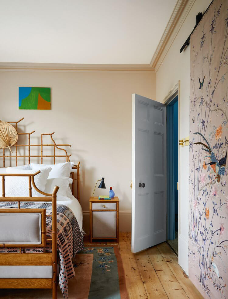
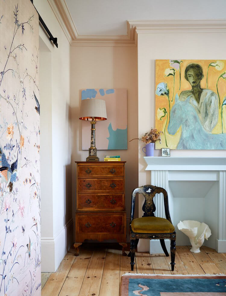
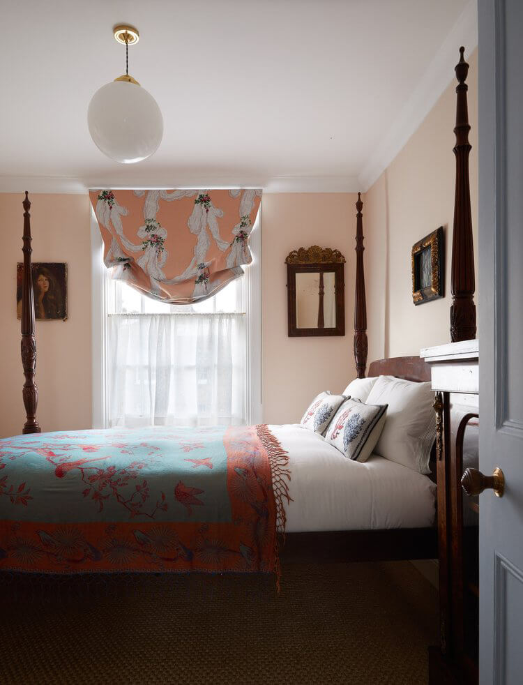
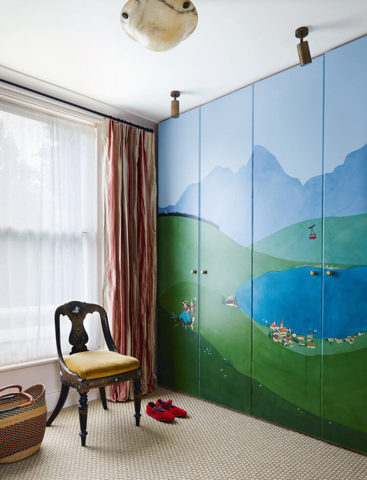
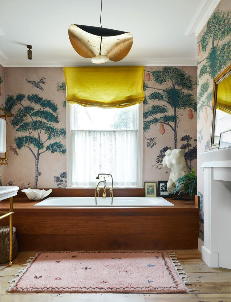
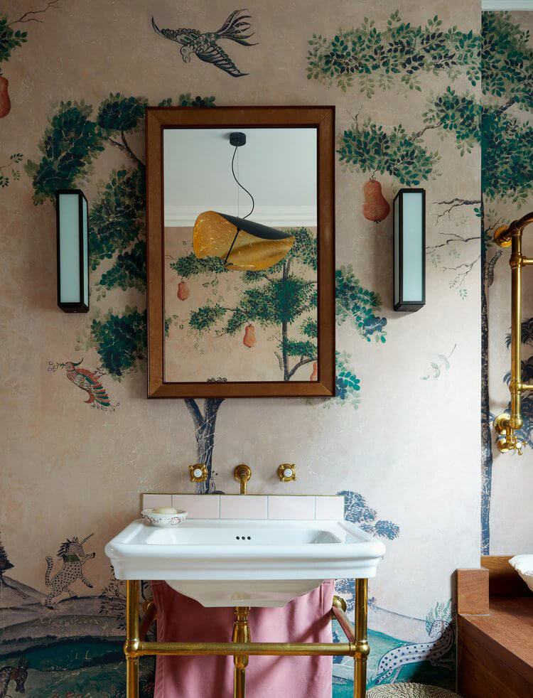
Bespoke pale pink and blue walls, a kitchen decorated with turrets and finials, murals and tree wallpapers mix with antique and vintage furniture to create the prettiest, eclectic Victorian home in east London designed by Rachel Chudley. I love that it’s precious but not too precious and the colours are sooo soothing. Photos: Paul Massey
Casa Alamillo 2
Posted on Mon, 13 Nov 2023 by KiM
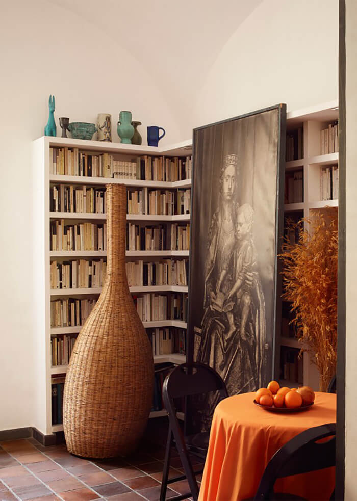
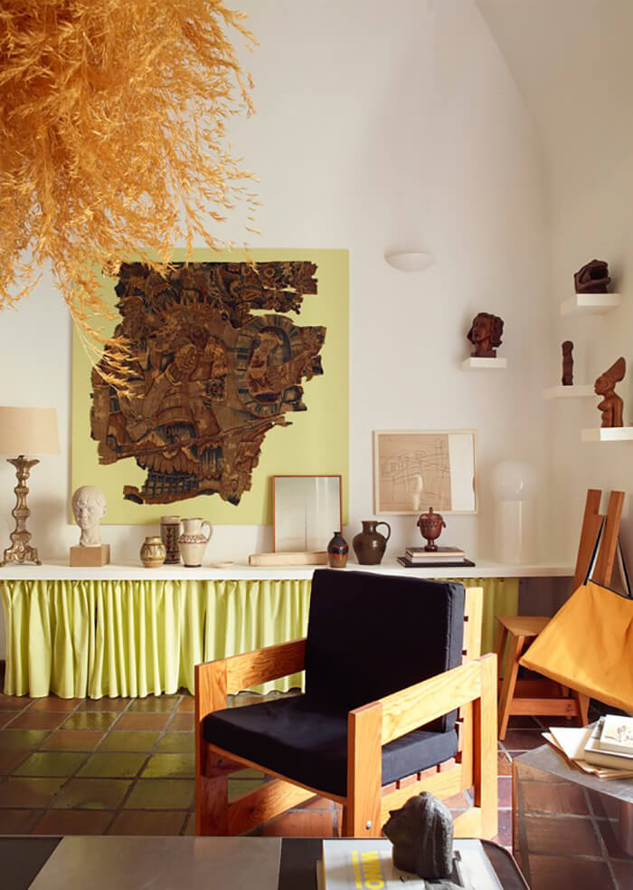
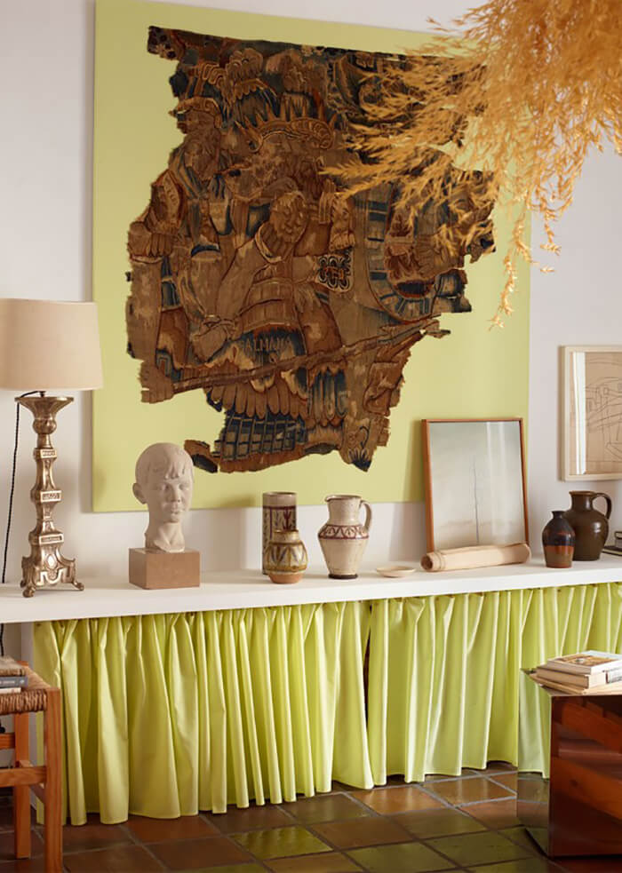
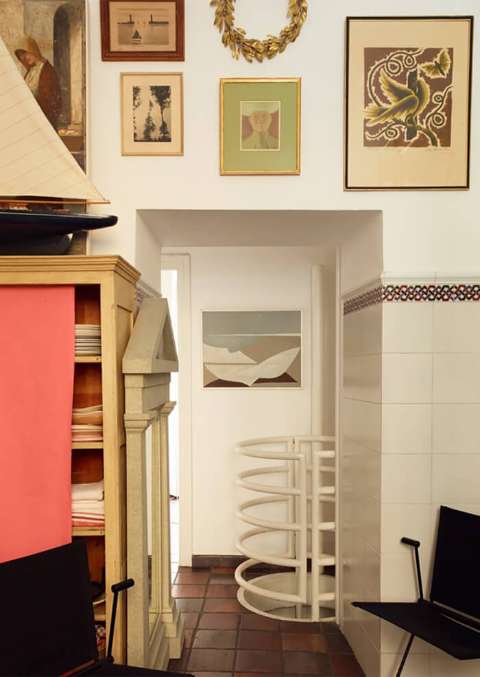
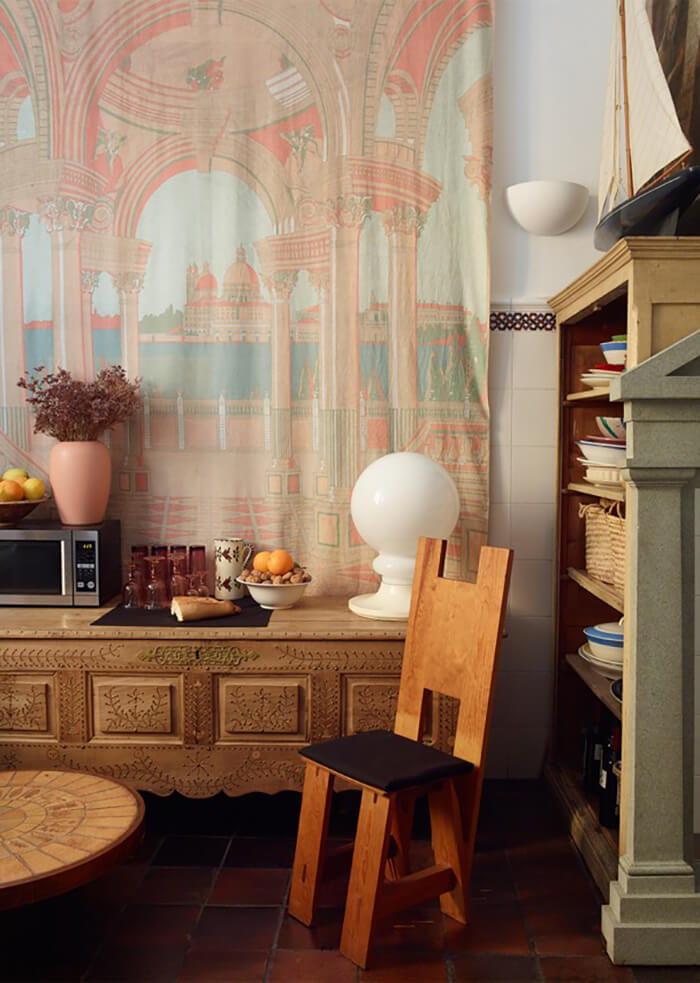
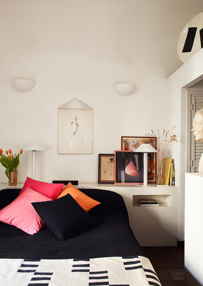
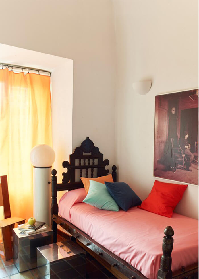
The Madrid apartment of Iñigo Aragón and Pablo López Navarro of design studio Casa Josephine is, as Jo commented in this post on a past project of theirs (I think located in the same building), ‘quirky yet oh so stylish mix of classicism and 80s Italian design‘. This one is perhaps leaning a bit more on the global/ethnic side but I am here for it! These designers have such a unique eye. Photos: Pablo Zamora
