An eclectic apartment in Madrid
Posted on Wed, 13 May 2020 by KiM
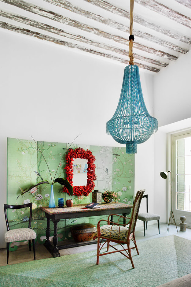
What an absolutely beautiful, vintage-filled apartment this is! Located in Malasaña, Madrid, it is filled with many eclectic and unexpected touches that make it really unique. That screen above is to die for, the sofa cover is GORG (LOVE the draped arms), lots of modern artwork and bits of wallpaper for some added pattern. And there’s even a tree. Designed by Pepe Leal.

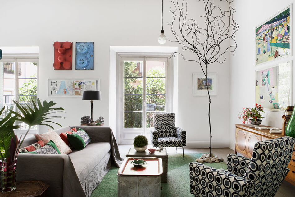
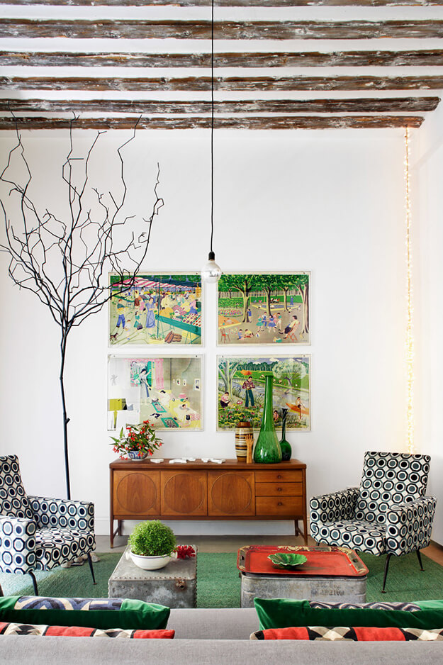

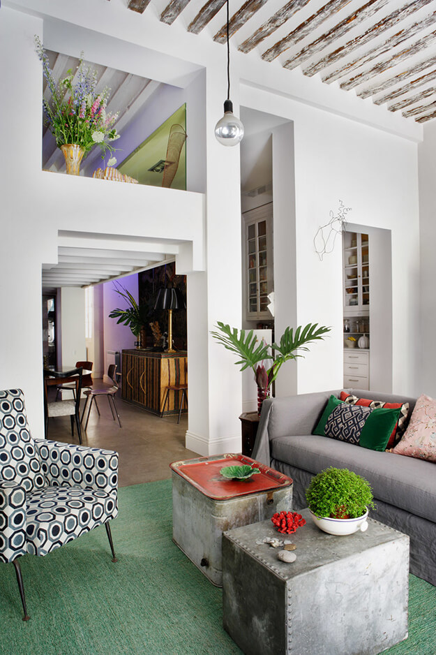
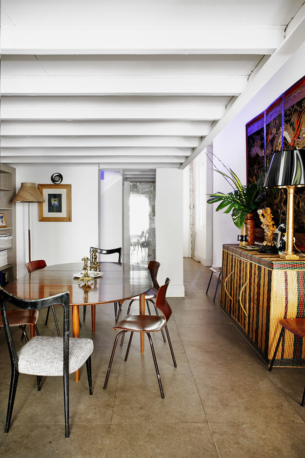
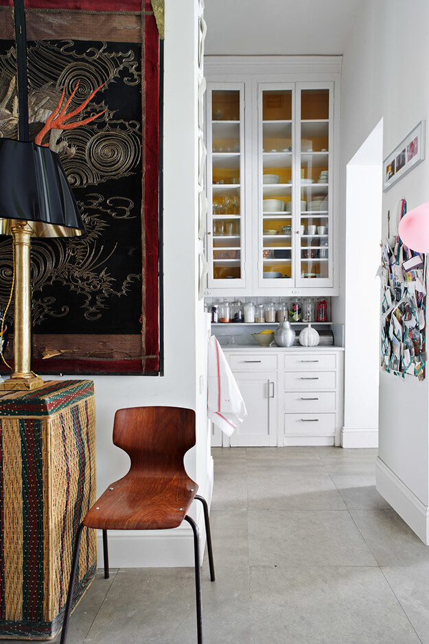
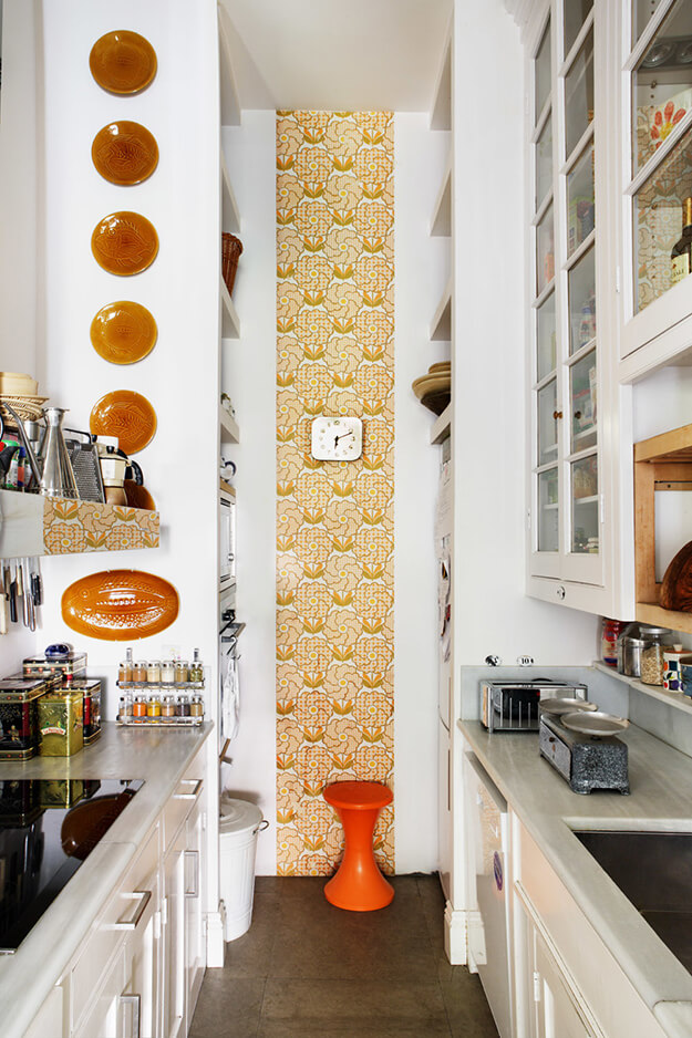
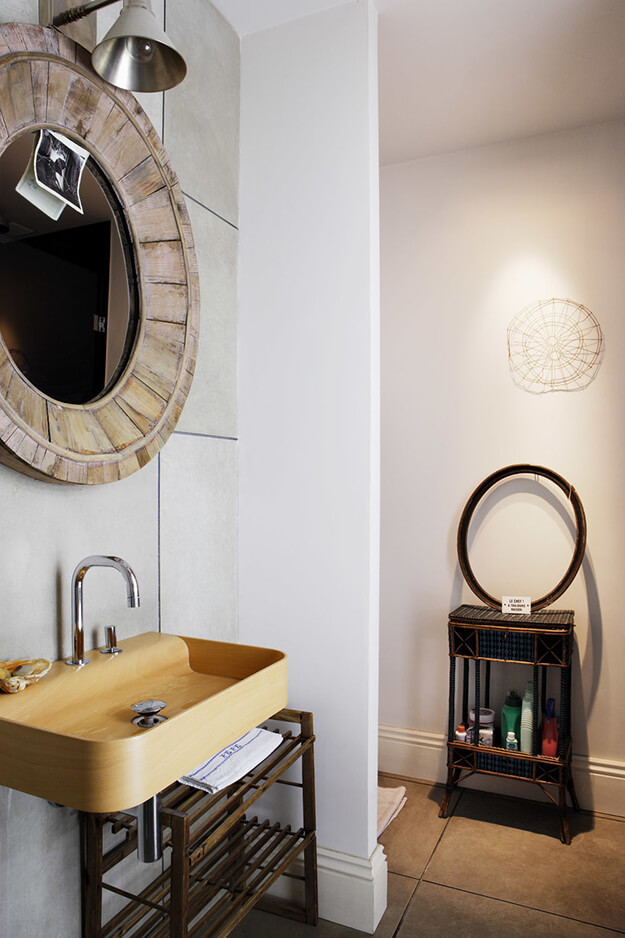
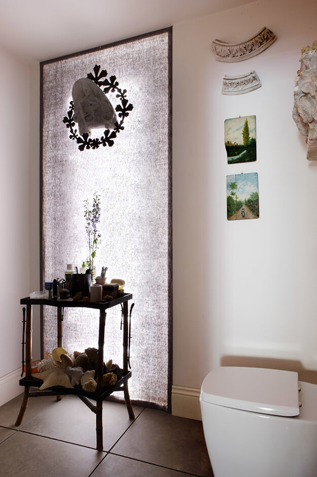
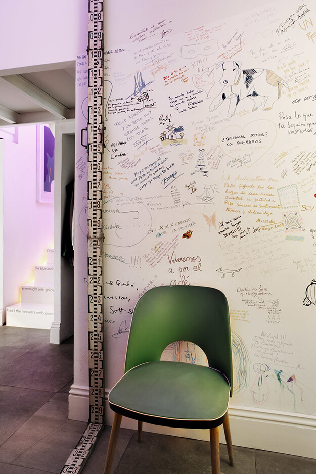
Photos: Belén Imaz


A divinely bohemian 1850s Brooklyn brownstone
Posted on Mon, 11 May 2020 by KiM
Architect and designer Elizabeth Roberts strikes again with another exquisite project transforming centuries-old homes in Brooklyn into modernized masterpieces. In this four-story 1850s brownstone designed for a fashion designer, an art consultant and their children, a premium was placed on the way the space and interiors felt, first and foremost. The result is a bohemian home that is equal parts monumental and tactile. Select restored elements, such as the delicate crown molding in the parlor, play against clean plastered walls. Impactful and modern interventions are rendered with exquisite materials and delicate details, such as the thin proportions of the railings and posts inside and out, an oversized island clad in expressive stone, a family room with an elevated hearth that turns into a bench and a travertine-clad master bath with custom tub. An exquisite balance is struck between bold architectural moves and delicate proportions.
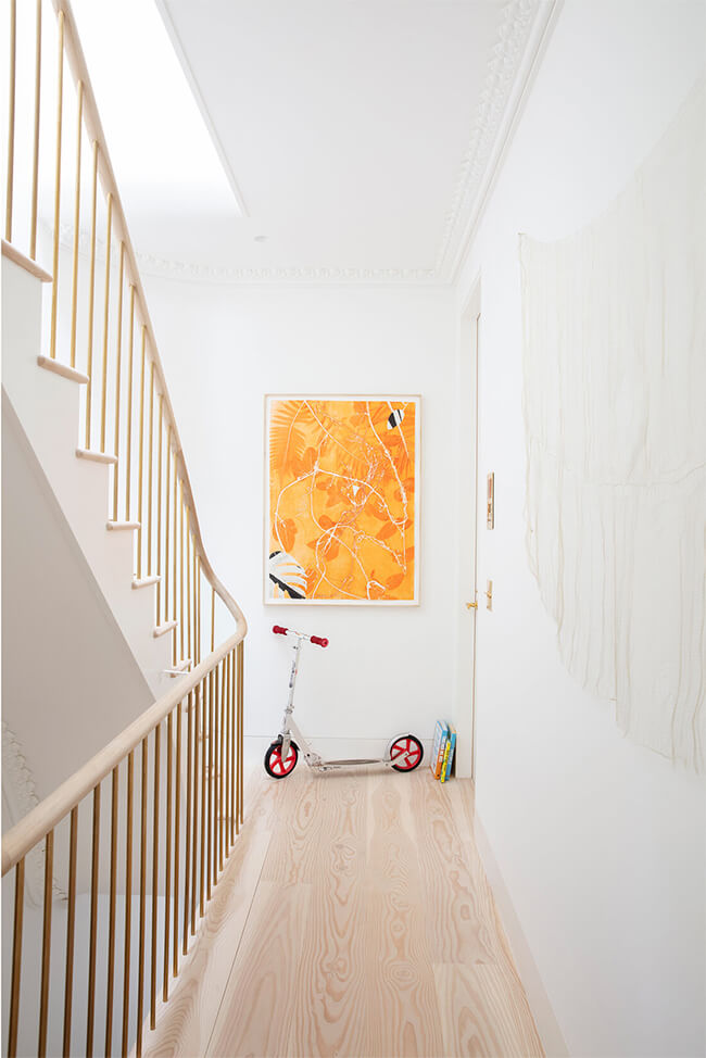
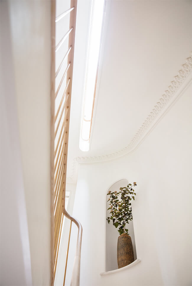
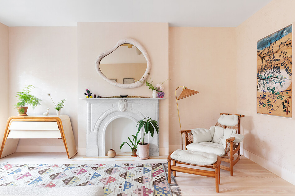
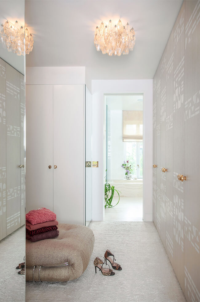
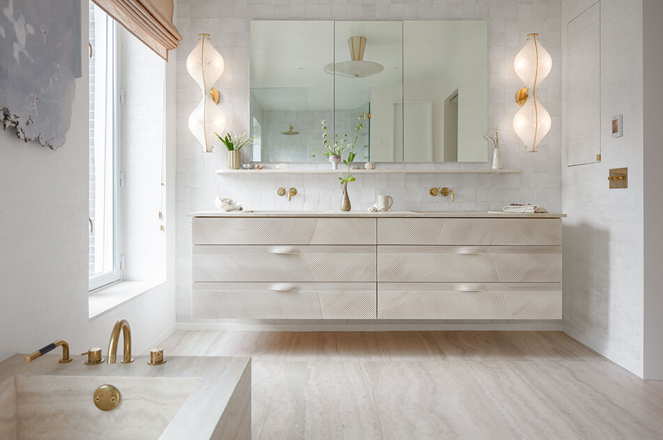
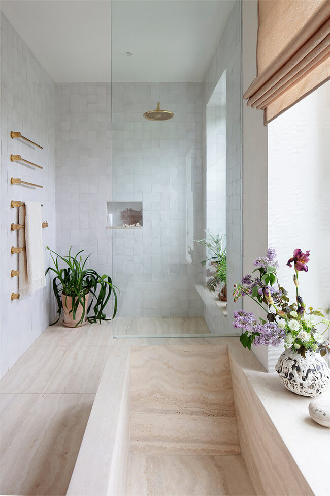

Photos: floto+warner
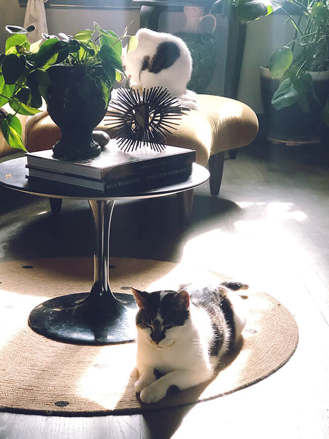
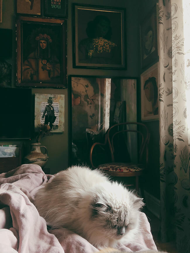
Monday’s pets on furniture
Posted on Mon, 11 May 2020 by KiM
If you would like to participate in the Monday’s pets on furniture series please send photos, your name, location and a brief description to kim[at]desiretoinspire[dot]net, or hashtag your photos on Instagram with #dtipetsonfurniture. Thanks!
View this post on Instagram
And some from me: Felix is the worst note taker and not very helpful while I’m working remotely….In late afternoons you will always find brothers Frankie and Bernie sunning themselves in the living room….and Milo loves to curl up on the bed next to me.

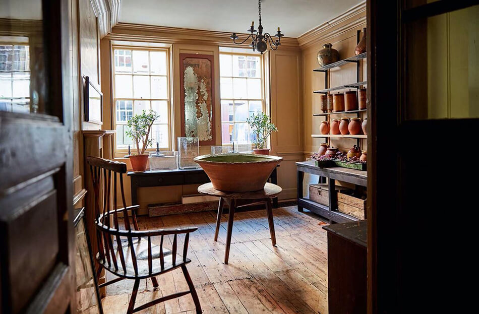
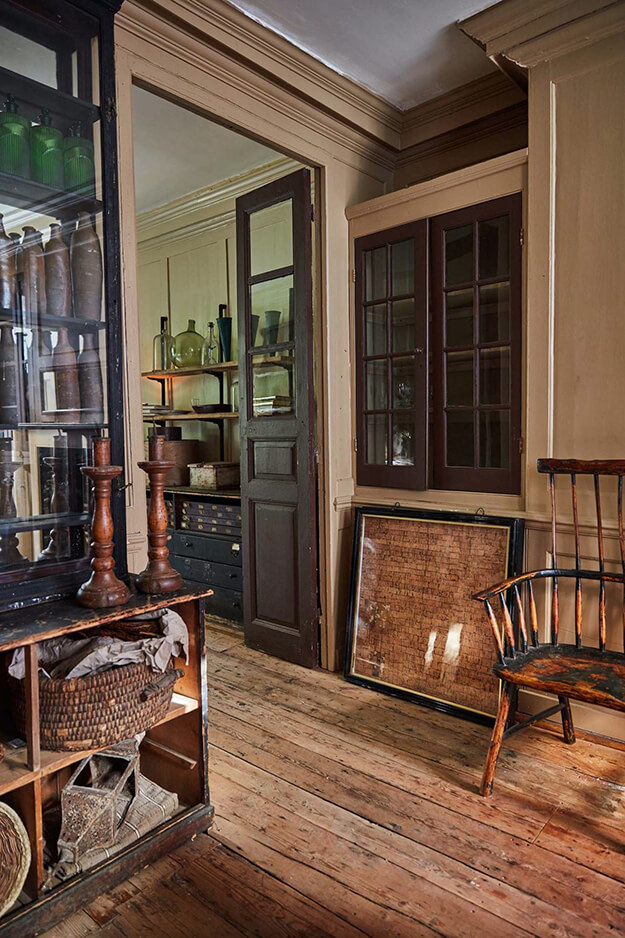
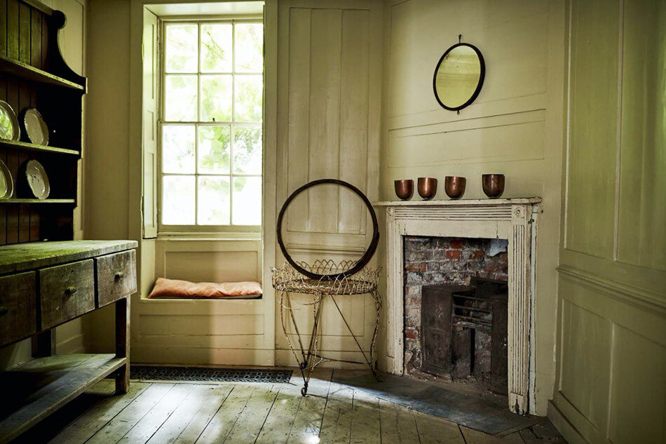
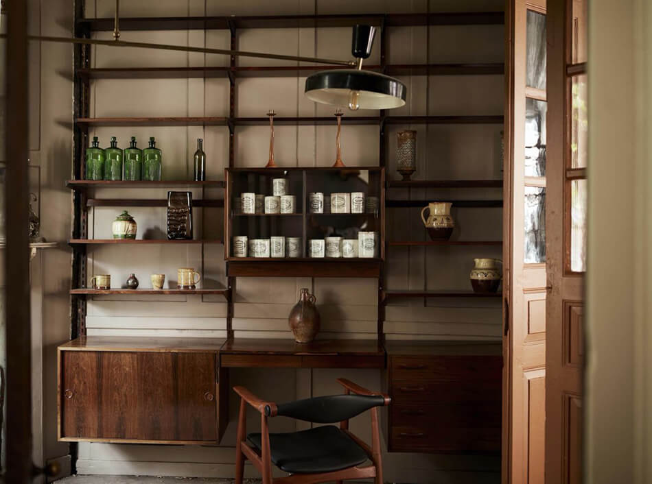
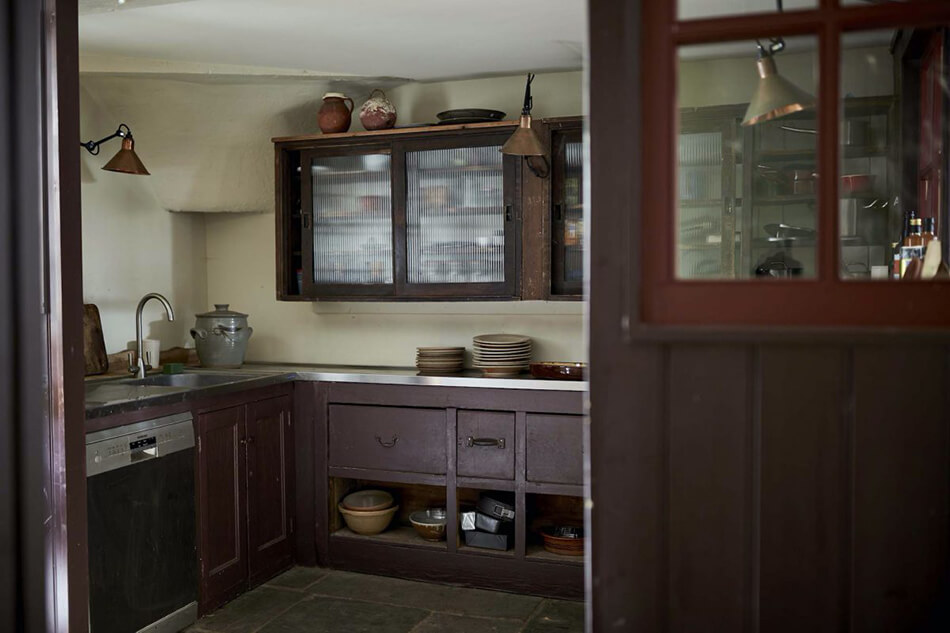
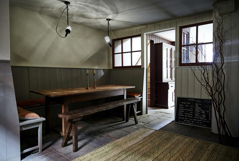
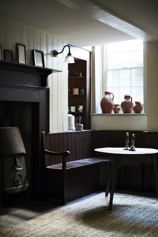
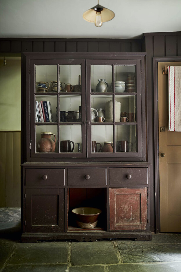
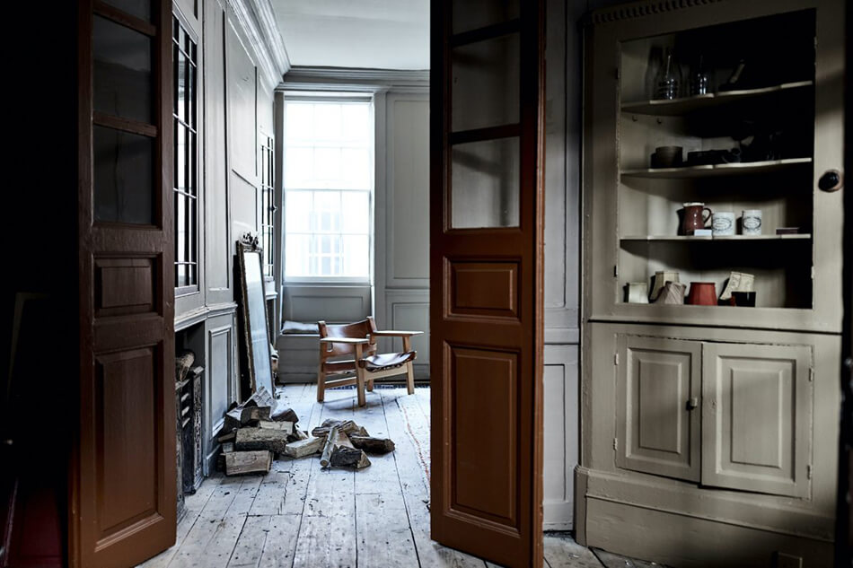
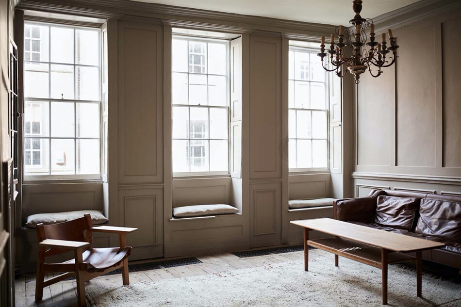
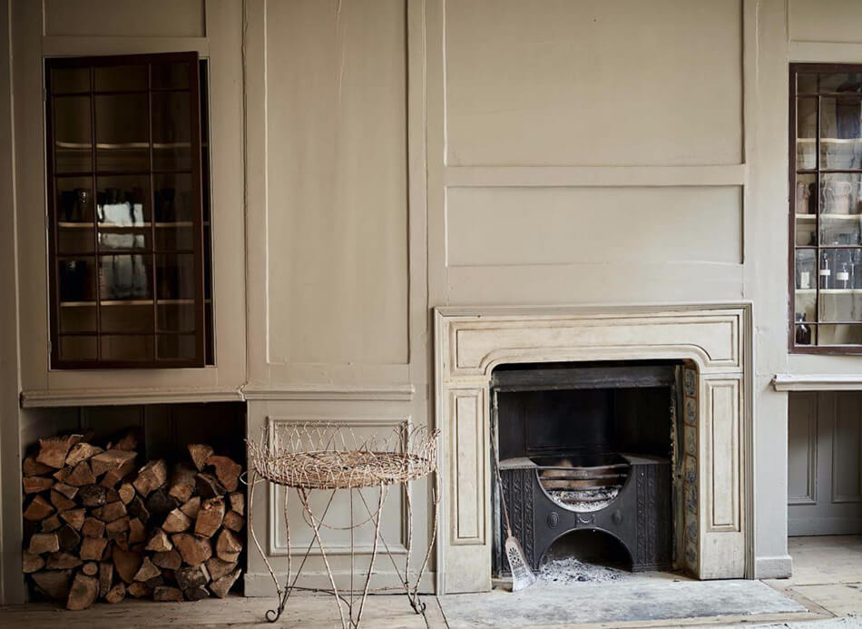
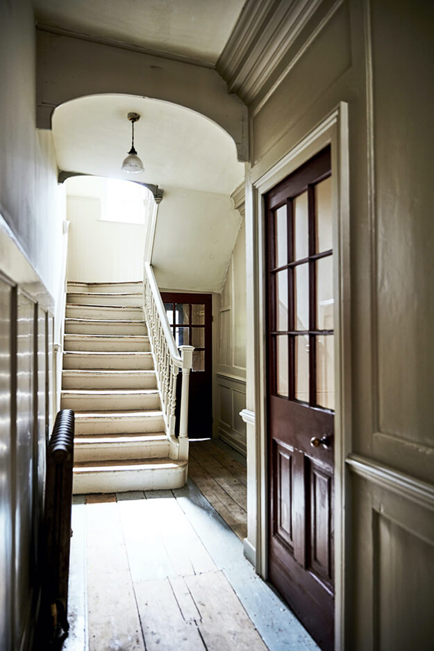
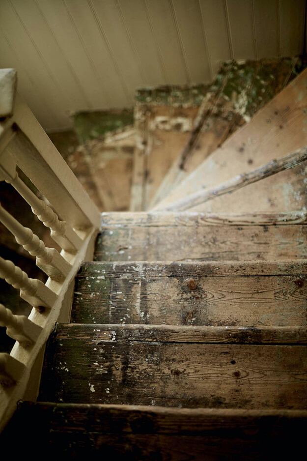
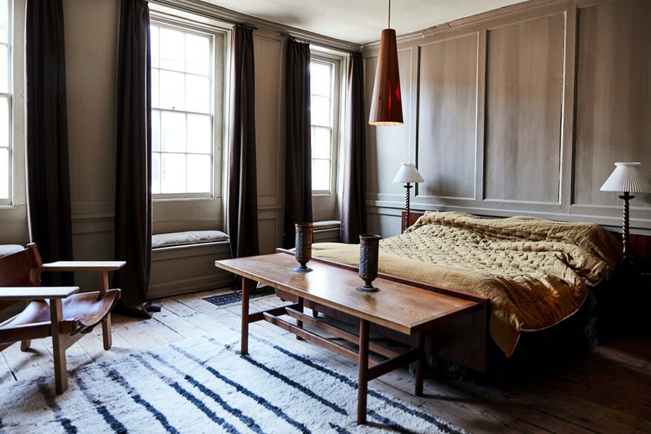
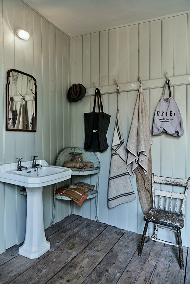
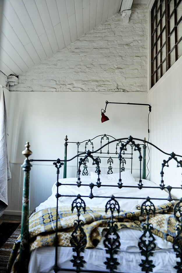
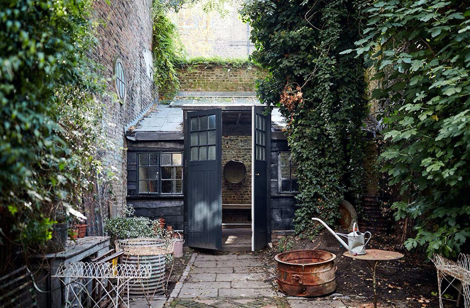
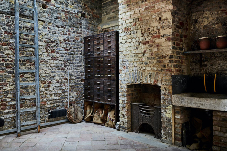
A 1700’s period townhouse in London
Posted on Sun, 10 May 2020 by KiM
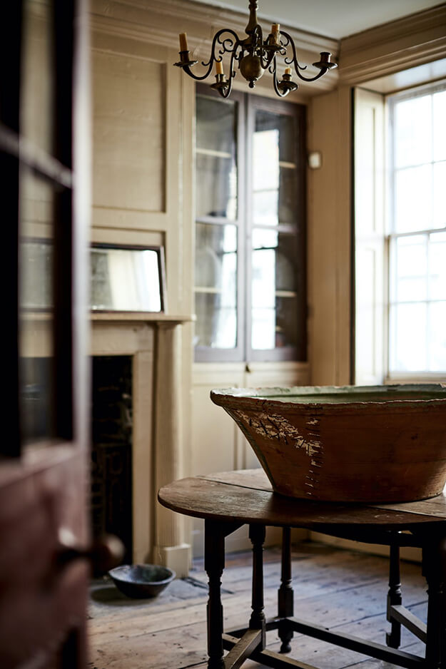
A bit of period magic for your Sunday viewing pleasure. This early 1700’s townhouse in Spitalfields, London is everything you could dream of in a home from that era. Left virtually untouched, as it should be, it is a step back in time with old floorboards, stone, brick, shutters, windows, beadboard, moldings and all the good things. Available as a location home via Shoot Factory.

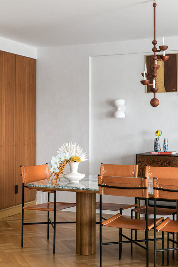
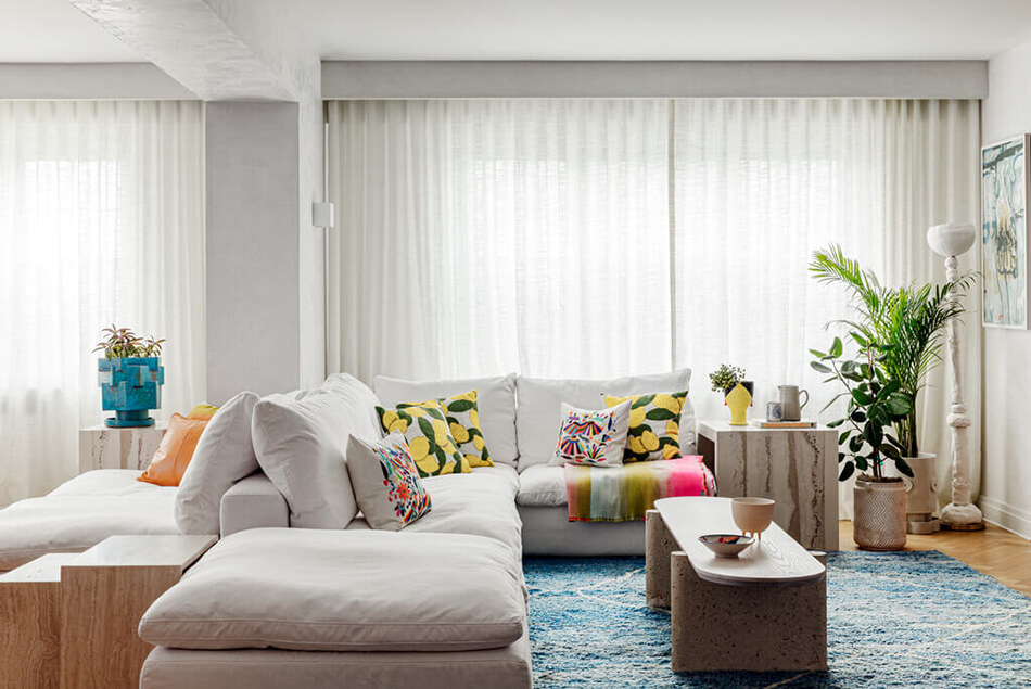
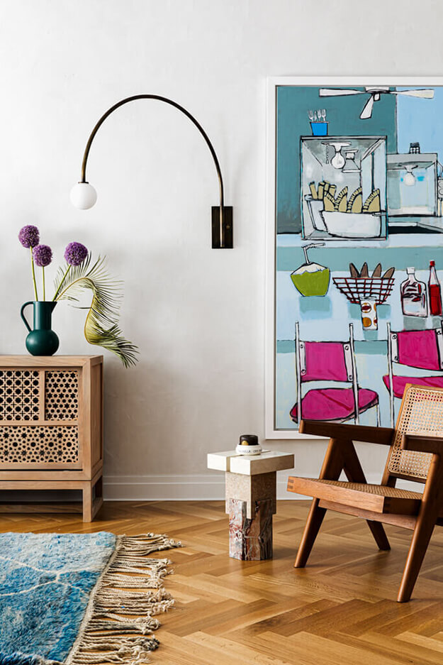
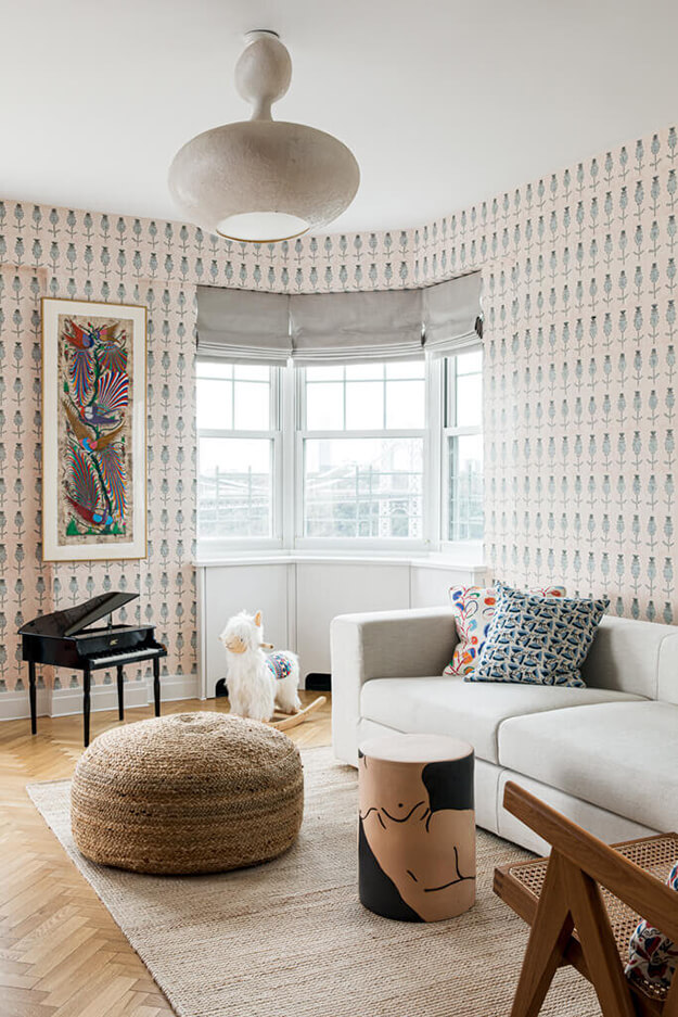
Not afraid of colour
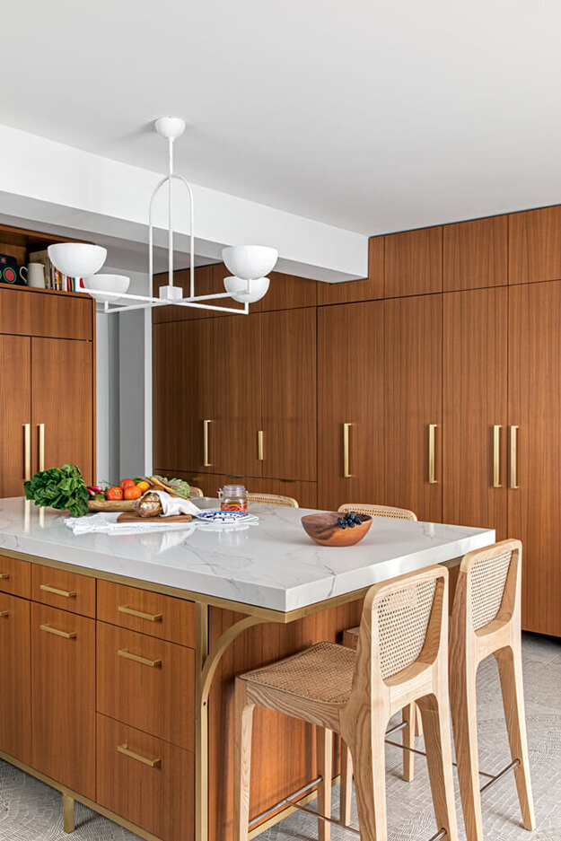
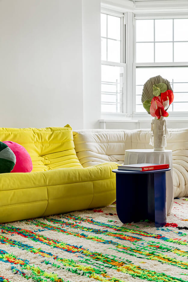
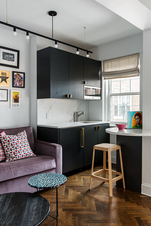
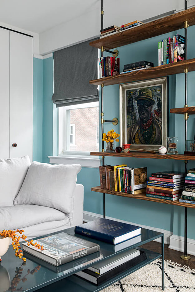
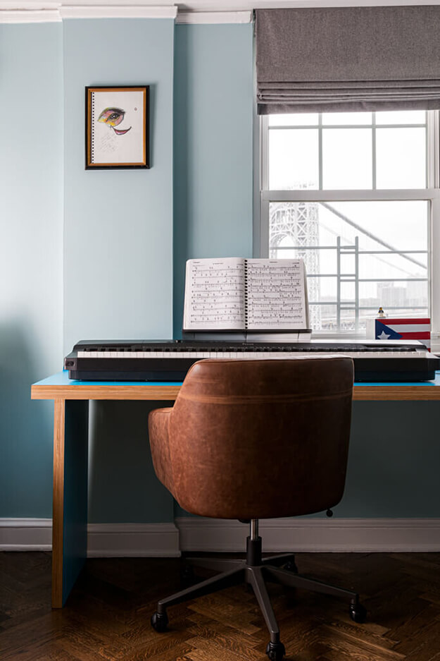
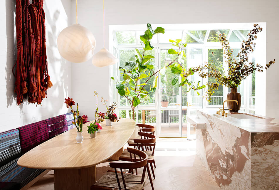
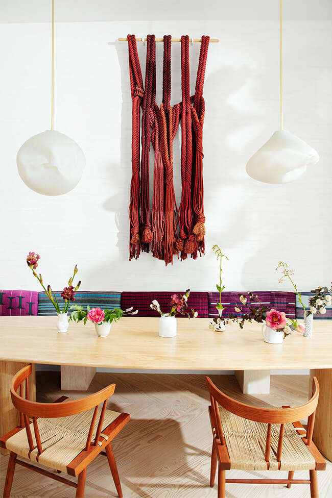
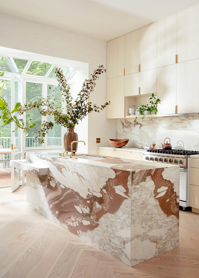
Posted on Thu, 7 May 2020 by KiM
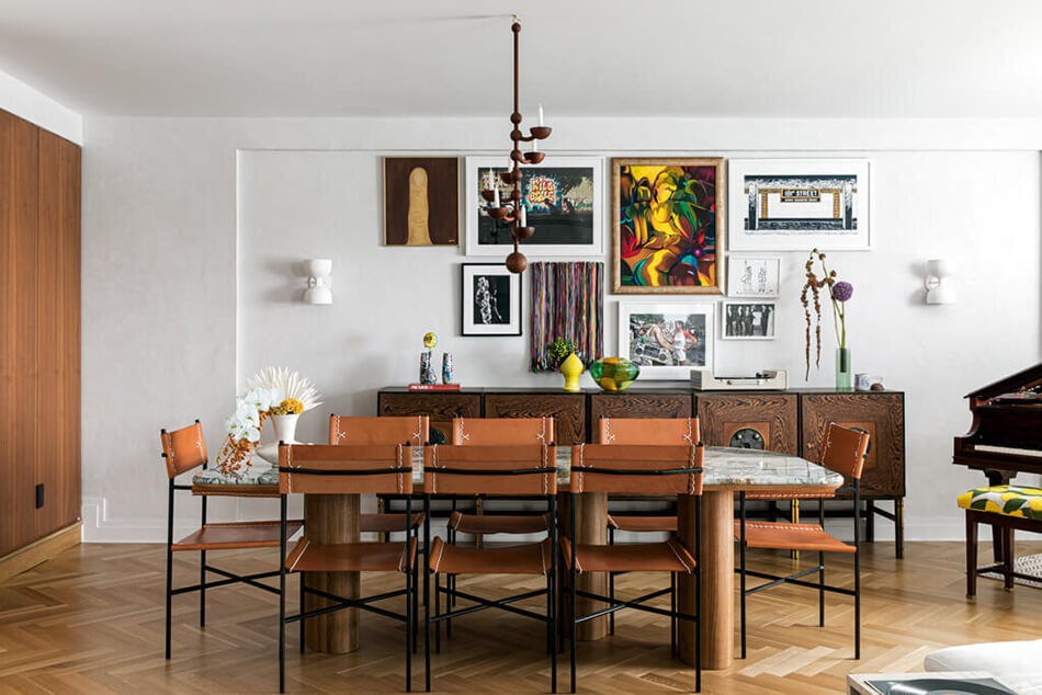
Lots of bright colours were used as accents throughout this space designed by NYC-based Tali Roth, bringing in lots of energy and youthfulness. Grounded by lots of wood and some more earthy tones, this is how you do colour right. Also, let this dining room be a lesson in a perfectly executed gallery wall.