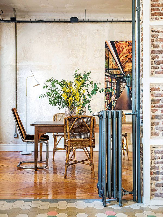
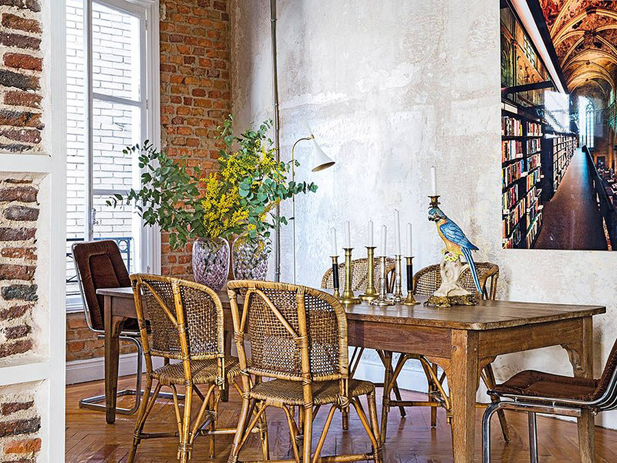
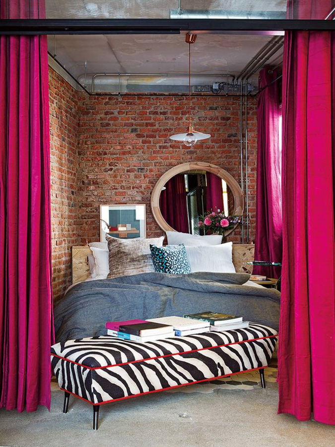
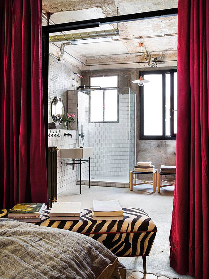
An eclectic industrial loft in Madrid
Posted on Sun, 22 Apr 2018 by KiM

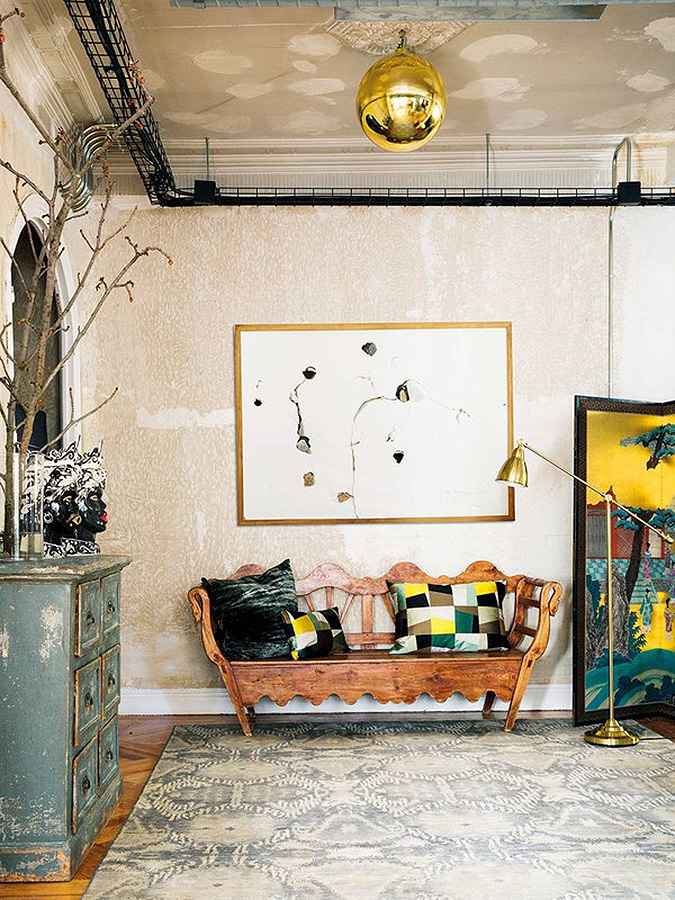
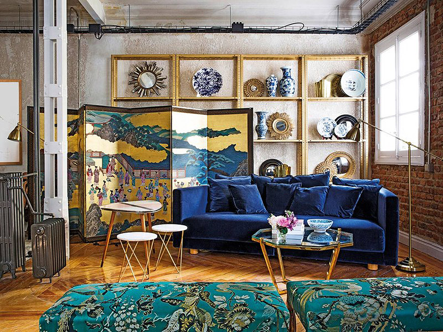
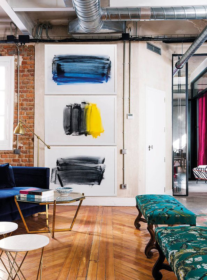
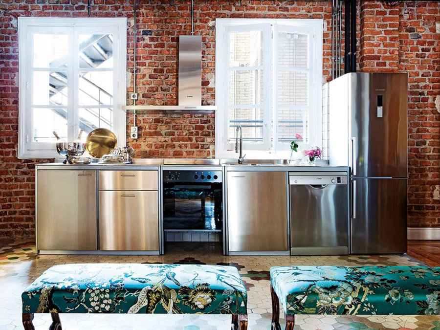
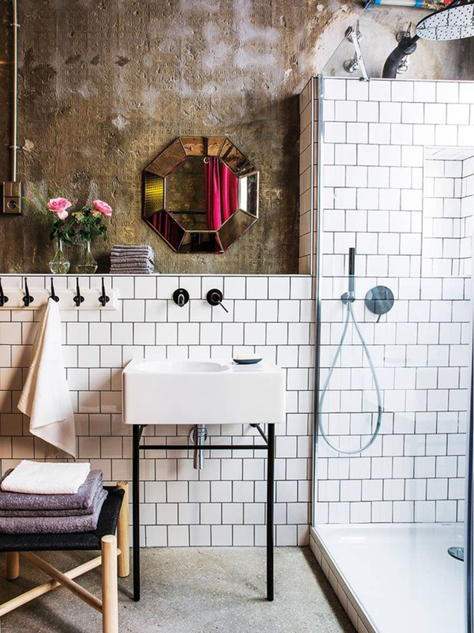
Nothing beats a backdrop of an industrial loft. Add in some vibrant colours, patterns, textures, and vintage furnishings and you have an eclectic and sophisticated space. This gem is located in a building in Madrid built in 1935 and was transformed by architect Peyo Basurto of Ping Pong Estudio, interior designer María Ruiz-Mateos and stylist Mercedes Díaz de Rábago. It is TO DIE FOR. Via Nuevo Estilo. (Photos: Pablo Sarabia)


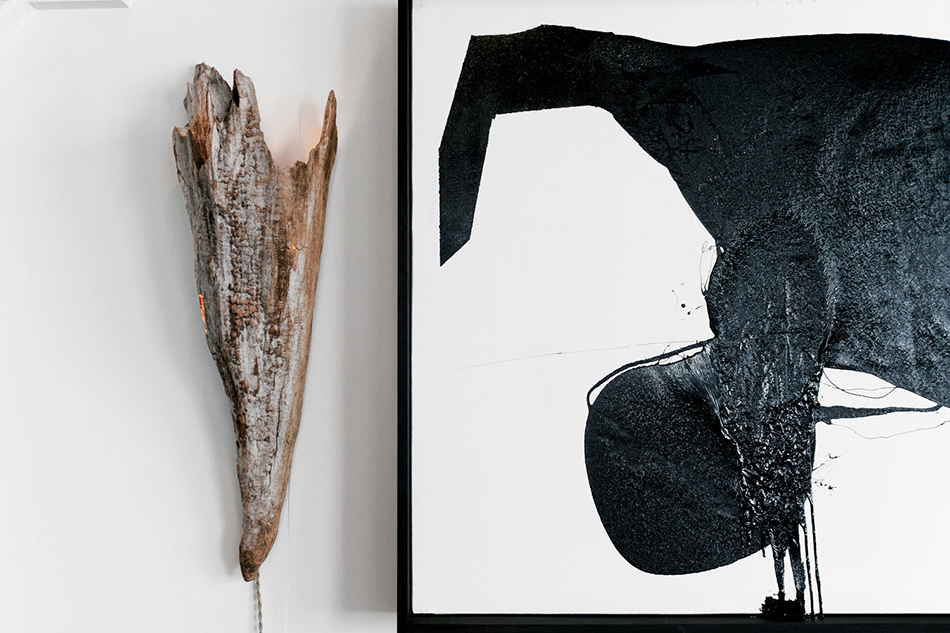
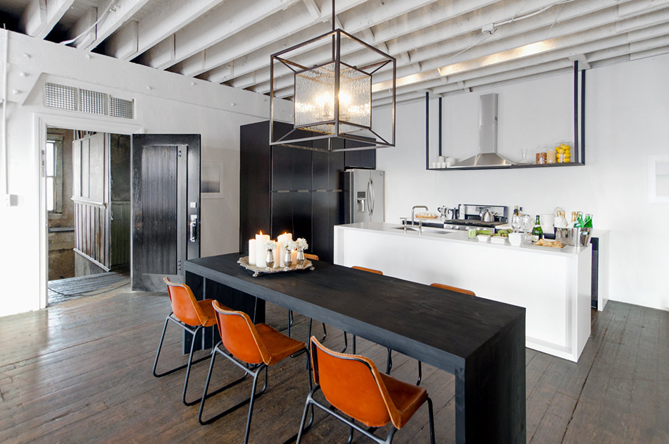
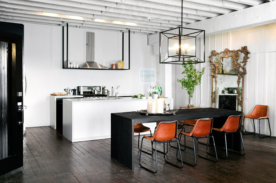
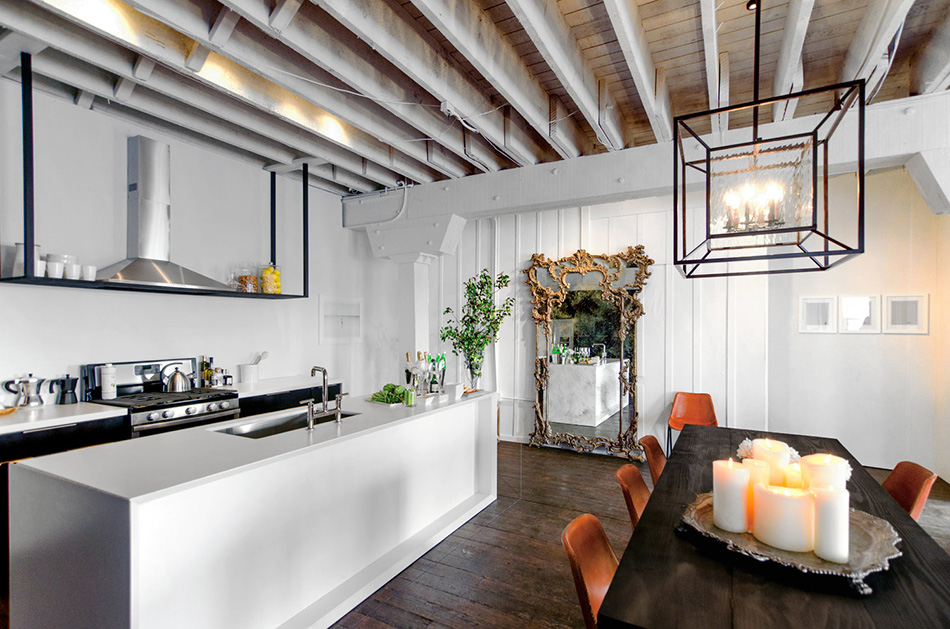
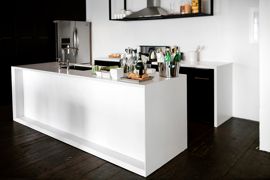
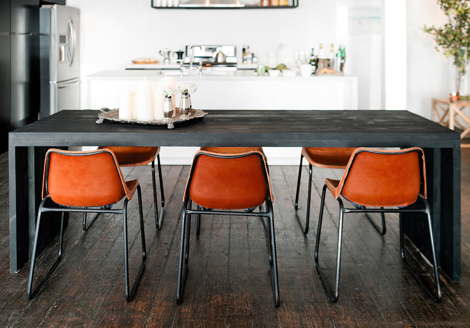
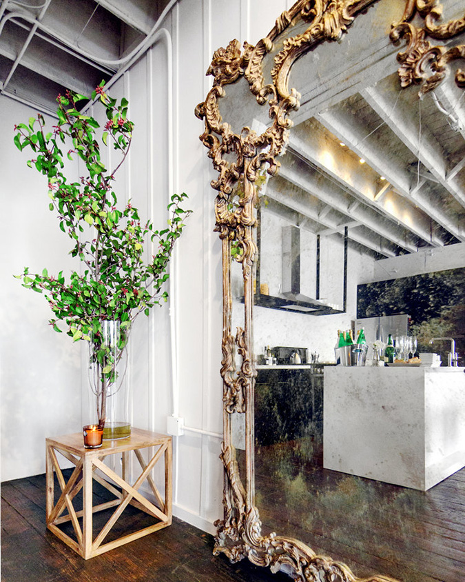
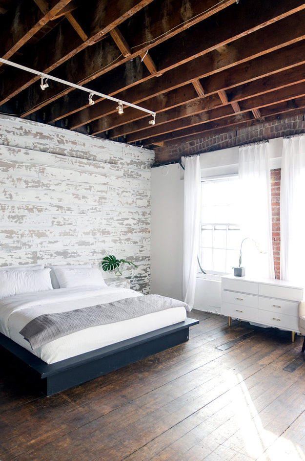
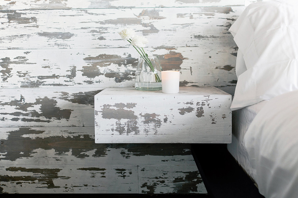
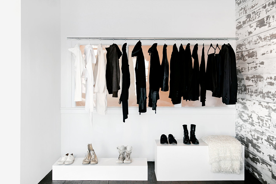
A black and white loft in downtown LA
Posted on Thu, 19 Apr 2018 by KiM
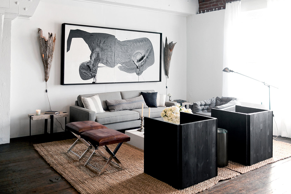
There is something so sexy about a black and white space. Make it a downtown LA loft with exposed wooden beams, steel trusses and original hardwood floors and it doesn’t really get much hotter than that! Designed by avant-garde, minimalist interior designer Lukas Machnik.
A lighter transformation of my living room
Posted on Thu, 19 Apr 2018 by KiM
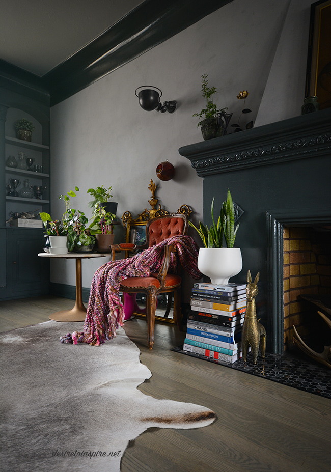
I was at it again a few weekends ago, going to town on my living room walls. As much as I love some dark paint, having a dark grey living room after about 3 years was getting to me. The cave-like effect had lost its initial appeal. Here is what it looked like before the transformation:
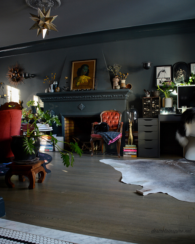
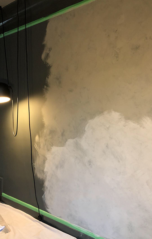
That was Downpipe by Farrow and Ball – high gloss on the trim and fireplace and estate emulsion on the walls (and Plummett on the ceiling) . Luckily I didn’t need to change anything but the walls (gawd I hate painting trim – and it’s high gloss so I may be stuck with it forever!). I am not a faux-finish gal but I have always loved the plaster walls the talented duo behind Jersey Ice Cream Co. always use in their projects. So I thought I would give it a go. Due to my busy schedule and general laziness when it comes to painting projects, I came up with a plan. I went to Home Depot and bought a couple of cans of Rustoleum’s Chalked paint – a medium grey (Country Grey) and a concrete coloured grey (Aged Grey). Then I bought many packs of cheesecloth, at Jo’s suggestion. I did a rough, thin coat of the medium grey over my dark grey walls, letting a bit of the dark grey show through. Oh – chalk paint dries almost instantly so I added a bit of water to it. Then I brushed on the lighter grey in small sections and immediately started dabbing with the cheesecloth. And voilà! It looks like concrete/plaster!
Here is a quick snap I took on my phone during the process:
And here is how it looks now! (I know some people may think the dark was better but trust me, a room with larger windows that let in more light would have been much easier to live with)
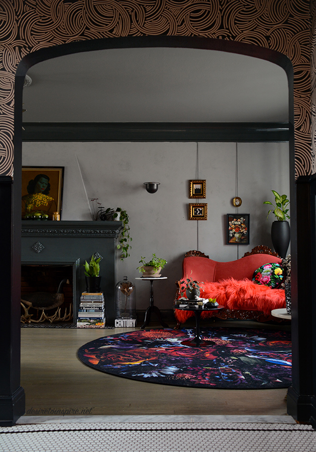
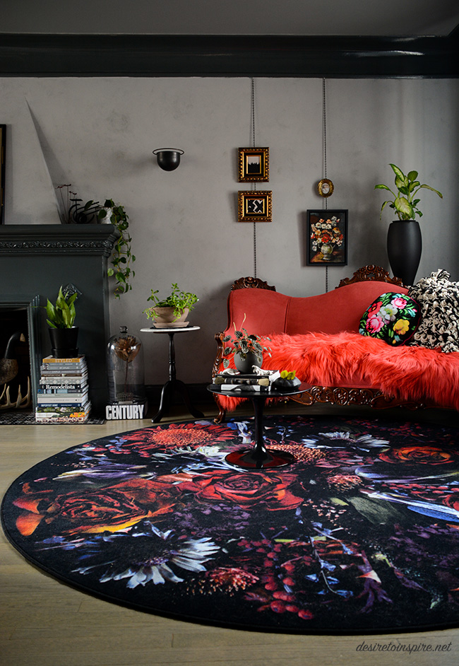
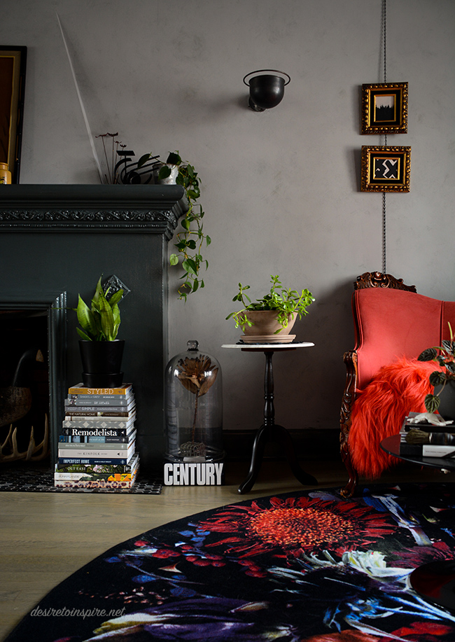
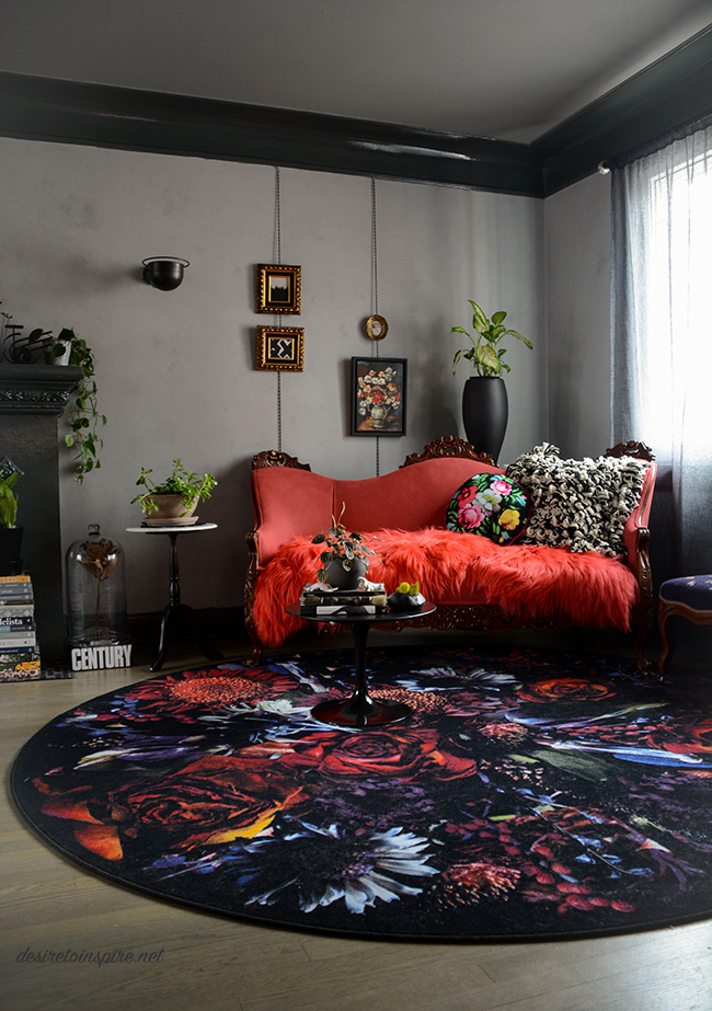
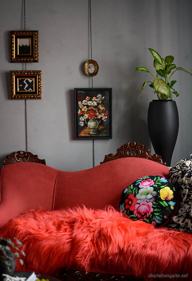
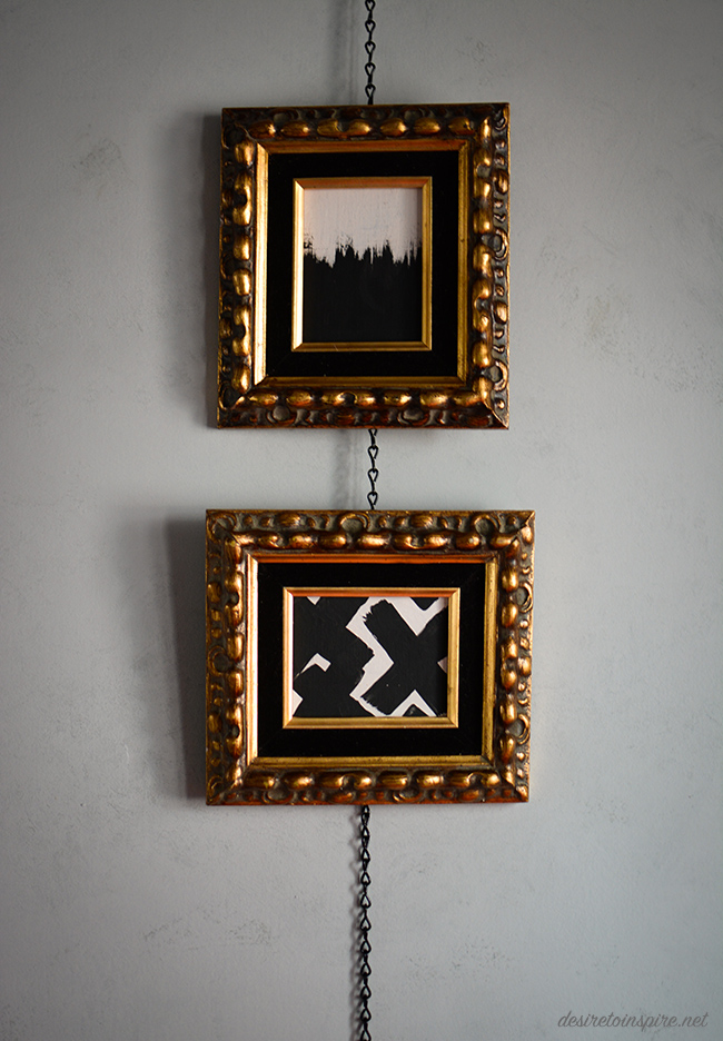
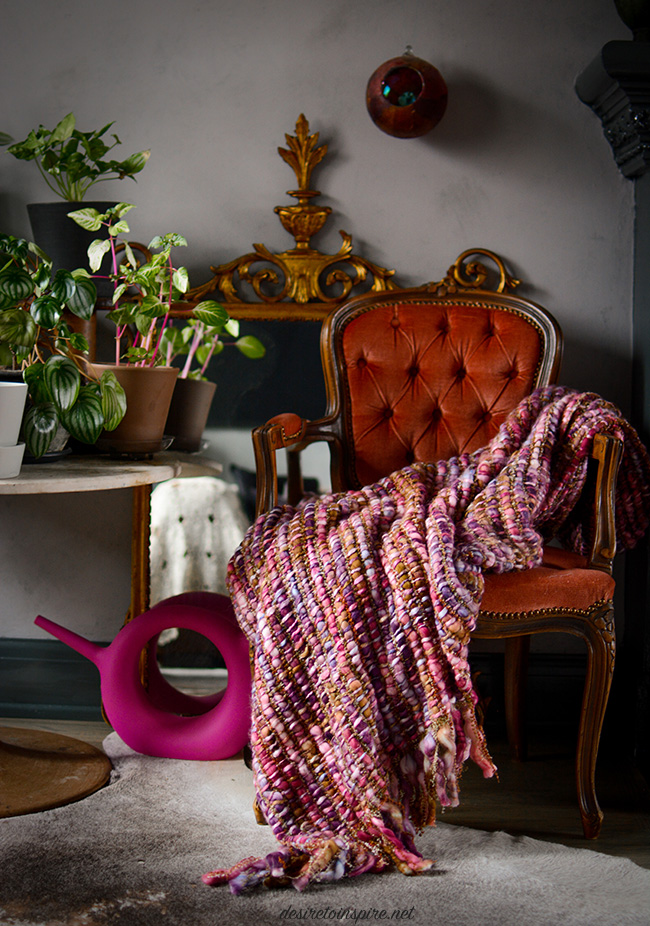
I was inspired by a photo I saw recently while doing blog research and found this simple solution for hanging art in a not-so-average way. I bought some small black chain at Canadian Tire which I attached by little eye hooks into the bottom of the molding left it hang down (I might hook it into the baseboards to straighten it out a bit). Those beautiful frames I found at Highjinx. They had awful still life paintings in them so I painted over them with some leftover paint I had stashed away.
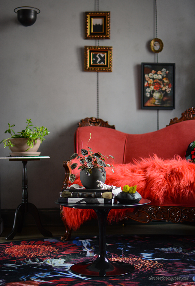
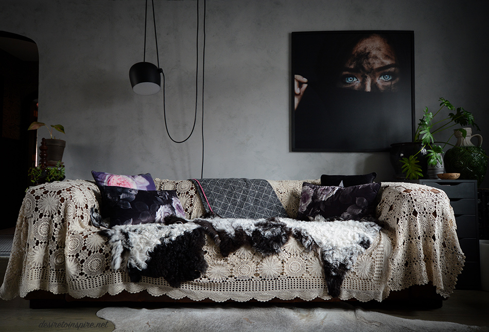
(I really want to sell the awesome leather sofa under those tablecloths and get a new one more suitable for this space. Maybe this? Or this?)
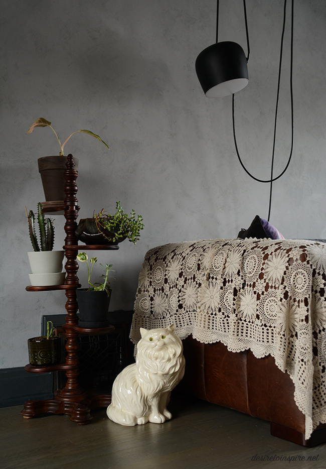
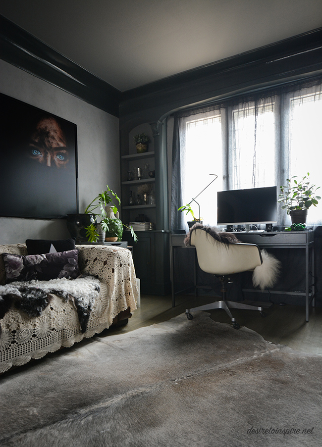
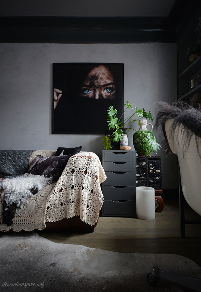
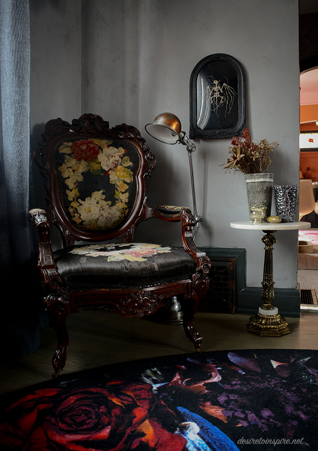
Sources: raspberry vintage sofa + brass base side table + pink tufted chair – The Pale Blue Dot; Moooi carpet by Marcel Wanders – The Modern Shop; sheepskins – Cowboy Kate Outpost; Knoll tulip table + black tall plant stand + blanket over back of sofa – Alteriors; floral pillow on raspberry sofa – Wild Rice Designs; knitted pillow – Hana Waxman; embroidered bat art – Caitlin T. McCormack; large portrait over sofa – photo by Amanda Margareth; ceramic cat + black base side table – Highjinx; pink blanket and remaining pillows – Homesense; FLOS aim pendant by Ronan and Erwan Bouroullec. Everything else random vintage finds.
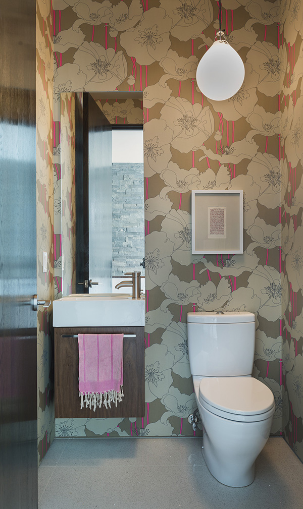
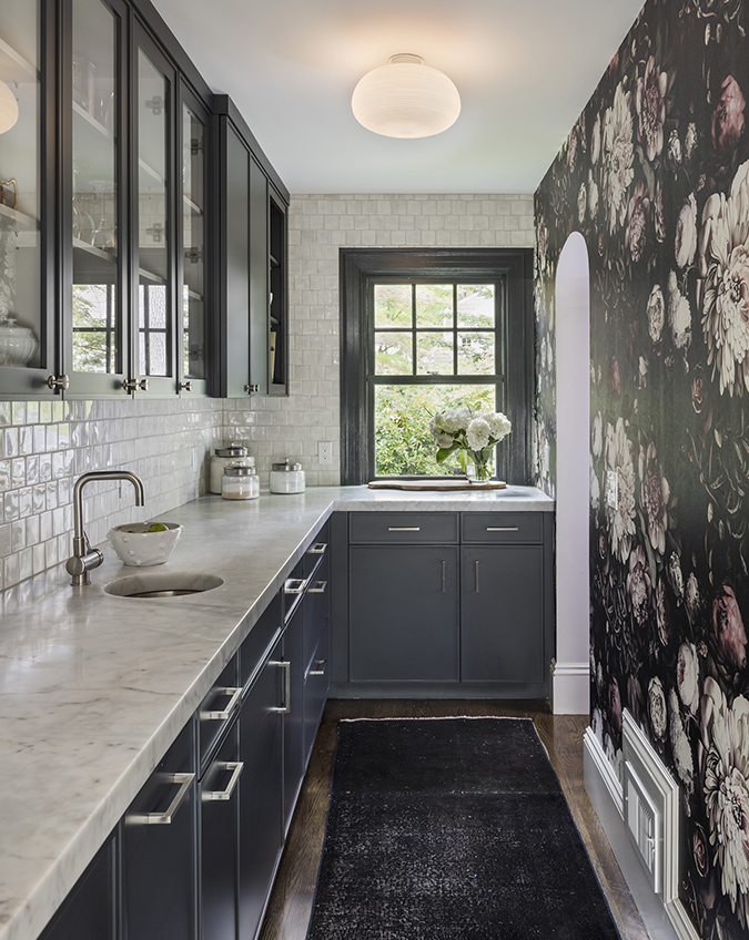
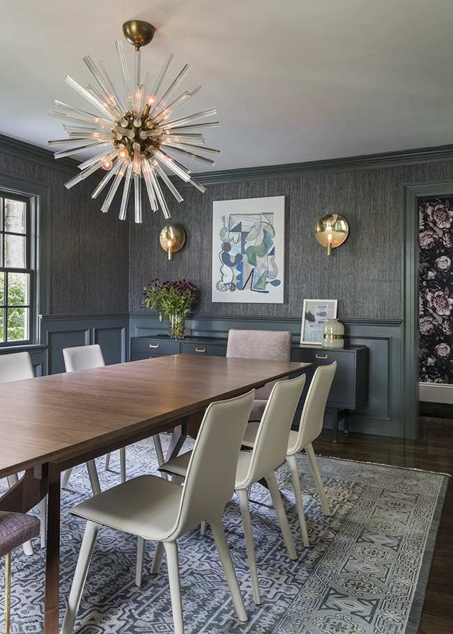
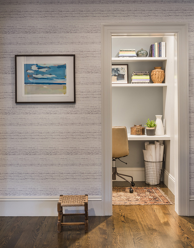
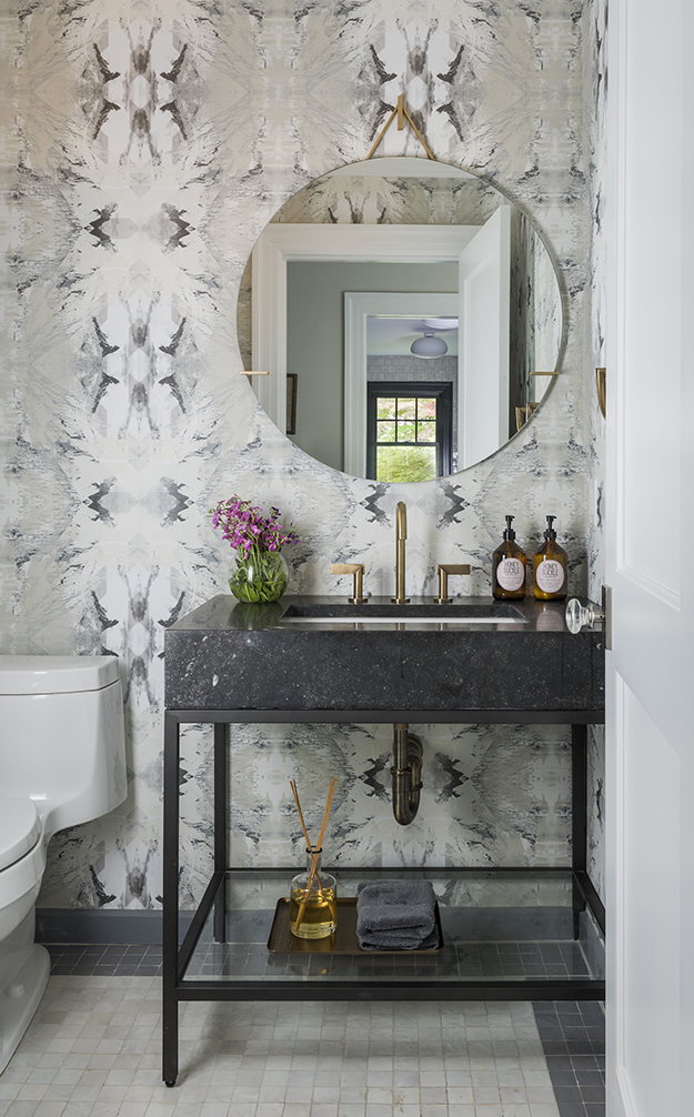
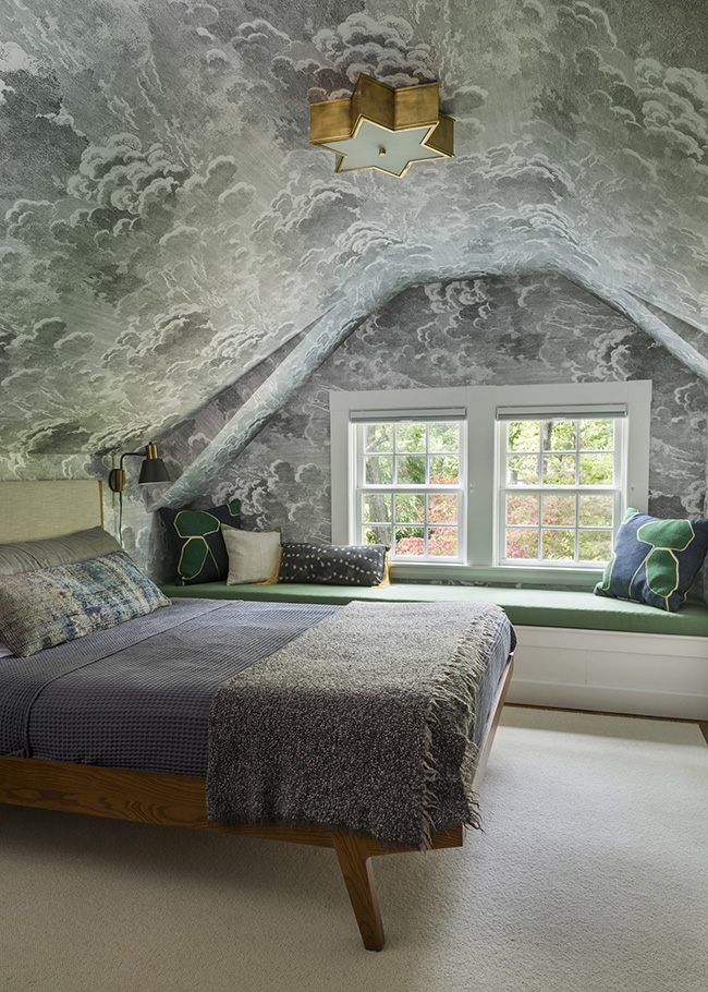
Another vibrant project by Thread Art and Design
Posted on Tue, 17 Apr 2018 by KiM
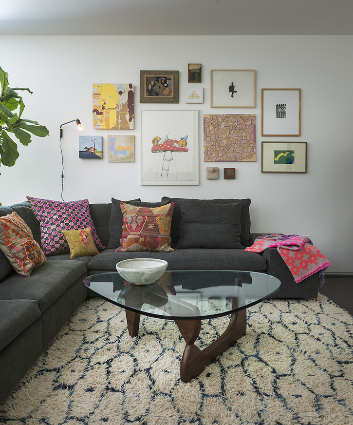
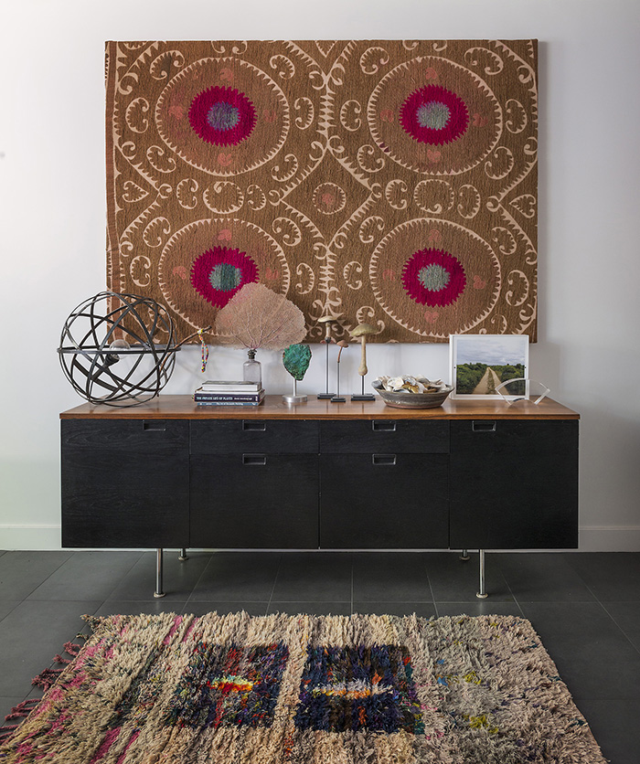
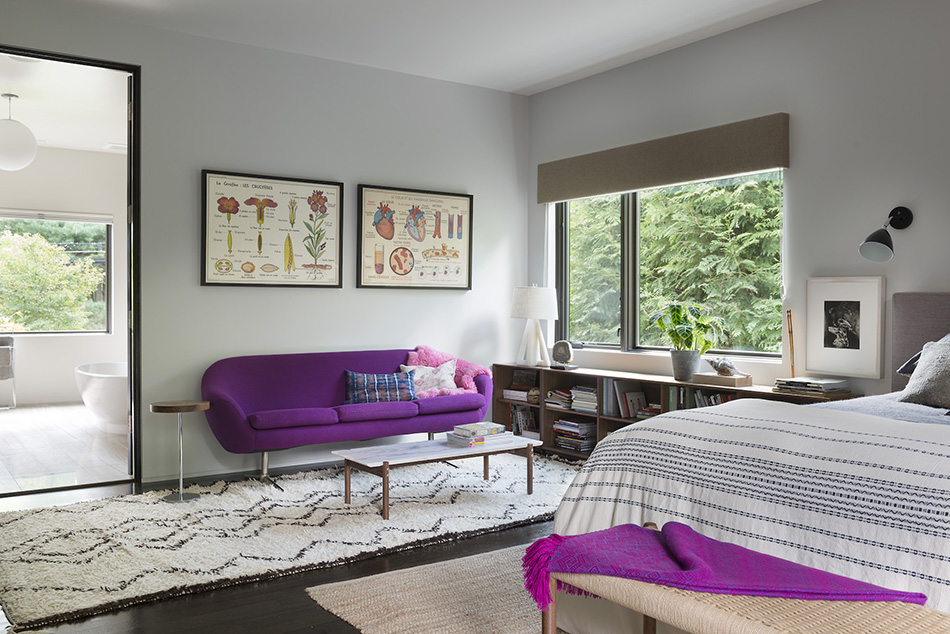
I wanted to share another project by Thread Art and Design because I am smitten with Lindsay’s work. This one has a mid-century vibe and includes a deeper accent colour palette, some black for drama and not as much wallpaper. LOVE this home too.


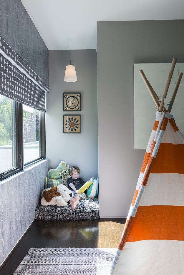
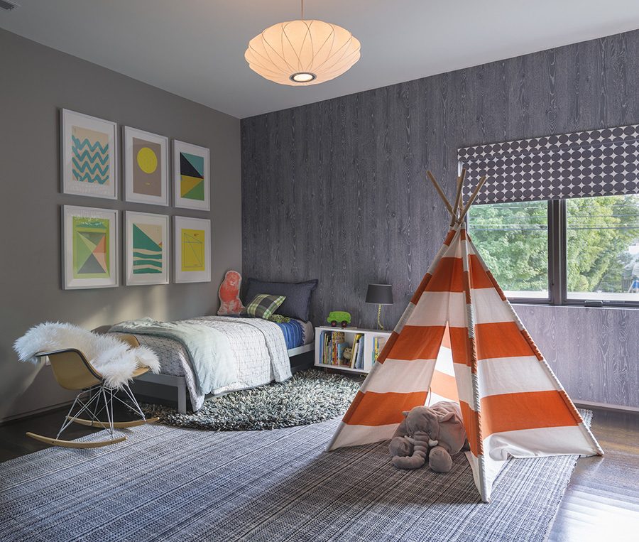
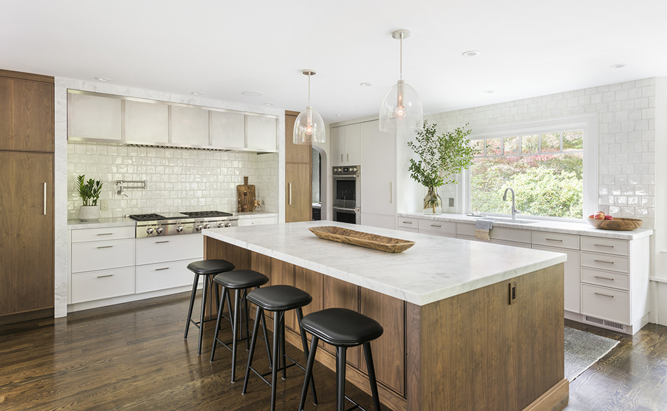
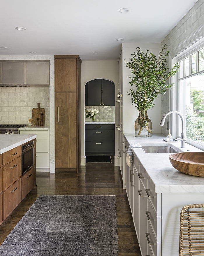
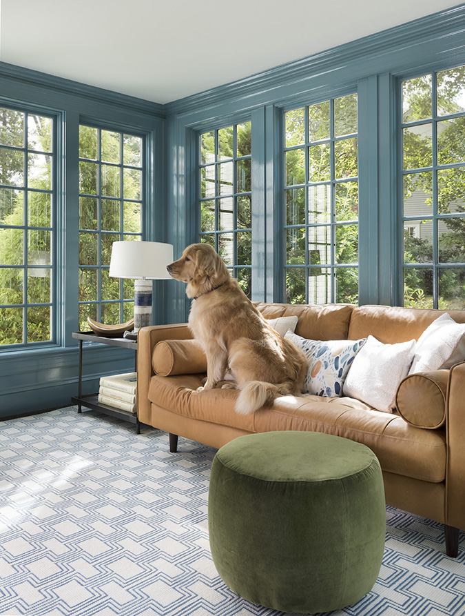
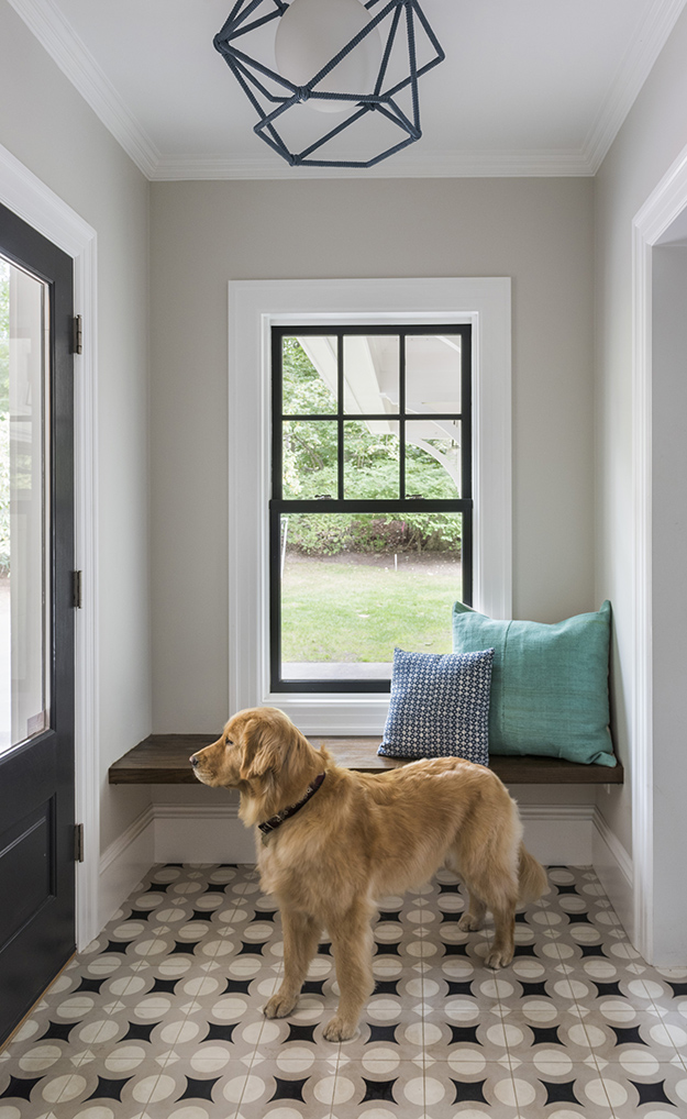
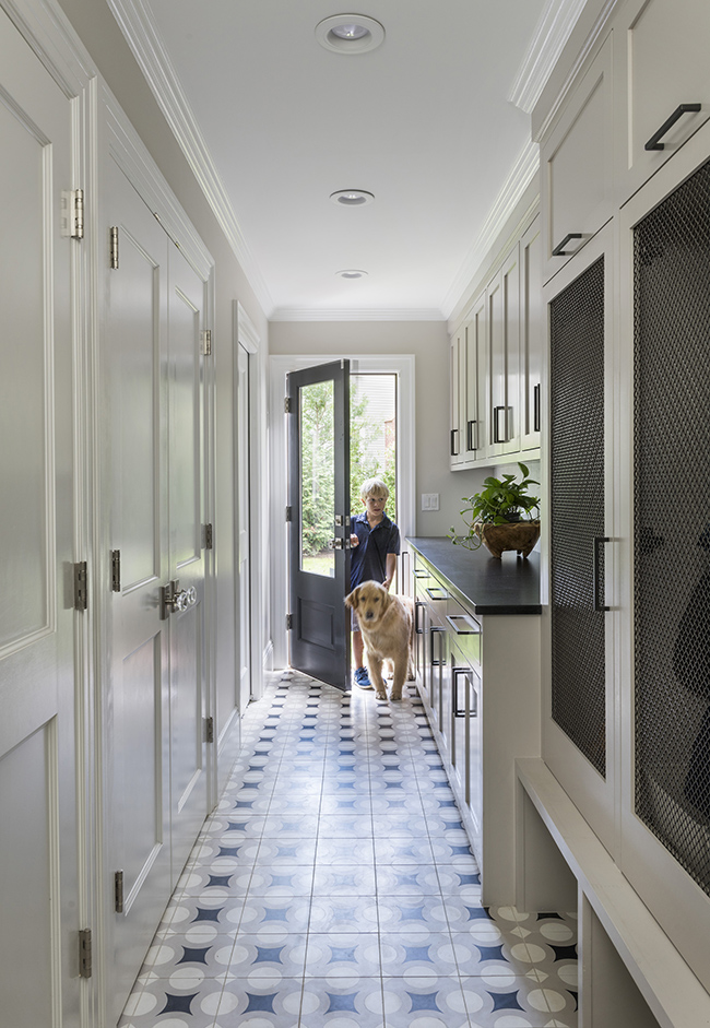
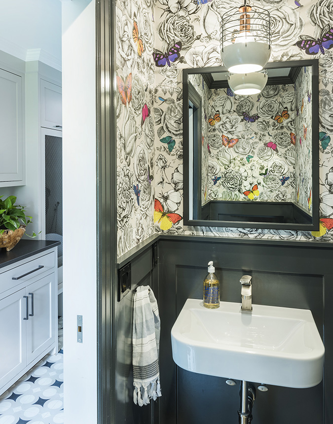
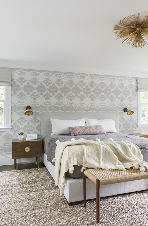
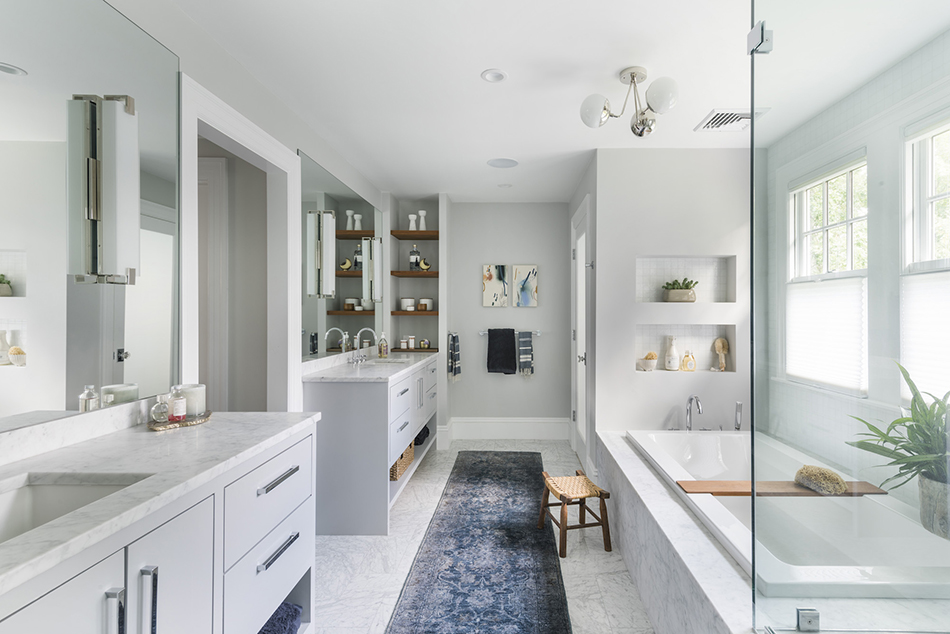
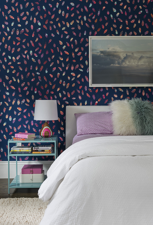
Striking patterns in a project by Thread Art and Design
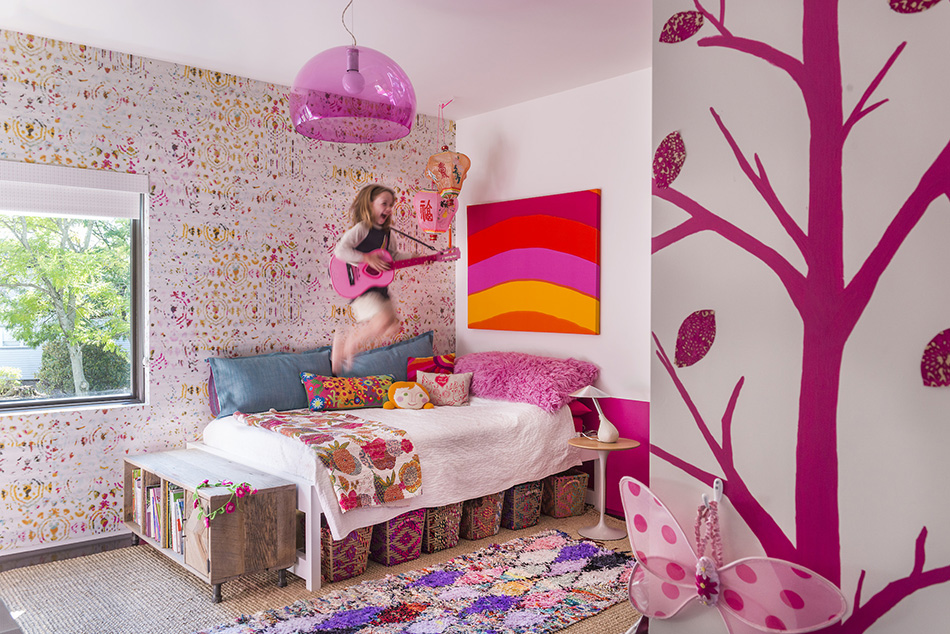
Posted on Tue, 17 Apr 2018 by KiM
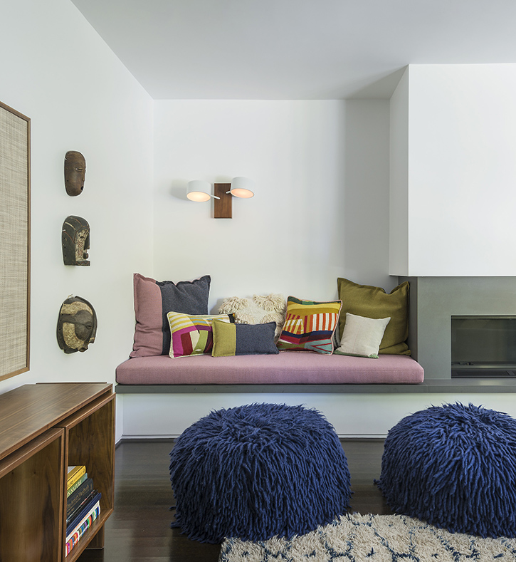
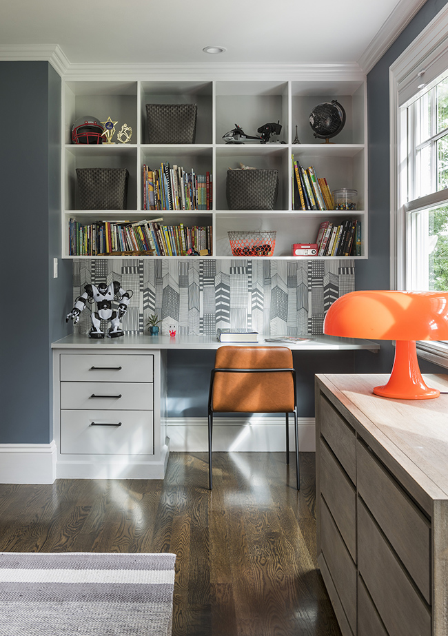
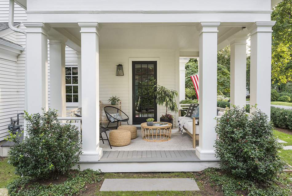
I love lots of textures and patterns in a home, when done really well. This home designed by Boston-based designer Lindsay Bentis of Thread Art and Design is a lesson in how to add lots of patterns via wallpaper, tile, rugs and pillows and not overdo it. The vibrancy and energy here is really a feast for the eyes. There is just so much to look at!
(It has been a loooong time since I featured Linsday’s work. See here)