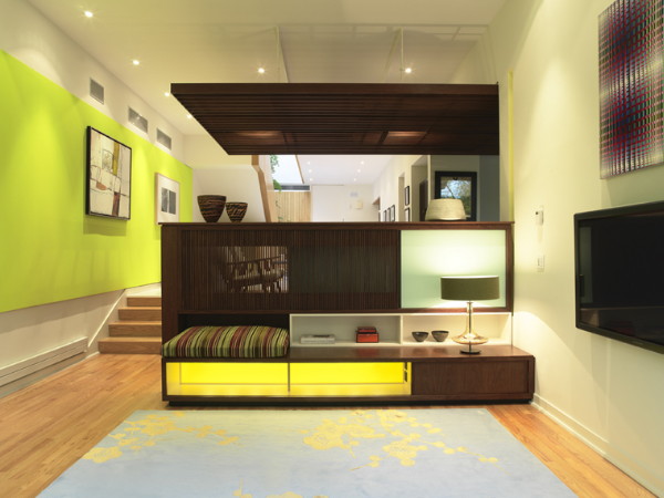
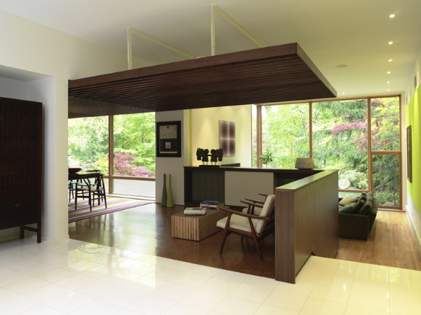
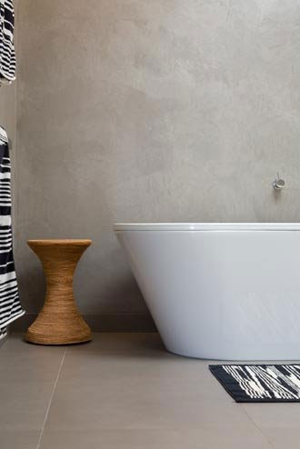
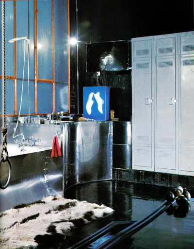
3rd UNCLE
Posted on Thu, 3 Jun 2010 by midcenturyjo
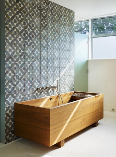
I have no uncles. If I did I’d want him to be just like 3rd UNCLE. Ok that was a pretty sappy intro but you must admit it’s a memorable name for a design studio. Toronto based 3rd UNCLE Design create modern spaces that are light, bright and fun. Too many people think minimalism is cold, hard and rigid. Lighten up! Minimalism is about being resourceful, creative, clever. What I wouldn’t give for a soak in that tub!


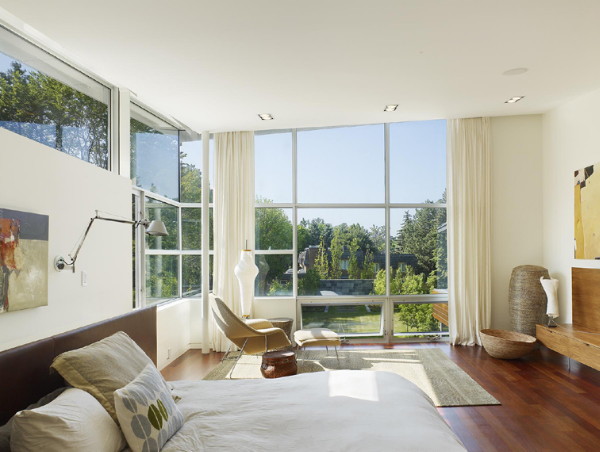

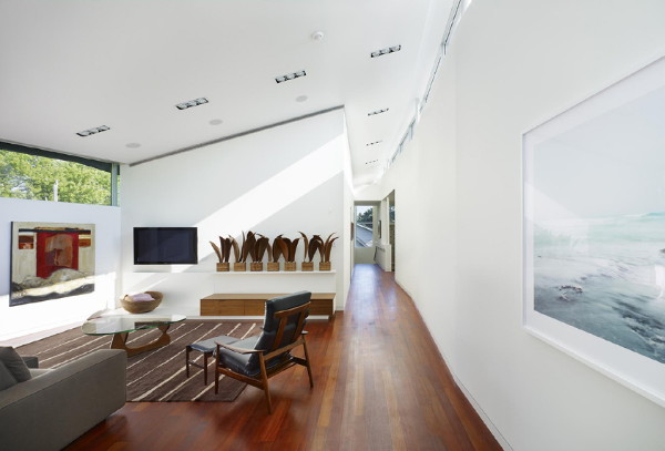
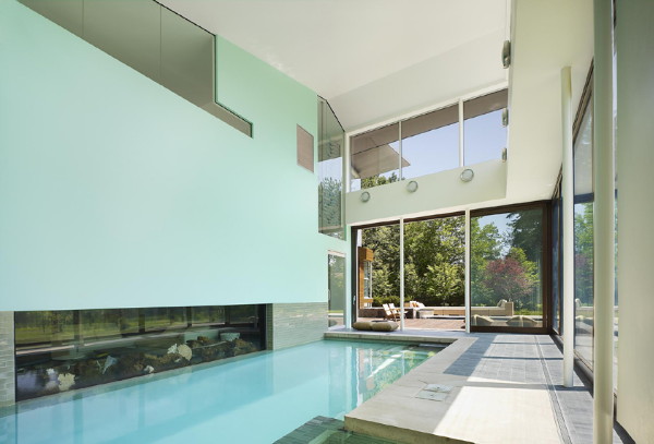


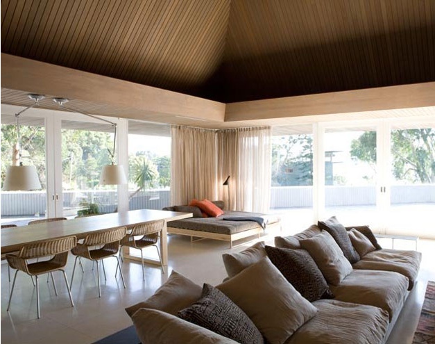
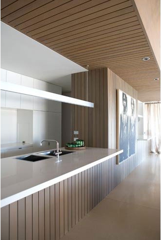
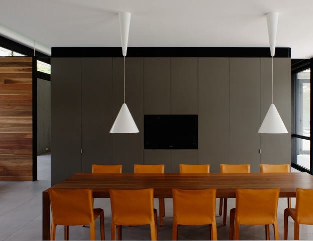
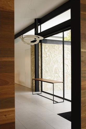
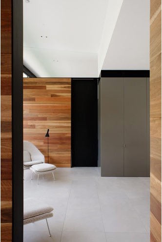
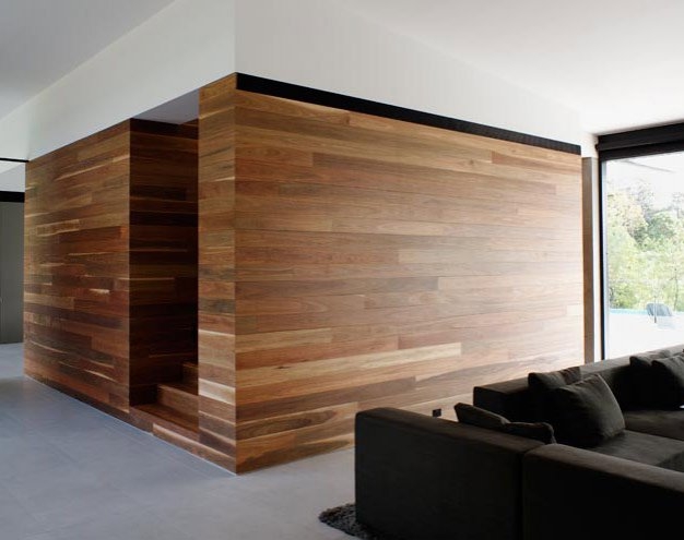
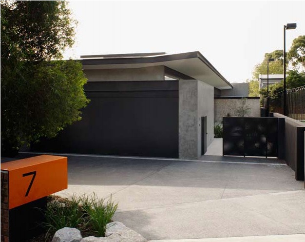
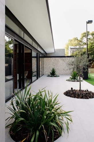
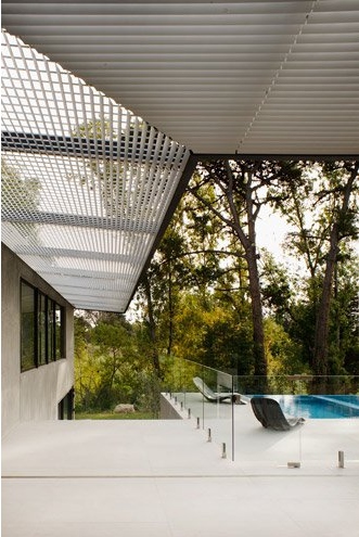
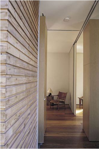
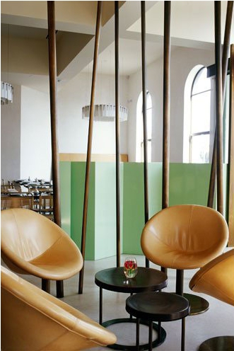
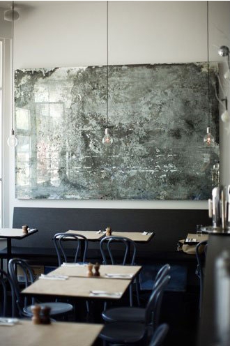
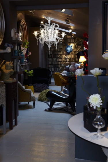
Chris Connell Design on the MAP
Posted on Wed, 2 Jun 2010 by midcenturyjo
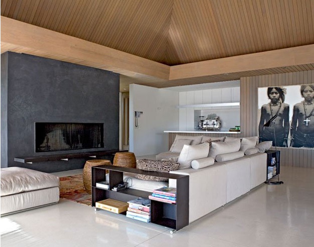
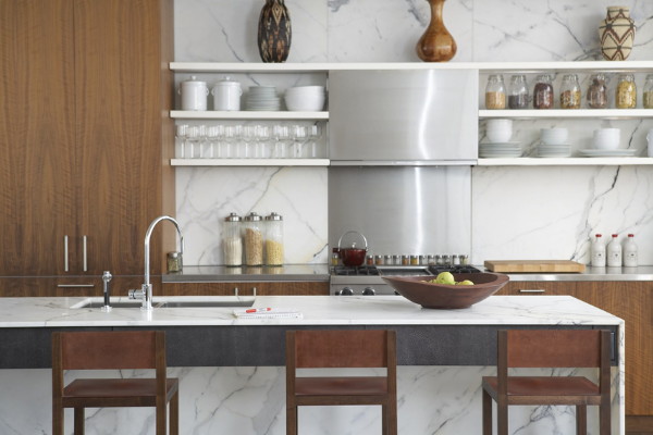
Clean minimal lines. Beauty in simple form and enjoyment in function. Modern and fabulous. Chris Connell and his design studio are not only interior designers and architects but symbiotically are MAP International, classic contemporary Australian furniture. His spaces are elegant and at ease but as we all know less may be more but it’s also a darn sight more difficult to achieve than more. It is all about well executed details, about making everything look effortless but always about the quality of design. I’ve included some of the design studio’s commercial work too. Those of you familiar with Melbourne’s cafe scene will know and most likely already love these dining spaces.


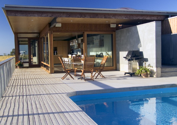
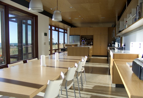
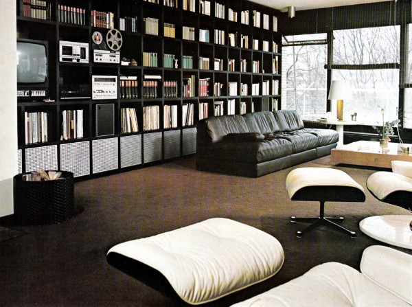
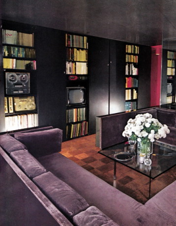
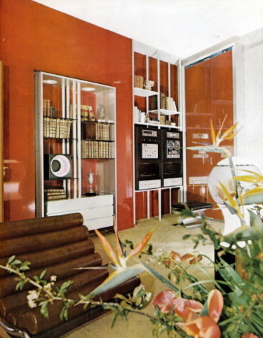
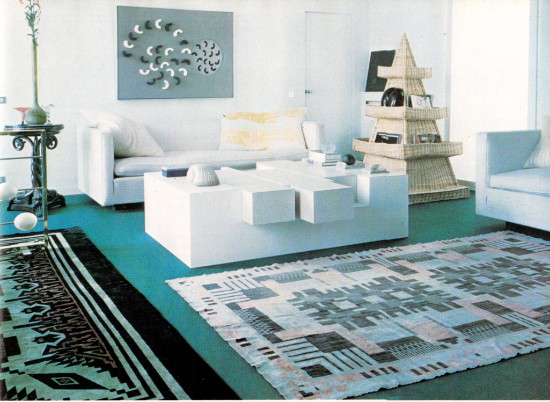
Retro going, going, gone
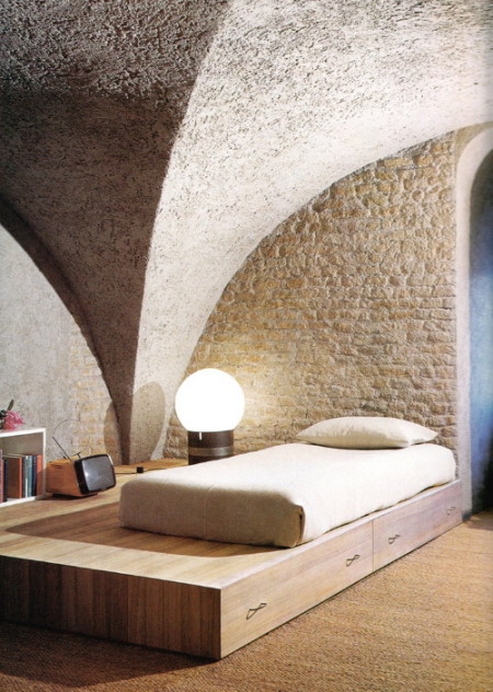
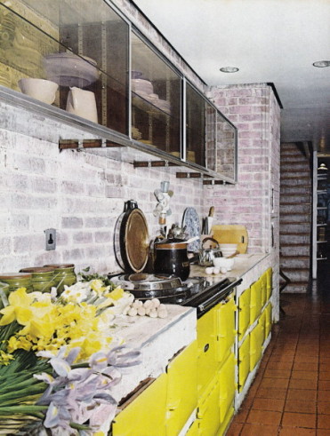
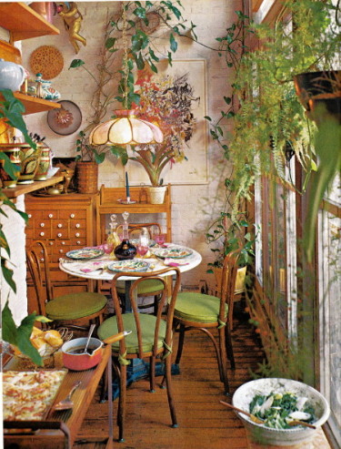
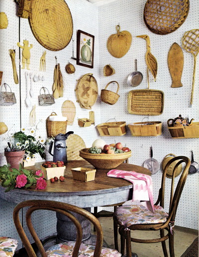
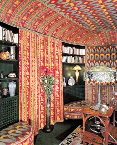
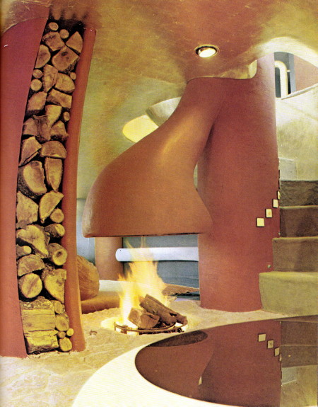
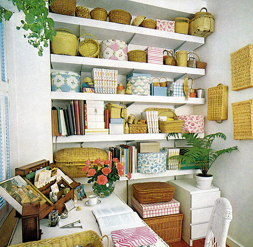
Posted on Tue, 1 Jun 2010 by midcenturyjo
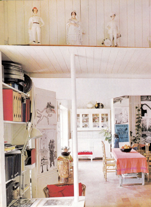
At last dear readers we turn the final pages of Storage, A House and Garden Book, Melinda Davis, Pantheon Books, New York, 1978. I’m sad to be finished. It was an interesting look at retro rooms that at times didn’t appear all too retro. It just goes to show that good design is timeless (and bad design a giggle many years on). I would truly move into the first home in a heart beat and the second, the bedroom, is spot on for the latest rustic southern European look sweeping blogs and magazines. Even the vintage TV is a hot collector’s item! There is the strangest fireplace that has me shaking my head. I think it’s the gold leaf ceiling and I think I like it! So retro lovers and loathers which ones push your buttons?

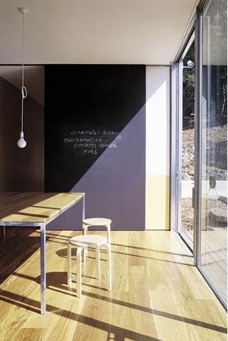
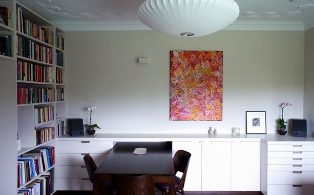
Paddington pad by SWAD
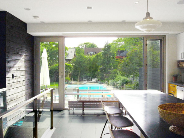
Posted on Mon, 31 May 2010 by midcenturyjo
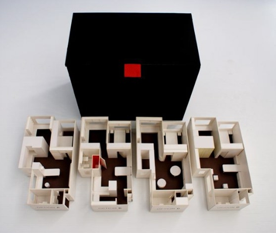
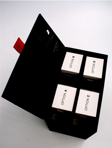
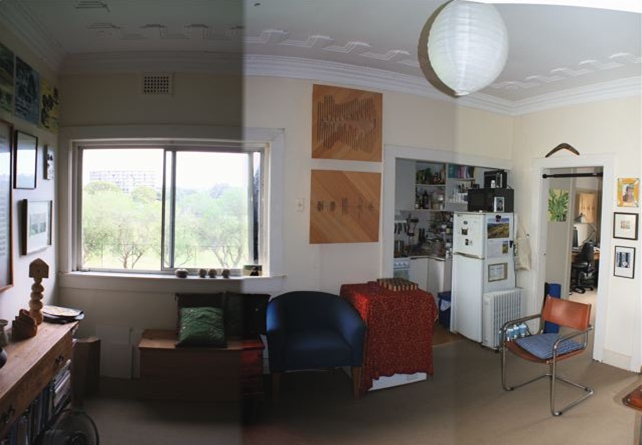
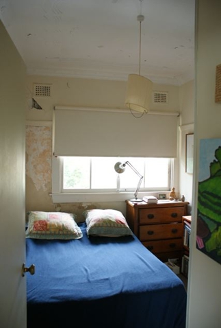
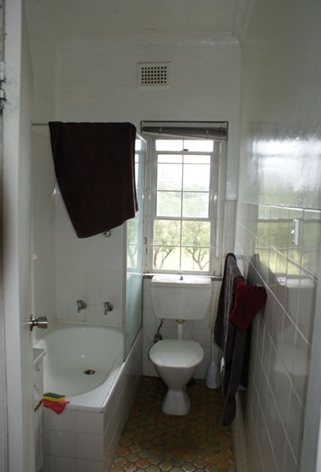
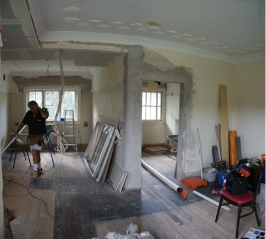
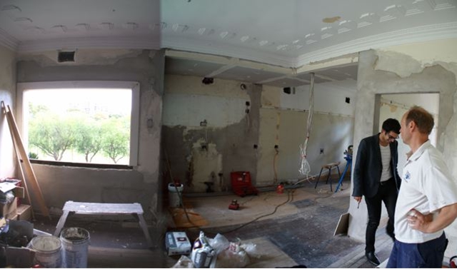
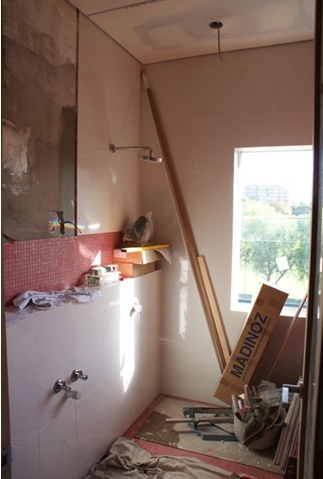
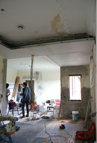
Scott Weston emailed with his latest project and as usual he included lots of pictures – before, during and after as well as his amazing presentation models in this case 4 options. Scott always writes the best descriptions of his work so I’ll let him take it away. “I thought you might like to see this jewel box of an apartment that is just 48m2 and was totally gutted and re-built within three months in Paddington, Sydney…
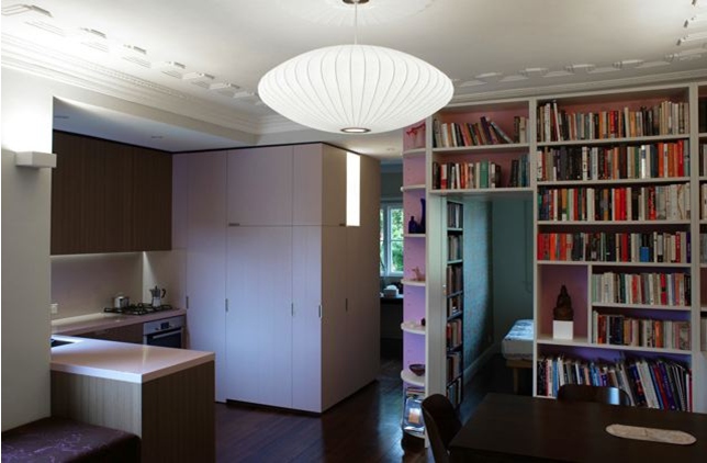
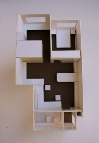
We fly our Contractor/Builder out from Copenhagen to do these type of quality projects as he is much more cost-effective being a jack-of-all-trades and it saves time/money (and he’s a perfectionist!). The tiniest apartment comprising existing entry vestibule, separate bathroom, living room (faces north) with small alcove kitchen and two bedrooms (one functions as an office) that both face east. We removed the wall between kitchen and study, removed the windows in the kitchen, living room and bathroom and replaced with shugg frameless sliding windows to maximise views/light. The whole apartment was gutted and the floor was partially removed and replaced then stained a deep walnut. Walls were chased for electrical and light fittings.
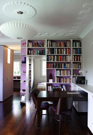
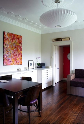
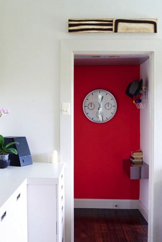
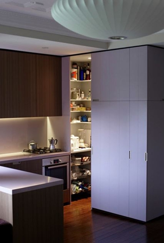
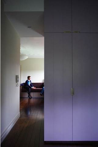
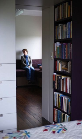
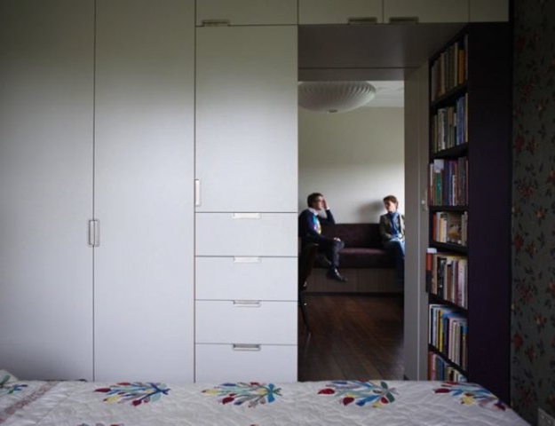
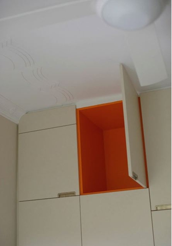
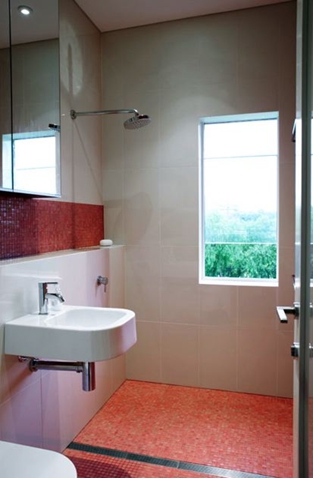
At concept stage we focused on asking the Client to provide a functional list of what their storage and living requirements were so we could assess and start to use these components as the main joinery pieces in the apartment. The main focal point is the ‘magicians box’ or multi-functional joinery unit (hand-painted in dirty mauve) that sits in the kitchen and straddles living room and study which acts as storage unit, light box, pantry, integrated fridge, wardrobe and broom cupboard. Other joinery items are room specific providing specific storage requirements with quirky details such as tangerine internal carcasses to otherwise bone white storage cupboards. Lighting is either plaster uplights, lightboxes, LED strip lighting or the hero piece in the living room the George Nelson bubble pendant that is dimmable. The kitchen benchtop is mauve (dirty mauve) with timber carcasses below and overhead cupboards with matching glass splashbacks. We designed a banquette that sits under the northern window that you can lounge on with pullout drawers underneath for added storage. The fabric seat is aubergine wool with fine pink embroidery as a detail. The bathroom is off white with translucent pink glass mosaics and matching pink epoxy grout and mirror cabinets for maximum storage. The Client is thrilled and I went shopping yesterday with them to purchase the all important Missoni bathroom towels and the french bedlinen as we are designing a chocolate brown velvet fitted bedspread! This project is a great exercise in not upgrading and moving to a bigger place but staying put, purging all the stuff you have collected and no longer need and allowing us to provide a truly beautiful design environment in which to reside.”
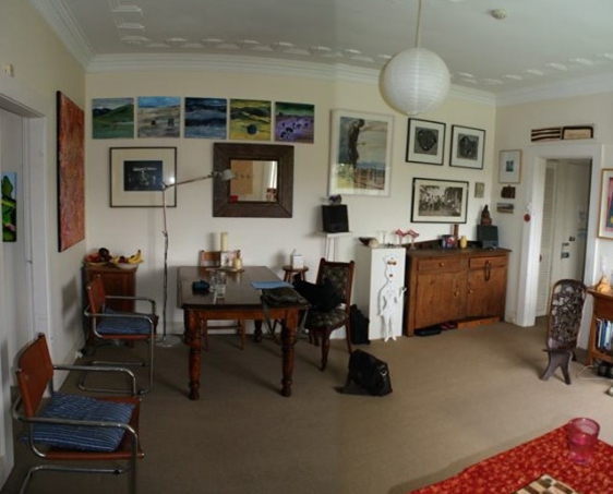
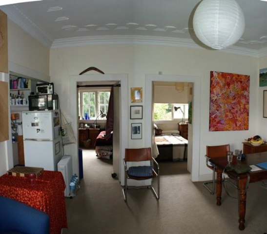
And now the befores and durings. What a transformation! What a job! What an apartment! Such clever spatial planning and beautiful bespoke cabinetry. Thanks Scott. Your work is always so inspiring.

WINKS
Posted on Sat, 29 May 2010 by midcenturyjo
 … spending time with old friends
WINKS – weekend links. Here we list what has come in during the week, things we’ve found and things we think you’ll want to see. If you’d like to see your blog or website featured email us and if we think it fits with our readers we’ll link you. So what’s in this week?

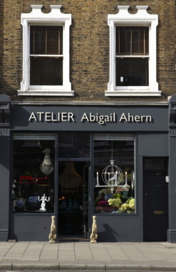
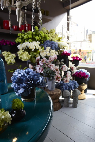
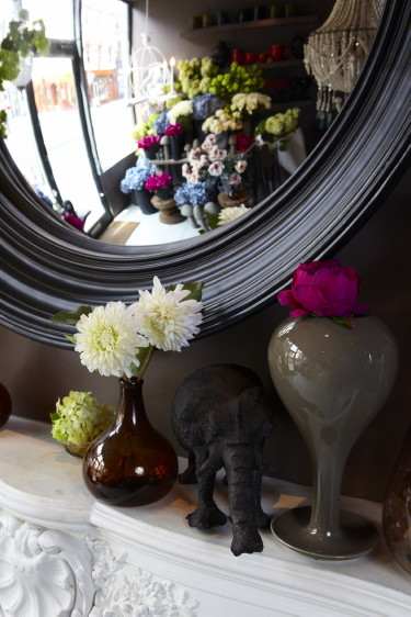
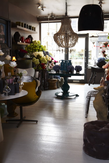


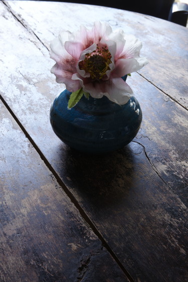
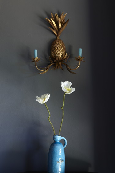
- I can’t get enough of Abigail Ahern. Her home, her Atelier, her book A Girl’s Guide to Decorating, her blog. Cutting edge mistress of the darkside, she is one of the world’s most subversive style makers. Grey is the new black is the mantra we all chant (actually black is fine too just not white, never white). I fell off my chair when PR Megan sent me these lush images of Abigail’s latest venture – faux flowers. YES! Big, blowsy, almost slatternly in their voluptuousness. I have always loved the much maligned faux flower. They can be the offerings at the high altar of kitsch but they can also be simply gorgeous. Think how eco-chic you can be. You can cut out the water waste of intensively farmed blooms, the airplanes full of flowers jetting round the world, the waste of week after week replacing dead bouquets. If the feng shui of the faux weirds you out think of them as not dead flowers but little manmade works of art. Hang it you don’t need an excuse. You just need a vase full.
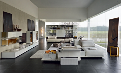

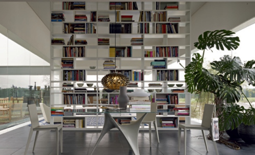
- Lusting after anything by Italian design masters Molteni&C. Anything. Everything. Sleek, modern, luxuriously comfortable furniture, clever stylish storage solutions. Beautiful and functional.
- Exotic tiles from Hastings Tile & Bath. The Tusk and Animal Skin collections caught my eye. Animal instincts.

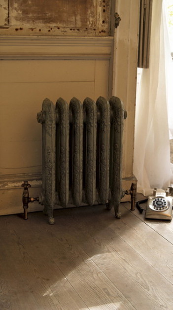
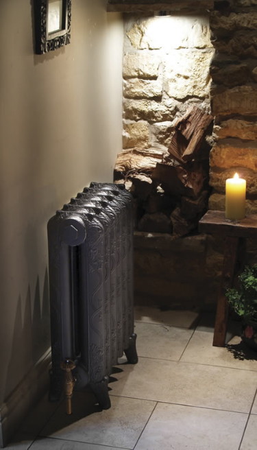
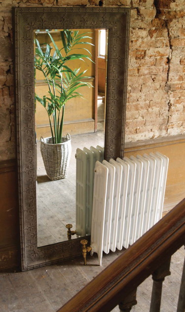
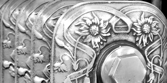
- After receiving an email about Trads this week I wish I lived in a climate where cast iron radiators were needed. Look at these beauties. I feel cosy and nostalgic just looking at the images.
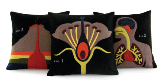
- Time for a little science lesson. The Science Lesson collection from Heather Lin that is. Botany, geology and anatomy. Embrace your mad scientist!