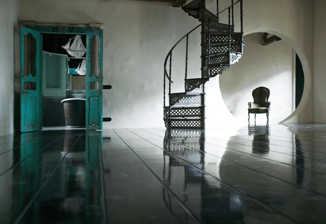
Ruy Teixeira
Posted on Tue, 20 May 2008 by midcenturyjo
Brazilian born Italian based photographer Ruy Teixeira’s work has a poetic element that is not often captured through a lens. His understanding of and respect for the design he shoots is obvious. His portfolio is mind blowing not just his houses but his amazing collection of portraits of the world’s leading designers. This is just a taste. Vibrant, exuberant and empathic, three words I use to describe his work. One word? Fabulous!


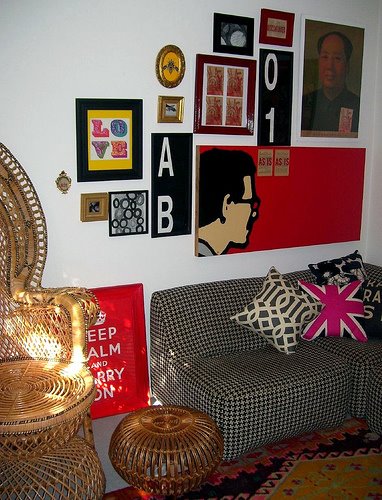
Jo’s place
Posted on Sat, 17 May 2008 by midcenturyjo
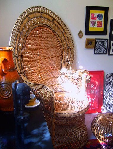
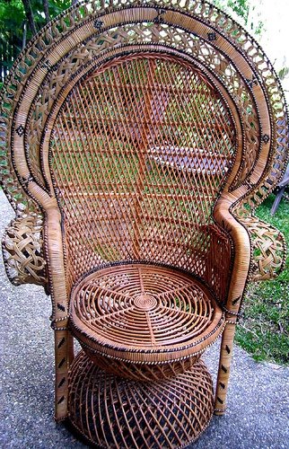
So I feel like a queen with a throne… or should that be a blogger with a bad case of retro! My new peacock chair fills a corner of my office (it’s HUGE!). For once I resisted the urge to paint a piece of furniture. It was such a lovely day today. The sun was streaming in through the window and all I wanted to do was climb into my chair and read a book. Sorry, too much blogging to do and besides a big comfy pillow is needed for the seat. It’s hard on the old bottom! The wall is a work in progress and the Keep Calm poster is a present for a friend. You know I tried minimalism once but just couldn’t do it. I wonder why?
WINKS
Posted on Sat, 17 May 2008 by midcenturyjo
WINKS – weekend links. Here we list what has come in during the week, things we’ve found and things we think you’ll want to see. If you’d like to see your blog or website featured email us and if we think it fits with our readers we’ll link you. So what’s in this week?
-
- New must read blog! Shannon Fricke has given in to the lure of blogging. Gorgeous gorgeous just like her personal style. Follow the renovations of her recently acquired country New South Wales property and drool over the eye candy she shares. To see how much we love Shannon click here and here.
-
- 2Modern have launched their new 2Modern Design Directory. It is a great way for Modern Architects and Interior Designers to promote their work (it’s free to get listed)…and a really easy way for businesses or consumers to find pre-screened Modern Architects and Interior Designers in their area. I’ve been busy checking out fabulous designers from all over the States. Great resource (and not just for us!). While your link hoping don’t forget to drop by 2Modern’s blog, always a must read!
-
- Lee Kleinhelter from the über stylish Pieces shot this into the inbox. “40% Off Chic Dog Accessories! This Saturday, May 17th 10am – 5pm. ALL DOGS WELCOME! Treats and water will be provided for the pooches.” They’ll need a deep drink to cool down after getting all hot under the collar over Lee’s fabulous fur baby must haves!
-
- It’s so exciting over at design*sponge. Grace has opened the voting for the 2008 d*s scholarship and the 12 finalists will blow you away. Amazing talent and a fabulous contest to foster emerging designers. Links to voting here.
-
- Fabulous furniture in the email inbox. Ghettogloss presents its first-ever exhibition featuring furniture as art, and art as furniture in a solo-show by artist/designer Eve Yun. This is a unique line of high-end furniture, influenced mostly by nature and Asian culture. All the furniture pieces are “green”, made with all natural materials, including hardwood, silk and cotton. The line has been described as “furniture that fuses organic and moderne with quality in art.”
-
- Jeni Crawford from Rian Rae has beautiful new finds in store from fabulous dreamy chandeliers to the cutest mushroom soaps. Time to drop around to her online store for another look. Sigh!
Jeni has a fabulous promo running until 22 May. Anyone who makes a purchase of $200 or more, gets to choose one of these gorgeous bags (colour of their choice). These ruffle bags make great laundry bags or totes for carrying your towels and beach supplies. Jeni just asks that after making a purchase, you shoot her a quick email letting her know which colour you would like. Love these. YUM!
- Jeni Crawford from Rian Rae has beautiful new finds in store from fabulous dreamy chandeliers to the cutest mushroom soaps. Time to drop around to her online store for another look. Sigh!
-
- Laura from Fifi Flowers Design Decor is a talented artist who created this lovely room from images that she loved from the blogs she visits. To see more of her room and the real pieces that inspired it click over here.
-
- Charmingwall is just about the cutest animated website I’ve seen in quite some time. After you’ve stopped marvelling at the wonderful line drawings winding around the page you’ll realise that it is the online store of a New York gallery specialising in carefully curated limited edition fine art prints. And do the prints match the hype of the animated site? You bet! I want them all!
- The long awaited debut issue of the alt-country style+design webzine from Urban Prairie’s Chris Brown titled “REFUELED” is here! “I have felt for a long time that there should be a alternative magazine in the country arena.” said Chris, “I want to continue to blur the lines with country – continue to inspire a younger generation.” Each issue, to be published bi-yearly, will feature collectors, shows, designers, decor, style & music. Like Chris it’s just pure country class! Man you produce some great sh*t Chris!
So much more to share but I’ve run out of time. There’s always next week!
Look what the peacock chair fairy left me
Posted on Fri, 16 May 2008 by midcenturyjo
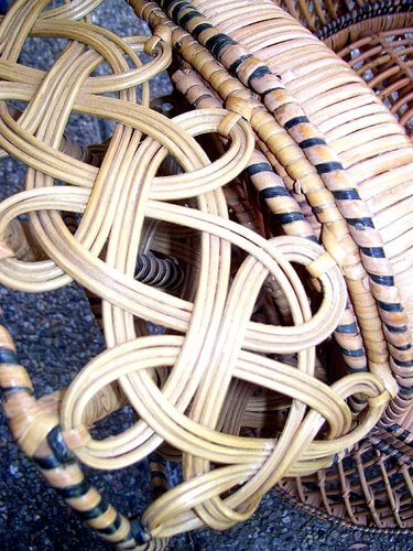
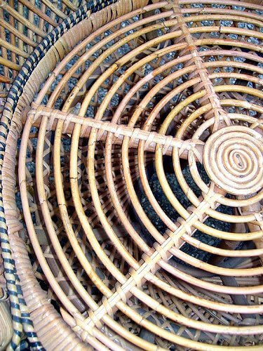
So excited. I have another peacock chair and this one is a beauty! Made in the 70s by the man who taught my blind husband to weave cane (yes the typical cliche of a blind man making baskets!) and stored in a shed since his retirement the now 73 year old gentleman let my husband have it for a reasonable price and the promise to help with some cane weaving jobs. He just finished weaving a basket for a hot air balloon and he’s supposed to be retired. I would love to have seen his shop in it’s heyday. I was too excited to wait until it was in my office to take a photo. It’s currently drying after a warm soapy wash. Tomorrow hopefully photos of it gracing a corner of my retro office.
Killing two birds with one stone
Posted on Wed, 14 May 2008 by midcenturyjo
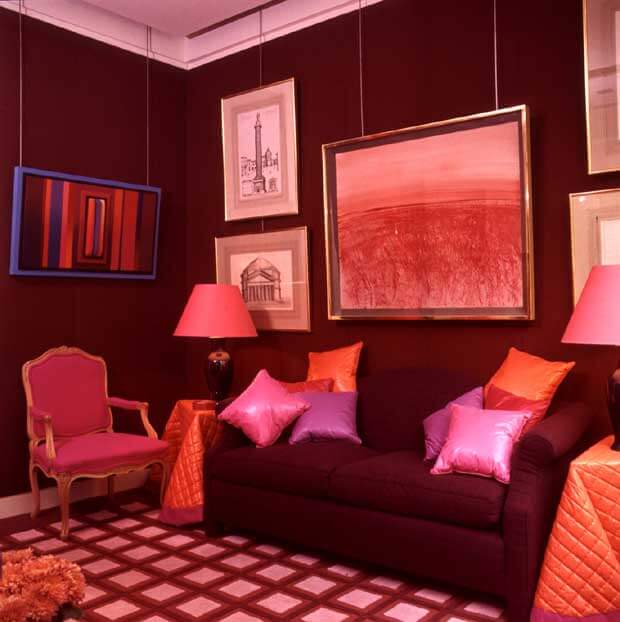
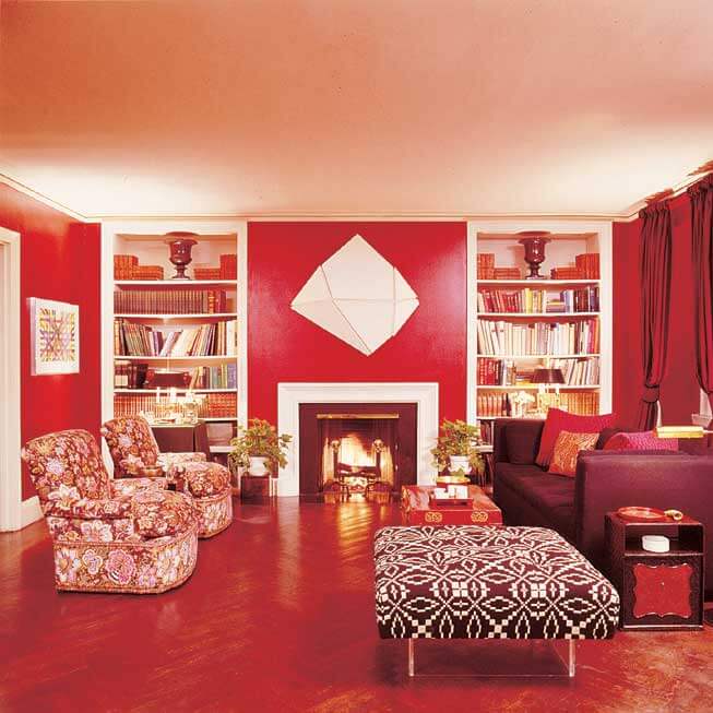
Sorry for the rather murderous analogy but it will all become clear soon I hope. I’m in a retro kind of mood today. It must be due to the lack of retro posts lately. I’ve also been inspired by Tessa’s design dilemma. When Kim bewailed the fact that no one paints a room burgundy my immediate thought was “they used to”. The light bulb went on in my head and one name was there – David Hicks. I’ve paid homage to Hicks before but I realised he was part of the solution. These are his lush rich rooms, not always burgundy but brave in their dark hues.
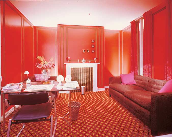
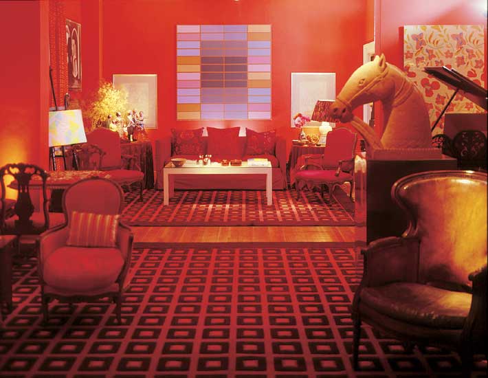
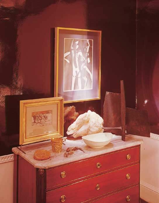
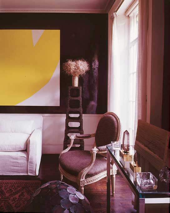
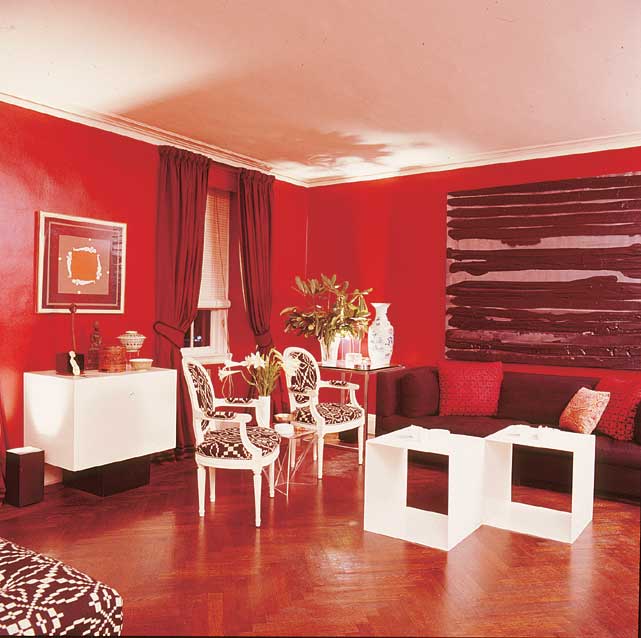
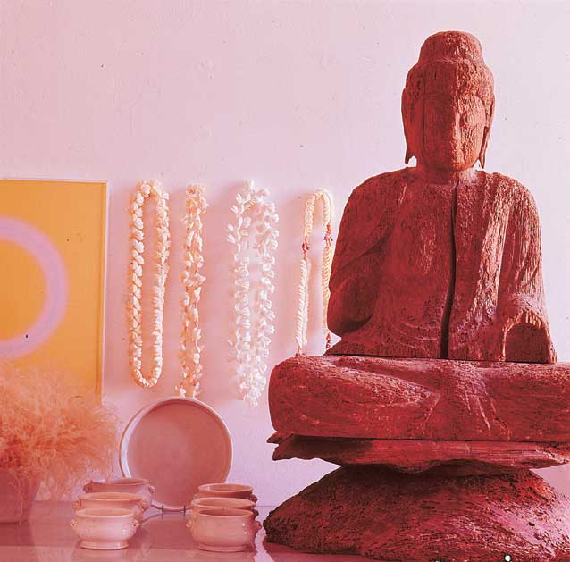
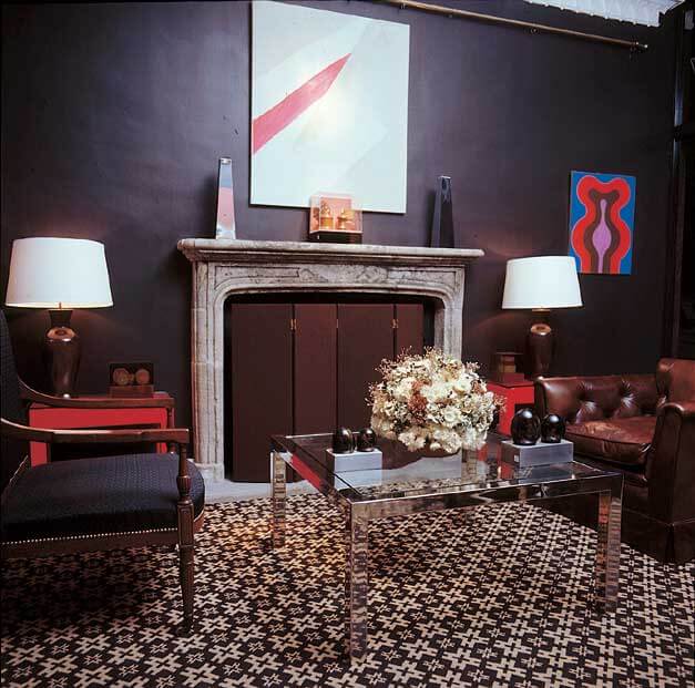
Imagine that Buddha vignette in a burgundy room! Or that yellow and white abstract canvas.
Tessa leans toward super bright hues (oranges, yellows, apple greens, etc.), Kim had some great ideas and with David Hicks’ help I’m going to suggest a few more. White, white, white. Tone it down with white. White furniture – think sleigh bed in white gloss, white sheers and fabric that uses white. Chocolate and white, navy and white, pink and white, black and white and even certain greens with white. Treat your burgundy walls as a deep dark neutral.
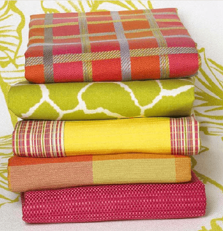
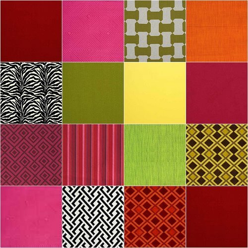
Bright colours? Why not! All these fabrics were pulled from Lee Jofa’s Groundworks Collection. Many are by David Hicks. Bright colours particularly orange and yellow and pink and green are all happy with burgundy. You don’t have to buy these fabrics but they give you an idea. Maybe florals are more your thing Tessa. I suggest a trip to the paint store. Gather together as many burgundy paint chips and every possible accent colour and play to your heart’s content. My second suggestion is dark wood with an ethnic twist, suzanis and kilims in rich reds, pinks, oranges and black. Layers and layers of pattern. Cocoon yourself in the mysterious dark. OK now I have retro rooms and Tessa’s burgundy dilemma out of my system. Two birds – not bad!