Displaying posts labeled "Blue"
Millbrook House
Posted on Thu, 13 Aug 2020 by KiM
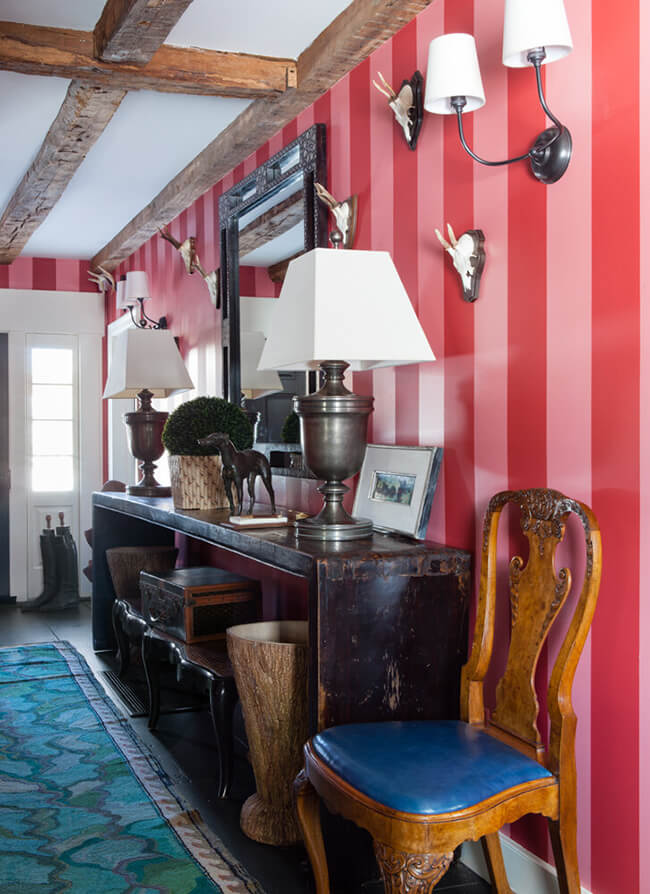
I can appreciate traditional and antique furnishings, but when typically pared with a pale/drab colour palette I am always left underwhelmed and dreamy of 80 year old grannies curled up on the sofa crocheting. Designer Nick Olsen took the rustic bones of this farmhouse, added some sassy in-your-face colours and patterns for a more youthful juxtaposition and WOW – this sure ain’t Granny Mae’s digs anymore!
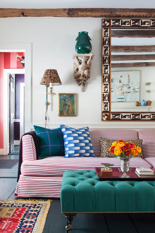
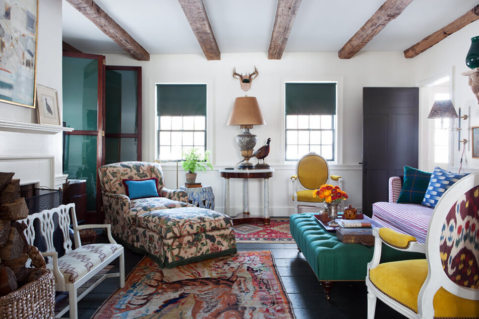
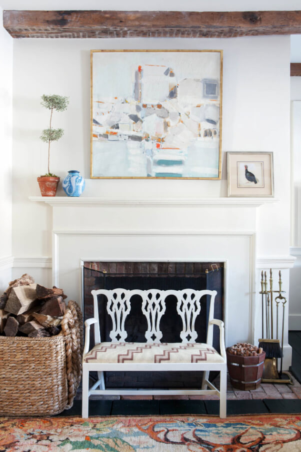

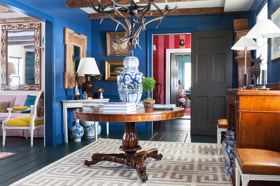

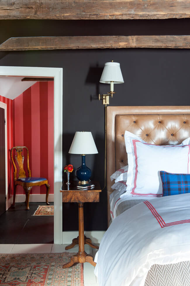
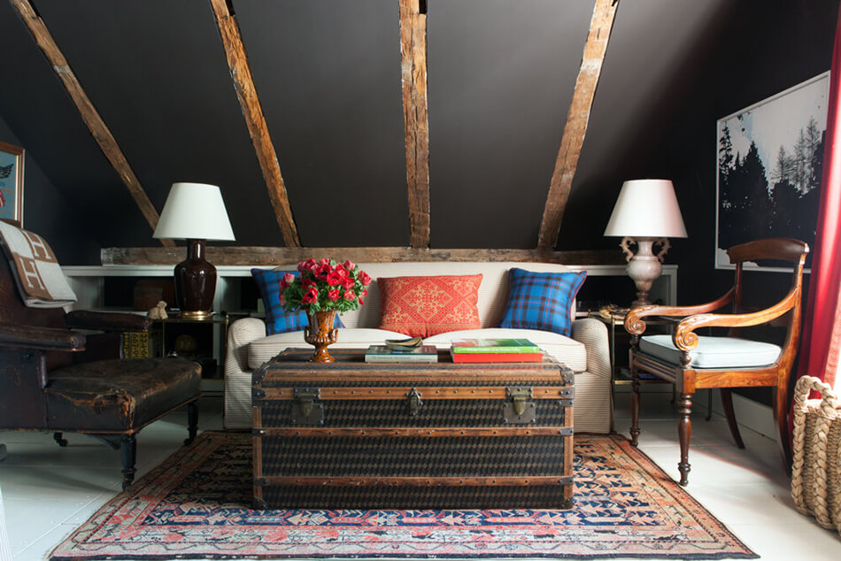
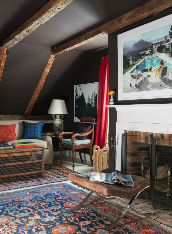
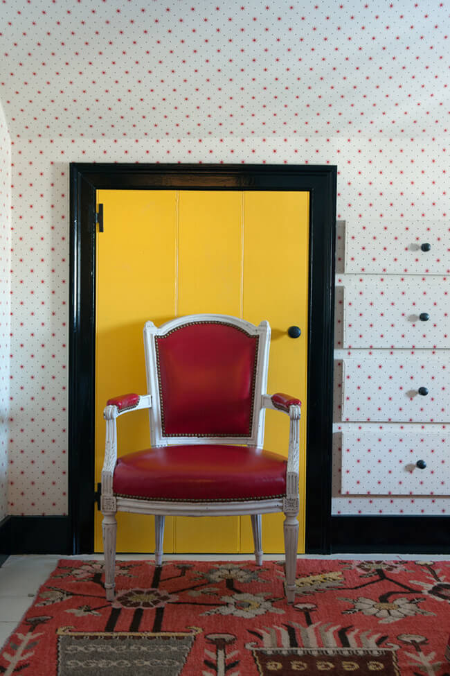
Photos: Reid Rolls
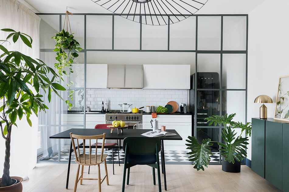
A Paris inspired apartment in downtown Chicago
Posted on Fri, 7 Aug 2020 by KiM
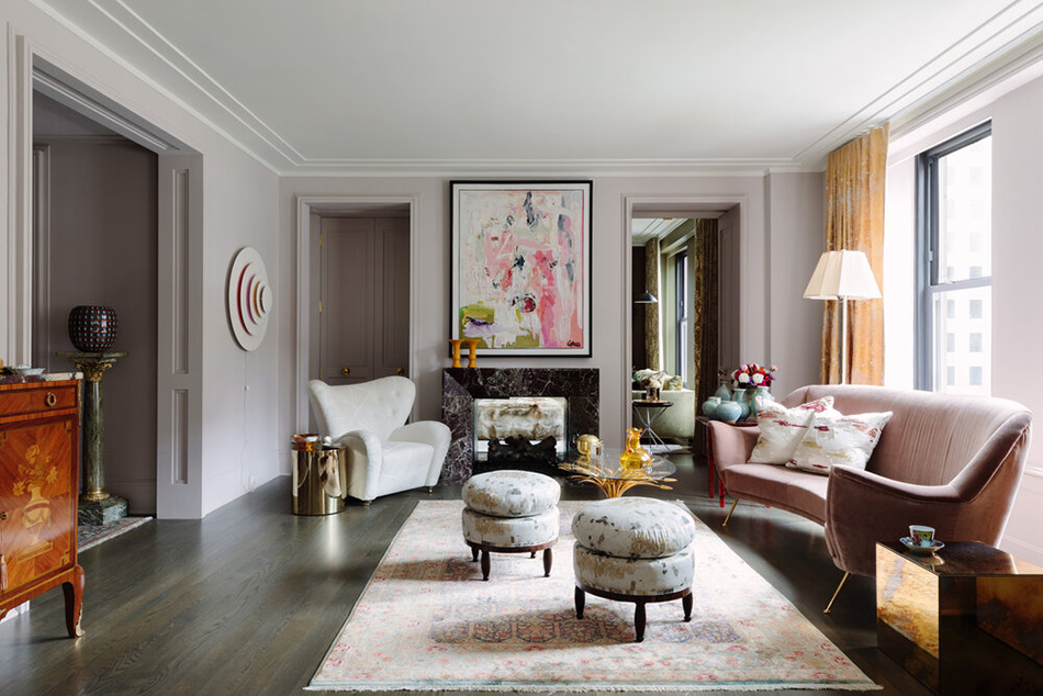
Christopher Kent of Studio CAK turned this apartment in the Palmolive building in downtown Chicago into a chic Parisian pad. A gut renovation, lots of ballsy colour choices (that kitchen OMGGGGG) and sculptural furnishings really add a WOW factor here. This is a “I would not touch a thing” sitch.

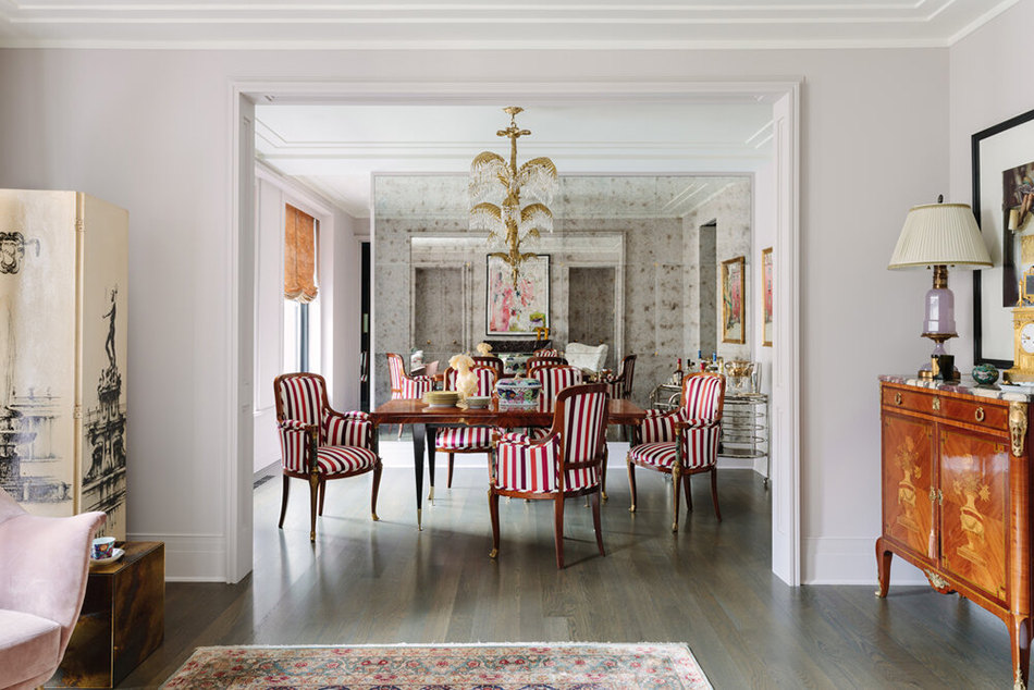
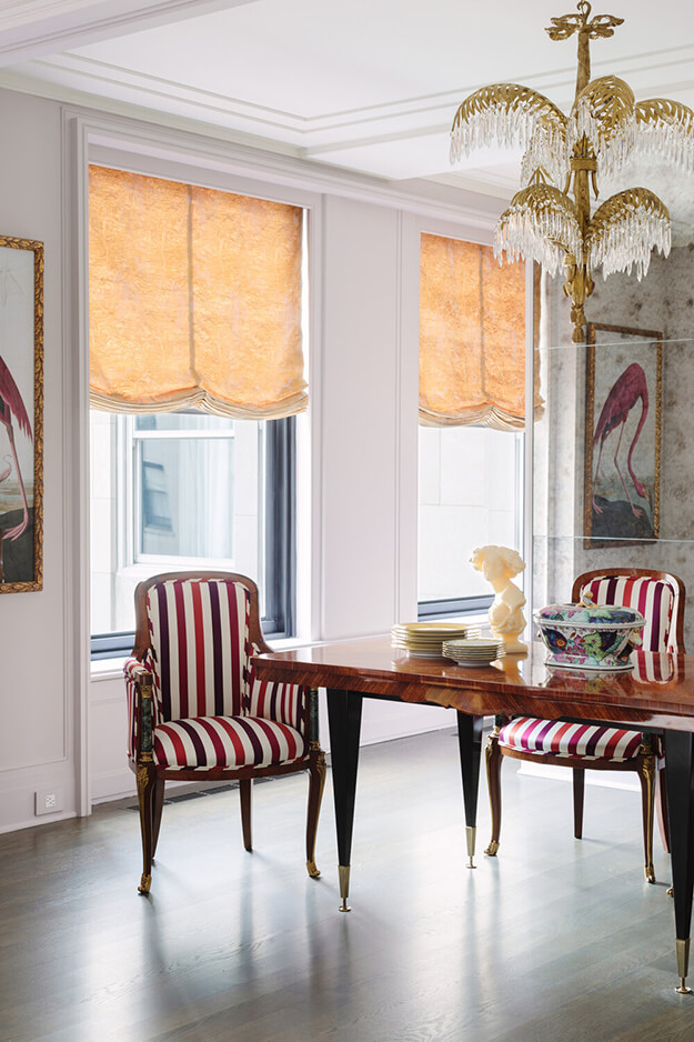
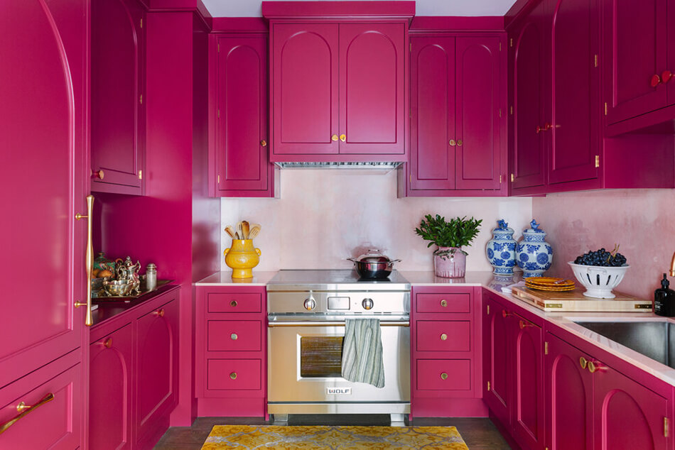
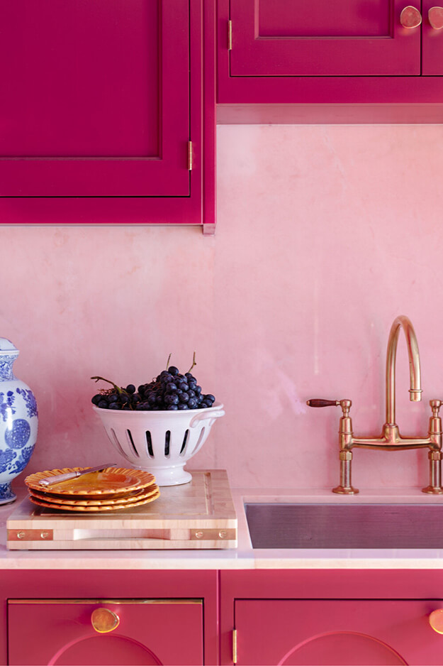
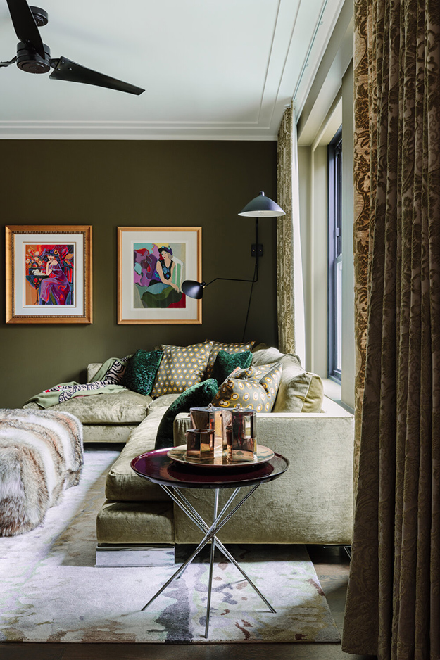
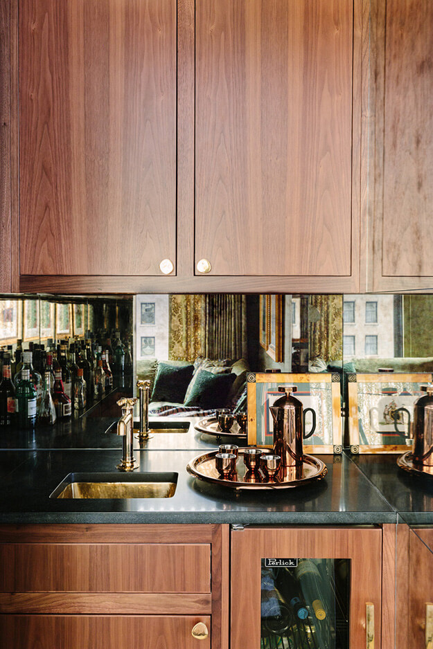


Photos: Aimée Mazzenga
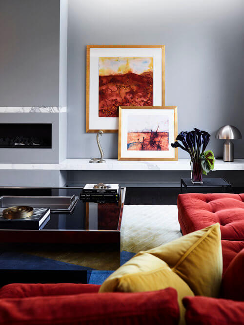
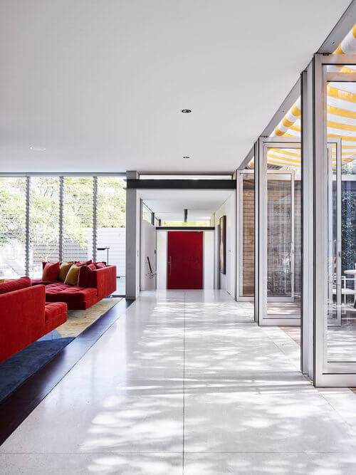
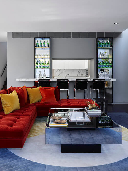
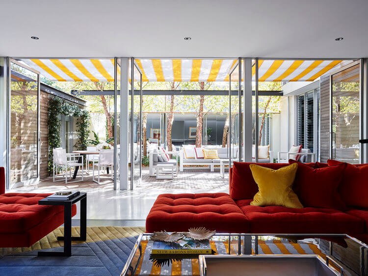
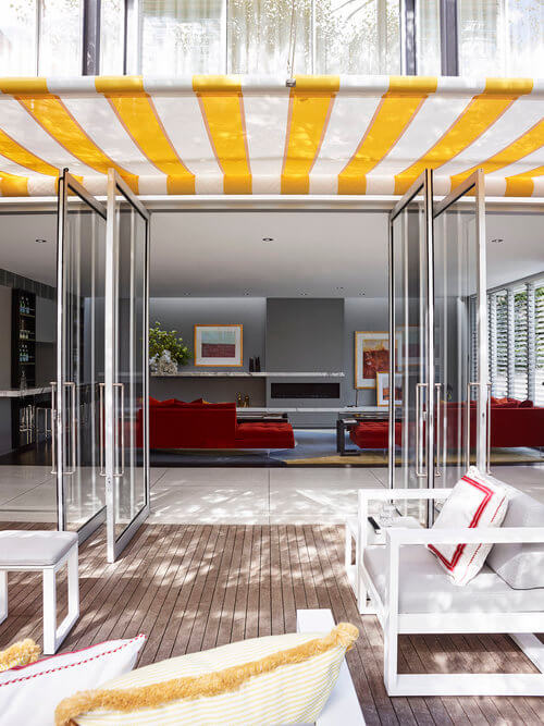
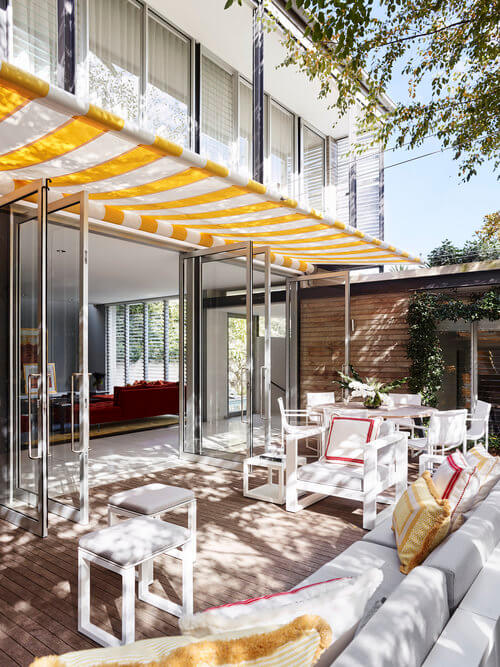
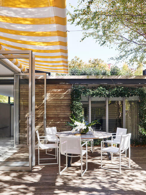
Colour
Posted on Thu, 6 Aug 2020 by midcenturyjo
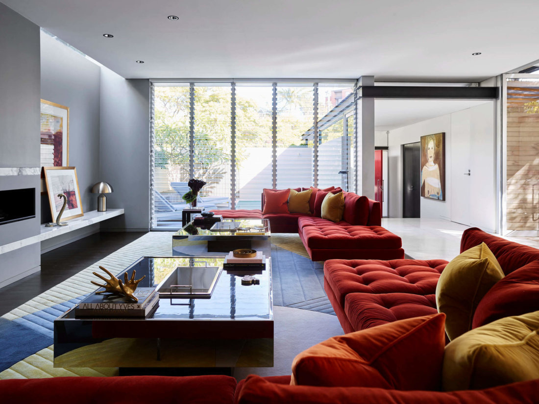
Colour, colour, colour. For those who think that Australian designers can only do beige I give you The Palm, Woollahra by POCO Designs.Take a mid century vibe, wrap it in a jewel box of bright colours, open the interiors to the outside, sprinkle on the luxe and you’ll never crave beige again.

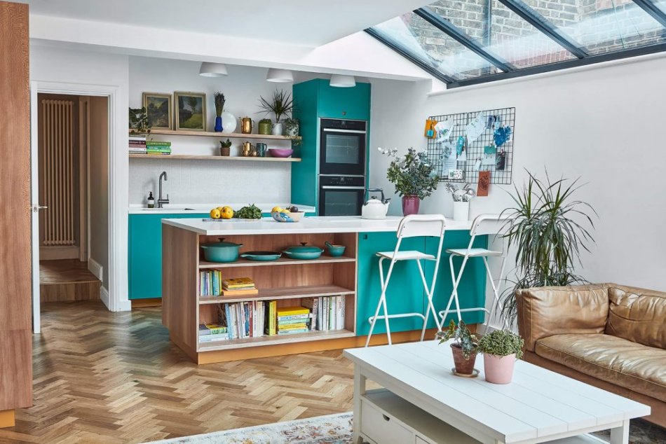
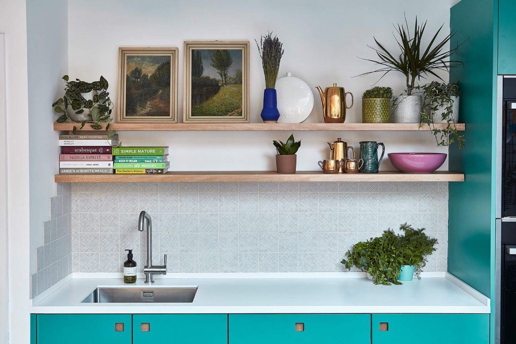
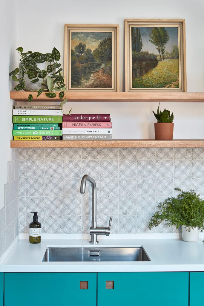
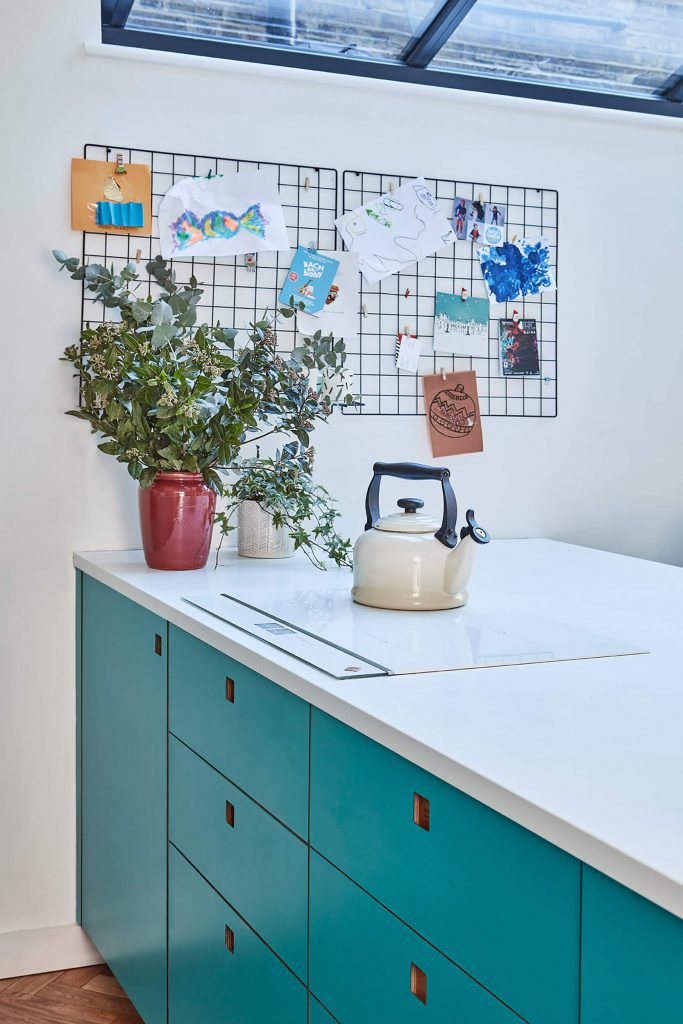
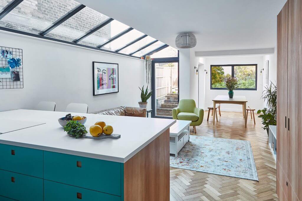
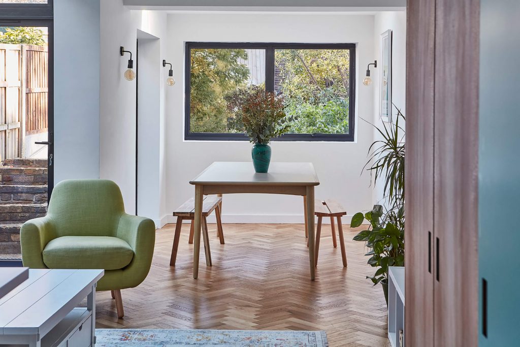
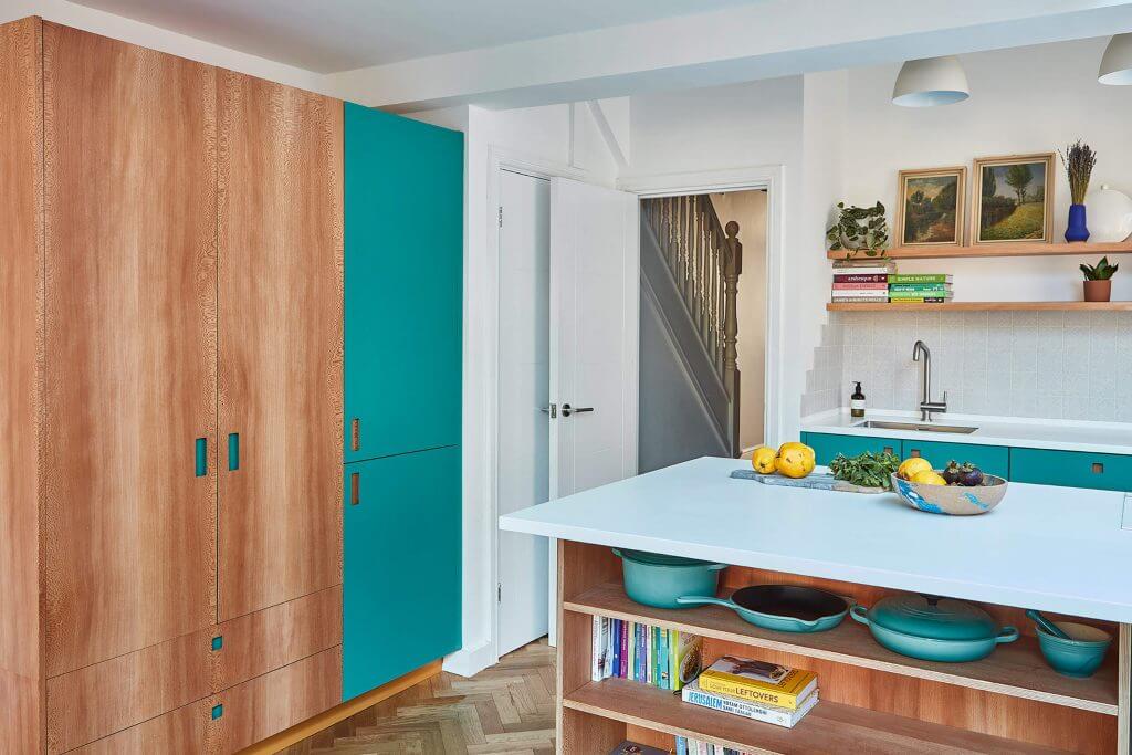
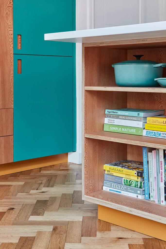
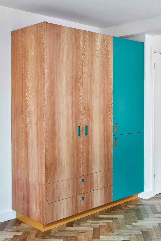
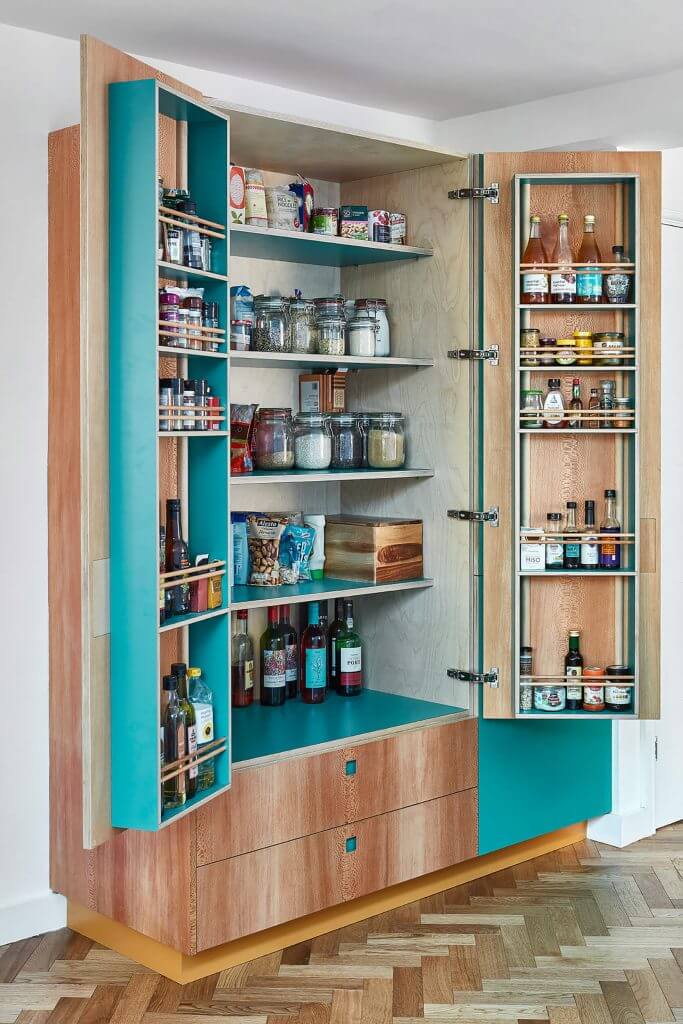
Colour in the kitchen
Posted on Tue, 21 Jul 2020 by midcenturyjo
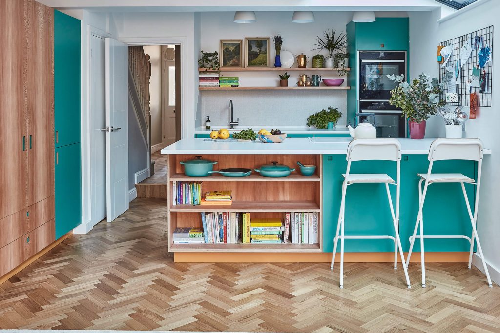
Begone boring beige and wimpy white. We want colour in the kitchen and we want it now. Tower Hamlets Road by London-based kitchen designers Pluck.
“This colourful open-plan kitchen in a Victorian terrace in North East London is about family life. Our design includes a large larder and an extra wide peninsula to provide generous worktop space and lots of storage (nine drawers, three cupboards and the open shelves to be precise!). The palette is Effra, London Plane and Market Mustard.”

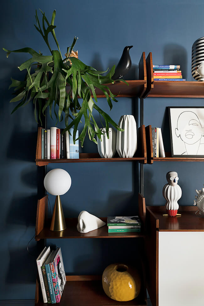
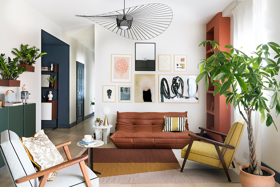
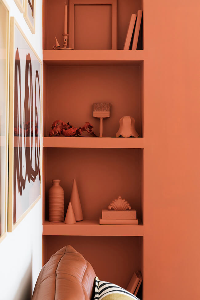
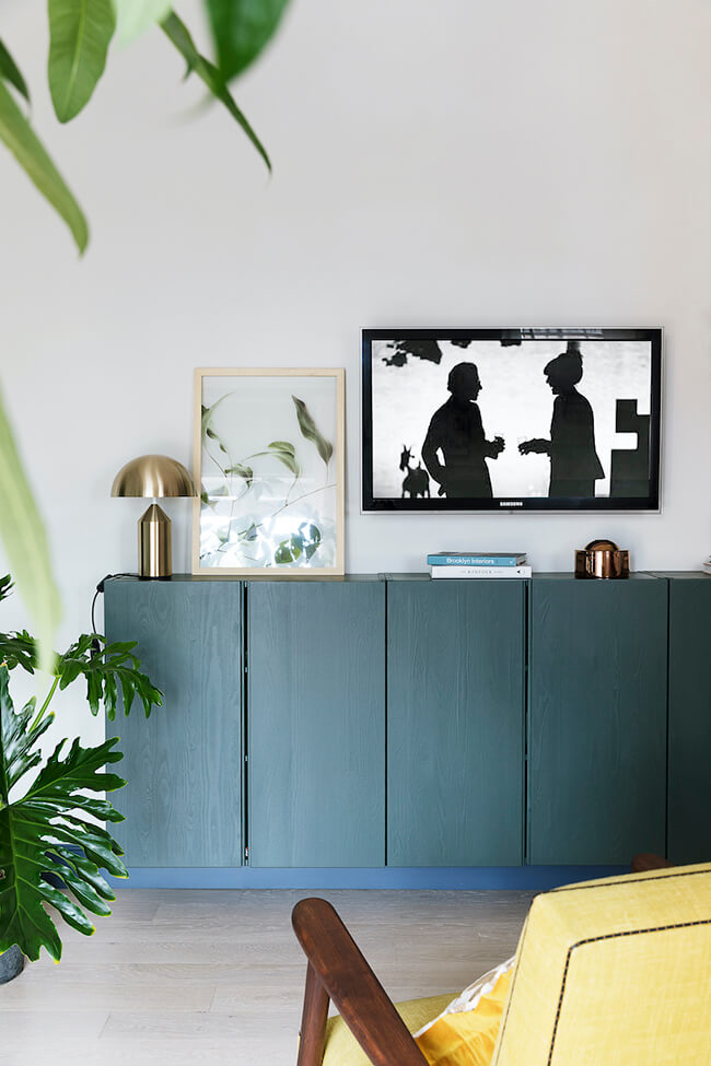
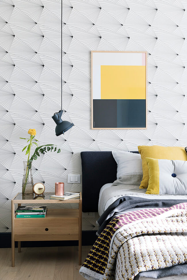
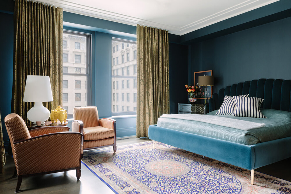
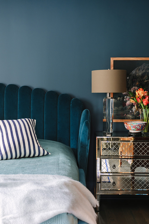
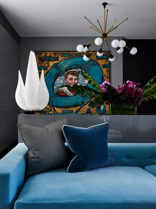
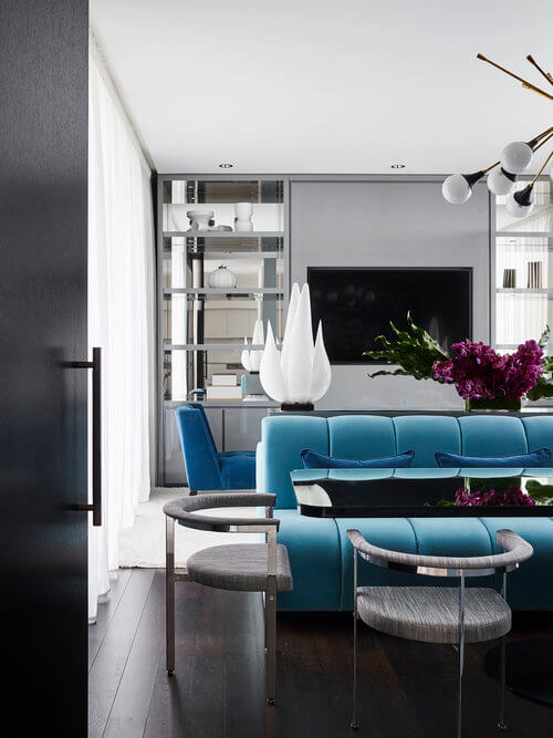
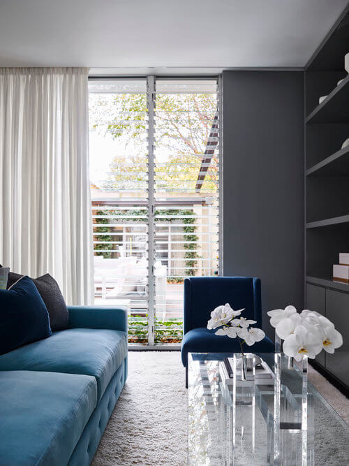
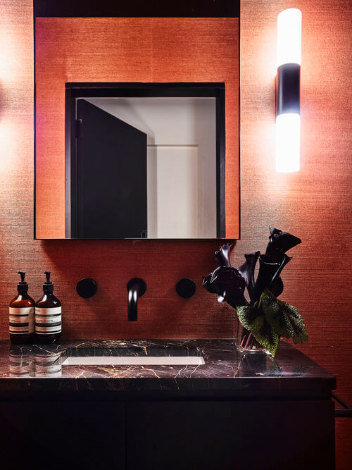
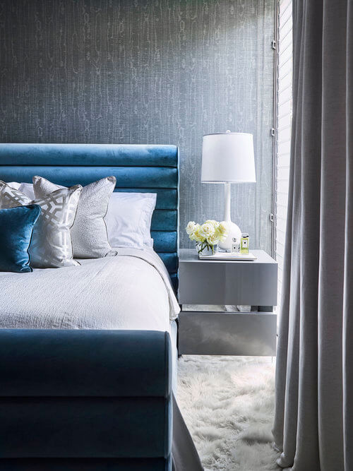
Deep jewel tones in an apartment in Italy
Posted on Mon, 20 Jul 2020 by KiM
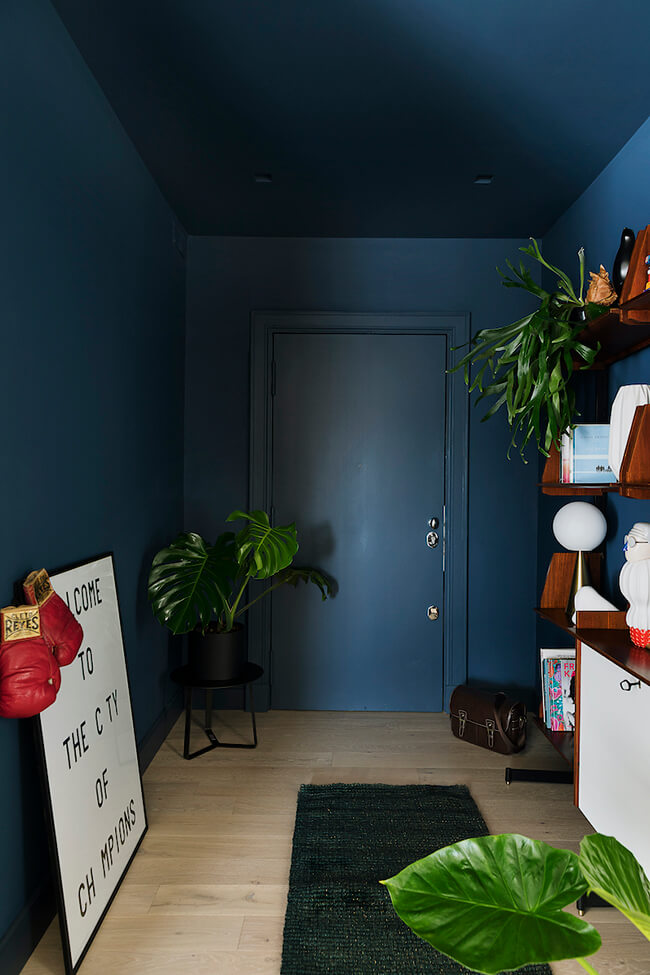
A midnight blue cocooning foyer, a mustard yellow accent chair, a Togo leather sofa in cognac with coordinating painted nook (love this!!!), more blue and yellow in the bedroom…. This apartment by Italian designer Grazia Caruso of Vesper Design is modern and vibrant and I really love the warmth of these colours playing off each other. Such good energy in this space.