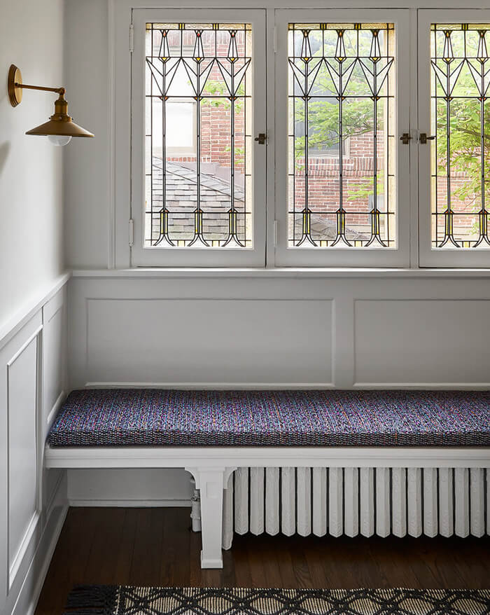
Displaying posts labeled "Blue"
Sunday (pre-pandemic) at a tapas bar/restaurant
Posted on Sun, 7 Jun 2020 by KiM
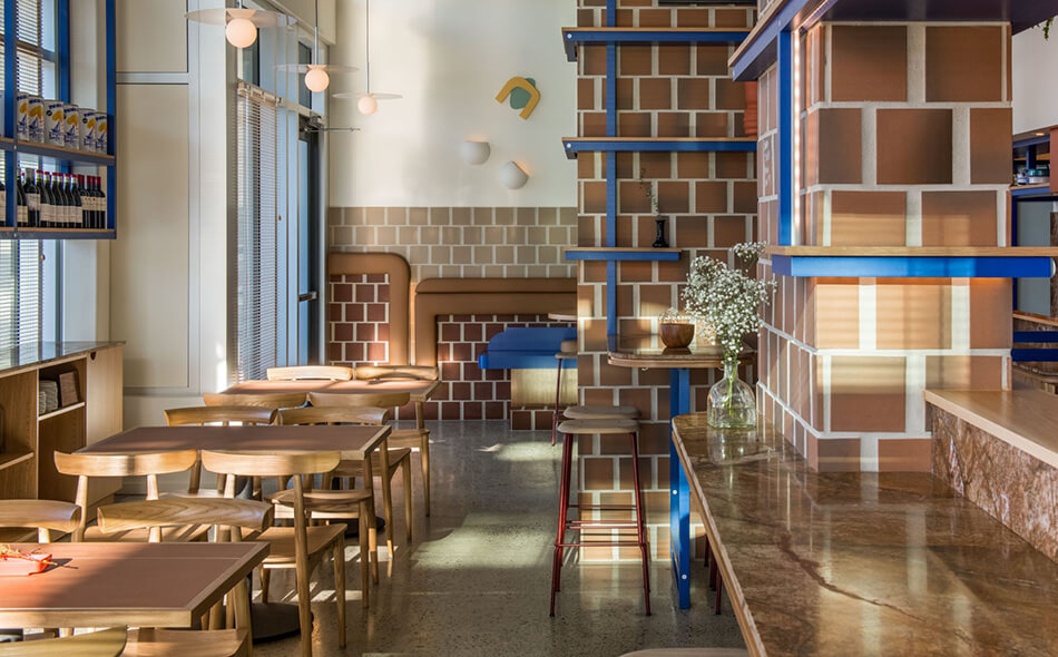
Oh how I would love to enjoy a dinner out on the town again, and to transport myself to Vancouver and this fabulously designed tapas bar & restaurant. Como Taperia is a nod to the classic, centuries-old, standing-room-only tapas bars in Barcelona’s Poble Sec or Madrid’s La Latina quarters. These spaces are tight, acoustics are loud and you may or may not be offered a place to sit, favouring conversation and community over intimacy and comfort. Our access point to the materiality and colour strategy came from one particular reference, Jardins de les 3 Xemeneies, and its three brick chimneys that backdrop the bustling Poble Sec–the only remains of an early 20th century power station built by the Barcelona Traction, Power and Light Company ( a Canadian utility company that operated light and power utilities in Catalonia, Spain) locally known as La Canadiense for the old company’s Canadian electricity production. Opening a tapas bar in Canada, this history acted as a leeway into exploring the vernacular of this neighbourhood, allowing Como to become a contemporary materialization–an homage to all we love about Spain. The rest was an exercise in keeping things simple and fun and letting a few other cool points of inspiration stand out against this backdrop like the punches of cobalt blue reminiscent of Miro and the art program taking Jean Arp’s work as a point of departure. Designed by Ste. Marie.
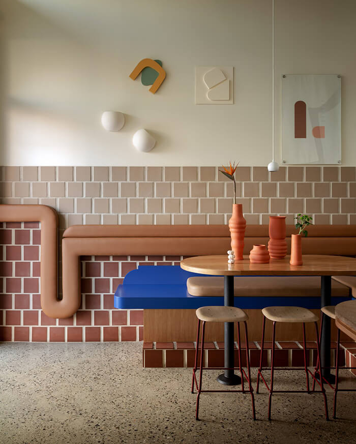
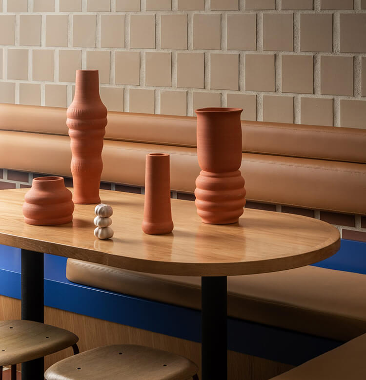
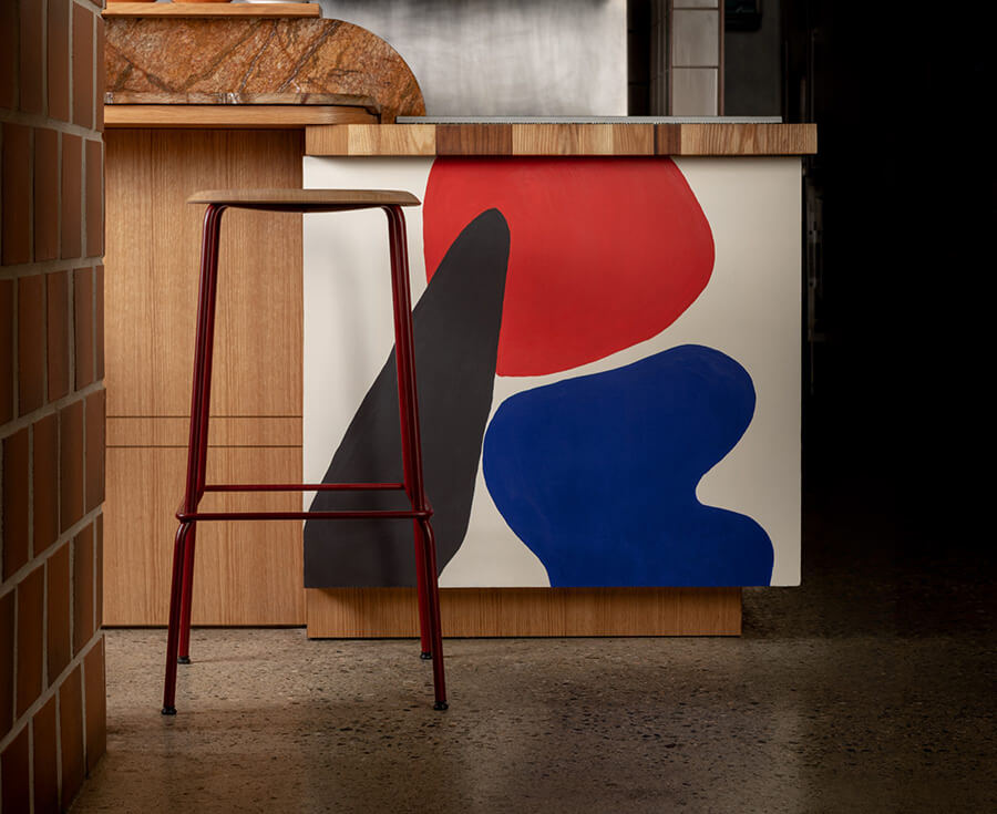
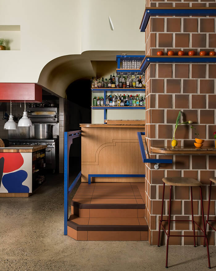
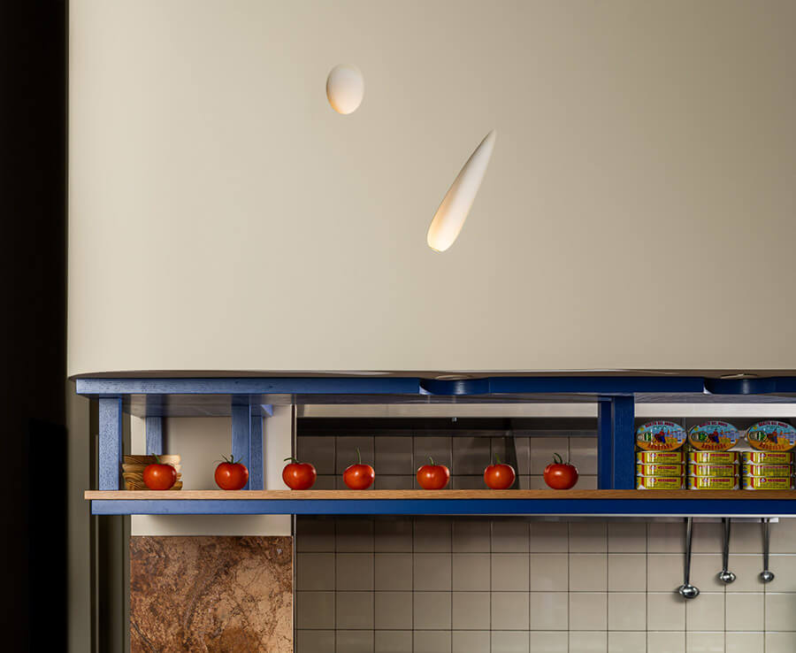
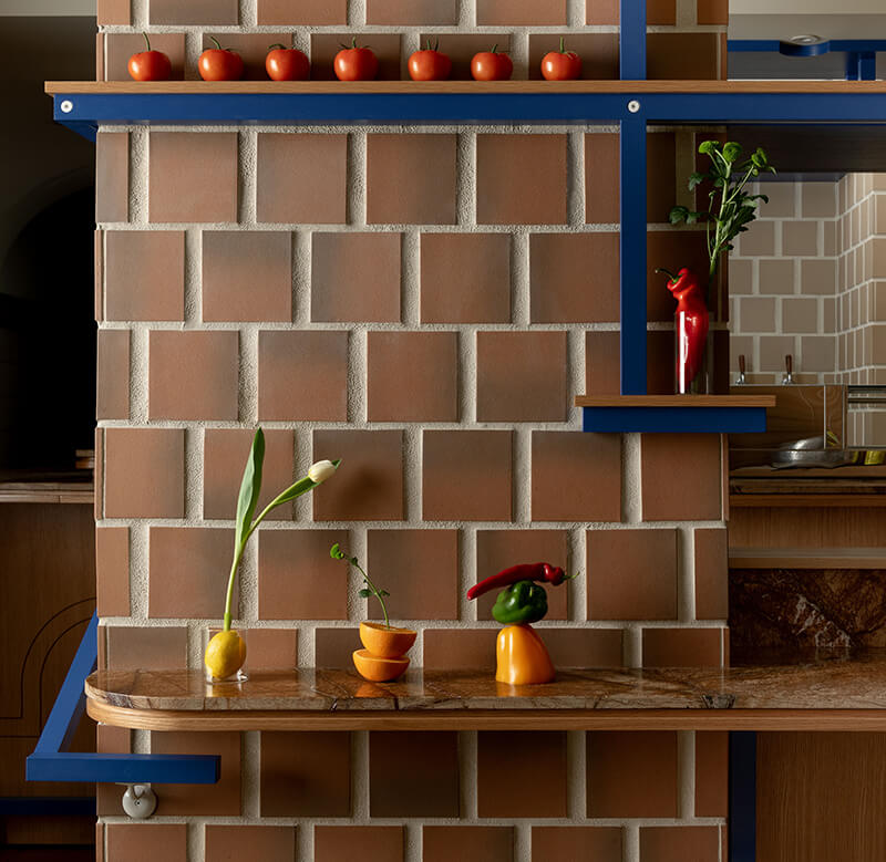
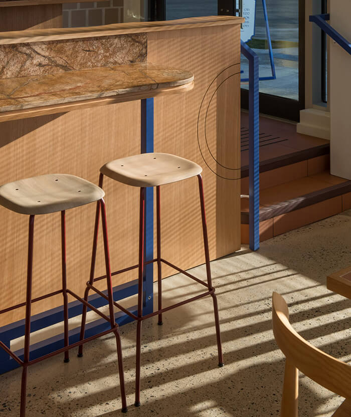
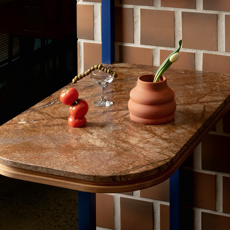
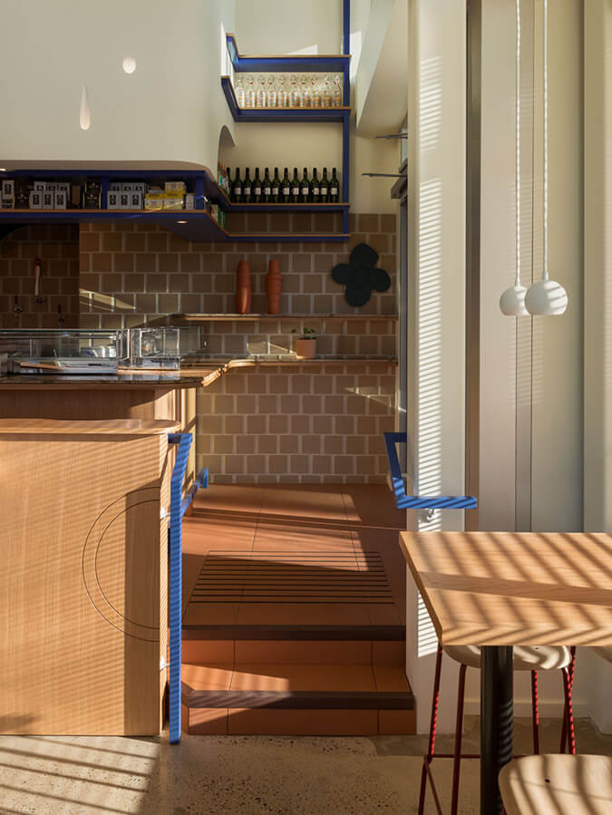
Photography by Conrad Brown
Styling by Kate Richard
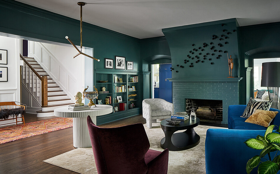
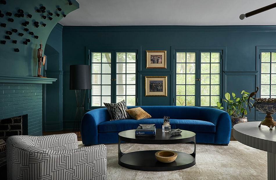
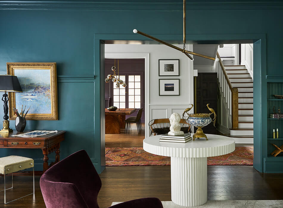
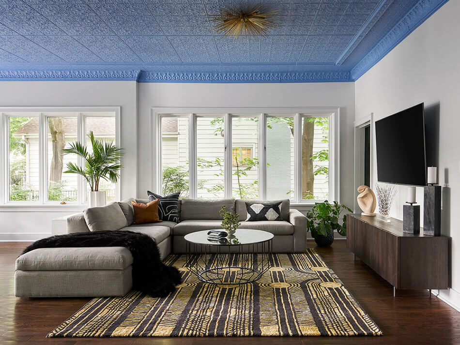
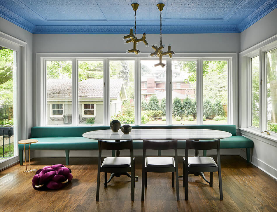
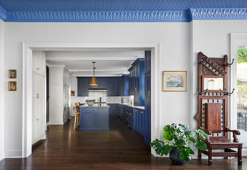
House of jewels by Studio Sven
Posted on Tue, 19 May 2020 by KiM
I wanted to share another very intriguing project by Studio Sven. In this case it’s quite a traditional style home that is given quite unexpected lashings of jewel-toned colours. At first I was a bit taken aback but the more I devoured these photos the more I like what I see (I’m still uncertain about that blue ceiling – not a fan of blue). It’s an inexpensive and very impactful way of modernizing a home.

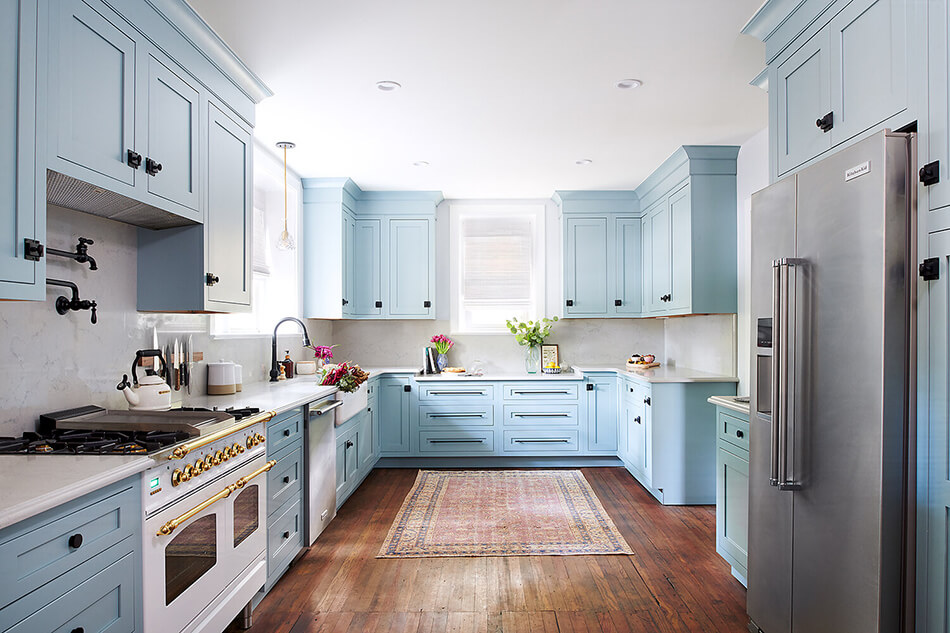
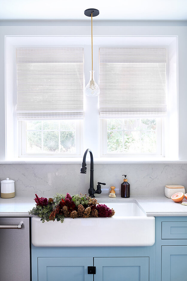
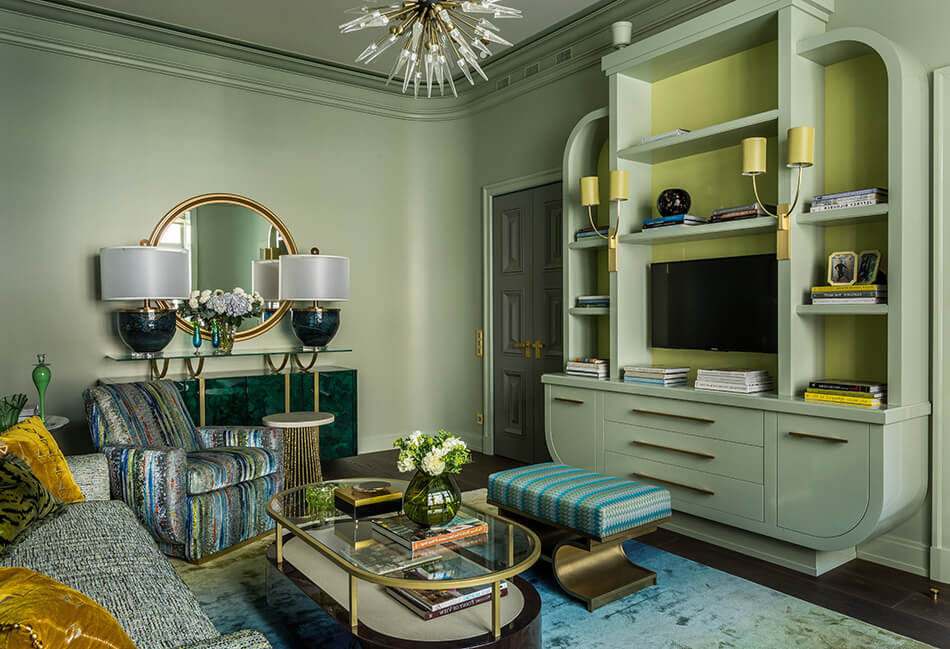
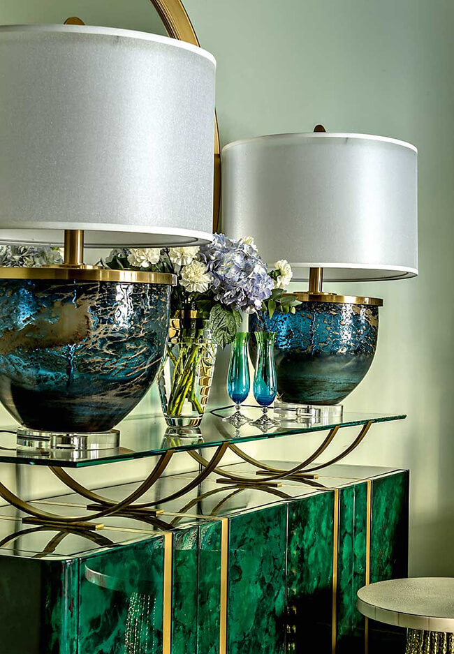
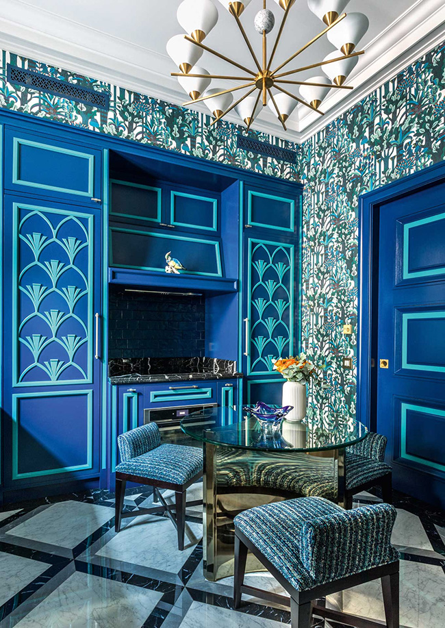
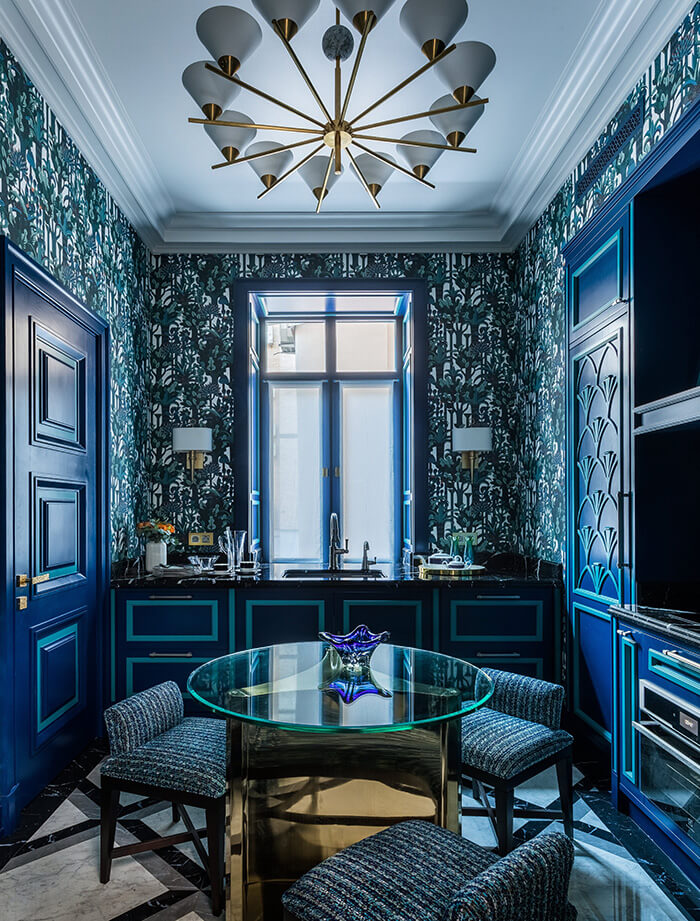
Another eclectic apartment by Pepe Leal
Posted on Wed, 13 May 2020 by KiM
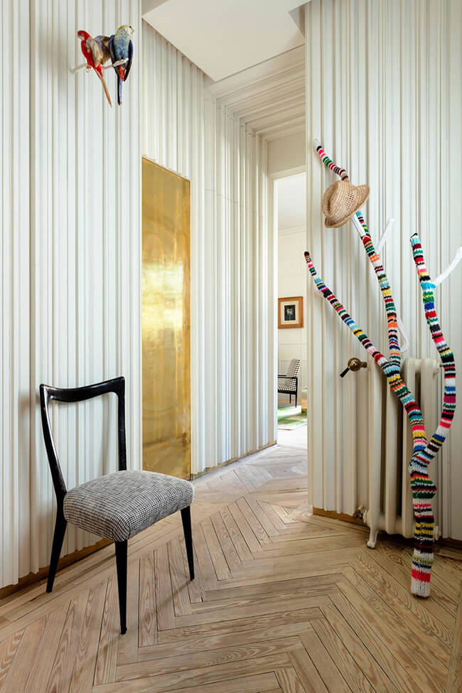
I am head over heels in love with this apartment. Possibly more than the last one I featured by Pepe Leal. I generally hate blue, but I’m dying over the kitchen. And the photo above – is that moldings installed length wise all over the walls? I’d hate to be the one to clean that, but I love that idea! And the powder room sink setup! So cute!
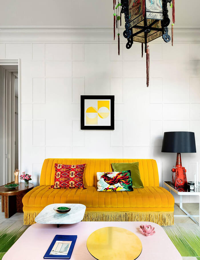
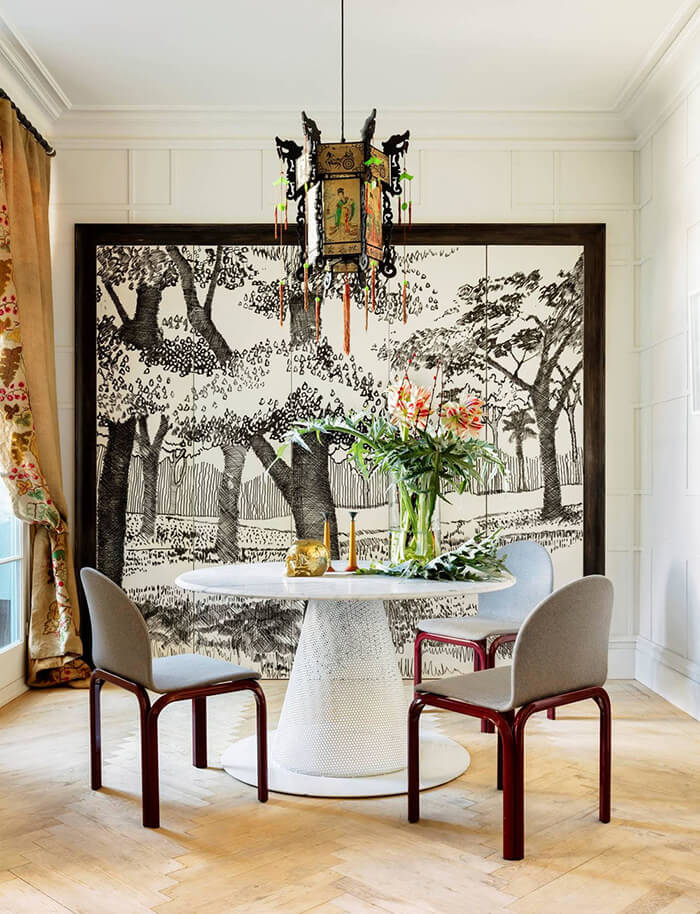
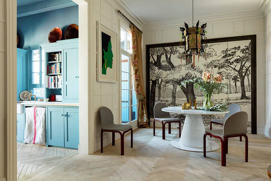
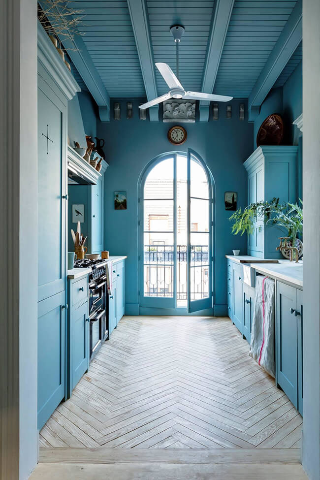
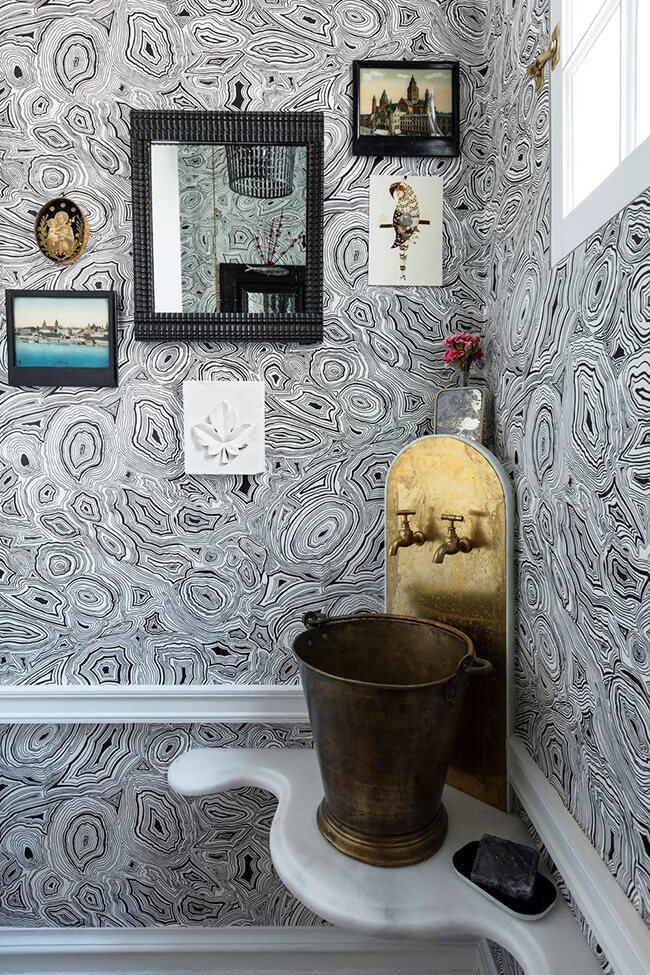
Photos: Ricardo Labougle
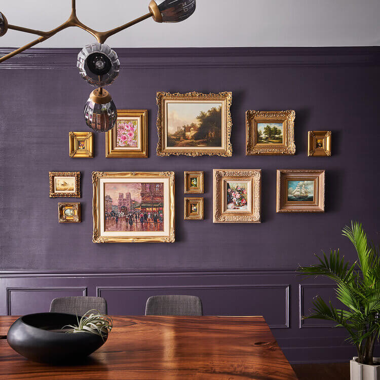
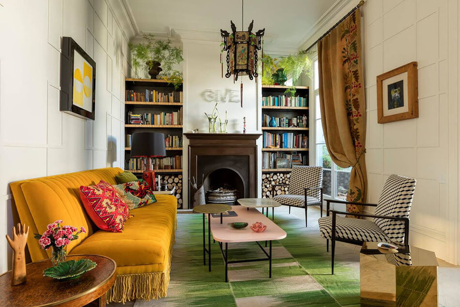
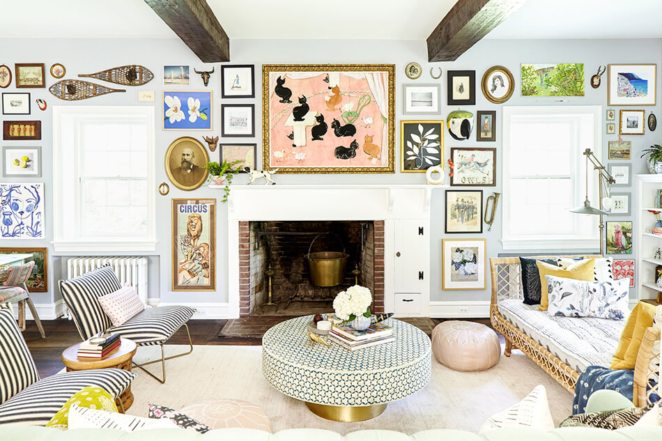
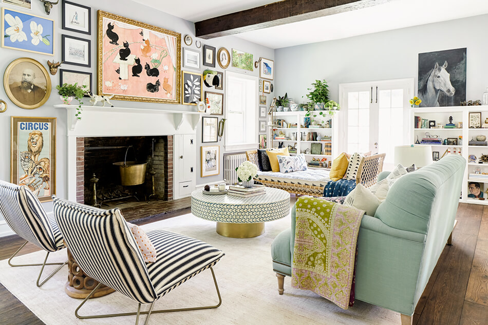
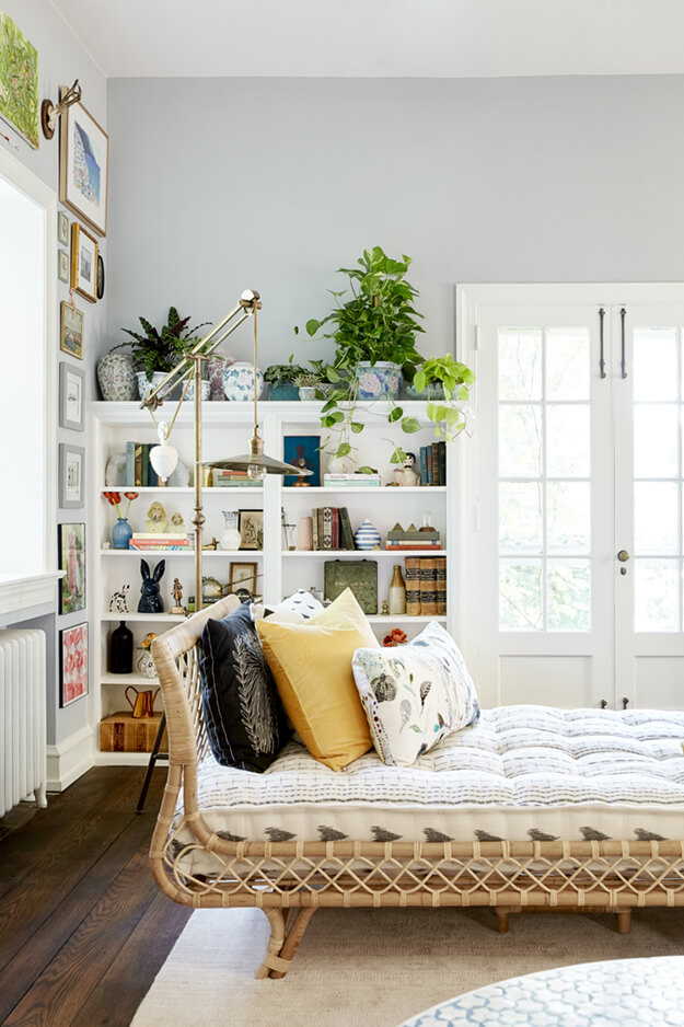
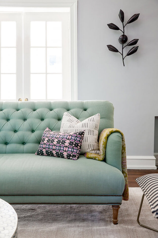
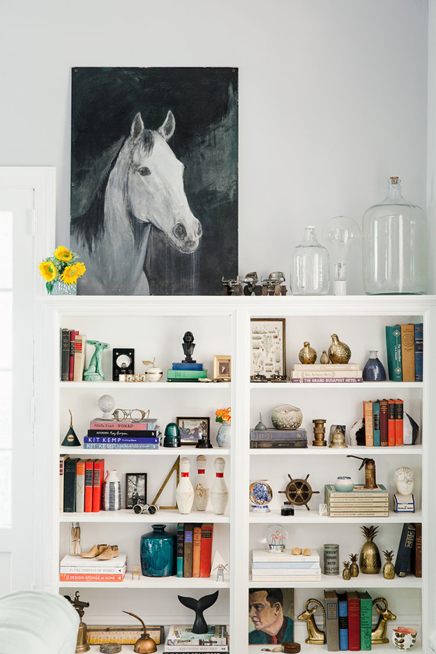
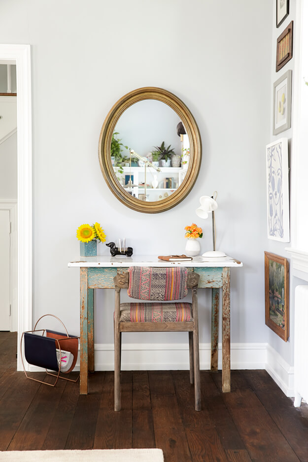
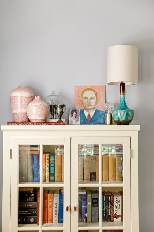
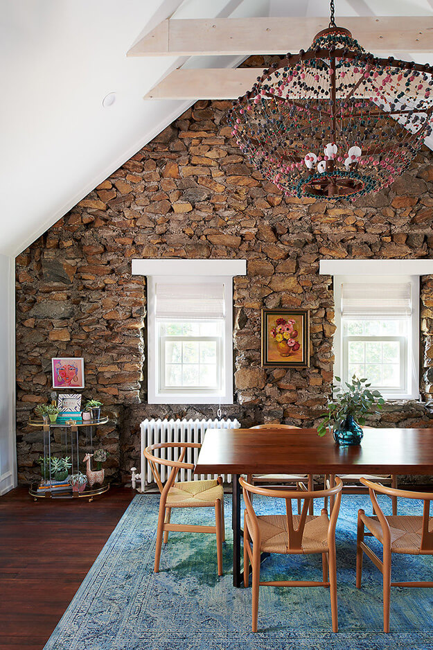
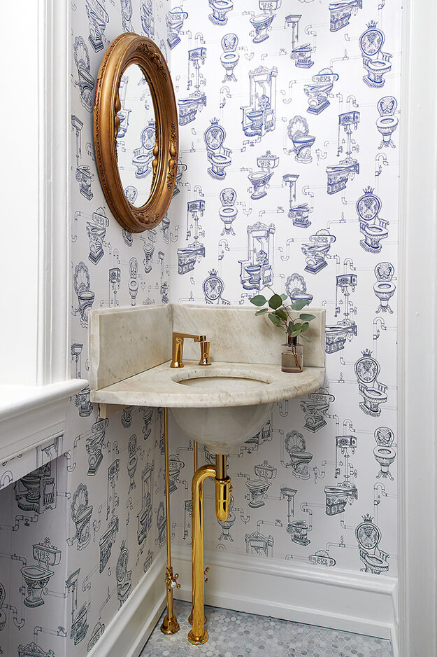
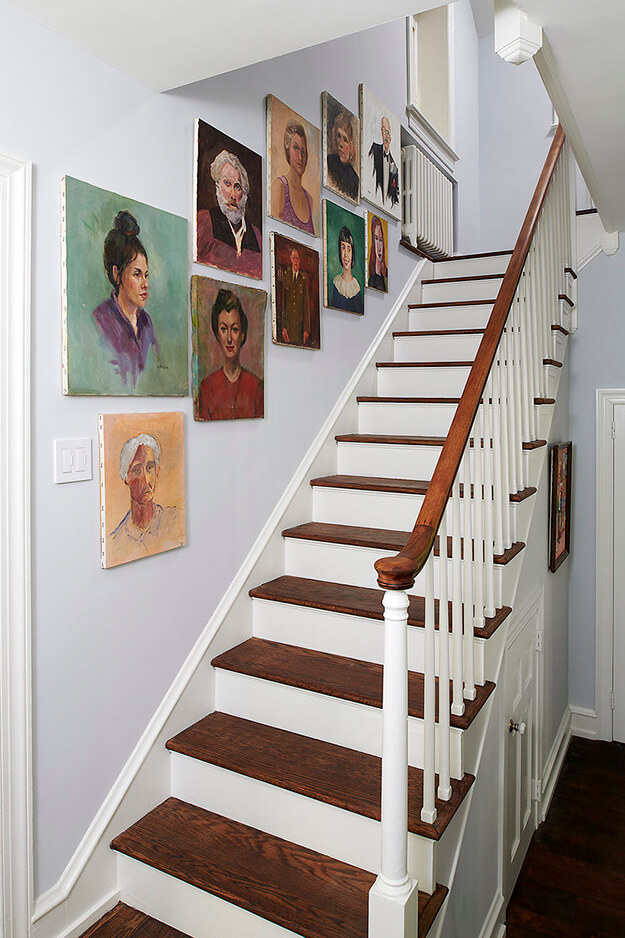
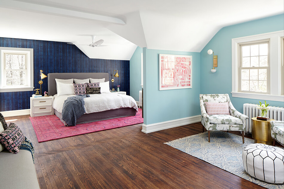
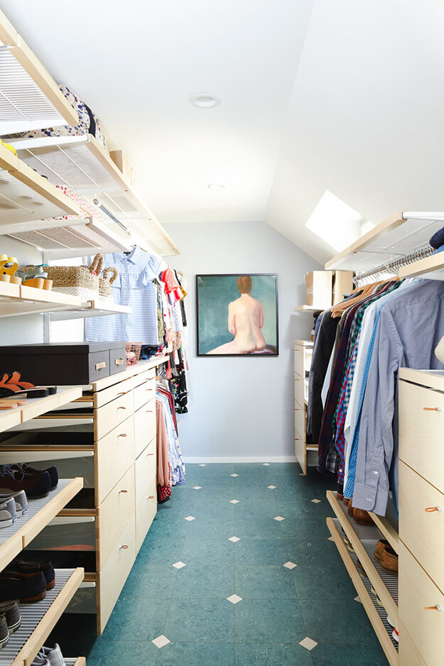
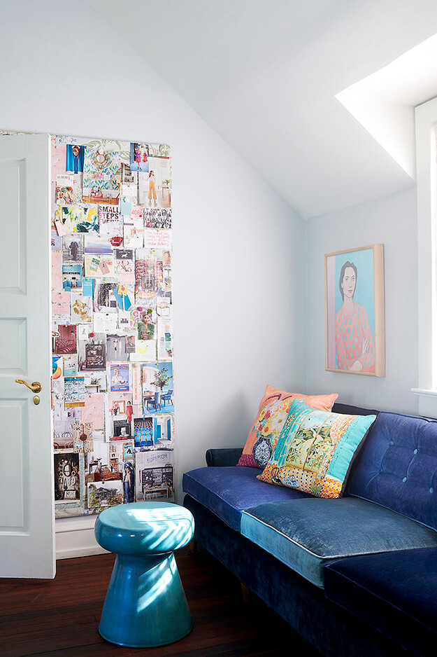
An exuberant forever home
Posted on Wed, 29 Apr 2020 by KiM
Really lively and bright colours, playful wallpaper, an elaborate gallery wall, and vintage vibes are abundant in this Pennsylvania forever home designed by Michelle Gage. She has added so much energy to each space. Forever indeed! (Photos: Rebecca McAlpin)

The office of Russian interior designer Boris Dmitriev
Posted on Sun, 26 Apr 2020 by KiM
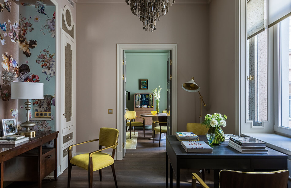
As soon as I came across a feature on Russian designer Boris Dmitriev‘s office/apartment in Architectural Digest Russia I laughed because it is such a bold contrast to the office Jo featured yesterday. Located in a building built in 1905 in Moscow, this 84 m² space is so unique. Boris does not shy away from colour or pattern! I know this isn’t for everyone, but his attention to detail and the way he pulls it all together with such cohesion is extraordinary.
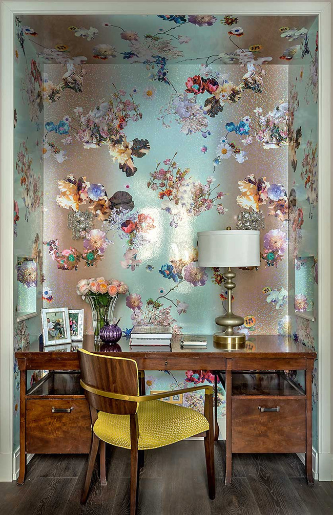
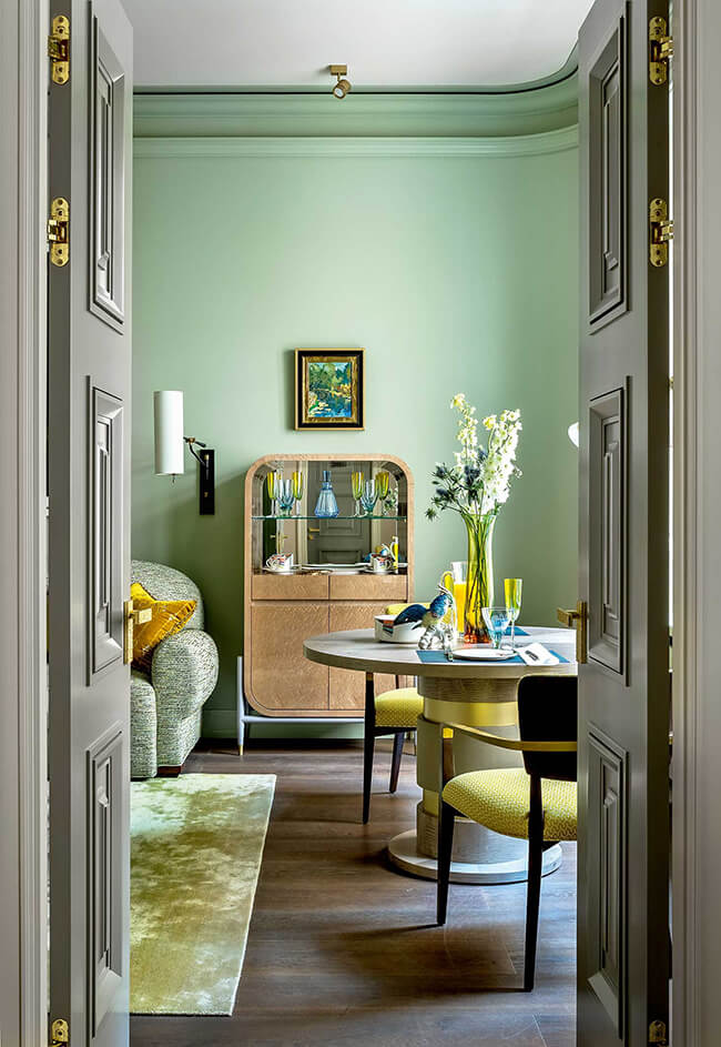
Photos: Mikhail Stepanov

