Displaying posts labeled "Uncategorized"
Revisting Generation
Posted on Wed, 31 Aug 2016 by KiM
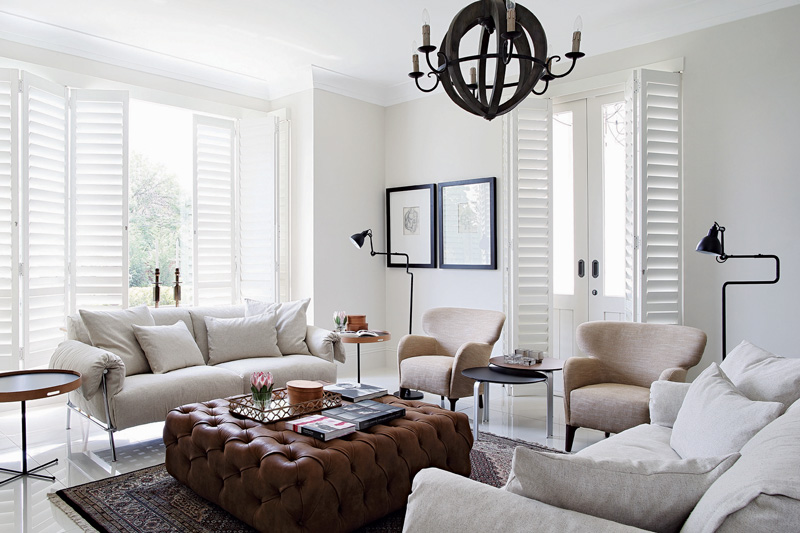
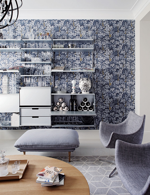
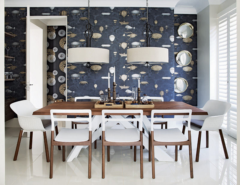
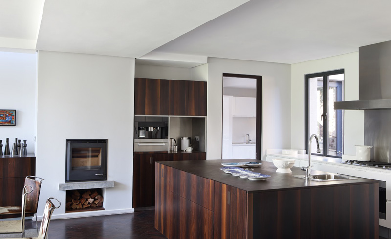
It has been a while since I featured the work of Generation from South Africa. Not only do they carry some pretty spectacular furniture, but their spaces are polished, inviting and hard to spot any overdone trends here! As a side note I just took a look at their sofa range and WOW. I typically find sofas boring but these really do it for me. (And this isn’t a sponsored post for the record)
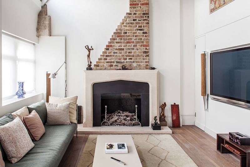
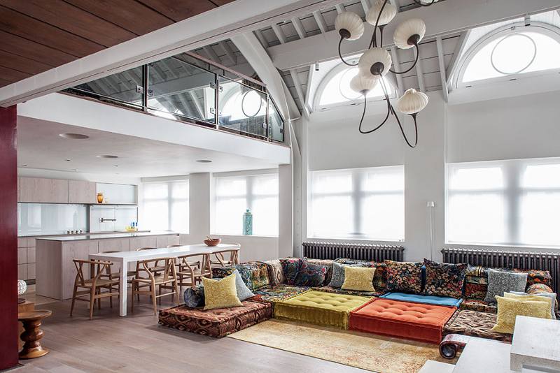
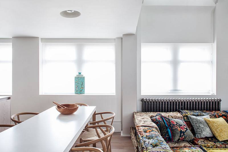
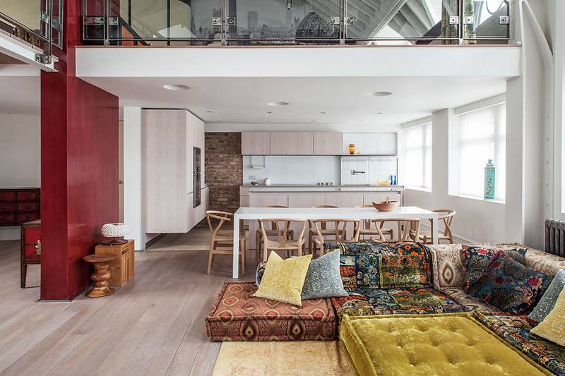
Boho Modern
Posted on Mon, 29 Aug 2016 by midcenturyjo
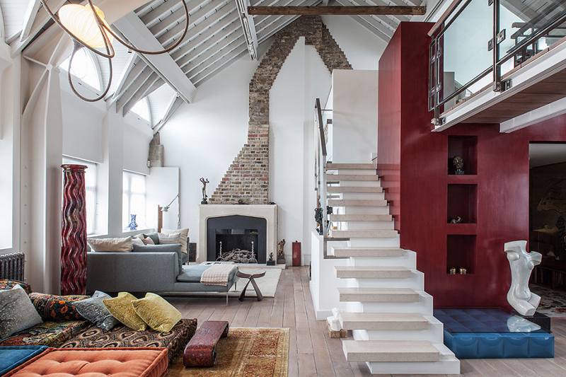
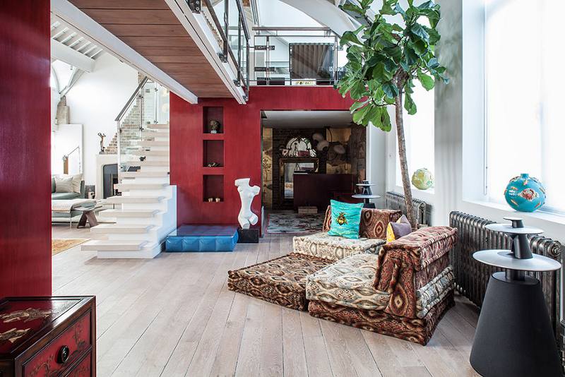
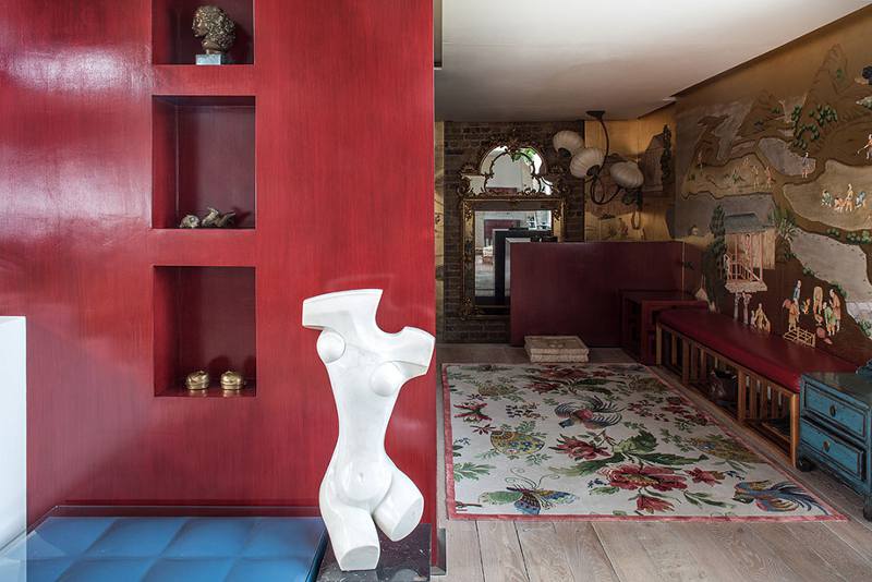
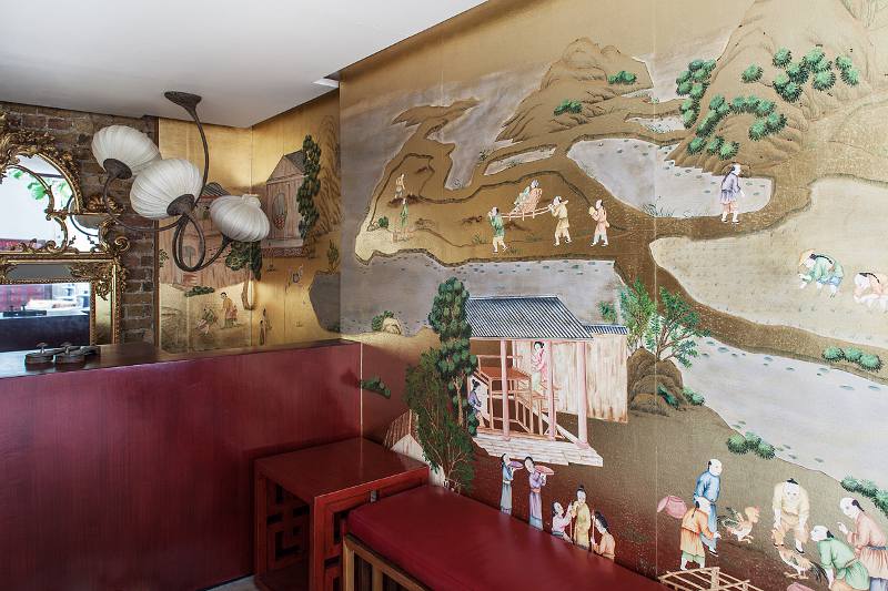
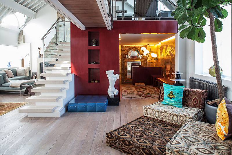
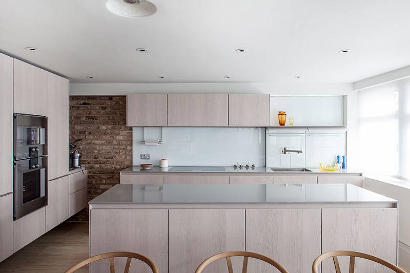
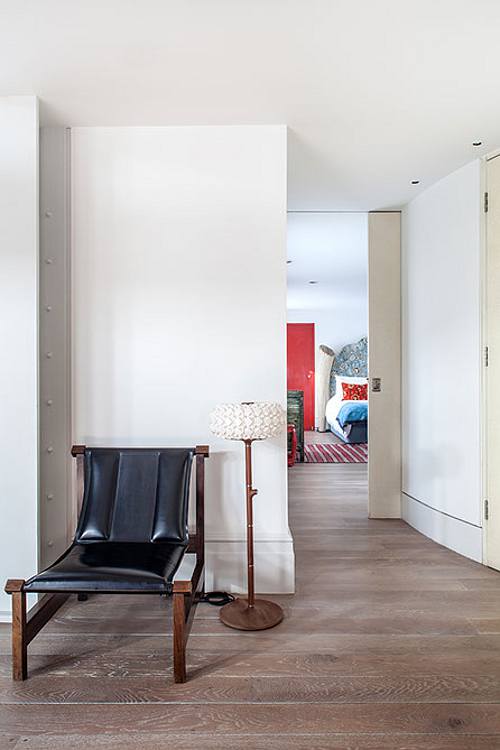
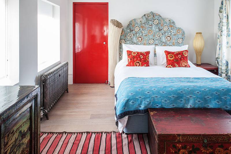
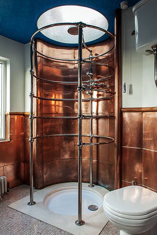
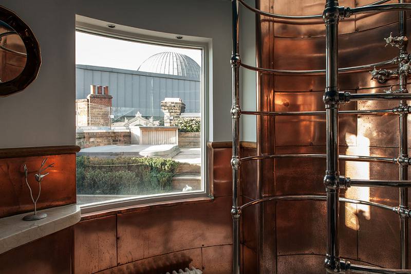
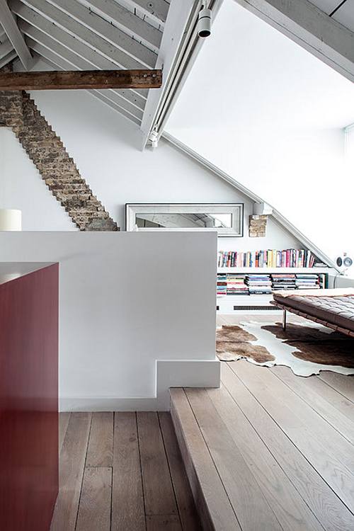
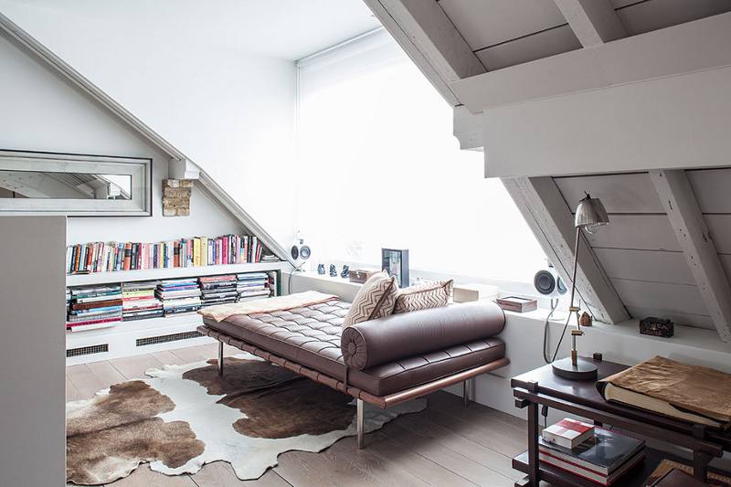
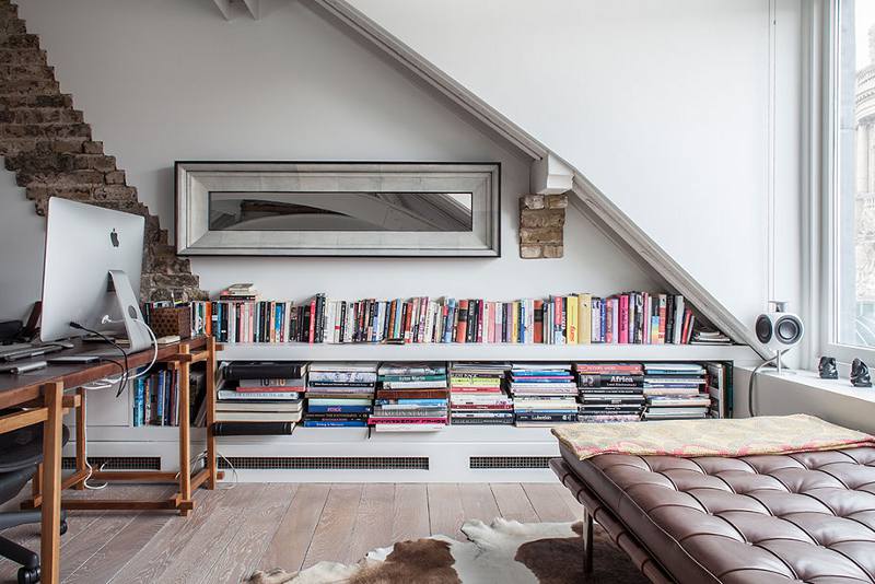
I’ve seen Boho Scandi and Boho Shabby Chic. I’ve even seen Boho Gothic and a touch of Boho stirred through Hollywood Regency but it’s rare to see Boho Modern. Glass and chrome, sleek kitchen, wishbone chairs and modern art married with a riotous Roche Bobois Mah Jong sofa, oriental wallpaper and lacquer cabinets. A modern loft style apartment with a strong personality. And then there are the views. A Private Residence in Covent Garden, London by Caroline Cobbold Design.
Rebecca Atwood – Living With Pattern
Posted on Sun, 28 Aug 2016 by KiM
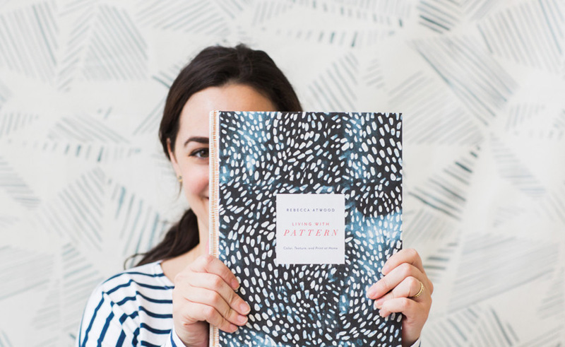
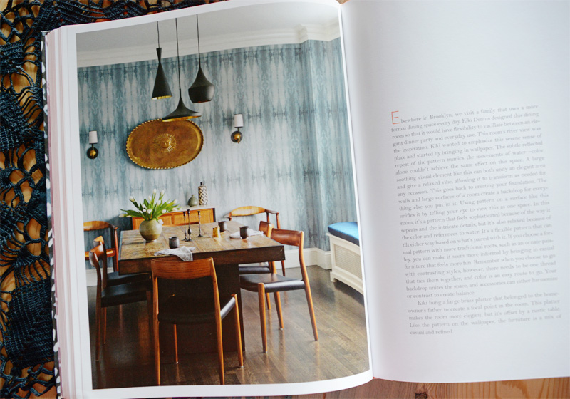
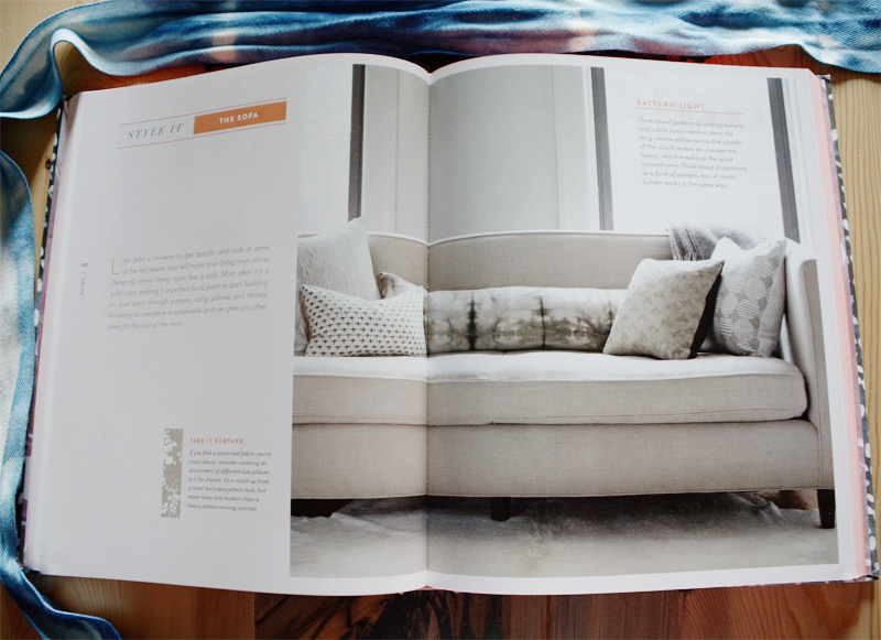
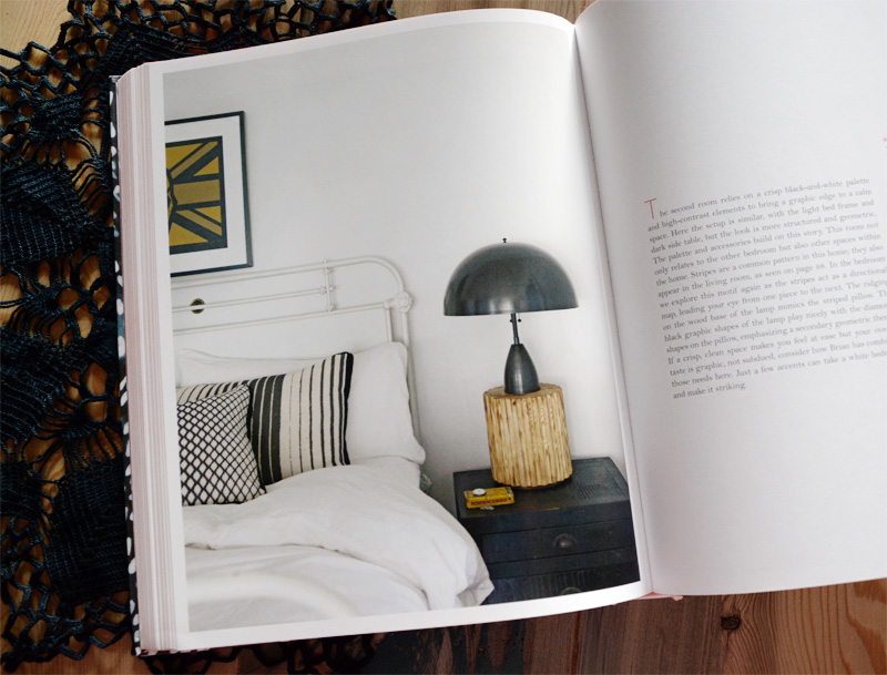
Brooklyn based designer and artist Rebecca Atwood is launching her first book in a few days and I was really excited to get my hands on a copy the other day. I love pattern and admittedly I am at times unsure how to mix patterns in a fun but cohesive way so this book was an eye opener for me and is packed with tons of great advice. In Living With Pattern, Rebecca demystifies how to use this design concept that often confounds and confuses, demonstrating how to seamlessly mix and layer prints throughout a house.
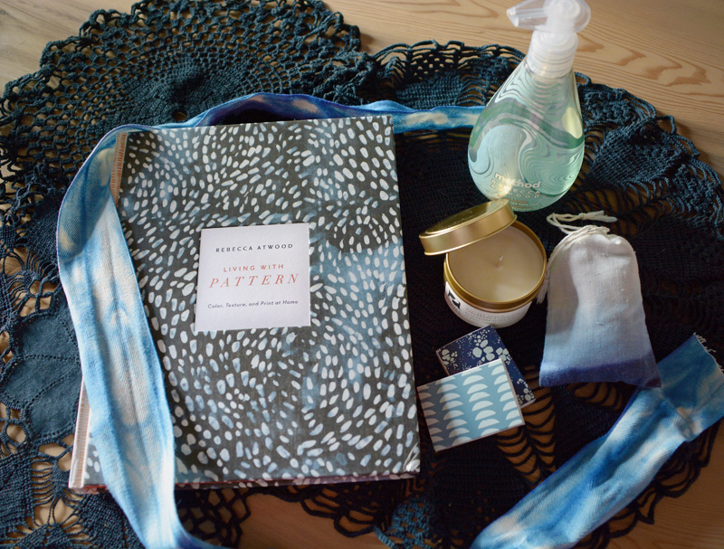
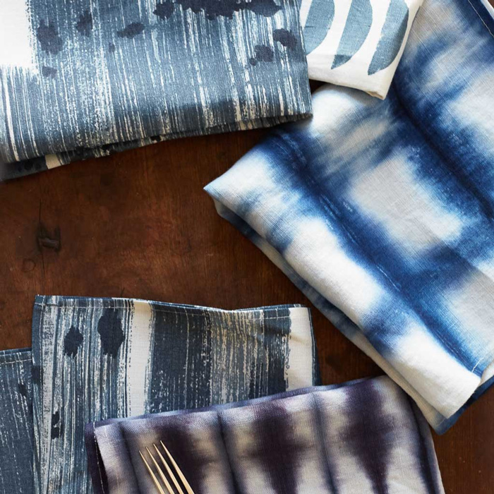
Before I get more into Rebecca’s book, check out all the little goodies that came with it! (Except the doilies – those are mine that I can’t seem to be able to dye black. Maybe I should get some tips from her since her hand-dyed textiles are incredibly beautiful and she clearly knows what she’s doing.) A side note: the cover is her beautiful Speckled Fabric in Navy.
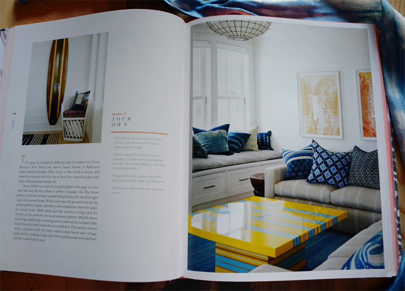
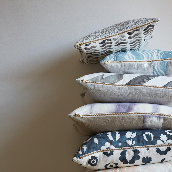
These next few photos are a glimpse inside the book. Eye candy, and trust me when I say you are going to want ALL THE PILLOWS and ALL THE PATTERNS.
Here are a few places where you can order yourself a copy: Amazon, iBooks, Barnes & Noble, kobo.
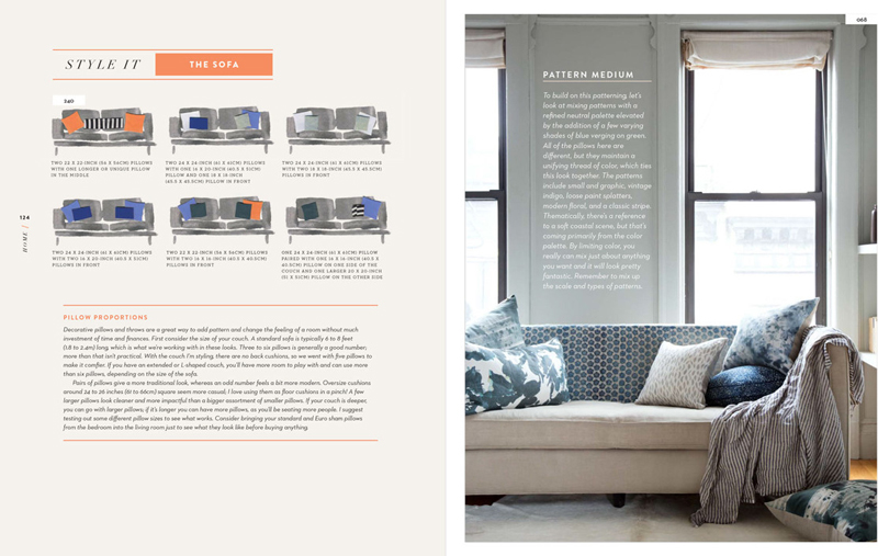
On a card within the book were her top tips for pattern mixing which I thought I would share.
1. New to pattern? Keep your color palette tight to unite different styles.
2. Mix up the scale with an assortment of small, medium and large scale prints.
3. Use bigger prints on areas you want to draw the eye, and smaller prints on areas you want to recede in space.
4. Consider proportion– about 40-60% of the room should be patterned.
5. Remember to have fun! Pattern is the best tool for telling your story. If you love it, you can make it work.
(P.S. Use her hashtags #RApatternmixing and #LivingWithPattern to share with her your awesome pattern mixing techniques)

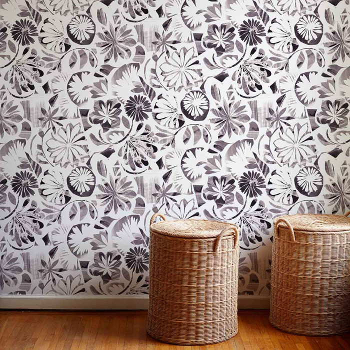
Below are some samples from her online shop where she carries fabric, artwork, pillows, wallpaper, blankets, table linens and baskets. I want everything. SO GOOD!

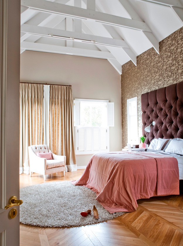
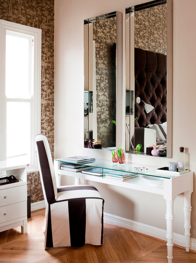
Glebe House Tour 2016 – part 1
Posted on Tue, 23 Aug 2016 by KiM
A couple of Sundays ago, I had the privilege of a personal tour of one of this year’s homes that will be featured in the Glebe House Tour next month. I have been honoured to be a part of this tour for several years now, highlighting a home or two on the blog after meeting with the homeowners and wandering their homes with my camera and husband in tow to take notes and listen carefully while I worry about getting every gorgeous corner captured in photos. I selected this home after viewing a few preview photos and was in awe of its size and the artwork throughout. I hope you enjoy my tour of this home as much as I enjoyed getting to see it personally. There was so much to capture and to share that I needed two posts to get it all in. This post features the main floor and basement. The second post featured the second floor and exterior. Before I get into this, the tour this year is September 18 from 1-4pm, and if you are around Ottawa on that day you need to go on this tour! Five of the most incredible homes in the Glebe are yours to wander through and drool over. It is so much fun! Tickets can be purchased here.
Corinne and her husband John bought this home for their family of 5 about 3 years ago. It was built in 1913 and needed SO much work. It was basically gutted as it needed new electrical, insulation and all that fun stuff (NOT), along with leveling the floor that had a 10″ slope (??!!). The original radiators were maintained and the moldings were saved and reused as well.
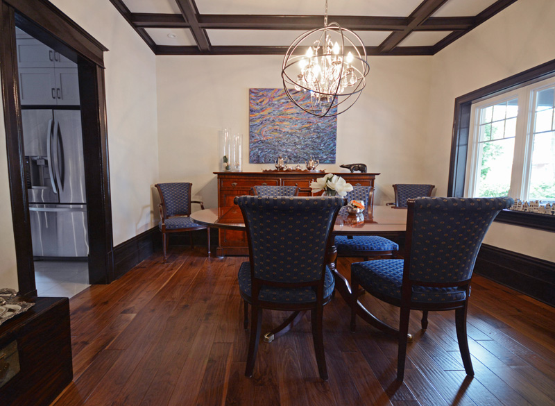
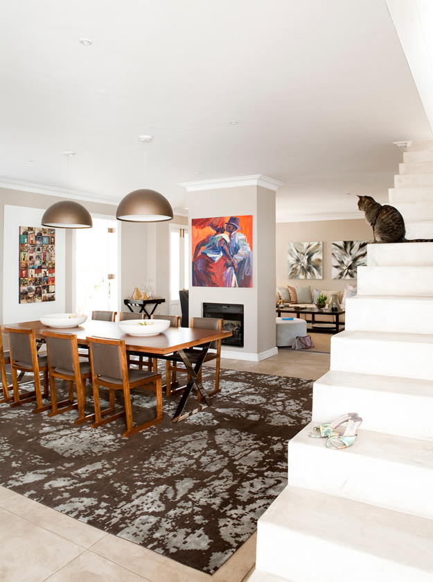
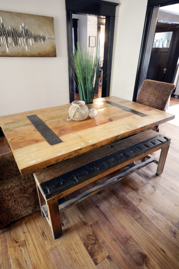
The dining table is made of mahogany and is one of many pieces the couple brought back from the Netherlands, where they lived for over 20 years. The large painting is by a friend named Lou Korte (I apologize if I get any names wrong).
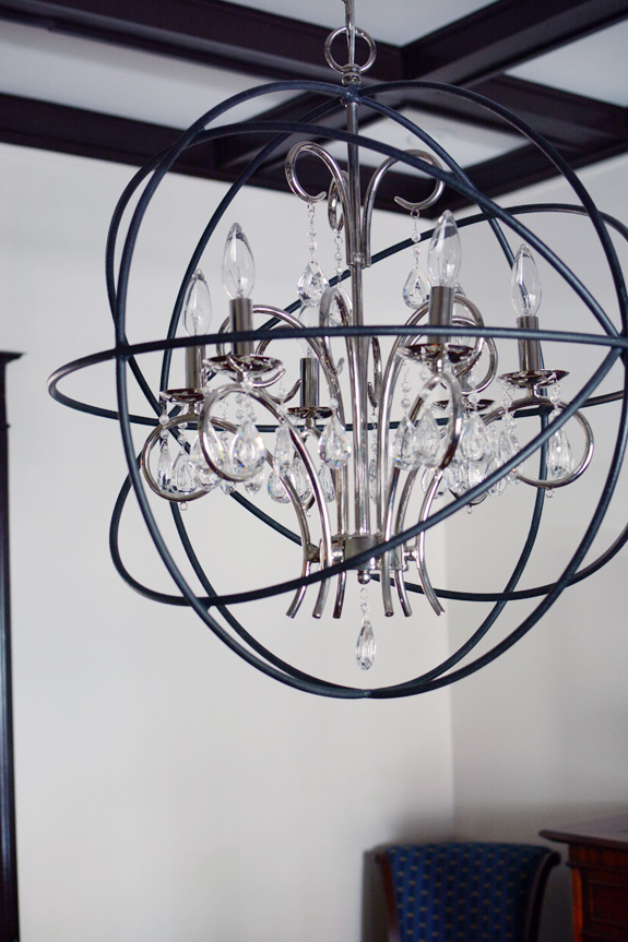
The light fixtures throughout the house are a contemporary/traditional blend and really suit the homeowners’ style. Almost all of them have a sparkle factor which I love.

The vase is Murano glass brought back from the Murano factory in Italy. *GASP*
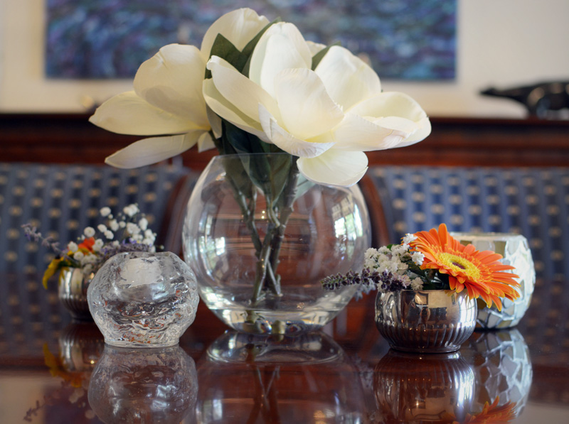
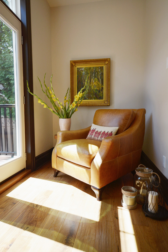
There were beautiful flower arrangements throughout the house. Bonus homeowner points. 🙂

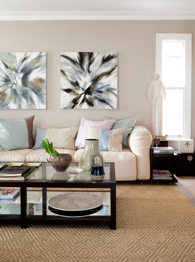
The painting in the living room is by Bonnie Brooks, and another fabulous light fixture!

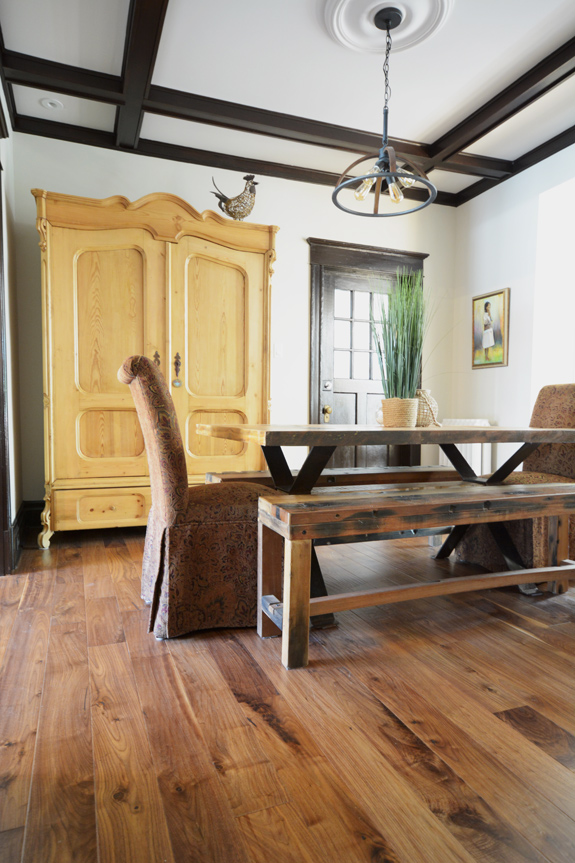
The armoire in the informal dining area was used in a Swiss farm and was made in Germany around 1890. This may be my favourite room in the house. I adore the eclectic blend of furniture.
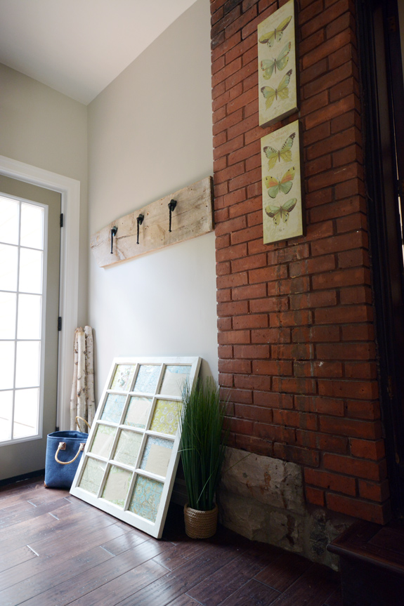
The mudroom was formerly a covered porch that the homeowners wanted to replace with a garage but due to city limitations they went with this handy little area instead.
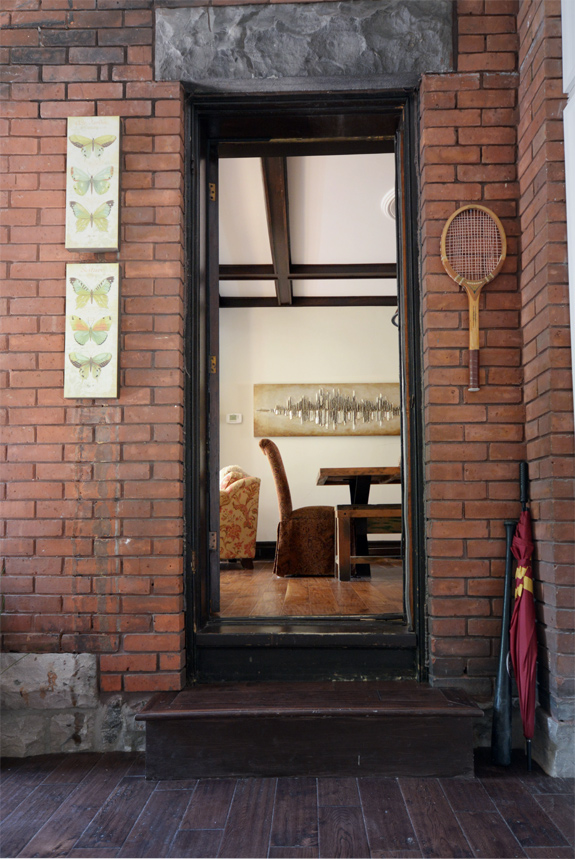
This brick wall and door were left intact during the renovations.
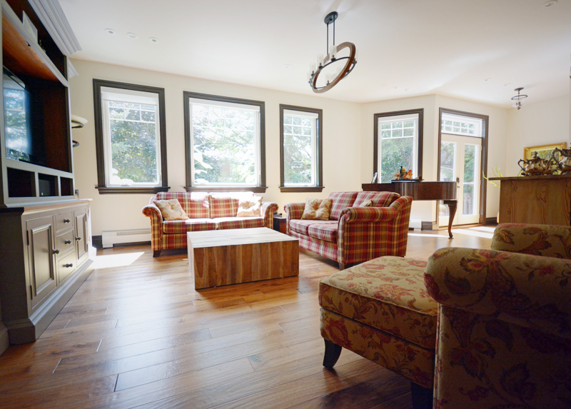
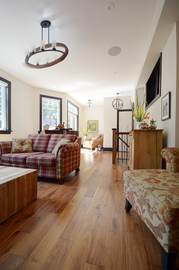
The family room is located at the back of the house and is part of the large 4 story addition the homeowners added during the renovations. It is bright and spacious enough to fit their grand piano.
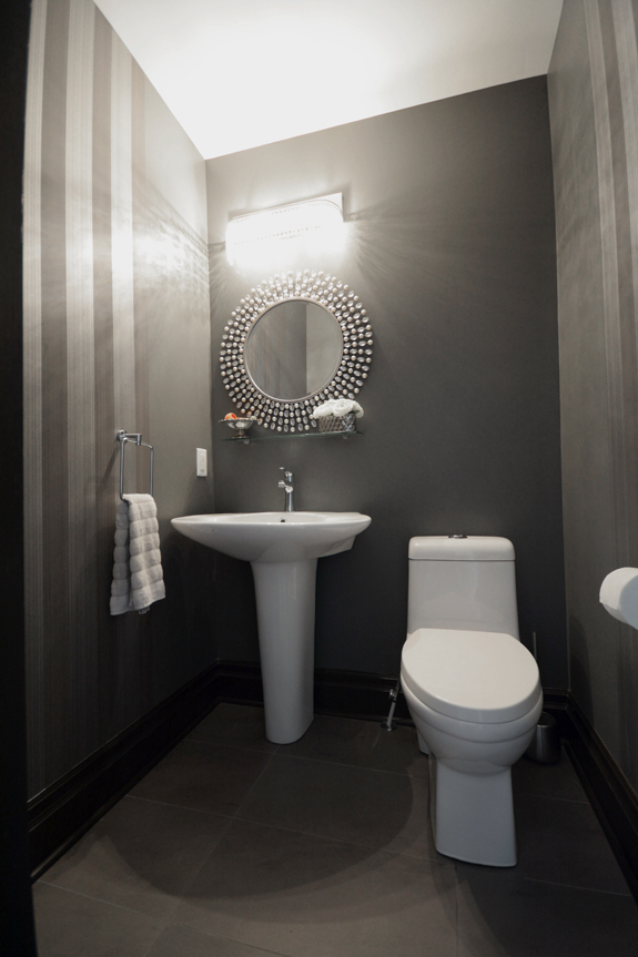
Loving the tiny dramatic powder room just off of the family room. The perfect space to do something unexpected.
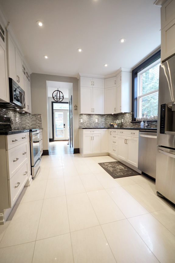
The kitchen cabinets are by Boiserie Sebo. Husband and I both noted that this was the perfect sized kitchen – not too big, not too small. The off-white floors and cabinetry really brighten the space since it only has one small window.
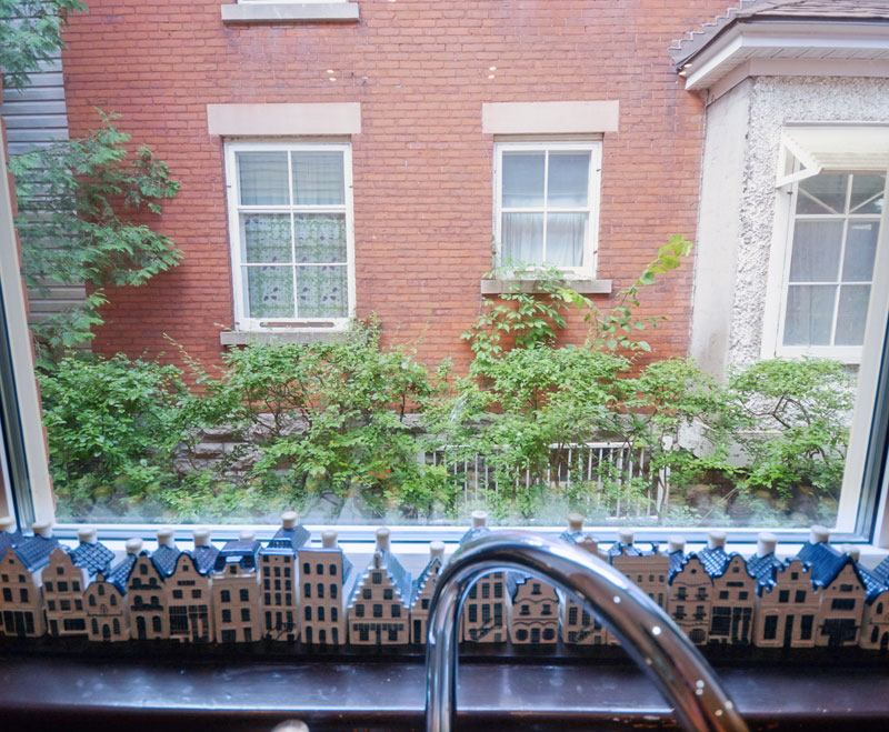
The window, albeit small, has an adorable view of the neighbouring house.
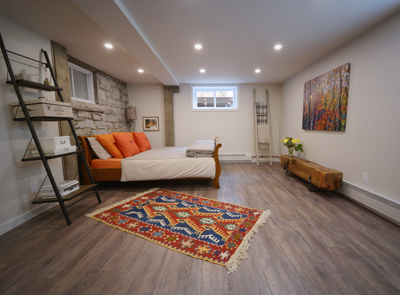
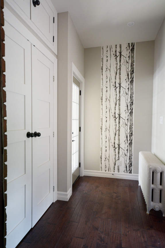
The basement is finished including this large guest suite. The homeowners may have a hard time getting their kids to leave the nest when they have a secluded space like this available! (And the third floor, currently used by the kids, is another gem that will surely have them overstaying their welcome)
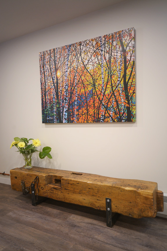
The painting is by Tim Packer.
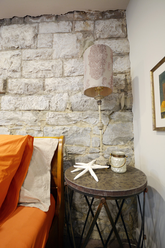
The wall behind the bed is the original stone foundation that they left exposed. Love that!
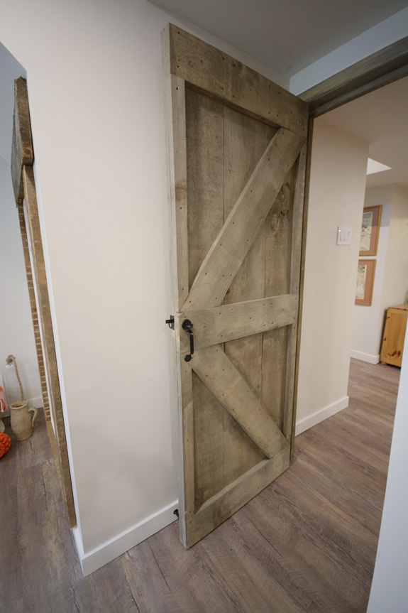
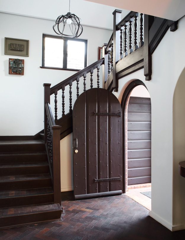
I had to get a photo of one of the really cool barn-style doors they had made.
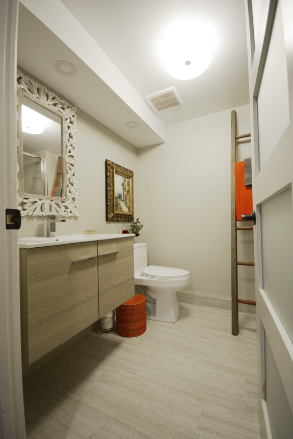
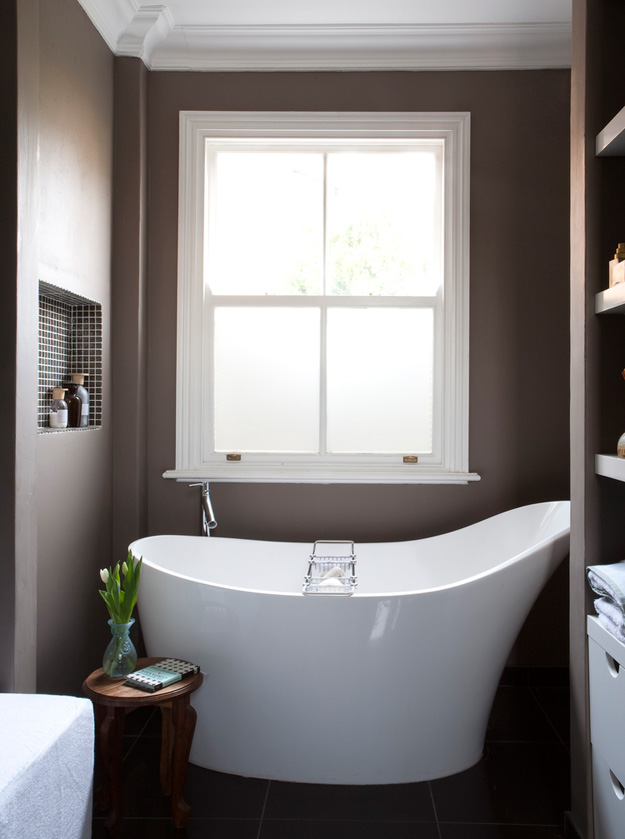
Next to the guest suite is a full bathroom.
Stay tuned for the rest of the home later today!
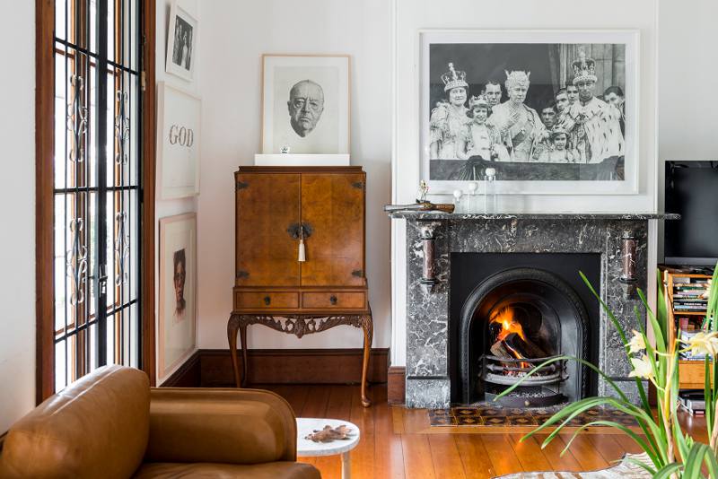
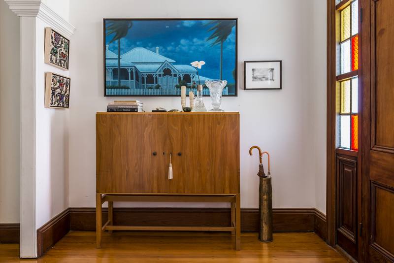
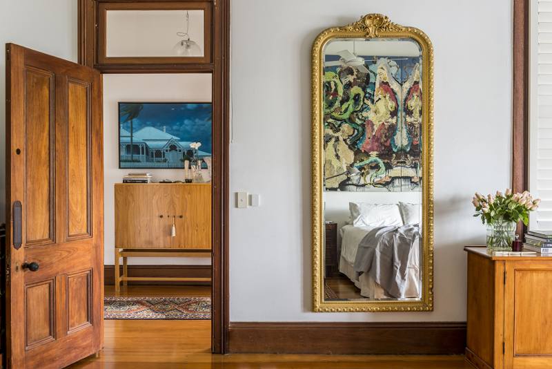
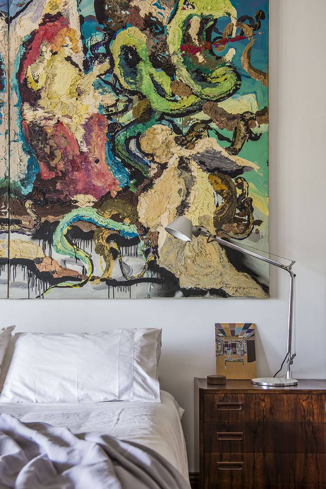
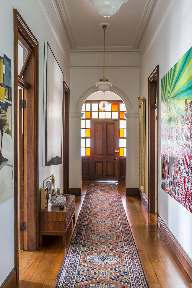
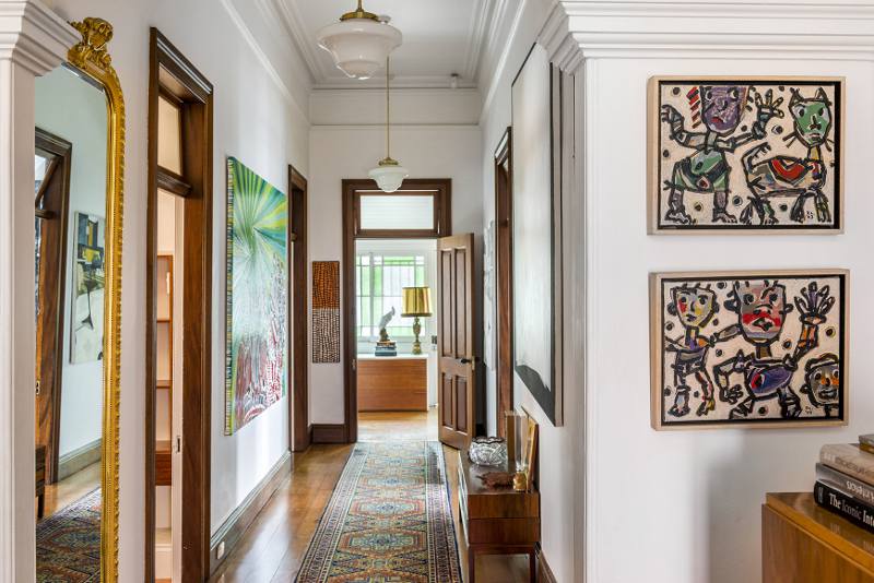
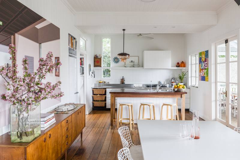
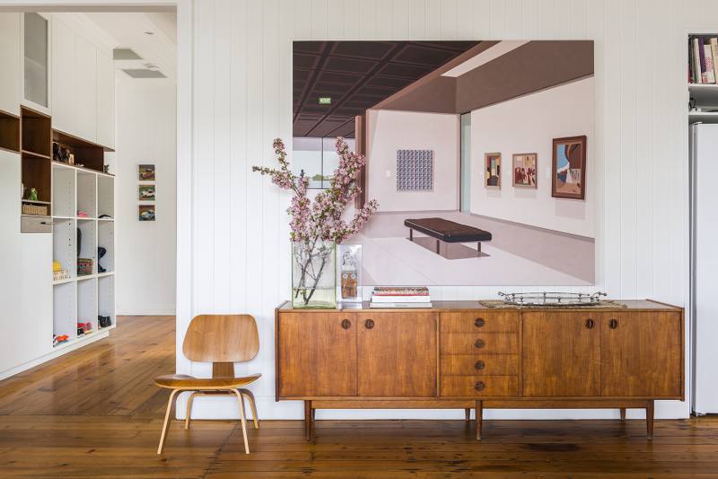
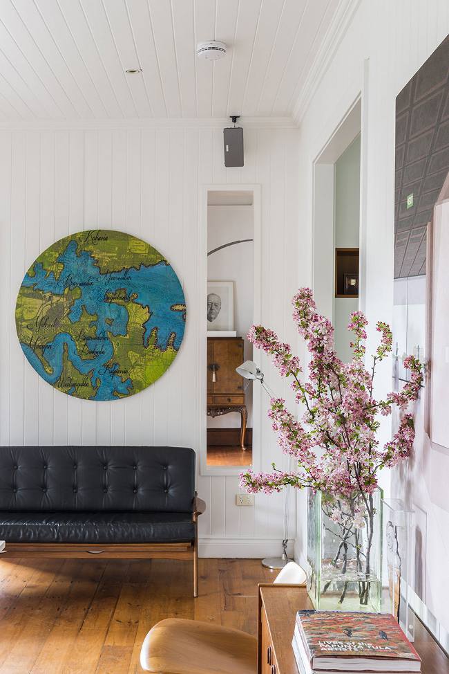
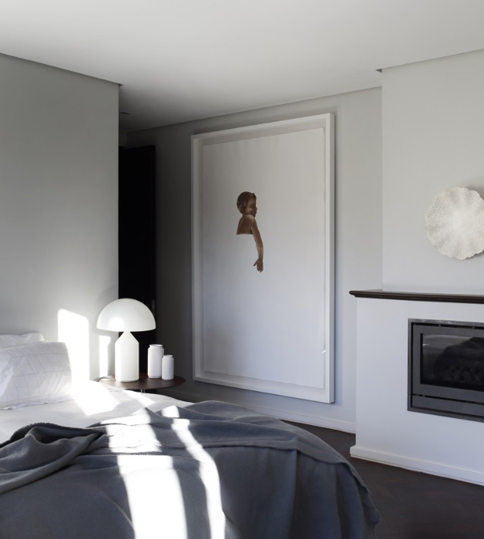
The perfect marriage
Posted on Mon, 22 Aug 2016 by midcenturyjo
Don’t get me wrong. It’s the perfect marriage of old and new, of fabulous art and practical living, of the quest for the ideal home and the Japanese aesthetic of wabi-sabi. Yes this heritage-listed home in the Brisbane suburb of New Farm by MMO Interiors may represent the perfect design marriage (and my dream home) but, if it was mine, I’d be taking the art in the event of a break up. Actually that’s wrong. I’d want it all.