Displaying posts labeled "Wallpaper"
A renovated midcentury rambler home in Minneapolis
Posted on Wed, 7 Jan 2026 by KiM
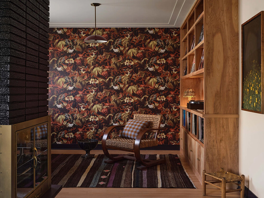
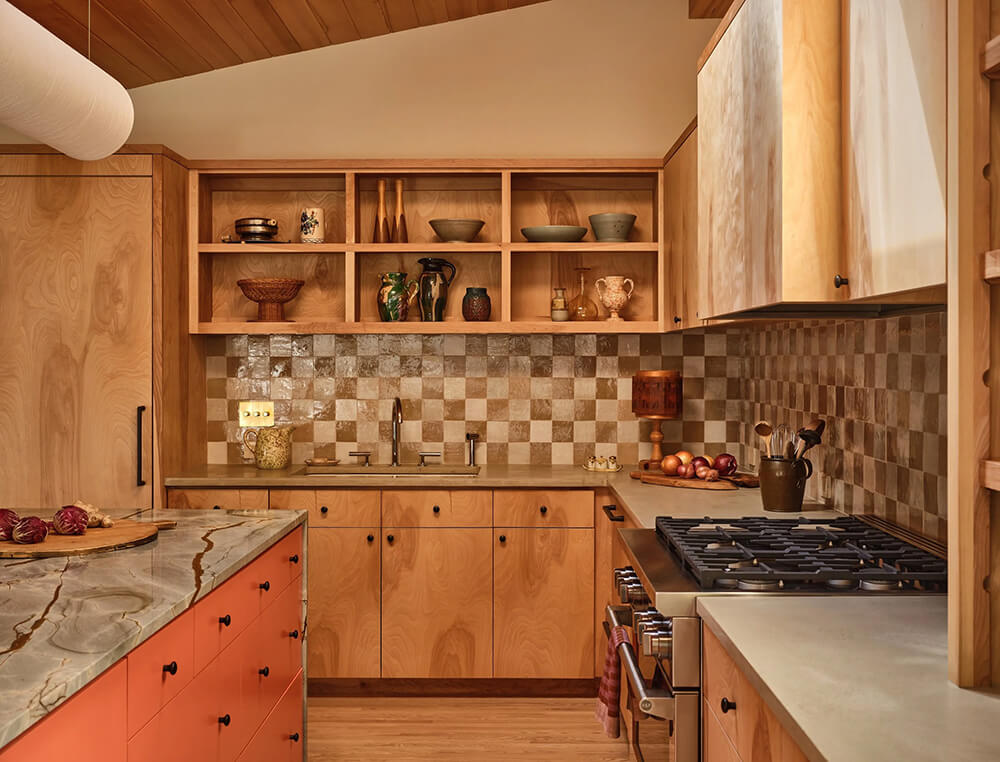
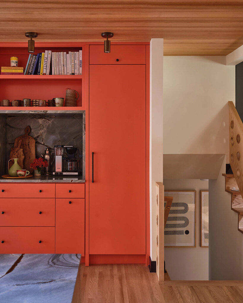
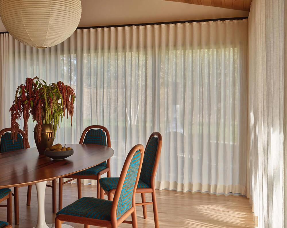
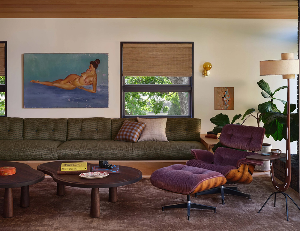
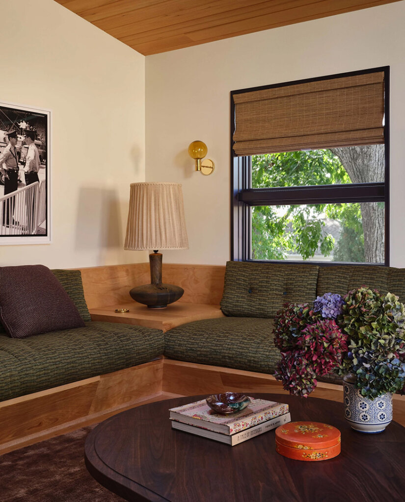
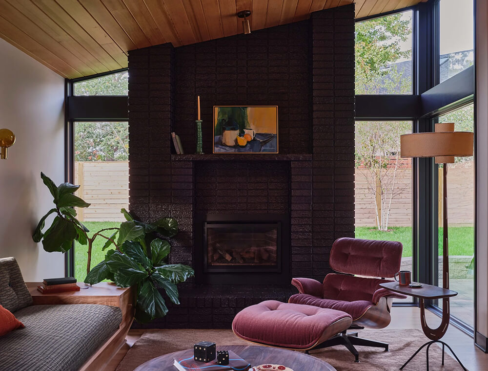
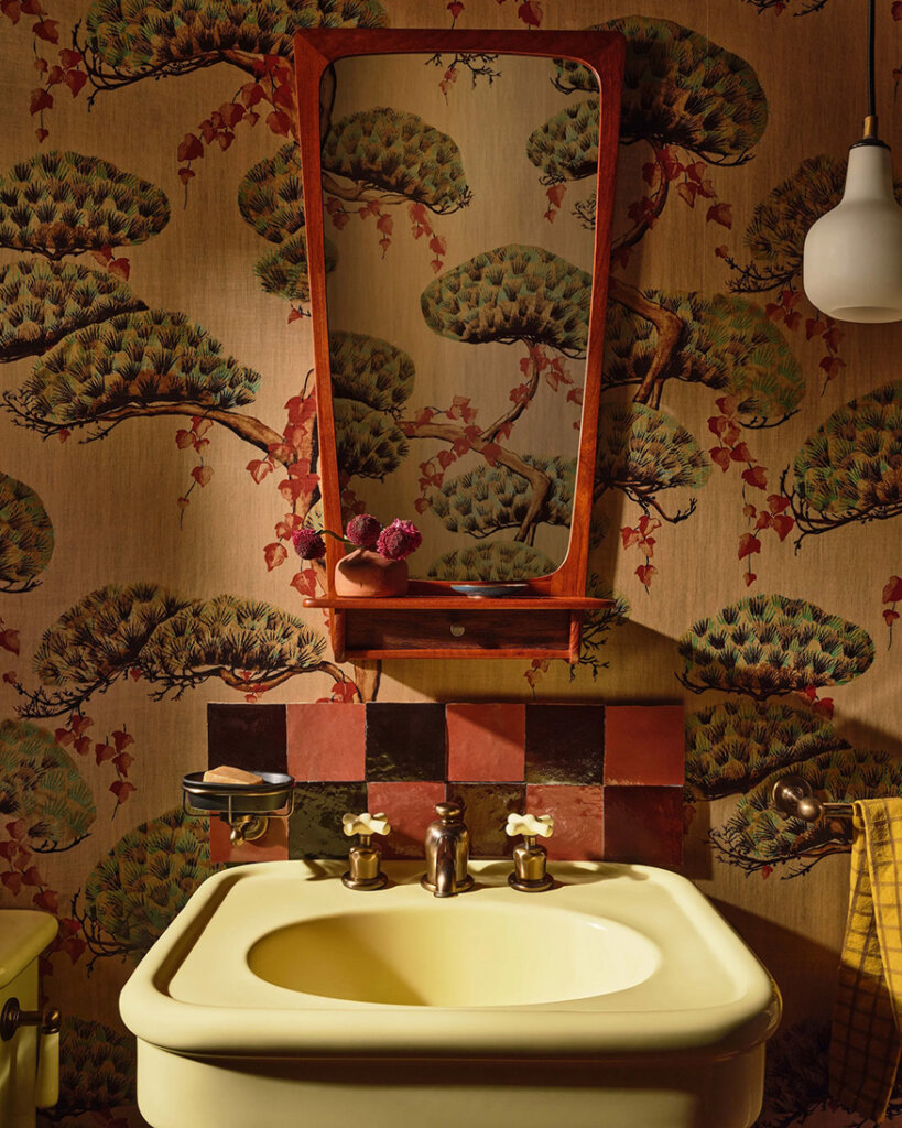
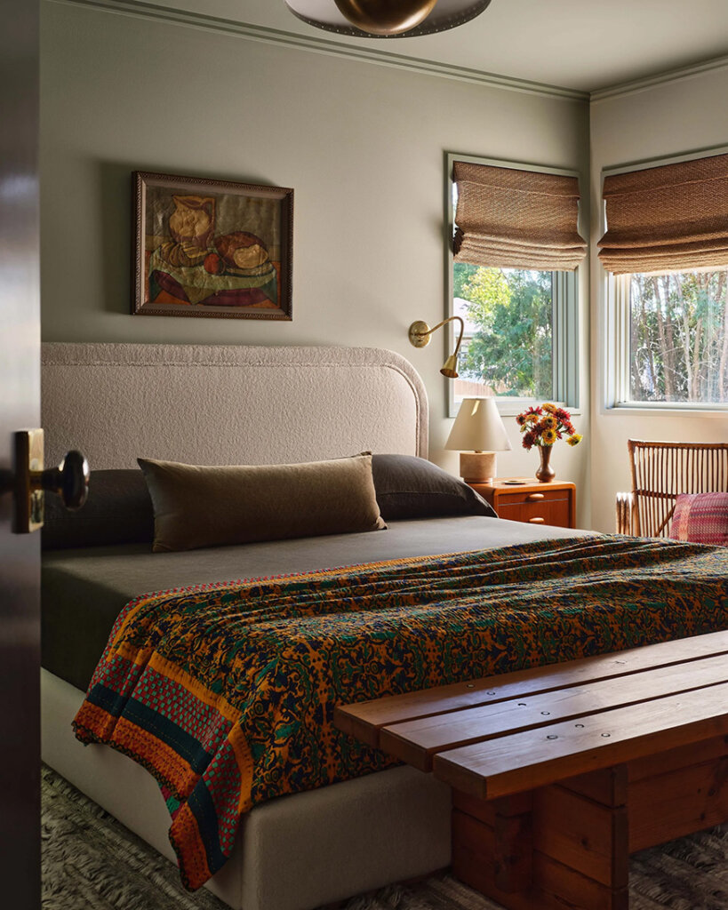
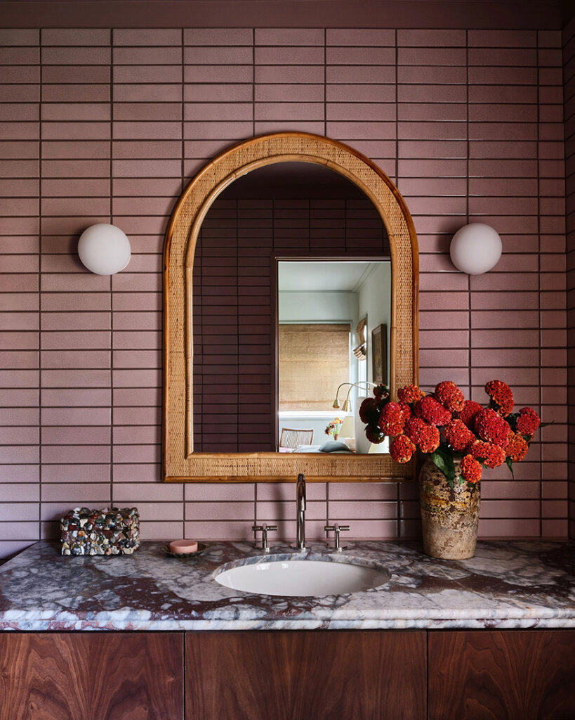
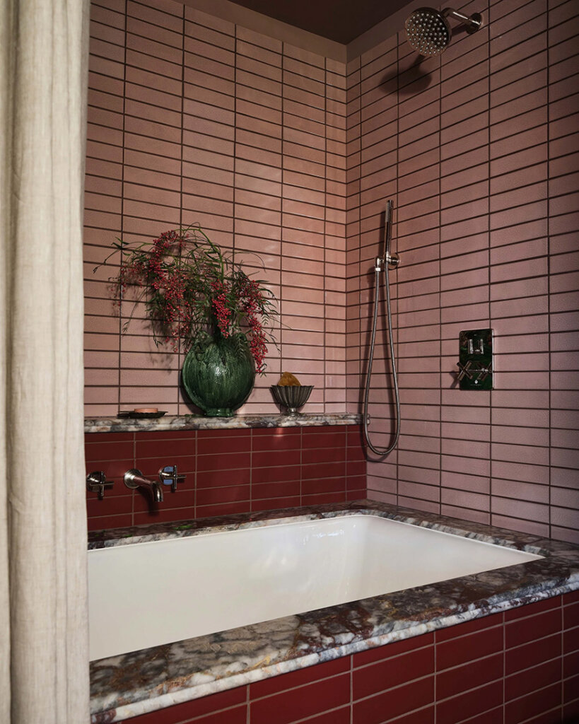
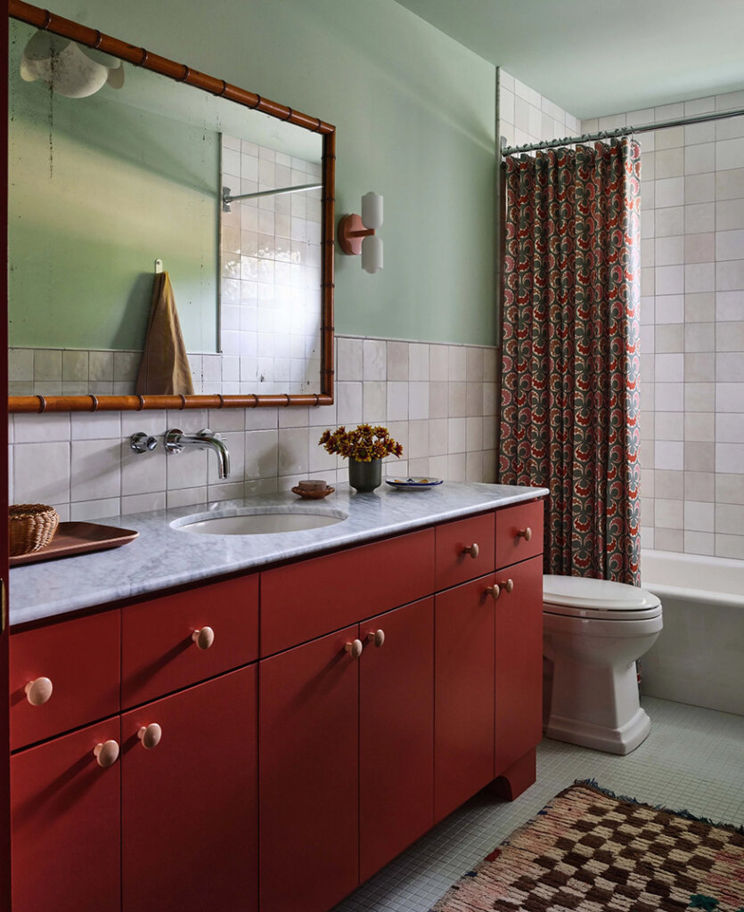
Snuggled within a windy Edina, Minnesota street, our Vibrant Mid Century Split Level breathed life back into this 1955 home. A gut renovation, just-enough vintage, and a nod toward the home’s bones, recaptured the space. A mashup of bold colors, unexpected materials, and a dash of curiosity gives this young family a unique and personal oasis.
I love that designer Anne McDonald embraced and enhanced the groovy mid century elements of this home and added some beautiful deep jewel tones as well as some funky patterns (that kitchen backsplash is the bees knees). It’s now more current and totally liveable and practical. Photos: Michael Clifford; Styling: Yedda Morrison.
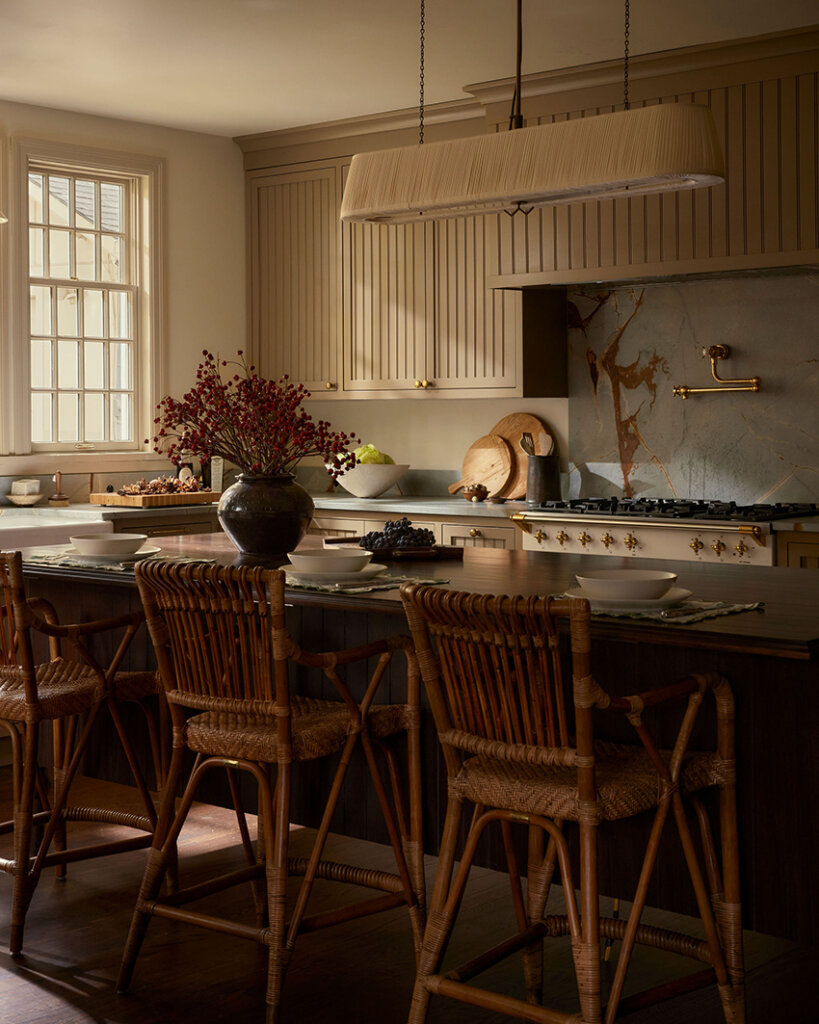
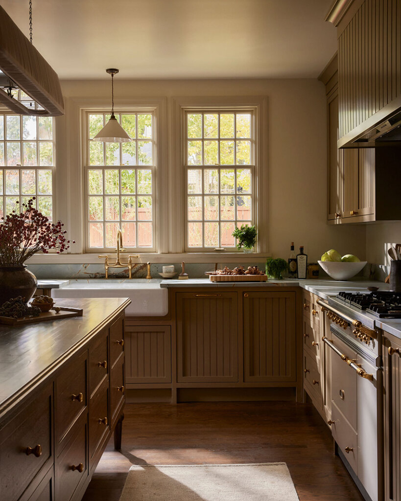
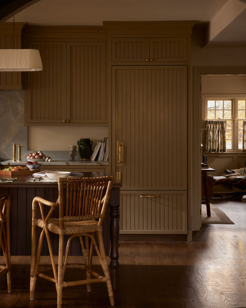
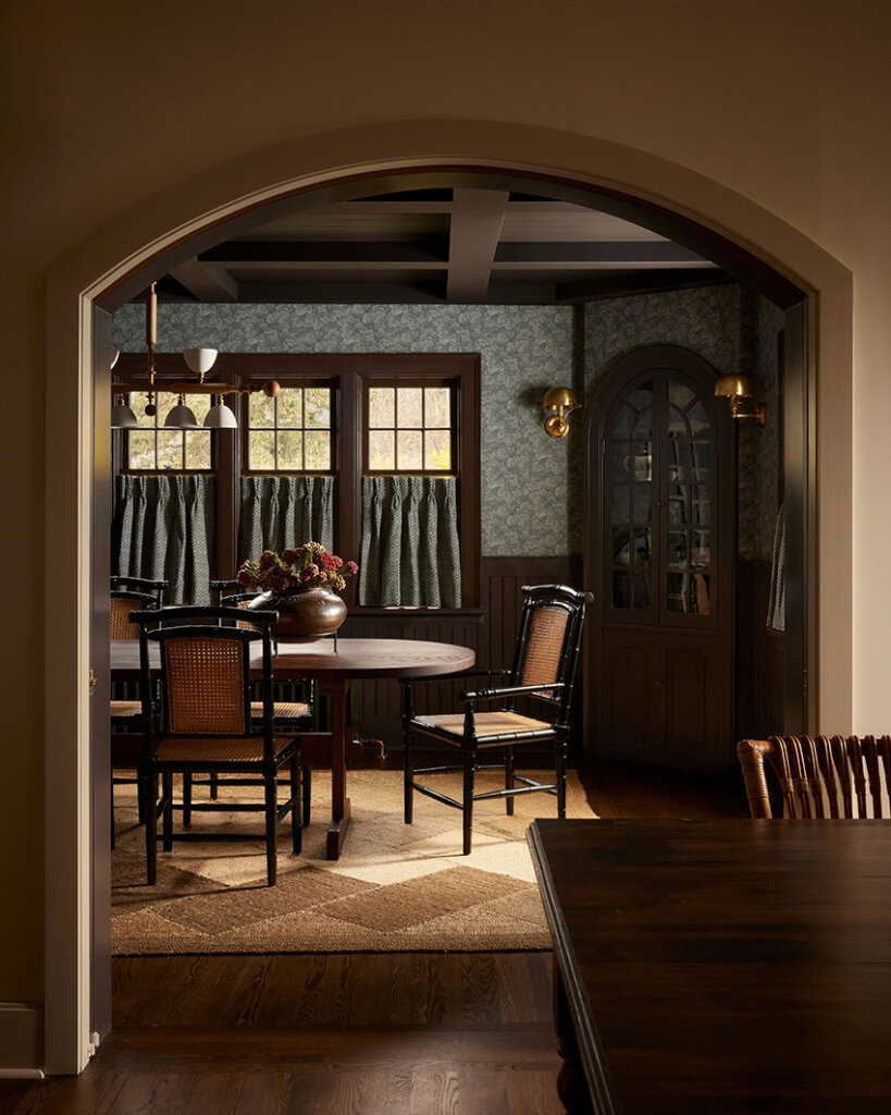
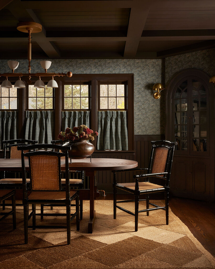
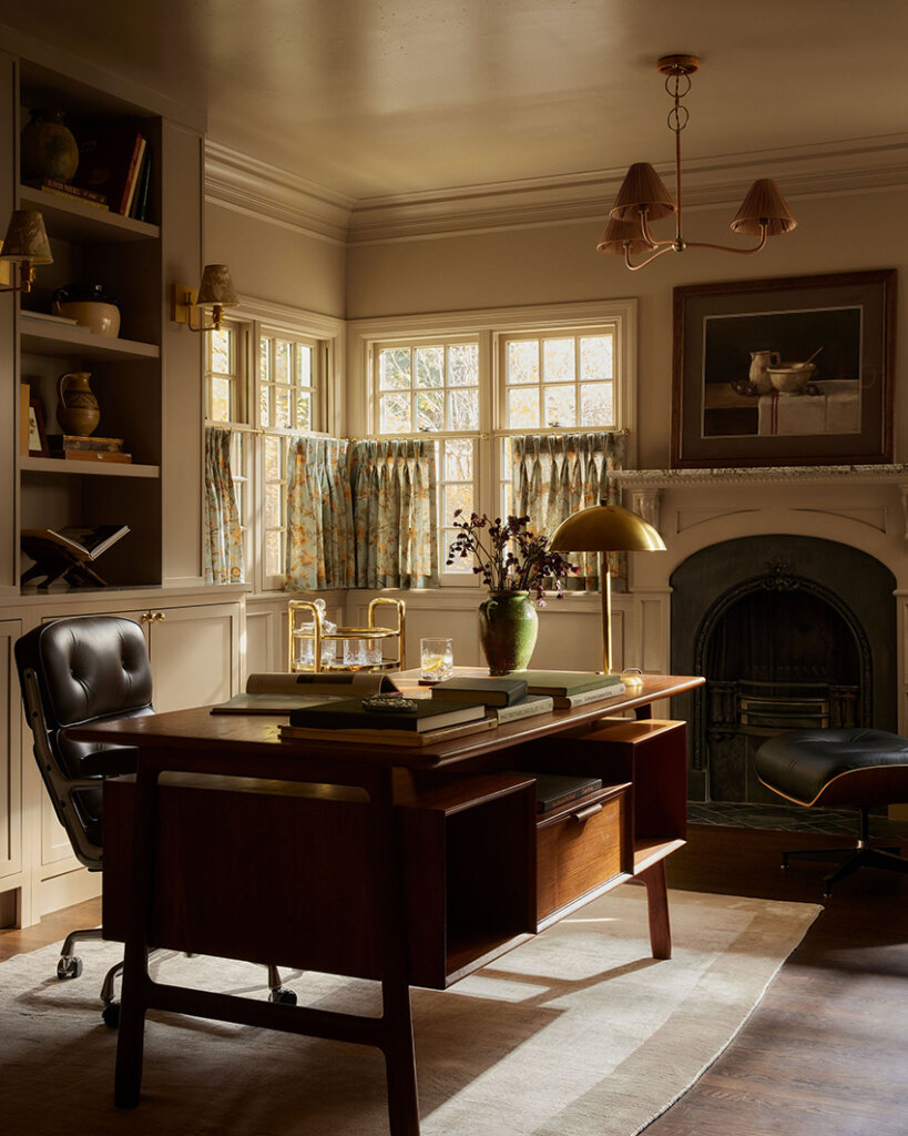
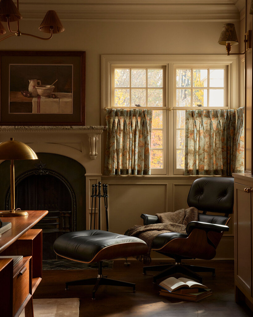
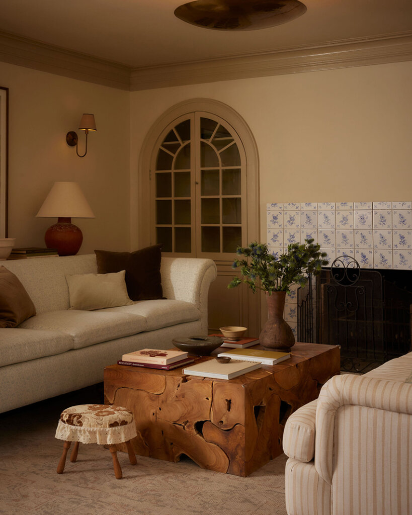
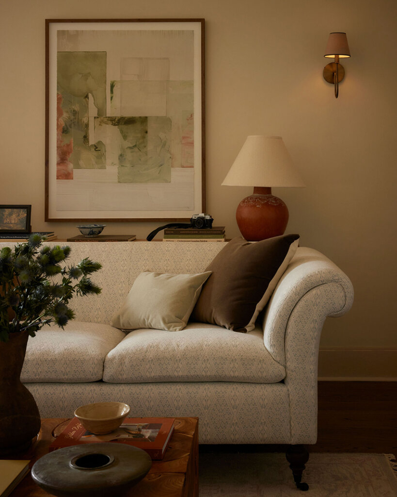
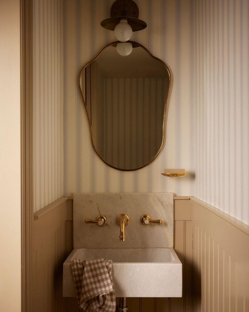
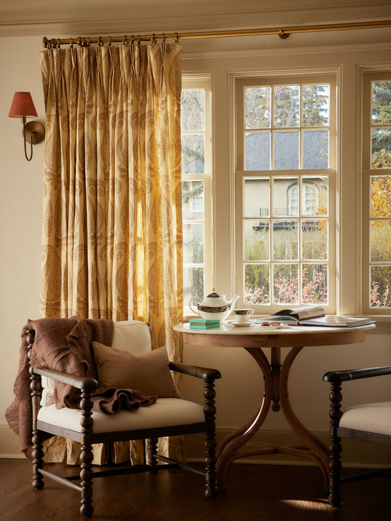
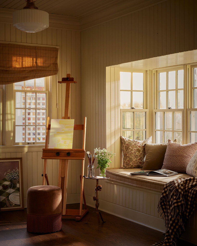
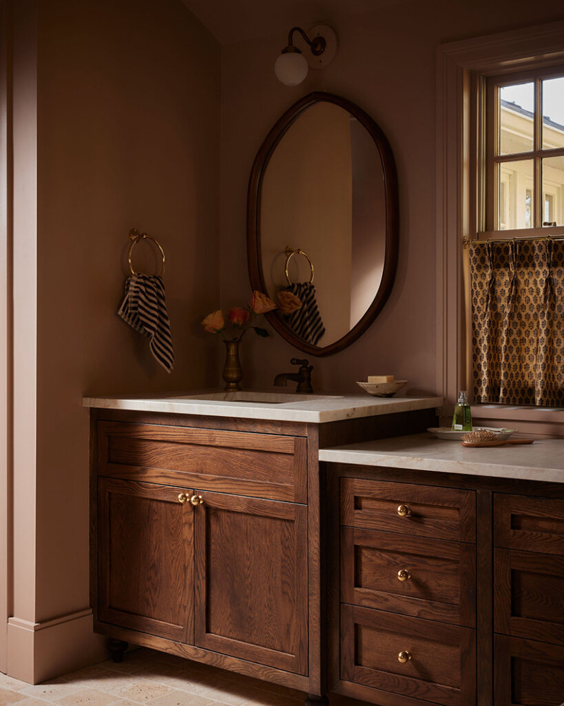
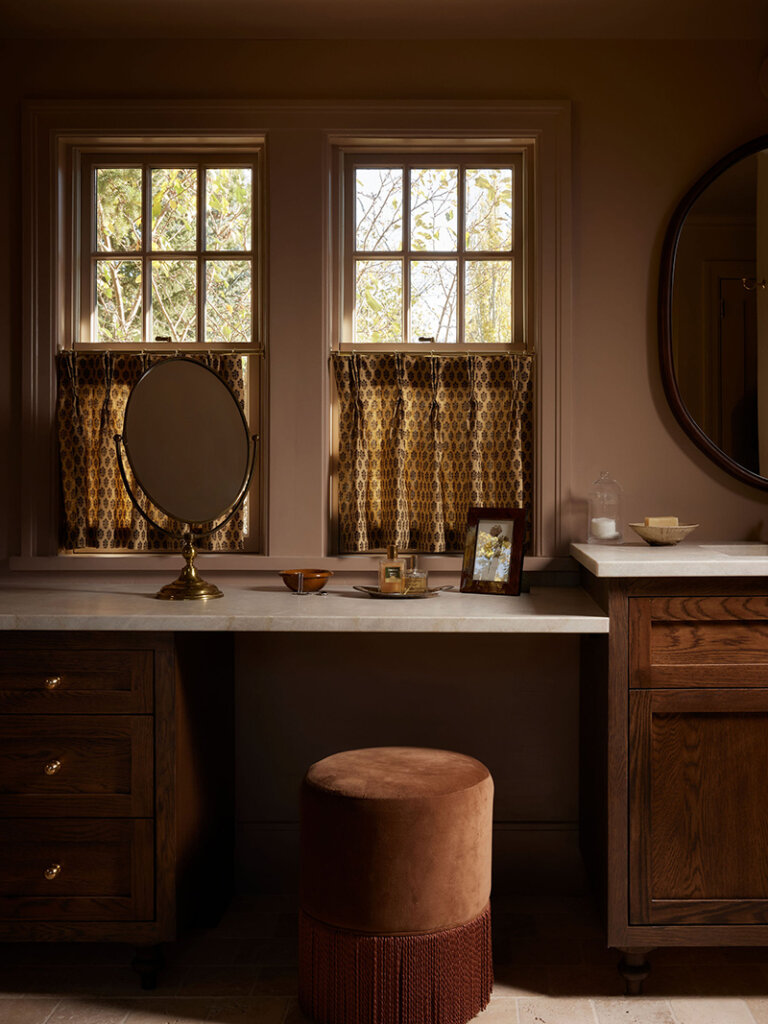
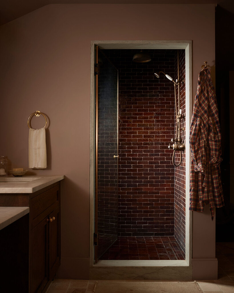
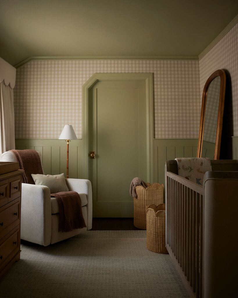
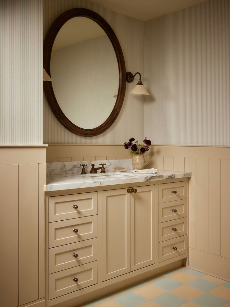
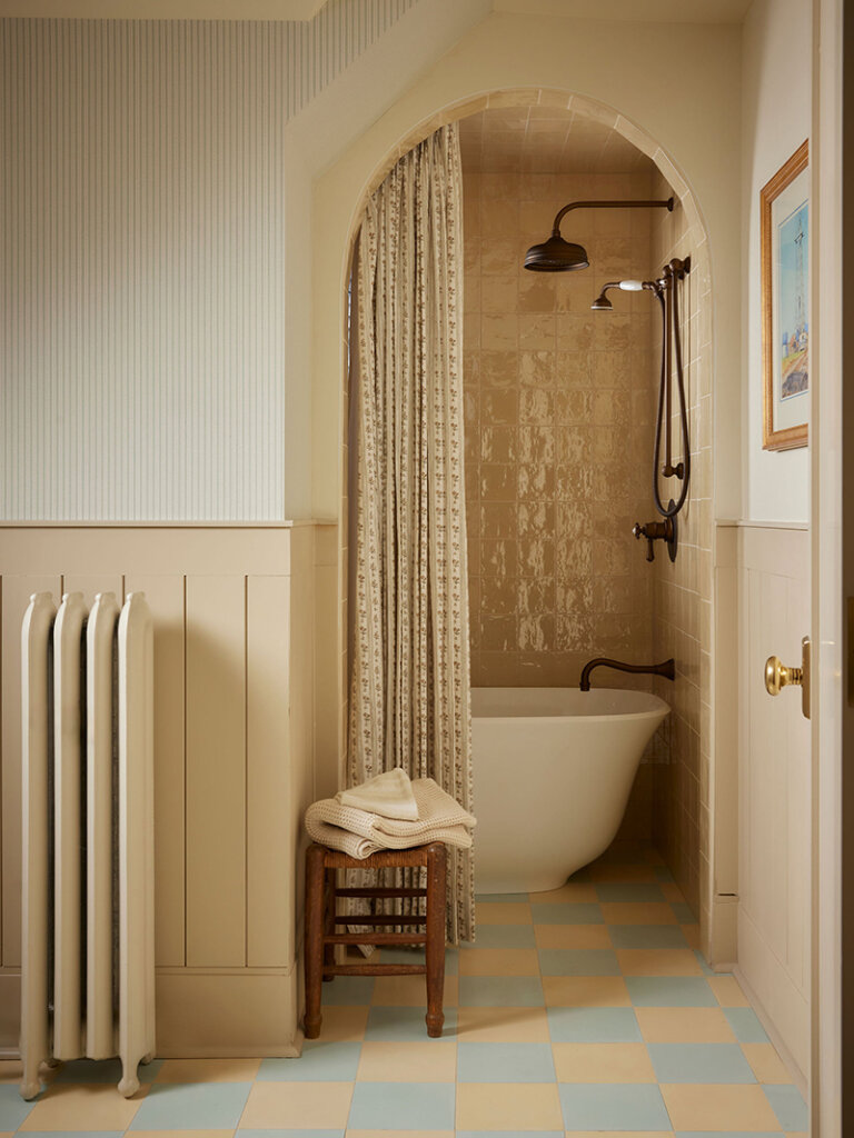
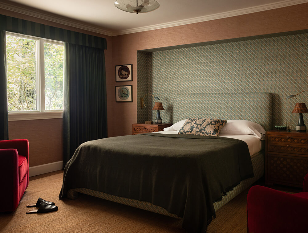
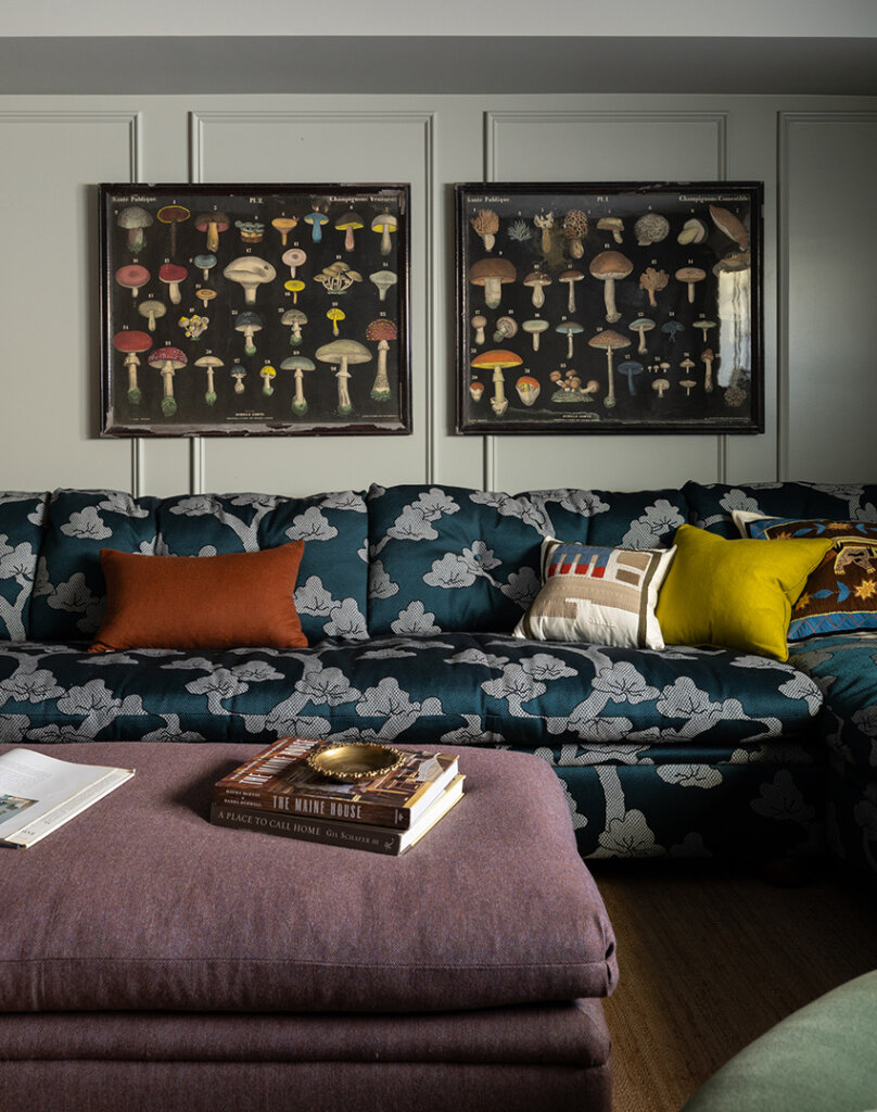
Tudor on the hill
Posted on Mon, 5 Jan 2026 by KiM
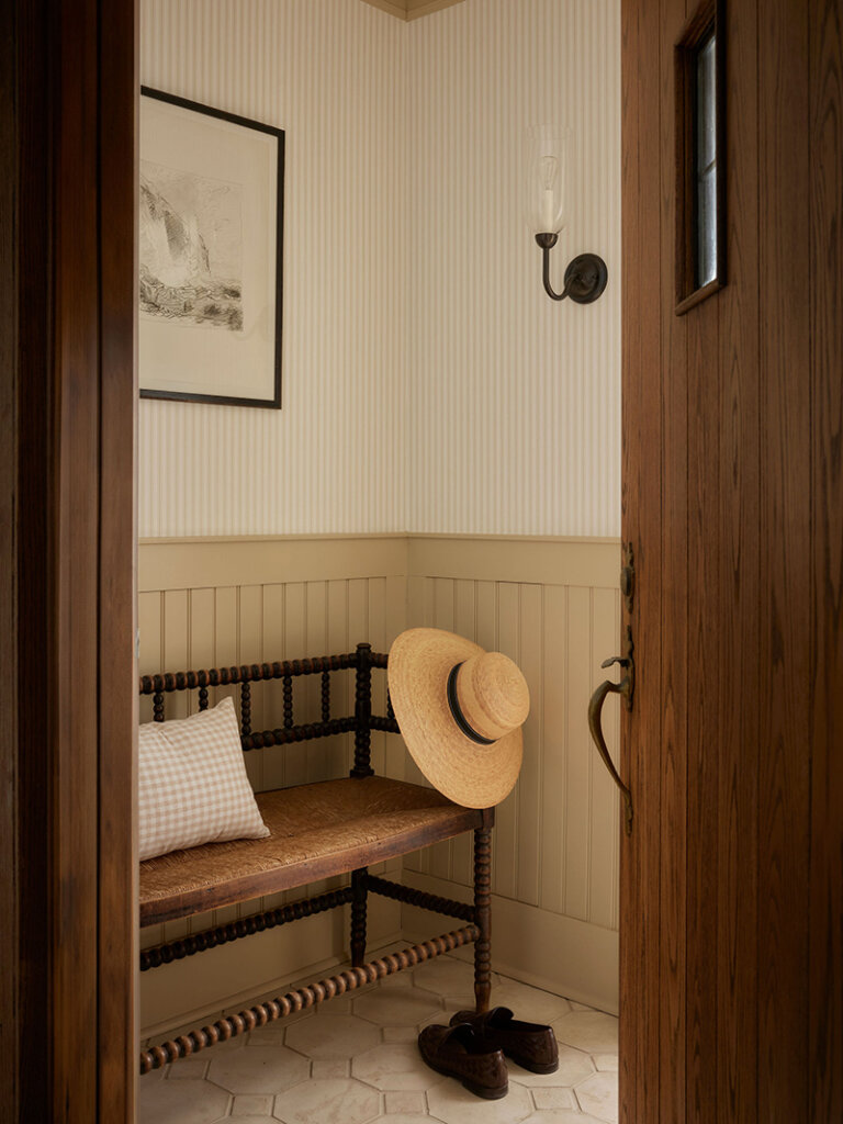
This Tudor home was already rich with character and an undeniable sense of history, so our role was to listen carefully and build upon what was already there. We leaned into English-inspired detailing, layered pattern play, tailored millwork, and a softened, heritage-driven palette to create rooms that feel collected, cozy, and elevated all at once. Traditional silhouettes meet thoughtful finishes, with warmth always leading the way.
As always with Ashley Montgomery‘s projects, I am completely smitten, and this is definitively a top favourite because of the traditional touches. The prettiest of colour palettes too. Photos: Lauren Miller.
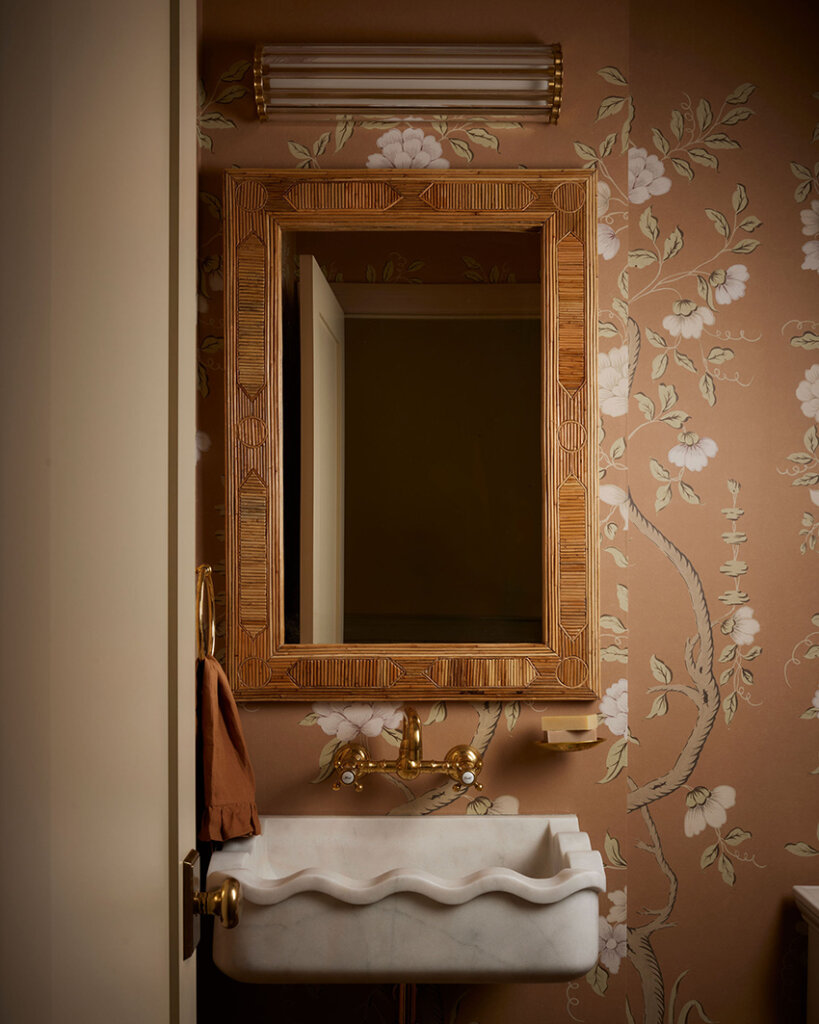
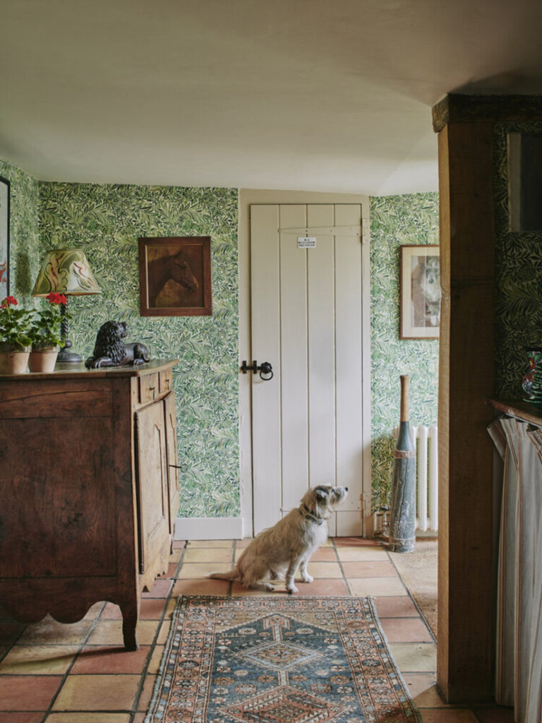
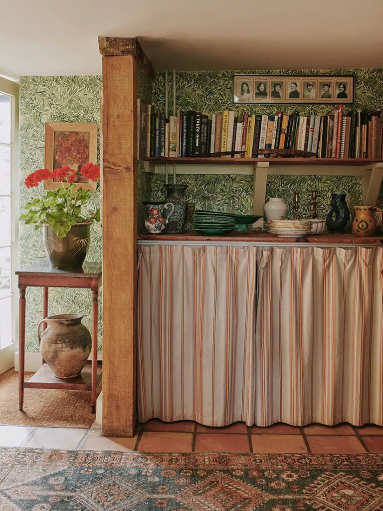
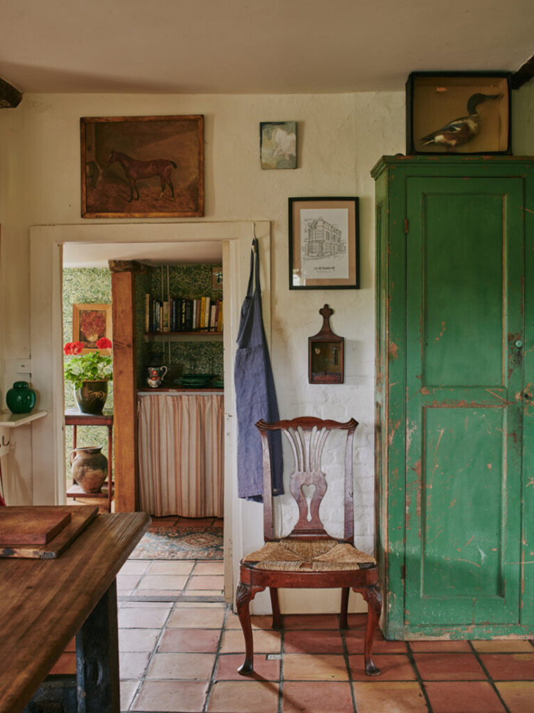
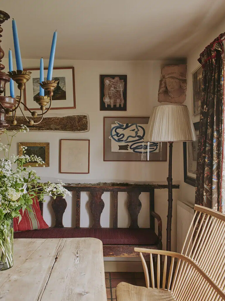
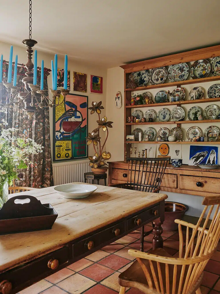
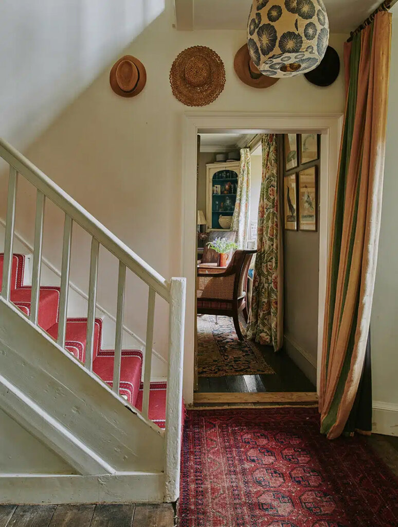
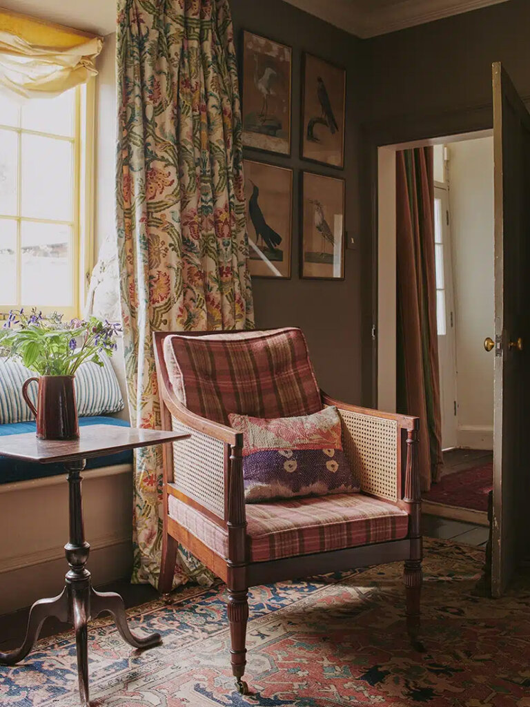
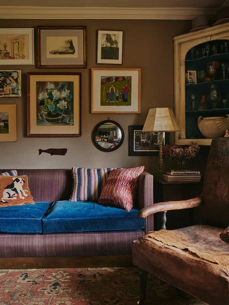
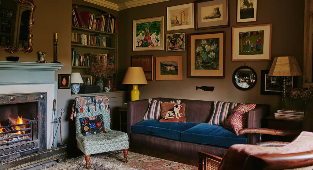
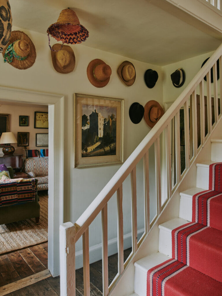
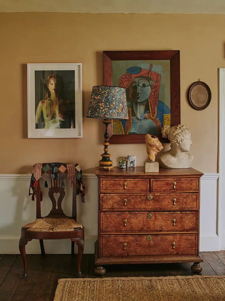
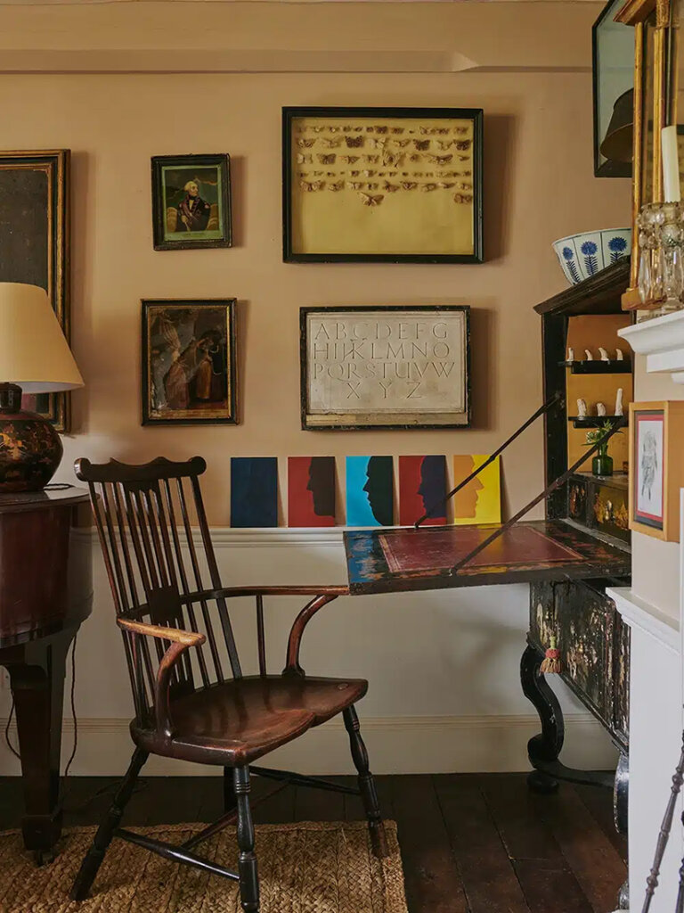
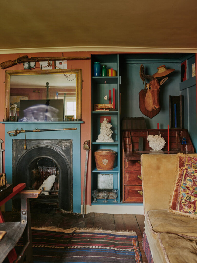
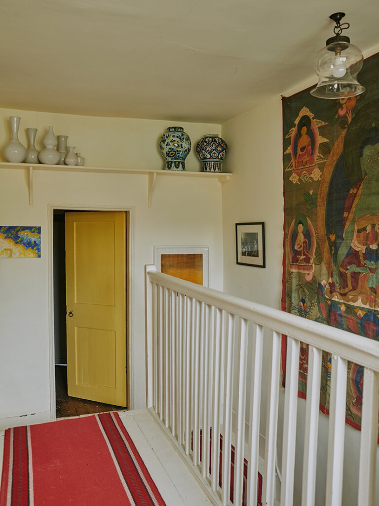
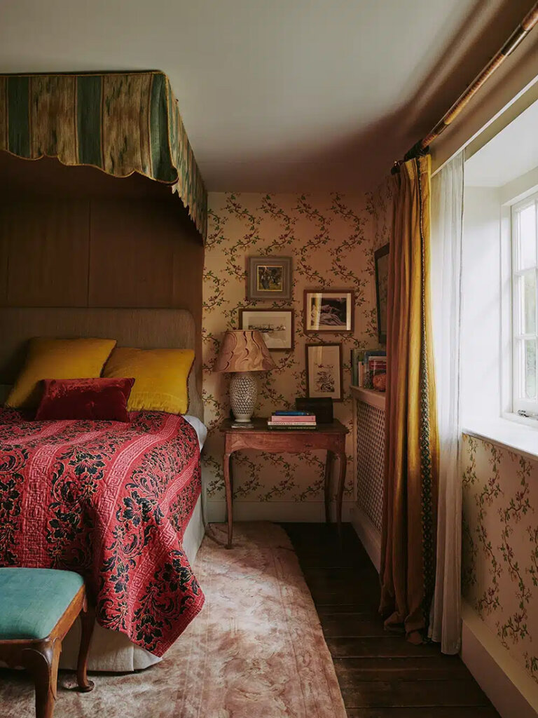
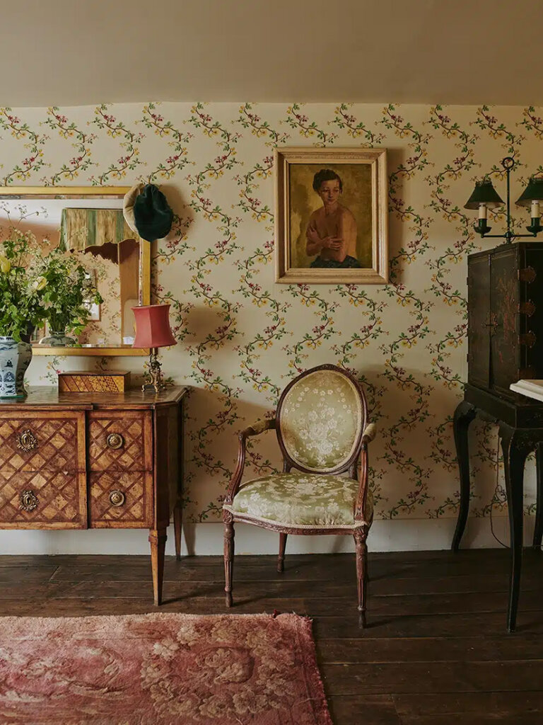
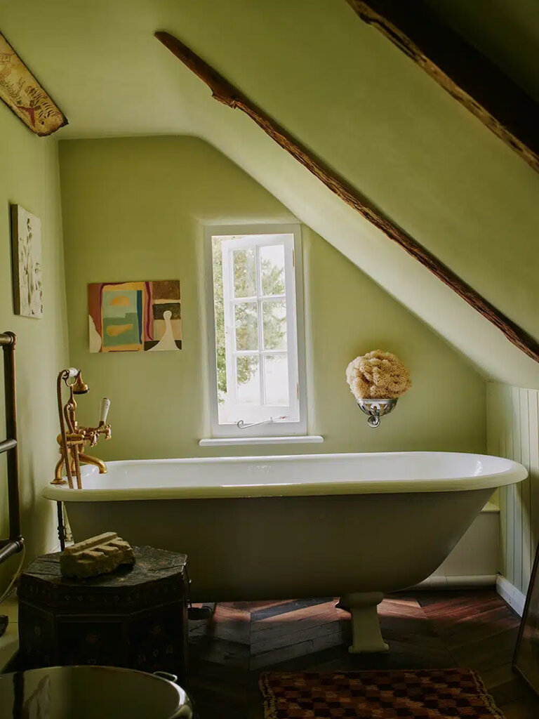
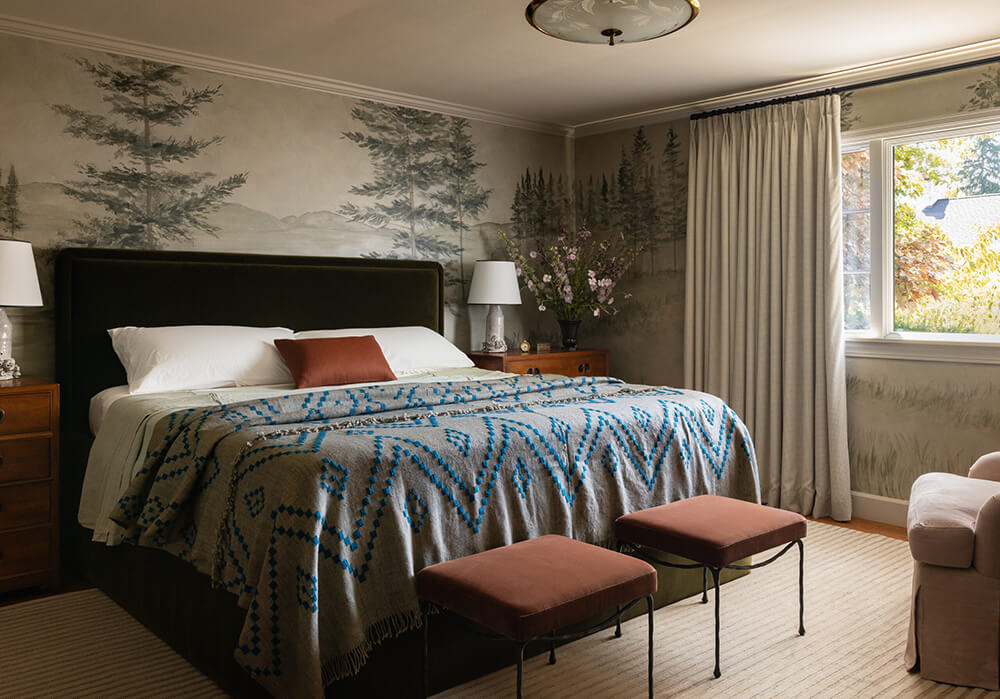
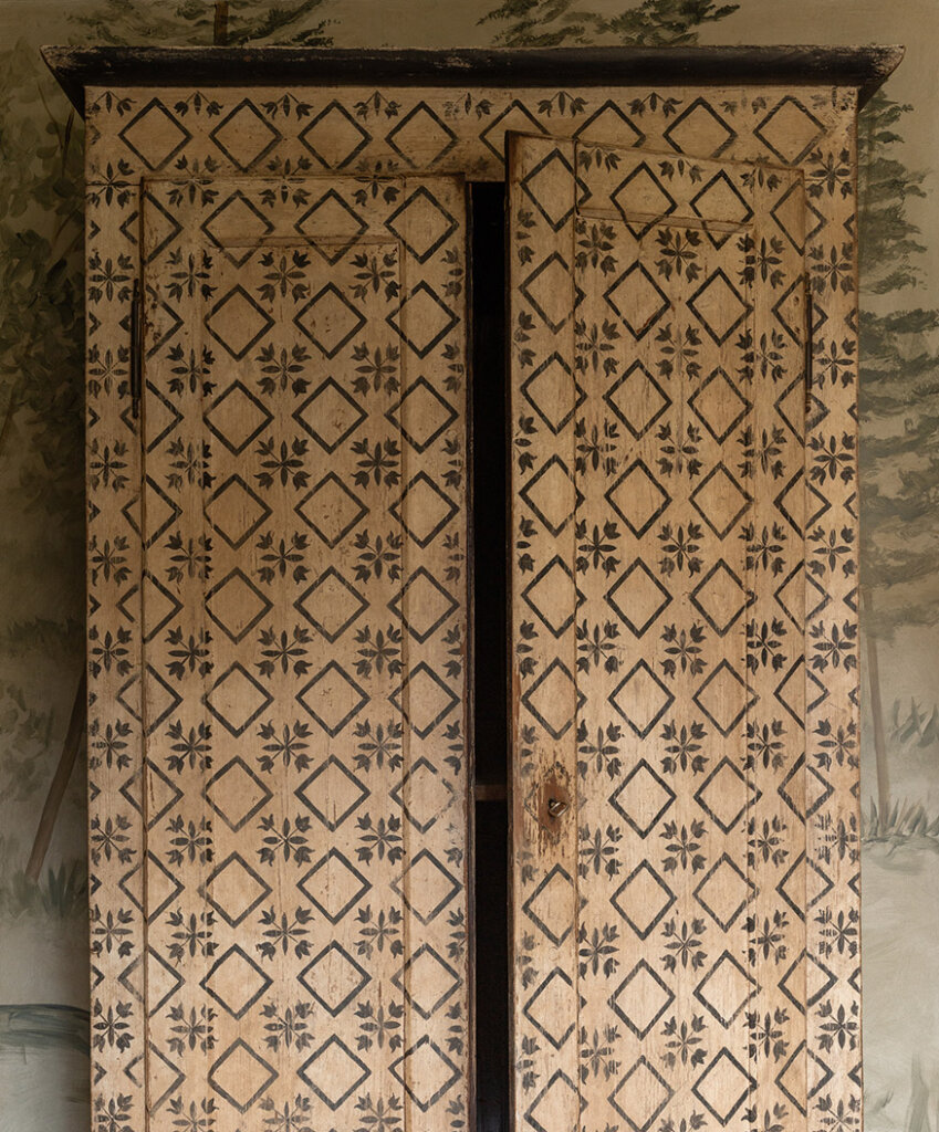
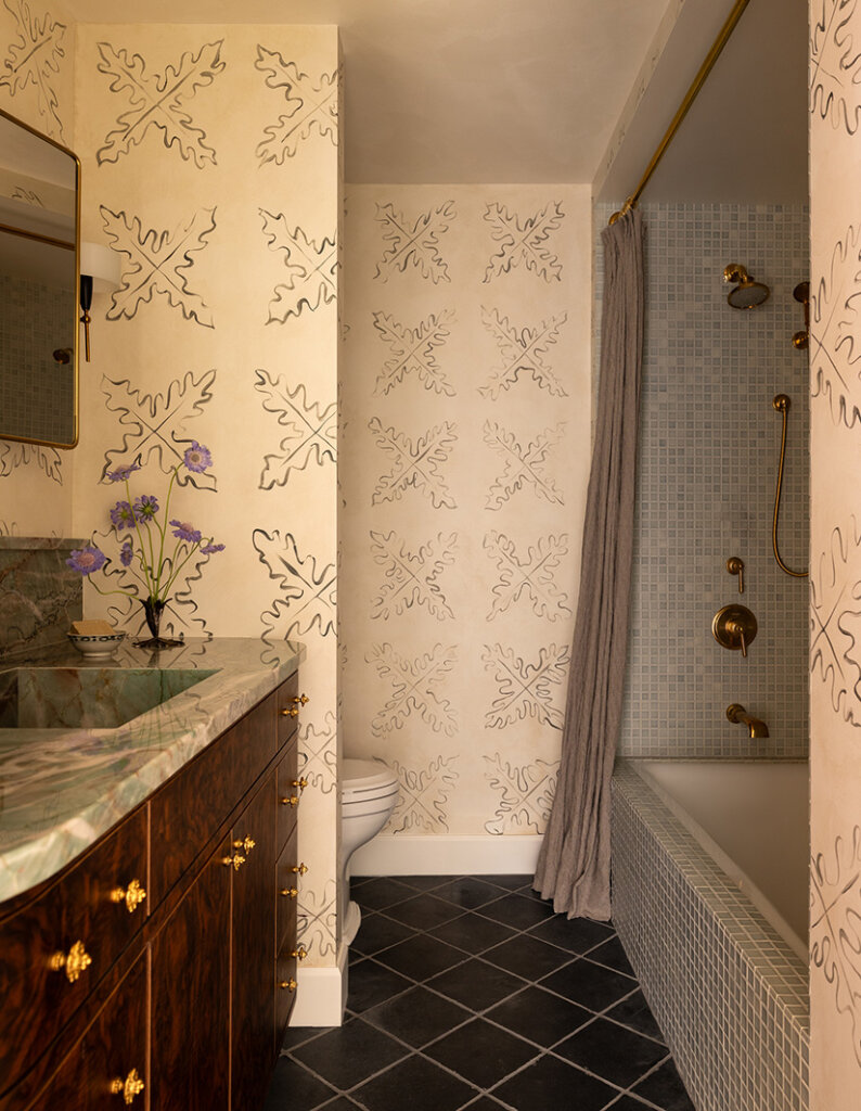
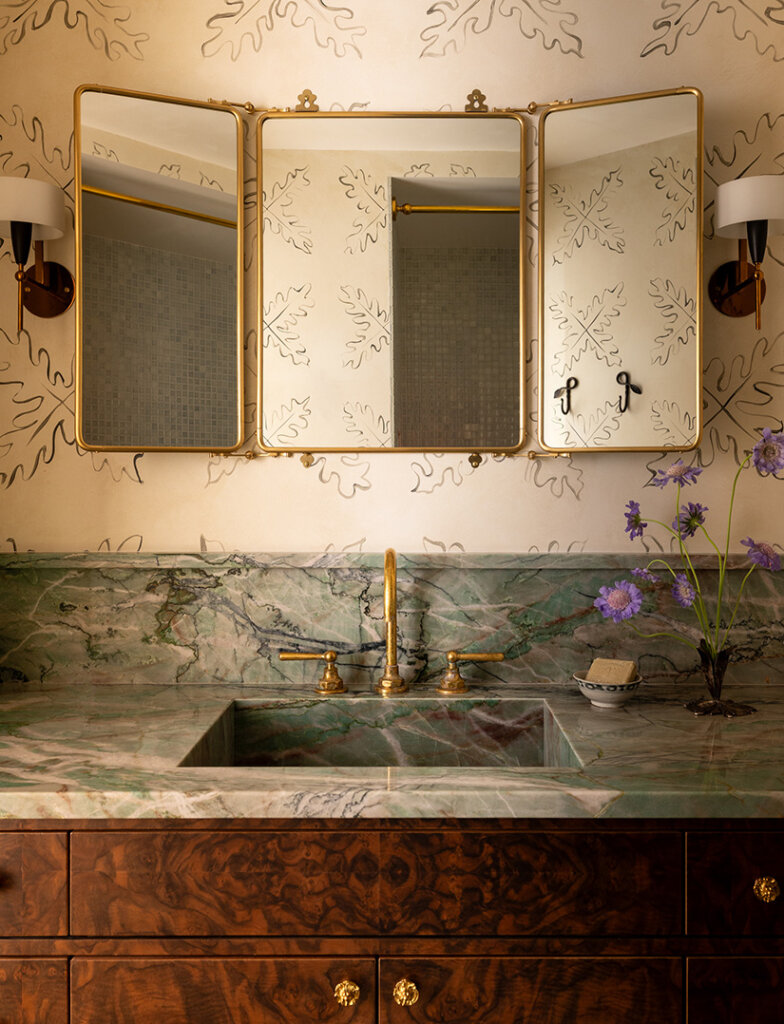
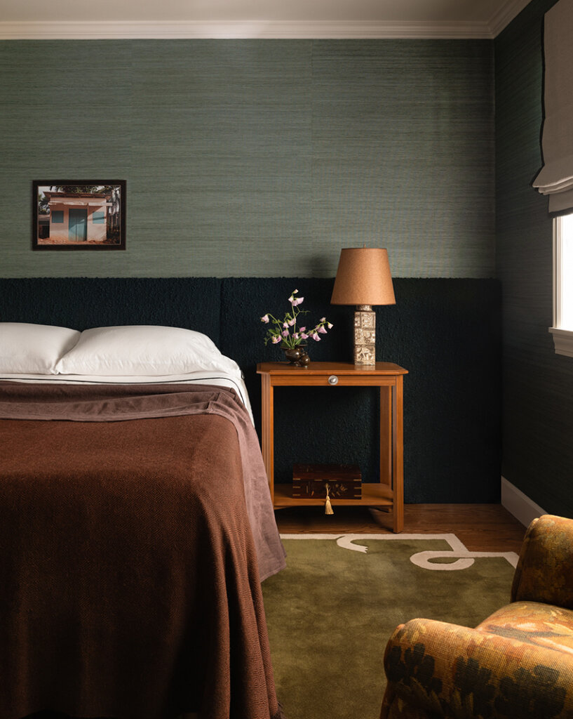
A designer’s farmhouse in the Hampshire countryside
Posted on Thu, 18 Dec 2025 by KiM
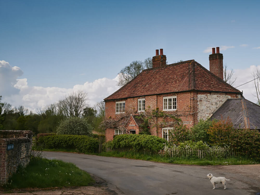
Yavington Cottage, Max’s own home in the Hampshire countryside, is a masterclass in creating a Max Rollitt interior on a more modest scale. Unlike most of the projects featured here, the cottage isn’t the work of the Max Rollitt interiors team, but a collaborative effort between Max and his wife Jane, with signature touches like thoughtfully chosen antiques and unexpected layering of colour creating an interior that’s rich, comfortable and deeply personal.
Patterns, layers, unexpected colour combinations, antique textiles (the bed canopy is 18th century) and furnishings mixed with rustic pieces…it is eclectic and unique and full of life. This home is everything. Photos: Chris Horwood.
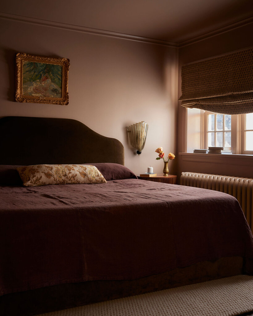
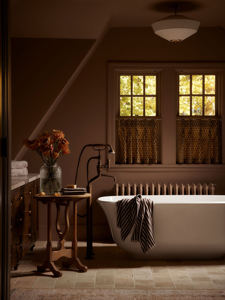
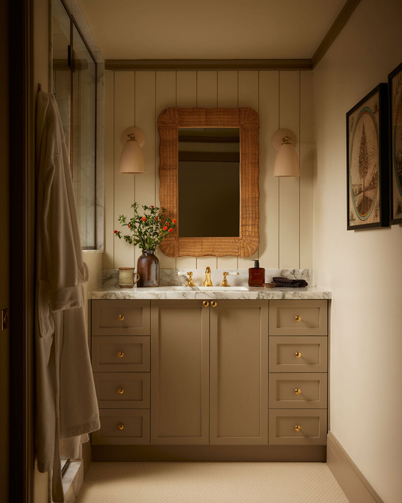
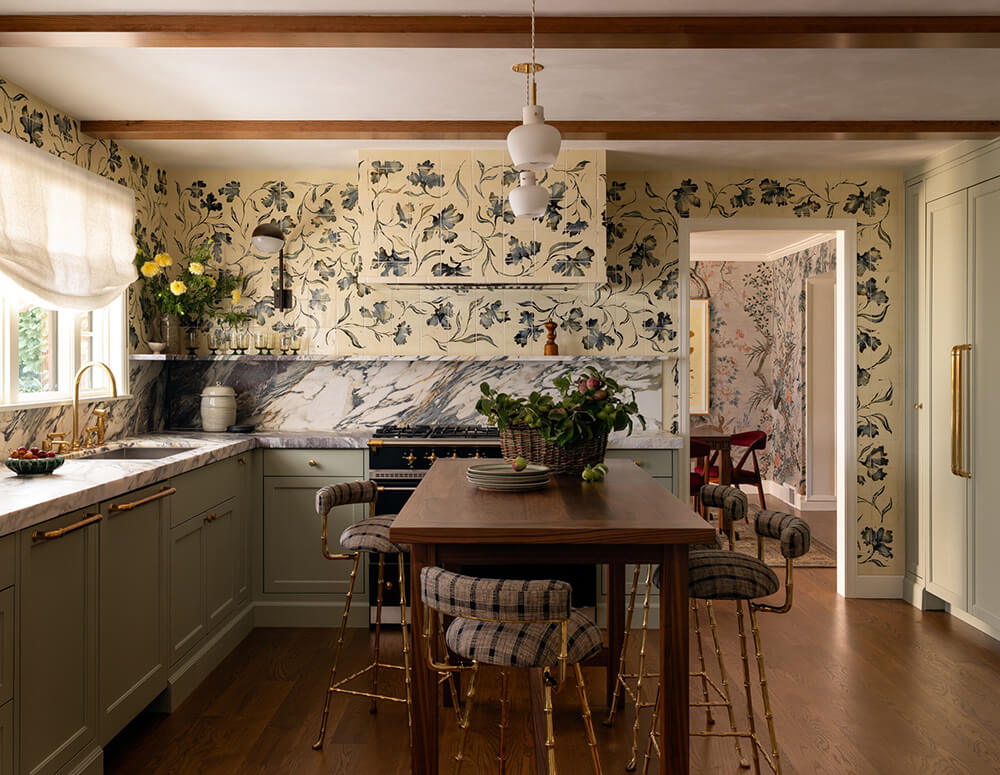
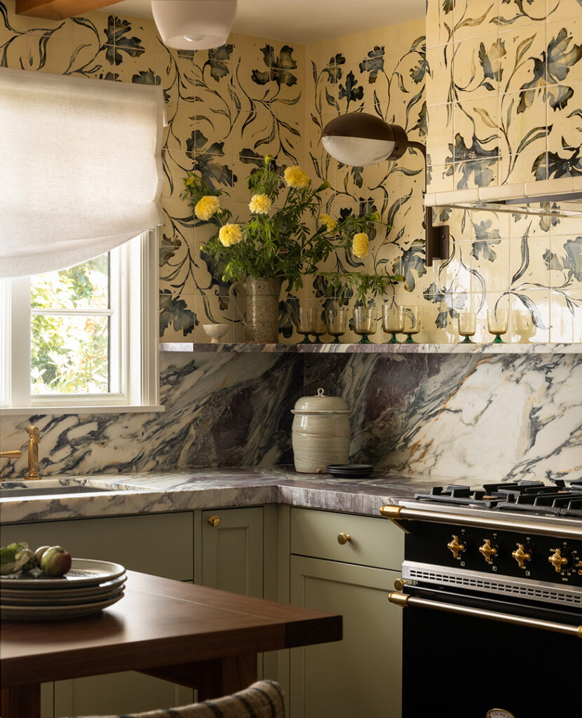
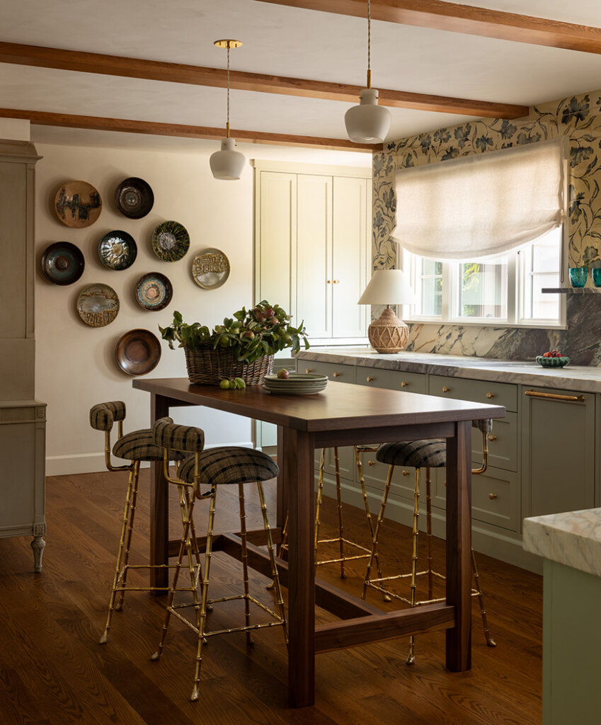
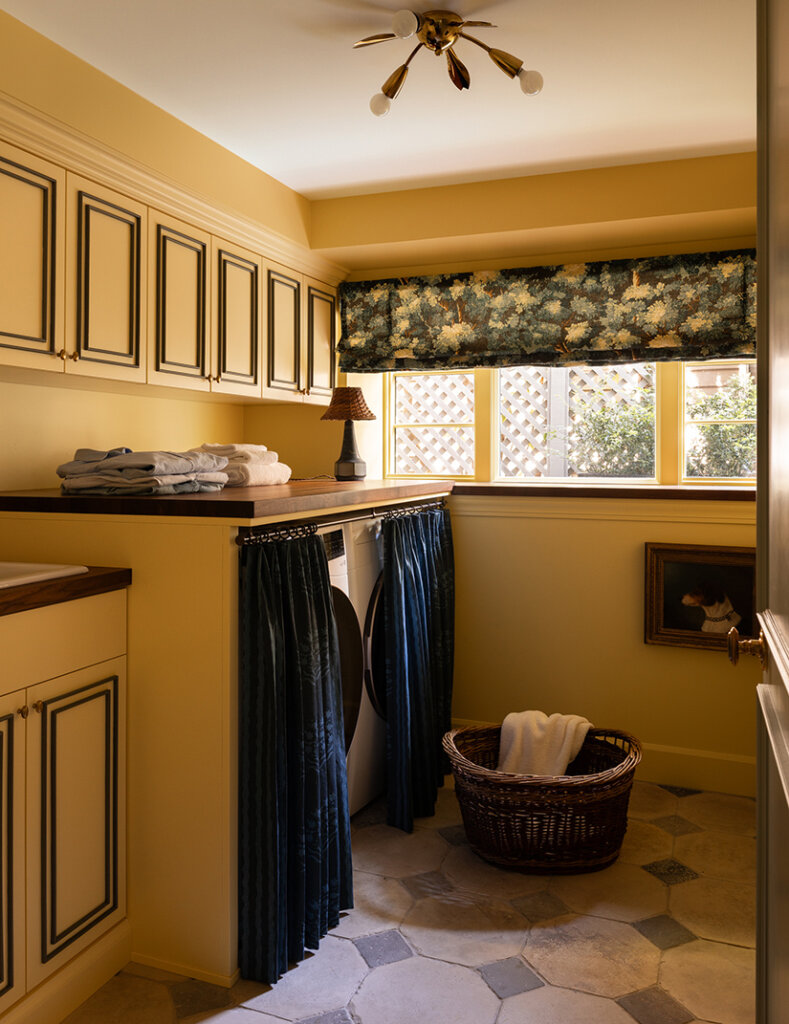
Heidi Caillier takes on a low ceiling challenge
Posted on Tue, 16 Dec 2025 by KiM
Heidi Caillier tackled the design of this Seattle home that had mid-century bones with a few Colonial touches, but it lacked a clear identity. With little architectural detailing—and limited opportunities to add or modify it without significant cost—it needed another way to feel engaging and beautiful. She introduced contemporary shapes and patterns that complemented the existing structure, creating character without altering its framework. Adding detail to the walls, particularly in the kitchen with handmade custom tiles, was a trick she used to distract from the low ceilings. Brilliant! Photos: Haris Kenjar.
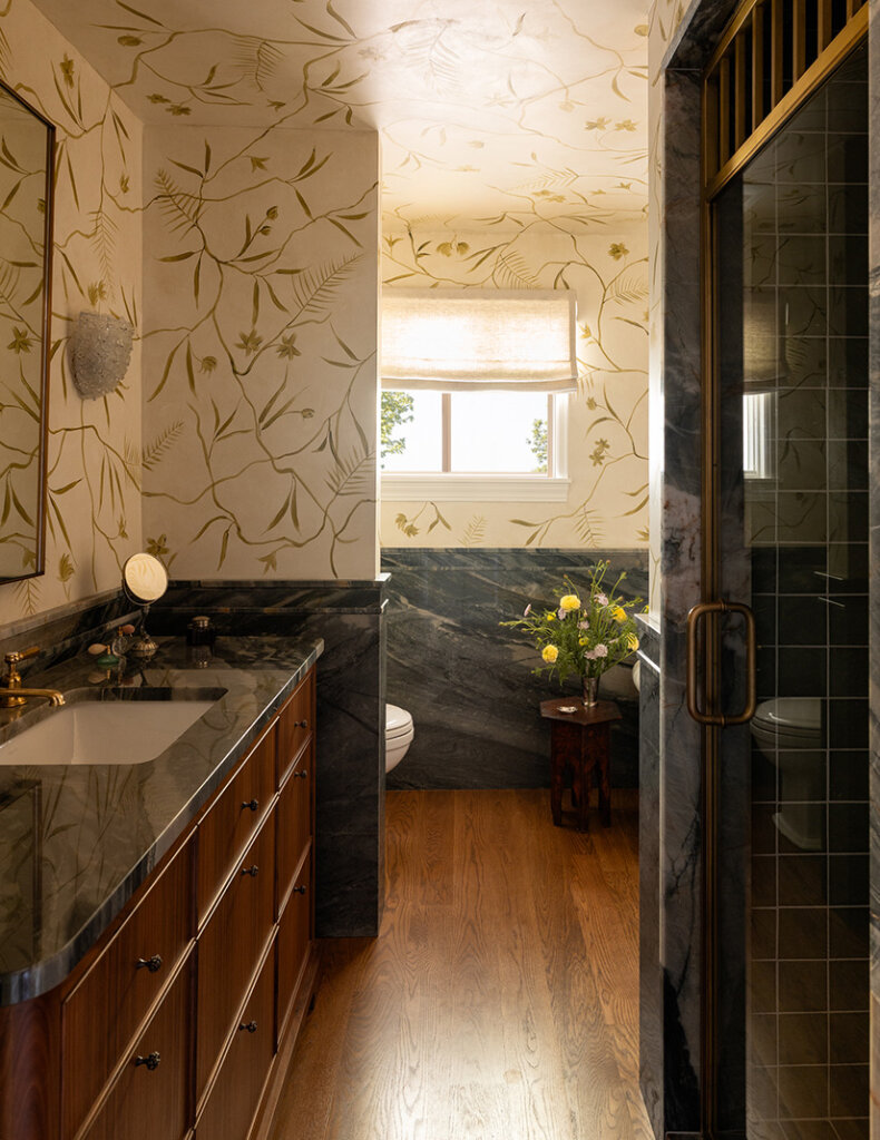
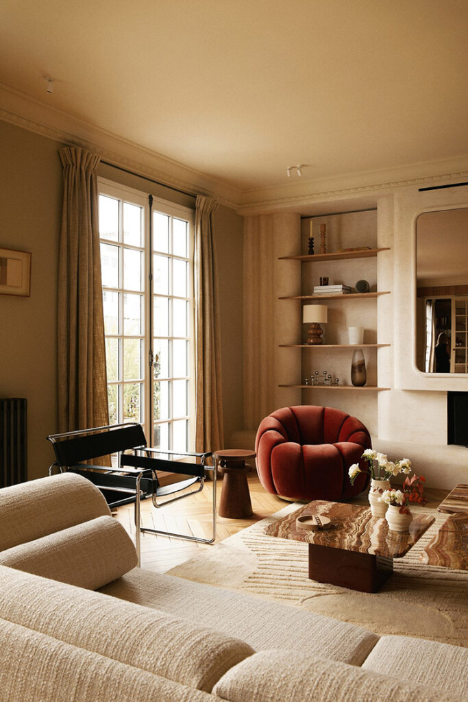
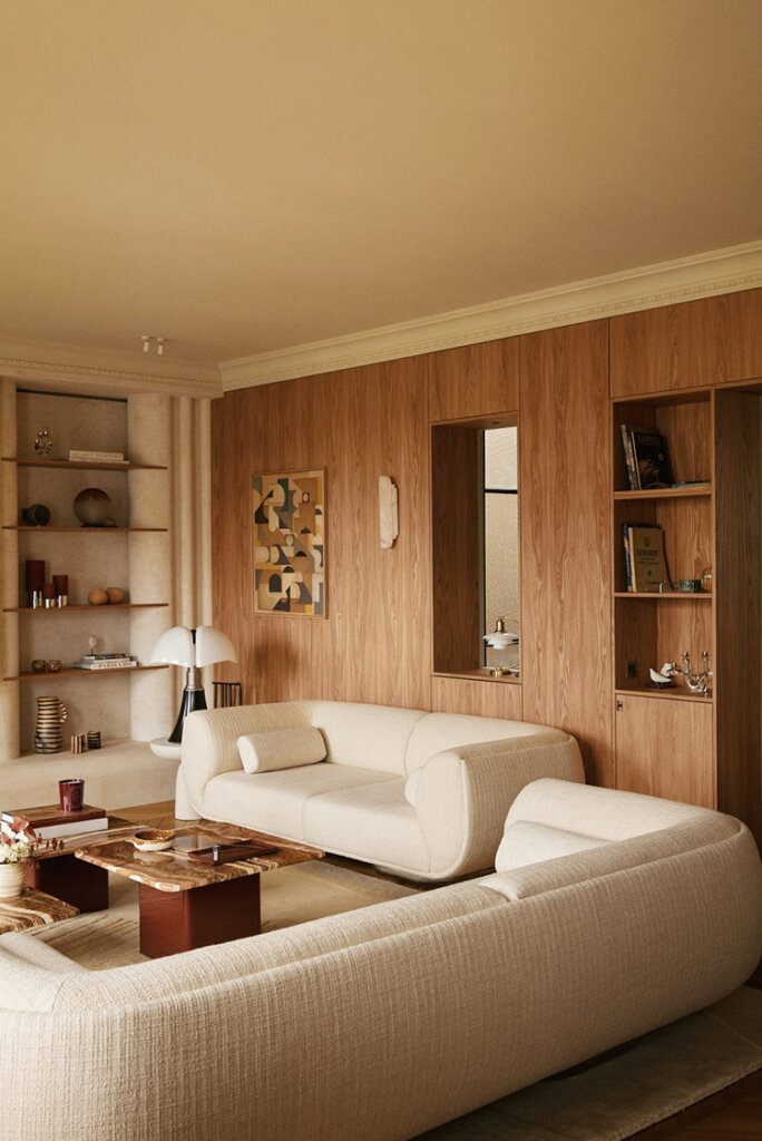
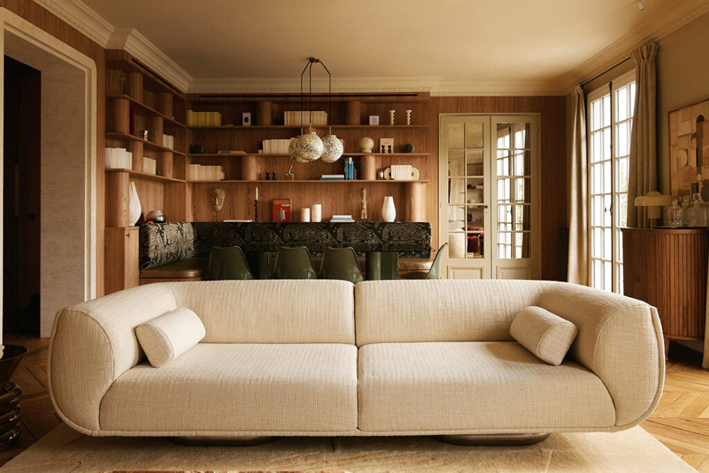
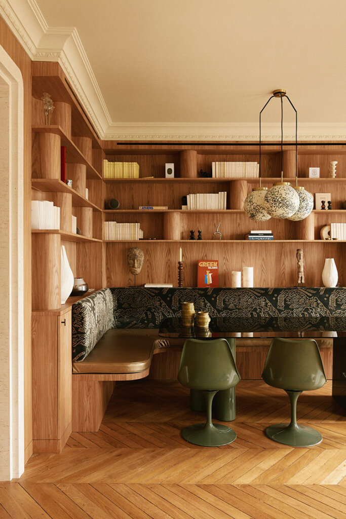
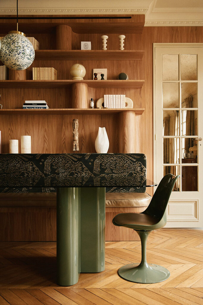
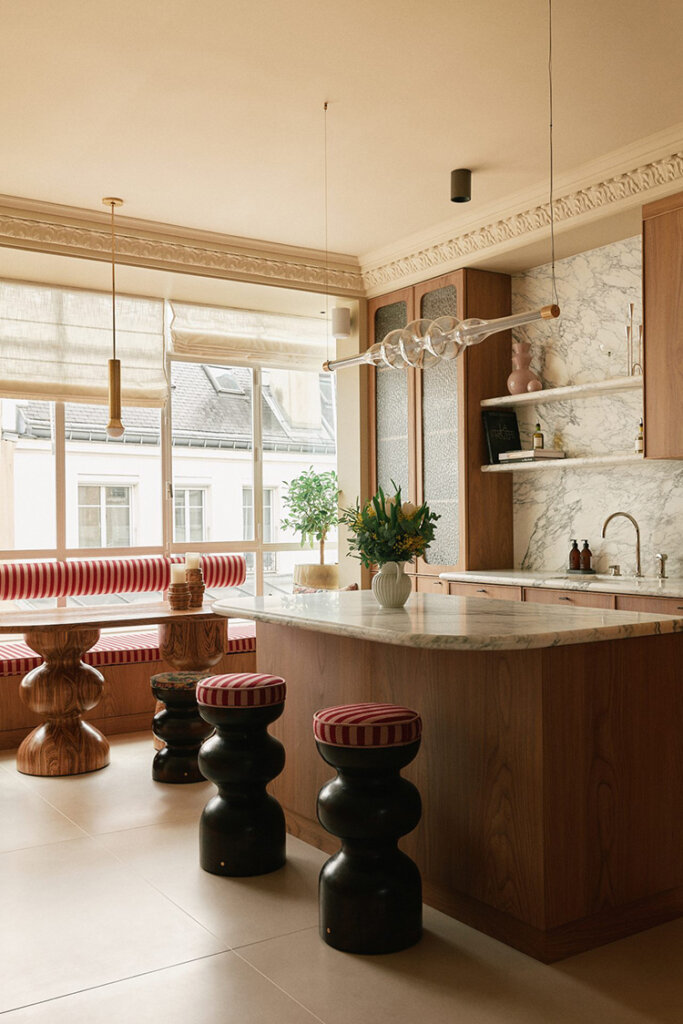
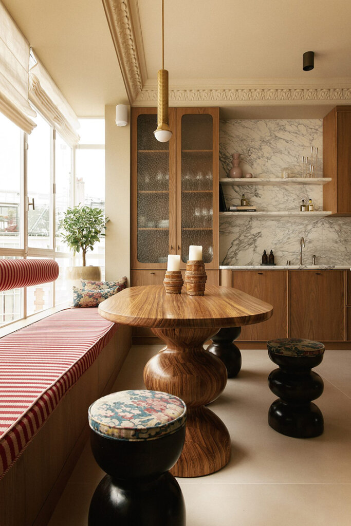
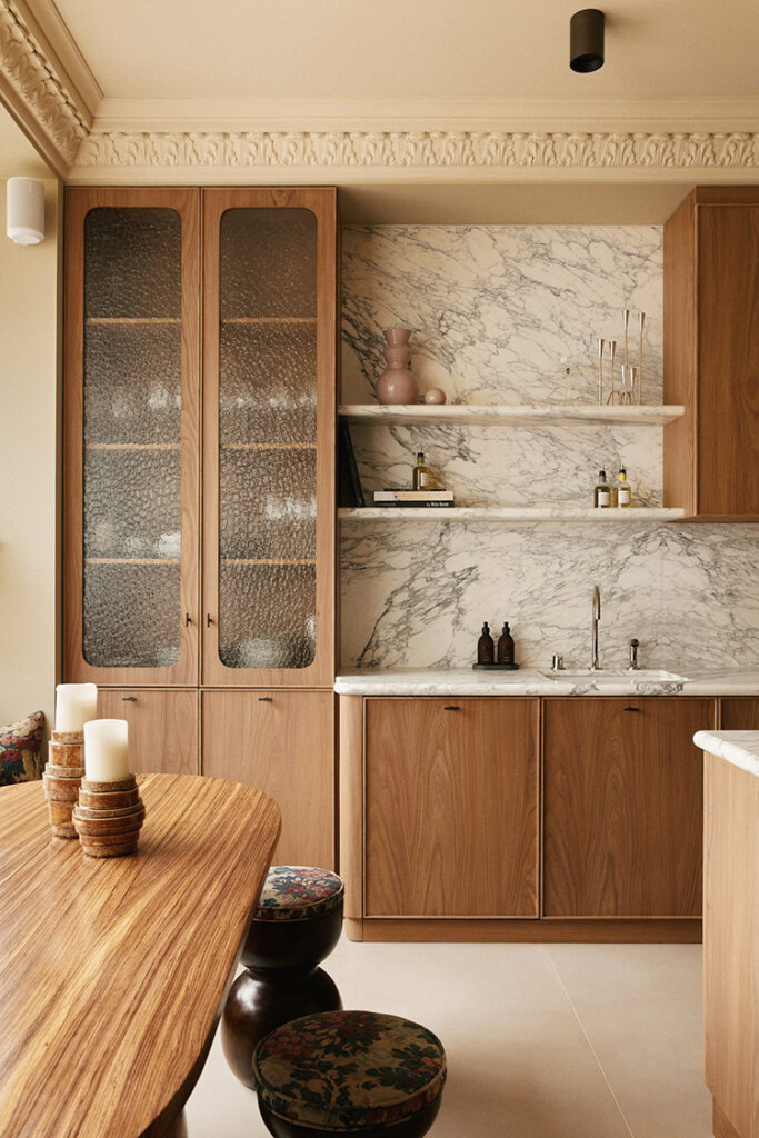
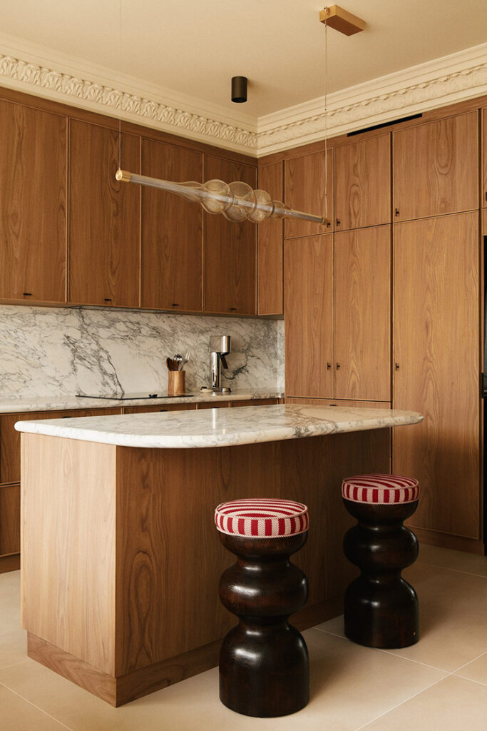
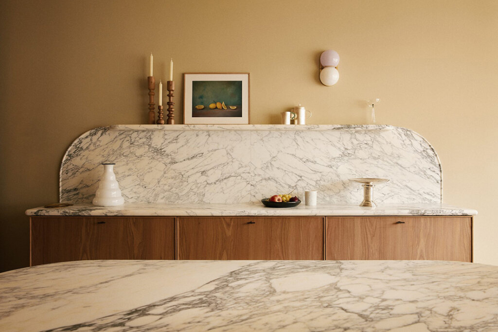
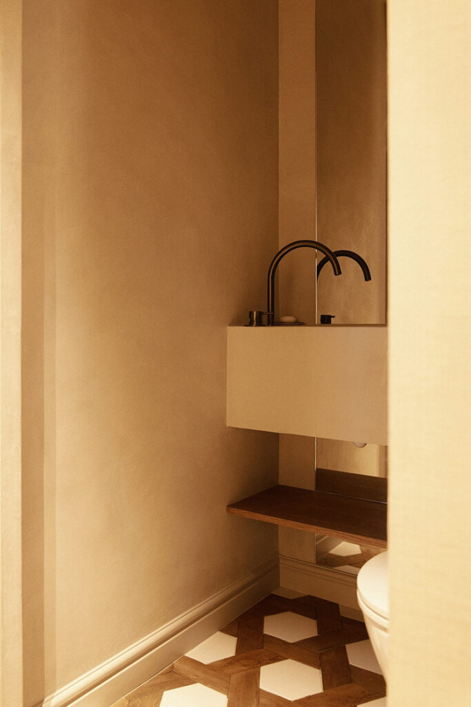
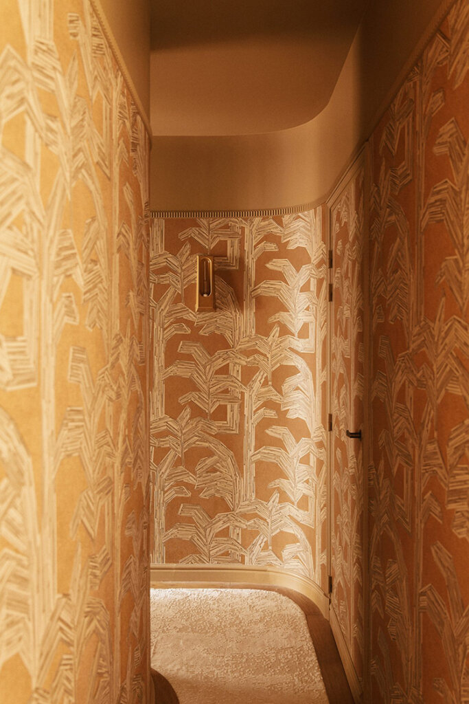
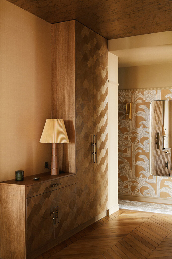
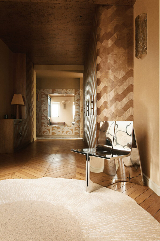
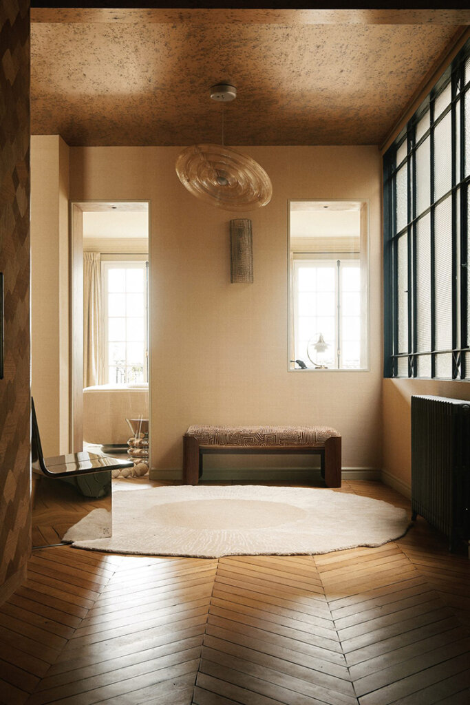
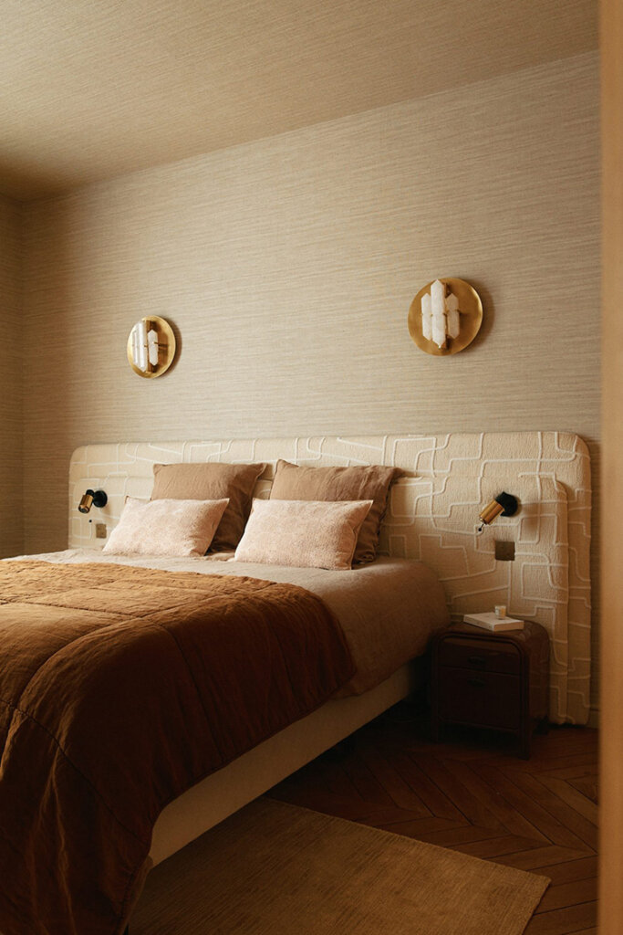
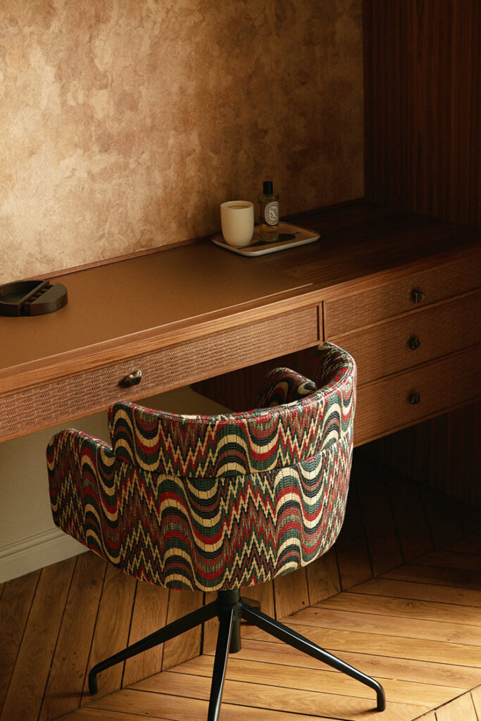
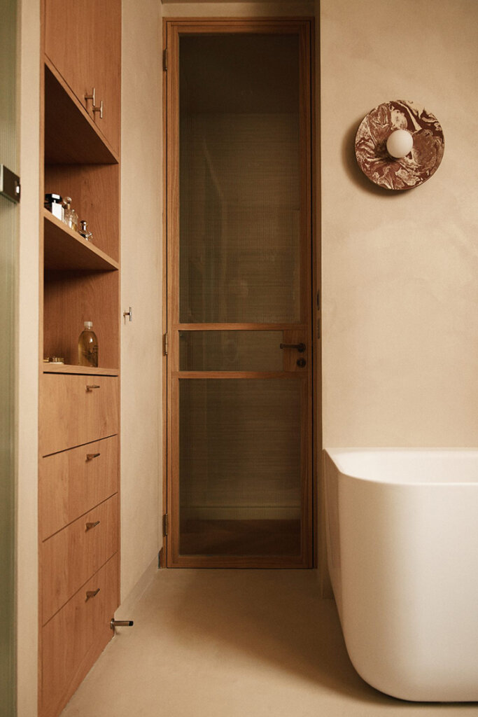
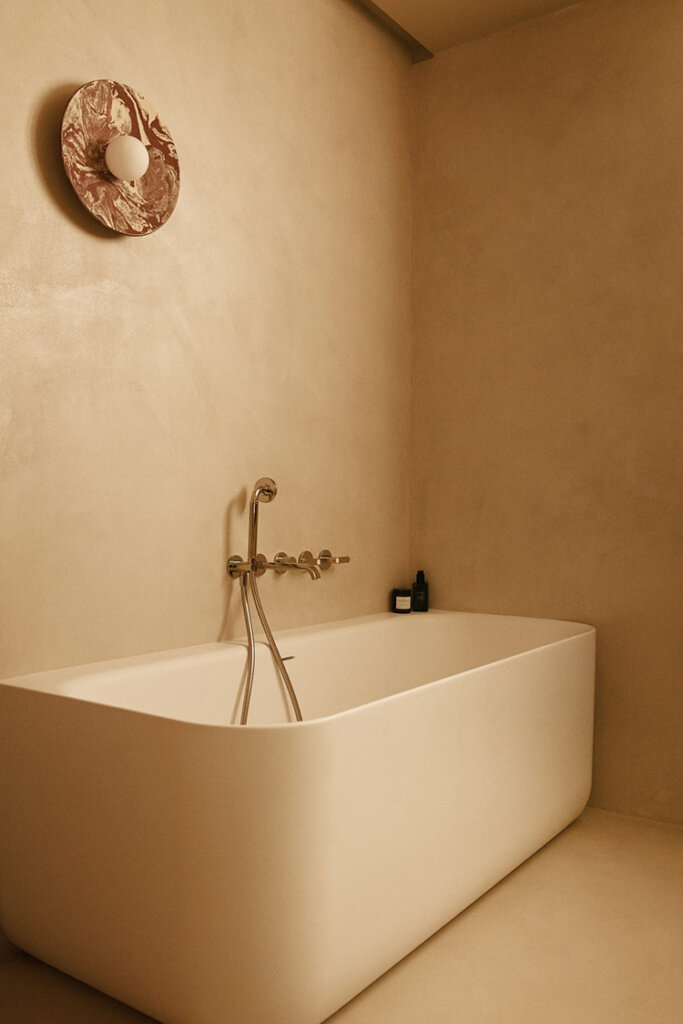
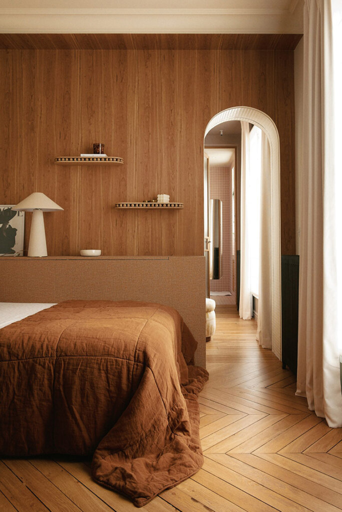
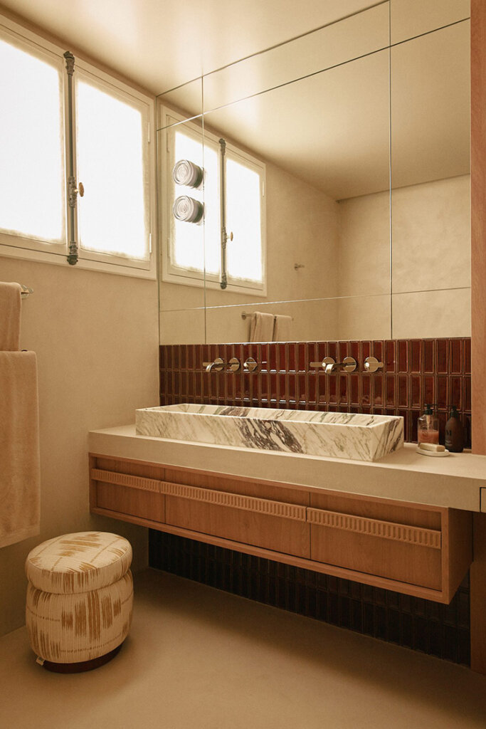
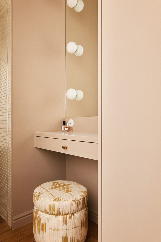
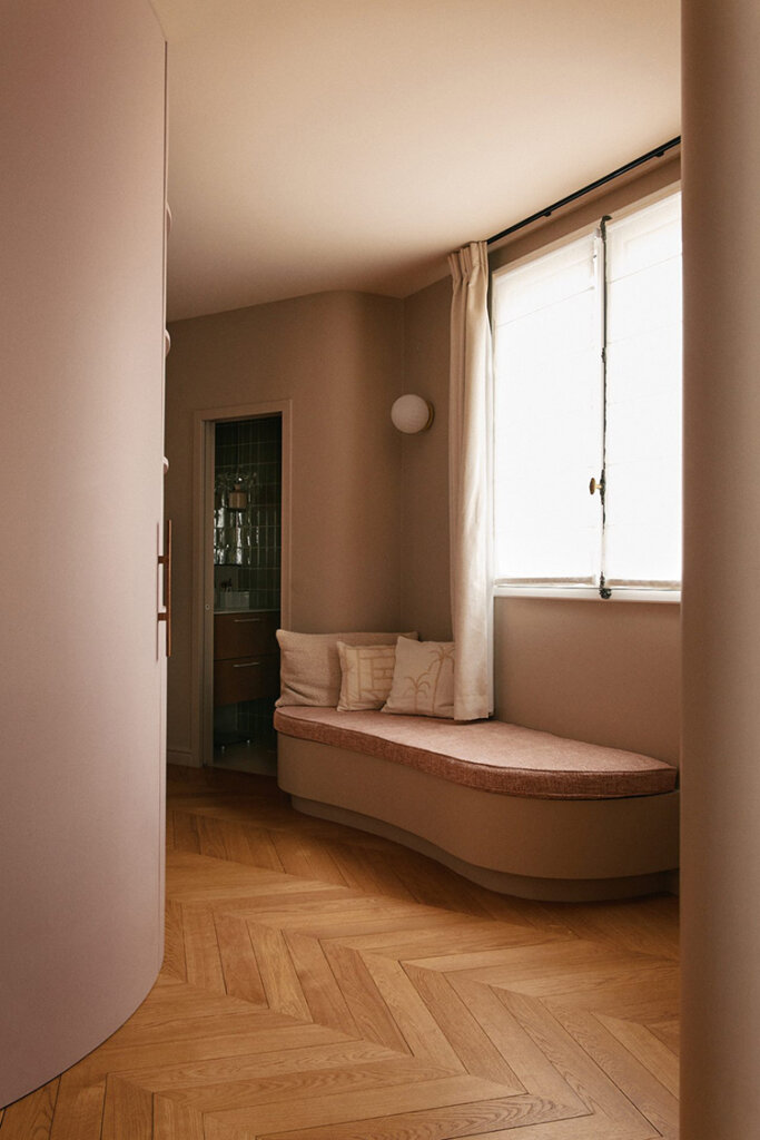
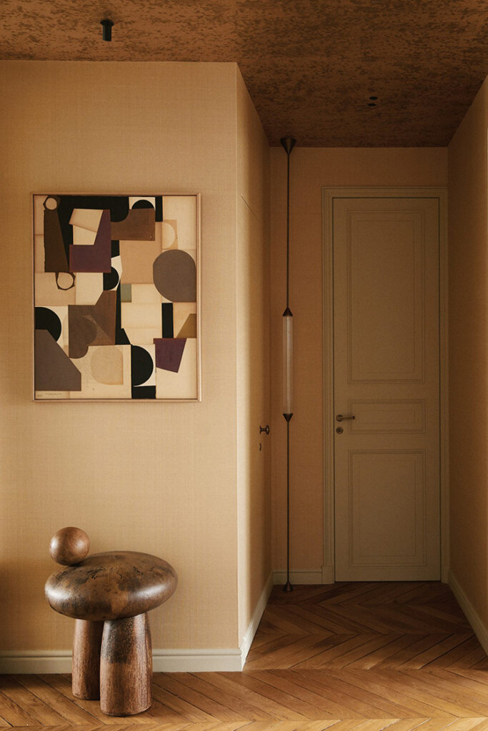
A renovated apartment in Paris’ 16th arrondissement
Posted on Thu, 4 Dec 2025 by KiM
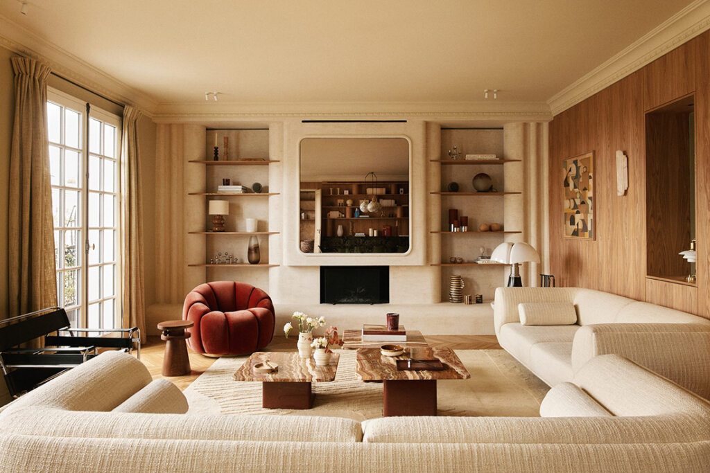
This 220m2 apartment in Paris’ 16th arrondissement represents Paris design to a T. The meticulousness of the details to take advantage of every square inch and provide plenty of storage, the exquisite selection of furnishings, a wide range of materiality (that MUST include marble), and an overall air of sophistication and elegance that one expects from a Parisian dwelling. La Muette by Caroline Andréoni. Photos: Oracle.