Displaying posts labeled "Yellow"
Where old meets new – the gut renovation of a home in Pennsylvania
Posted on Mon, 1 Sep 2025 by KiM
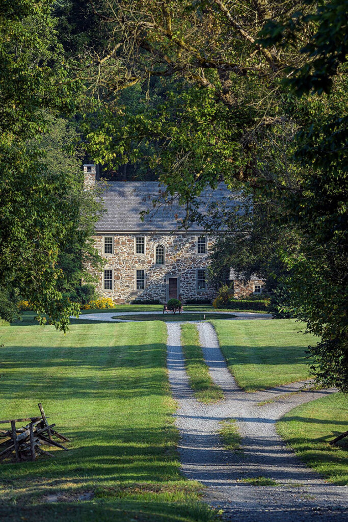
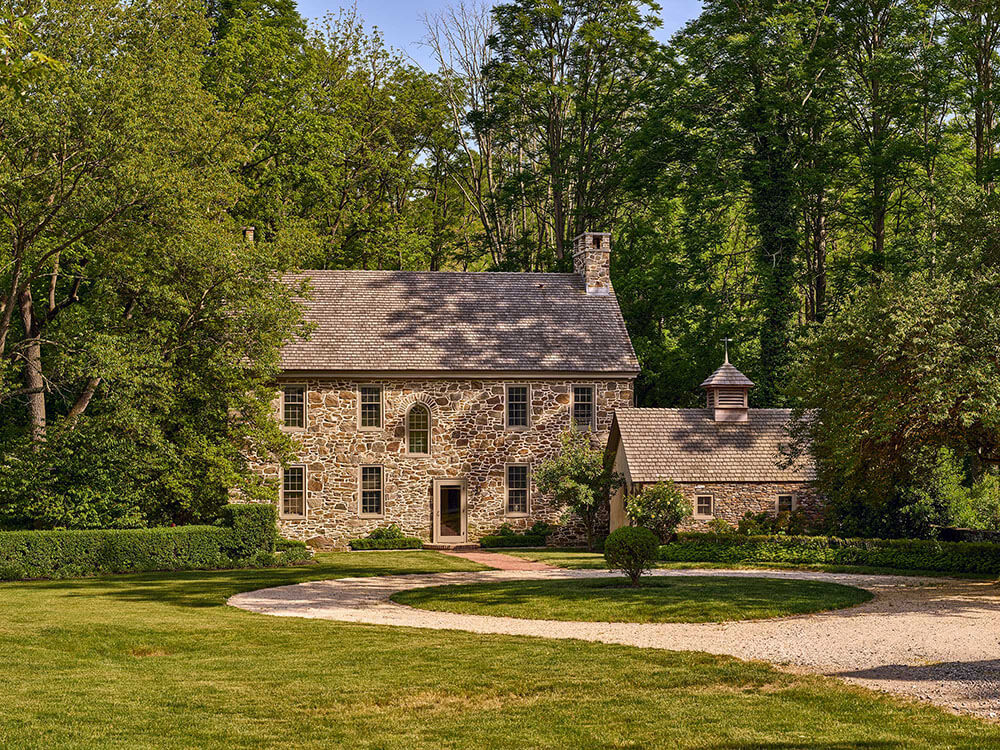
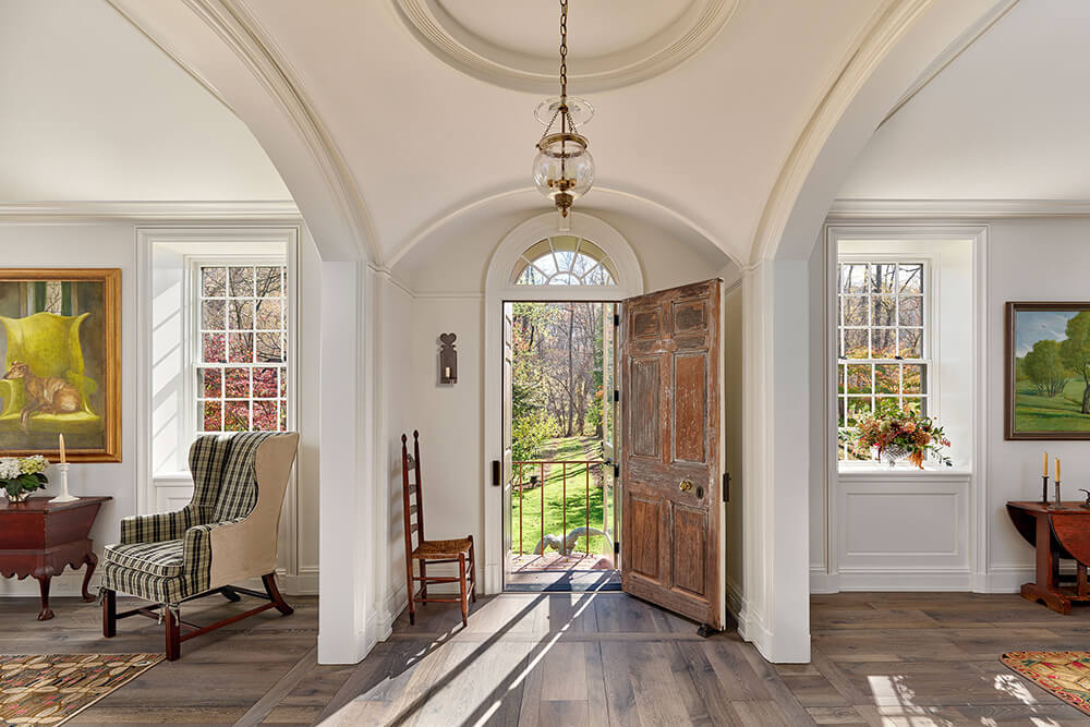
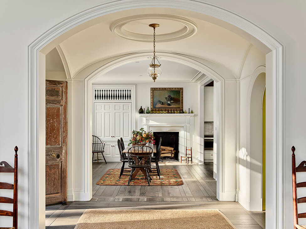
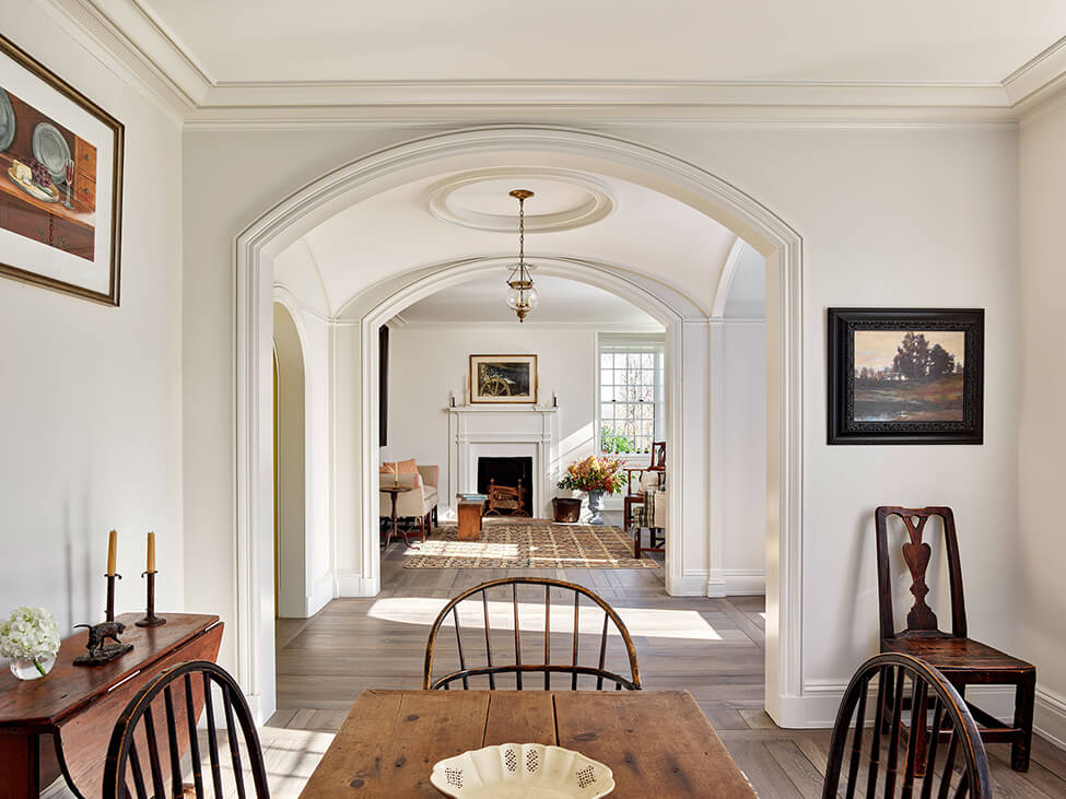
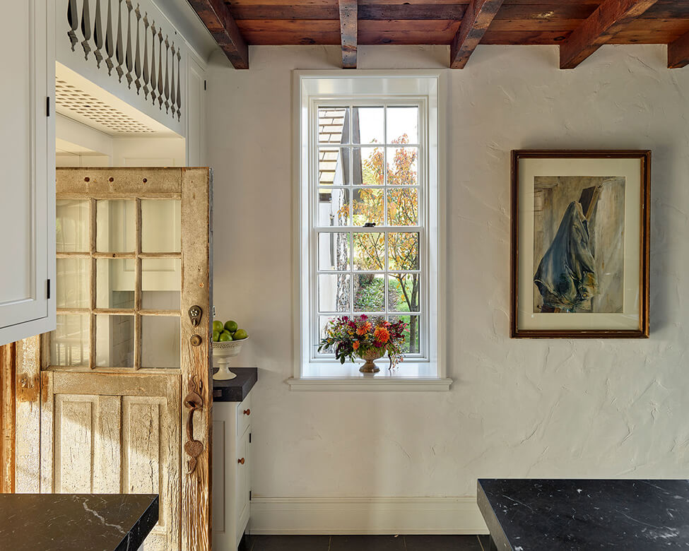
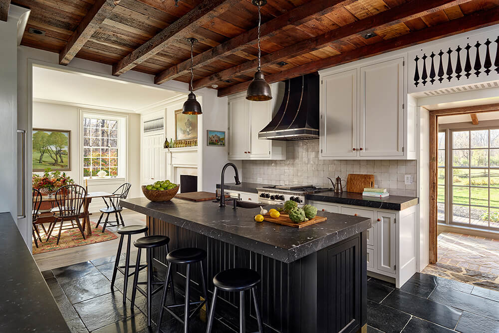
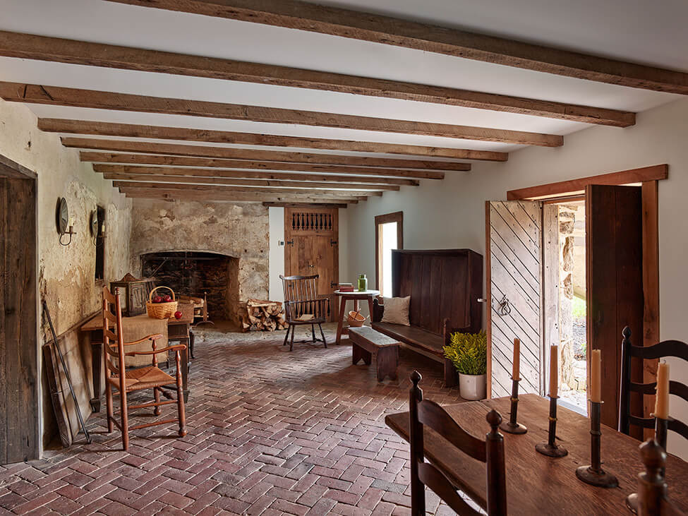
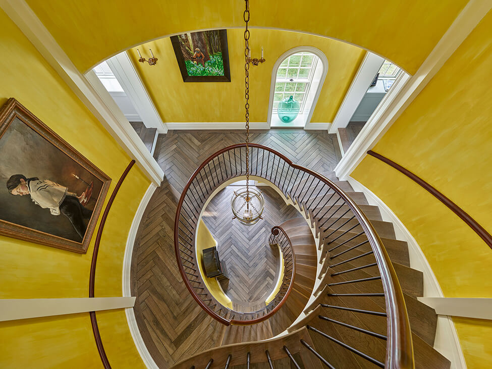
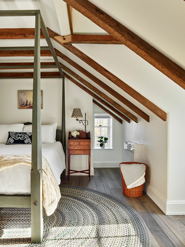
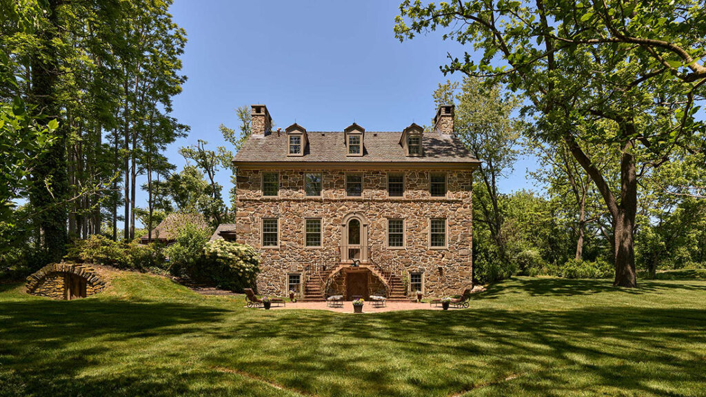
The goals of the project at “Big Bend”, located in Chadds Ford, Pennsylvania, were two-fold. The design team was charged with completely re-envisioning the interior of the house through a gut renovation that would deliver amenity updates and a setting for a contemporary lifestyle. Simultaneously, restoration of the exterior and minor additions would occur with the minimal possible impact on the historic character of the building. Our client wanted the interior to surprise visitors. In response, our design delivers utterly unique, dramatic spaces created through custom casework, vaulted ceilings, and a plan that provides multiple sightlines through the house from various points of entry.
I loooooooove the mix of old and “newer” in this home and how it all looks like there’s some history behind it even if it’s been rebuilt. I don’t know what the interior looked like before the renovation but I think Archer & Buchanan Architects did it justice. Builder: Griffiths Construction, Inc.; Photos: Jeffrey Totaro.

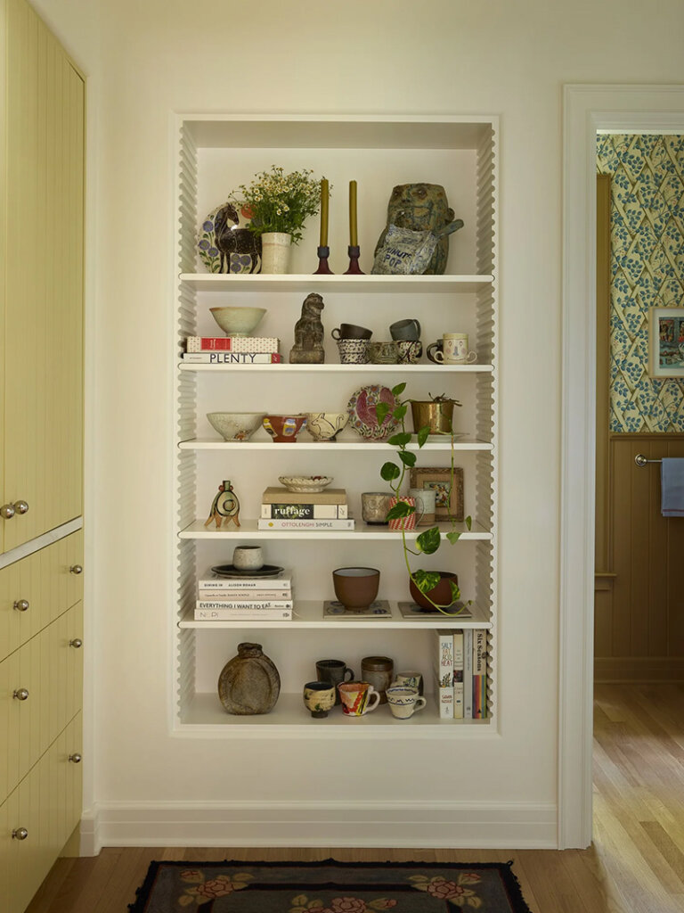
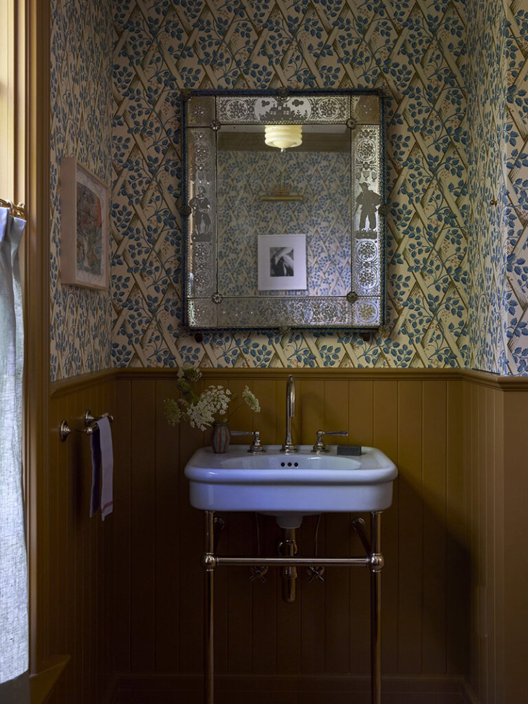
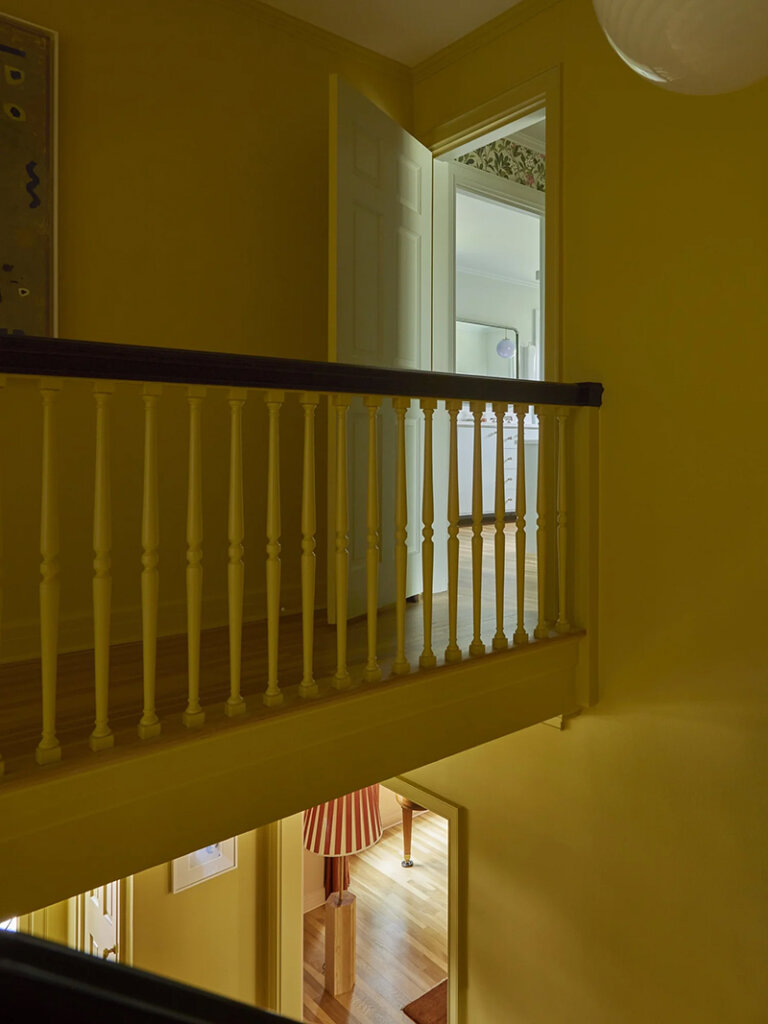
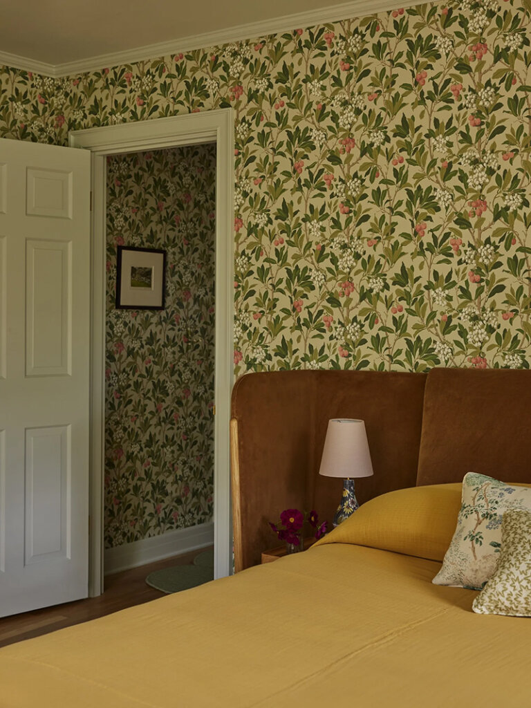
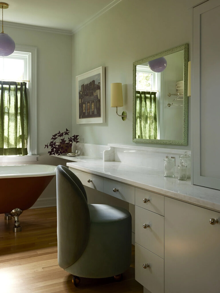
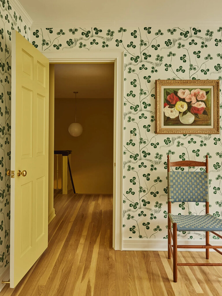
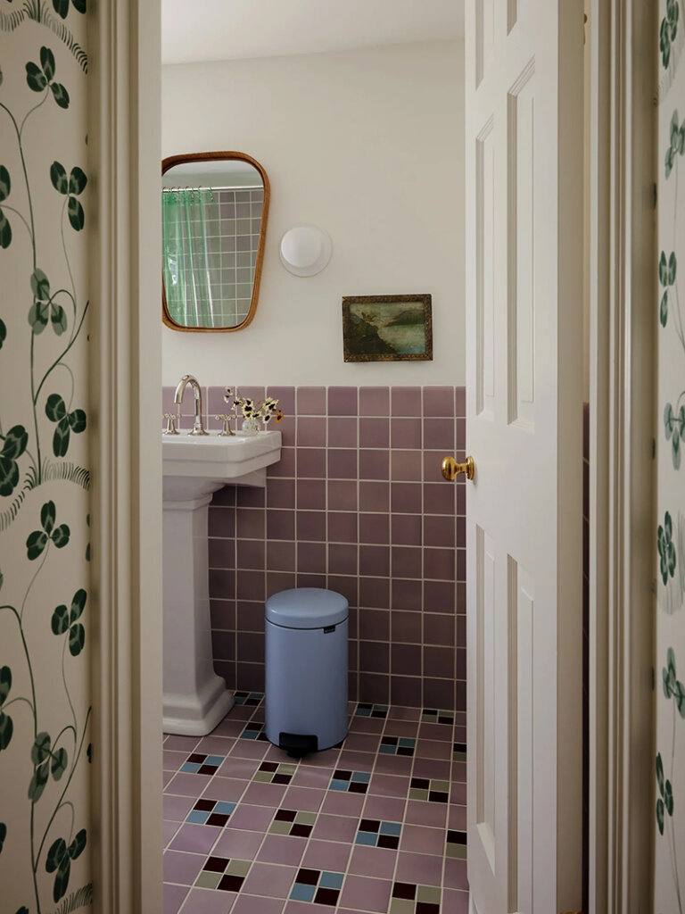
Bold colours and botanical prints in a 1946 Colonial home in Portland
Posted on Tue, 26 Aug 2025 by KiM
Just because you live in a Colonial home doesn’t mean it has to be decorated in a traditional and stuffy way. And if you have Frances Merrill of Reath Design responsible for the interiors you know it’s going to include a cacophony of colour and pattern (in this a mix of pastels and rich colours, and lots of botanical prints), and a mix of vintage and contemporary furnishings. It’s the perfect foil for a fun, young family who wanted something cheerful to combat cold, grey days. Photos: Laure Joliet.


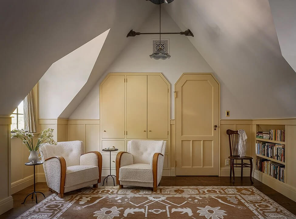
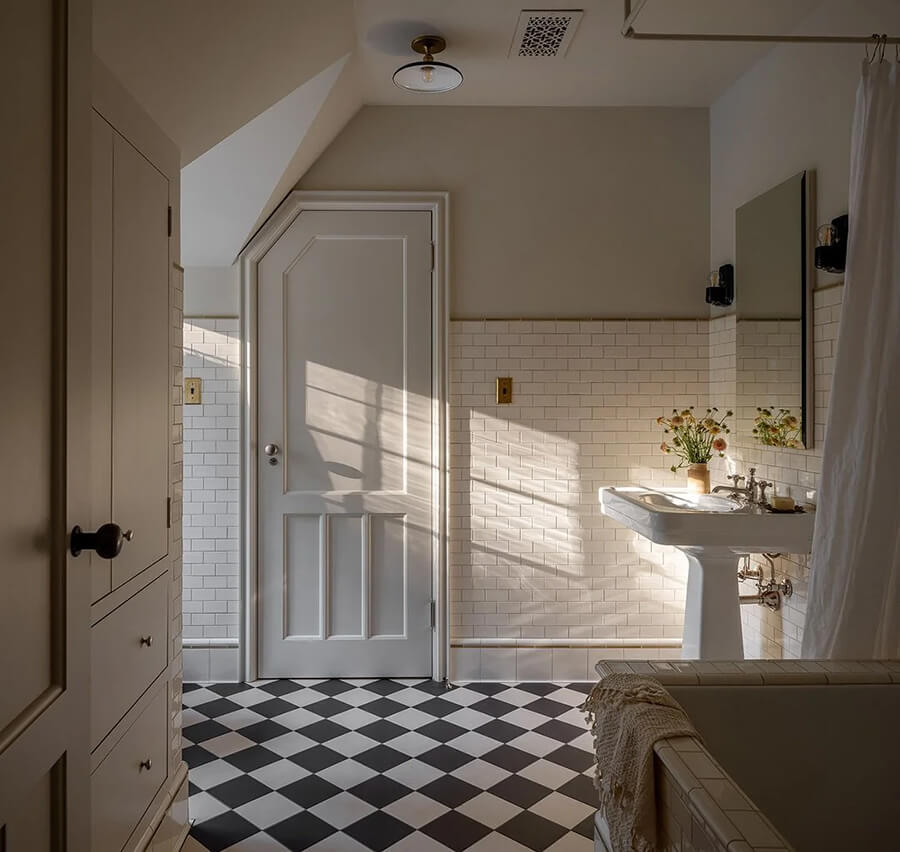
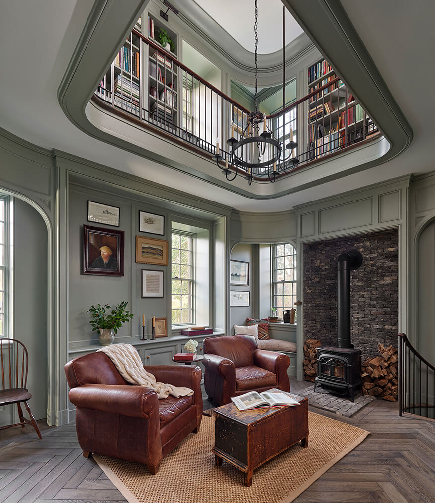
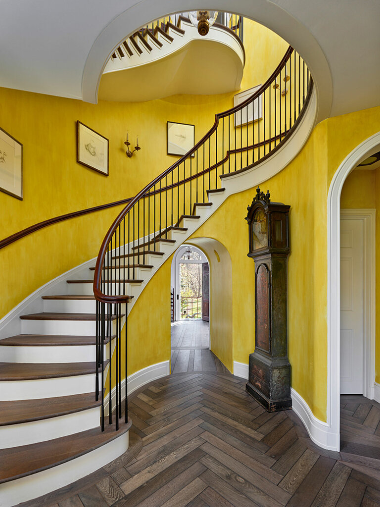
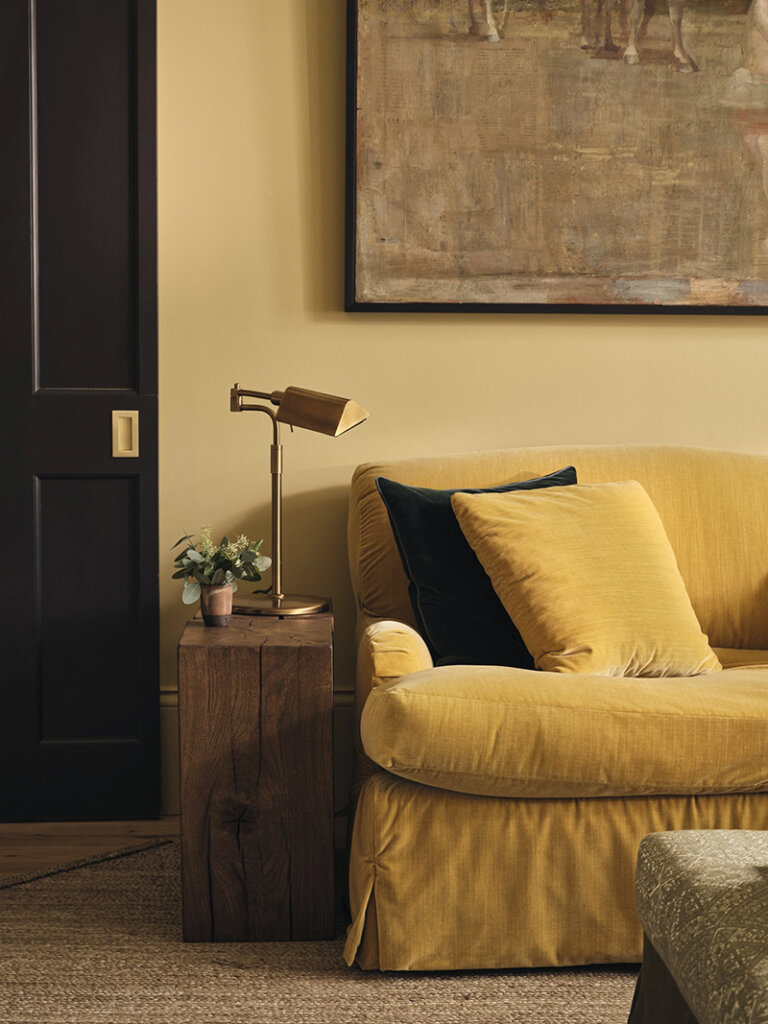
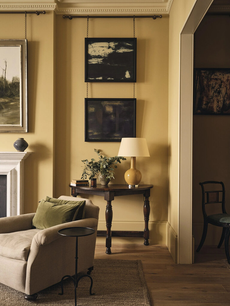
A Kensington townhouse with the prettiest yellow sitting room
Posted on Thu, 14 Aug 2025 by KiM
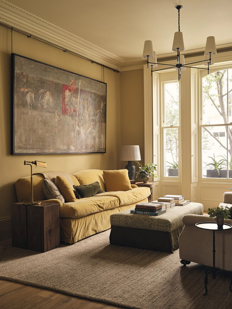
This was a 2 1/2 year project of a large Kensington townhouse, including a grand architectural intervention of a large basement excavation and addition of a barrel vaulted space above. This lead to a light flooded lower ground floor and architecturally arresting structure of a double height space with a bookcase rising up within. It was a complete renovation, with every detail, large and small, designed and considered. And as home for a family with two young children it had to be both characterful and uniquely designed, and super practical, comfortable family home.
I am utterly smitten with this yellow tonal sitting room (Edward Bulmer’s ‘Lute’) that “offers a soft, sunny backdrop for layered textures and quiet contrast”. Designer Jessica Summer sure knows how to use colour in impactful ways but on the softer side, creating hints of drama and depth.


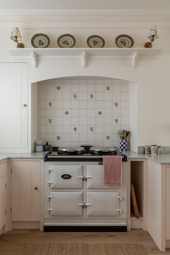
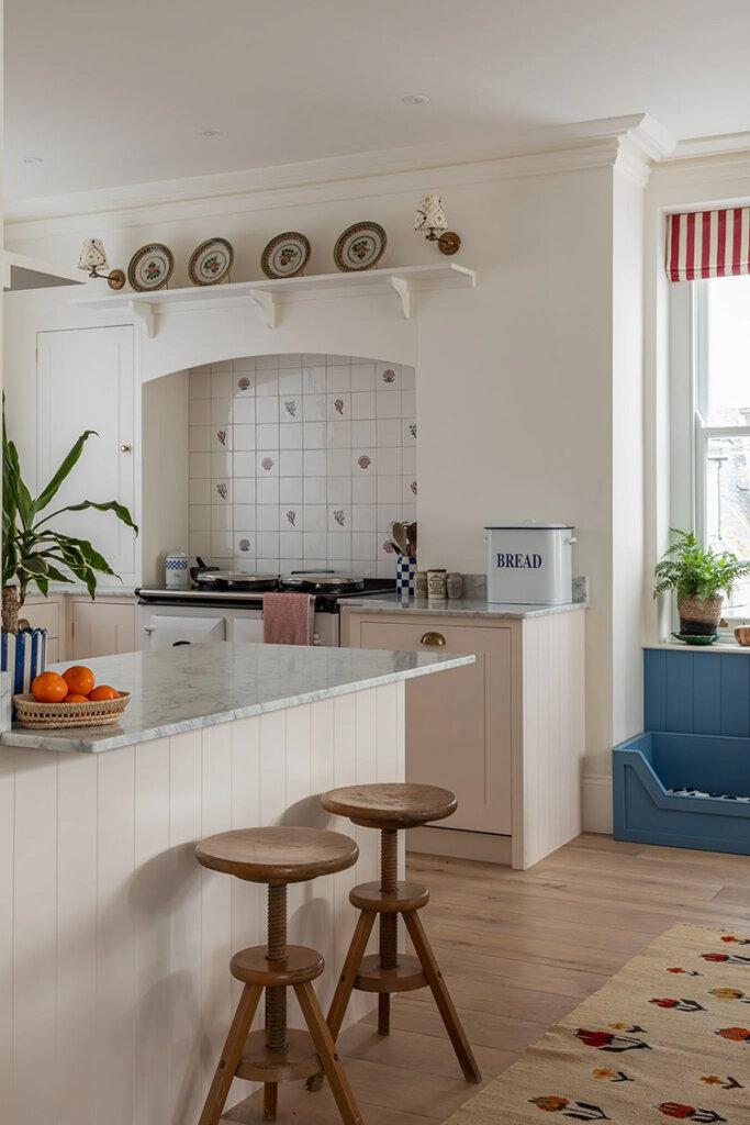
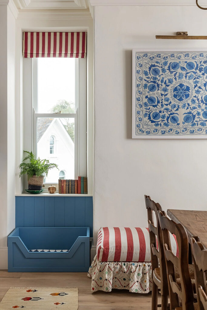
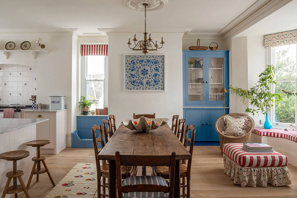
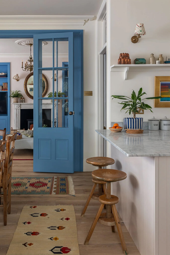
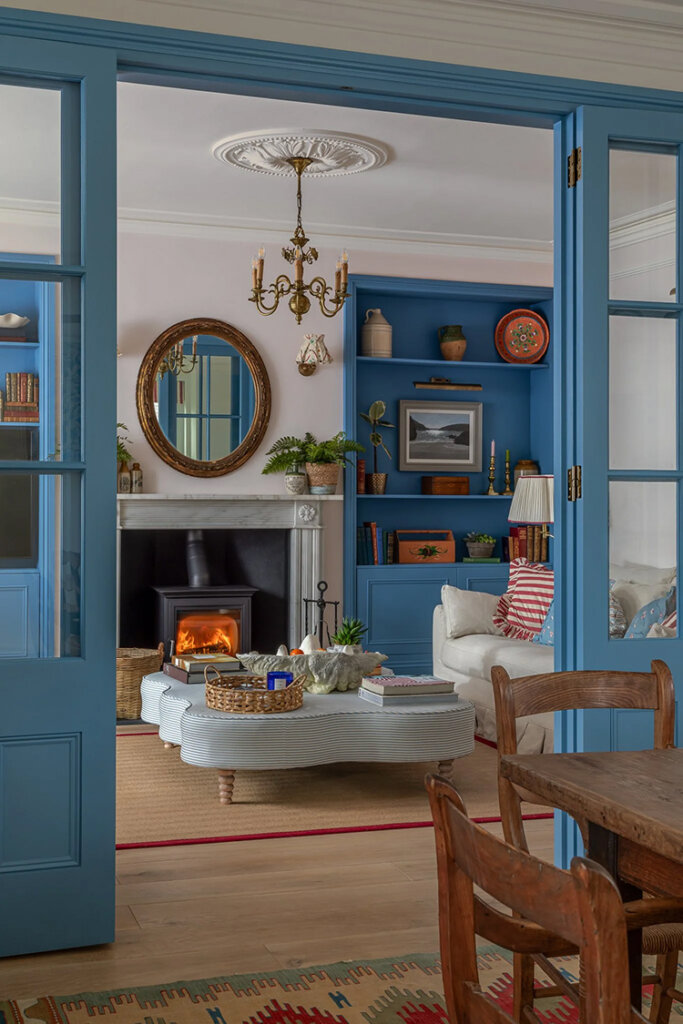
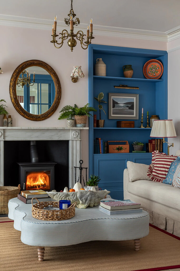
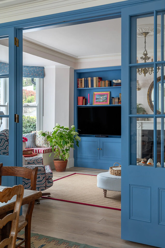
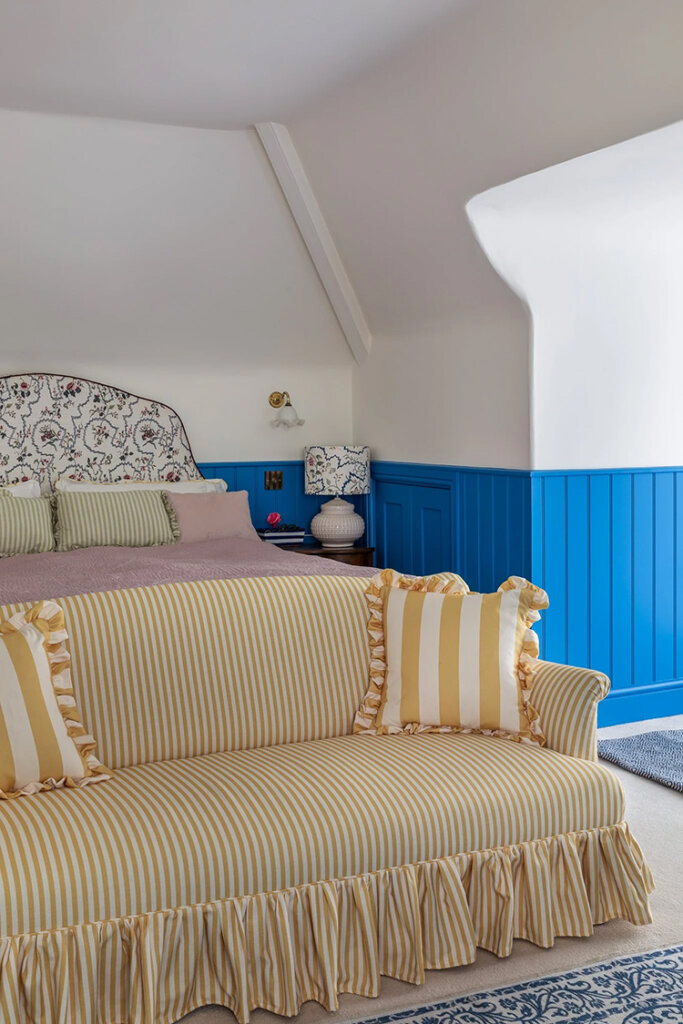
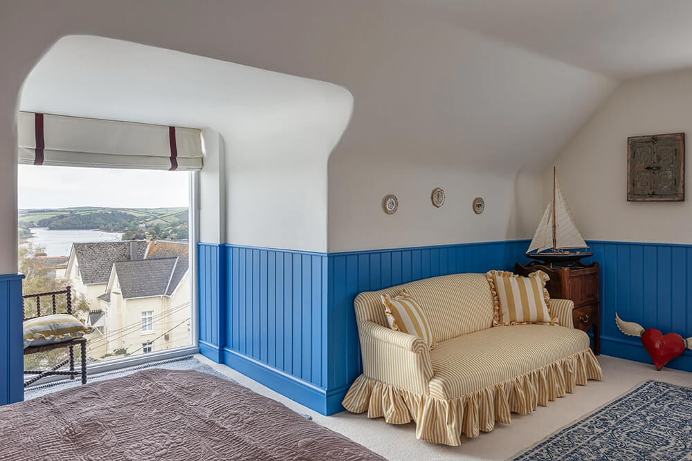
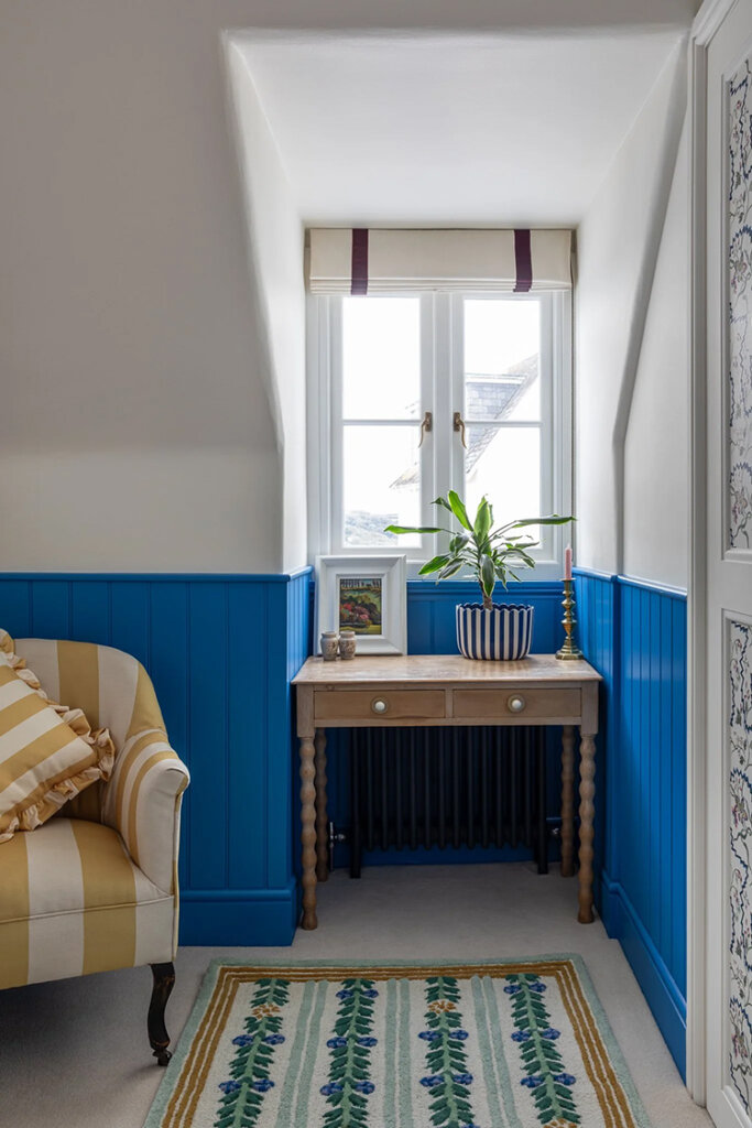
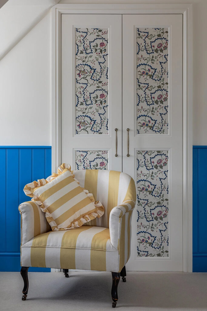
A bright, coastal cottage in Devon
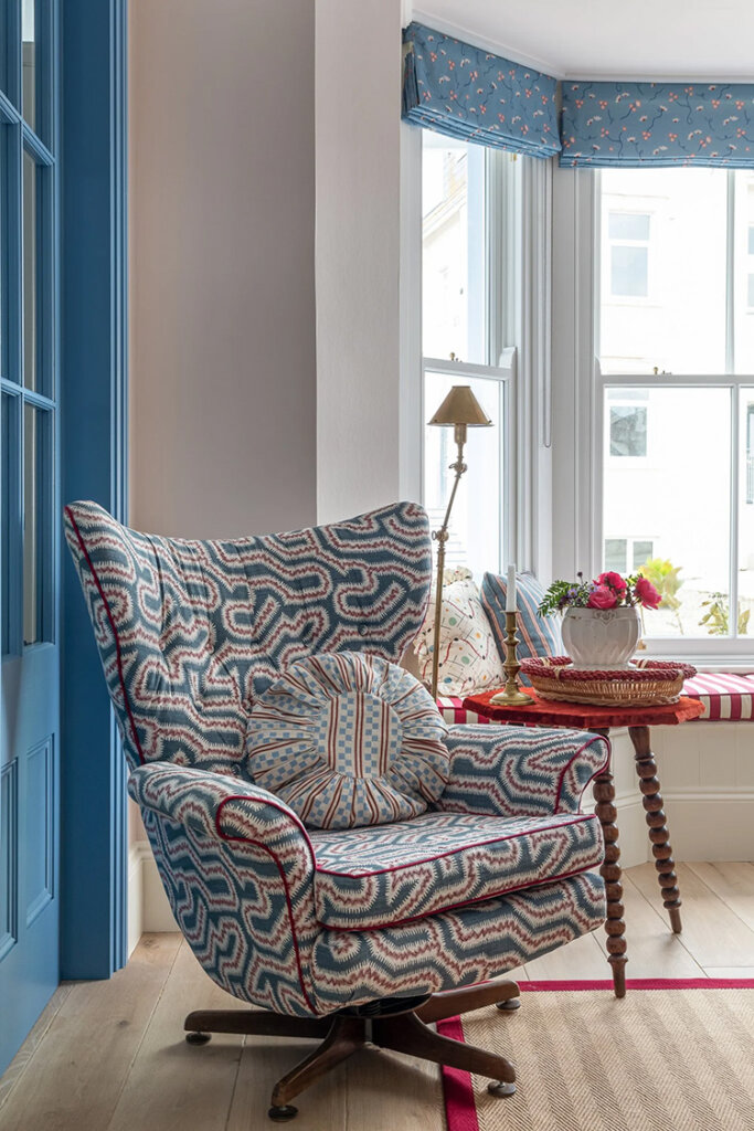
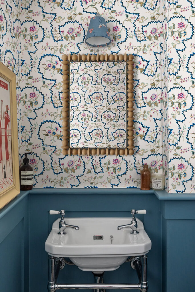
Posted on Tue, 12 Aug 2025 by KiM
When you have views of the gorgeous coast of Salcombe, Devon it seems logical to go with a seaside vibe in this Victorian family cottage. Lots of white, blue, red and yellow and some really fun stripes, which I am always a fan of, makes this home really inviting and playful and brings the outdoors in. Designer Sarah Southwell really hit the nail on the head here. Photos: Jonathan Bond.
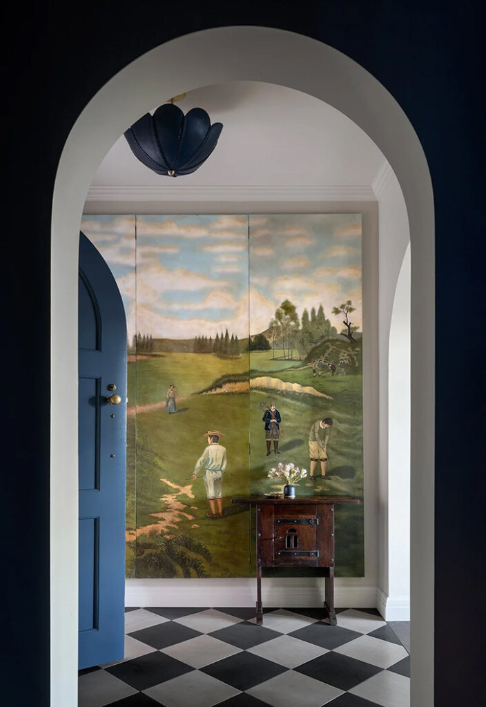
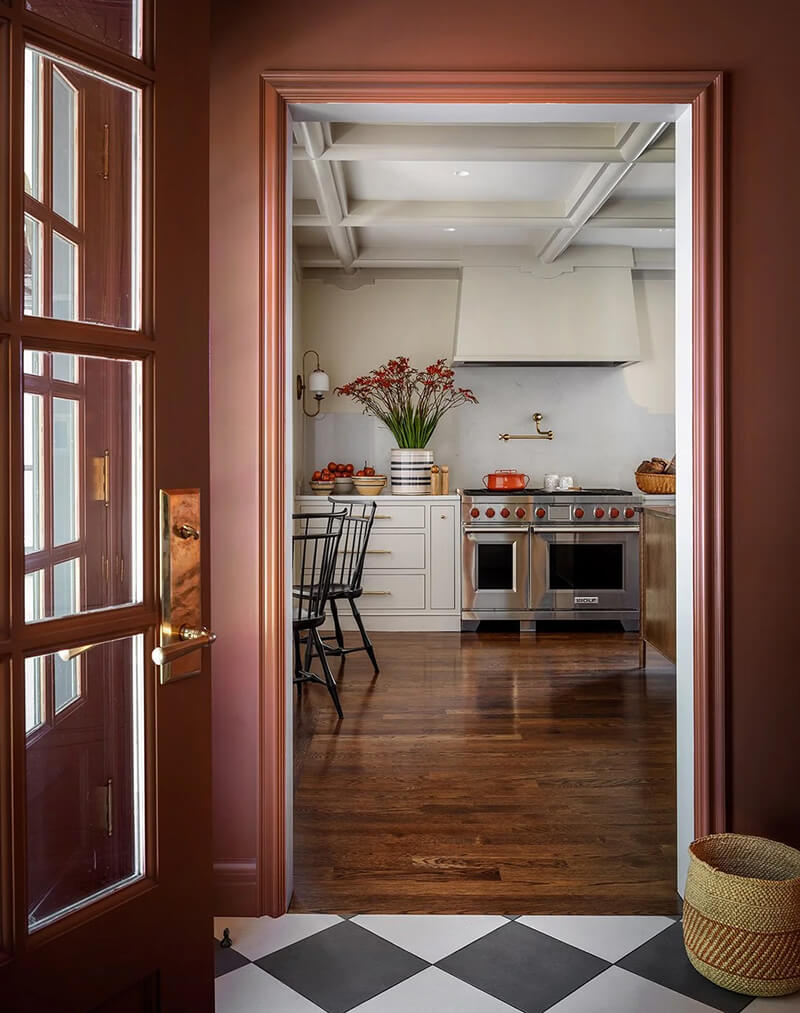
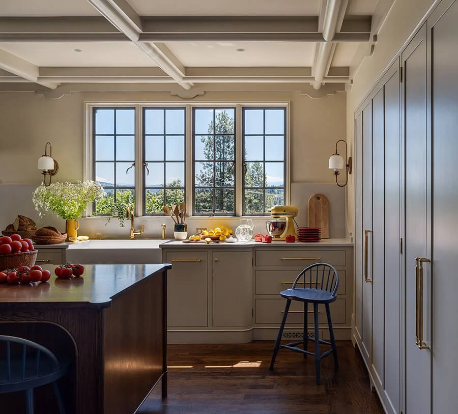
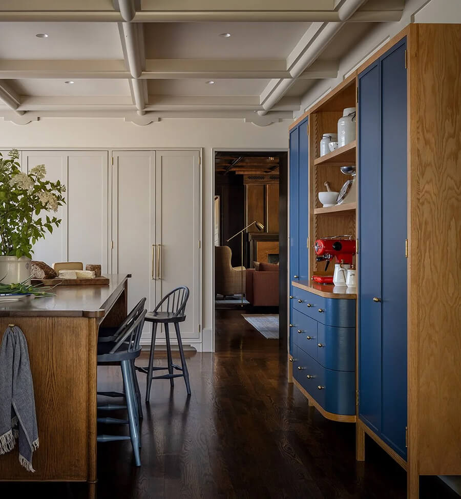
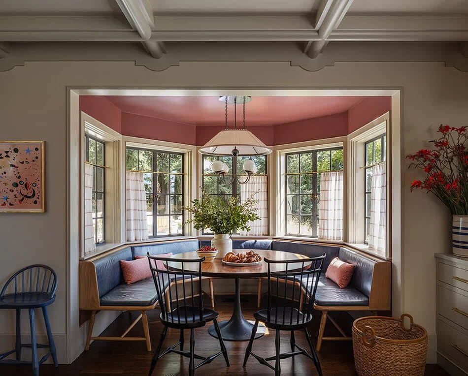
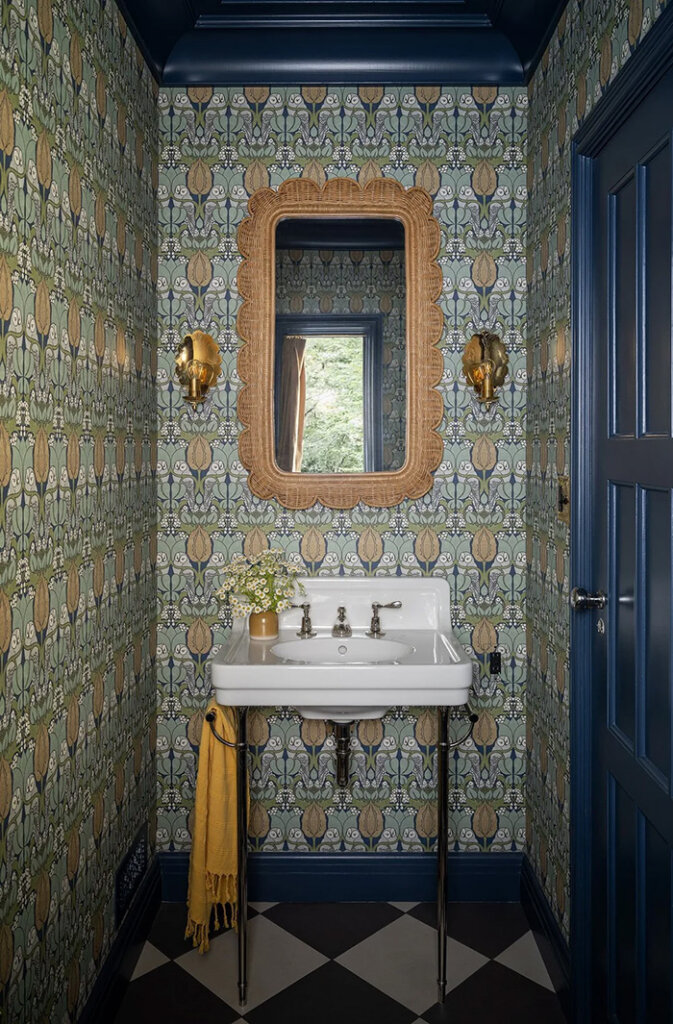
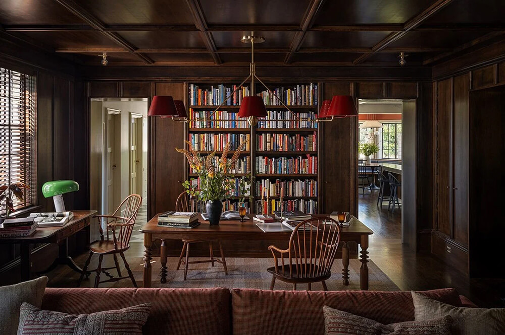
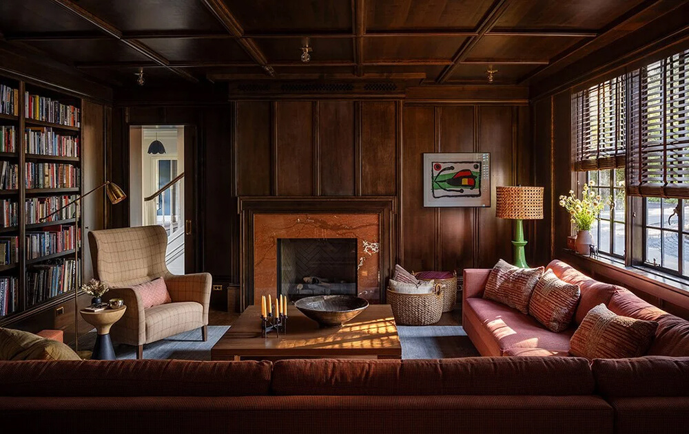
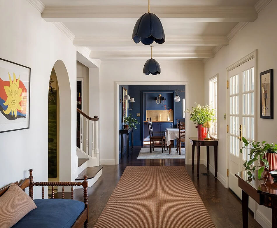
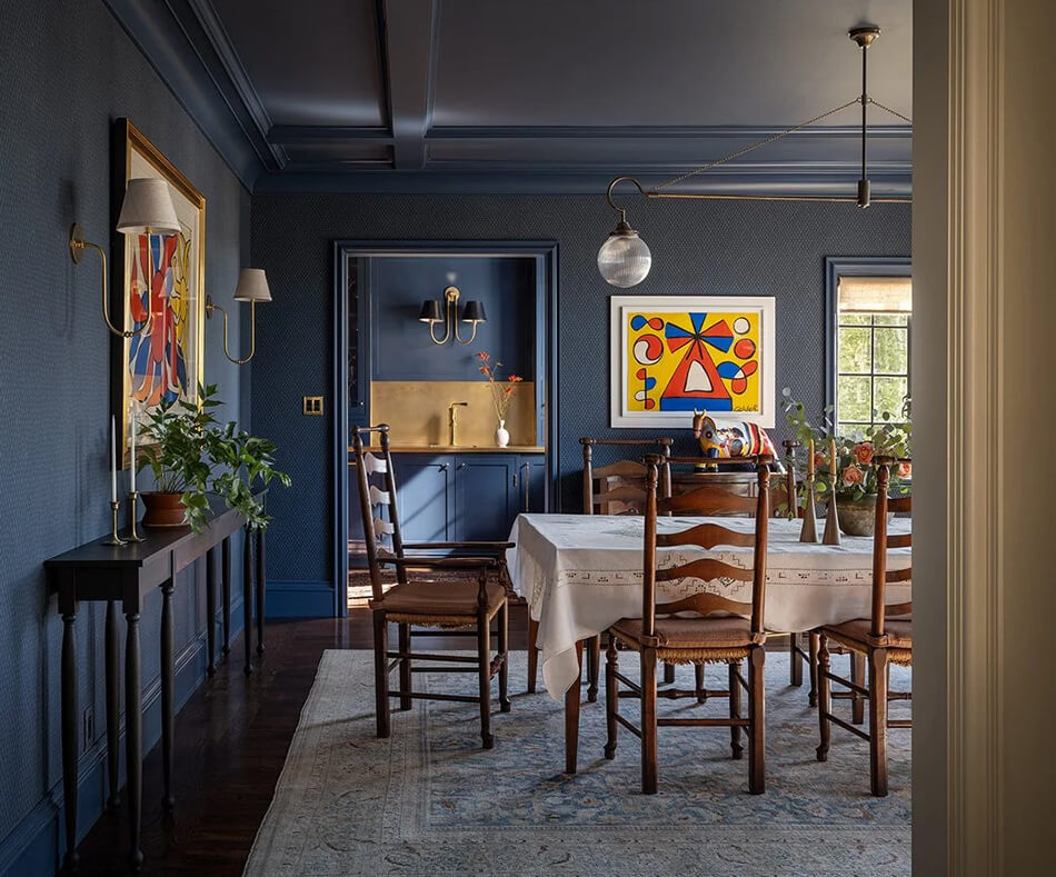
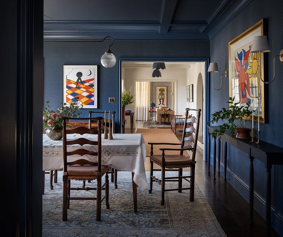
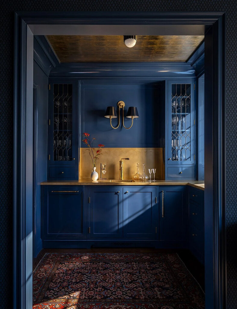
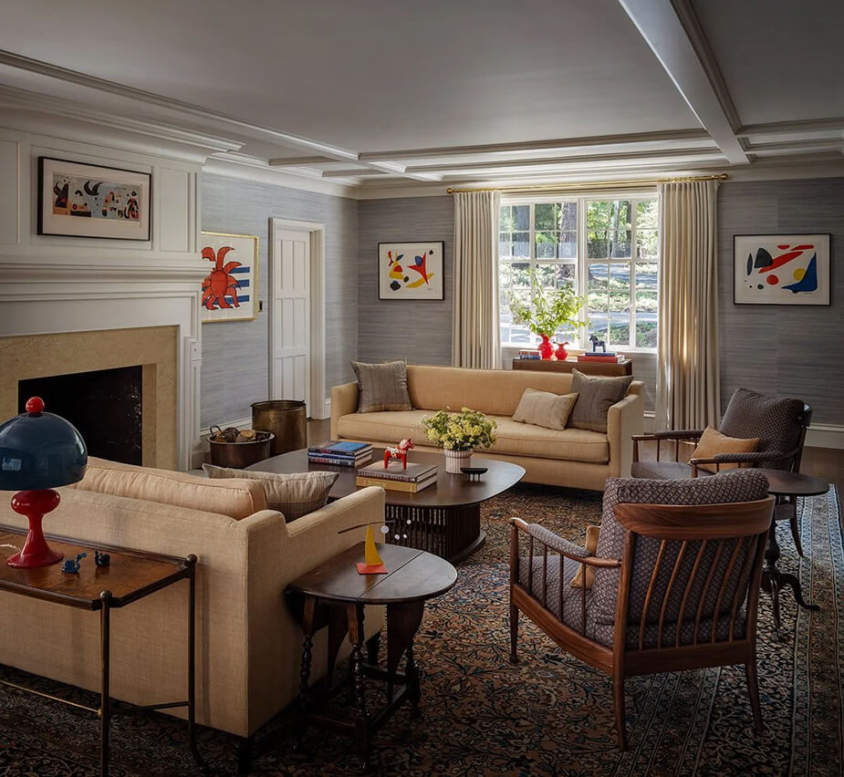
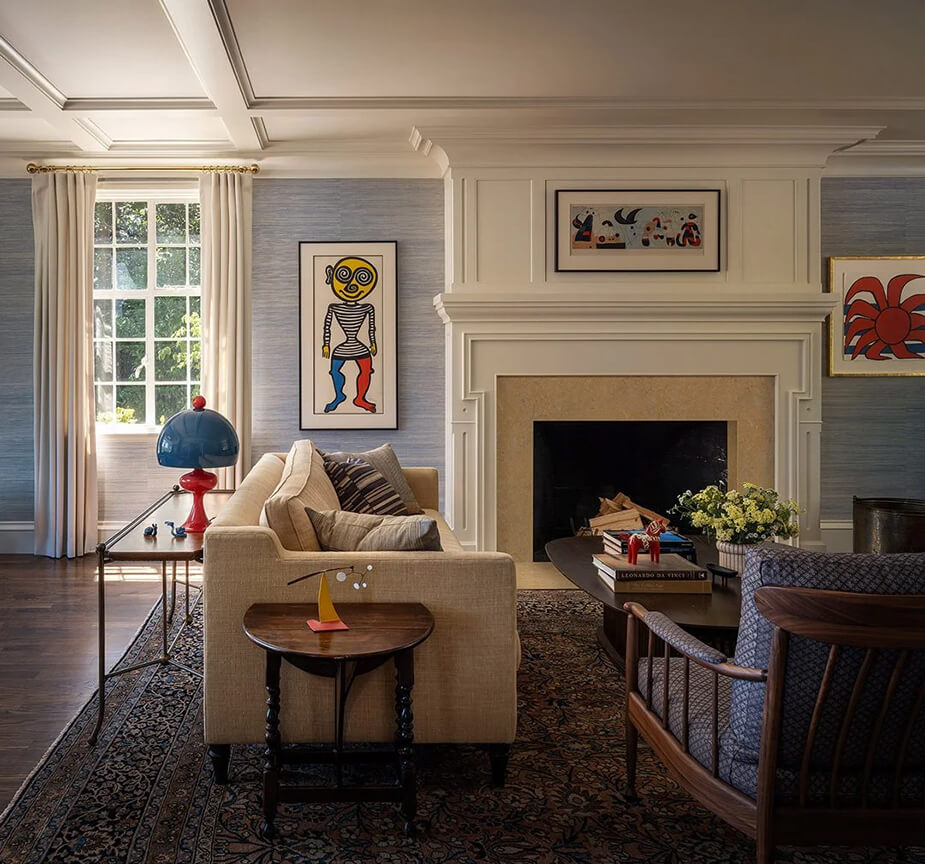
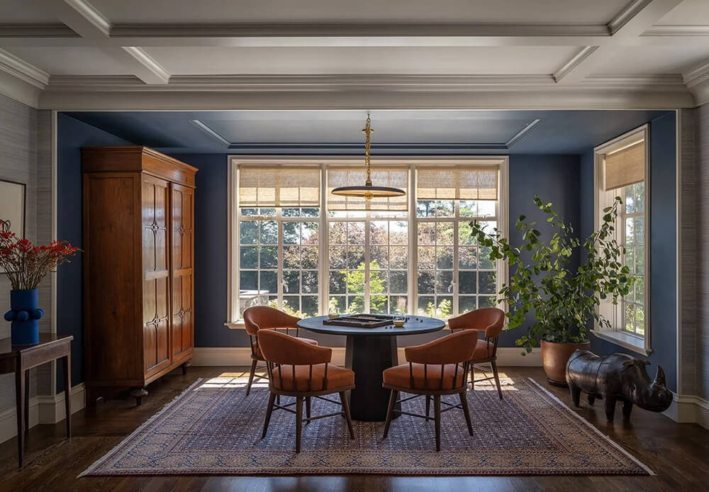
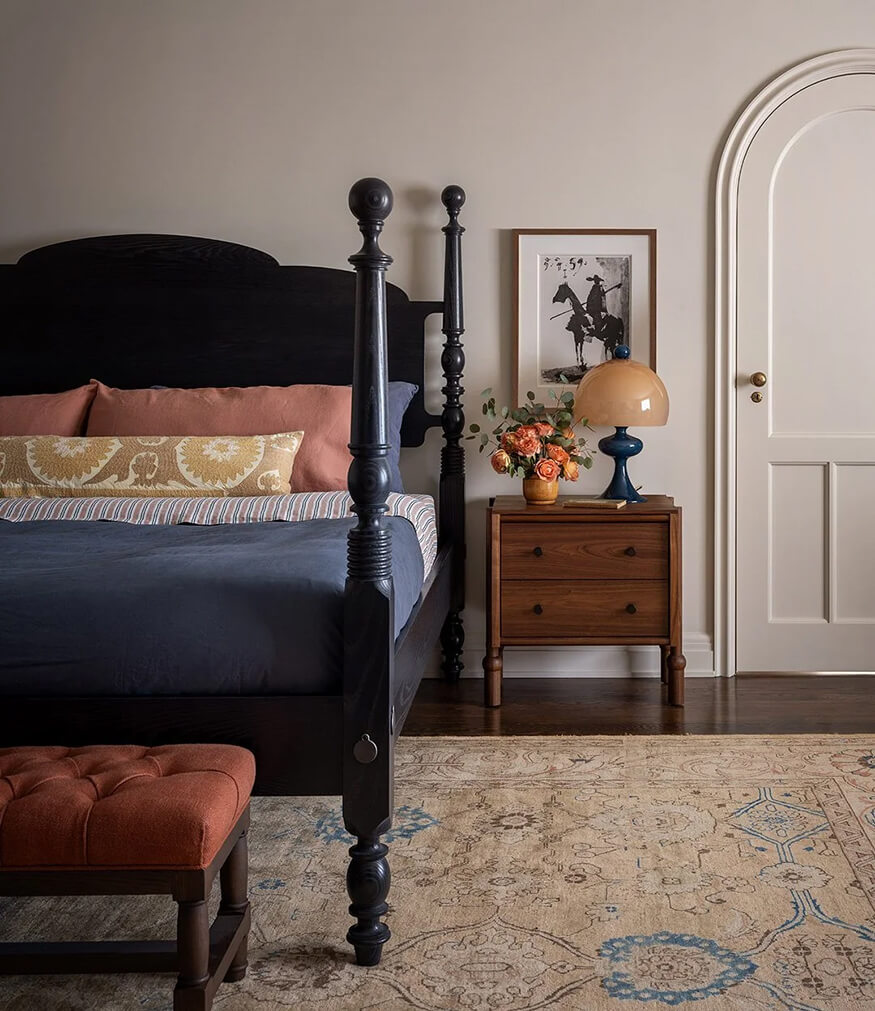
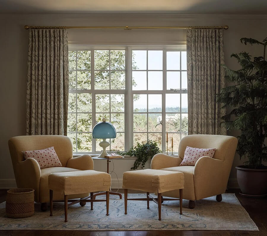
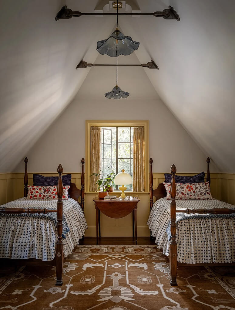
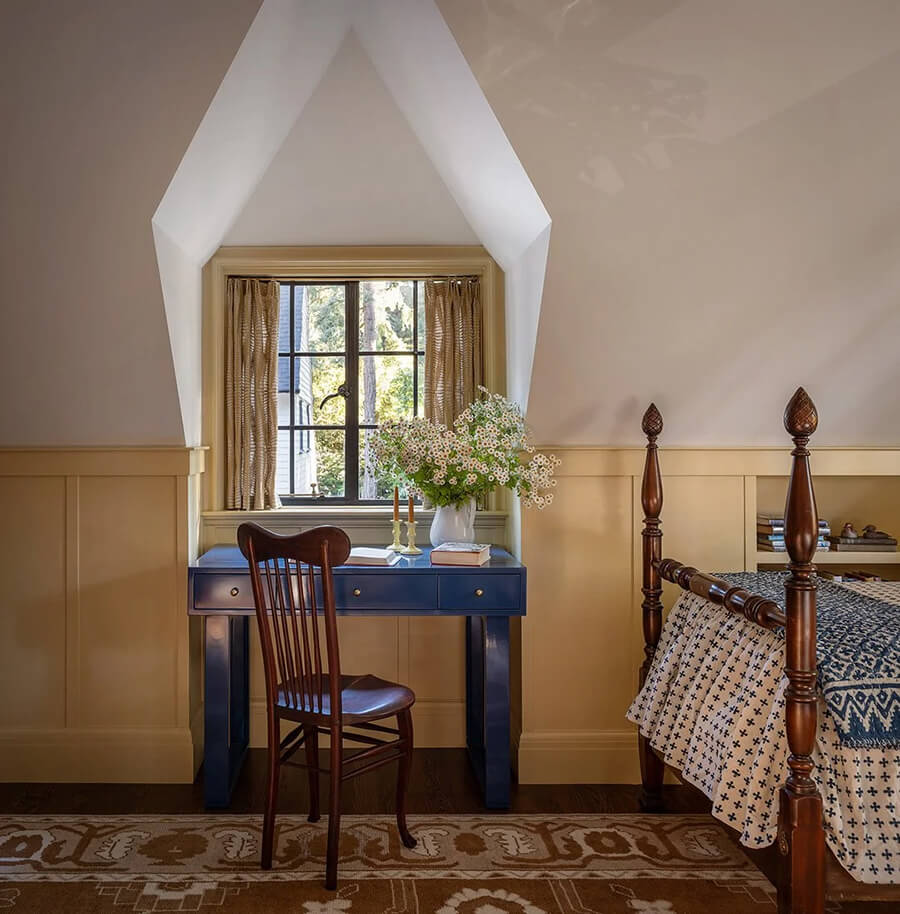
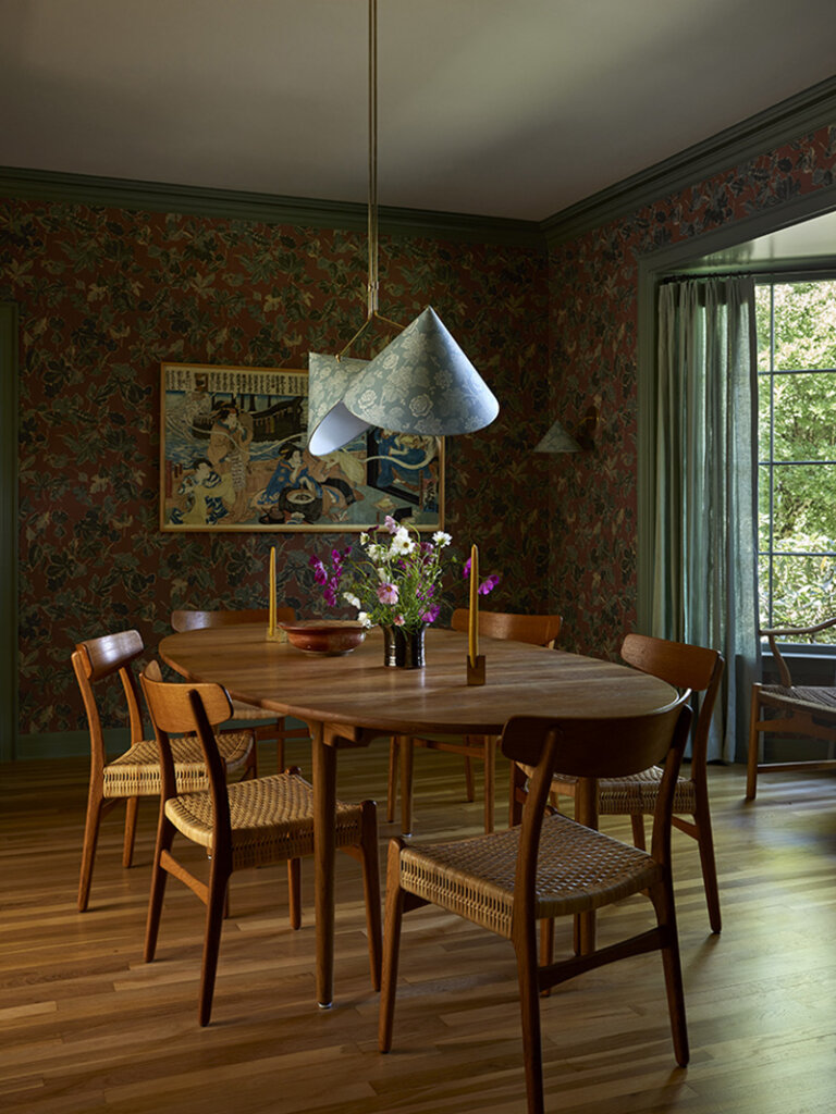
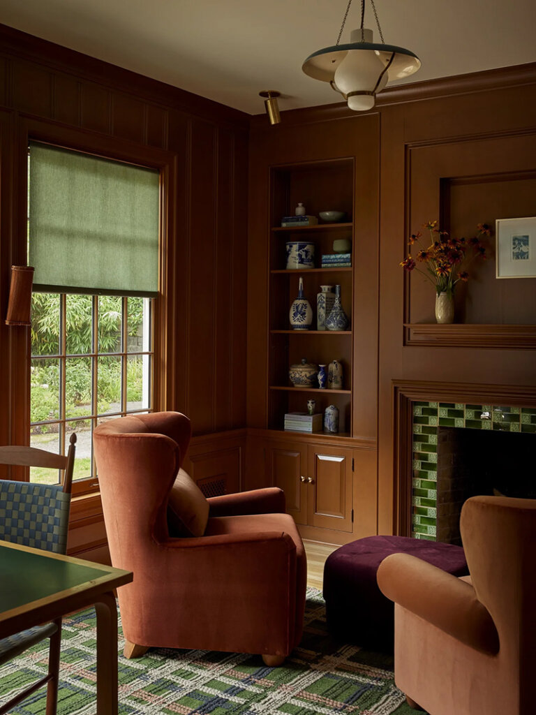
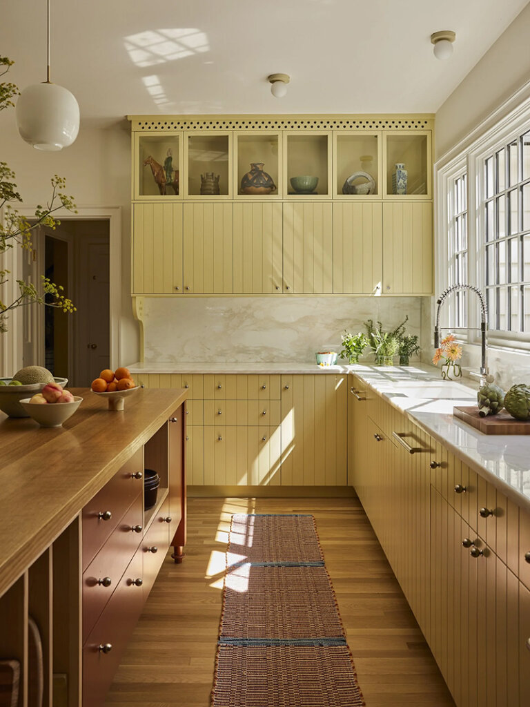
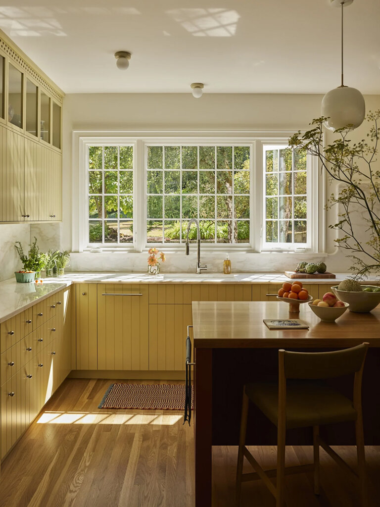
An early 1900s Arts and Crafts home with an impressive modern art collection
Posted on Wed, 6 Aug 2025 by KiM
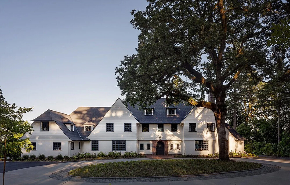
In addition to refurnishing the house, we also undertook an extensive renovation; adding a standalone three-car garage and converting the existing attached garage into a mudroom, a laundry room, a paneled-wood family room, and an expanded kitchen. Our clients, who had inherited an impressive art collection of primarily Calders, Miros, and Picassos, described their style as ‘East Coast preppy,’ and so we accepted the challenge of marrying that aesthetic with the bold, primary colors and forms of the iconic modern artworks. We developed an interior color and material palette in the reds, blues, yellows, blacks and whites of the art, but with each of those colors softened and muted. The result is a house that feels right for the art, right for the clients, and right for the house.
Jessica Helgerson does it again, creating some vintage magic in this beautiful home but somehow managing to work in this modern art collection and have everything make sense. I love how cohesive it all is by using those primary colours throughout (though in very manageable shades). Photos: Aaron Leitz.