Displaying posts labeled "Kim’s House"
New additions around my house
Posted on Thu, 23 Aug 2018 by KiM
It has been a while since I shared anything happening around my house but unfortunately there hasn’t been much going on because I LOVE SUMMER and there is no way I’m going to spend what little free time I have not lounging poolside. I have insisted that since my husband and I don’t take any vacations over the summer that we do something fun each weekend and lately that has been visiting some flea markets. As a result I have some photos of my finds from those jaunts and a few other purchases I have made lately (nothing major though as I also need to sell off some furniture to make room). I also received some new books that I wanted to share.
Let’s start with some of the new bits and bobs I have acquired. First, up is a photo of a spot in my living room where I now showcase some pieces from my main squeeze and the best collector of vintage fabulousness there is, Rhett Baruch.
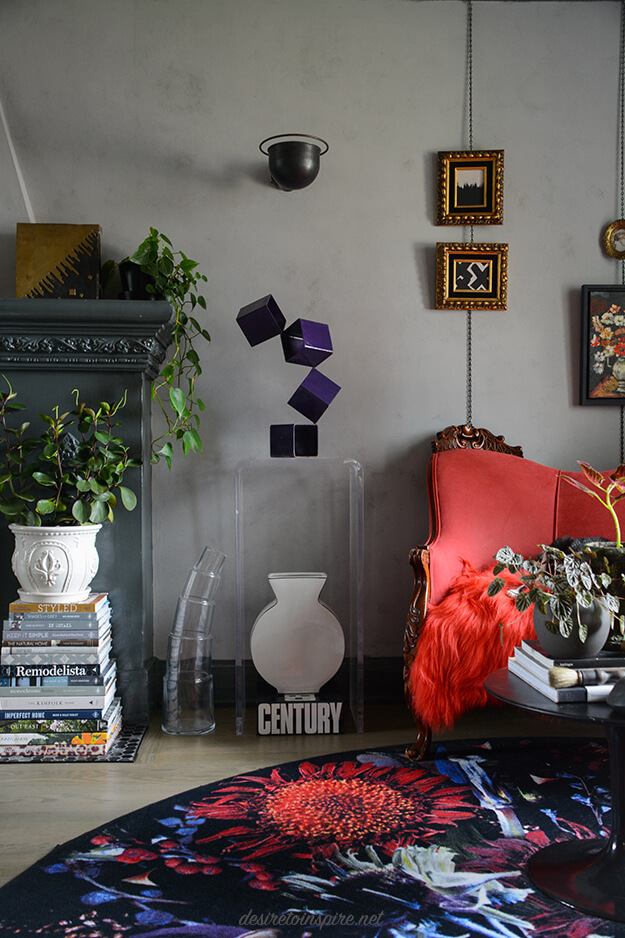
The purple steel cube sculpture and brass vase on the mantle are from Rhett. Now 2 of the coolest things I own. Also new is the curved glass vase on the floor I picked up last weekend at the McHaffie Flea Market. The perfect lead-in to a photo of all my scores from that trip:
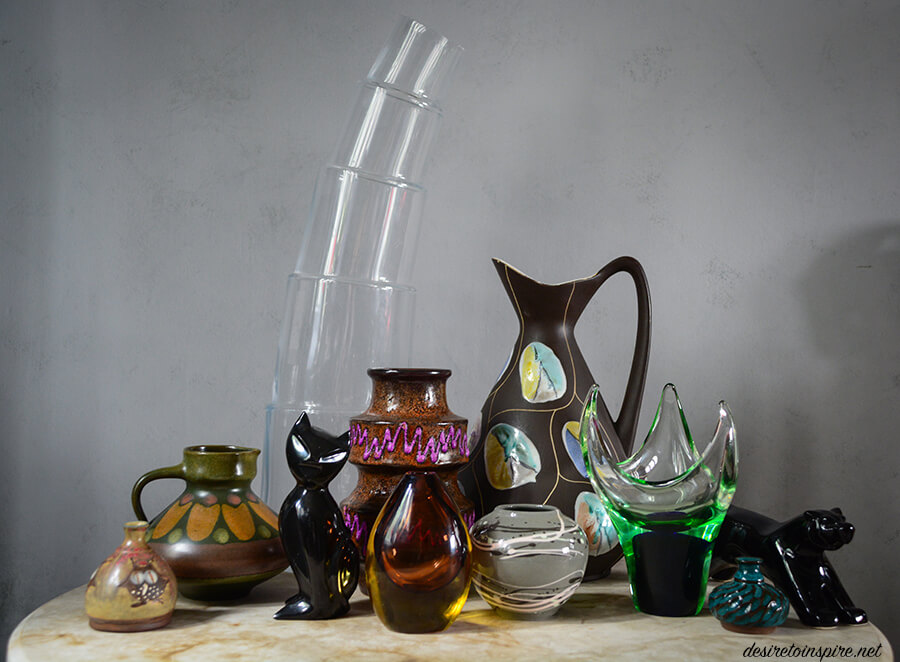
As much as I try, I can’t seem to quit collecting West German pottery so there are 3 new pieces of that, along with some glass, some studio pottery and a couple of animals to bring some of the wild in. 🙂 The glass and WGP is from Sherry and Gordon’s awesome booth Off the Wall Retro.
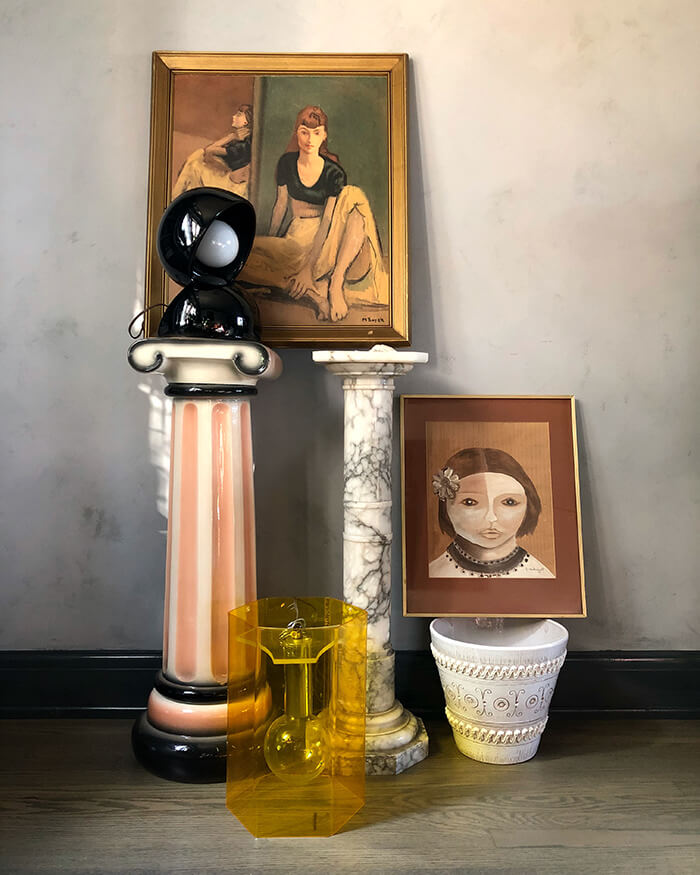
Another recent trip was to Montreal to check out the St-Michel flea market. I always score there but no furniture though which was a bummer. I did however come home with this:
I’ll show you where I put most of these. (The light is yet to be installed in my media room. I have a little painting project for in there too so I’ll share that once it’s completed).
That adorable little black glass lamp is lighting up my dining room sideboard. (Most of the items on there with it are from Vanier Moderns)
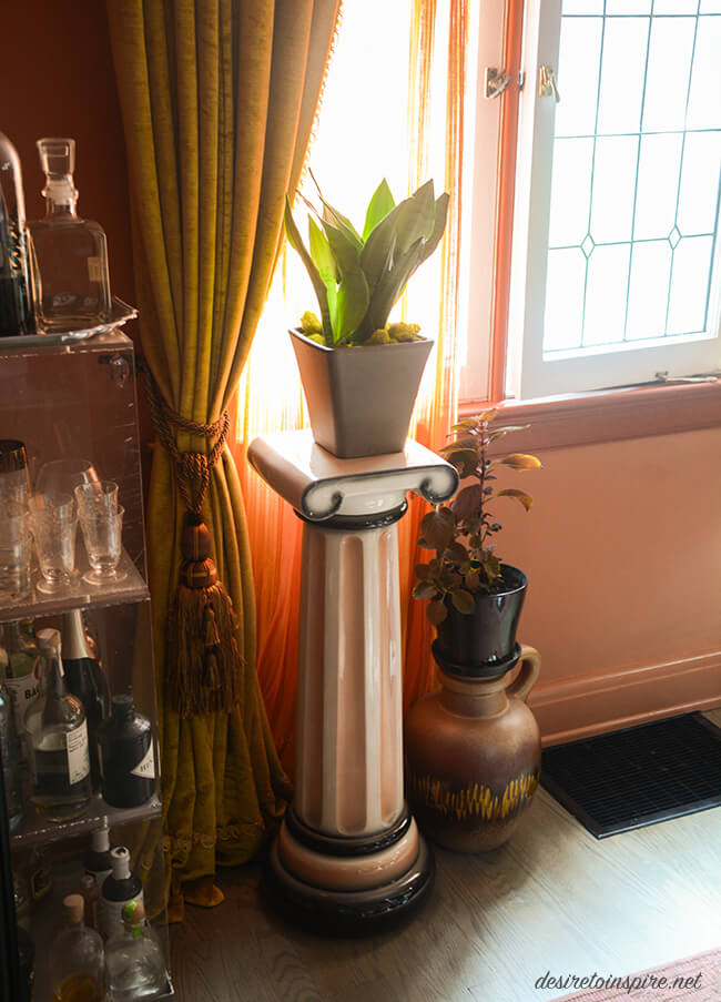
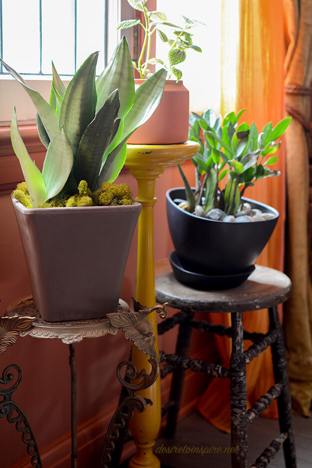
That 80’s funky pedestal is now a plant stand in my dining room.
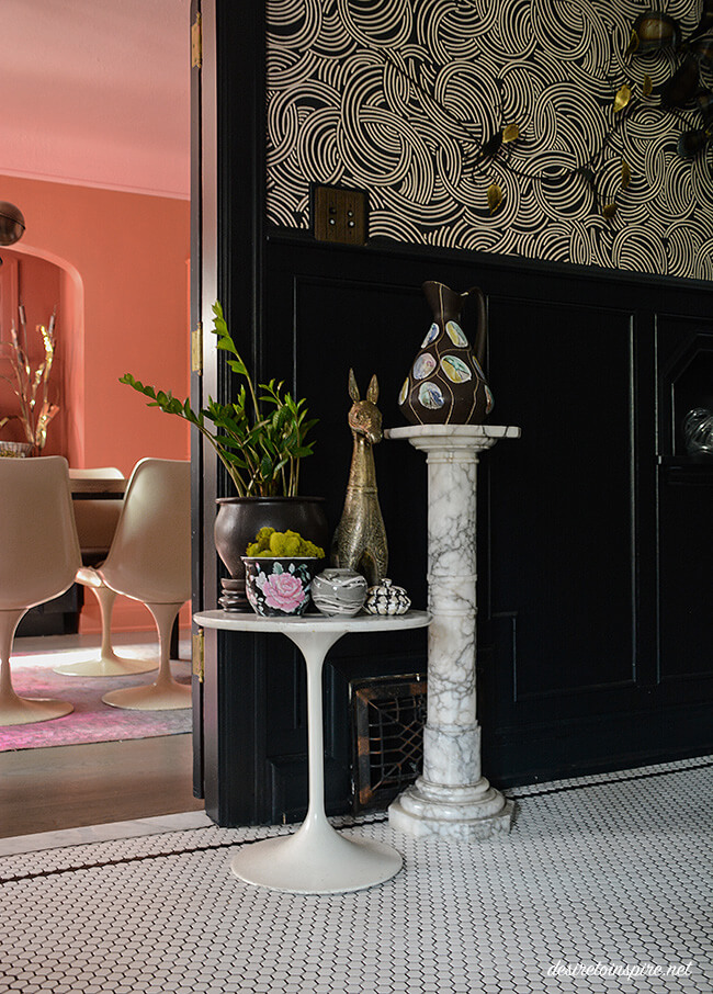
The solid marble (!!!) pedestal is in my foyer topped with my gorgeous new West German vase (with smaller vase on the tulip repro table, and a Chinese plant pot I found at Value Village for $3.99).
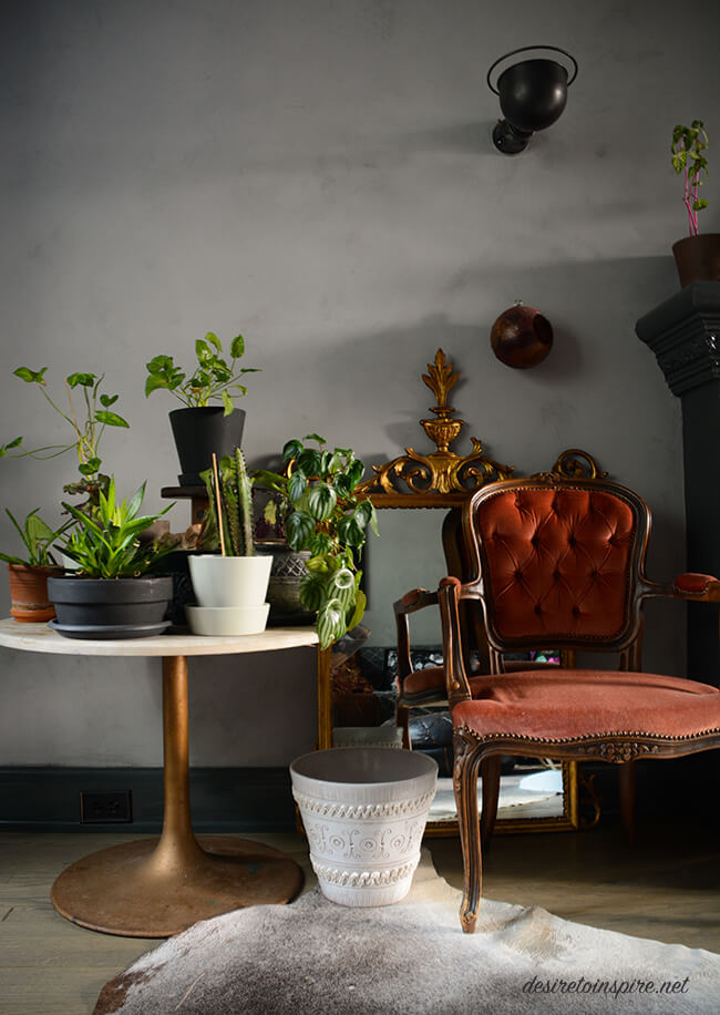
Not sure what to do with this pretty white pot so I stuck it by my plant table so the next time I buy a big plant I’ll remember to plant it in that. 🙂
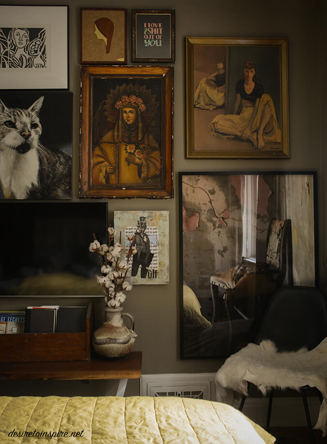
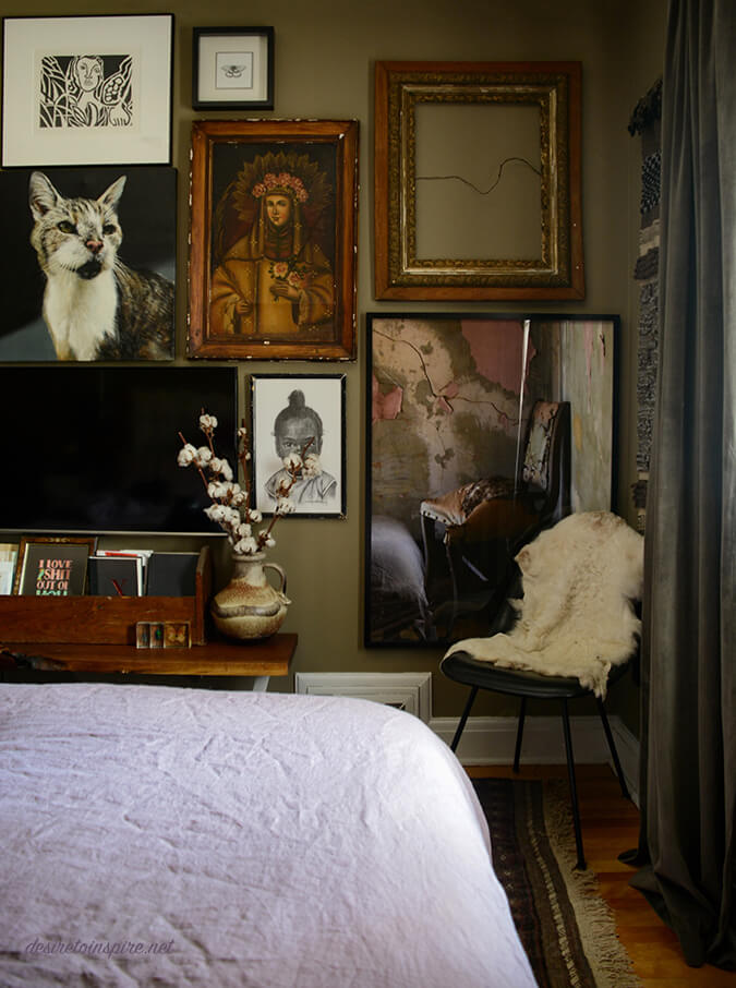
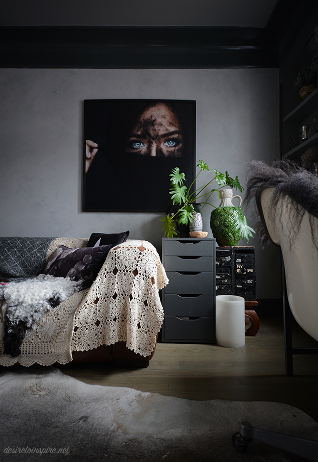
Two new pieces of art fit perfectly on my neutral toned gallery wall in the bedroom. Top right is the one I picked up in Montreal and the woman’s head up at the top is brass and wood on burlap – LOVE – from Off the Wall Retro.
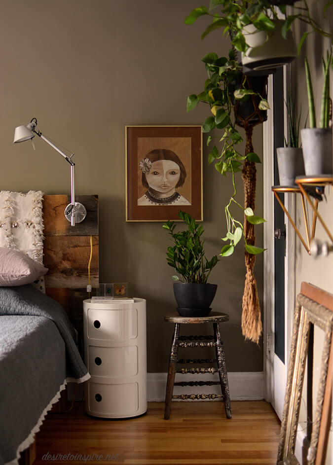
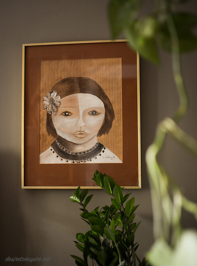
I almost didn’t buy her but someone left a DM on my Instagram story about her and I realized what an idiot I was so I ran back and snapped her up. (She’s an original so they priced her at a whopping $30). I hung her on this wall so I can see her every time I walk down the hall to the main bathroom.
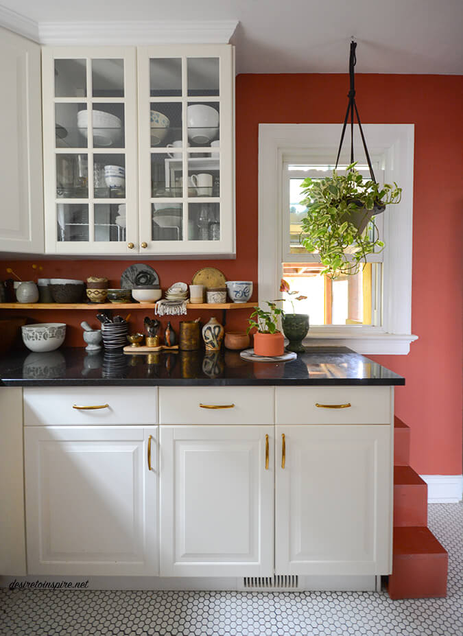
Oh – and I repainted my kitchen! (In case you missed this in one of my pets on furniture series) It was a dark blue before and I frankly am not a big fan of blue. I used up some of the leftover paint from my dining room makeover – Farrow & Ball’s Picture Gallery Red. Get this – I hate red more than blue! This red though is out of this world. I absolutely adore it. Such a warm and cozy colour. Now I just need to get some new cabinets and a decent stove and I’m all set! 😉
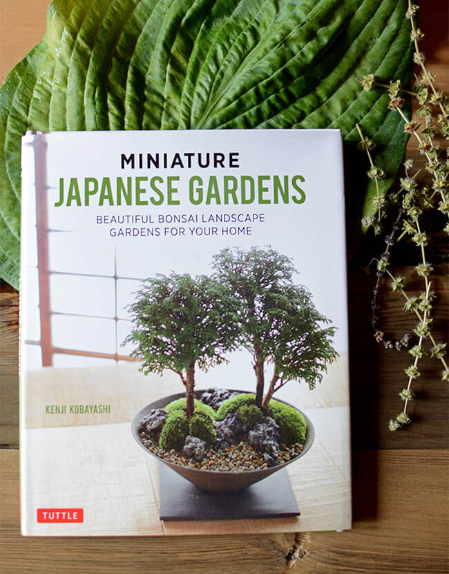
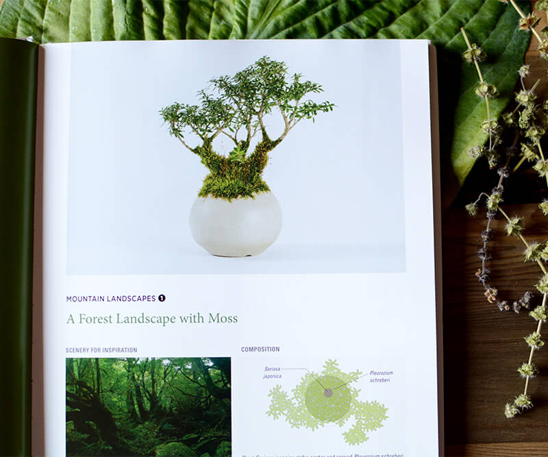
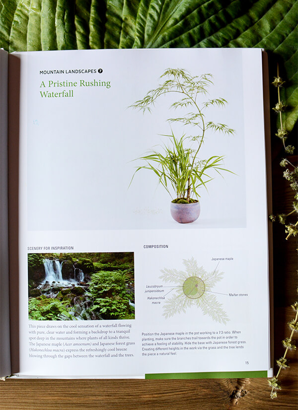
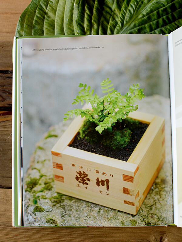
Ok now on to the new books. Tuttle Publishing sells the cutest little books about gardening that I absolutely love. These 2 make wonderful additions to my growing collection. The first is Miniature Japanese Gardens that shows you how to create simple Japanese-style container gardens using inexpensive plants and materials that are available everywhere. Diagrams demonstrate how to organize the plants, and step-by-step instructions on how to build and care for your mini gardens. (By Kenji Kobayashi)
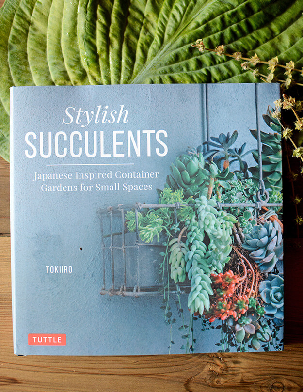
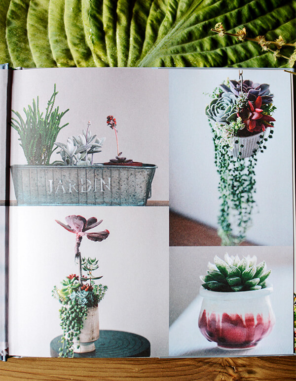
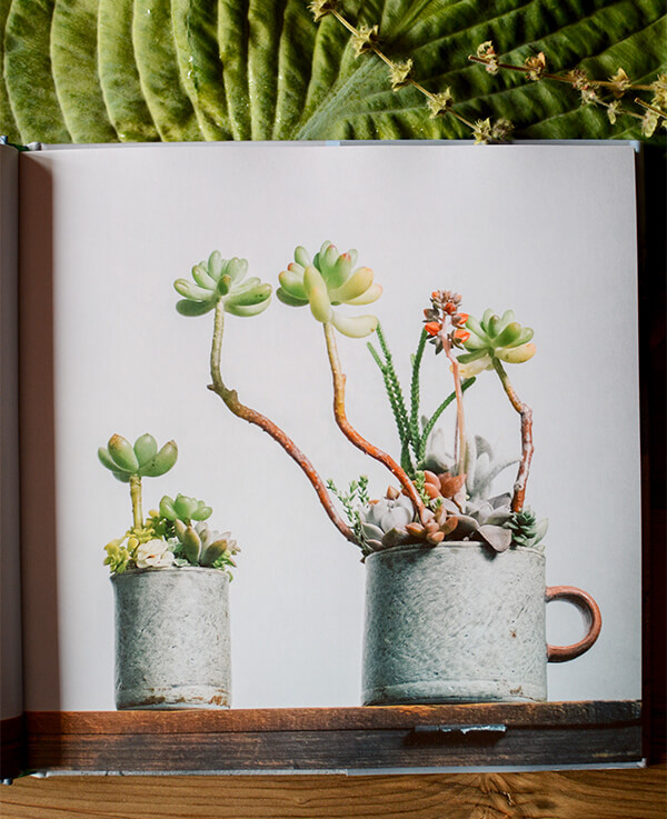
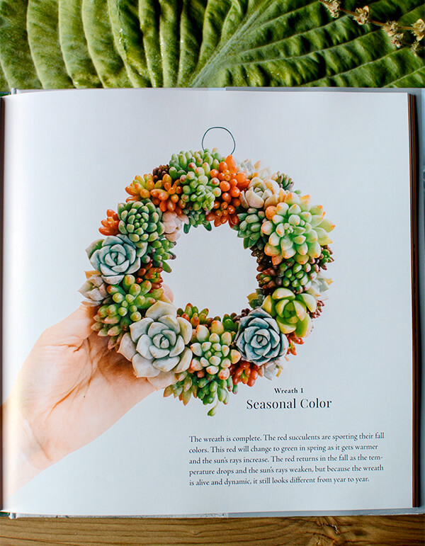
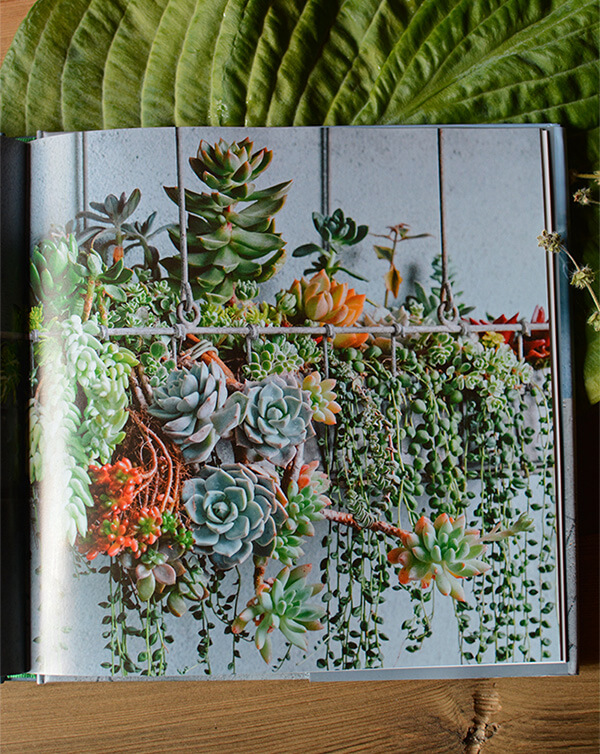
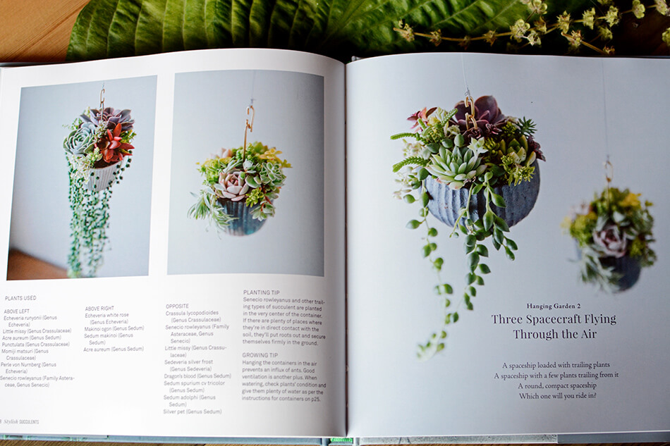
They also sent over the book Stylish Succulents. I adore succulents so I was stoked to add this to my pile of gardening books. This one could have been called “planting for dummies” because it describes each step of making some of the most beautiful succulent arrangements I have ever seen. It even shows you how to make a succulent wreath! So freaking cool!!! This one is by garden and green interior designers Yoshinobu and Tomomi Kondo, collectively known as TOKIIRO.
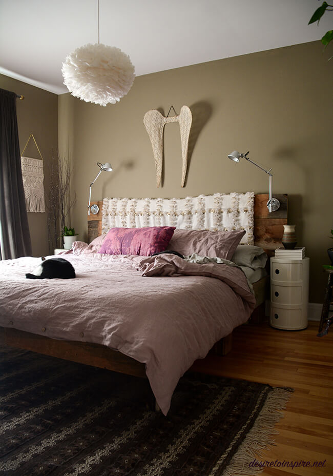
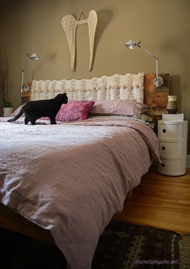
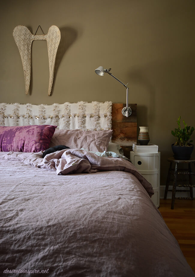
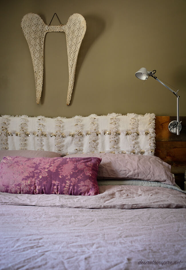
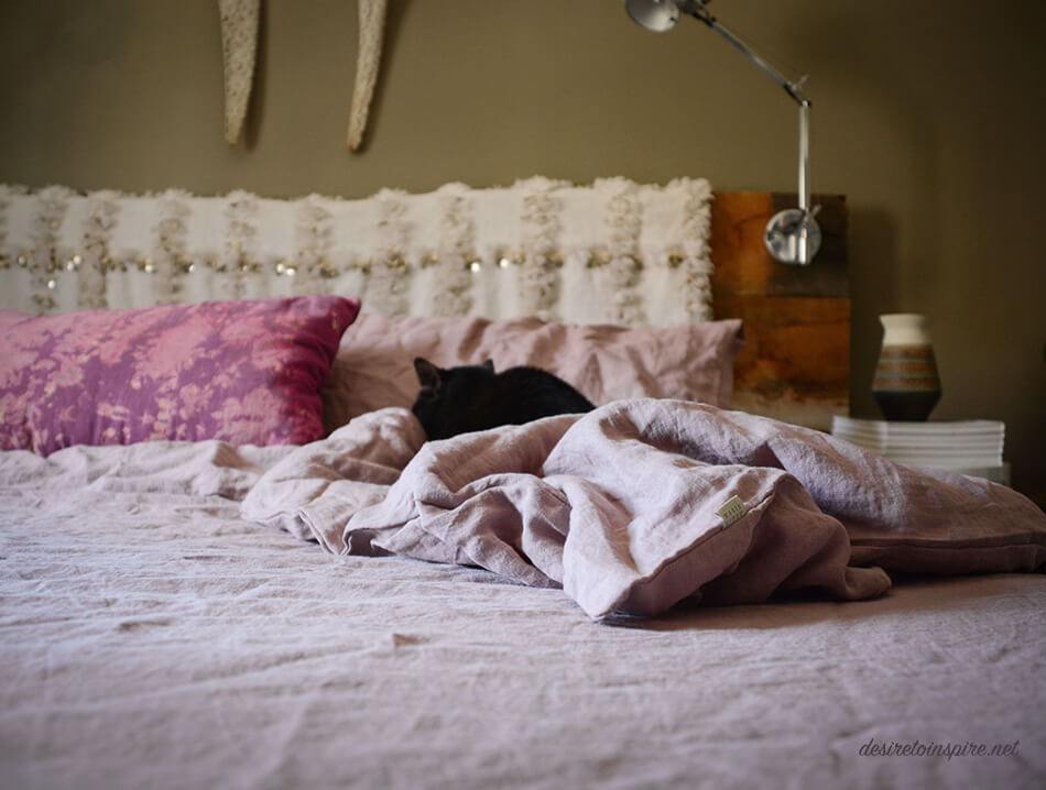
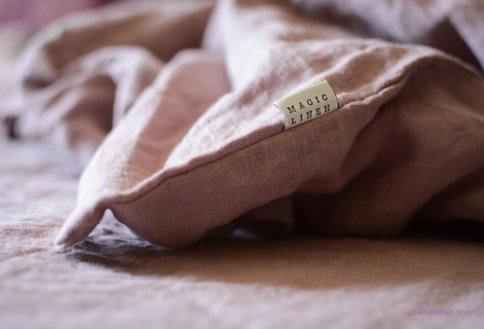
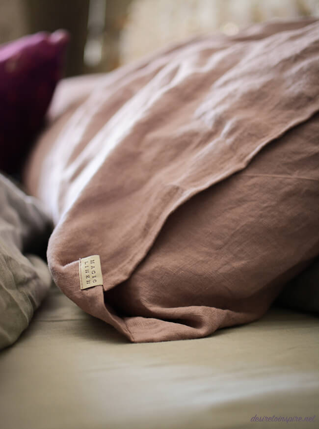
My new linen bedding
Posted on Fri, 11 May 2018 by KiM
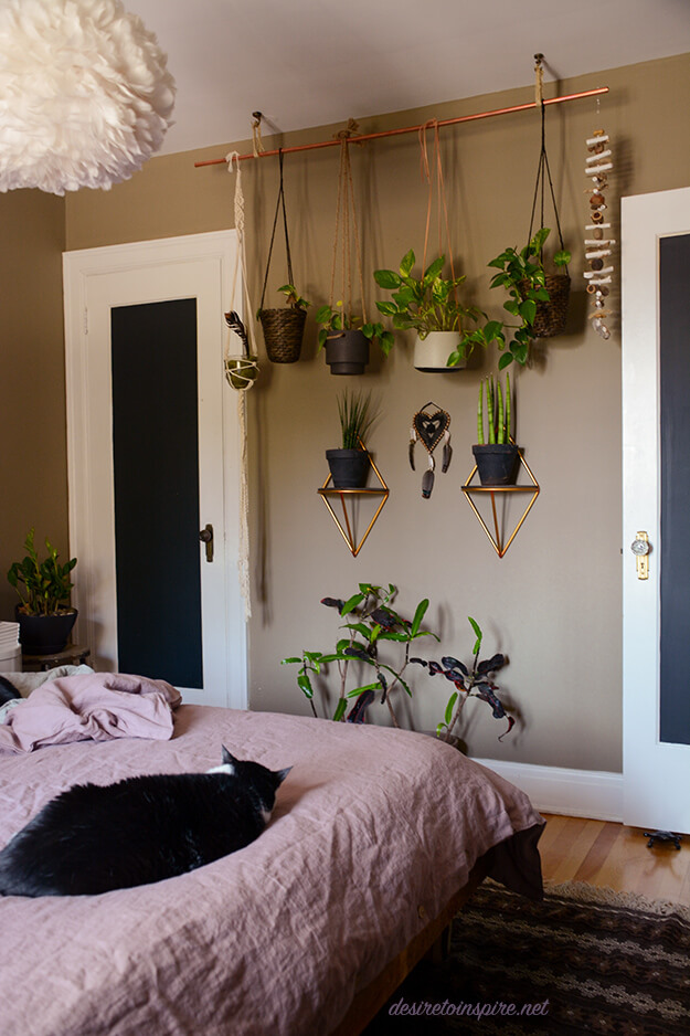
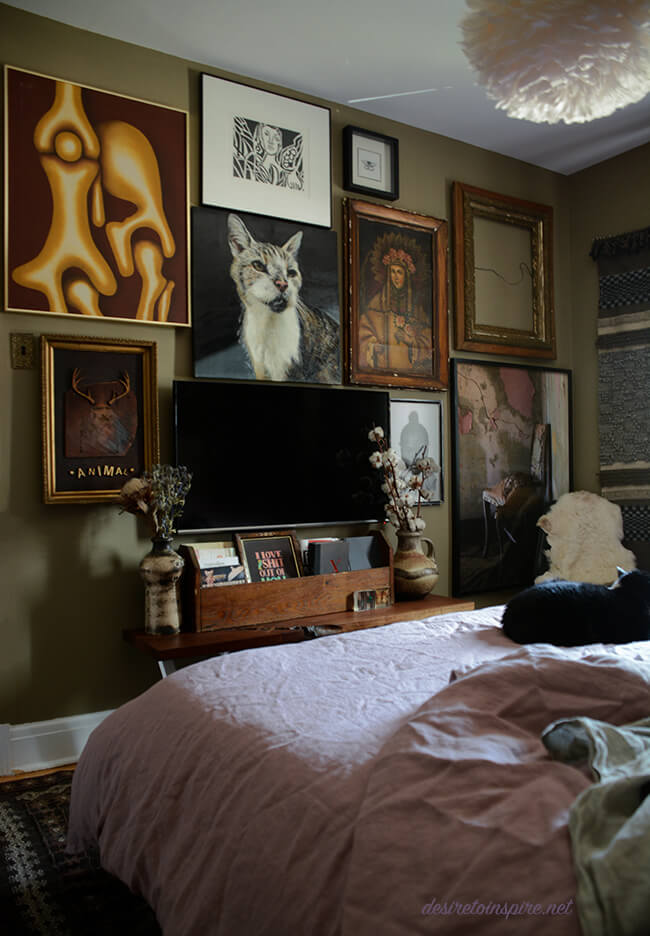
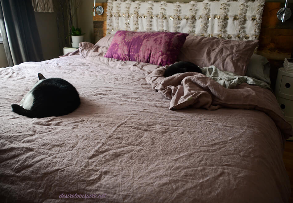
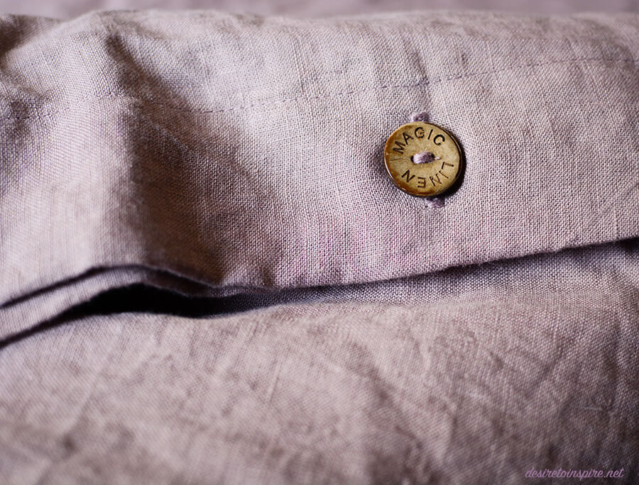
The lovely folks at Magic Linen must have sensed that my duvet cover was driving me insane (who doesn’t put a closure on their duvet cover?!) and that I absolutely adore linen. They are based in Lithuania and kindly let me choose a duvet cover and pillow cases for my bedroom. When they arrived I squealed in delight. I chose the woodrose colour and it is the perfect shade of dusty rose (and to note that they have every size duvet imaginable). I was a bit nervous about how it would look with my very strange wall colour (Farrow & Ball’s Mouse’s Back) but I was thankful that it they are both fairly “earthy” so they seem to jive together. And lawd half mursey their linen is TO DIE FOR. This might just be my favourite linen out there. It has a fairly thick weave, and is incredibly soft thanks to their stone-washing technique. I had to wait a few days before putting it on the bed because I didn’t have time to take photos when they arrived and of course cat fur is abundant in my bedroom so once I was finally able to it turned out I wasn’t the only one in love with the new linens. Mimin and Lucky wasted no time getting into my shots and a few minutes later, passing out. A huge thank you Magic Linen for adding some luxury to my bedroom. (Also on that note: their price point for this quality cannot be beat). I added a couple of photos at the end of my gallery wall opposite the bed that I recently rearranged.
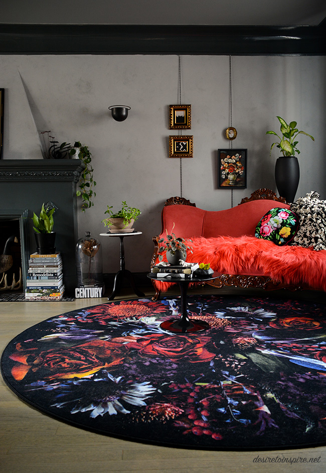
A lighter transformation of my living room
Posted on Thu, 19 Apr 2018 by KiM
I was at it again a few weekends ago, going to town on my living room walls. As much as I love some dark paint, having a dark grey living room after about 3 years was getting to me. The cave-like effect had lost its initial appeal. Here is what it looked like before the transformation:
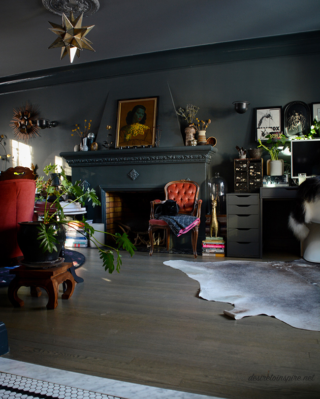
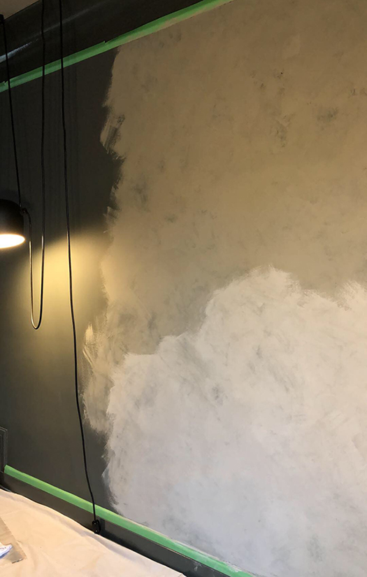
That was Downpipe by Farrow and Ball – high gloss on the trim and fireplace and estate emulsion on the walls (and Plummett on the ceiling) . Luckily I didn’t need to change anything but the walls (gawd I hate painting trim – and it’s high gloss so I may be stuck with it forever!). I am not a faux-finish gal but I have always loved the plaster walls the talented duo behind Jersey Ice Cream Co. always use in their projects. So I thought I would give it a go. Due to my busy schedule and general laziness when it comes to painting projects, I came up with a plan. I went to Home Depot and bought a couple of cans of Rustoleum’s Chalked paint – a medium grey (Country Grey) and a concrete coloured grey (Aged Grey). Then I bought many packs of cheesecloth, at Jo’s suggestion. I did a rough, thin coat of the medium grey over my dark grey walls, letting a bit of the dark grey show through. Oh – chalk paint dries almost instantly so I added a bit of water to it. Then I brushed on the lighter grey in small sections and immediately started dabbing with the cheesecloth. And voilà! It looks like concrete/plaster!
Here is a quick snap I took on my phone during the process:
And here is how it looks now! (I know some people may think the dark was better but trust me, a room with larger windows that let in more light would have been much easier to live with)
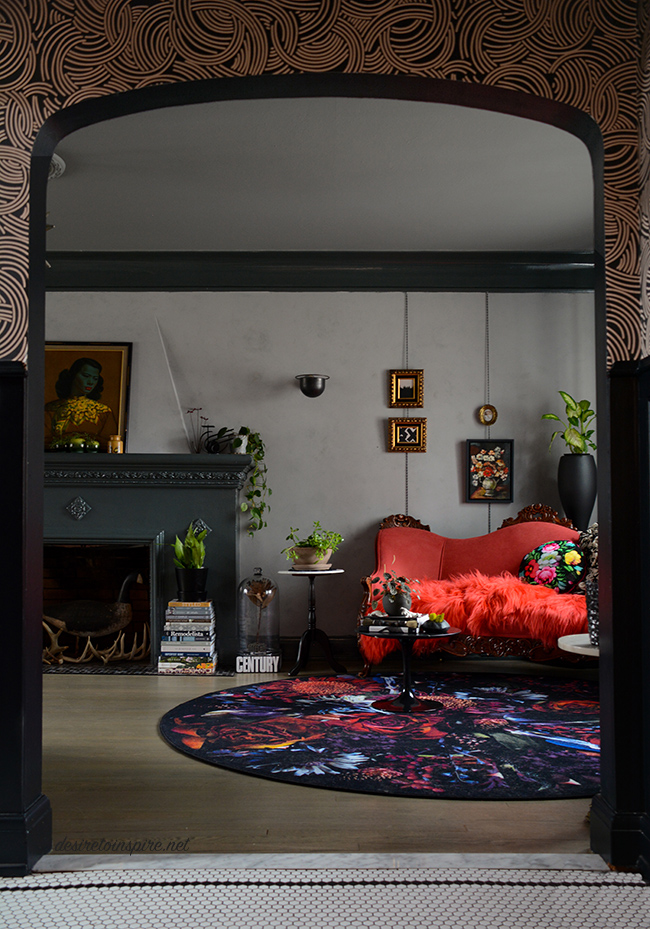
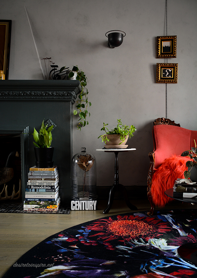
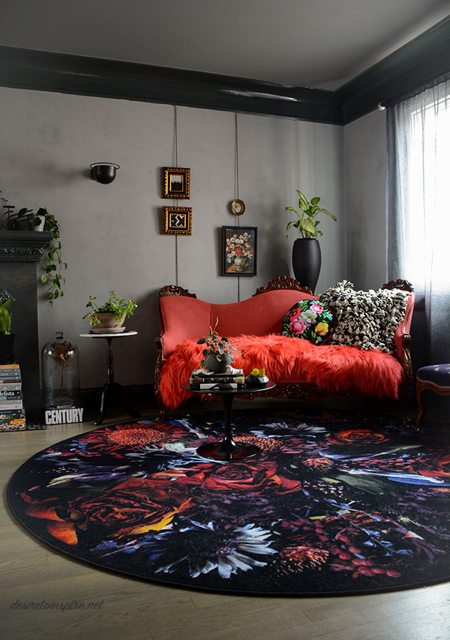
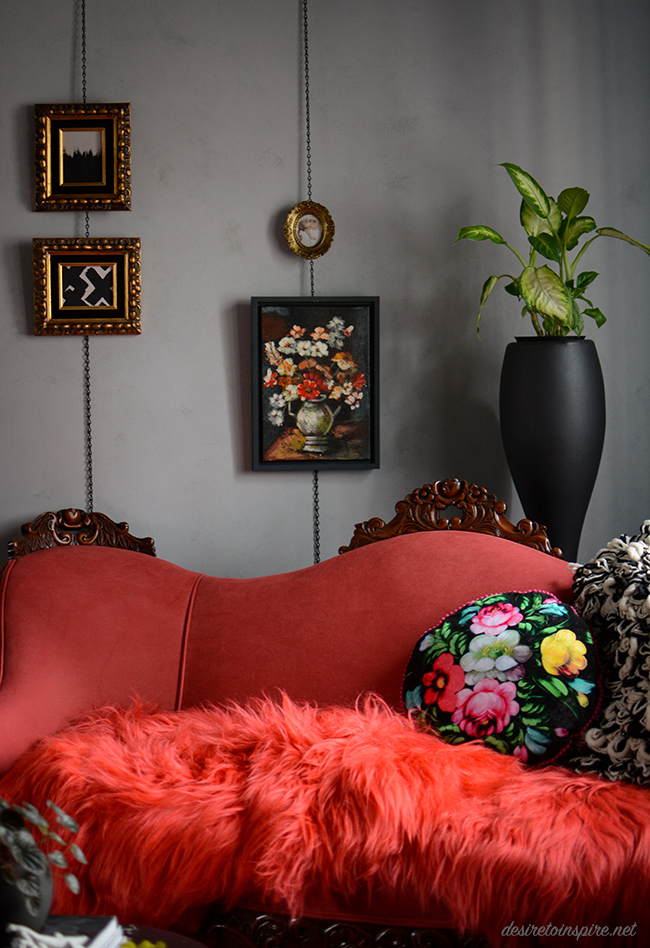
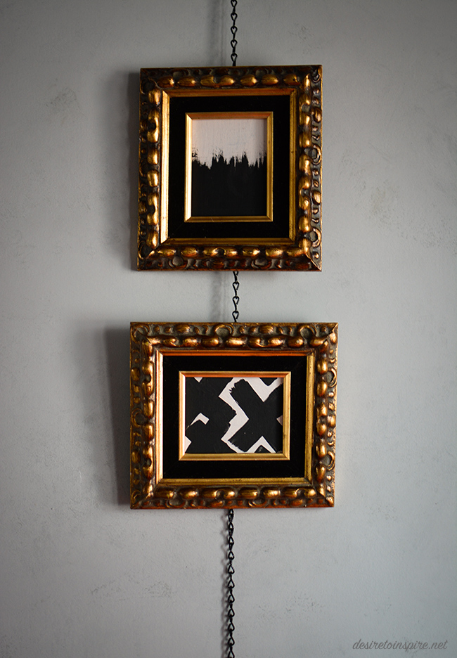
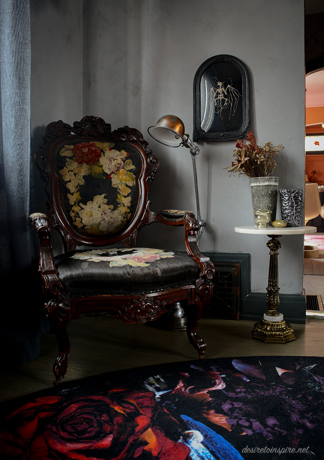
I was inspired by a photo I saw recently while doing blog research and found this simple solution for hanging art in a not-so-average way. I bought some small black chain at Canadian Tire which I attached by little eye hooks into the bottom of the molding left it hang down (I might hook it into the baseboards to straighten it out a bit). Those beautiful frames I found at Highjinx. They had awful still life paintings in them so I painted over them with some leftover paint I had stashed away.
(I really want to sell the awesome leather sofa under those tablecloths and get a new one more suitable for this space. Maybe this? Or this?)
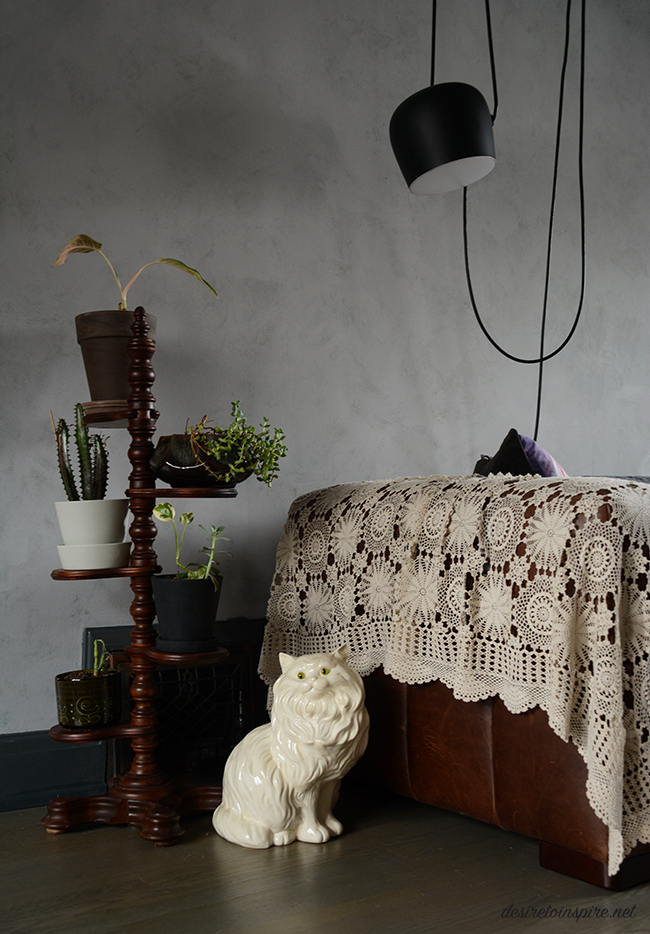
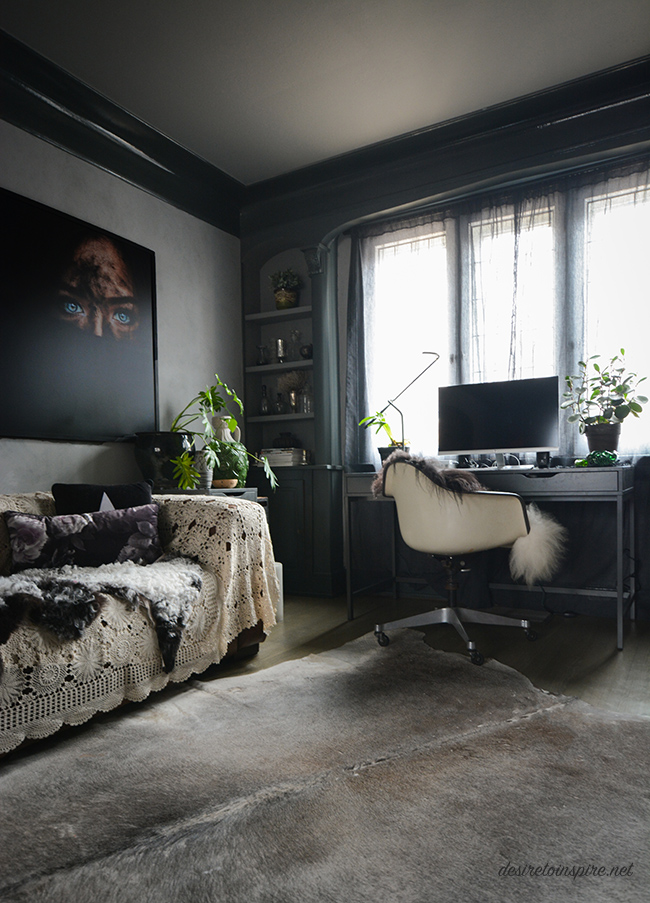
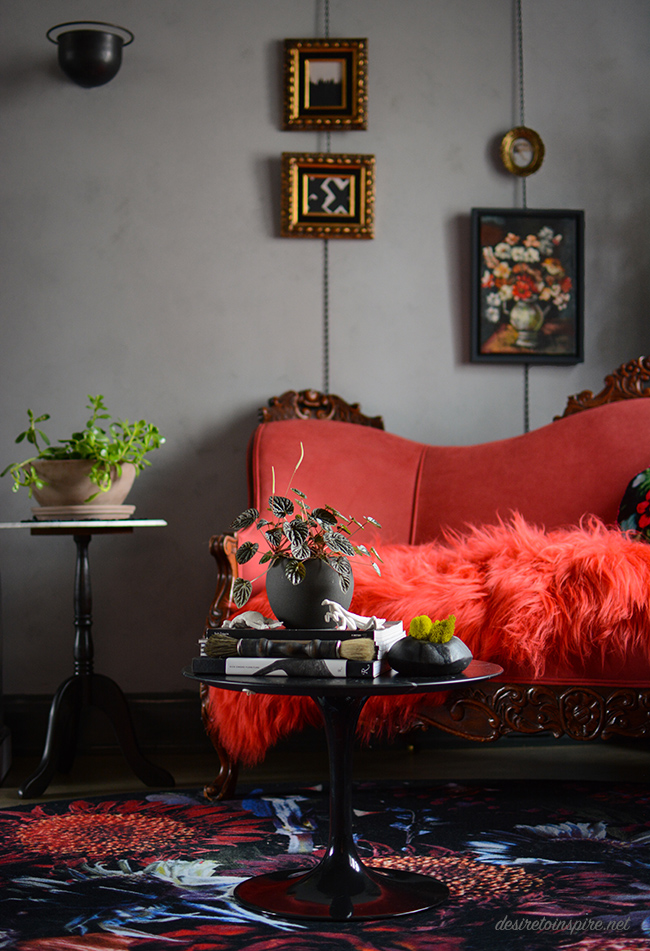
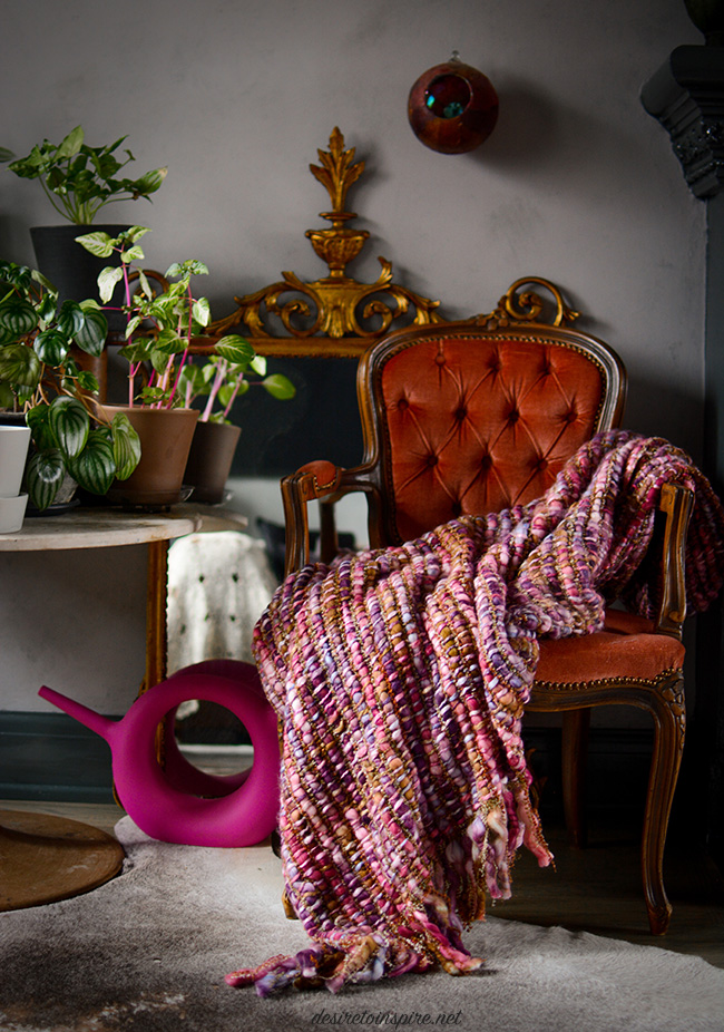
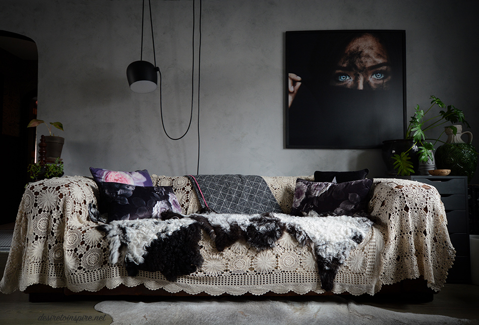
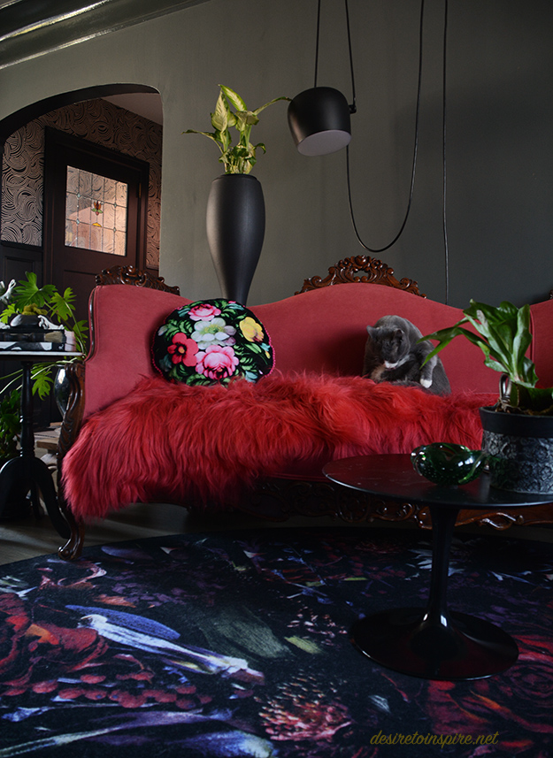
Sources: raspberry vintage sofa + brass base side table + pink tufted chair – The Pale Blue Dot; Moooi carpet by Marcel Wanders – The Modern Shop; sheepskins – Cowboy Kate Outpost; Knoll tulip table + black tall plant stand + blanket over back of sofa – Alteriors; floral pillow on raspberry sofa – Wild Rice Designs; knitted pillow – Hana Waxman; embroidered bat art – Caitlin T. McCormack; large portrait over sofa – photo by Amanda Margareth; ceramic cat + black base side table – Highjinx; pink blanket and remaining pillows – Homesense; FLOS aim pendant by Ronan and Erwan Bouroullec. Everything else random vintage finds.
When the best things come in the mail
Posted on Thu, 22 Mar 2018 by KiM
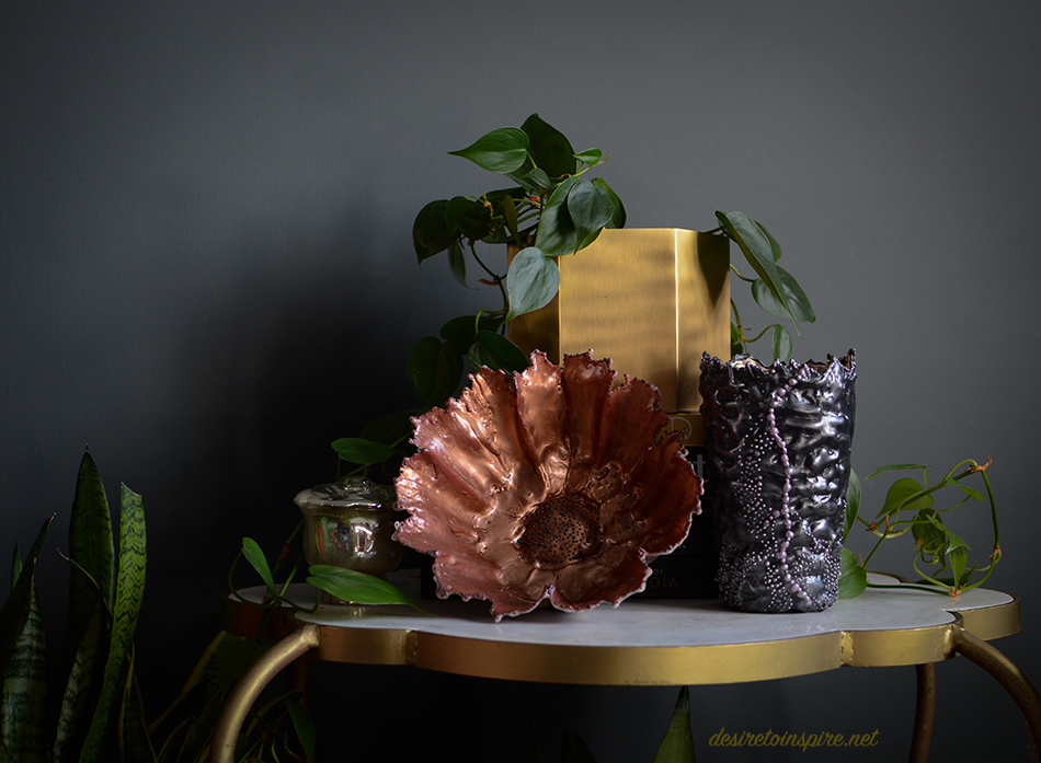
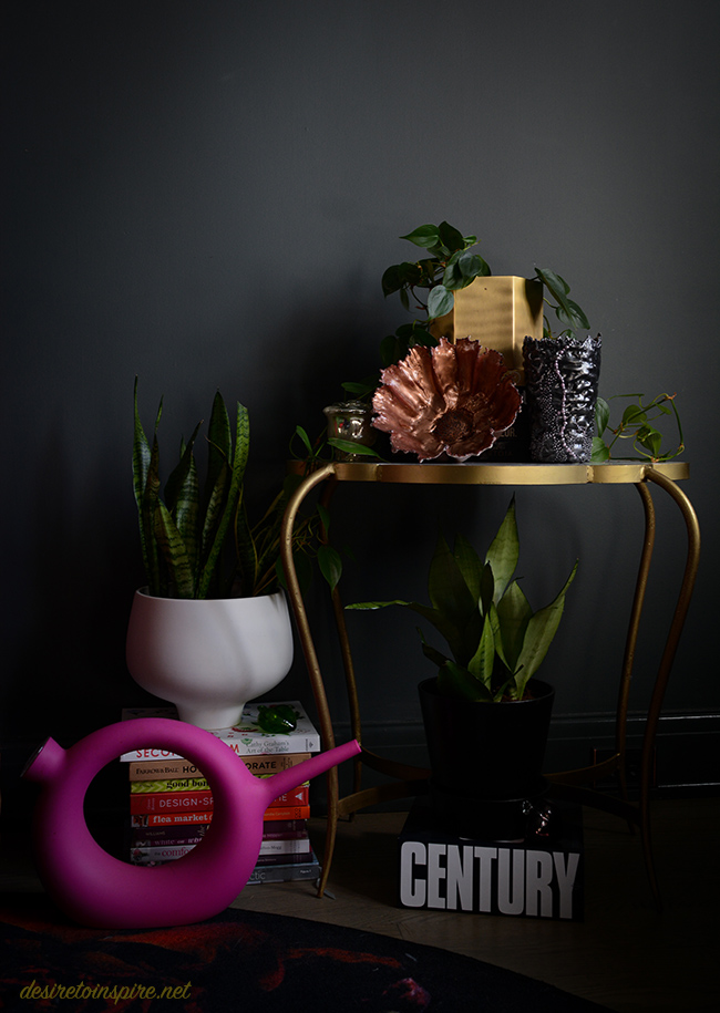
Over the last month or so I have received some really awesome things that I wanted to share. Nothing excites me more than packages on my front porch! I’ll start with some encaustic pieces – a medium I was really not familiar with.
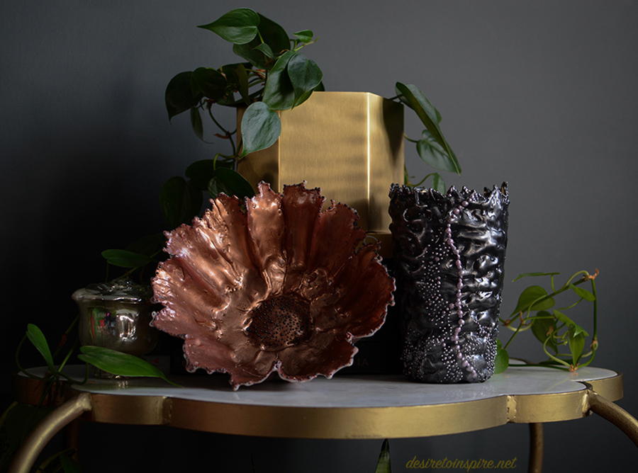
Tracey-Mae Chambers of TMC Design Collection is an Indigenous Canadian encaustic sculptor who lives in Southern Ontario. She uses melted beeswax mixed with Damar resin to strengthen the wax and this liquid is then formed into her beautiful collection of vessels. They are then treated with clear gloss lacquer to make them more durable. I had a really tough time deciding which pieces to get but thought this stunning copper flower bowl and black vase would work really well in my home. Thanks Tracey-Mae!!
I had seen some fabulous pillows popping up on some of my favourite U.K. based Instagram accounts lately and was super excited when Karen Sedgwick of Wild Rice Designs (based in Nottingham, U.K.) got in touch about these infamous pillows of hers. Again, I had a really hard time picking my favourite pillow (the runners up were this one and this one).
In the end I went with the vintage floral velvet because I fell in love with the pattern.
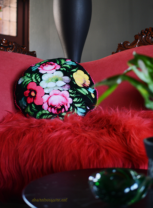
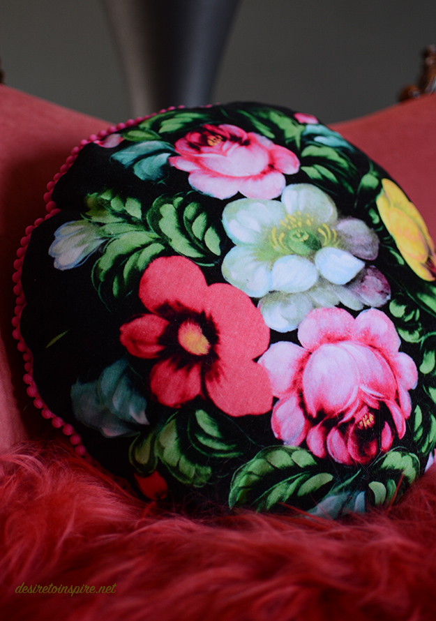
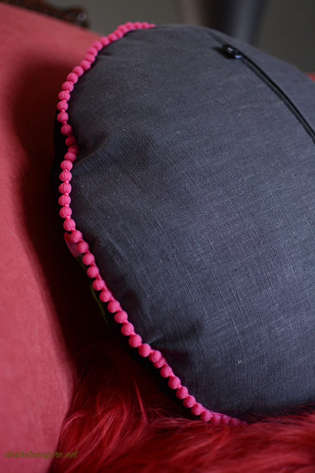
It is soooo beautifully made and I could not be happier with it (I’m a bit picky about pillow quality – the feather fill and cotton linen backing with that adorable pom-pom trim totally sold me). Here’s her Instagram, website, and Etsy shop. Thank you Karen!!
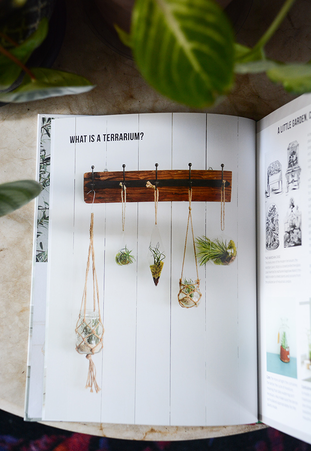
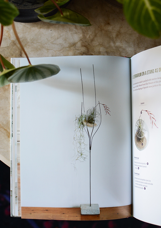
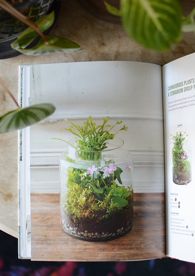
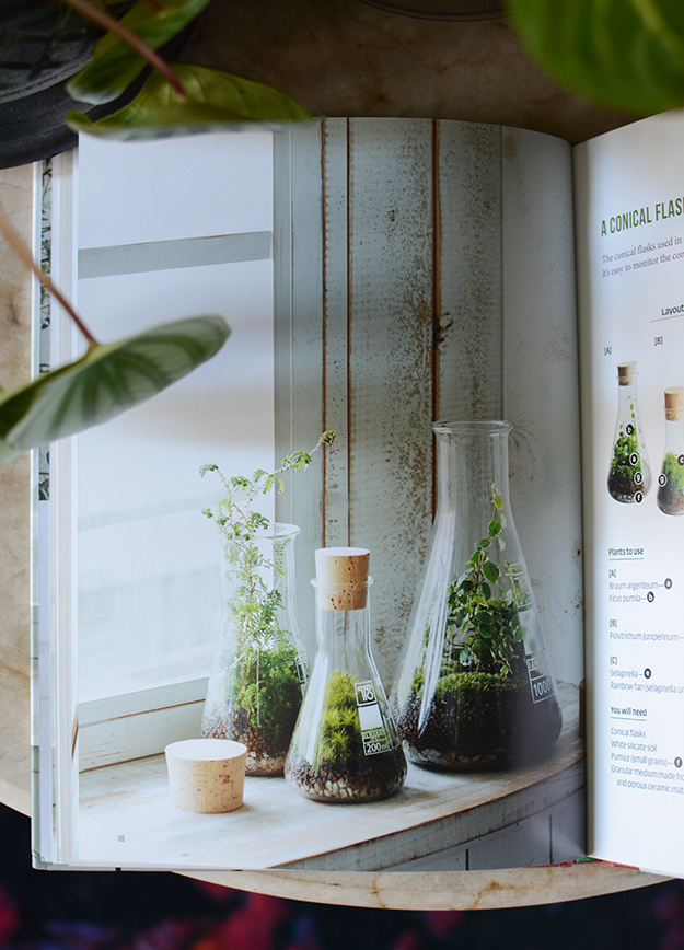
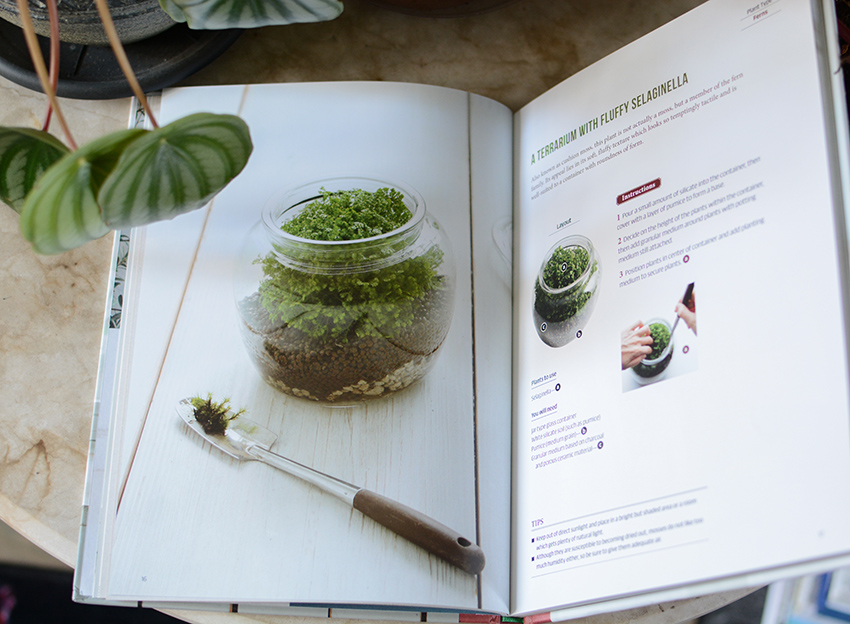
I also received another little gem of a book from Tuttle Publishing called Miniature Terrariums. So cute!
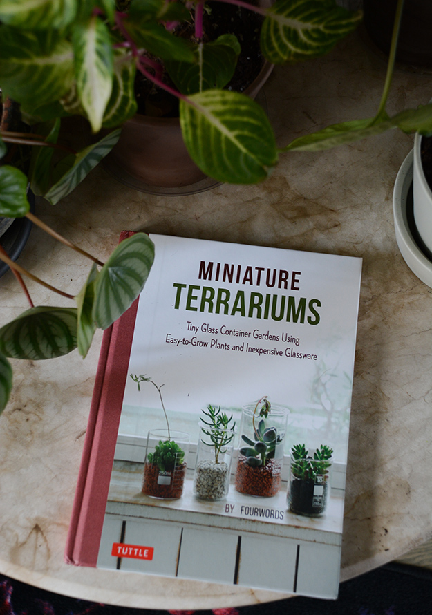
What I love about this book is not only does it give lots of instructions for being able to execute these terrariums, but it shows you the beauty of repurposing glass containers such as a lab flask, wine glass, mason jar, or an inexpensive glass box or hanging bulb. It gives some examples of using moss and fern, air plants, succulents and other types of plants. I REALLY want to try some of these this summer. Find this book on Amazon here.
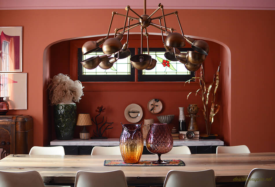
My dining room got a makeover
Posted on Wed, 14 Mar 2018 by KiM
When Christmas was over I was itching for a house project. I wasn’t looking for anything major as I only had a few days to really get into it before the new year, so I decided to give my dining room a makeover. I wasn’t really feeling the colour scheme I had gone with of grey/taupe and pale pink. I found it a bit cold and lifeless, especially when I love cozy, dramatic dining rooms. And since my dining room can be closed off from the rest of the house I knew I could go with something bold. I’ll start with a before photo. And for those of you who lean towards subtlety you may prefer this to the after. 😉
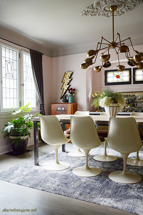
I went looking through Farrow & Ball colours and kept going back to terra-cotta shades. They seemed so warm and inviting. So I went for it! I did a bit of a random colour scheme of pink, terra-cotta and mustard. 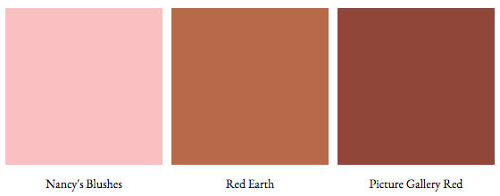
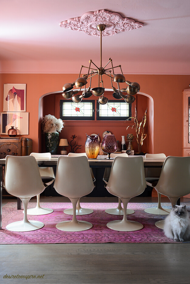
I thought this room could use some dramatic curtains, and thought some crushed velvet in a mustard shade would do the trick. After a bit of digging on Etsy I found the most incredible set of very heavy, vintage curtains that were absolutely perfect. (I’ll include sources for everything at the end of the post)
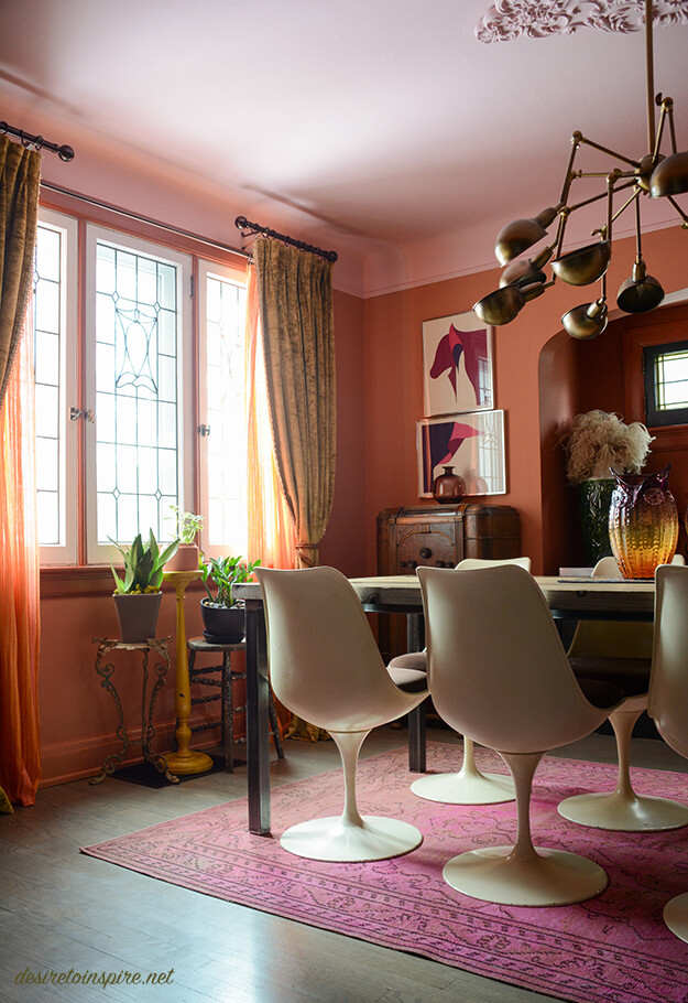
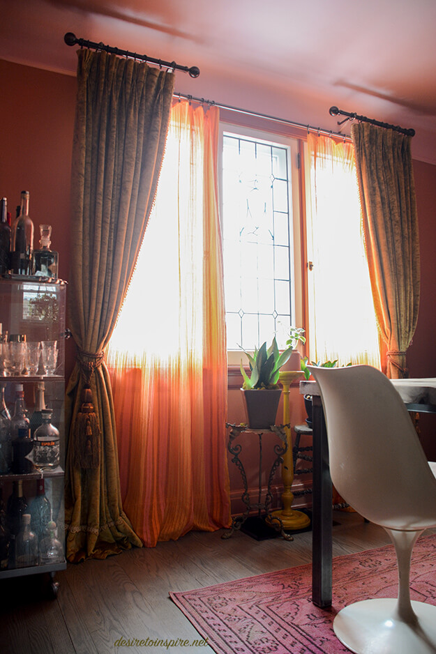
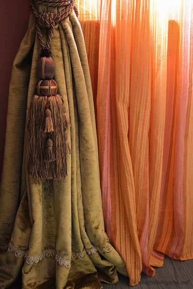
Because the curtains weigh a ton I opted for a short rod on each side for them and found some sheer fabric and had them made into panels that we could easily slide across for privacy. (We live on a busy road so having something that could close so the city of Ottawa can’t watch us eat was crucial). I feel like a legit grown-up now with this curtain set-up, complete with tassels! That scalloped edging at the bottom is also along the inside edges of the curtains and is such a pretty detail.
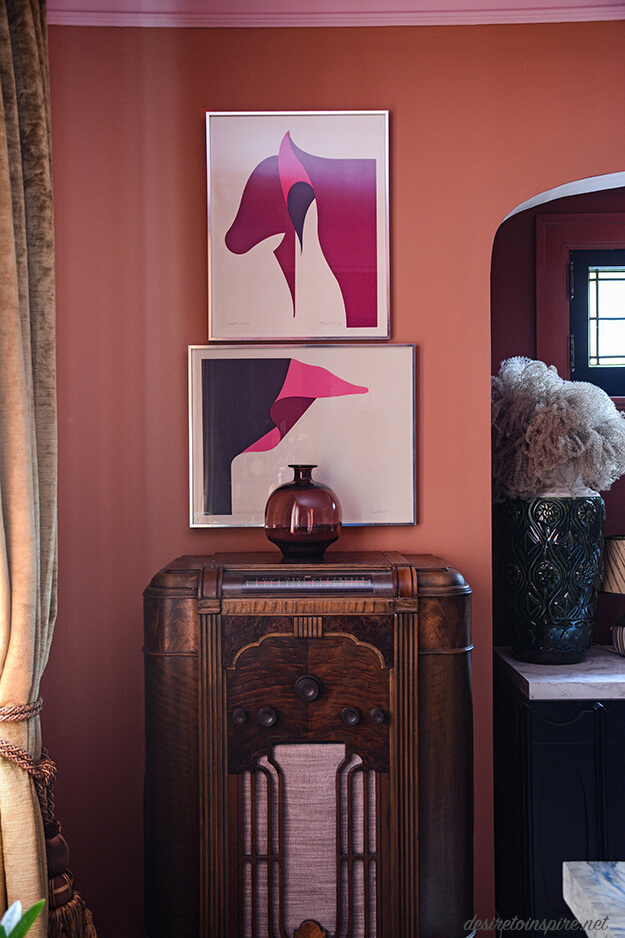
A few weeks ago husband and I drove to Montreal to check out our favourite flea market and I found the art in the photo above (and a third one which you’ll see later). I almost didn’t buy them but thought they were so fun I went back for them without knowing where I could use them. I realized they would be a bold addition of colour in the dining room. I am SO glad I ended up scooping them up.
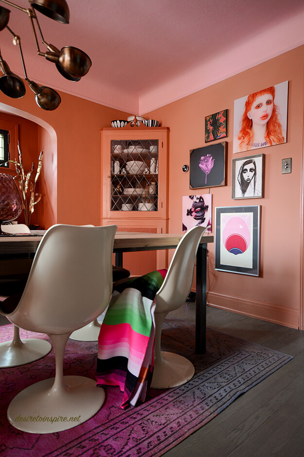
There isn’t much wall space in my dining room so I opted for a gallery arrangement on the only decent sized wall in the room. I had fun coming up with this. 🙂
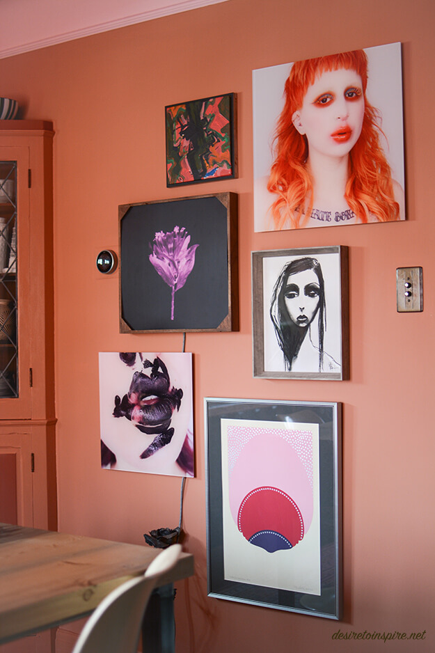
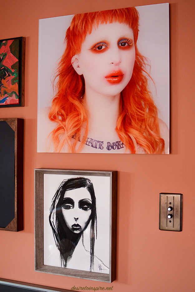
The gorgeous girl with the orange hair and the print of the lips in the previous photo are of my Instagram friend Kelseyanna who kindly sent me copies which I had blown up and mounted on acrylic. The other gorgeous girl is a print by Mel Remmers. Love her!
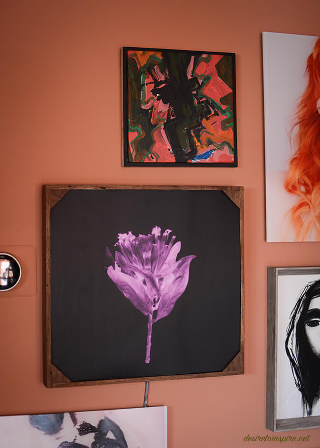
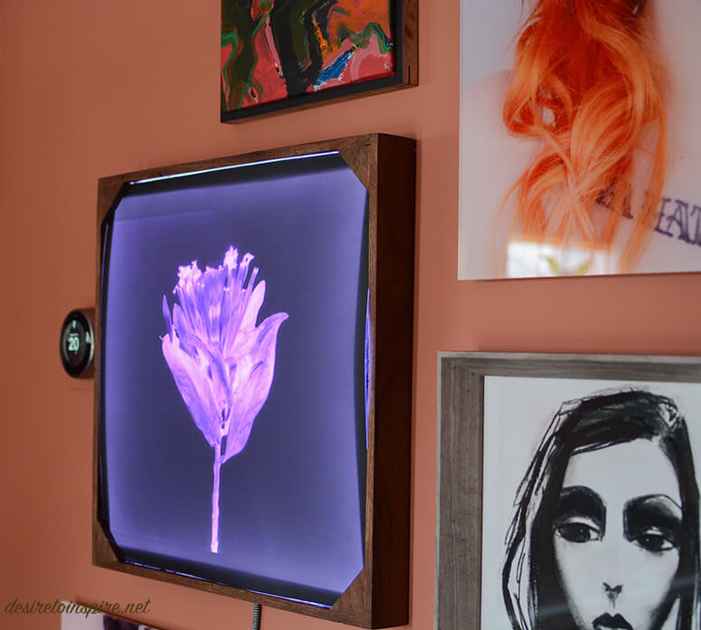
At the top is a canvas painting by another dear Instagram friend Andrea. Below it is a lightbox my husband built for me. Inside is a photograph I took that I turned into an x-ray. Unfortunately it is hard to photograph when turned on but I LOVE how it turned out!
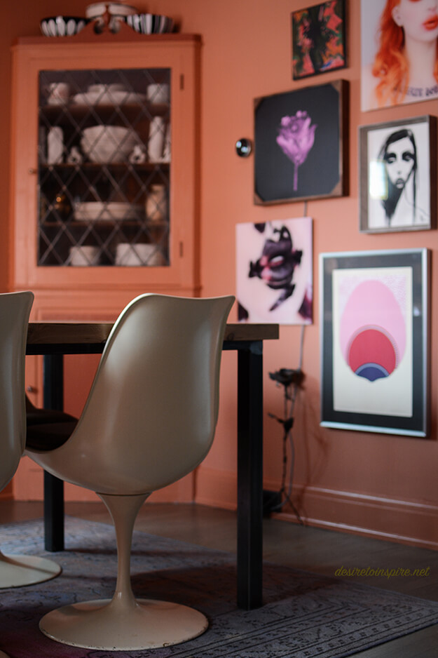
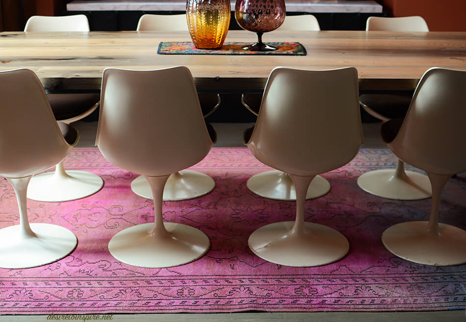
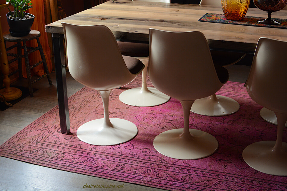
To my amazement I managed to find a rug that had shades of orange and pink in it to bring in the 2 major colours of the space. And it’s a perfect low pile rug for a dining room so sliding these heavy tulip chairs back and forth and cleaning up cat messes is no biggie.
There are still a few things I want to change in here. I found a darling vintage fabric to cover the chairs with (might not have enough to do all though dammit); I want a smaller, oval dining table because this one my husband built is a bit too big; I want a new buffet that is ideally 7′ long like this one. Regardless of those items I am really enjoying this transformation. At first when my husband saw the colours he thought I was insane but he quickly grew to love it too. I also had him on board with the curtain situation despite it taking hours to install/hang everything. Hope you all like it!
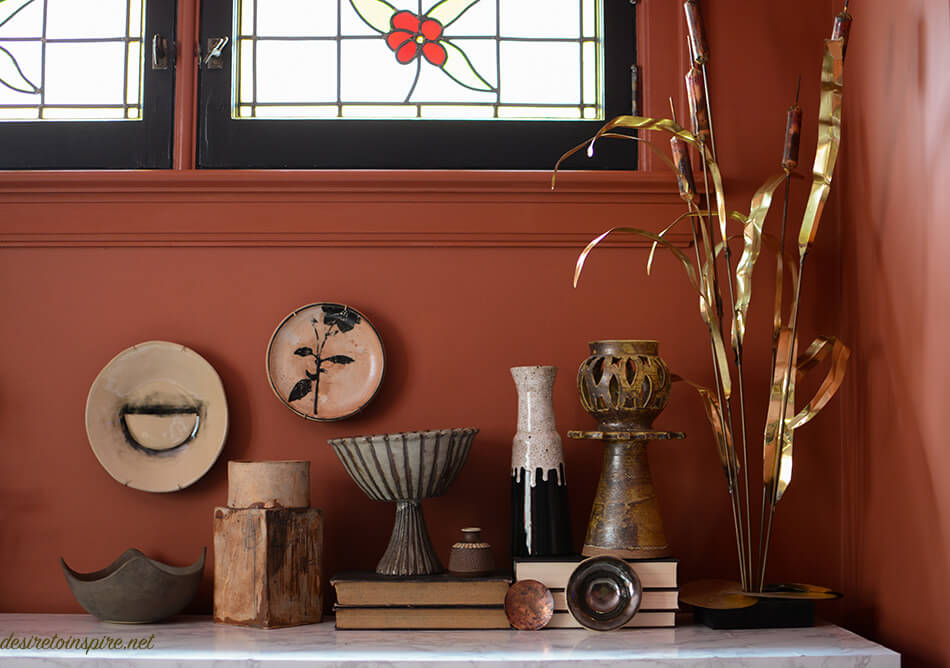
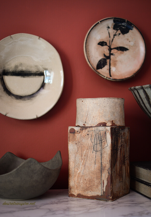
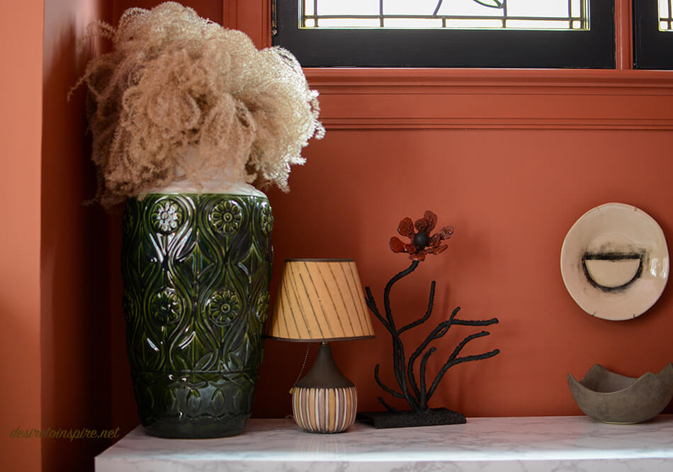
>>>SOURCES<<< wall colour: Red Earth, ceiling colour: Nancy’s Blushes, alcove colour: Picture Gallery Red, velvet curtains: AuDelaVintage, fabric for sheers: bettiecouture, curtain tassels: FabricsTrimsPillows, curtain hardware: Cozzy Coverings, 3 pink and purple signed and numbered prints from Montreal’s St. Michel flea market, vintage radio converted into a Bluetooth speaker by my husband: Daff Design, purple vase on radio & glass owl vase on dining table & most of the vintage ceramics on buffet: Vanier Moderns, plate with semi-circle hanging on wall in alcove & bowl below it & 2 small bowls leaning against books: Le Lou Ula Atelier, plate with flower: L’Arbre et la Rivière, brass reed sculpture & brass plant stand: The Pale Blue Dot, wooden stool plant stand & purple vase on dining table: Highjinx, rug: eCarpetGallery, Hay Denmark blanket and Ferm Living orange pot: The Modern Shop, framed canvas abstract painting: Andrea @hunt.and.scavenge, photos on acrylic: Kelseyanna Fitzpatrick @kelseyannaf printed by PosterJack, print of girl in black/white: Mel Remmers

