More green
Posted on Mon, 29 Oct 2007 by KiM
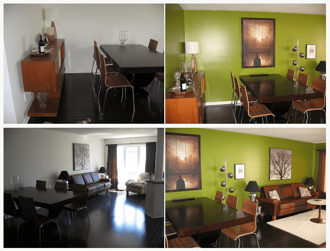
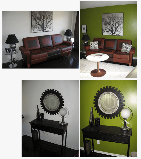
My twin sister moved into her first home about six months ago and to my horror painted most of her main floor white. She finally came to her senses and decided the space needed colour. She thought green would work best with her furniture, and had a particular green in mind.

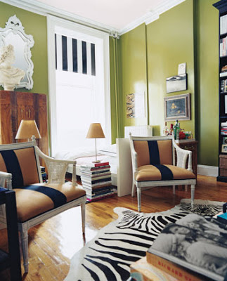
She loved the green in Nick Olsen‘s apartment pictured above. According to Nick, it’s high-gloss Oregano by Benjamin Moore. My sister went with semi-gloss, and the results are fabulous. So fabulous I had to post about it. She wants to get some accents in yellow, and I told her she should try and find a zebra print rug because Nick’s looks AMAZING. I also suggested she paint out the baseboards in the wall colour or even black because the white stands out too much against the green and the floors. The space has alot of potential now that there’s some colour going on. Below are some before and after photos of her living/dining area.


thombeau says:
Wow! What a terrific color, and what a fabulous difference it makes! Well worth posting!
She should definitely paint the baseboards and outlets. Plus, hold off on the yellow accents for a while; the place looks great as it is!
Anonymous says:
Looks beautiful! Could you please tell me where the round mirror is from? I’m looking for something like that.
julia says:
I got it at a store here in Ottawa called Bouclair Home.
Island spice says:
I think the black trim would be too sombre. I think some nice white crown molding would make the green look very crisp.
Tina says:
The rug (via link) looks awesome!
Love your new accessories in the room too… wink, wink! Super Cute!!!
drey says:
wow the room is so different: plus-personality! the white look was… drab. now it’s all shiny and green and utterly delicious! well done, twin sister!
Peggy says:
What a beautiful home! Kim this is excellent presentation. I love the white, but I love the green too. Your sister has great taste (wonder where she gets it from?). I love her artwork and her lamps.
I would like to see a turquoise pillow on the sofa, and maybe an orange one, but that’t it. The rooms look beautiful as they are. I even like the rug. A zebra-print seems like overkill to me with that graphic sofa. I love the coffee table. Is that the table from your home?
Leah says:
It looks great! I love her artwork, too — especially the tree image. Any idea who it’s by?
Leah
kim. says:
The tree print I bought for her last Christmas. I think it’s just a nicely framed poster to be honest with you. So no idea who it’s by. Peggy – good eye regarding the table. Our parents had 2 of them so eventually my sister got the second one. And turquoise is an good idea with the green.
interiores 3d says:
Very original green color with bright, I hang it on my blog, I am a decorator in Seville, Spain, the transformation is total.Espero your assertion. Of course you create the enlace.saludos. Interior 3d