Before and after
Posted on Tue, 27 Jan 2009 by KiM
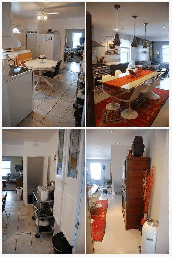
Just a heads-up for those folks who were following my kitchen renovation. I’ve done a post over on my kitchen blog of before and after photos, which I think are really helpful to give a realistic idea of the extent of the project. A peek is below, and here is a link to the post.
Leave a Reply to kim. Cancel reply


Jennifer Ramos says:
Its AMAZING!! What did you do with the DIOR ADDICT print? Also..im confused, did GT give you a discount for the renovation? if so thats great!
kim. says:
Thanks Jo! Hard to remember the ugly when it’s now sooooo pretty.
Thanks Jen! The print is sitting in a pile in the basement with other art I’m not currently using. And Greentea provided the cabinets, and the rest I (or the bank) was responsible for. 🙂
Abbey Goes Design Scouting says:
That’s AWESOME — so inspiring!
Anonymous says:
Wow. I’m so inspired by the bold choices!!
kim. says:
Thanks Abbey and Anon!
Carrie says:
I always love those before and after pictures 😉
Anonymous says:
it’s a good makeover and i like the choices for the kitchen and floor…however the furniture and decorating all kinda still looks random and not pulled together. it’s missing something.
kim. says:
Thanks for your thoughts Anon, and I’d sincerely love to hear your ideas on what’s missing. I found it a bit tough to mix the Asian style cabinets with the modern look I also love.
Anonymous says:
Yea, understandable. It seems like it would be really hard to mix the two. I think what makes it feel “non-flowy” is maybe the furniture placement. I know there’s not much you can do with the placement of the kitchen table. But maybe try removing the orange runner and basket. It may make the kitchen seem more airy and more in keeping with the white counter tops. Make it feel more like an island and not pull your eye so much DIRECTLY onto the table. You know what I mean? I think what seems off about the living room is the green wallpaper, (I really like it, it’s a cool mural) but it kinda chops up the flow of that white wall from the kitchen into the living room.
Maybe it’s just the photos, but I find the contrast between the orange and green on the back wall is so striking, it pulls the eye in two different directions, and so it feels fussy.
I would just start with toning down some of the orange in the kitchen to cut down on the sharp contrast and help improve the flow between the two spaces since you have an open concept area. Personally I think I would get rid of the green wall mural because I think it’s too strong and over powers the living room. I would also try different furniture layouts for the living room to see if something works better in designating that space separately from the kitchen.
That’s what I would do. But like I said, I really like the kitchen bones and the new floor. Sorry if it came across as rude.
kim. says:
No Anon, you didn’t come across as rude so no worries there. I am by no means a professional interior designer so I always love hearing other people’s thoughts. I’ve got that stuff on the dining table because I can’t imagine an empty dining table. But I may take that stuff off or switch them out for something else and see what happens. As soon as the weather gets reasonable here, so in like 3 months (LOL – sort of not joking) my bf and I are building a low loungey couch for the living room that will be modular so that should work to keep the open space roomy. I’m on the fence about the mural. I think it’s really fun, and since I live in the city, it’s kind of nice to see a forest in my living room. I think I’ll get the room organized with furniture, then see what it looks like. Not much to do with furniture placement as the space is so damn narrow.
Thanks so much for your thoughts. I appreciate it. 🙂